 Dev Design Library
shadcn/ui CTA Button Components
Dev Design Library indexes 11 shadcn/ui cta button components from 5 open-source UI libraries, with the most coming from Watermelon UI, FLX UI, Kokonut UI, sv-particles and Badtz UI. Each one links to its page with the source code, a live preview where available, the library license and the install command. They follow the shadcn/ui conventions, so most install with the shadcn CLI and drop into a Tailwind project. Cta button components belong to the Actions group.
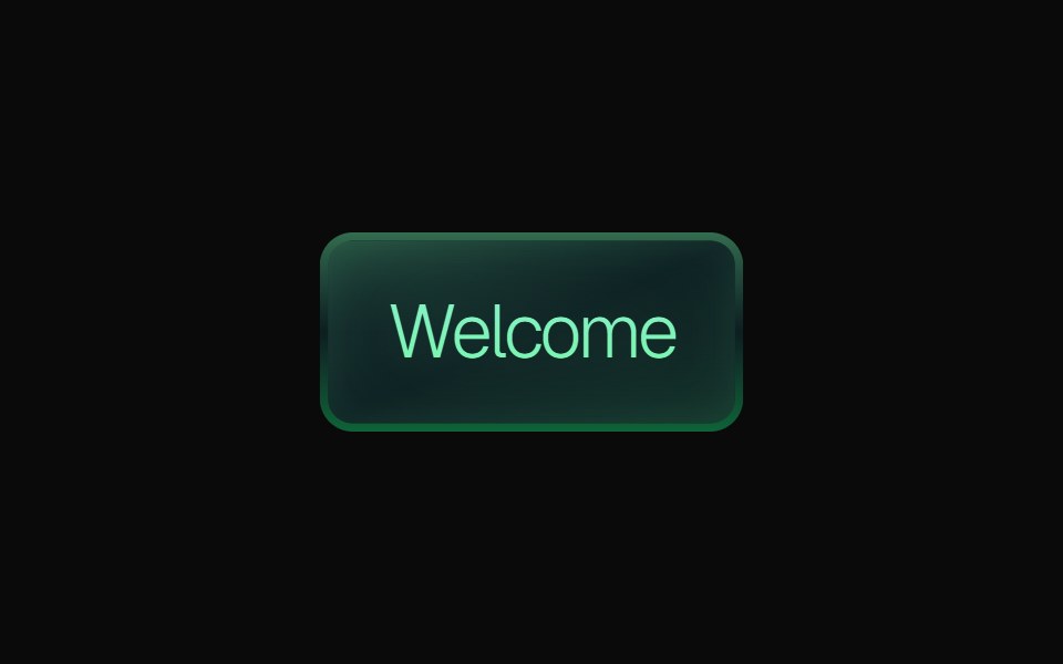 Gradient ButtonKokonut UI · ReactLayered gradient button with emerald, purple and orange variants, a gradient border, a soft inner glow, press feedback…
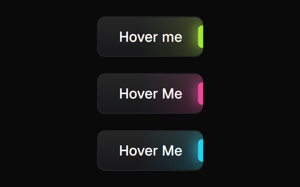 Glowing ButtonBadtz UI · ReactA visually distinct button component featuring a configurable, animated glow effect to highlight calls to action or…
 Cta 1Watermelon UI · React
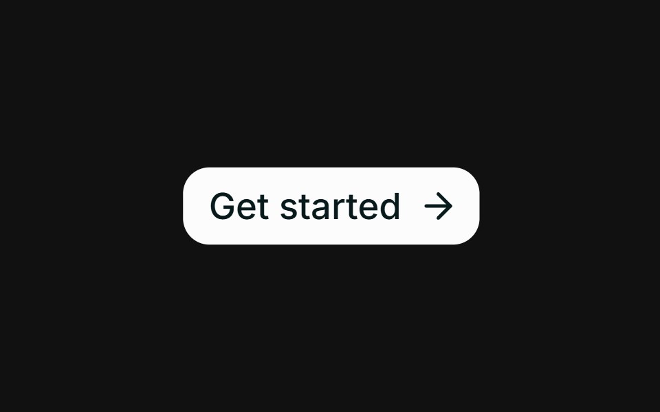 Hover slide arrowFLX UI · ReactCTA arrow nudges right on hover.
 Get Startedsv-particles · Svelte
 Cta 2Watermelon UI · React
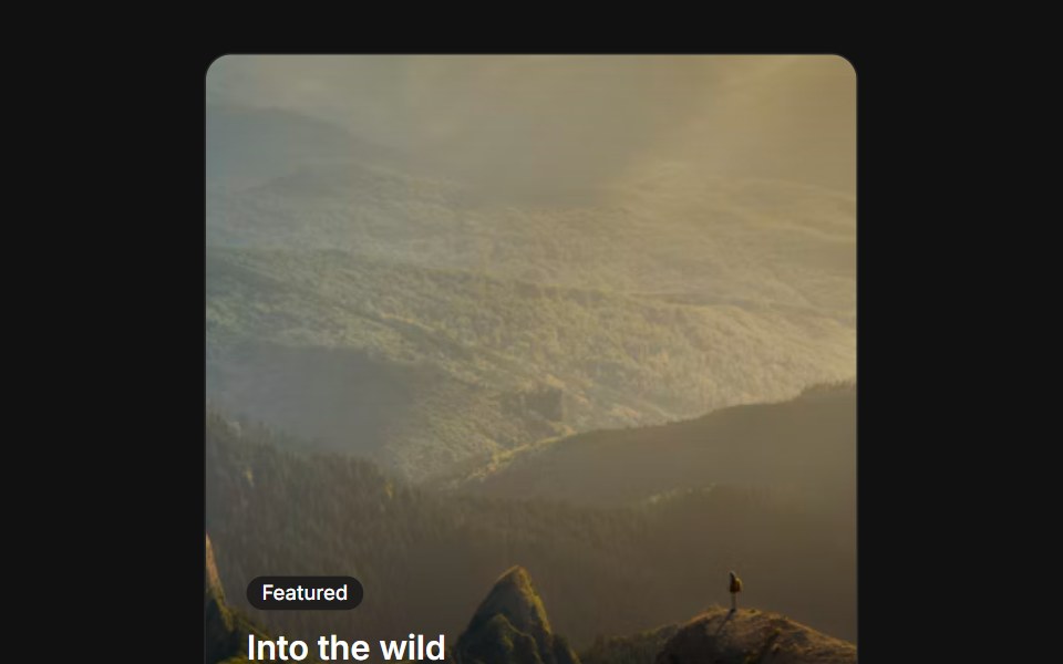 Image overlayFLX UI · ReactText and a CTA over a gradient-darkened cover image.
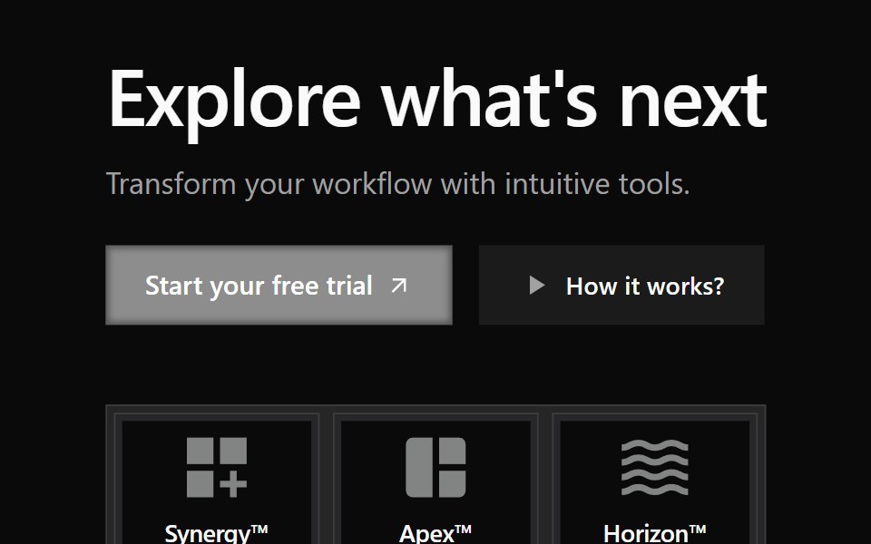 Cta 3Watermelon UI · React
 CTA (Call to Action)FLX UI · ReactShared CTA component with link and button variant
 Cta 4Watermelon UI · React
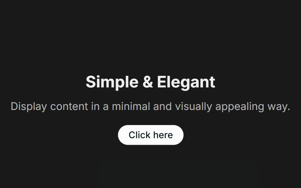 Call to Action 01FLX UI · ReactA centered text block with a title, description, and CTA.