 Dev Design Library
shadcn/ui Toggle Button Components
Dev Design Library indexes 6 shadcn/ui toggle button components from 4 open-source UI libraries, with the most coming from sv-particles, Kokonut UI, Cojeev UI and FLX UI. Each one links to its page with the source code, a live preview where available, the library license and the install command. They follow the shadcn/ui conventions, so most install with the shadcn CLI and drop into a Tailwind project. Toggle button components belong to the Actions group.
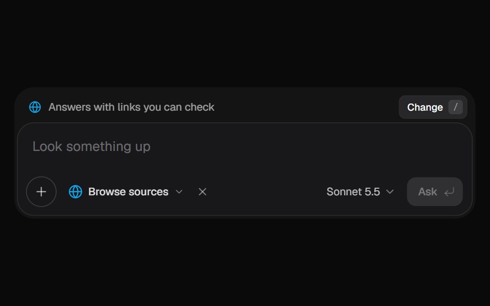 AI Input SearchKokonut UI · ReactAI composer with a Tools menu (browse, investigate, draft, run code, reason), a model picker and a live trace that…
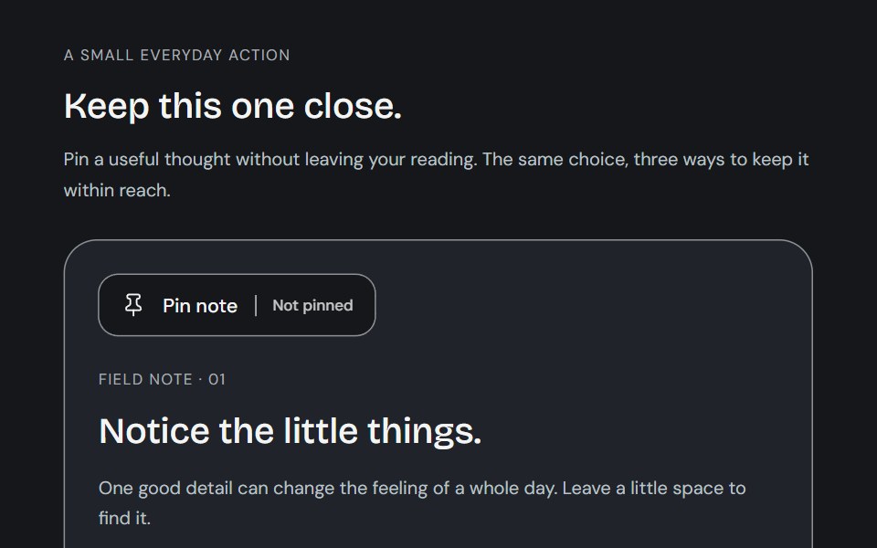 ToggleCojeev UI · ReactA small action with a lasting state: a toolbar tool, a paper bookmark or a descriptive preference. Native targets stay…
 Theme switcherFLX UI · ReactRadio group toggling light, dark, and system themes.
 Outline Like With Countsv-particles · SvelteOutlined like button with a heart and the number of likes next to it.
 Rotating Togglesv-particles · Svelte
 Show More Less Togglesv-particles · Svelte
Libraries with shadcn/ui toggle button components
Related categories
- Toggle Button Components
- React Toggle Button Components
- Tailwind CSS Toggle Button Components
- Animated Toggle Button Components
- shadcn/ui Action Components
- shadcn/ui Button Components
- shadcn/ui Button Group Components
- shadcn/ui Icon Button Components
- shadcn/ui CTA Button Components
- shadcn/ui Copy Button Components