 Dev Design Library
Tailwind CSS Toggle Button Components
Dev Design Library indexes 121 Tailwind CSS toggle button components from 43 open-source UI libraries, with the most coming from Origin UI, ReUI, Amicro Micro Transitions, Watermelon UI and UI Lab. Each one links to its page with the source code, a live preview where available, the library license and the install command. Every library in this list styles its components with Tailwind CSS utility classes. Toggle button components belong to the Actions group.
Showing 120 of 121, a mix from every library. Open a library to see all of its components.
 Toggleshadcn/ui · ReactA two-state button that can be either on or off.
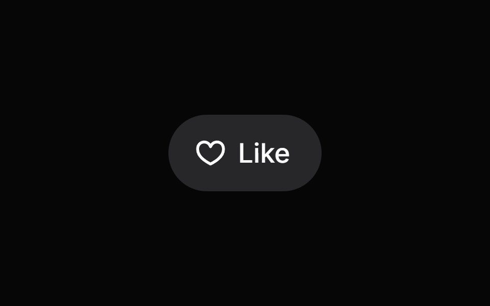 Toggle ButtonHeroUI · ReactAn interactive toggle control for on/off or selected/unselected states
 Theme TogglerMagic UI · ReactTheme toggle with View Transitions and animated clip-path masks (circle, polygons, star), optional viewport-centered…
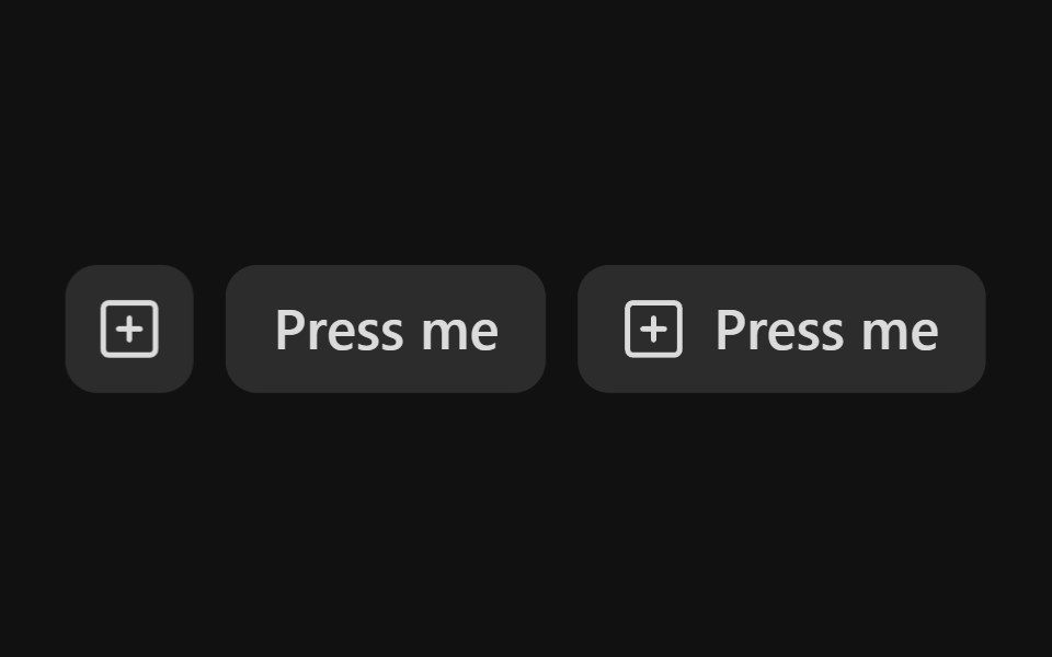 Toggle ButtonReact Spectrum · ReactToggleButtons allow users to toggle a selection on or off, for example switching between two states or modes.
 Togglecoss ui · ReactA two-state button that can be toggled on or off.
 ToggleOrigin UI · ReactA two-state button that can be toggled on or off.
 Theme SwitchPreline UI · JavaScript (HTML + Tailwind)
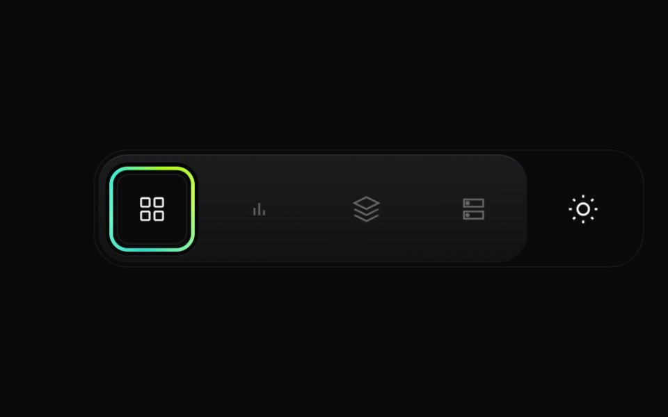 Gradient Button GroupCult UI · ReactPremium layered button group with animated active state, gradient ring accents, and theme toggle underlay
 Theme toggle button with animated moon and sun iconsReUI · ReactTheme toggle button with animated moon and sun icons
 Apple Icon MorphAmicro Micro Transitions · ReactApple Icon Morph loading animation.
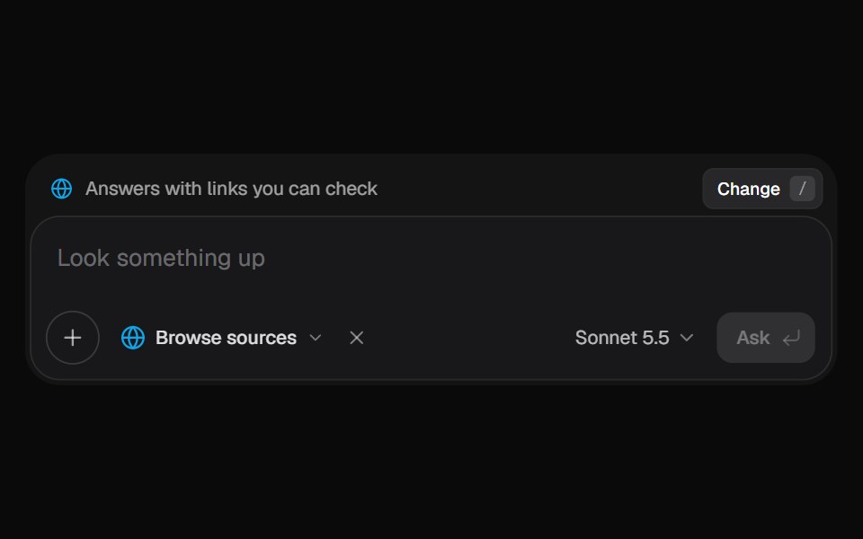 AI Input SearchKokonut UI · ReactAI composer with a Tools menu (browse, investigate, draft, run code, reason), a model picker and a live trace that…
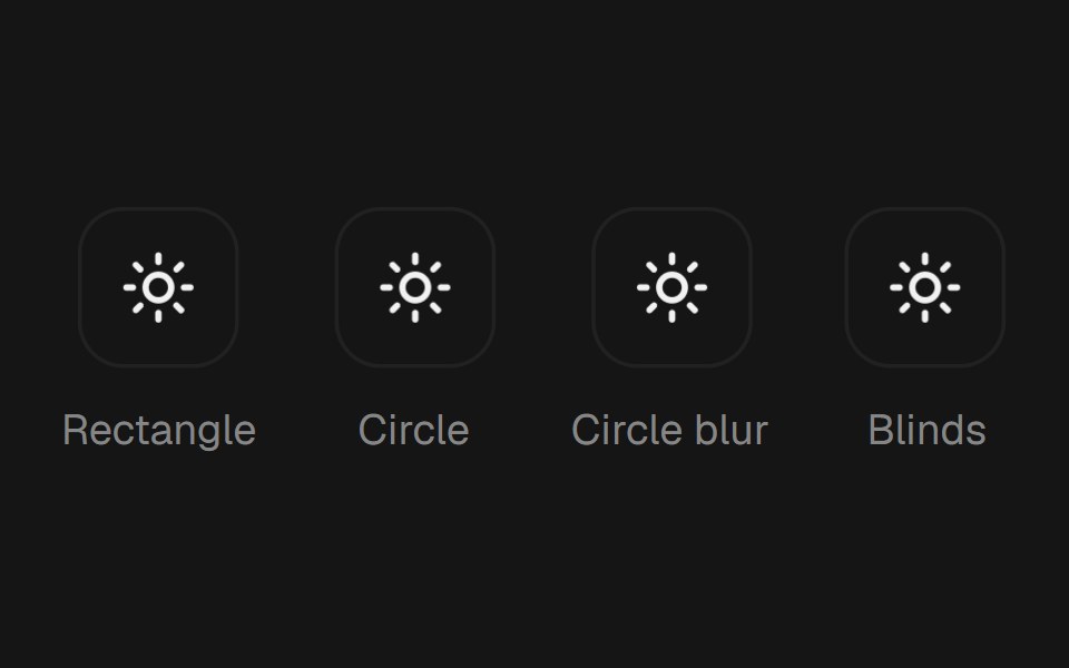 Theme TogglebeUI · ReactTheme toggle button that repaints the whole page through the View Transition API — a rectangle or circle clip-path…
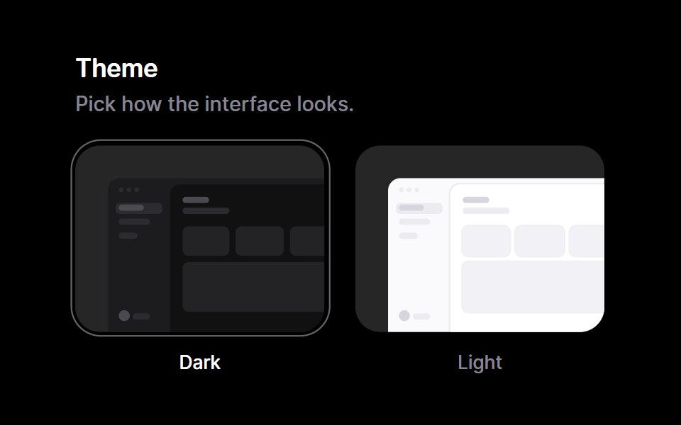 Theme SelectorRare UI · ReactA row of miniature app previews, one per theme, with a ring that marks the one you pick.
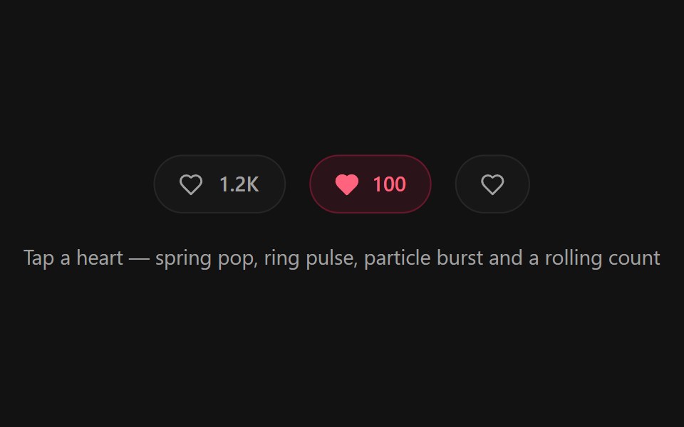 Like ButtonSpectrum UI · ReactA heart like button micro-interaction with a spring pop, ring pulse, radial particle burst, and a rolling odometer count
 ToggleVengeance UI · React
 ToggleToolcraft · React
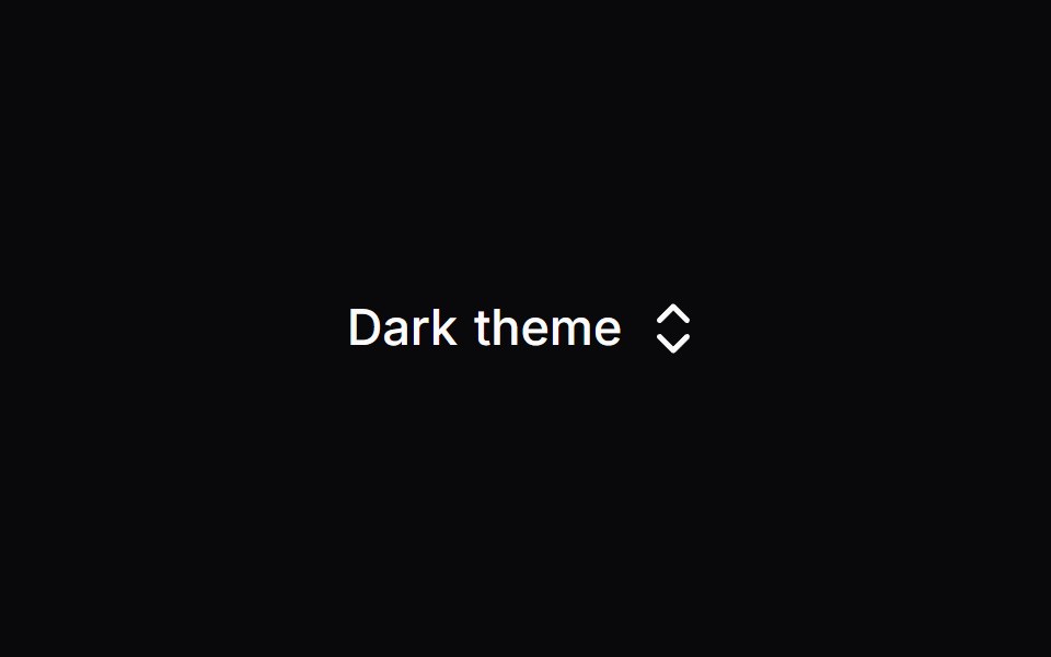 Mode ToggleLaunch UI · React
 Toggle ButtonPanel UI · React NativeA button that stays down, on its own or in a group.
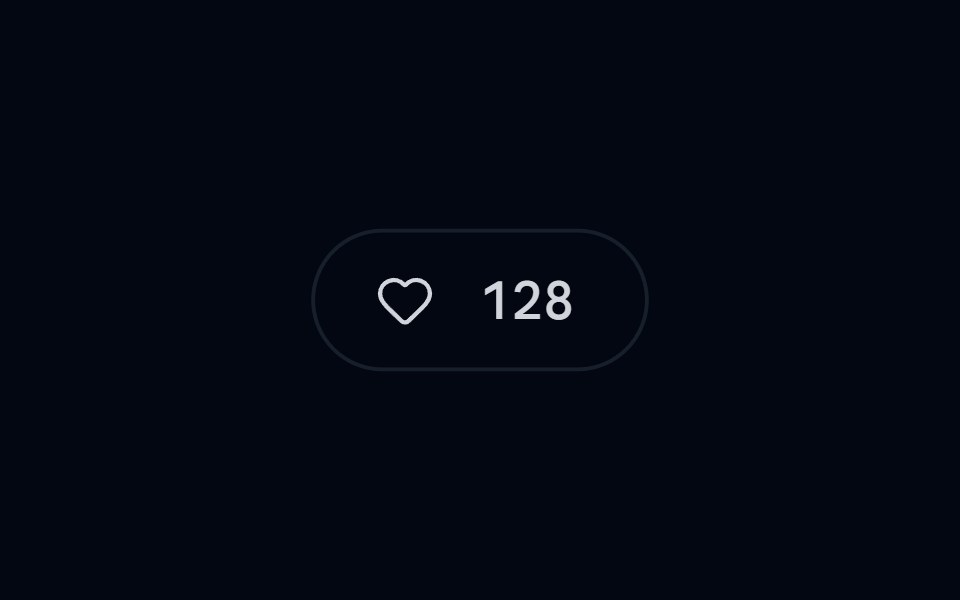 Button 20 - Animated Like ButtonShadcn Space · ReactLike button with burst particle effect and sliding count
 Blur Toggle ButtonPixel Perfect · ReactA button with blur transition effect on toggle using Framer Motion.
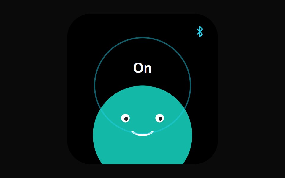 Bluetooth Face WidgetOpenSourceUI · React
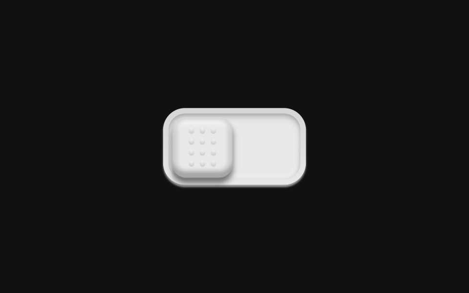 Theme Toggleuselayouts · ReactA physical switch with a dotted grip. Click and the knob slides across a recessed track.
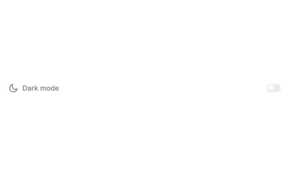 ThemeBoardUI · React
 Animated Theme TogglerAnimations (Svelte) · SvelteA smooth animated theme toggler that uses the View Transition API to create a circular reveal effect when switching…
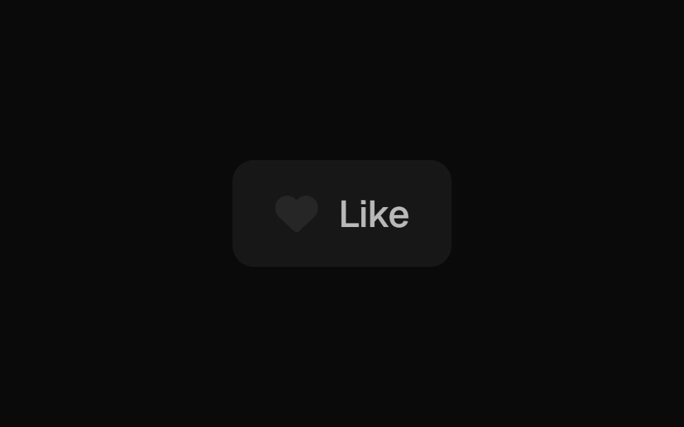 Like ButtonBadtz UI · ReactA dynamic button that animates on click, creating a burst of heart icons that randomly scatter before fading out.
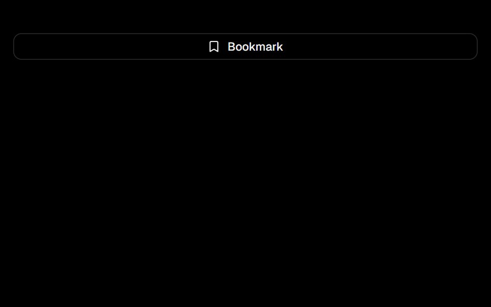 ToggleObsidianUI · React
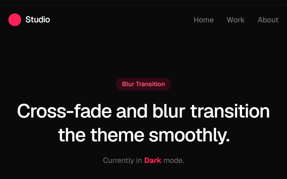 Blur Fade Theme TransitionGreatUI · ReactLight and dark theme toggle that switches the page with a blur and fade transition.
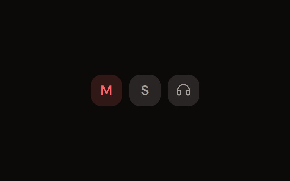 Channel Toggleaudiocn · ReactMute, solo and monitor toggle buttons with their own pressed colours.
 toggleBaseLayer · ReactA toggle button allows a user to toggle a selection on or off, for example switching between two states or modes.
 ToggleShark UI · ReactTwo-state button that can be toggled on or off.
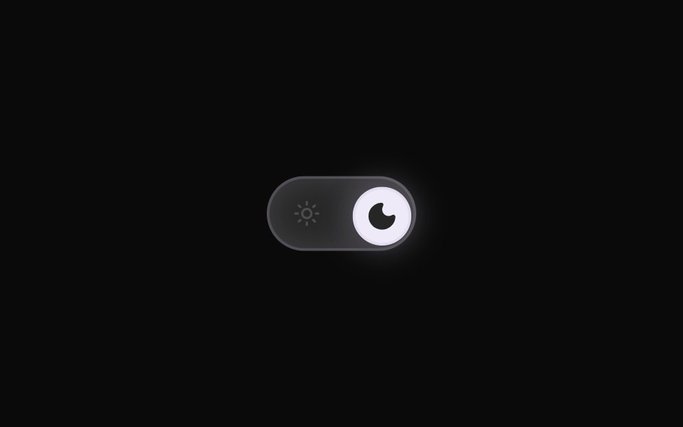 Theme ToggleRewamp UI · ReactRewampUI ThemeToggle Component A smooth, tactile Light / Dark mode toggle switch with layout-interpolated spring…
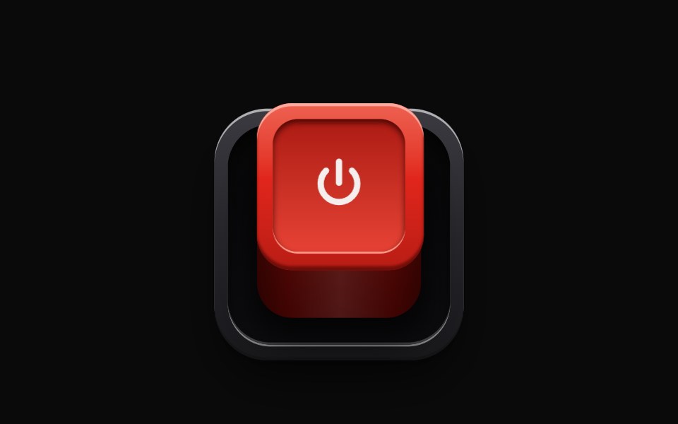 RealisticSwitchEvil Buttons · ReactA latching push switch, a raised box that sinks into its socket when pressed, stays down and glows while on, and…
 Save ToggleWatermelon UI · React
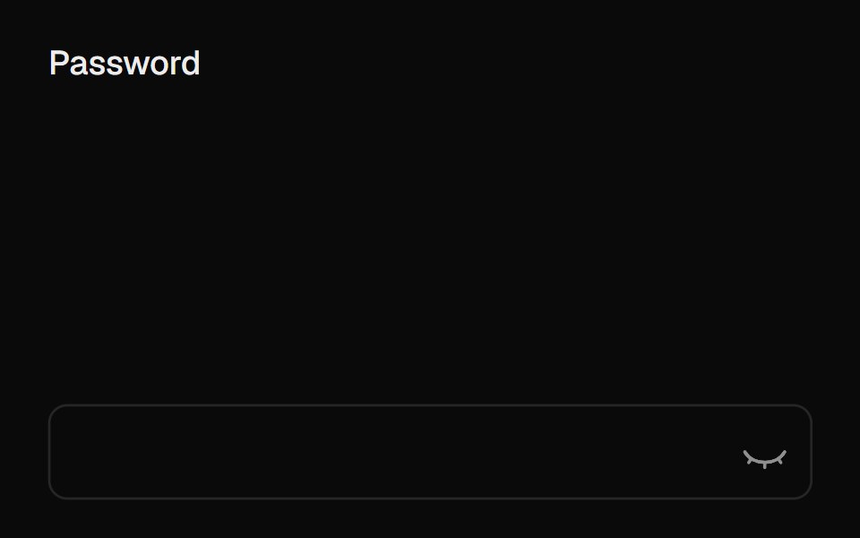 Eye ToggleUI Lab · ReactThe eye shuts when your password is hidden and watches while you type.
 ToggleHextaUI · ReactA button that stays on or off, with a fill that settles in when pressed, a clear hover-to-on step and icons that can…
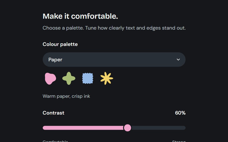 AppearanceCojeev UI · ReactChoose from six coordinated palettes and adjust reading contrast across the application.
 Theme switcherFLX UI · ReactRadio group toggling light, dark, and system themes.
 Theme TogglerVelora UI · ReactWipes the new theme in as a circle using View Transitions.
 Outline Like With Countsv-particles · SvelteOutlined like button with a heart and the number of likes next to it.
 Like ButtonSpaceUI · ReactA like button with burst particles, a ripple ring, a spring-animated heart, and a smooth NumberFlow count transition.
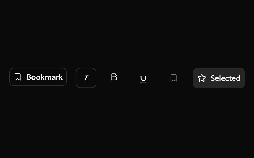 Toggle ButtonOUI · ReactReact aria components Toggle Button with shadcn characteristics.
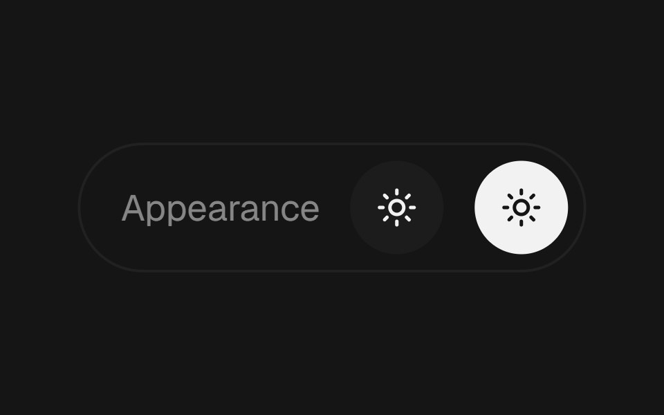 Theme ToggleEaseUI · ReactLight and dark switch that reveals the new theme as a circle growing from the center of the screen or from the button…
 Swapark-cn · ReactA shadcn-style swap component built with Ark UI primitives.
 Tailwind Toggle ButtonReact Spectrum · React
 Comp 102Origin UI · React
 Basic toggle.ReUI · ReactBasic toggle.
 Haptic RingAmicro Micro Transitions · ReactHaptic Ring loading animation.
 Switch ButtonKokonut UI · ReactLight and dark theme toggle whose sun folds into a moon while the new theme spreads from the button as a circle.
 Button 21 - Animated Upvote ButtonShadcn Space · ReactUpvote button with ripple, upward particles, and sliding count
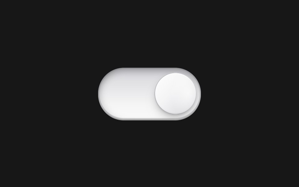 Pearl Toggle ButtonPixel Perfect · ReactPearl Toggle Button component.
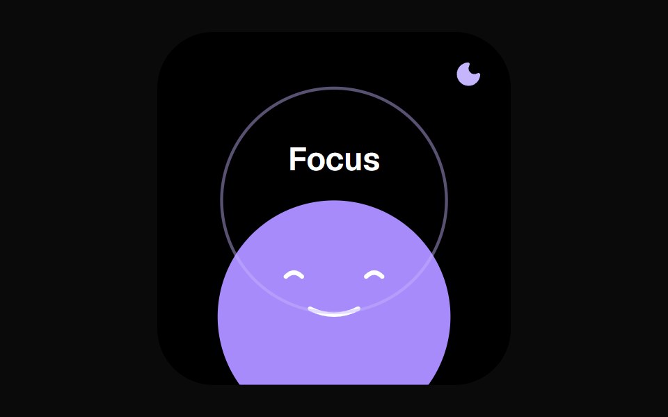 Dnd Face WidgetOpenSourceUI · React
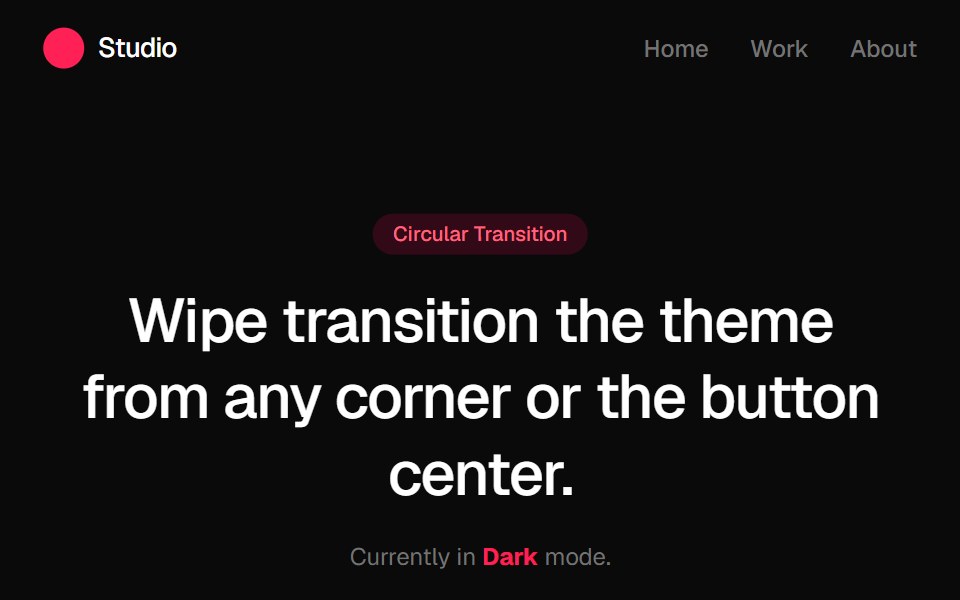 Circular Theme ProviderGreatUI · React
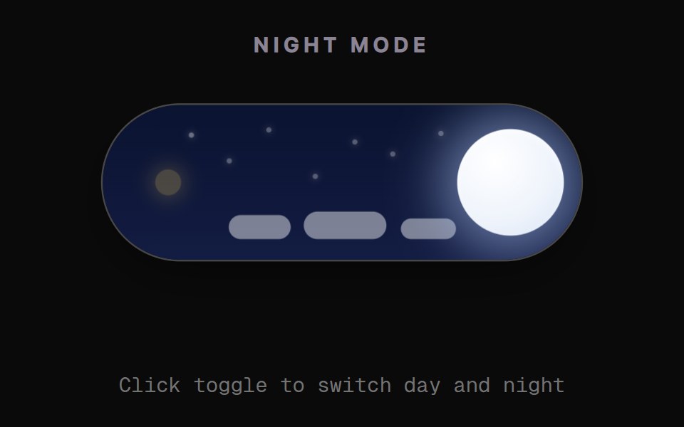 Day Night Sky ToggleRewamp UI · React
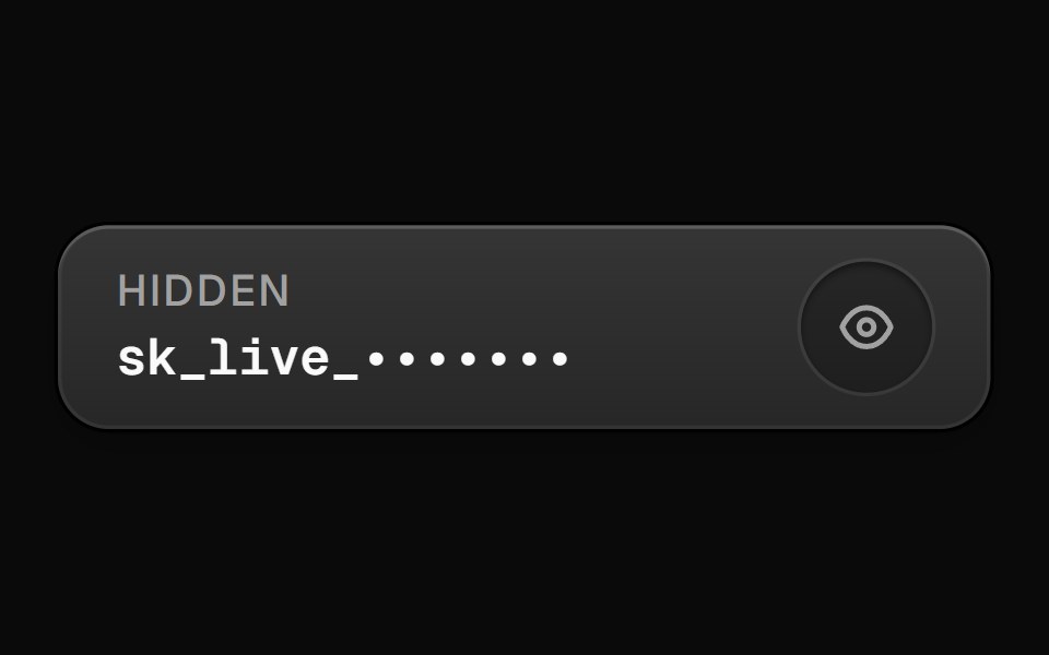 RevealButtonEvil Buttons · ReactA button that reveals a hidden secret value on hold or toggle, with a blur-in animation and an eye icon indicator.
 Save Toggle BaseWatermelon UI · React
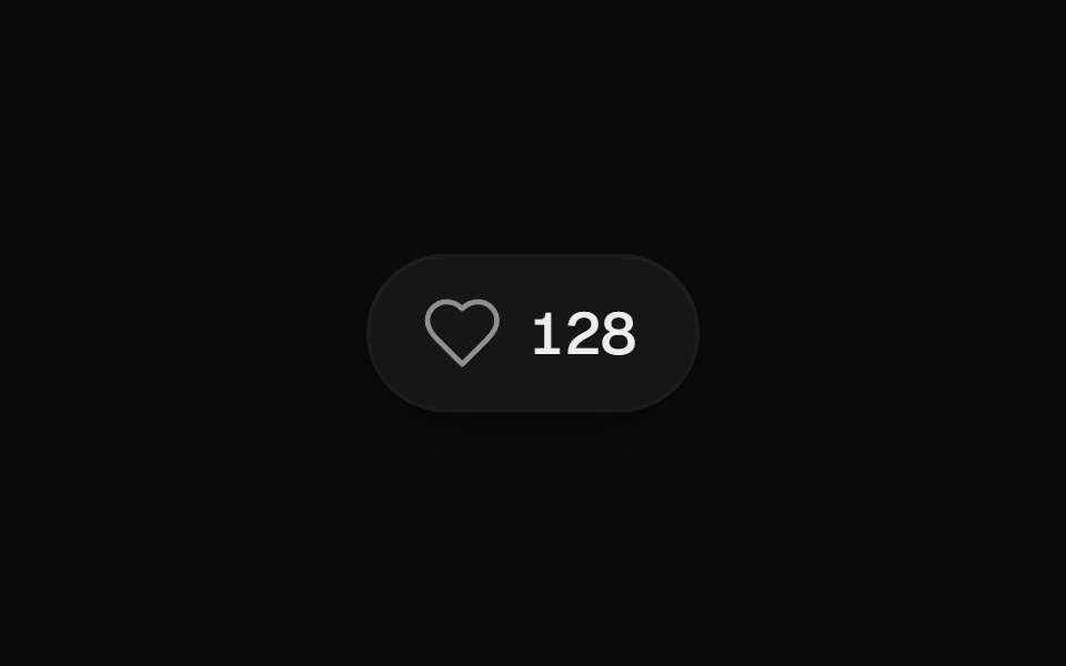 Like ButtonUI Lab · ReactPops, bursts and rolls the count when you like.
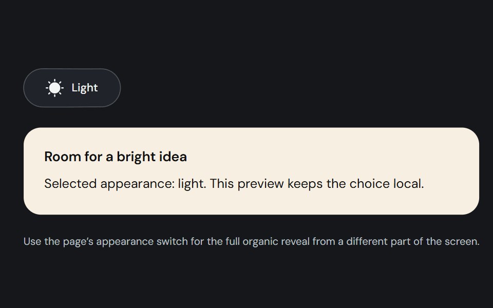 Theme toggleCojeev UI · ReactA controlled light/dark switch with a morphing sun and moon and a smooth organic page reveal.
 Rotating Togglesv-particles · Svelte
 Theme ToggleSpaceUI · ReactView Transition API theme switch with circle, blur, rectangle, and polygon reveals.
 Toggleark-cn · ReactA shadcn-style toggle component built with Ark UI primitives.
 Vanilla Toggle ButtonReact Spectrum · React
 Comp 103Origin UI · React
 Toggle with text label that changesReUI · ReactToggle with text label that changes
 HeartbeatAmicro Micro Transitions · ReactHeartbeat loading animation.
 Toggle 02 - Animated Like ButtonShadcn Space · ReactAn animated like (heart) button with active scale pop-up animation and particle radial burst effects.
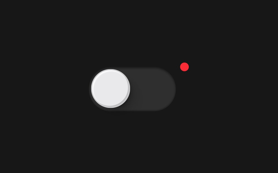 Toggle ButtonPixel Perfect · ReactAn animated toggle switch with spring physics using Framer Motion.
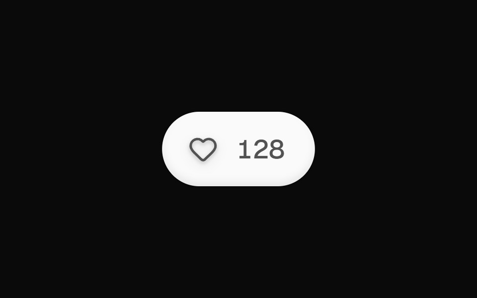 Like ButtonOpenSourceUI · React
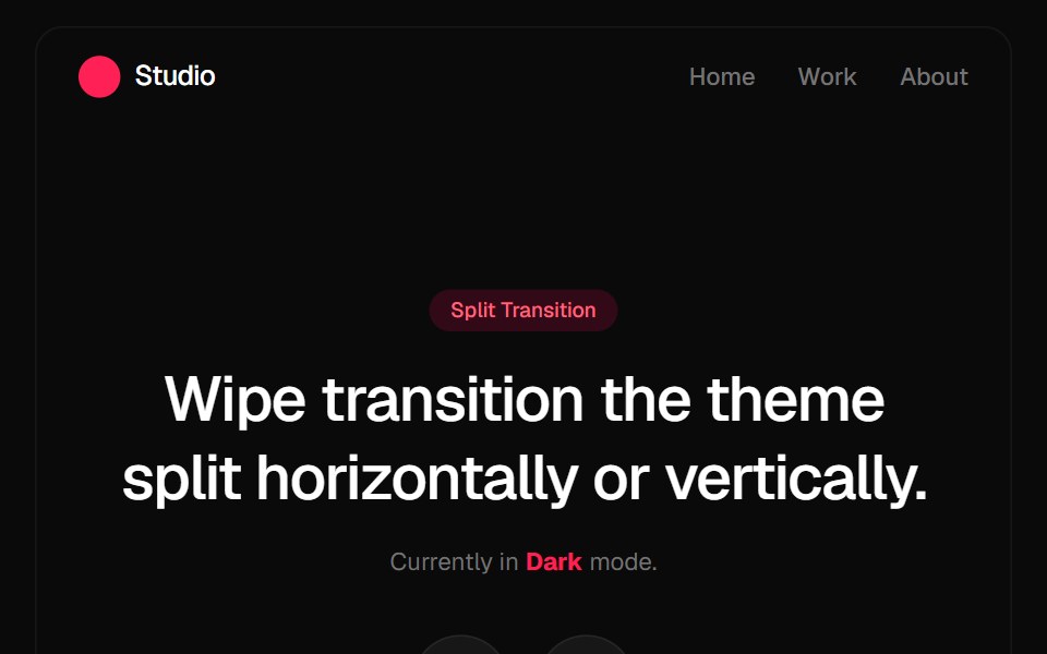 Split Theme ProviderGreatUI · React
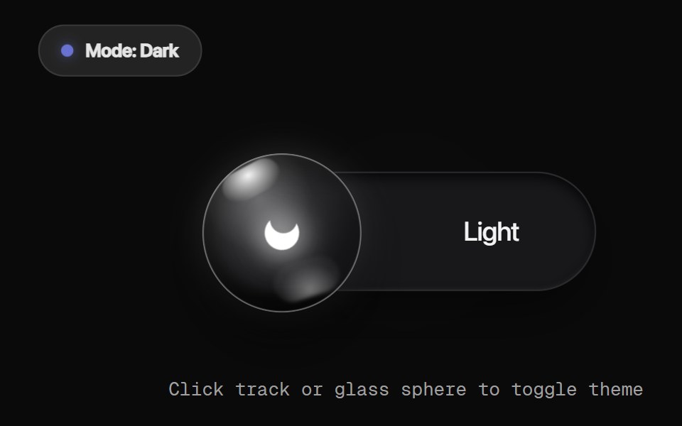 Glass Orb ToggleRewamp UI · React
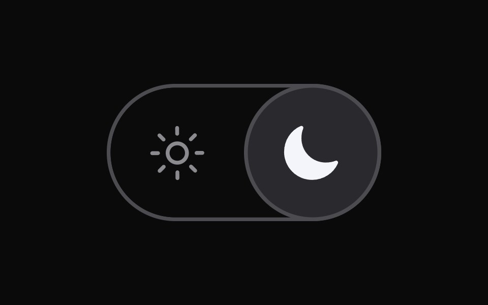 Switch ModeWatermelon UI · React
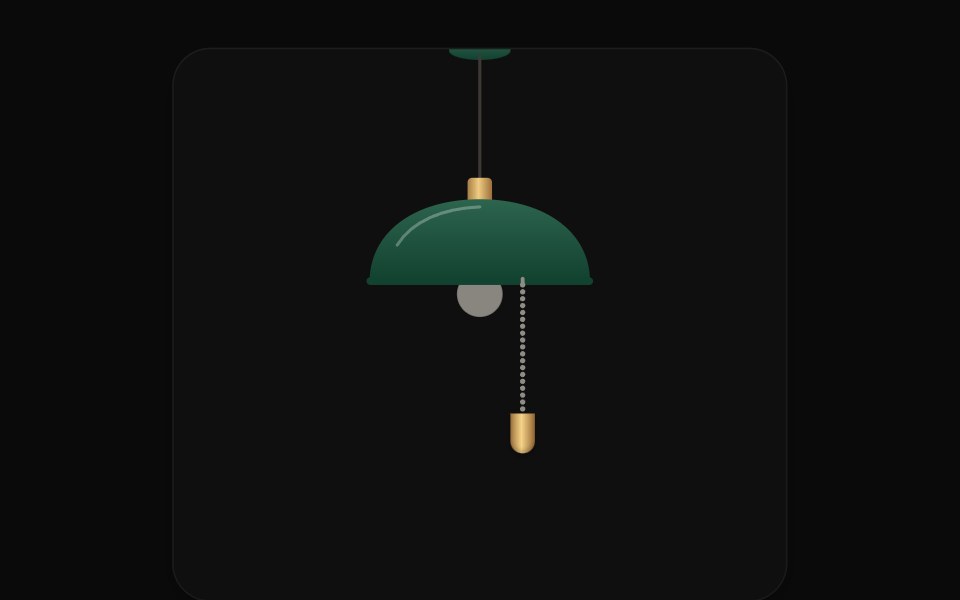 Pull Cord SwitchUI Lab · ReactPull the ball chain to switch the site's lights; light pours from the bulb as a cone.
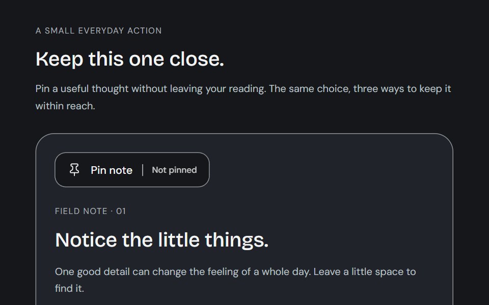 ToggleCojeev UI · ReactA small action with a lasting state: a toolbar tool, a paper bookmark or a descriptive preference. Native targets stay…
 Show More Less Togglesv-particles · Svelte
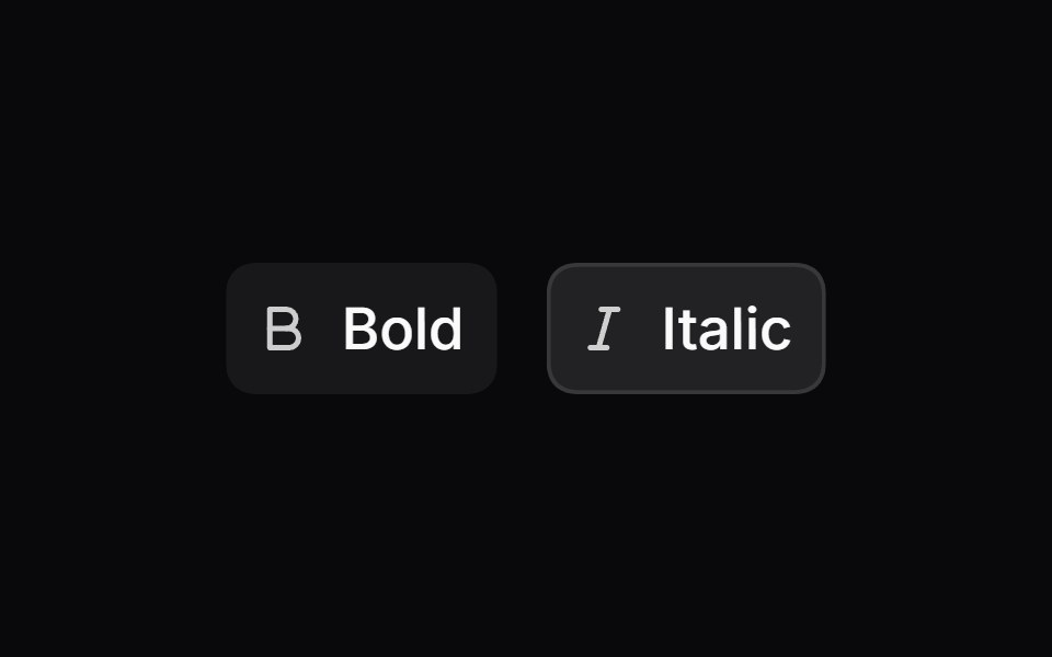 ToggleSpaceUI · ReactProvides a two-state button that users can press to turn a specific feature, view, or styling option on and off.
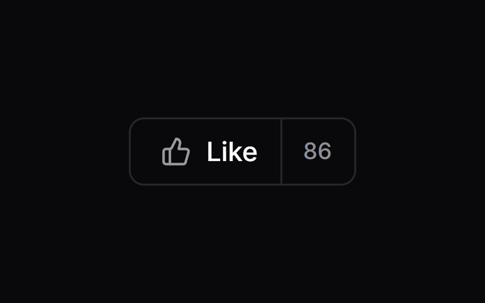 Comp 117Origin UI · React
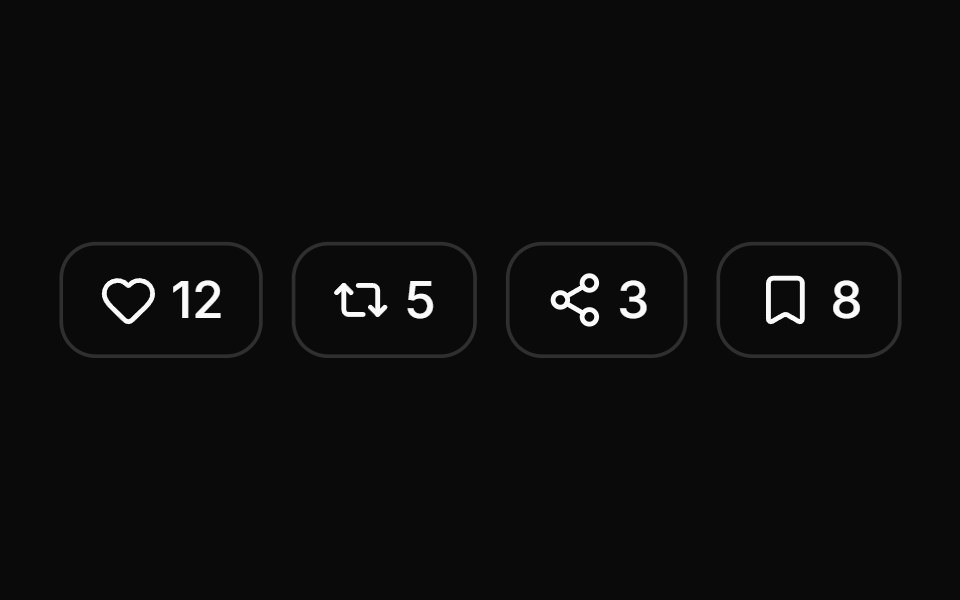 Social media reaction togglesReUI · ReactSocial media reaction toggles
 Light Dark MorphAmicro Micro Transitions · ReactTheme toggle whose sun icon changes shape into a moon. Alternador de tema cujo ícone de sol se transforma em lua.
 Toggle 03 - Animated Upvote ButtonShadcn Space · ReactAn animated Product Hunt / Reddit style upvote button with bouncing arrow and sliding digit counter.
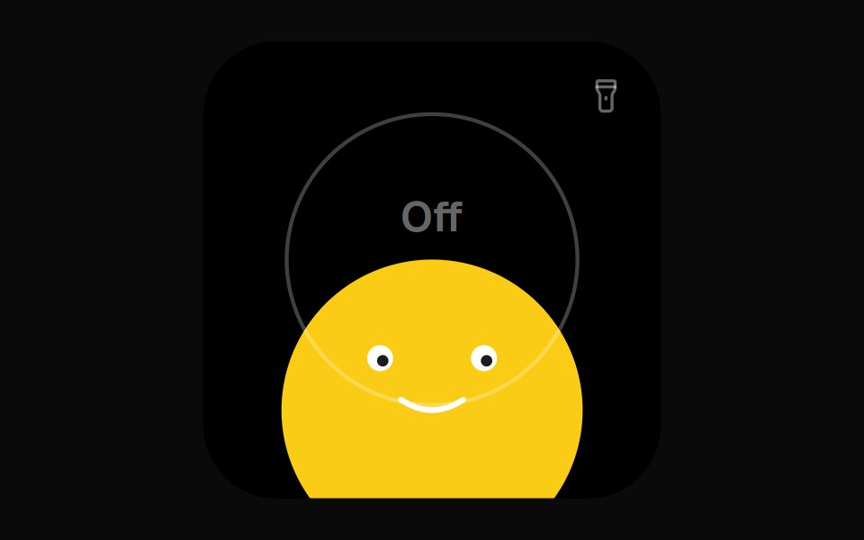 Torch Face WidgetOpenSourceUI · React
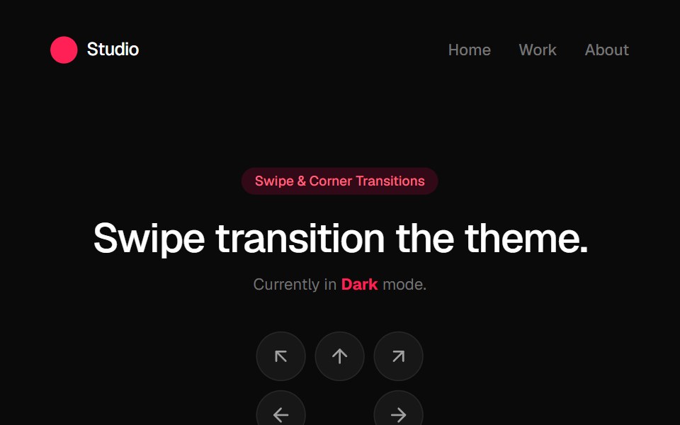 Swipe Theme ProviderGreatUI · React
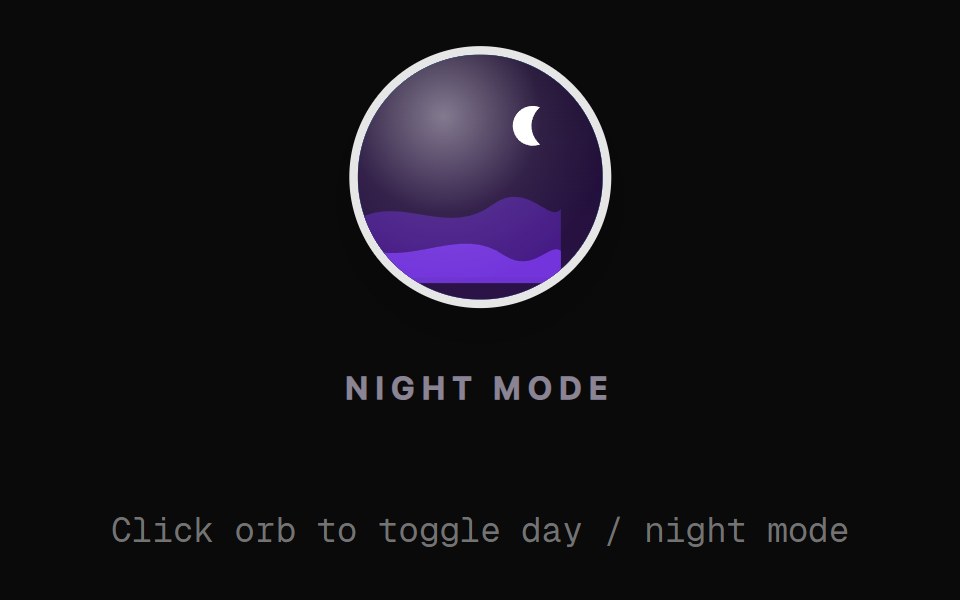 Landscape Orb ToggleRewamp UI · React
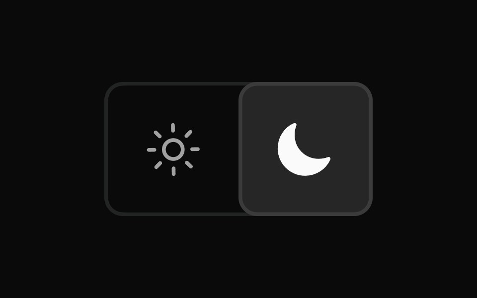 Switch Mode BaseWatermelon UI · React
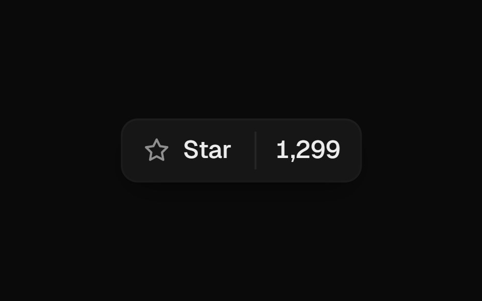 Star ButtonUI Lab · ReactSpins once and throws off tiny sparks when starred, then rolls the count.
 Mode SwitcherSpaceUI · React
 Comp 118Origin UI · React
 Toggle with tooltipReUI · ReactToggle with tooltip
 Plus Minus ToggleAmicro Micro Transitions · ReactDual square toggle buttons with solid color fills and spring micro-bounce.
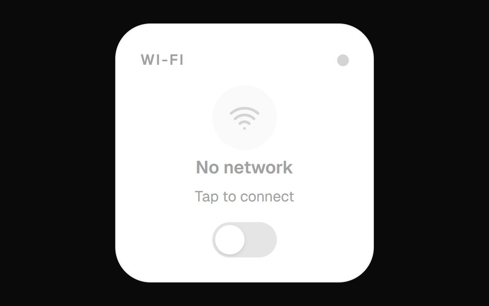 Wifi Toggle WidgetOpenSourceUI · React
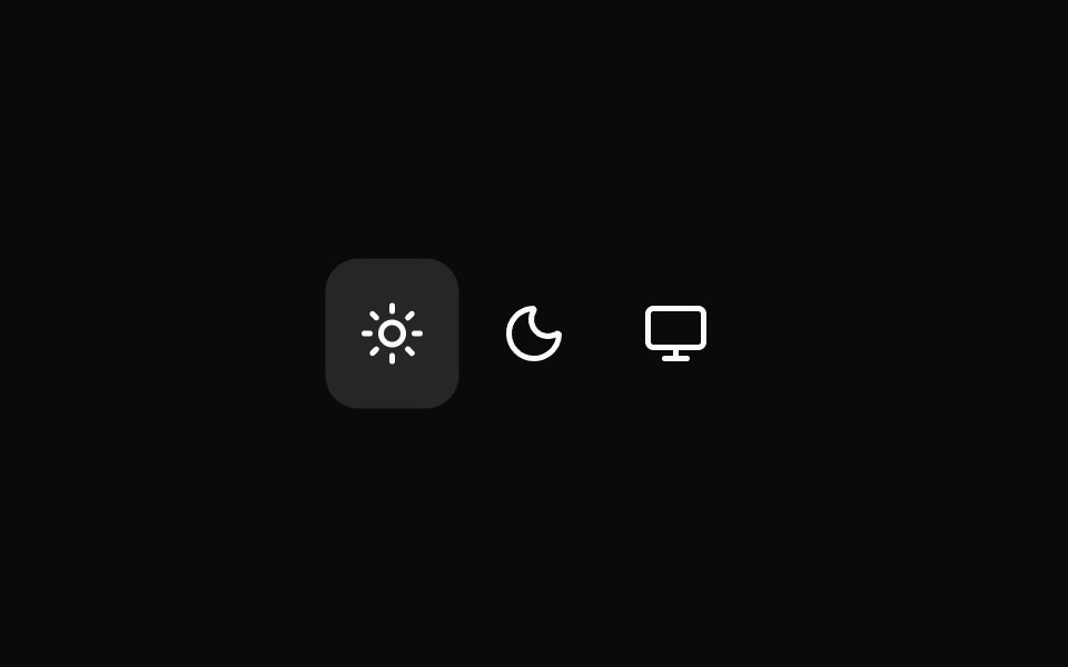 Theme TogglerWatermelon UI · React
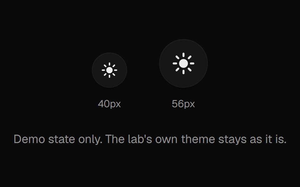 Theme ToggleUI Lab · ReactA sun that folds its rays away and turns into a crescent moon.
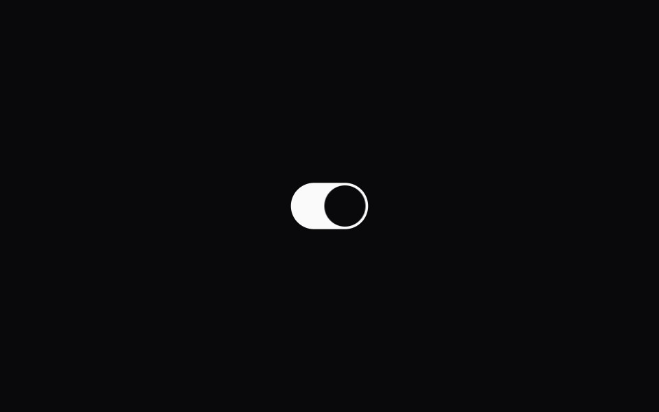 Theme SwitcherSpaceUI · React
 Comp 130Origin UI · React
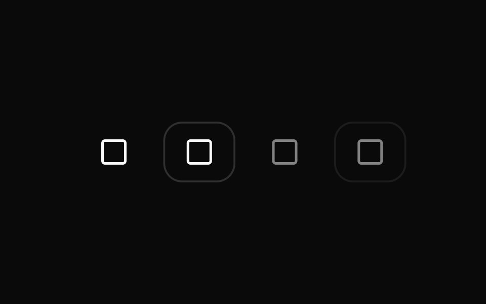 Disabled toggle statesReUI · ReactDisabled toggle states
 Pumping HeartAmicro Micro Transitions · ReactPumping Heart loading animation.
 ToggleWatermelon UI · React
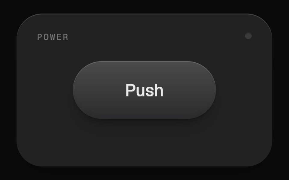 Push Lock ButtonUI Lab · React
 Comp 150Origin UI · React
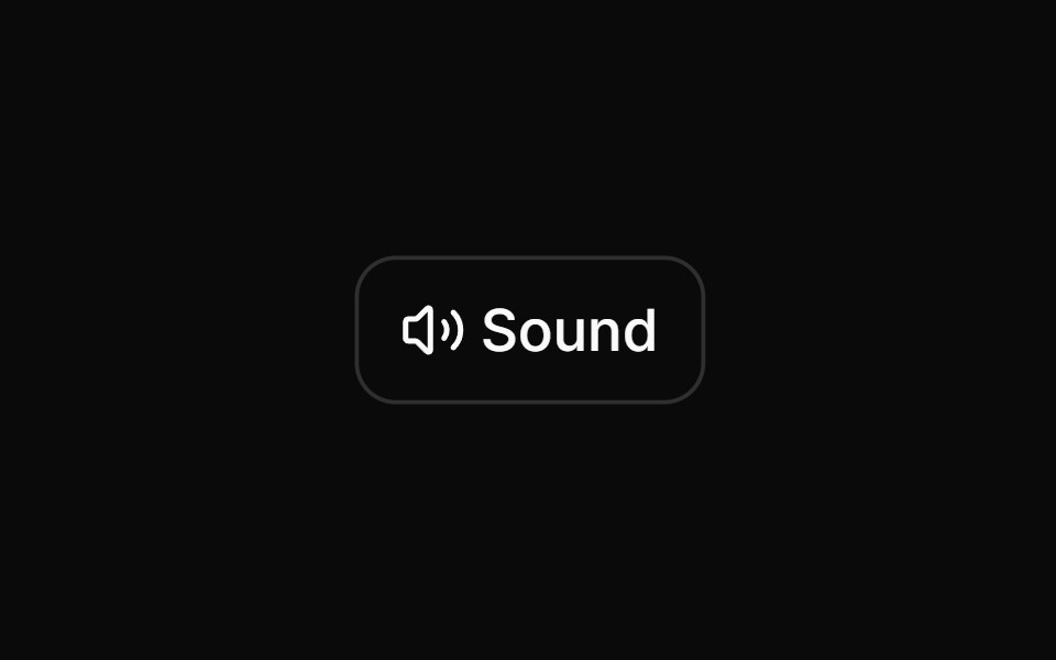 Toggle as mute/unmute buttonReUI · ReactToggle as mute/unmute button
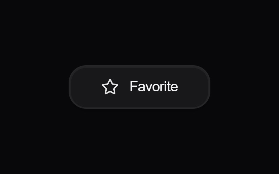 Button FavoriteAmicro Micro Transitions · React
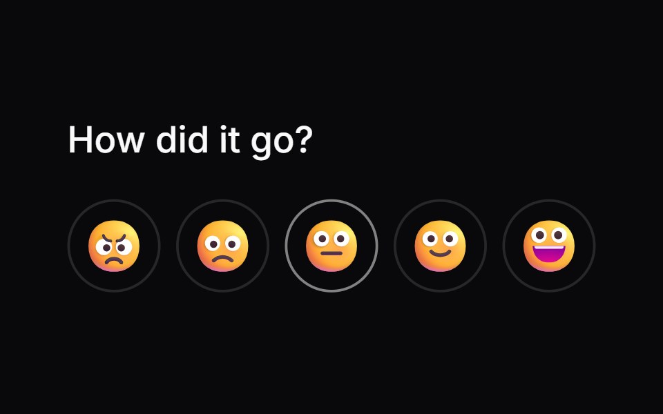 Comp 167Origin UI · React
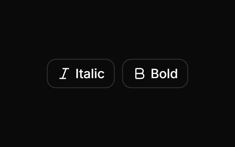 Toggle buttons with outline variant.ReUI · ReactToggle buttons with outline variant.
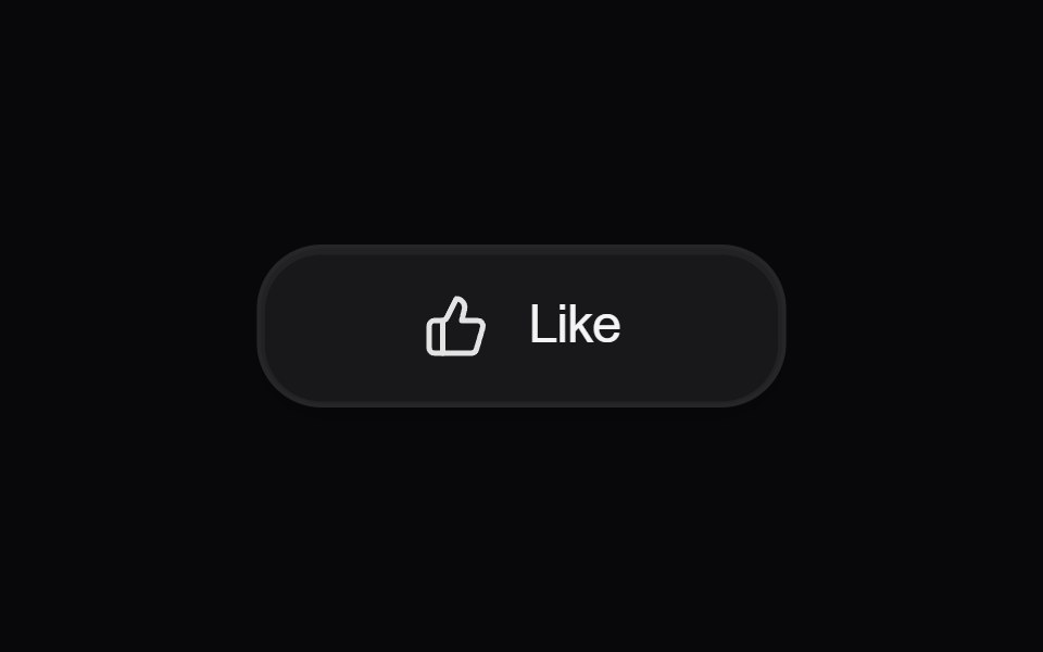 Button LikeAmicro Micro Transitions · React
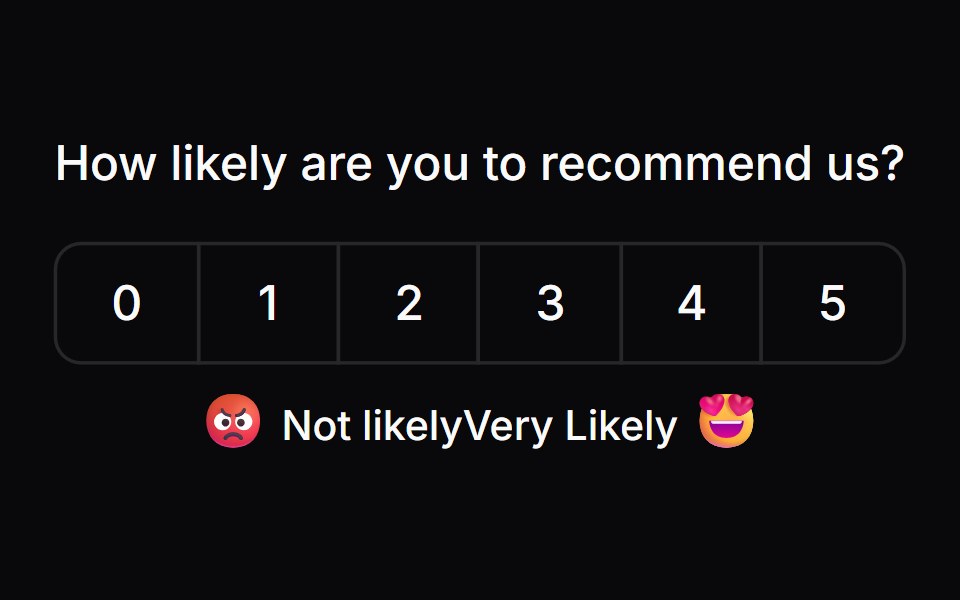 Comp 168Origin UI · React
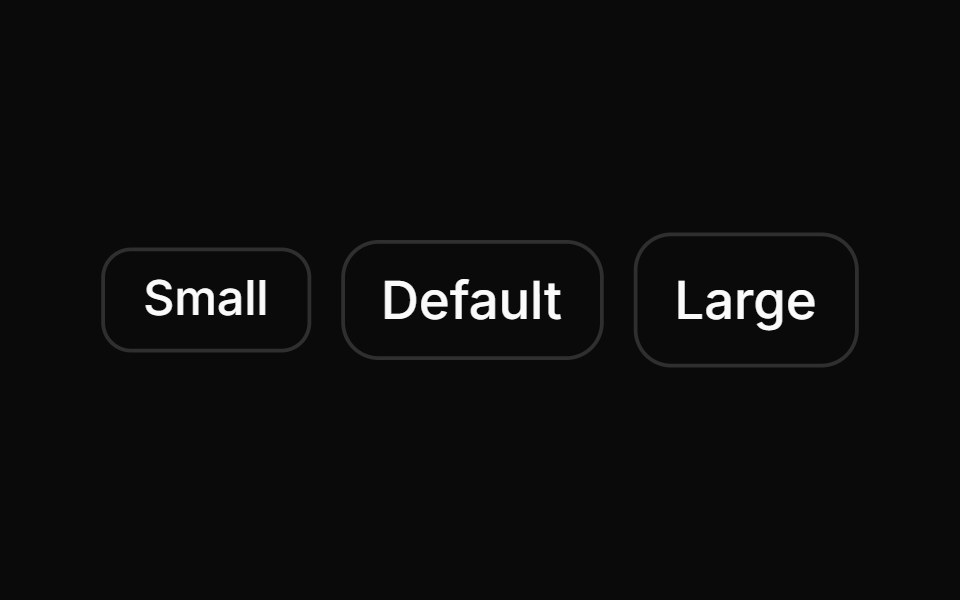 Toggle buttons in different sizes.ReUI · ReactToggle buttons in different sizes.
 Button SponsorAmicro Micro Transitions · React
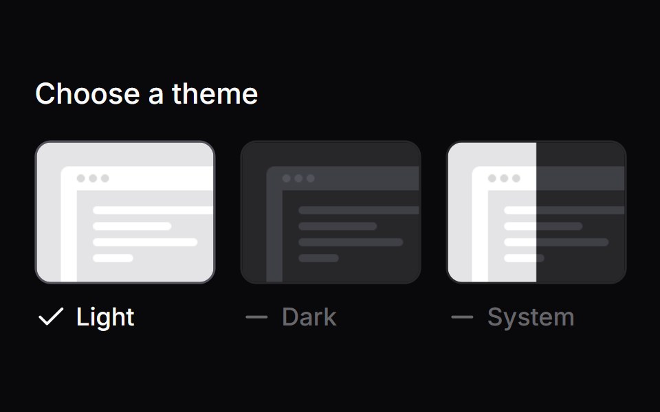 Comp 169Origin UI · React
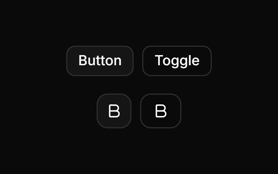 Toggle with button and icon.ReUI · ReactToggle with button and icon.
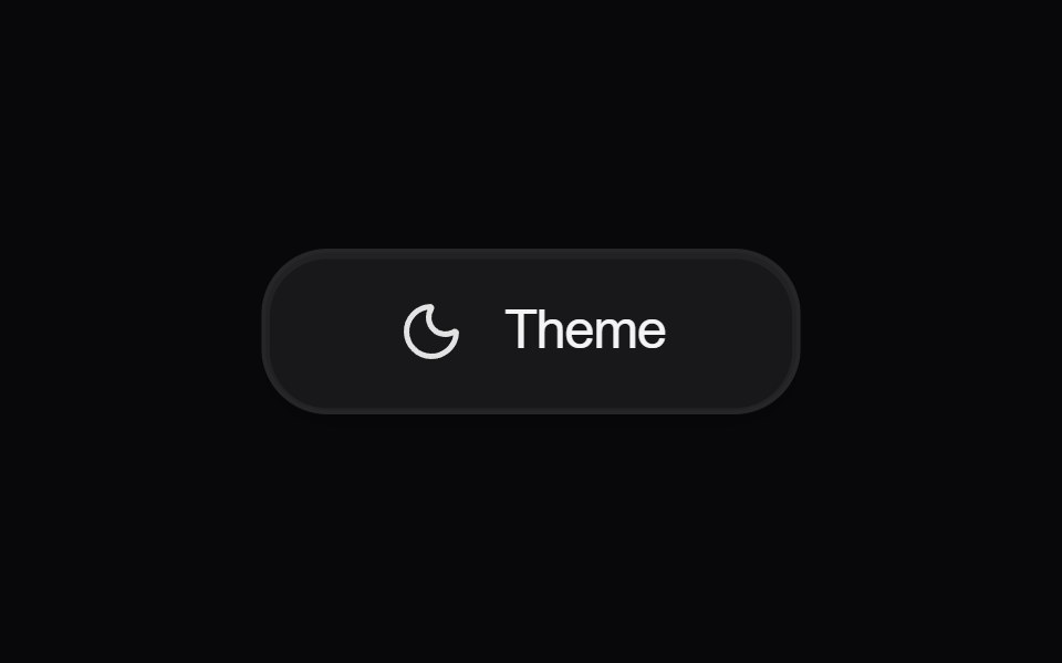 Button ThemeAmicro Micro Transitions · React
 Comp 171Origin UI · React
 Disabled toggle.ReUI · ReactDisabled toggle.
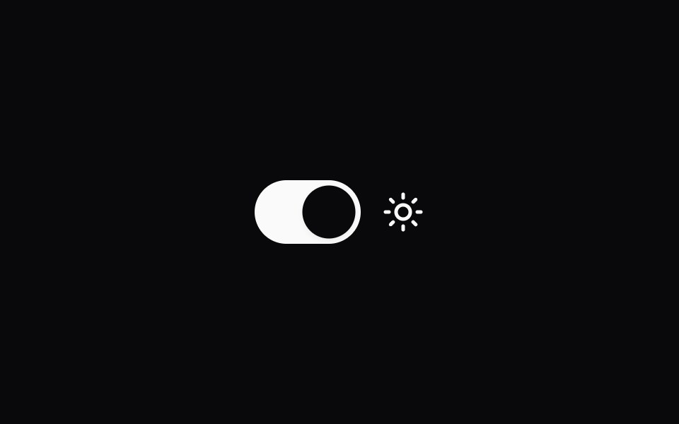 Comp 181Origin UI · React
 Toggle with icon.ReUI · ReactToggle with icon.
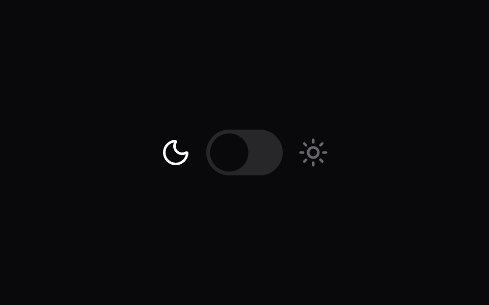 Comp 182Origin UI · React
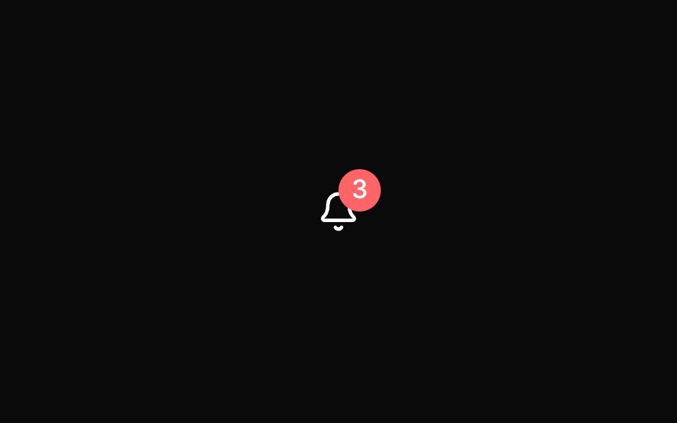 Toggle with notification count badgeReUI · ReactToggle with notification count badge
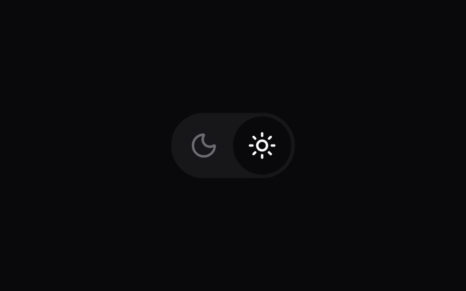 Comp 183Origin UI · React
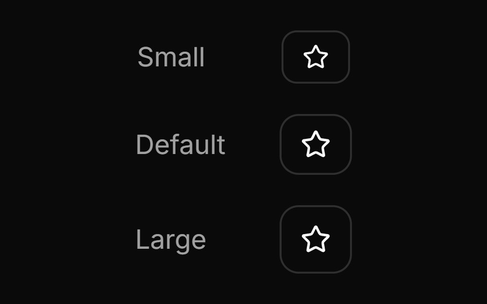 Toggle size variants showcaseReUI · ReactToggle size variants showcase
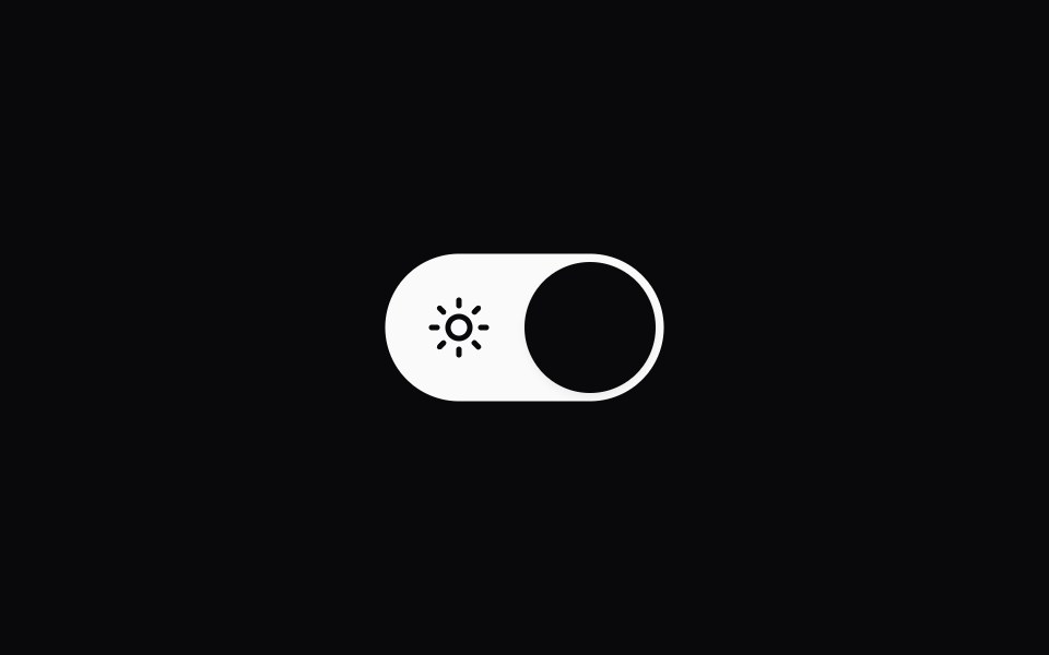 Comp 184Origin UI · React
 Toggle with icon swap on pressReUI · ReactToggle with icon swap on press
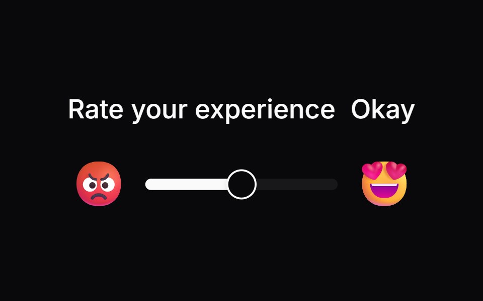 Comp 256Origin UI · React
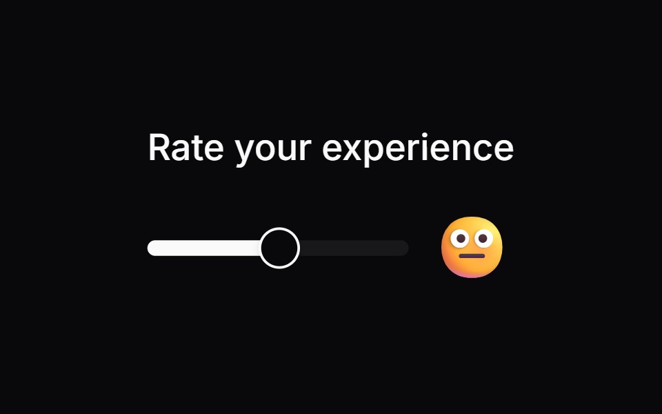 Comp 257Origin UI · React
Libraries with Tailwind CSS toggle button components
Related categories
- Toggle Button Components
- React Toggle Button Components
- Animated Toggle Button Components
- shadcn/ui Toggle Button Components
- Tailwind CSS Action Components
- Tailwind CSS Button Components
- Tailwind CSS Button Group Components
- Tailwind CSS Icon Button Components
- Tailwind CSS CTA Button Components
- Tailwind CSS Link Components
- Tailwind CSS Copy Button Components
- Tailwind CSS Theme Toggle Components
- Tailwind CSS Like Button Components
- Tailwind CSS Social Login Button Components
- Tailwind CSS FAB Components
- Tailwind CSS Download Button Components
- Tailwind CSS Slide To Confirm Components
- Tailwind CSS Hold Button Components
- Tailwind CSS Submit Button Components
- Tailwind CSS Send Button Components