 Dev Design Library
Tailwind CSS Button Group Components
Dev Design Library indexes 188 Tailwind CSS button group components from 49 open-source UI libraries, with the most coming from ReUI, Watermelon UI, Tremor Blocks, Oxbow UI and Shadcn Space. Each one links to its page with the source code, a live preview where available, the library license and the install command. Every library in this list styles its components with Tailwind CSS utility classes. Button group components belong to the Actions group.
Showing 120 of 188, a mix from every library. Open a library to see all of its components.
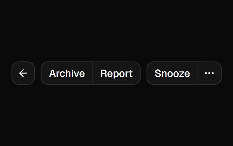 Button Groupshadcn/ui · ReactA container that groups related buttons together with consistent styling.
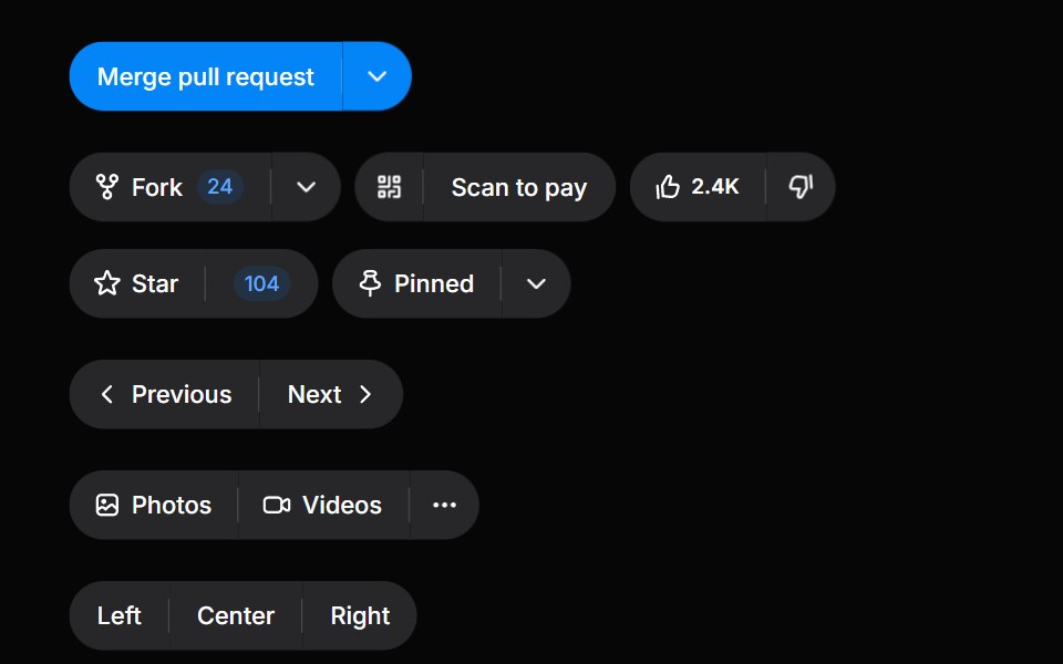 Button GroupHeroUI · ReactGroup related buttons together with consistent styling and spacing
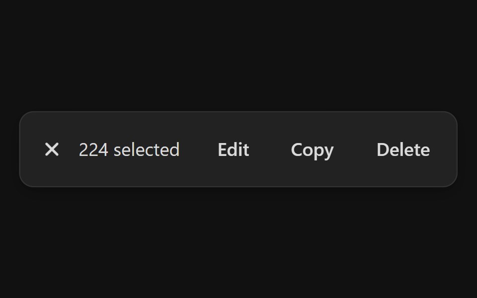 Action BarReact Spectrum · ReactAction bars are used for single and bulk selection patterns when a user needs to perform actions on one or more items…
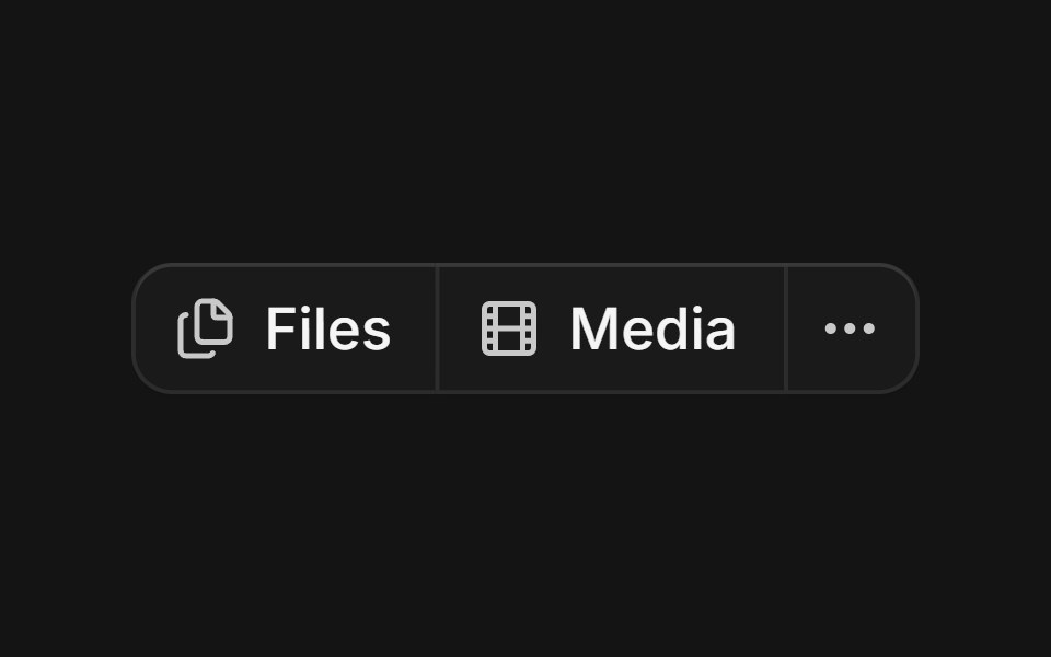 Groupcoss ui · ReactA component for visually grouping a series of controls.
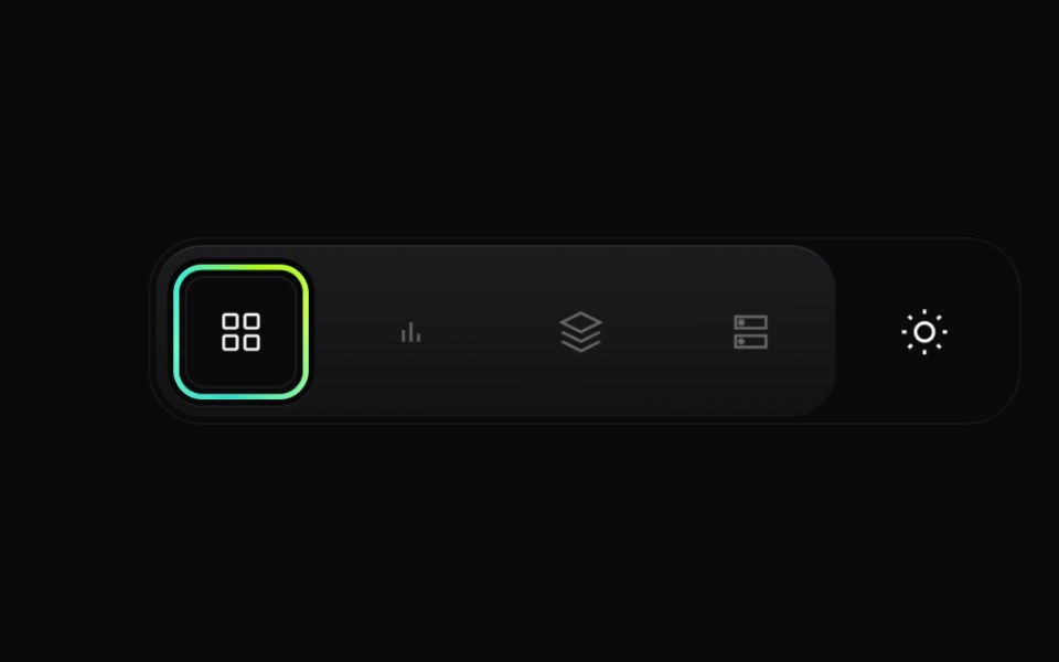 Gradient Button GroupCult UI · ReactPremium layered button group with animated active state, gradient ring accents, and theme toggle underlay
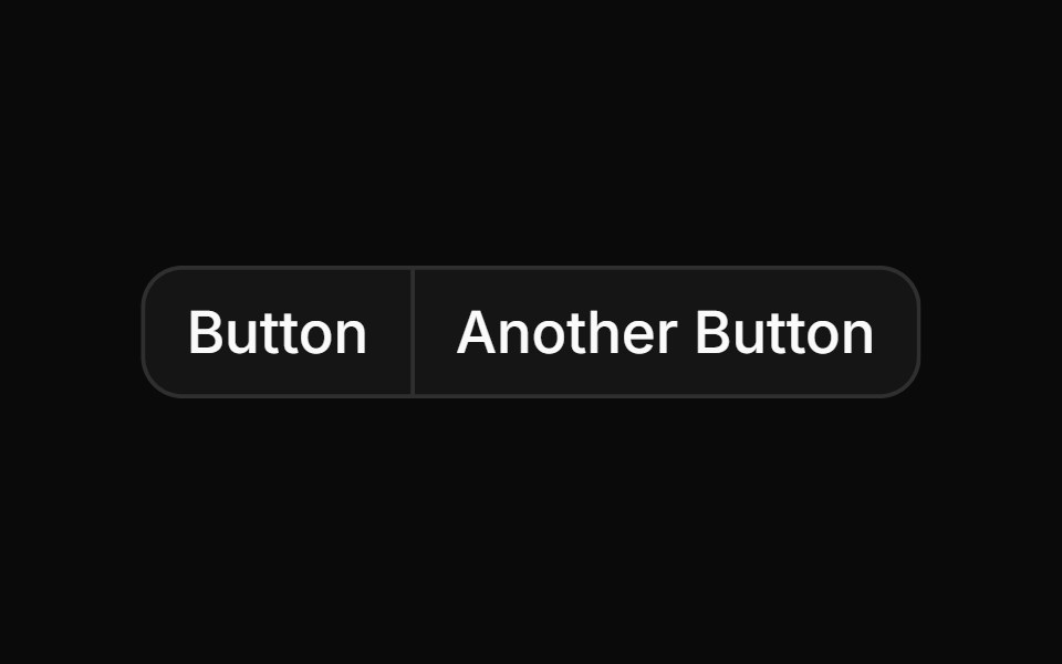 Basic button group with two buttonsReUI · ReactBasic button group with two buttons
 Morph Action PillAmicro Micro Transitions · ReactPill-shaped action button that changes shape to show a different state or more actions.
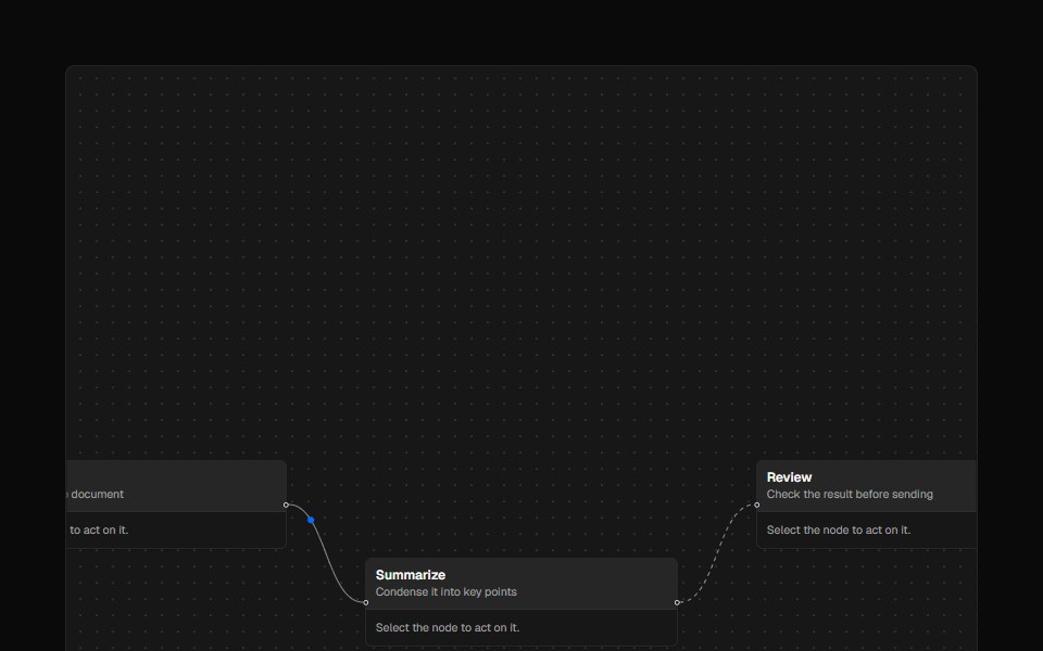 ControlsAI Elements · ReactA styled controls component for React Flow-based canvases with zoom and fit view functionality.
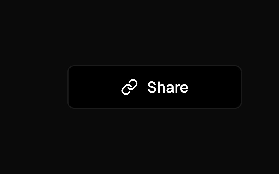 Social ButtonKokonut UI · ReactShare button that expands into a row of social icon buttons with staggered Motion animations on hover, built with…
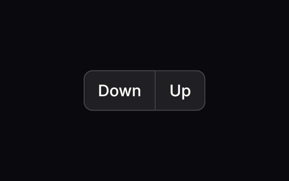 button-groupIntent UI · Reactbutton-group
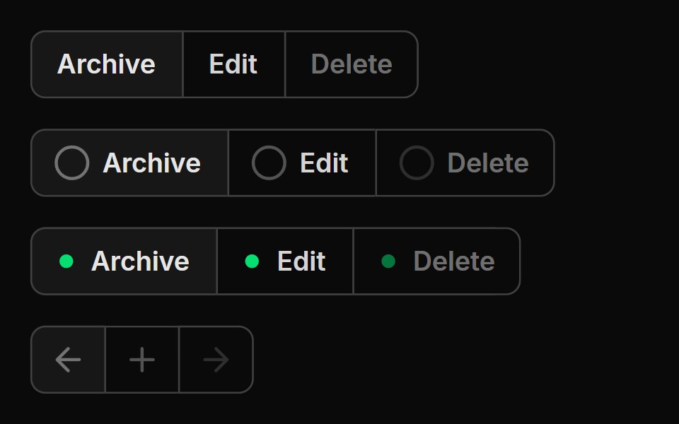 Button GroupUntitled UI React · React
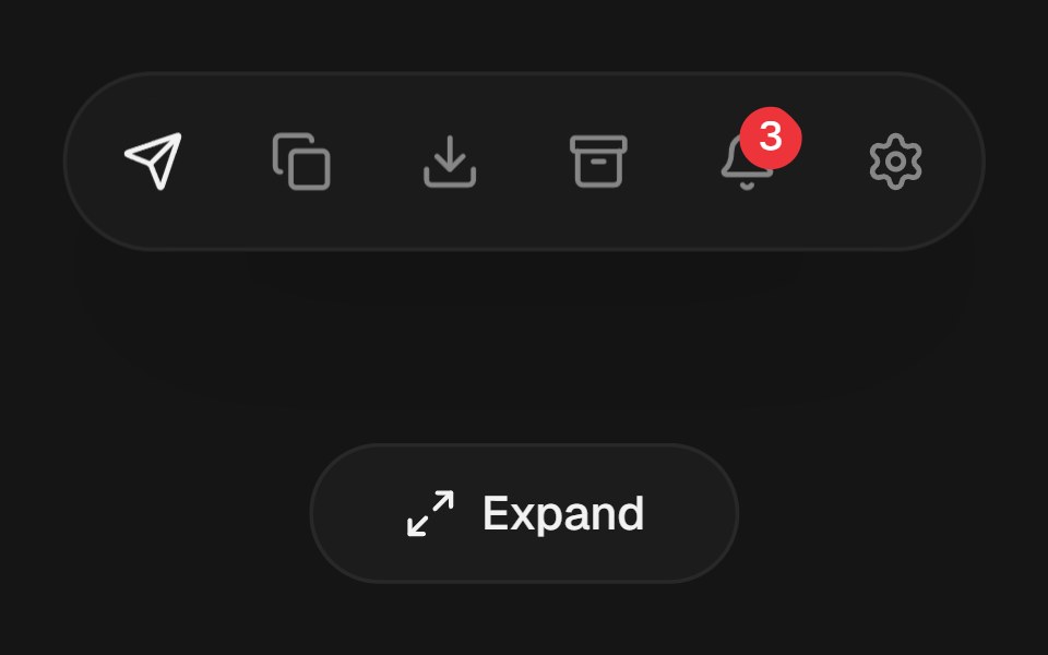 Expandable Action BarbeUI · ReactCompact icon actions that expand into labeled controls on hover or focus with shared layout motion.
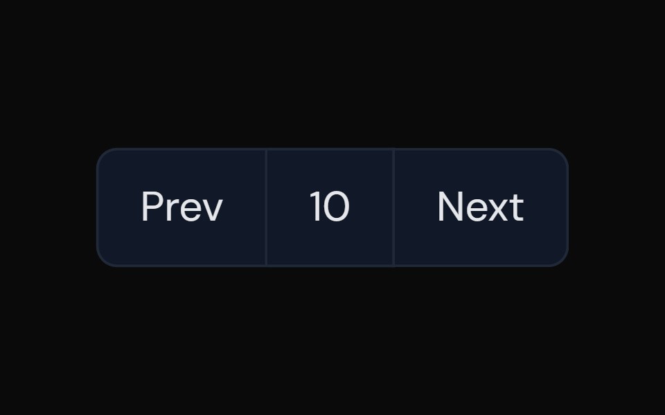 Button GroupTailGrids · ReactA component with multiple buttons grouped together.
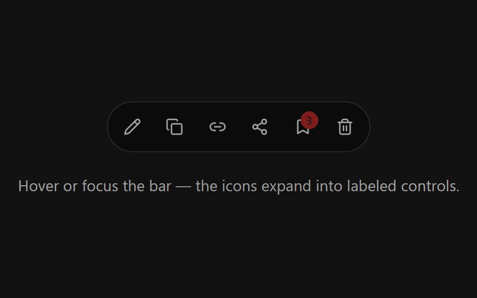 Expandable Action BarSpectrum UI · ReactCompact icon actions that expand into labeled controls on hover or focus with shared layout motion.
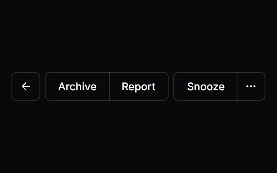 Button GroupVengeance UI · React
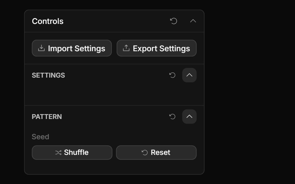 Actions ControlToolcraft · React
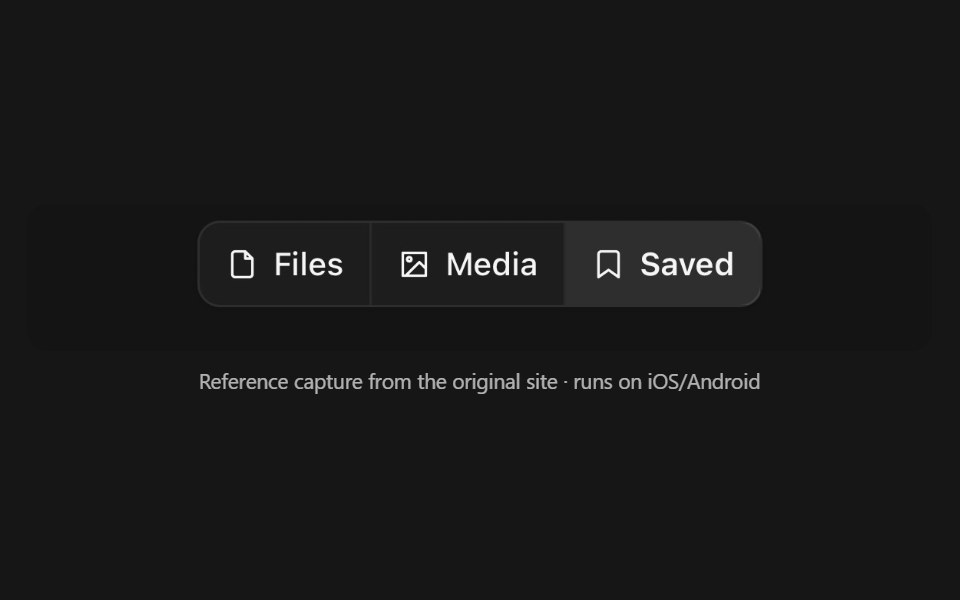 Button GroupPanel UI · React NativeSeveral buttons drawn as one control — a segmented run, a split action, a toolbar.
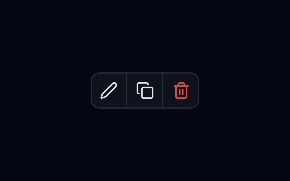 Button Group-01 - BasicShadcn Space · ReactBasic button group component
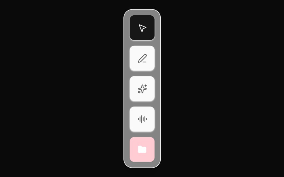 Editor Tool DockOpenSourceUI · React
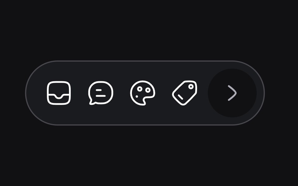 Dynamic Toolbaruselayouts · ReactA toolbar that adapts its size and layout based on content.
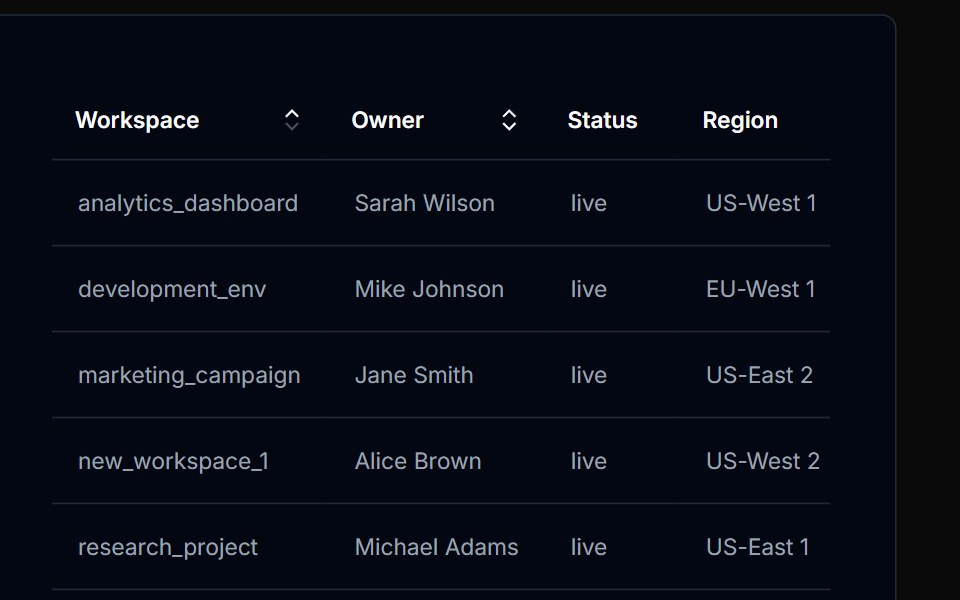 Table Action 01Tremor Blocks · React
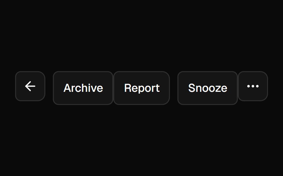 Button GroupShadcn Dashboard · React
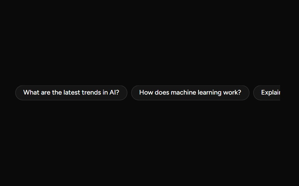 SuggestionAI Elements (Svelte) · SvelteA compact suggestion button set for displaying prompt ideas and quick actions.
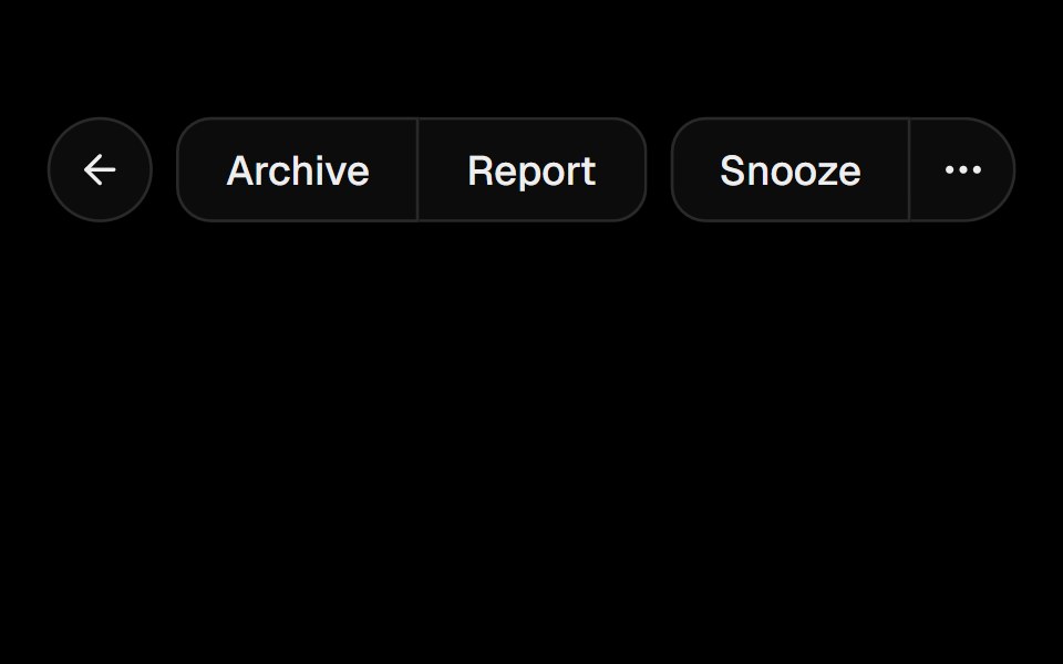 Button GroupObsidianUI · React
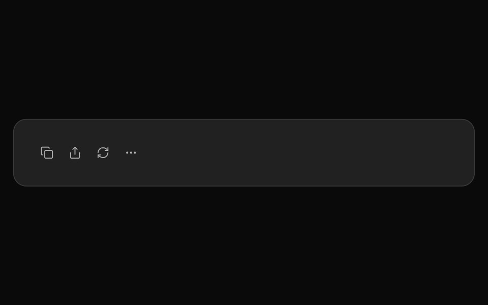 ChatGPT ActionsNotra · ReactCopy, share, redo and more buttons, built on shadcn Button and Tooltip.
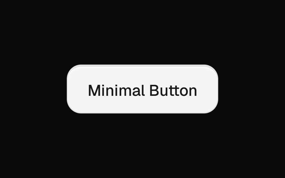 Minimal ButtonsGreatUI · React
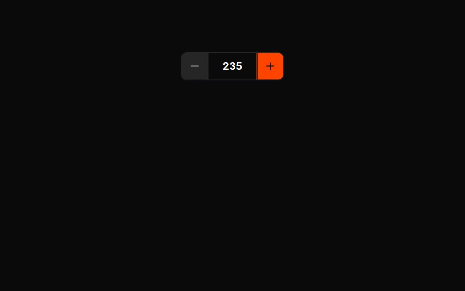 Button Groups 01Oxbow UI · AstroCounter group (− value +)
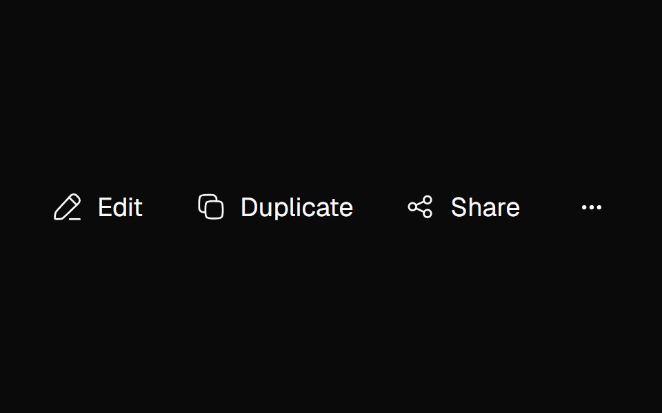 Adaptive ActionsNexvyn UI · ReactA responsive action toolbar that measures its available inline size and moves overflowed items into an accessible…
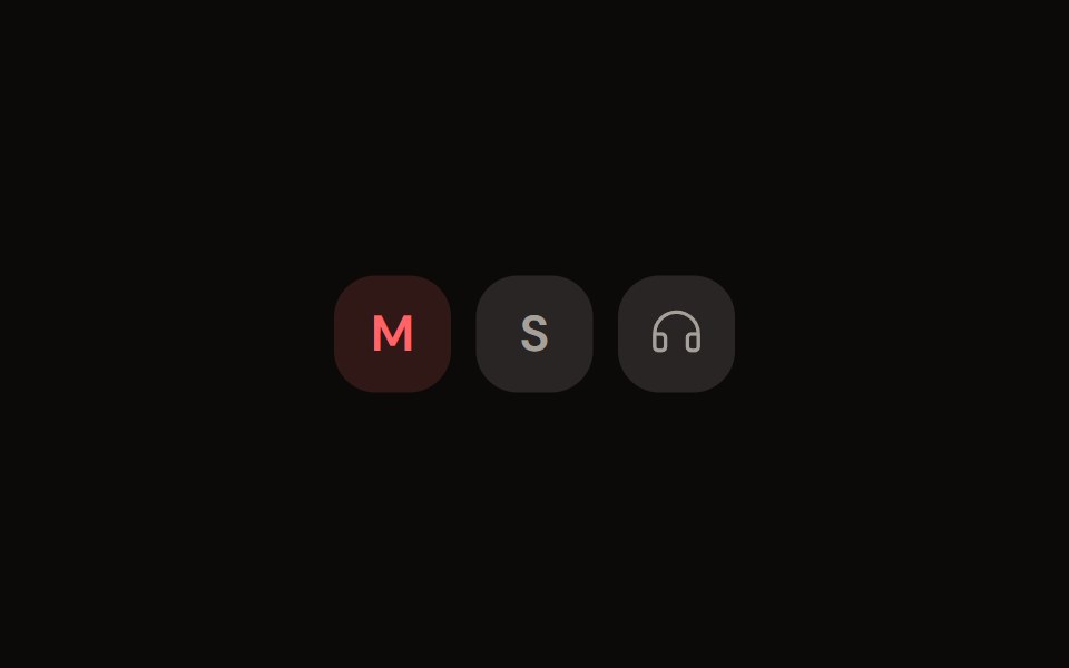 Channel Toggleaudiocn · ReactMute, solo and monitor toggle buttons with their own pressed colours.
 Action BarShark UI · ReactDisplay an action bar for selected items.
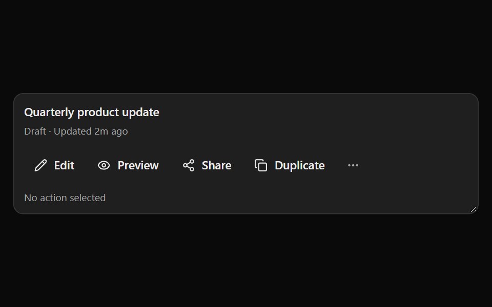 Smart OverflowSona UI · ReactA priority-first responsive action group that moves lower-priority actions into an accessible three-dot menu as…
 Button Group 1Watermelon UI · React
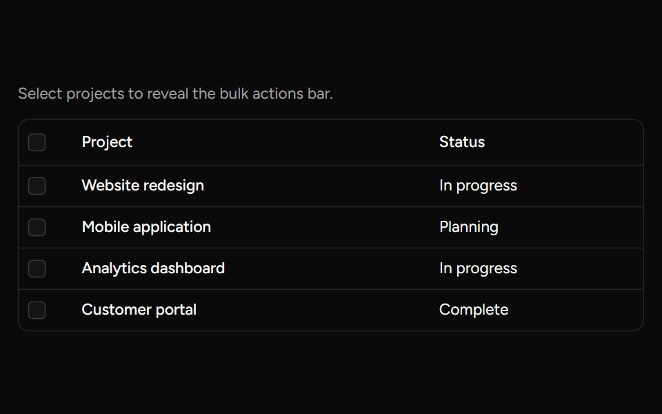 Bulk Actions Barsv-table · SvelteA floating action bar for performing custom actions on selected rows.
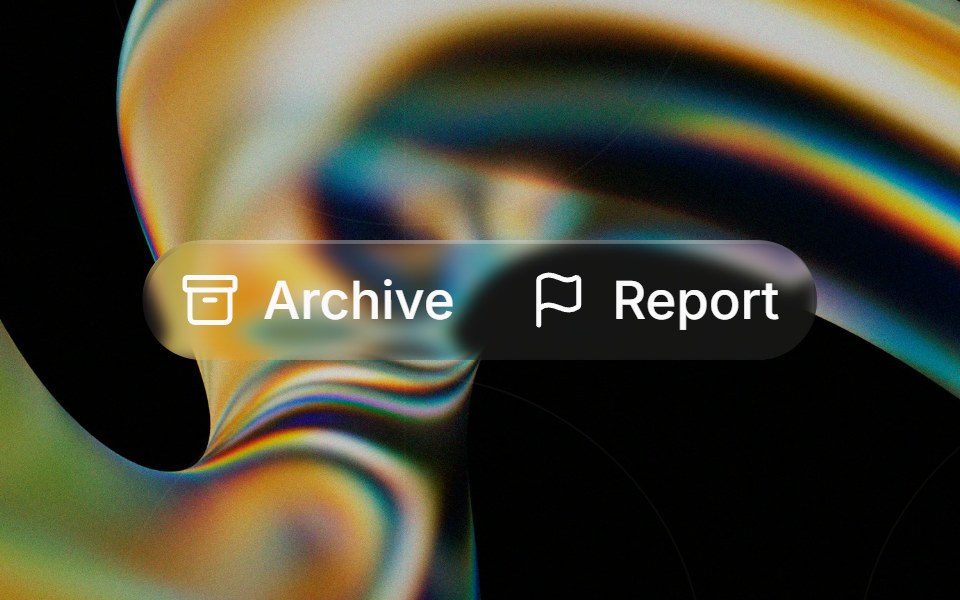 Glass Button Groupglasscn · ReactGlass Button Group with five variants: clear, frosted, subtle, liquid, and liquid-refract
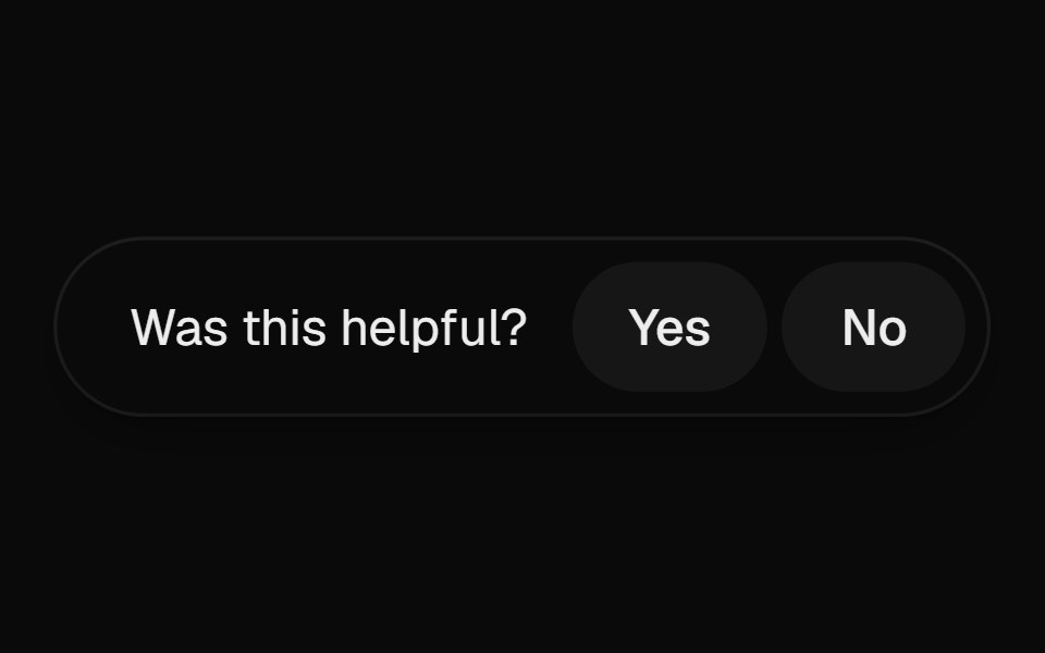 Helpful PromptUI Lab · ReactAsks if the page helped, and on a no opens into a field right where the question was.
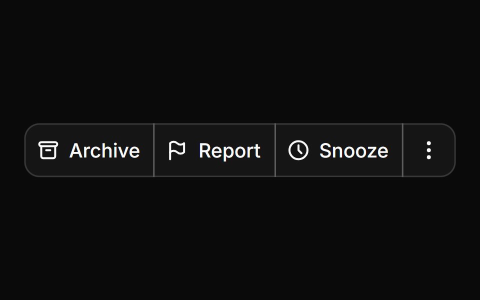 Button groupHextaUI · ReactButtons joined into one control, with shared seams, separators, text addons, nesting and vertical stacks.
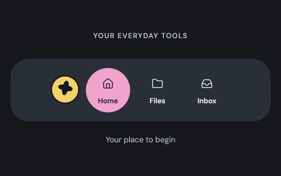 Action dockCojeev UI · ReactA reusable action dock composed from Cojeev base components.
 Preview Hover ToolbarMicroKit · ReactA thin empty pill that grows wider and taller off its fixed bottom edge when the surrounding preview is hovered…
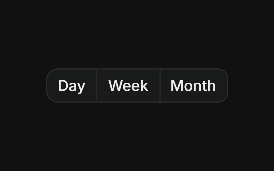 Basic groupFLX UI · ReactHorizontal row of buttons with merged borders, used for segmented controls like date range pickers.
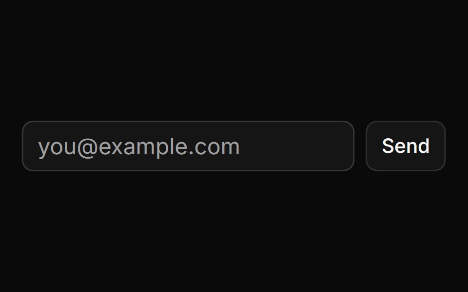 Button Using Groupsv-particles · Svelte
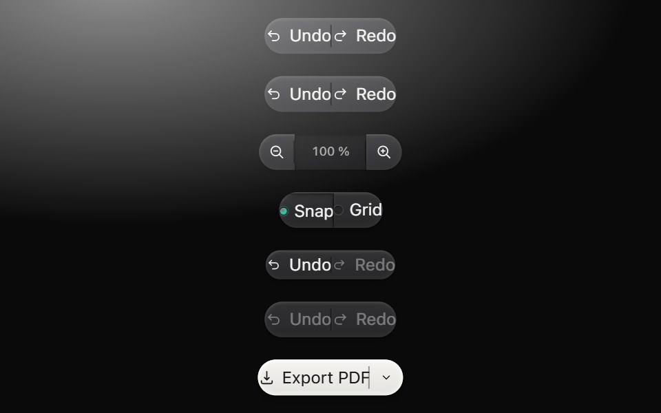 Button groupMetal UI · React + SwiftUIRelated action segments cut from one raised bar with engraved seams, independent presses and noninteractive readout…
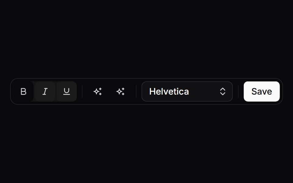 ToolbarSpaceUI · ReactArranges formatting tools, action buttons, and dropdown controls into a compact, accessible toolbar for quick editing.
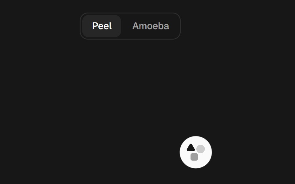 Gooey ToolbarSkecher UI · ReactA compact action toolbar with configurable liquid merging effects and accessible controls.
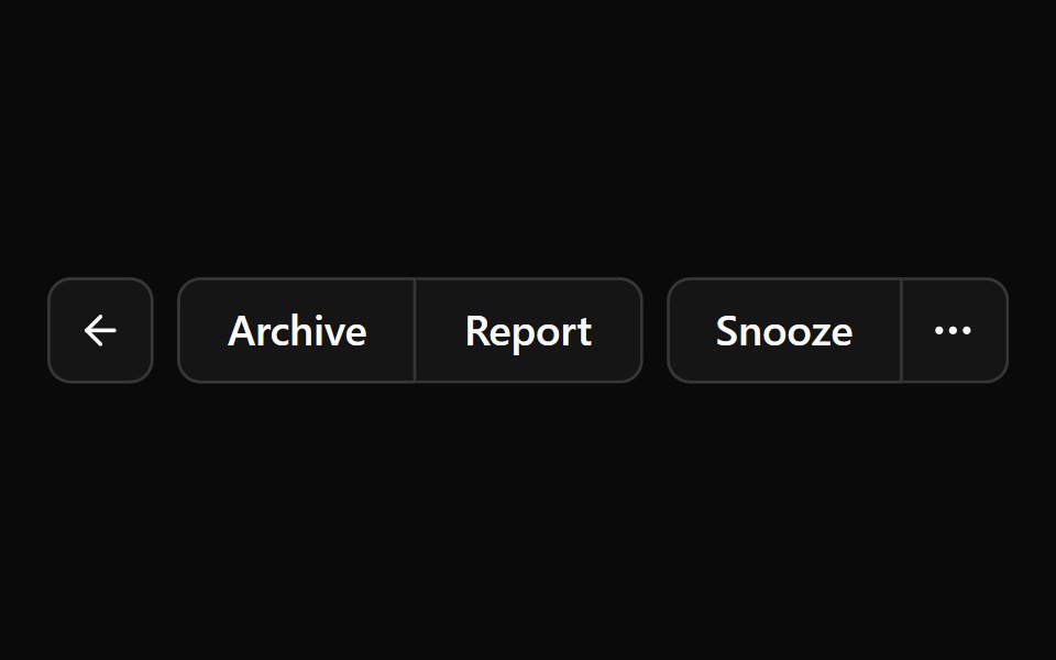 Button GroupOUI · ReactShadcn Button Group with react aria component characteristics.
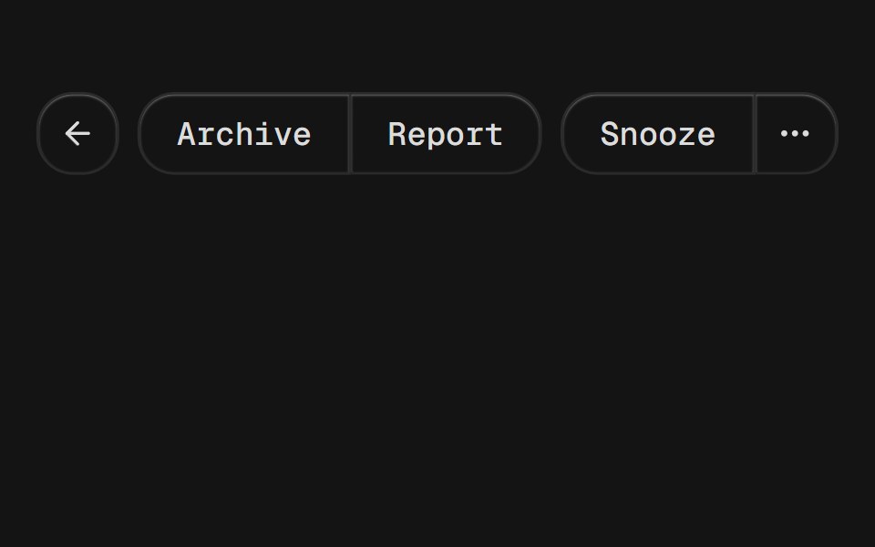 Button GroupD2Studio UI · ReactA container that groups related buttons together with consistent styling.
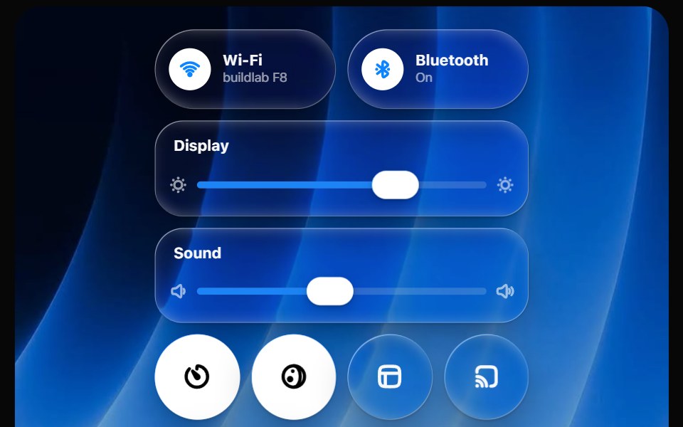 Glass Control CenterOpaline · ReactmacOS-style Control Center kit — glass modules, toggles, light-filled sliders and buttons.
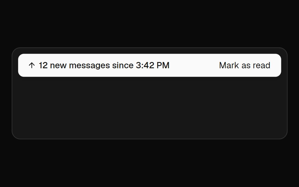 Jump BarFibo · ReactTakes people to unread messages, new messages or the present in a conversation.
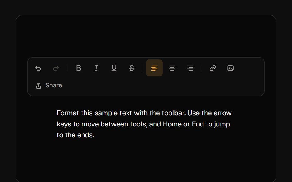 ToolbarReactFrame · ReactAn accessible toolbar of icon buttons, toggles, radio-style toggle groups and separators with roving-focus arrow-key…
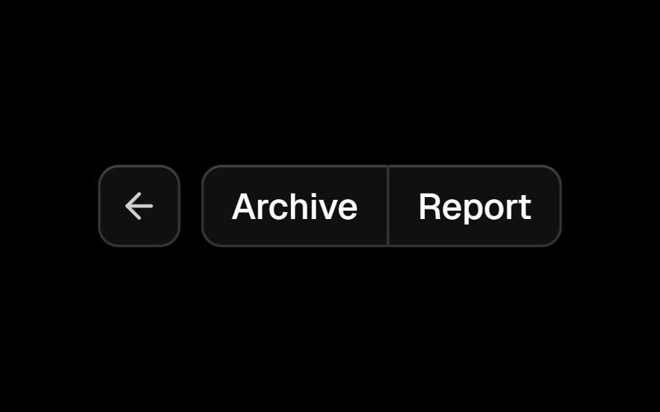 Button Groupark-cn · ReactA shadcn-style button group component built with Ark UI primitives.
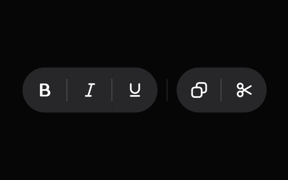 ToolbarHeroUI · ReactA container for interactive controls with arrow key navigation.
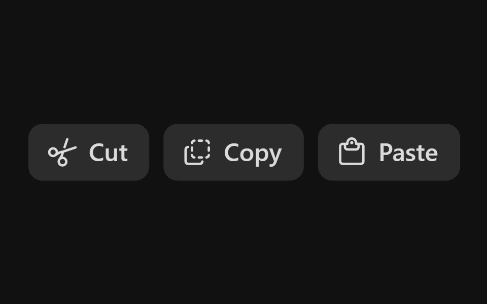 Action Button GroupReact Spectrum · ReactAn ActionButtonGroup is a grouping of related ActionButtons.
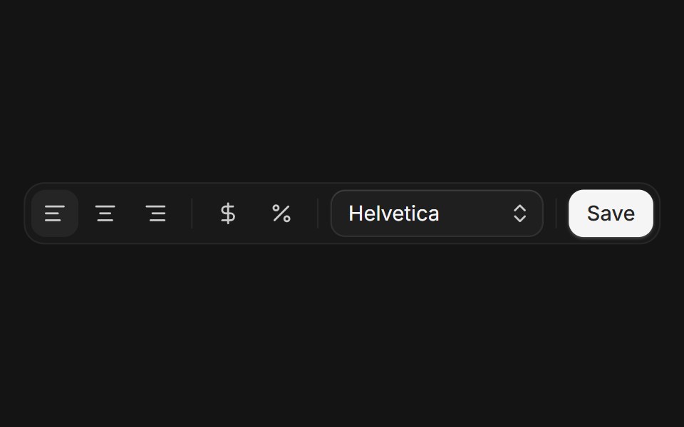 Toolbarcoss ui · ReactA container for grouping a set of buttons and controls.
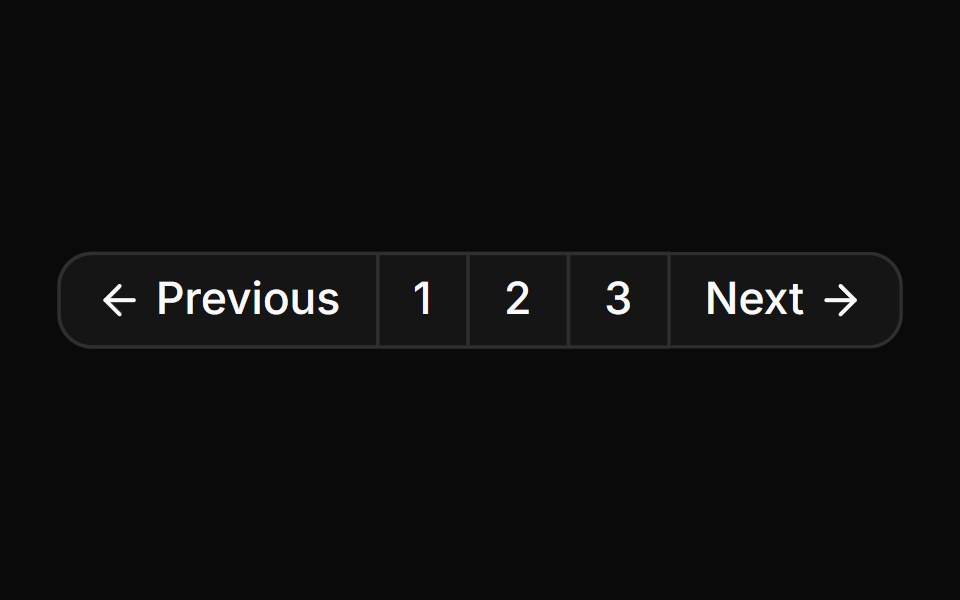 Button group used for standard paginationReUI · ReactButton group used for standard pagination
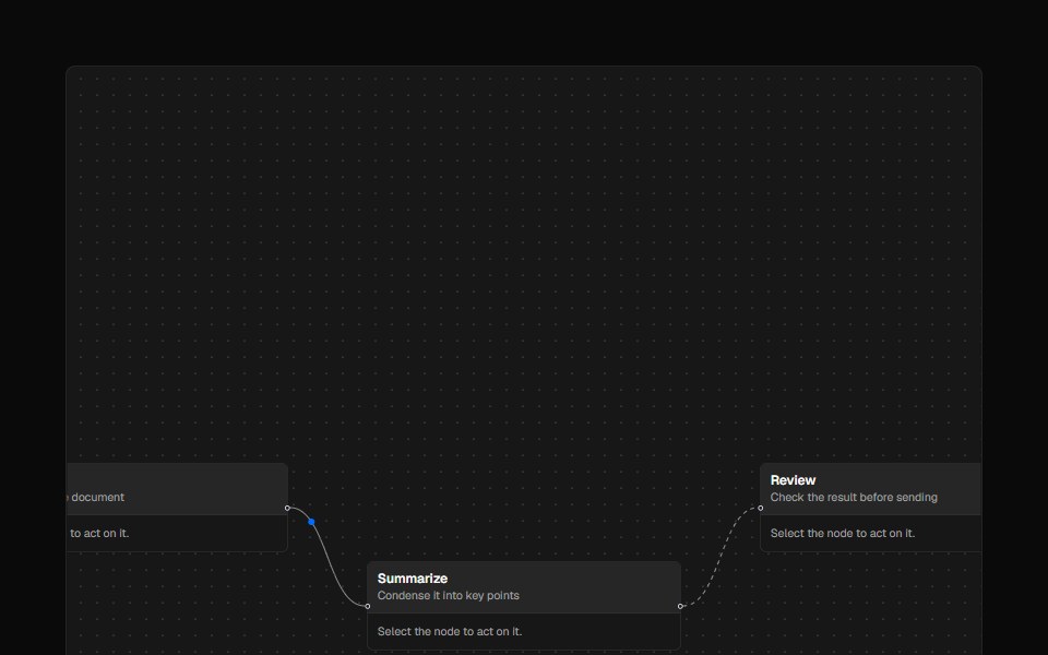 ToolbarAI Elements · ReactA styled toolbar component for React Flow nodes with flexible positioning and custom actions.
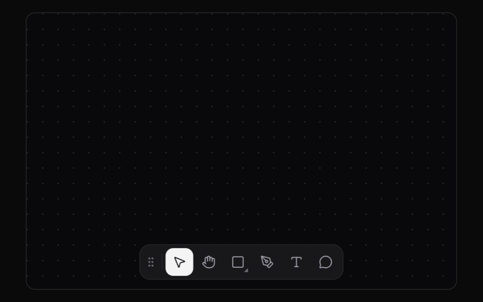 Tool DockKokonut UI · ReactAn editor tool dock with a sliding selection plate, shortcut tooltips and flyouts that you can throw to any edge.
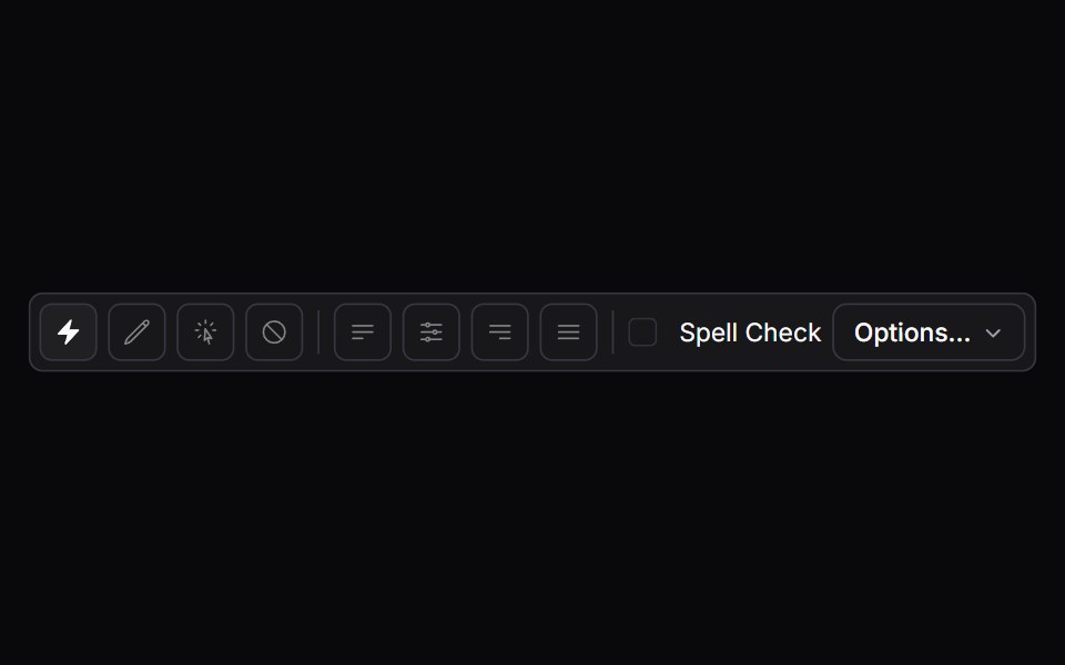 toolbarIntent UI · Reacttoolbar
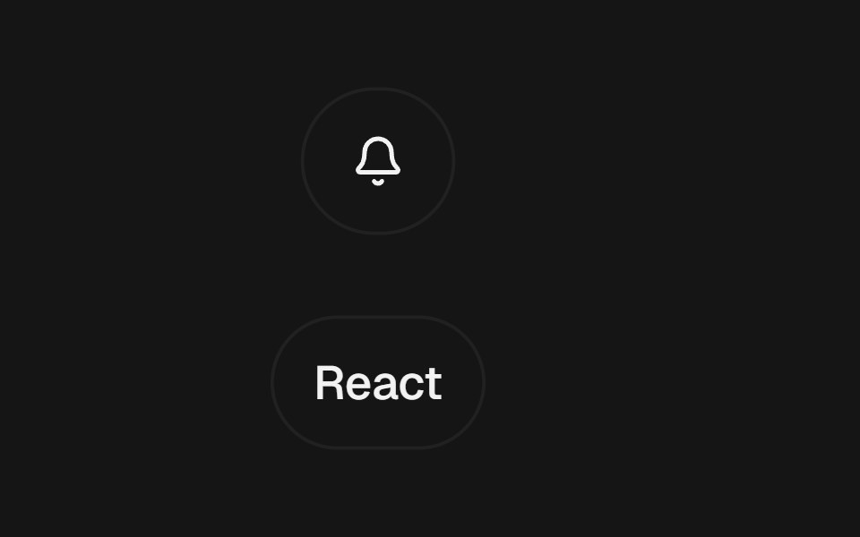 Expandable ControlbeUI · ReactClick-to-expand button and chip controls that reveal a label or trailing action through spring layout continuity.
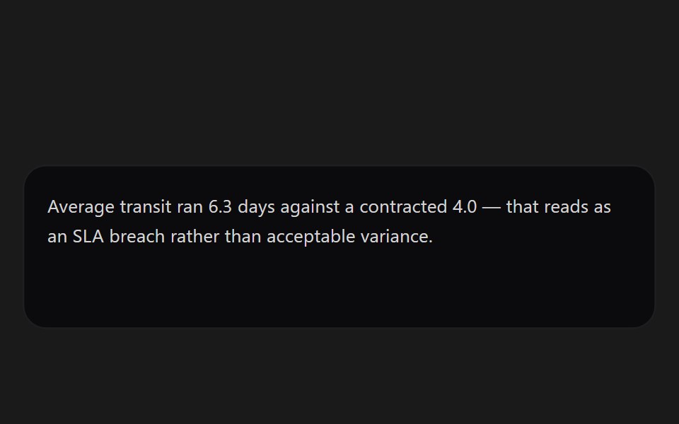 Message ActionsSpectrum UI · ReactPer-message controls — copy, regenerate, and thumb feedback.
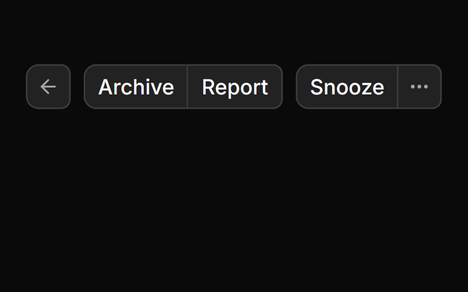 Button GroupToolcraft · React
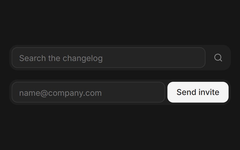 Web Button GroupPanel UI · React NativeGrouped buttons for toolbars, sort menus and split actions.
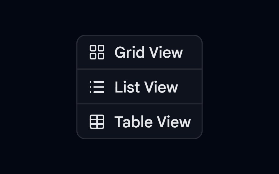 Button Group-02 - VerticalShadcn Space · ReactVertical button group component
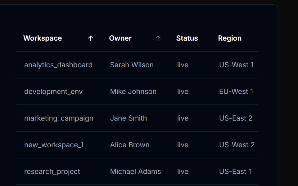 Table Action 02Tremor Blocks · React
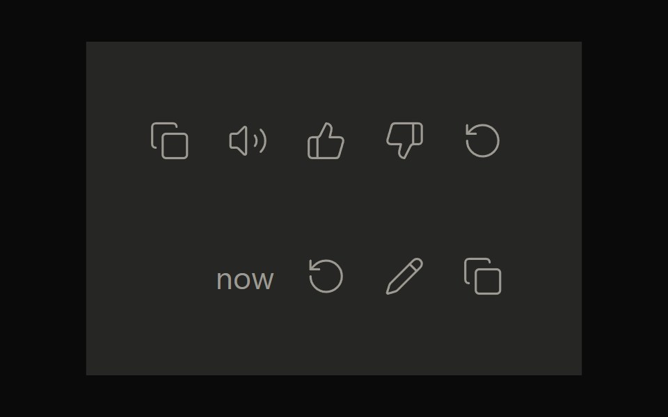 Claude ActionsNotra · ReactCopy, feedback and retry actions built on shadcn Button and Tooltip.
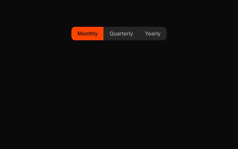 Button Groups 02Oxbow UI · Astro
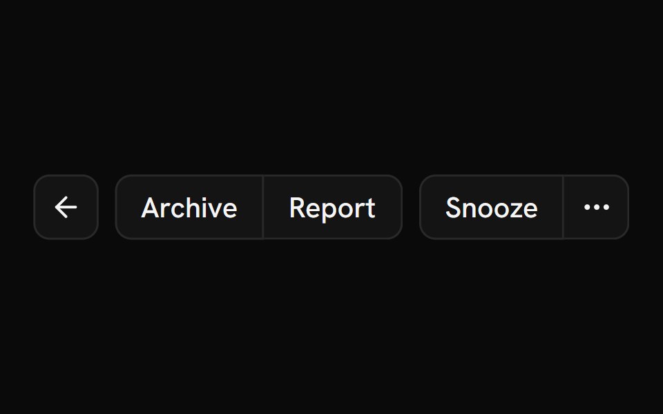 Button GroupShark UI · ReactGroup button elements together.
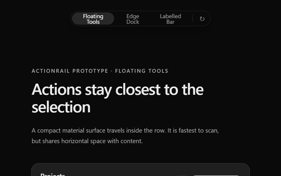 Prototype Action RailSona UI · React
 Button Group 10Watermelon UI · React
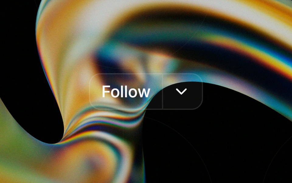 Button Groupglasscn · React
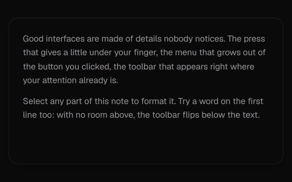 Selection ToolbarUI Lab · ReactA formatting toolbar that grows out of whatever text you select.
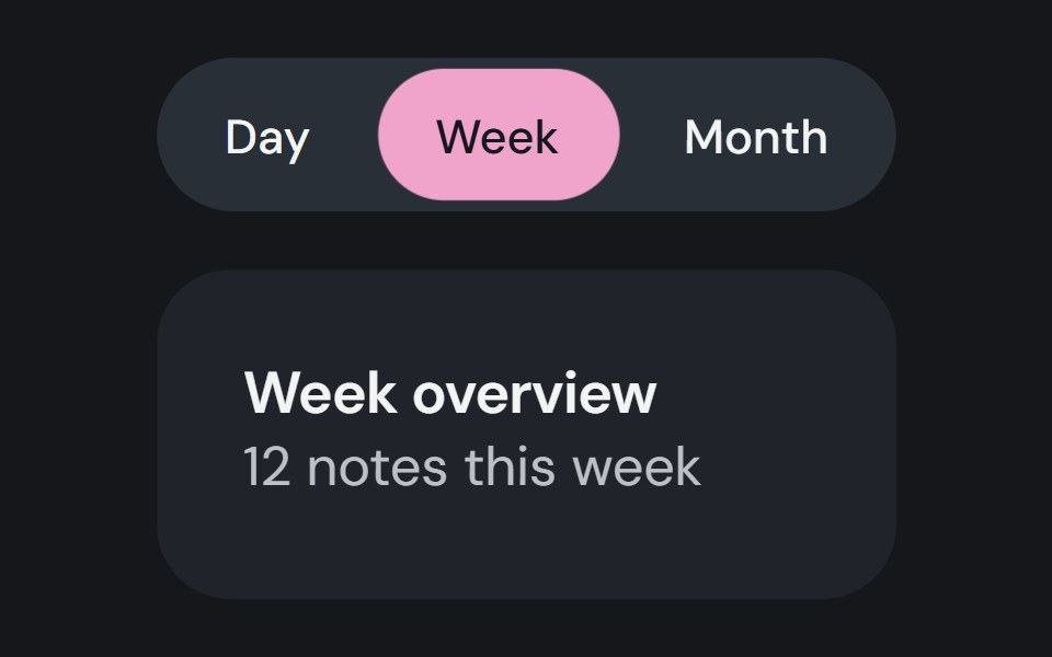 Button GroupCojeev UI · ReactPlaces related actions together and can track one selected button value.
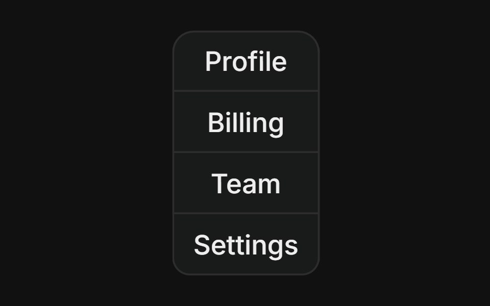 Vertical groupFLX UI · ReactStacked column of buttons with merged borders, used for vertical navigation menus.
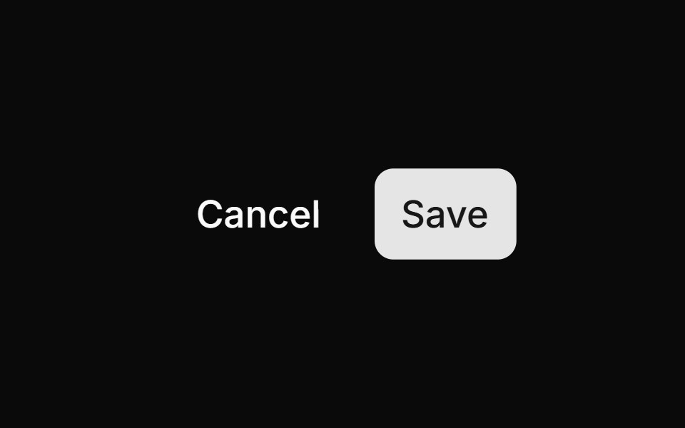 Cancel Savesv-particles · Svelte
 Liquid Glass SocialSkecher UI · ReactA responsive social-link cluster with focused liquid-glass motion and clear interaction feedback.
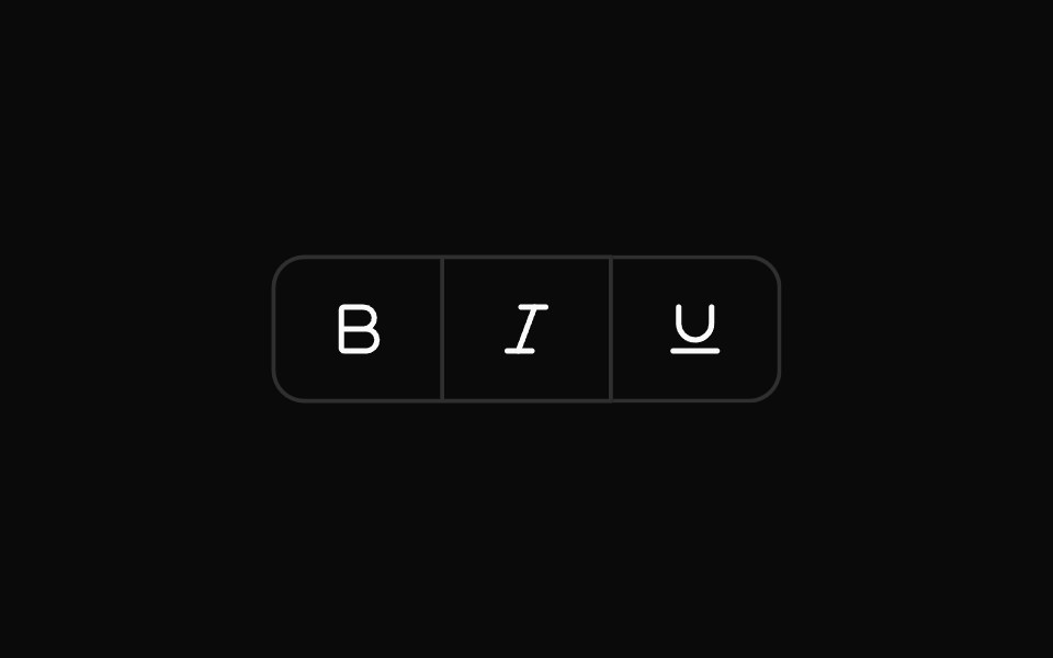 Toggle Button GroupOUI · ReactReact aria components Toggle Button Group with shadcn characteristics.
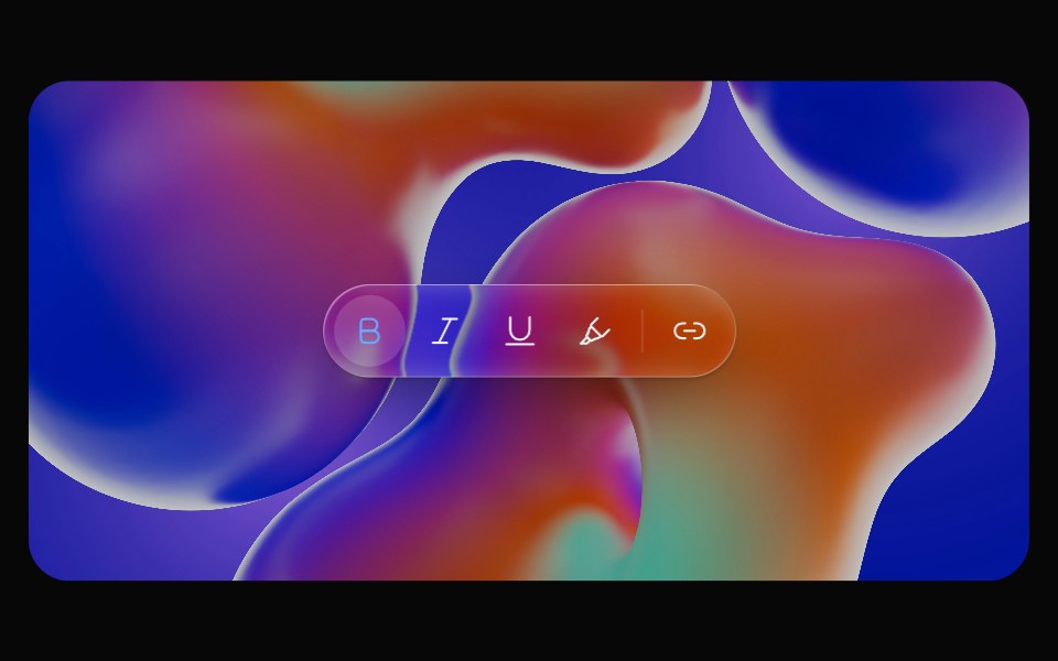 Glass ToolbarOpaline · ReactFloating capsule toolbar that groups icon actions.
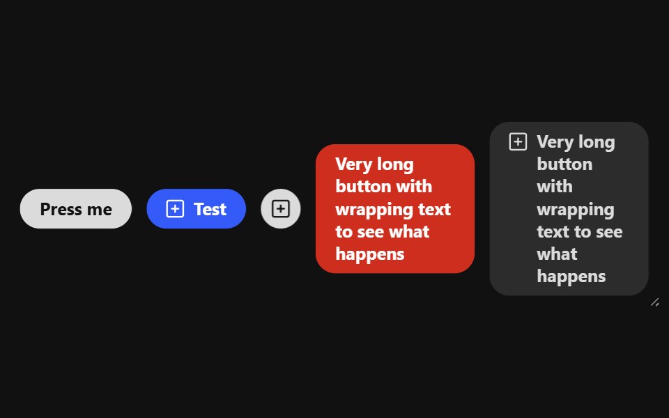 Button GroupReact Spectrum · ReactButtonGroup handles overflow for a grouping of buttons whose actions are related to each other.
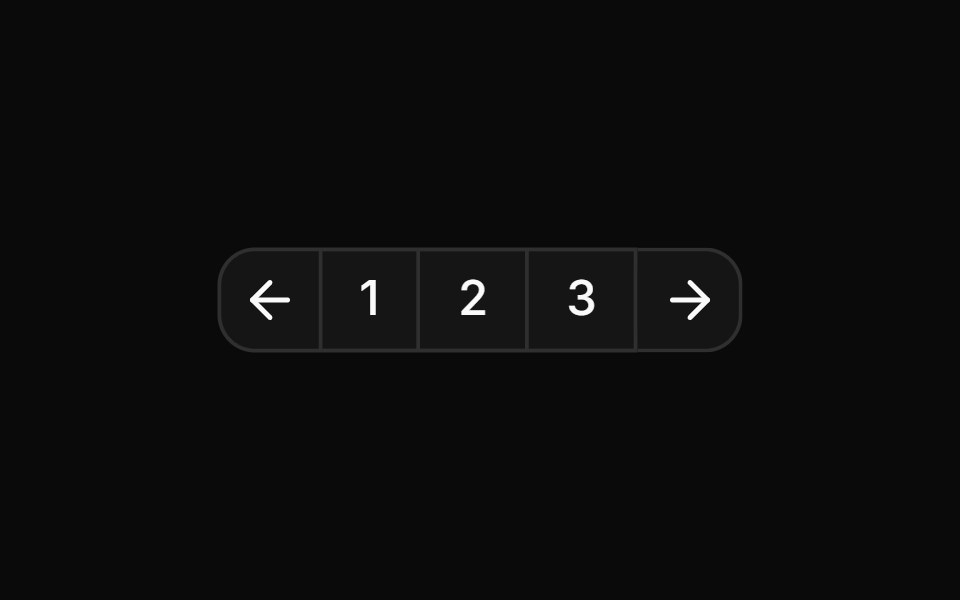 Pagination split into page numbers and navigation arrowsReUI · ReactPagination split into page numbers and navigation arrows
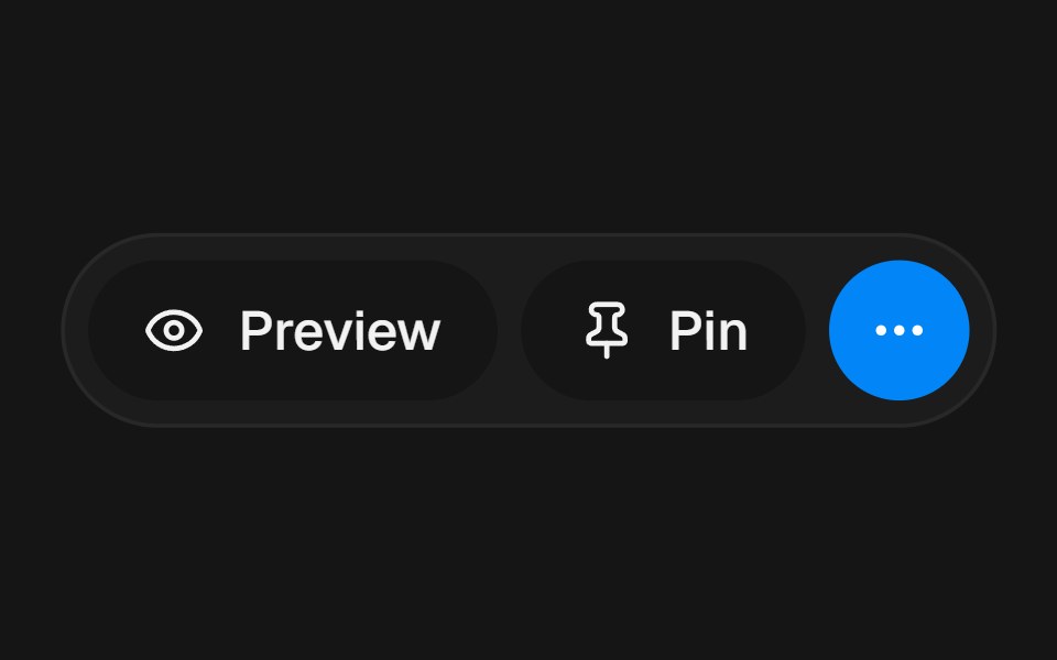 Overflow ActionsbeUI · ReactConnected pill rail for primary actions that springs open to reveal extra controls.
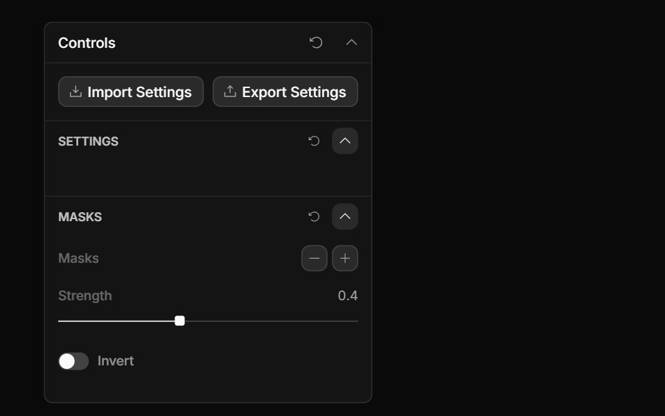 Collection Actions ControlToolcraft · React
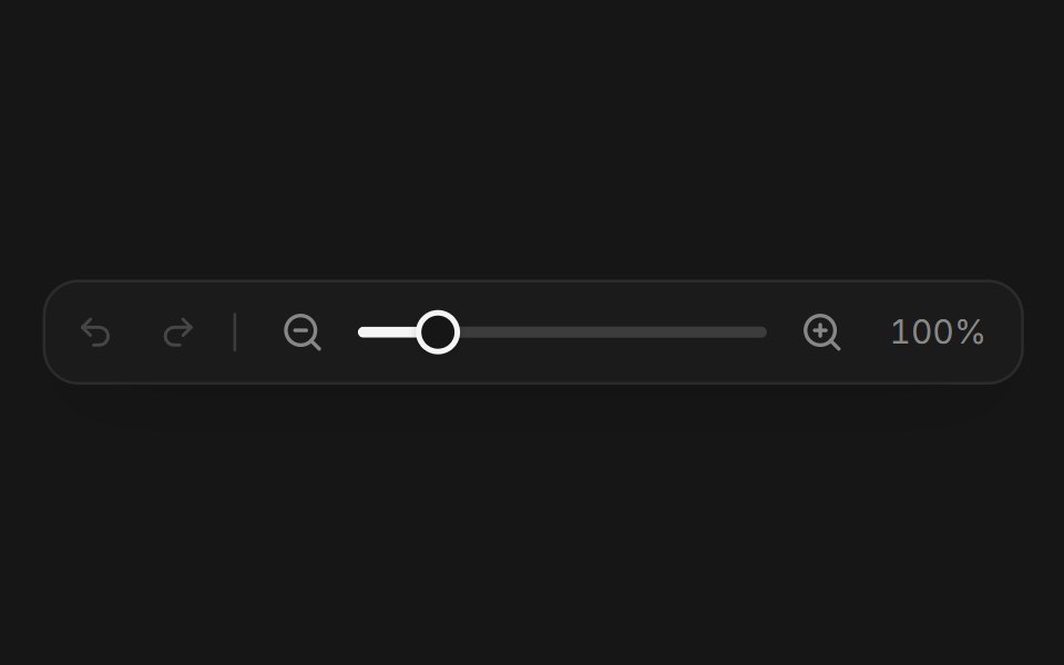 Web ToolbarPanel UI · React NativeAn editor toolbar with tools, undo, redo and zoom.
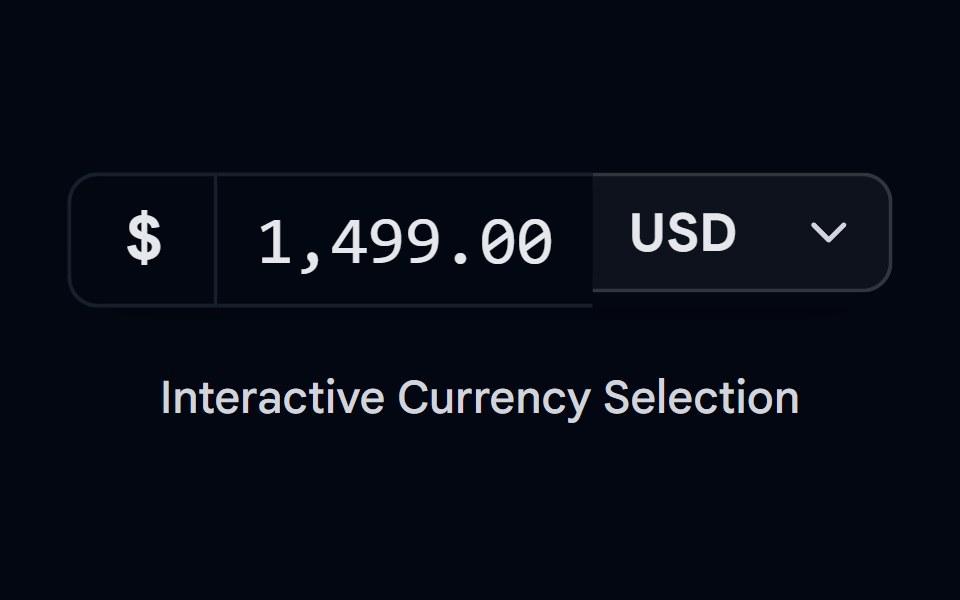 Button Group-05 - CurrencyShadcn Space · ReactCurrency style button group component
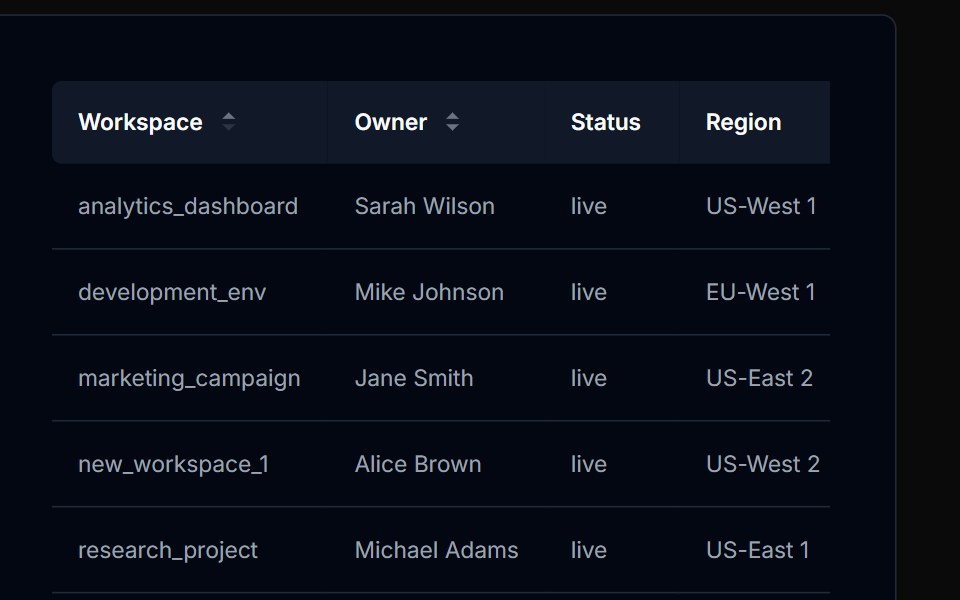 Table Action 03Tremor Blocks · React
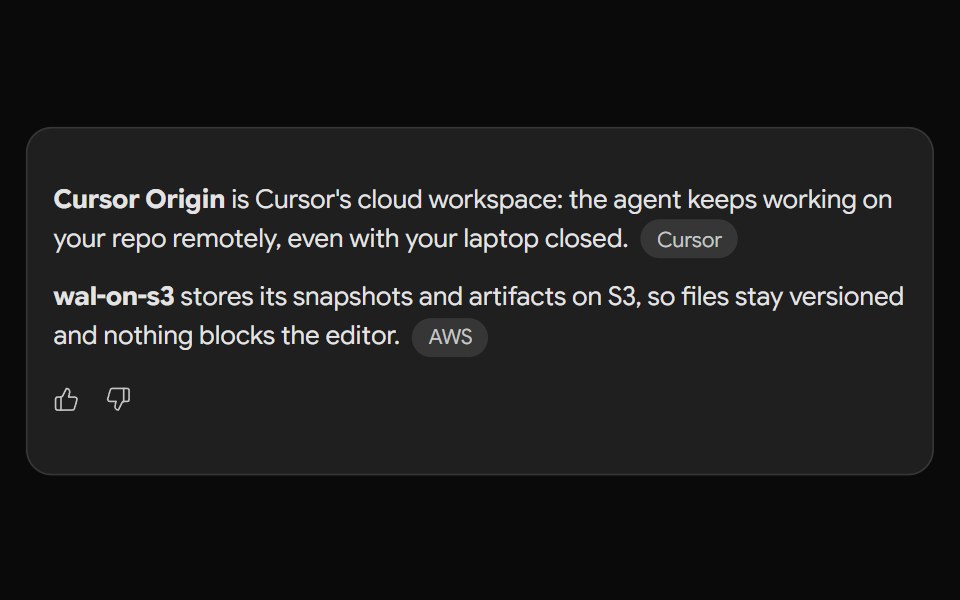 Gemini ActionsNotra · ReactFeedback, share, copy and more buttons built on shadcn Button and Tooltip.
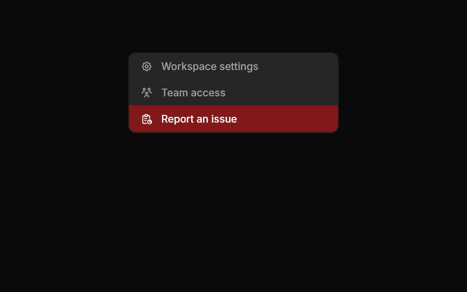 Button Groups 03Oxbow UI · Astro
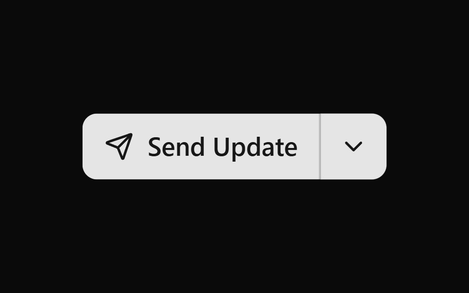 Button Group 11Watermelon UI · React
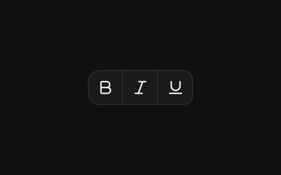 Icon toolbarFLX UI · ReactCompact toolbar of icon-only buttons with merged borders, used for text formatting actions.
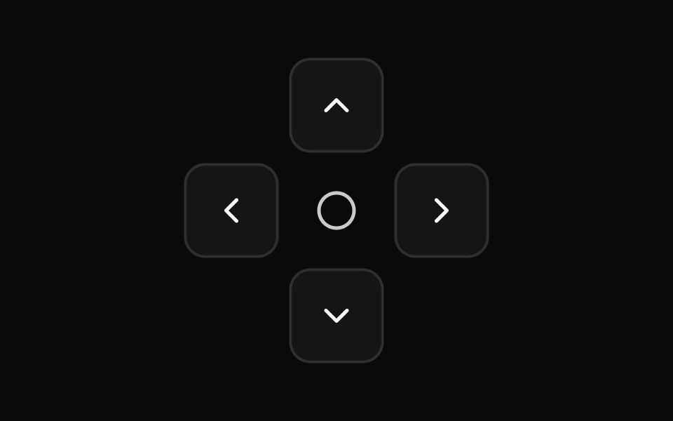 Direction Pad Controlssv-particles · Svelte
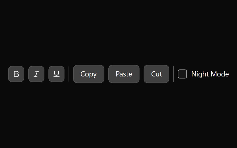 Tailwind ToolbarReact Spectrum · React
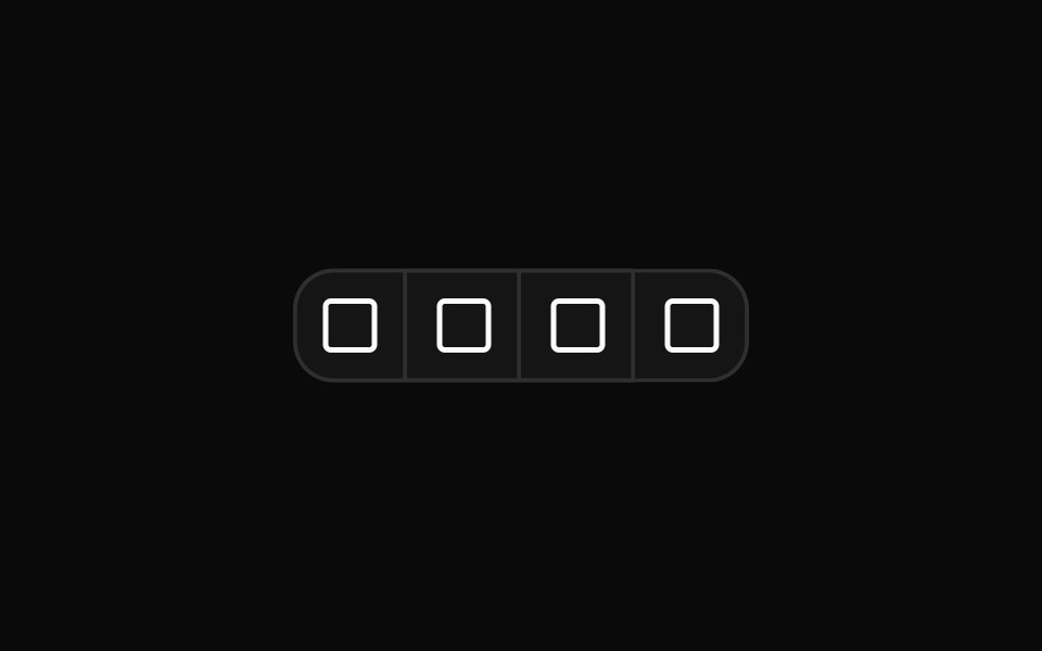 Button group for editor text alignment controlsReUI · ReactButton group for editor text alignment controls
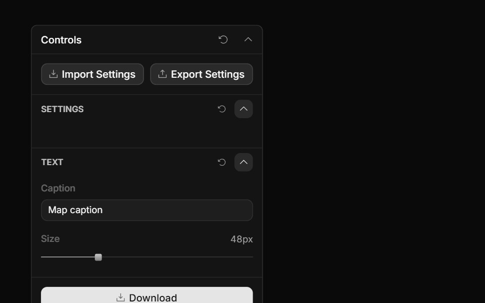 Panel ActionsToolcraft · React
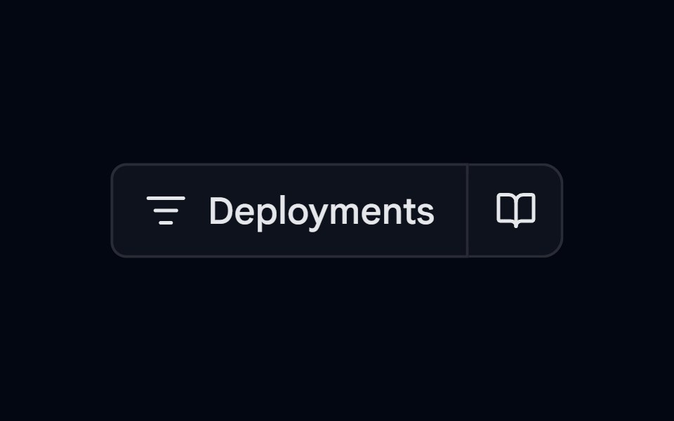 Button Group-06 - VercelShadcn Space · ReactVercel style button group component
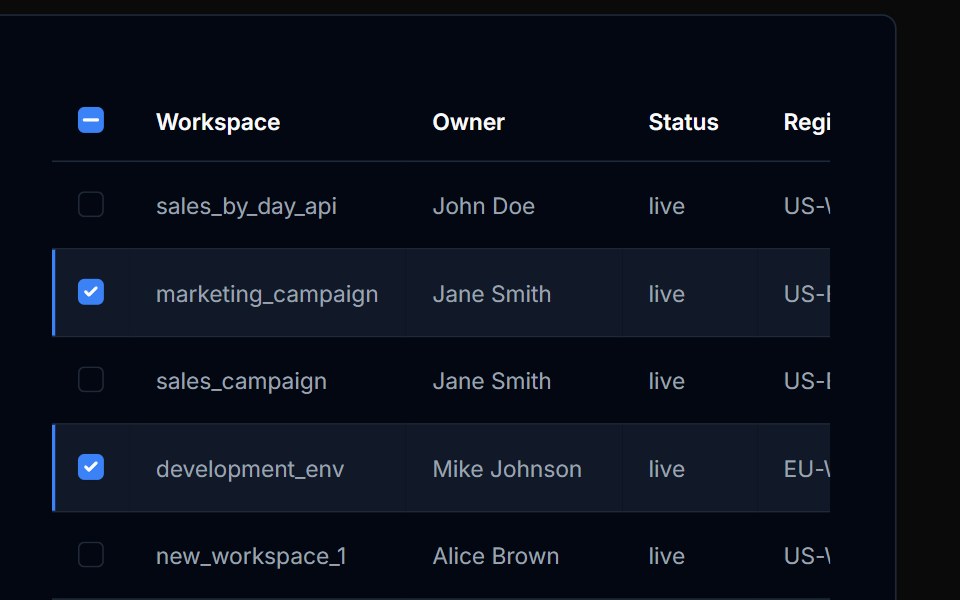 Table Action 04Tremor Blocks · React
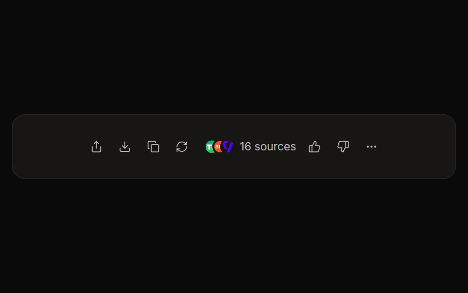 Perplexity ActionsNotra · ReactThe answer action bar with share, copy, rewrite, feedback and a sources button, built on shadcn Button and Tooltip.
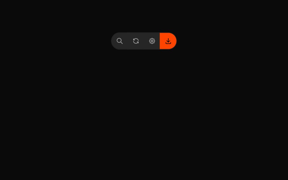 Button Groups 04Oxbow UI · Astro
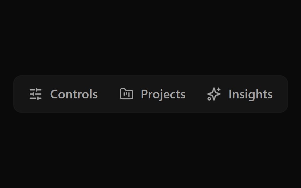 Button Group 12Watermelon UI · React
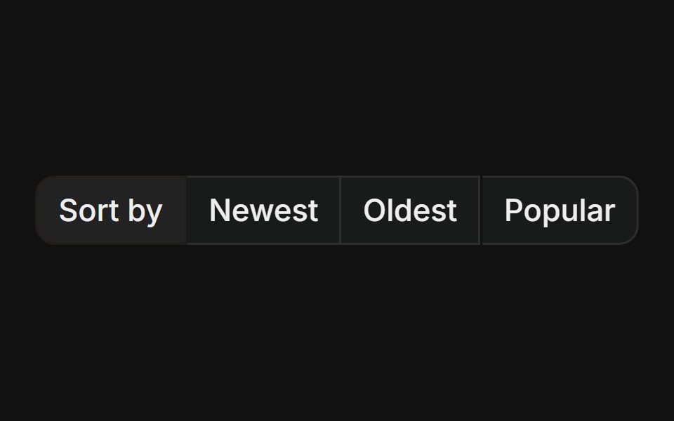 With label prefixFLX UI · ReactStatic text label leading a group of action buttons, useful for labelled sort or filter controls.
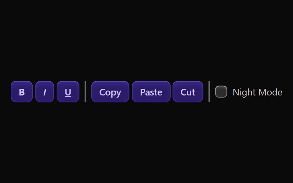 Vanilla ToolbarReact Spectrum · React
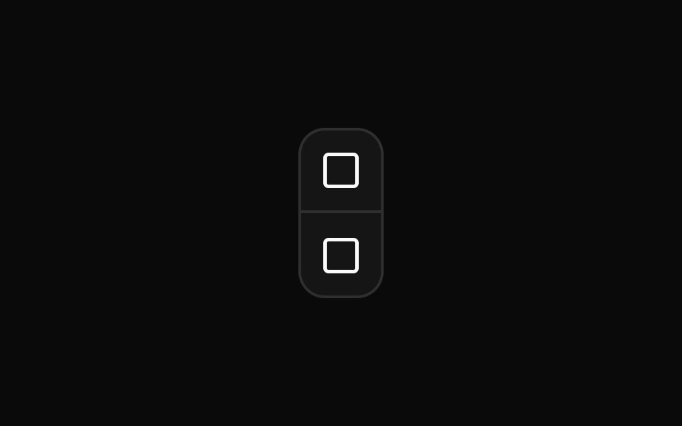 Vertical button group orientationReUI · ReactVertical button group orientation
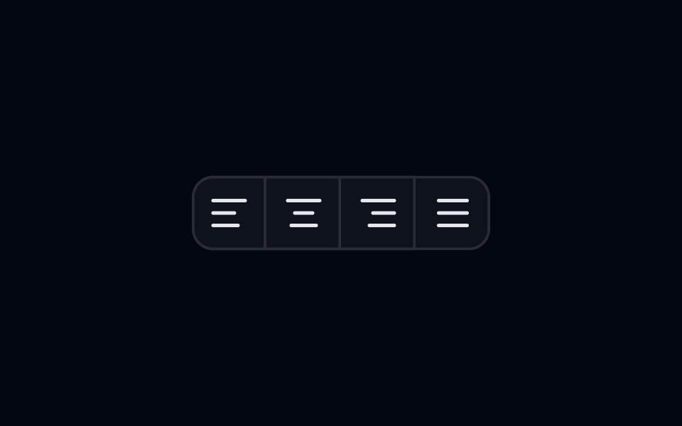 Button Group 07 - AlignmentShadcn Space · ReactAlignment style button group component
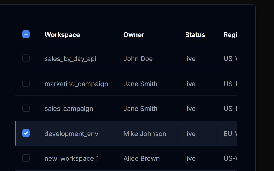 Table Action 05Tremor Blocks · React
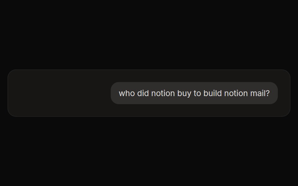 Perplexity User ActionsNotra · ReactThe time, edit and copy controls beside a user message.
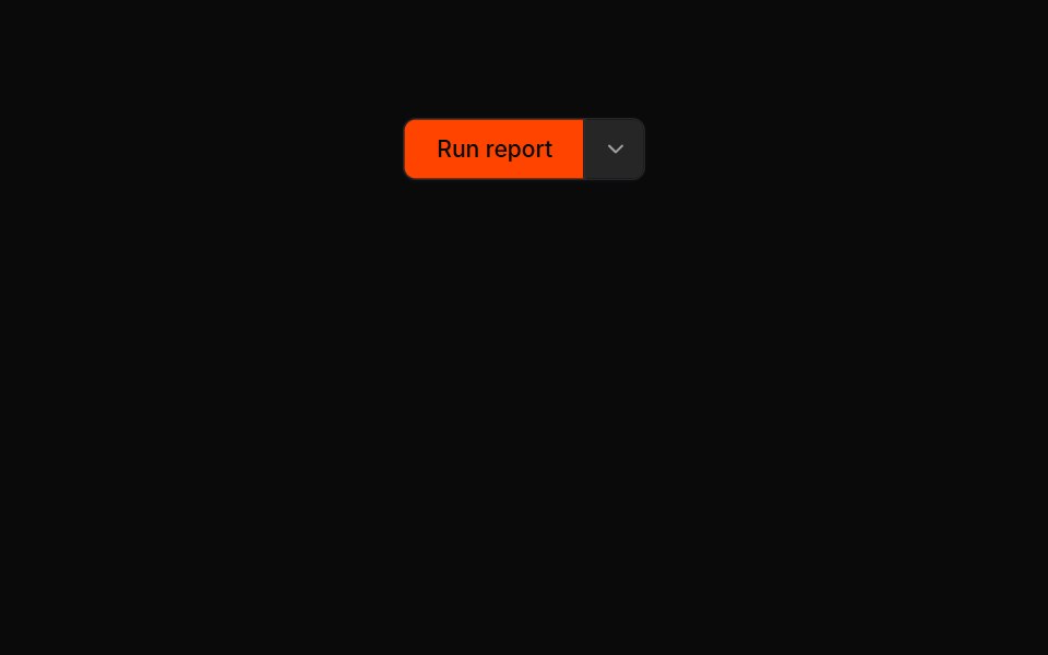 Button Groups 05Oxbow UI · Astro
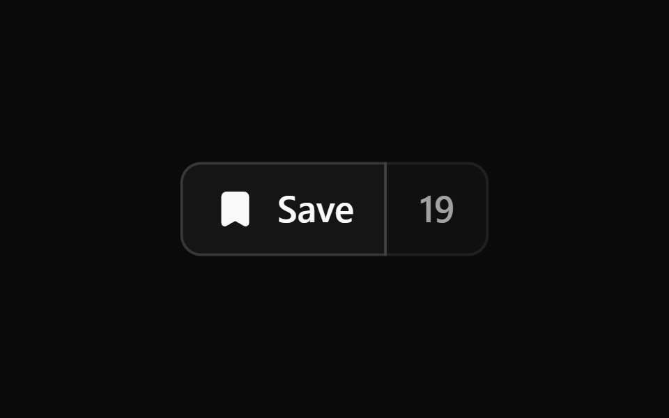 Button Group 2Watermelon UI · React
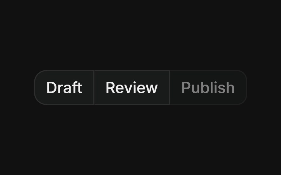 Group with disabledFLX UI · ReactMerged-border button row where one step is visually disabled and non-interactive.
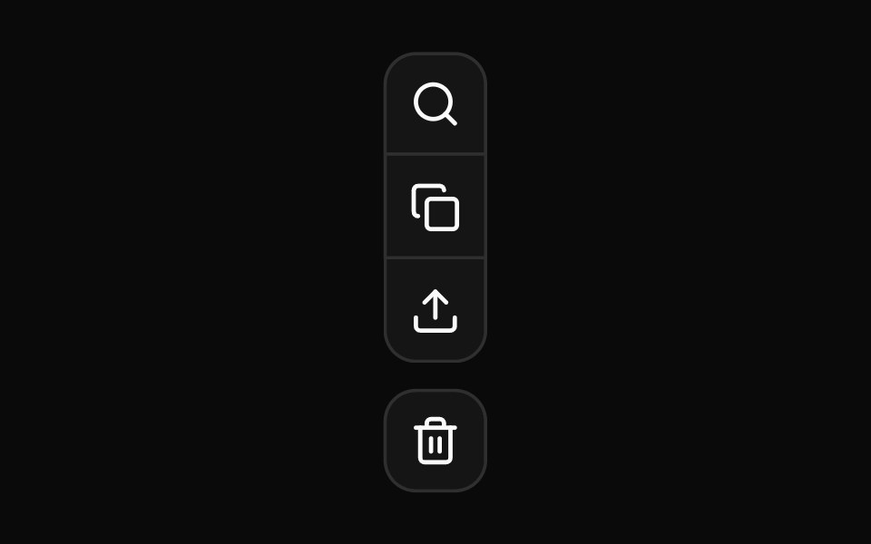 Nested vertical button group for complex tool palettesReUI · ReactNested vertical button group for complex tool palettes
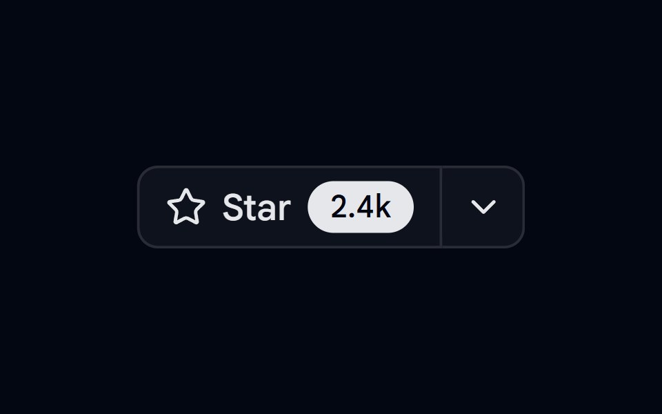 Button Group 08 - Github star barShadcn Space · ReactGithub star bar style button group component
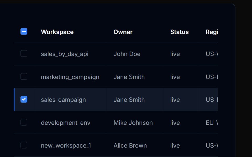 Table Action 06Tremor Blocks · React
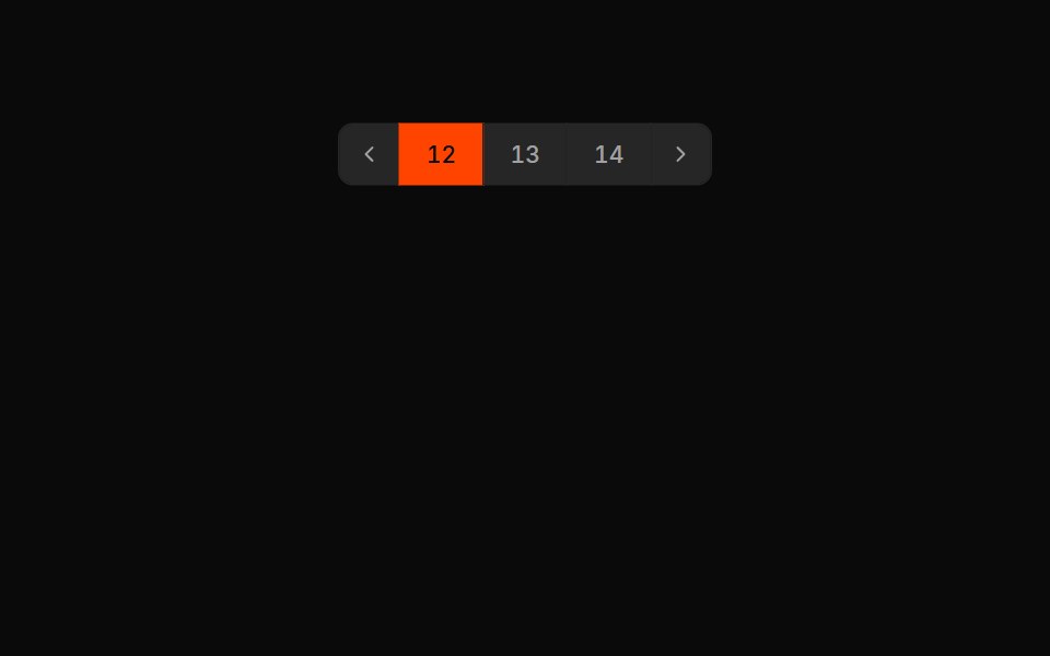 Button Groups 06Oxbow UI · Astro
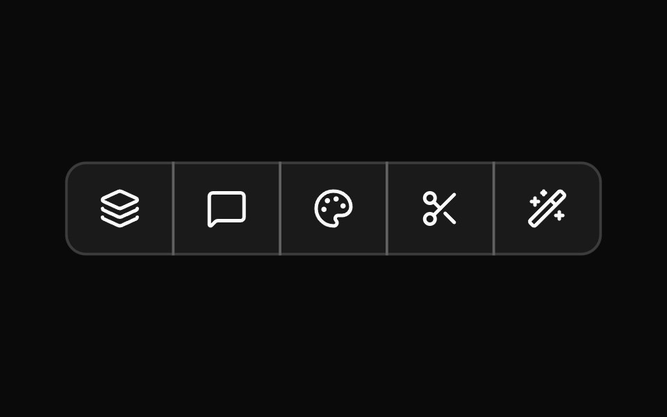 Button Group 3Watermelon UI · React
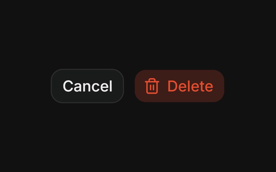 Destructive pairFLX UI · ReactCancel + Delete spaced action pair.
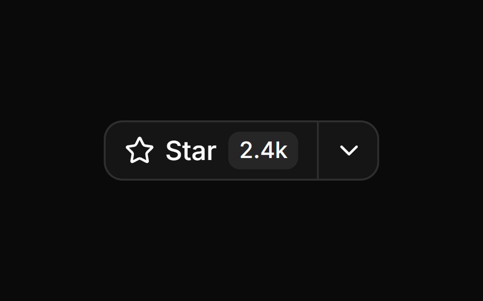 Star button group with count and dropdownReUI · ReactStar button group with count and dropdown
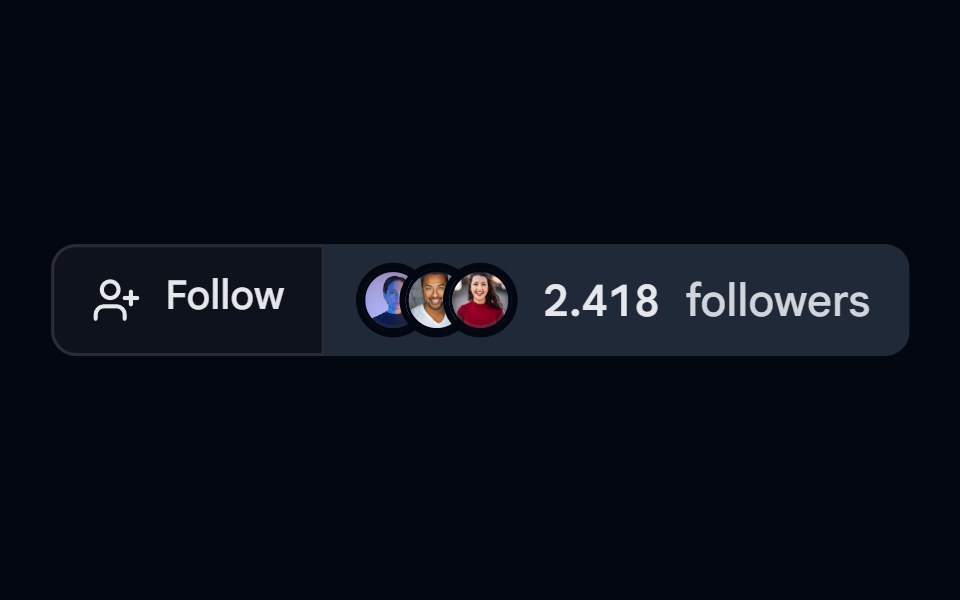 Button Group 09 - FollowShadcn Space · ReactFollow style button group component
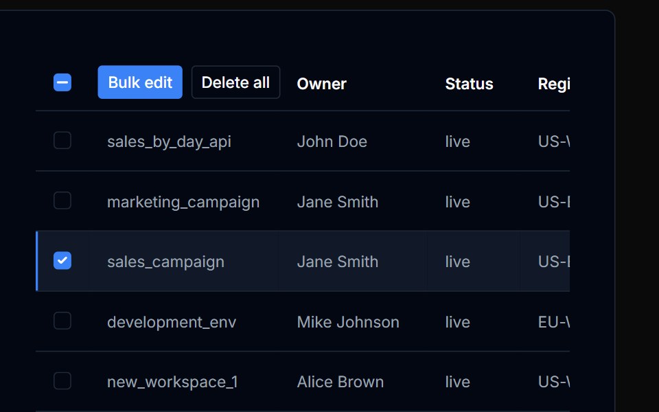 Table Action 07Tremor Blocks · React
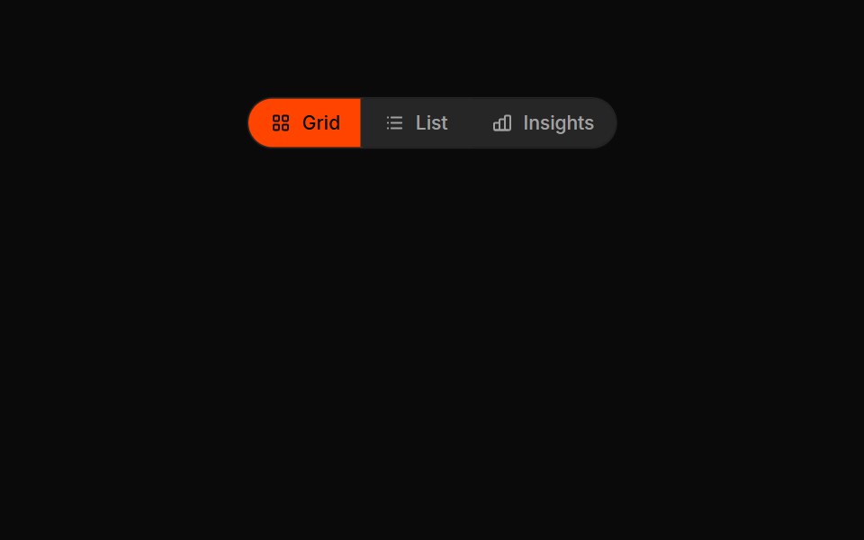 Button Groups 07Oxbow UI · Astro
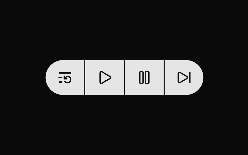 Button Group 4Watermelon UI · React
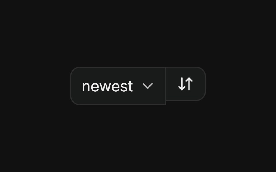 With selectFLX UI · ReactSort dropdown paired with a direction-toggle icon button in a merged-border row.
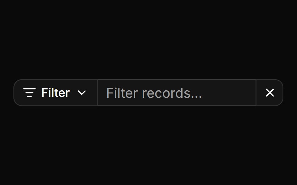 Search input with filter menu and clear buttonReUI · ReactSearch input with filter menu and clear button
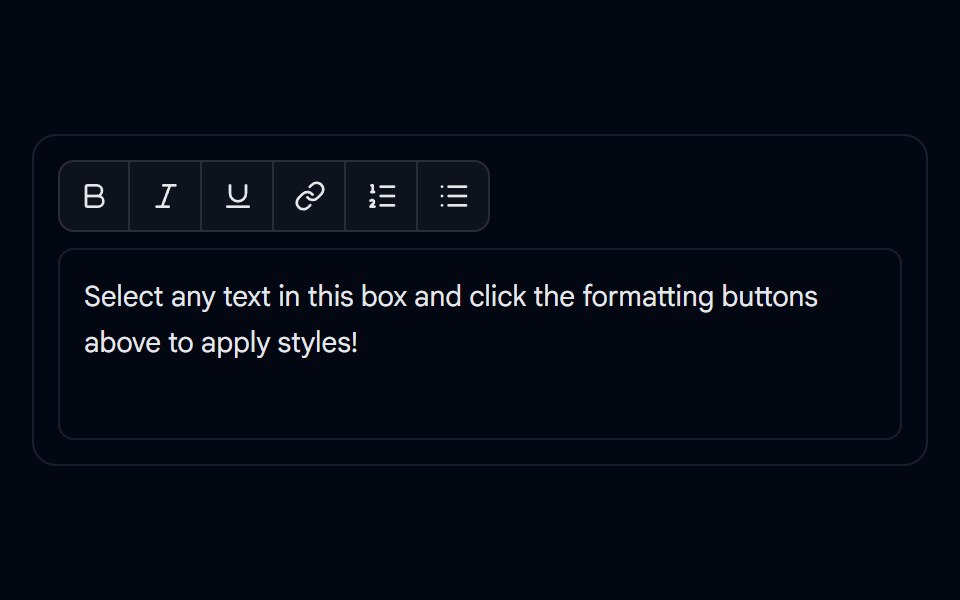 Button Group 10 - Editor ToolbarShadcn Space · ReactRich-text formatting toolbar button group component
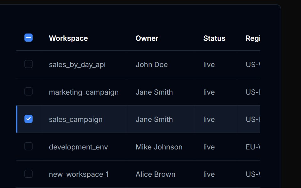 Table Action 08Tremor Blocks · React
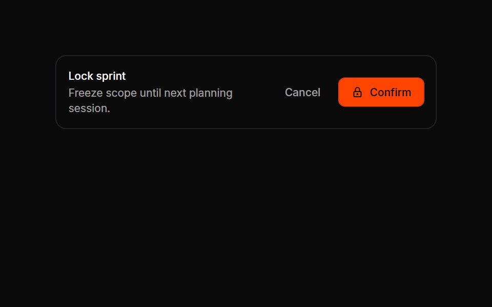 Button Groups 08Oxbow UI · Astro
Libraries with Tailwind CSS button group components
Related categories
- Button Group Components
- React Button Group Components
- Animated Button Group Components
- shadcn/ui Button Group Components
- Tailwind CSS Action Components
- Tailwind CSS Button Components
- Tailwind CSS Toggle Button Components
- Tailwind CSS Icon Button Components
- Tailwind CSS CTA Button Components
- Tailwind CSS Link Components
- Tailwind CSS Copy Button Components
- Tailwind CSS Theme Toggle Components
- Tailwind CSS Like Button Components
- Tailwind CSS Social Login Button Components
- Tailwind CSS FAB Components
- Tailwind CSS Download Button Components
- Tailwind CSS Slide To Confirm Components
- Tailwind CSS Hold Button Components
- Tailwind CSS Submit Button Components
- Tailwind CSS Send Button Components