 Dev Design Library
React Button Group Components
Dev Design Library indexes 187 React button group components from 53 open-source UI libraries, with the most coming from ReUI, Watermelon UI, Tremor Blocks, Shadcn Space and FLX UI. Each one links to its page with the source code, a live preview where available, the library license and the install command. Every library in this list targets React. Button group components belong to the Actions group.
Showing 120 of 187, a mix from every library. Open a library to see all of its components.
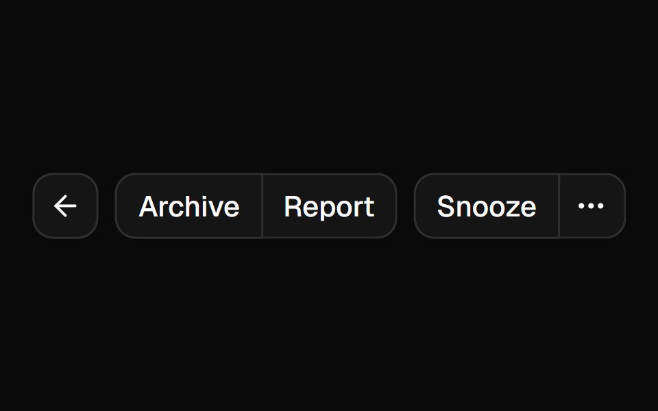 Button Groupshadcn/ui · ReactA container that groups related buttons together with consistent styling.
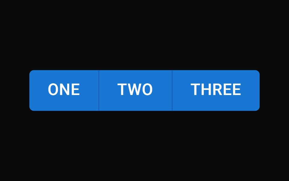 Button GroupMUI / Material UI · React
 Action BarChakra UI · ReactUsed to display a bottom action bar with a set of actions
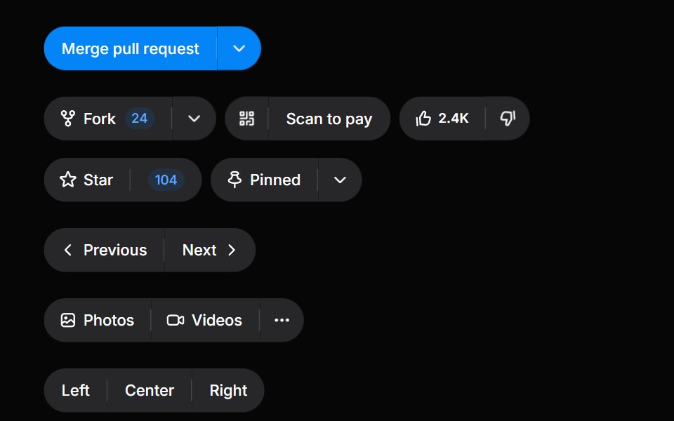 Button GroupHeroUI · ReactGroup related buttons together with consistent styling and spacing
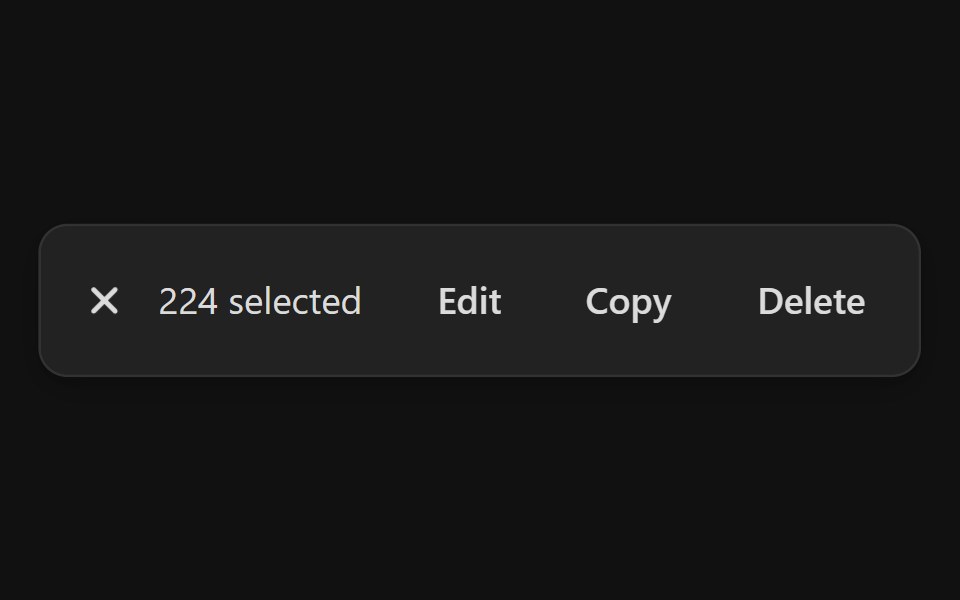 Action BarReact Spectrum · ReactAction bars are used for single and bulk selection patterns when a user needs to perform actions on one or more items…
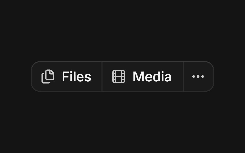 Groupcoss ui · ReactA component for visually grouping a series of controls.
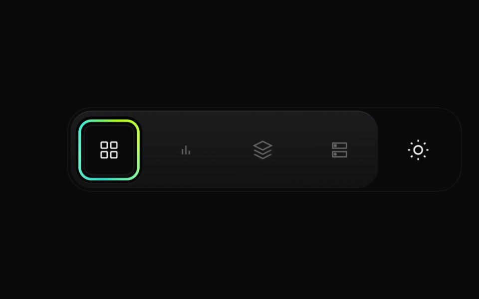 Gradient Button GroupCult UI · ReactPremium layered button group with animated active state, gradient ring accents, and theme toggle underlay
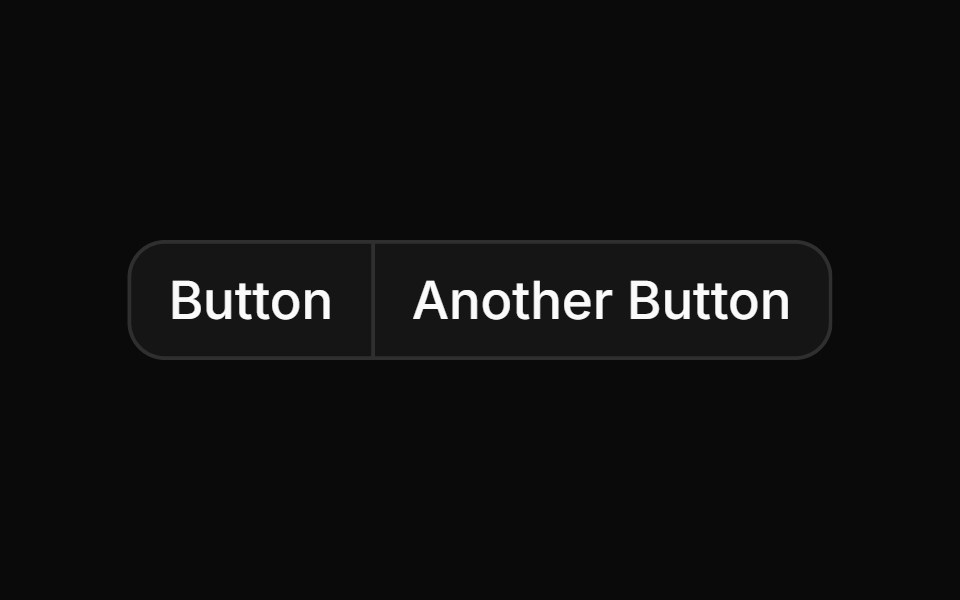 Basic button group with two buttonsReUI · ReactBasic button group with two buttons
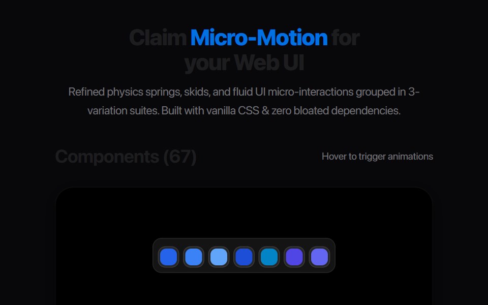 Morph Action PillAmicro Micro Transitions · ReactPill-shaped action button that changes shape to show a different state or more actions.
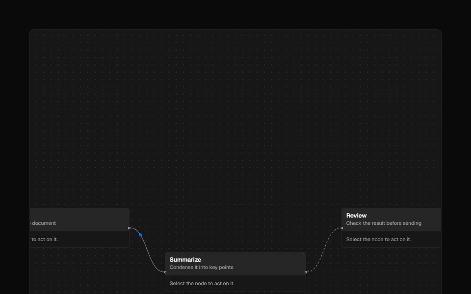 ControlsAI Elements · ReactA styled controls component for React Flow-based canvases with zoom and fit view functionality.
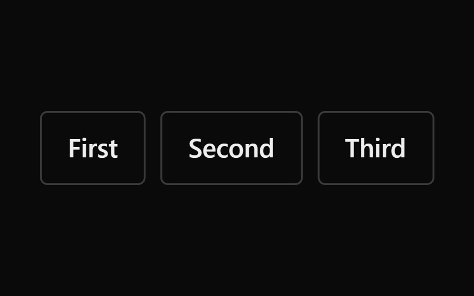 GroupPark UI · ReactA layout component for grouping related elements visually.
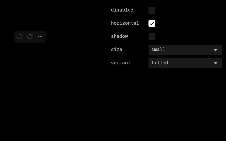 Action Icon GroupLobe UI · ReactActionIconGroup is a component for rendering multiple buttons with unified styling and layout control. It handles…
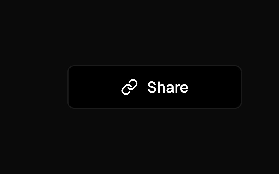 Social ButtonKokonut UI · ReactShare button that expands into a row of social icon buttons with staggered Motion animations on hover, built with…
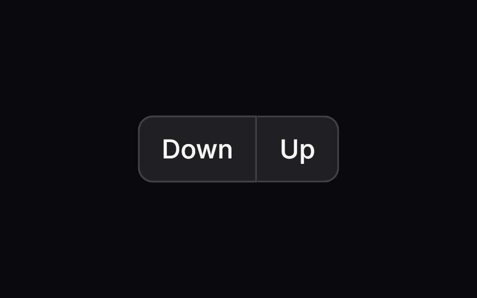 button-groupIntent UI · Reactbutton-group
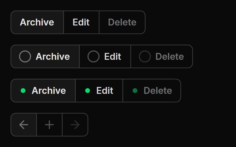 Button GroupUntitled UI React · React
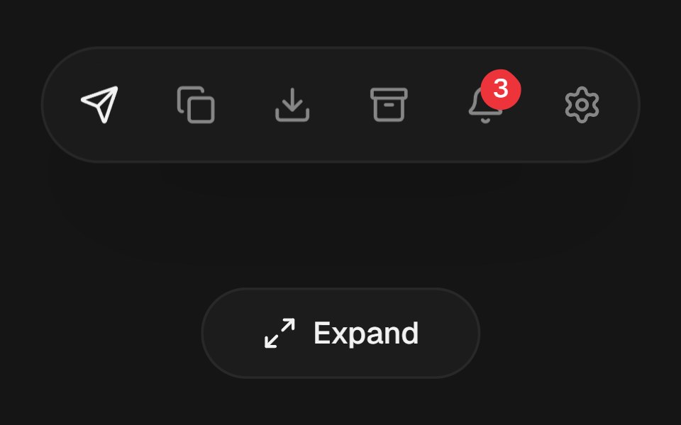 Expandable Action BarbeUI · ReactCompact icon actions that expand into labeled controls on hover or focus with shared layout motion.
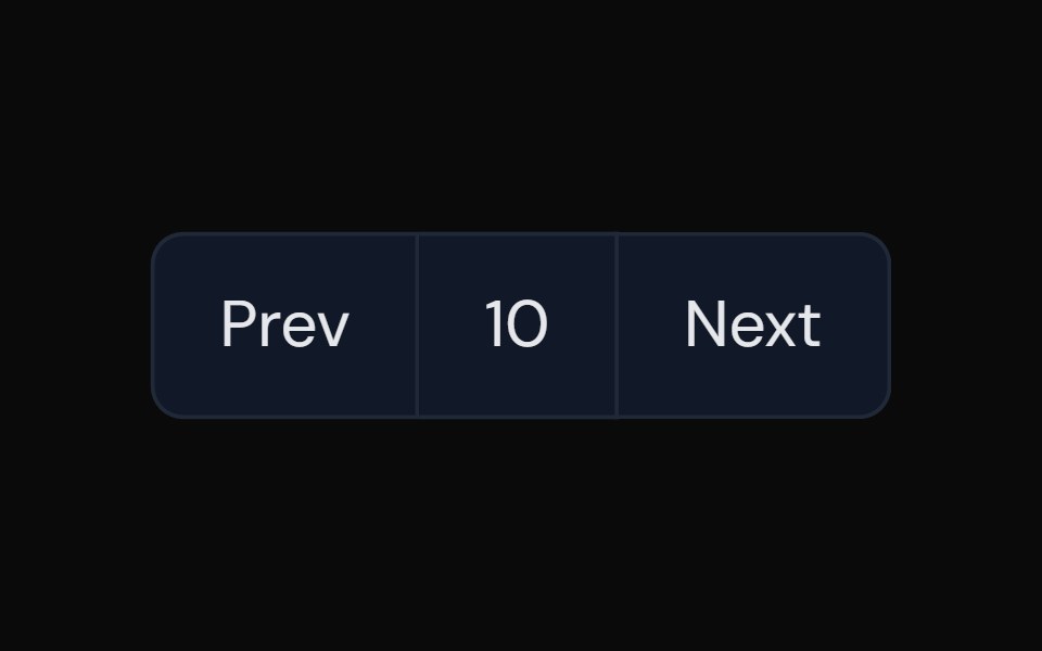 Button GroupTailGrids · ReactA component with multiple buttons grouped together.
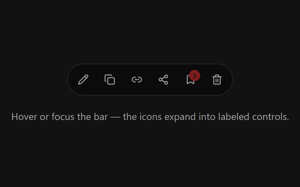 Expandable Action BarSpectrum UI · ReactCompact icon actions that expand into labeled controls on hover or focus with shared layout motion.
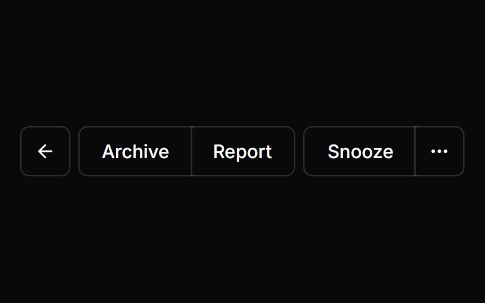 Button GroupVengeance UI · React
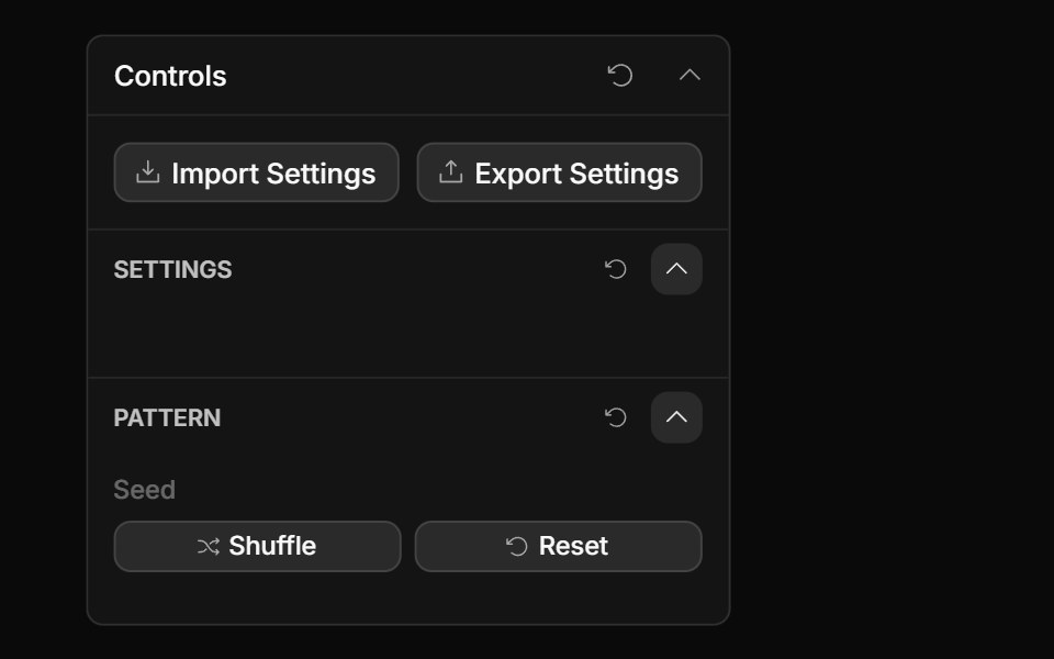 Actions ControlToolcraft · React
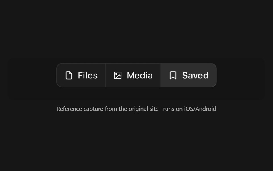 Button GroupPanel UI · React NativeSeveral buttons drawn as one control — a segmented run, a split action, a toolbar.
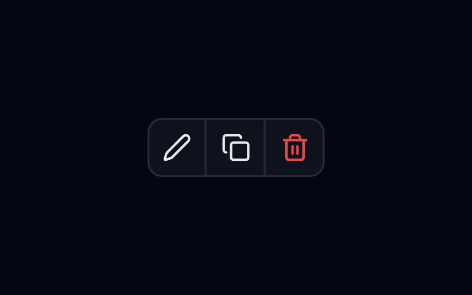 Button Group-01 - BasicShadcn Space · ReactBasic button group component
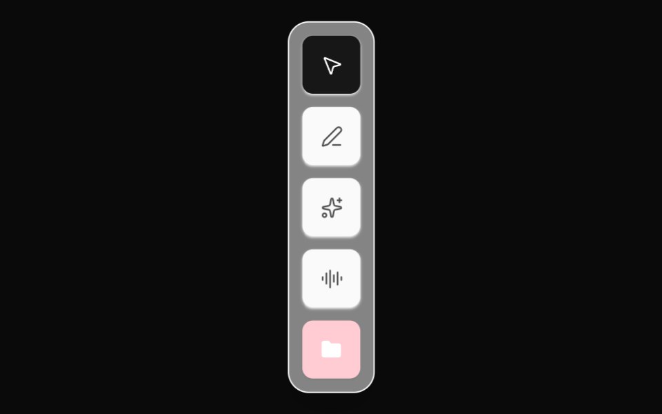 Editor Tool DockOpenSourceUI · React
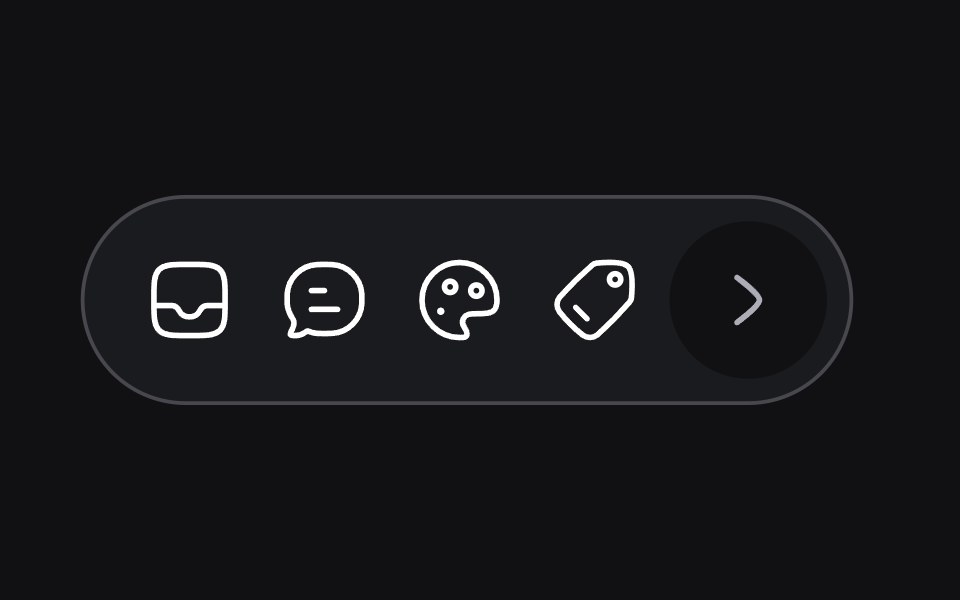 Dynamic Toolbaruselayouts · ReactA toolbar that adapts its size and layout based on content.
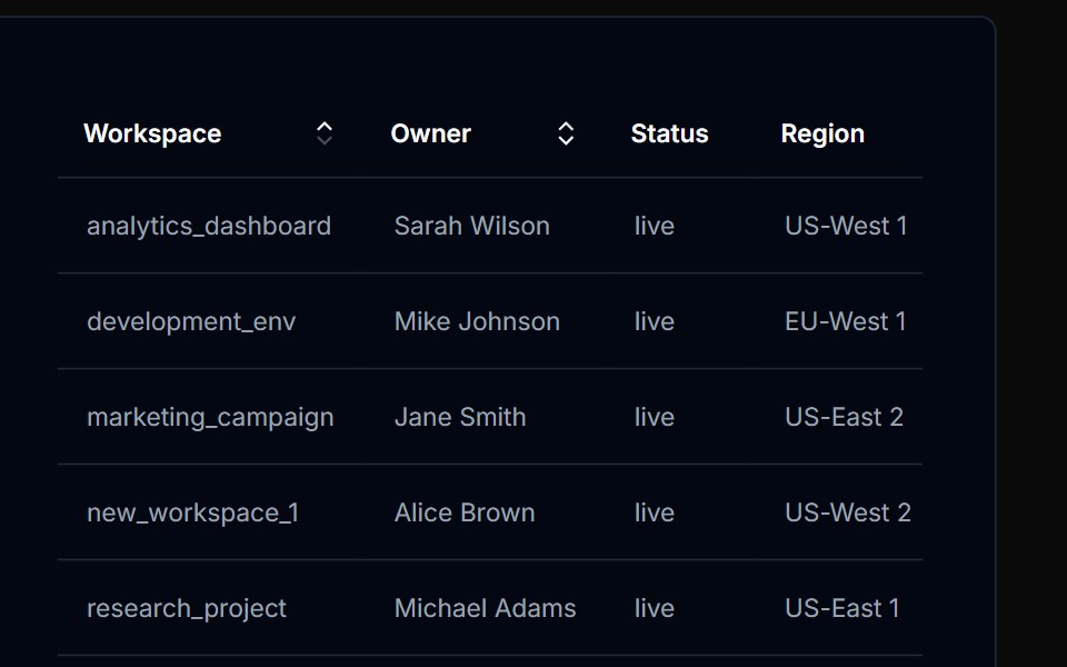 Table Action 01Tremor Blocks · React
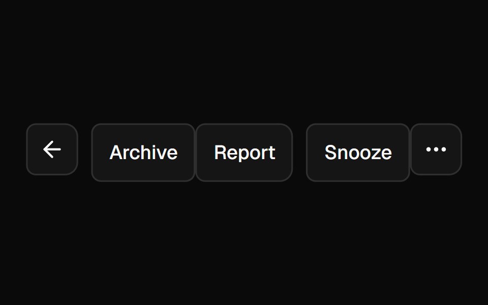 Button GroupShadcn Dashboard · React
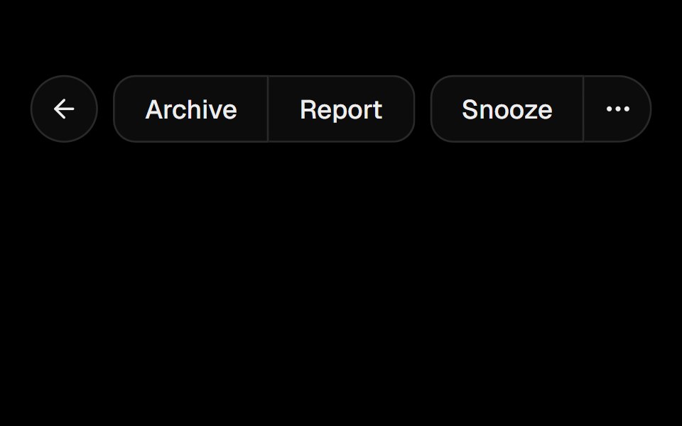 Button GroupObsidianUI · React
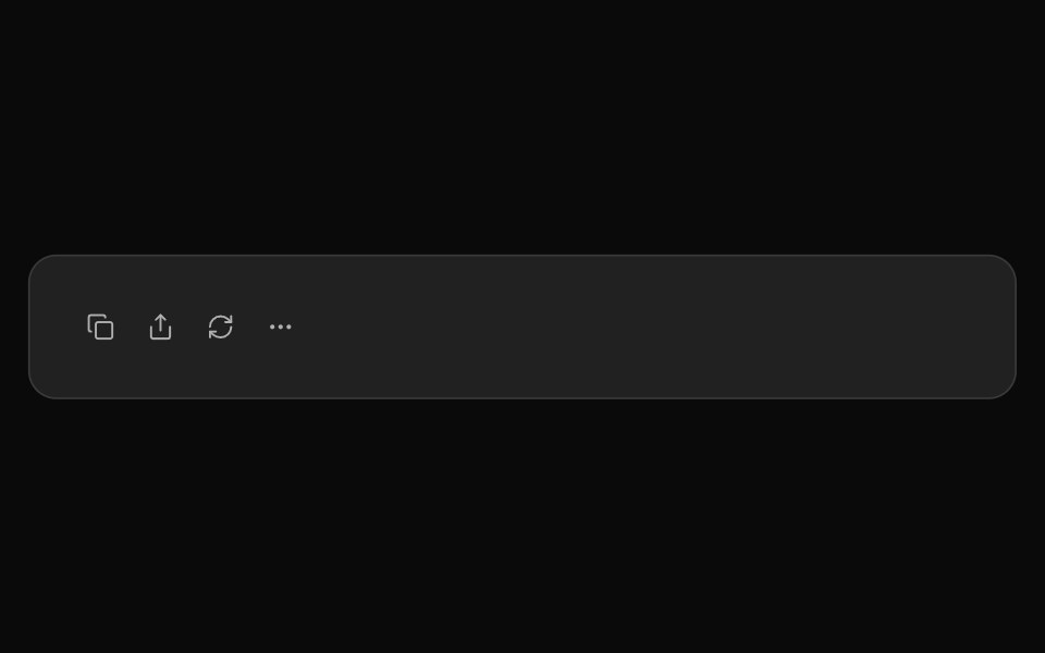 ChatGPT ActionsNotra · ReactCopy, share, redo and more buttons, built on shadcn Button and Tooltip.
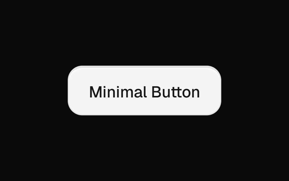 Minimal ButtonsGreatUI · React
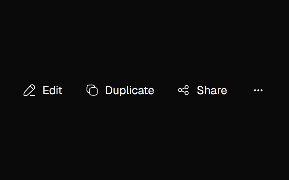 Adaptive ActionsNexvyn UI · ReactA responsive action toolbar that measures its available inline size and moves overflowed items into an accessible…
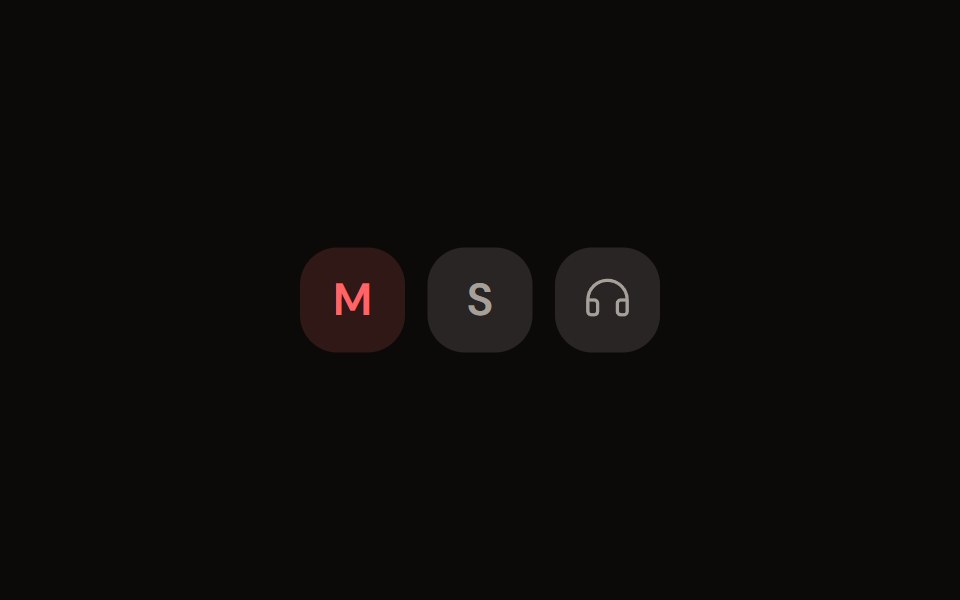 Channel Toggleaudiocn · ReactMute, solo and monitor toggle buttons with their own pressed colours.
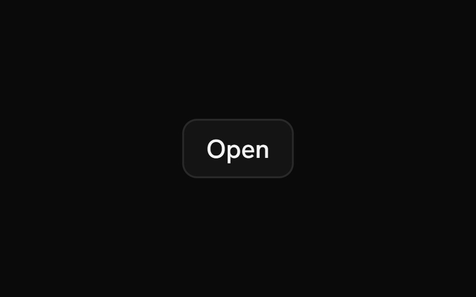 Action BarShark UI · ReactDisplay an action bar for selected items.
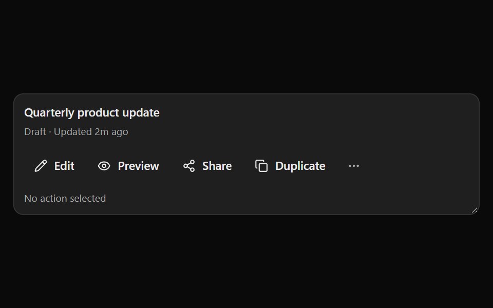 Smart OverflowSona UI · ReactA priority-first responsive action group that moves lower-priority actions into an accessible three-dot menu as…
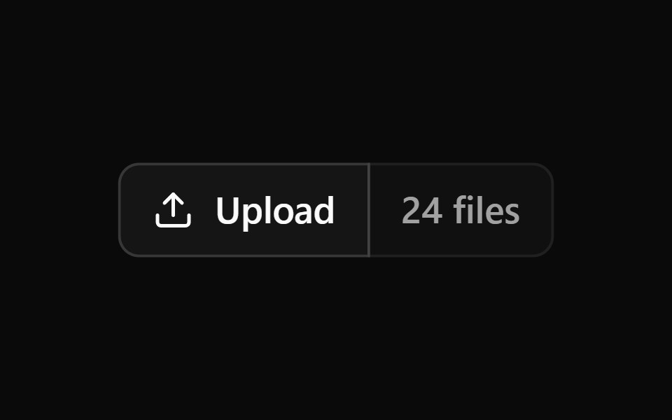 Button Group 1Watermelon UI · React
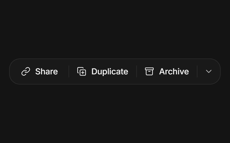 Button groupArc Library · ReactRelated actions joined into one surface with hairline dividers: a hover highlight glides between segments, the pressed…
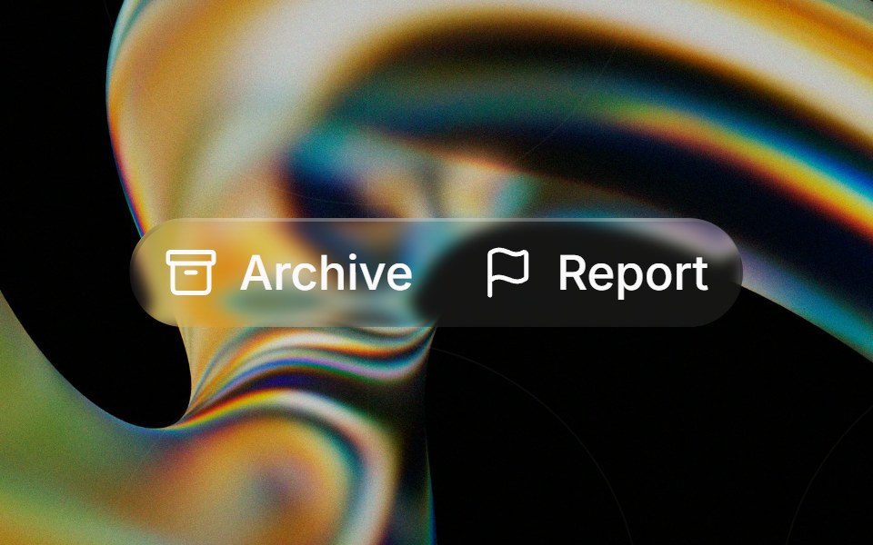 Glass Button Groupglasscn · ReactGlass Button Group with five variants: clear, frosted, subtle, liquid, and liquid-refract
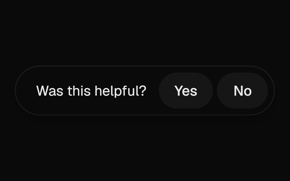 Helpful PromptUI Lab · ReactAsks if the page helped, and on a no opens into a field right where the question was.
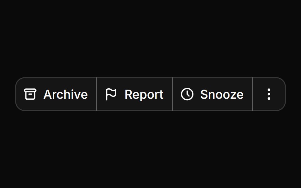 Button groupHextaUI · ReactButtons joined into one control, with shared seams, separators, text addons, nesting and vertical stacks.
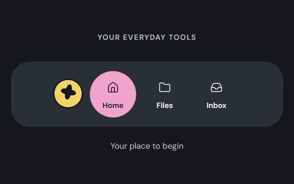 Action dockCojeev UI · ReactA reusable action dock composed from Cojeev base components.
 Preview Hover ToolbarMicroKit · ReactA thin empty pill that grows wider and taller off its fixed bottom edge when the surrounding preview is hovered…
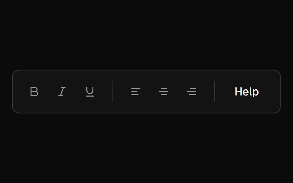 ToolbarROI UI · ReactA toolbar component for grouping action buttons and controls.
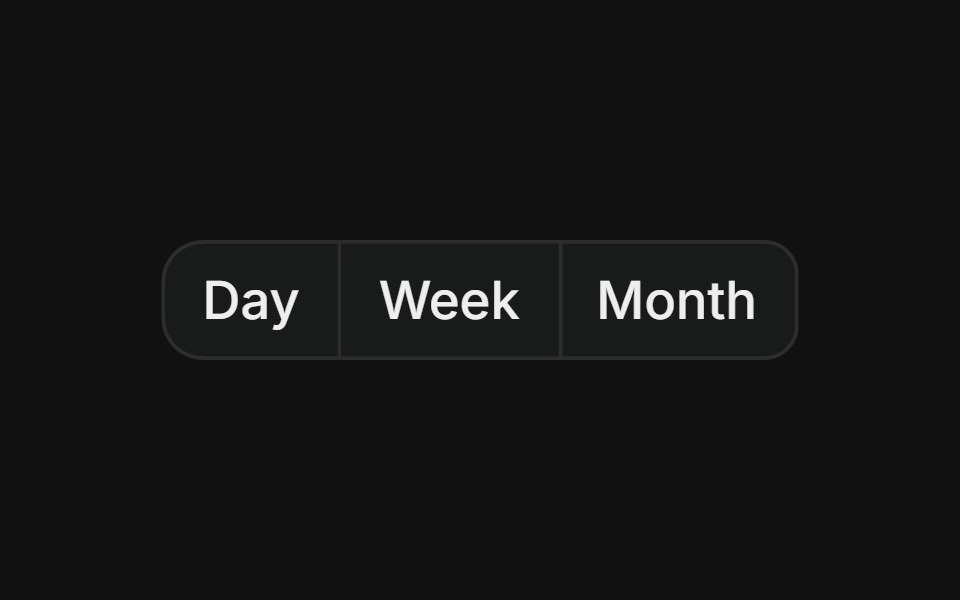 Basic groupFLX UI · ReactHorizontal row of buttons with merged borders, used for segmented controls like date range pickers.
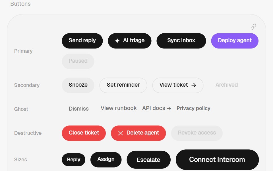 Button GroupHalaska UI · React
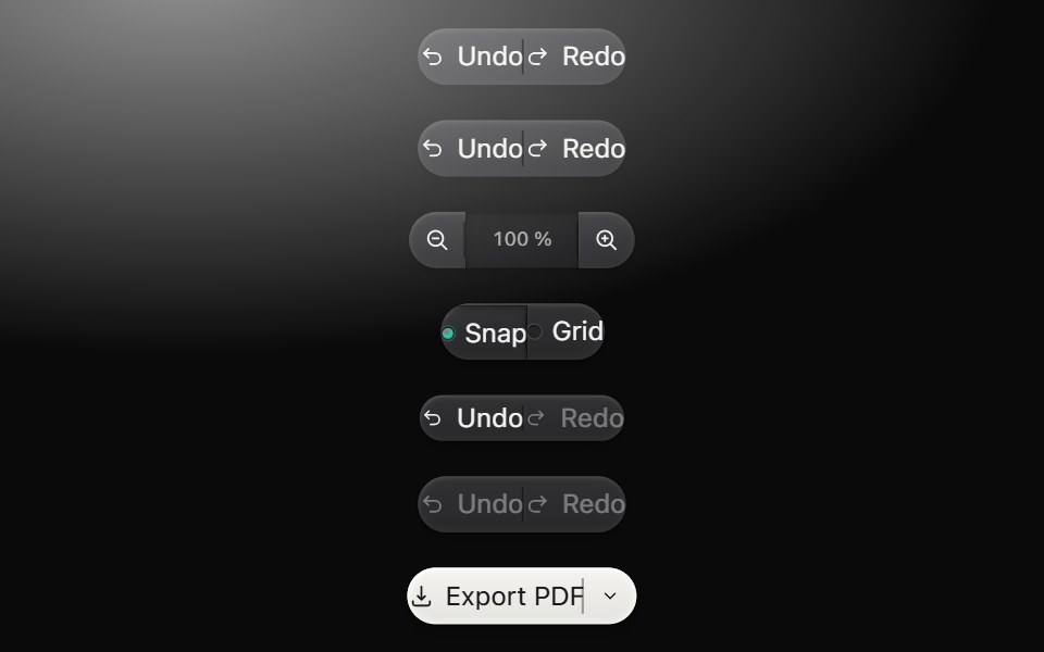 Button groupMetal UI · React + SwiftUIRelated action segments cut from one raised bar with engraved seams, independent presses and noninteractive readout…
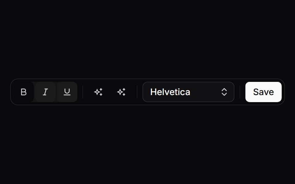 ToolbarSpaceUI · ReactArranges formatting tools, action buttons, and dropdown controls into a compact, accessible toolbar for quick editing.
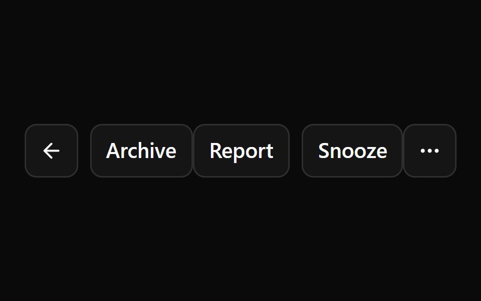 Aria Button GroupReScript shadcn · ReScript
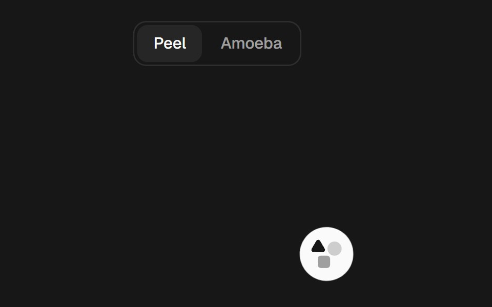 Gooey ToolbarSkecher UI · ReactA compact action toolbar with configurable liquid merging effects and accessible controls.
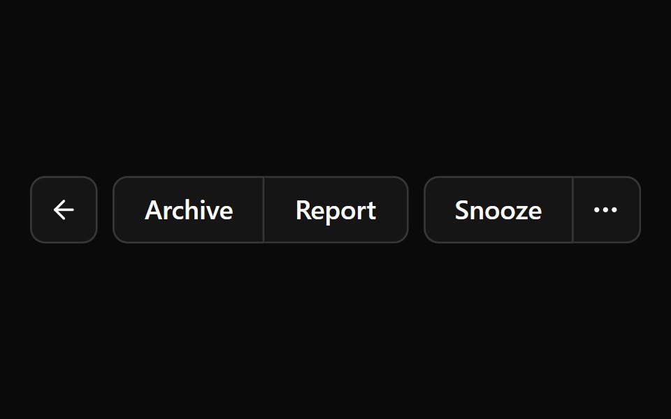 Button GroupOUI · ReactShadcn Button Group with react aria component characteristics.
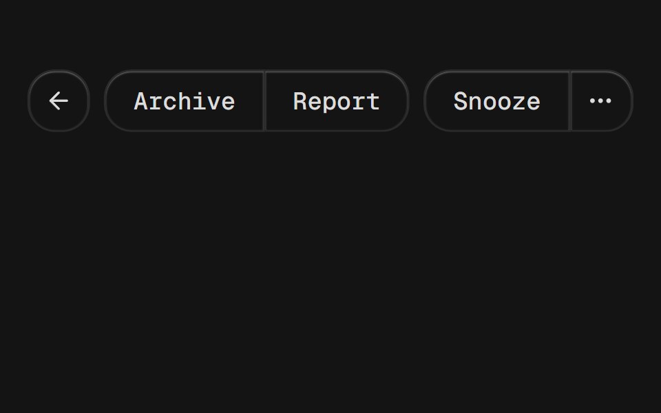 Button GroupD2Studio UI · ReactA container that groups related buttons together with consistent styling.
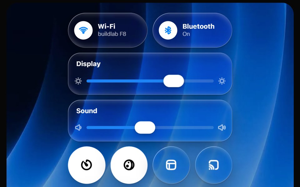 Glass Control CenterOpaline · ReactmacOS-style Control Center kit — glass modules, toggles, light-filled sliders and buttons.
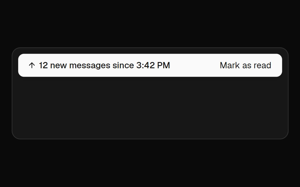 Jump BarFibo · ReactTakes people to unread messages, new messages or the present in a conversation.
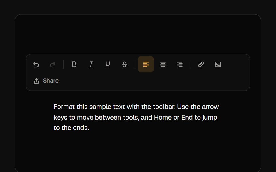 ToolbarReactFrame · ReactAn accessible toolbar of icon buttons, toggles, radio-style toggle groups and separators with roving-focus arrow-key…
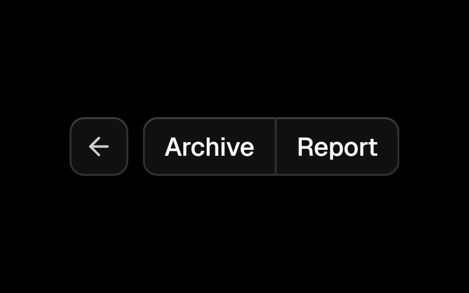 Button Groupark-cn · ReactA shadcn-style button group component built with Ark UI primitives.
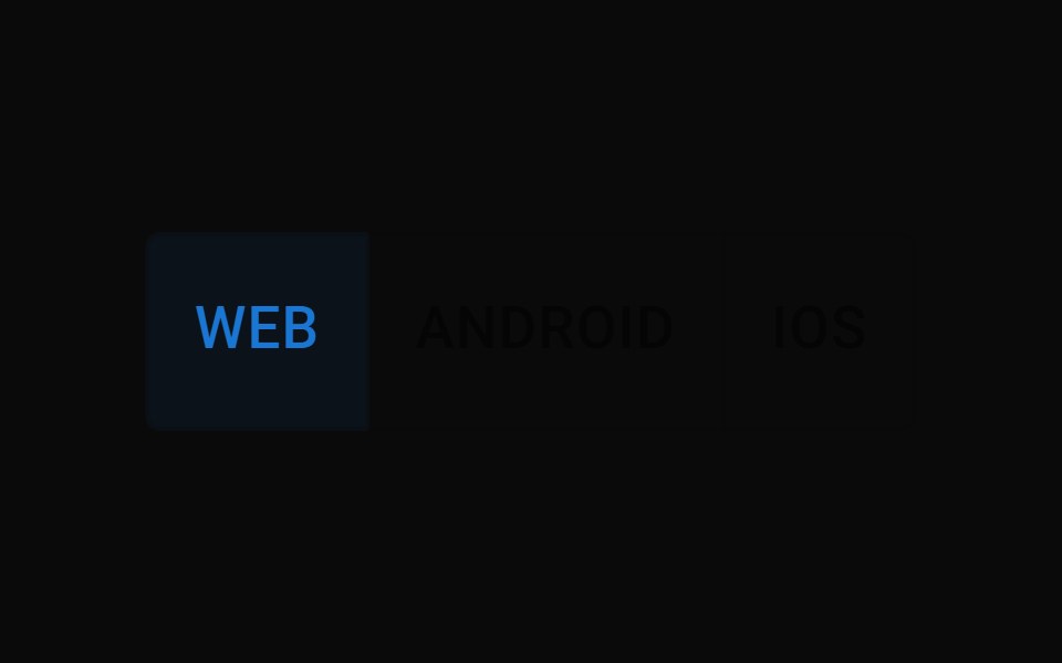 Toggle Button GroupMUI / Material UI · React
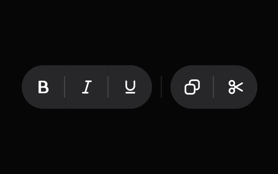 ToolbarHeroUI · ReactA container for interactive controls with arrow key navigation.
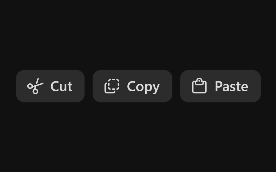 Action Button GroupReact Spectrum · ReactAn ActionButtonGroup is a grouping of related ActionButtons.
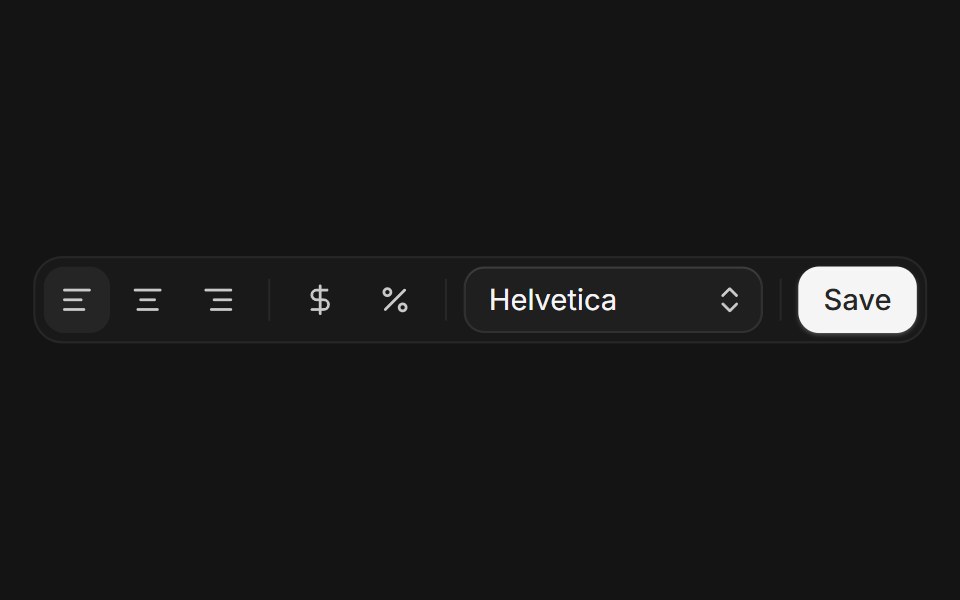 Toolbarcoss ui · ReactA container for grouping a set of buttons and controls.
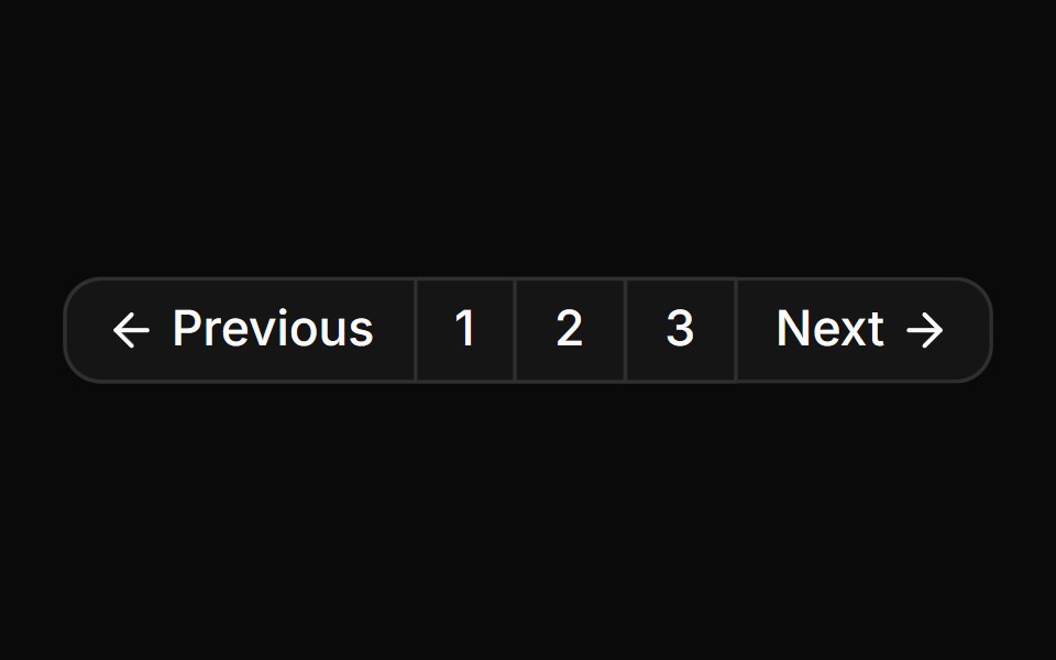 Button group used for standard paginationReUI · ReactButton group used for standard pagination
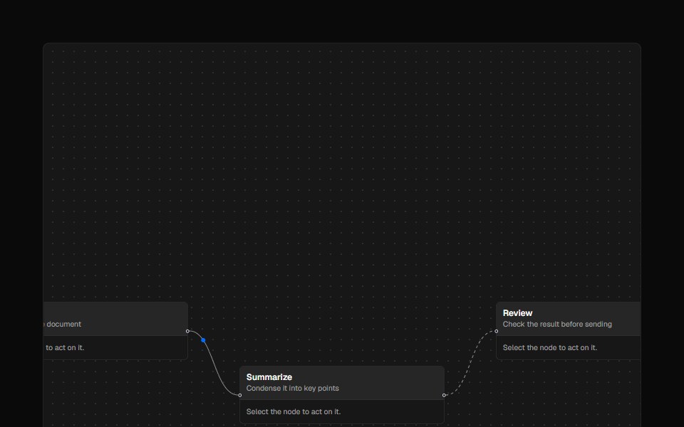 ToolbarAI Elements · ReactA styled toolbar component for React Flow nodes with flexible positioning and custom actions.
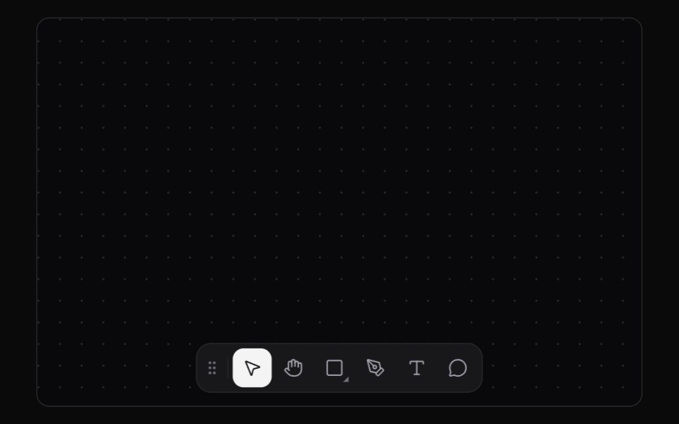 Tool DockKokonut UI · ReactAn editor tool dock with a sliding selection plate, shortcut tooltips and flyouts that you can throw to any edge.
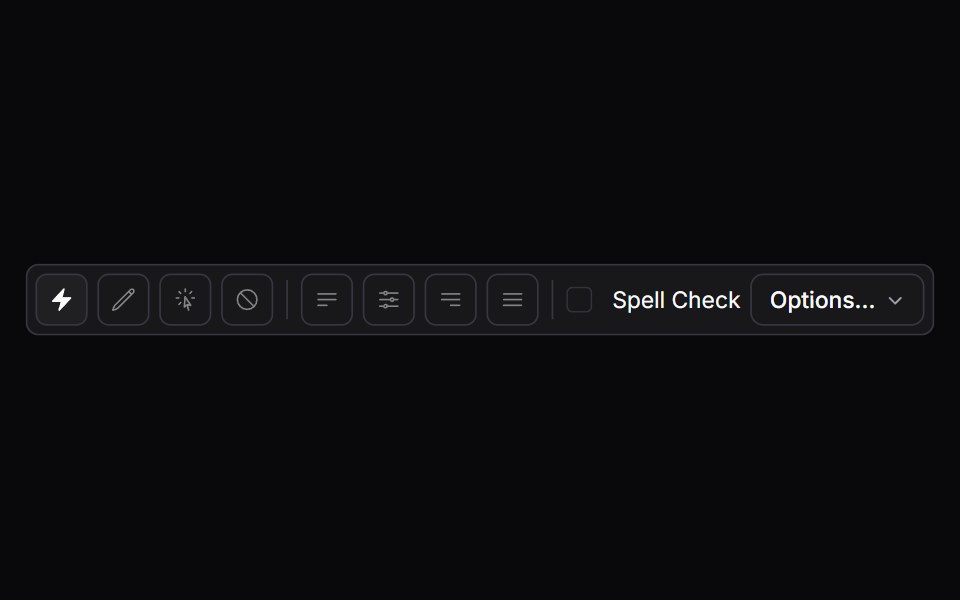 toolbarIntent UI · Reacttoolbar
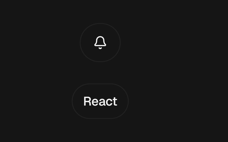 Expandable ControlbeUI · ReactClick-to-expand button and chip controls that reveal a label or trailing action through spring layout continuity.
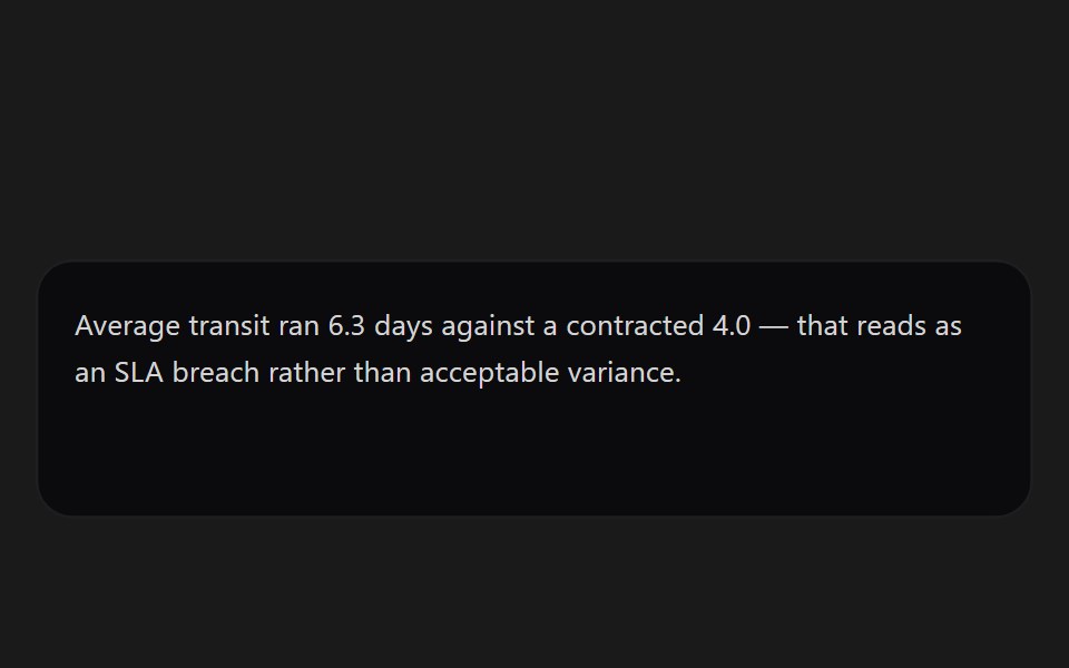 Message ActionsSpectrum UI · ReactPer-message controls — copy, regenerate, and thumb feedback.
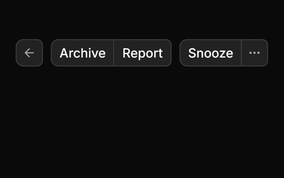 Button GroupToolcraft · React
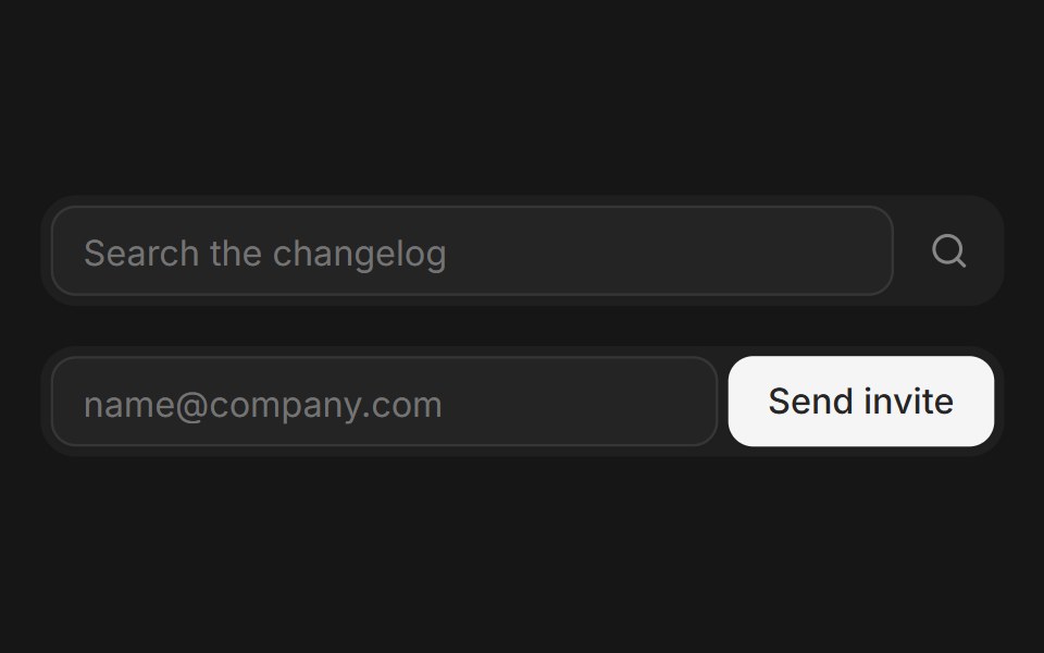 Web Button GroupPanel UI · React NativeGrouped buttons for toolbars, sort menus and split actions.
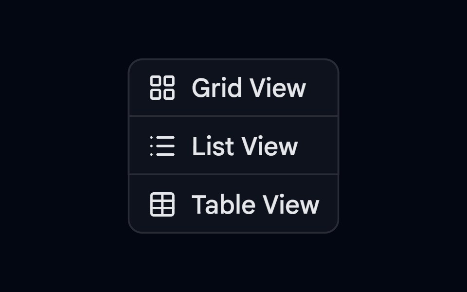 Button Group-02 - VerticalShadcn Space · ReactVertical button group component
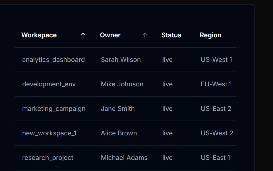 Table Action 02Tremor Blocks · React
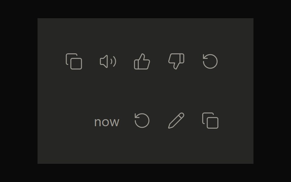 Claude ActionsNotra · ReactCopy, feedback and retry actions built on shadcn Button and Tooltip.
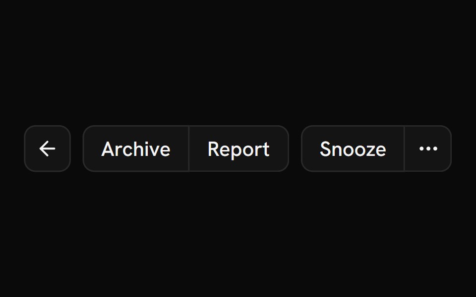 Button GroupShark UI · ReactGroup button elements together.
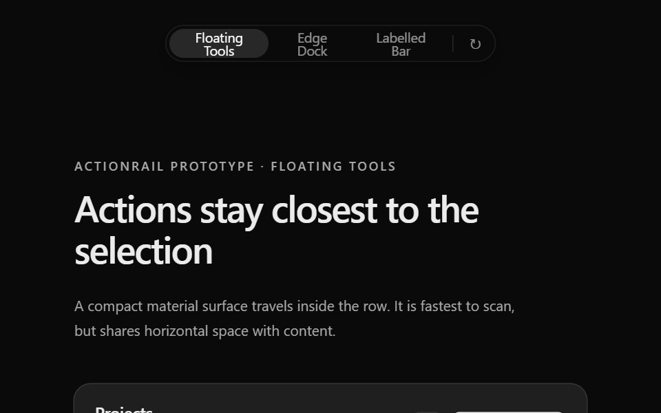 Prototype Action RailSona UI · React
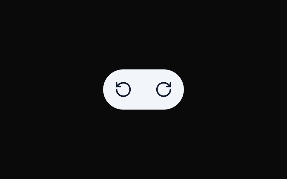 Button Group 10Watermelon UI · React
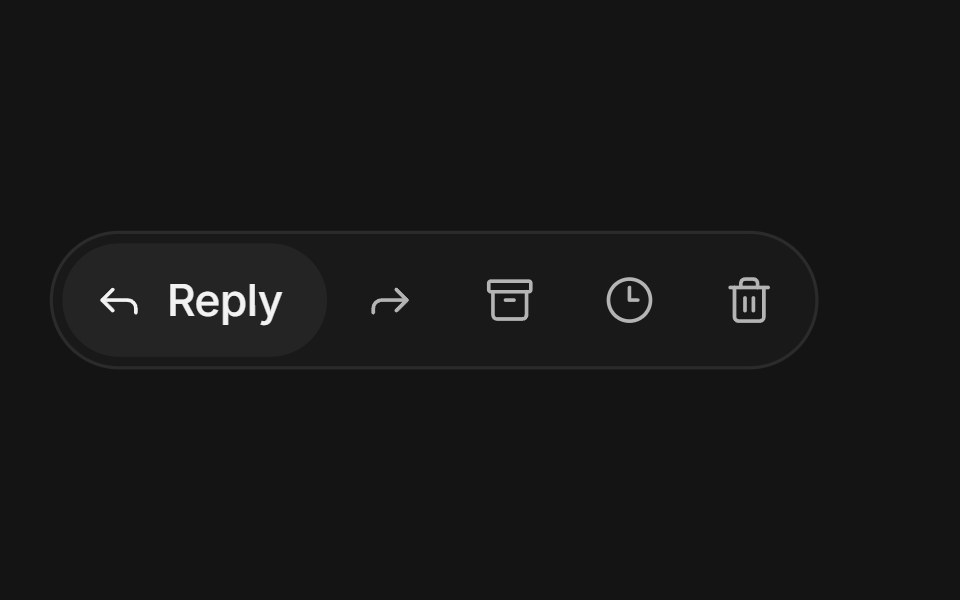 Expanding button groupArc Library · ReactIcon buttons in a compact group: the one you point at or focus grows to reveal its label while its neighbours slide…
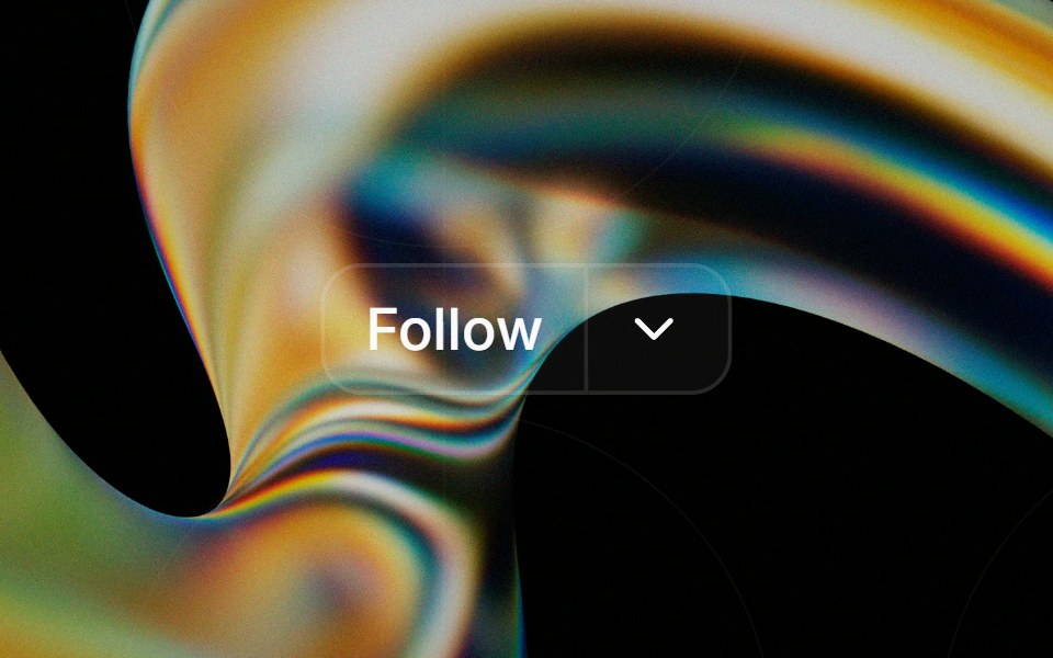 Button Groupglasscn · React
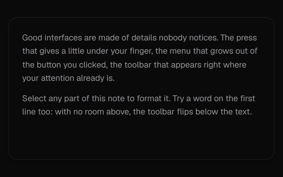 Selection ToolbarUI Lab · ReactA formatting toolbar that grows out of whatever text you select.
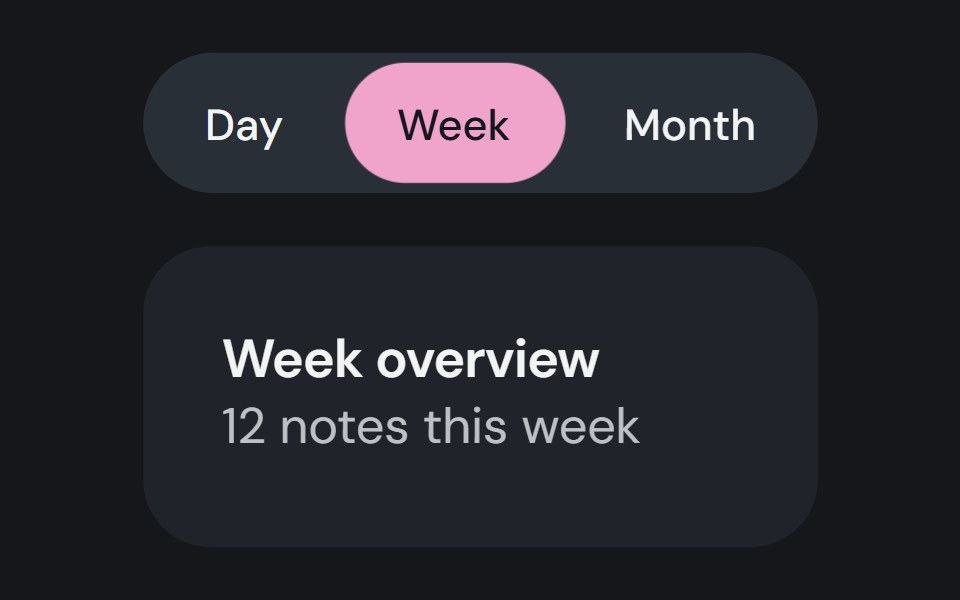 Button GroupCojeev UI · ReactPlaces related actions together and can track one selected button value.
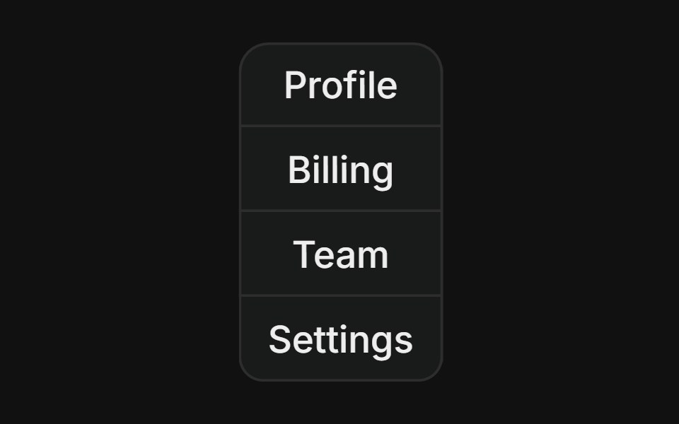 Vertical groupFLX UI · ReactStacked column of buttons with merged borders, used for vertical navigation menus.
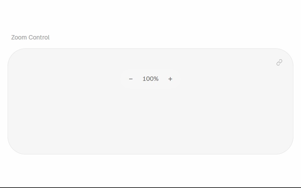 Zoom ControlHalaska UI · React
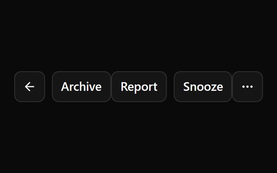 Base Button GroupReScript shadcn · ReScript
 Liquid Glass SocialSkecher UI · ReactA responsive social-link cluster with focused liquid-glass motion and clear interaction feedback.
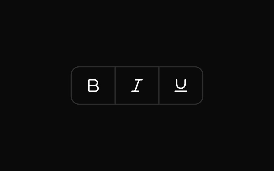 Toggle Button GroupOUI · ReactReact aria components Toggle Button Group with shadcn characteristics.
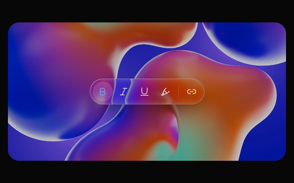 Glass ToolbarOpaline · ReactFloating capsule toolbar that groups icon actions.
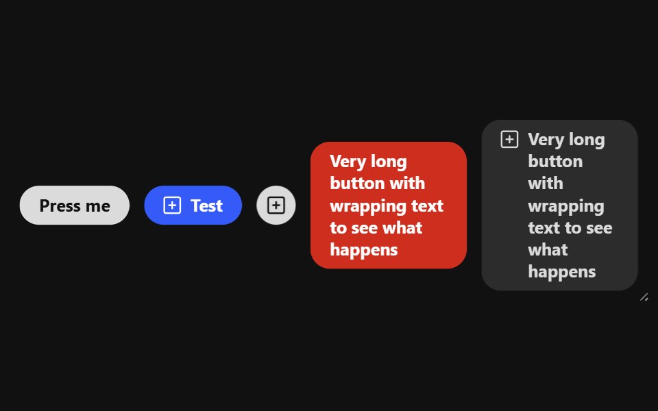 Button GroupReact Spectrum · ReactButtonGroup handles overflow for a grouping of buttons whose actions are related to each other.
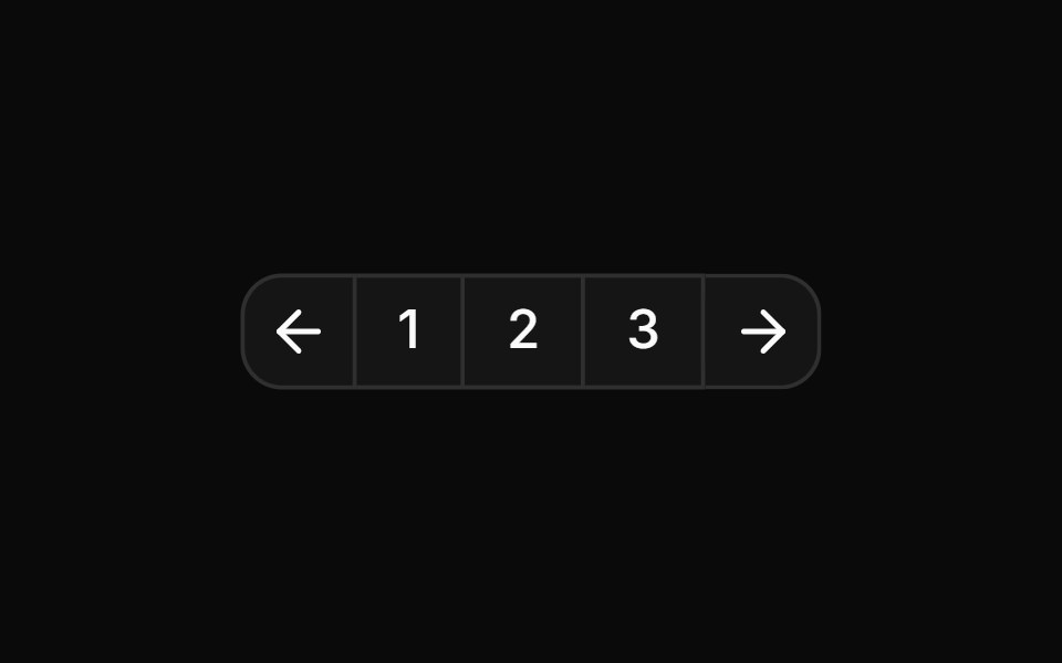 Pagination split into page numbers and navigation arrowsReUI · ReactPagination split into page numbers and navigation arrows
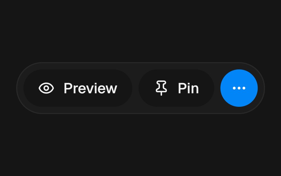 Overflow ActionsbeUI · ReactConnected pill rail for primary actions that springs open to reveal extra controls.
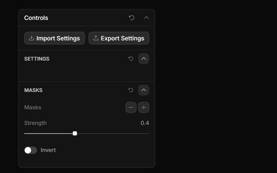 Collection Actions ControlToolcraft · React
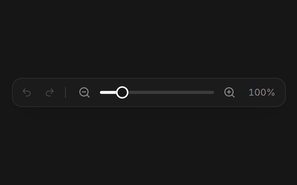 Web ToolbarPanel UI · React NativeAn editor toolbar with tools, undo, redo and zoom.
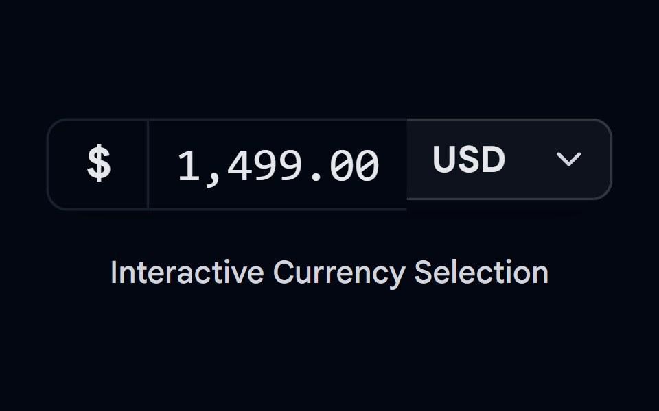 Button Group-05 - CurrencyShadcn Space · ReactCurrency style button group component
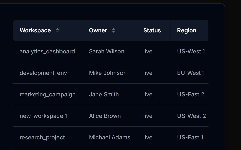 Table Action 03Tremor Blocks · React
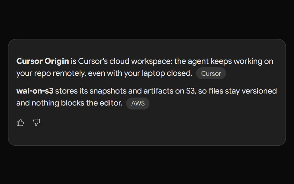 Gemini ActionsNotra · ReactFeedback, share, copy and more buttons built on shadcn Button and Tooltip.
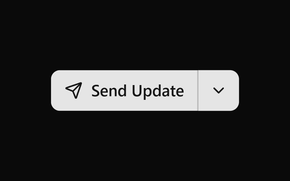 Button Group 11Watermelon UI · React
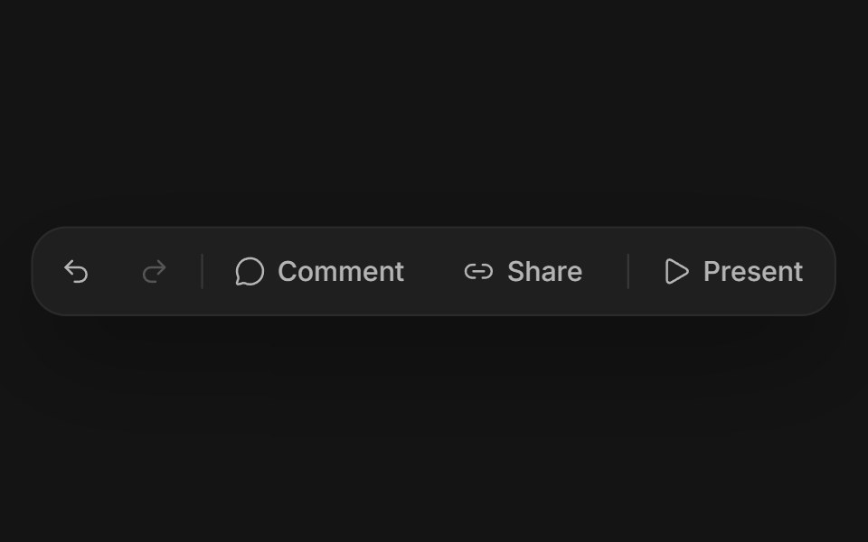 Floating button groupArc Library · ReactSeparate soft buttons in a quiet tray, with one shared highlight that morphs from button to button as you move, and a…
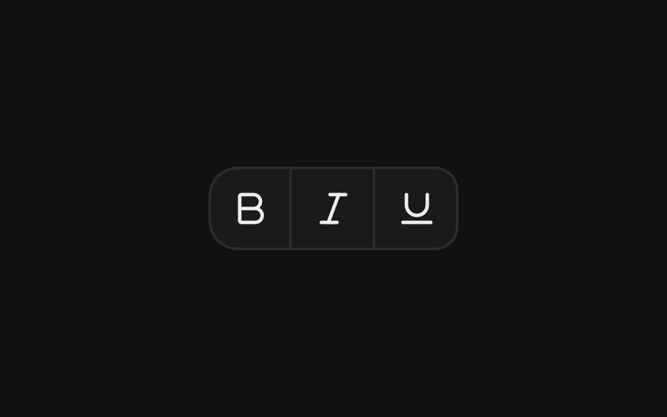 Icon toolbarFLX UI · ReactCompact toolbar of icon-only buttons with merged borders, used for text formatting actions.
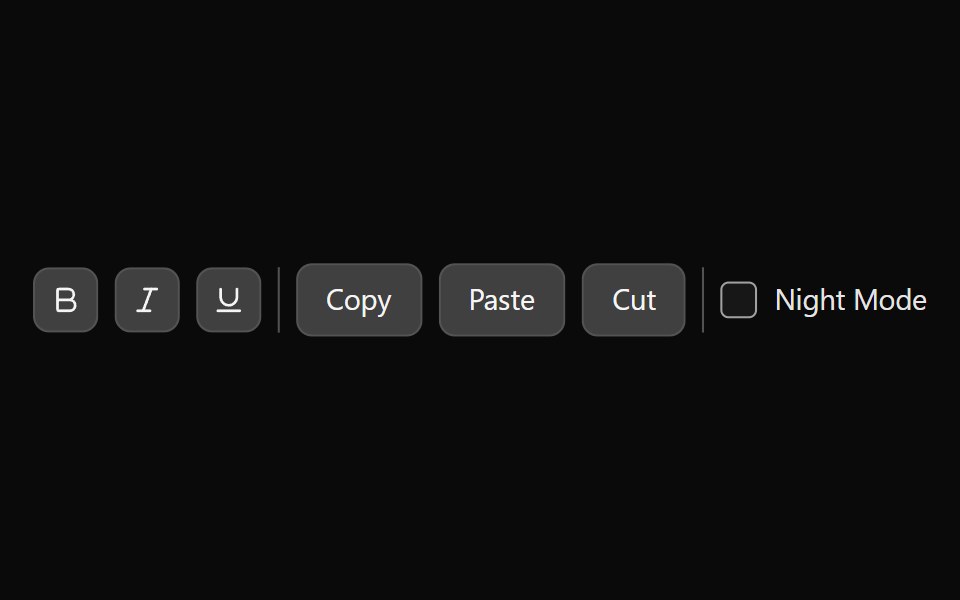 Tailwind ToolbarReact Spectrum · React
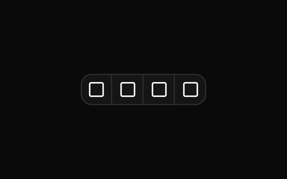 Button group for editor text alignment controlsReUI · ReactButton group for editor text alignment controls
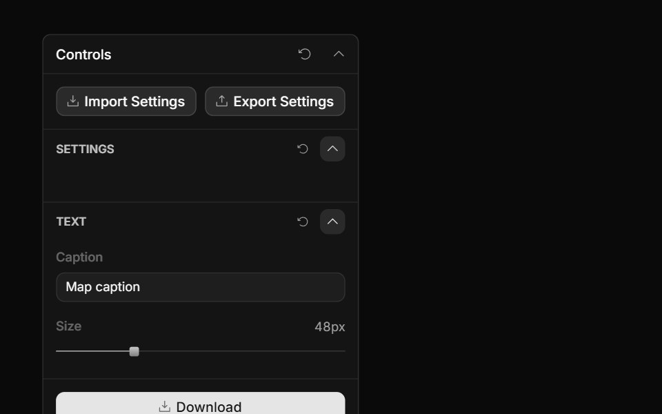 Panel ActionsToolcraft · React
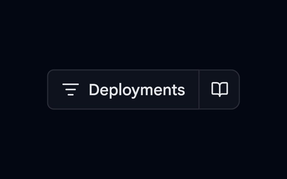 Button Group-06 - VercelShadcn Space · ReactVercel style button group component
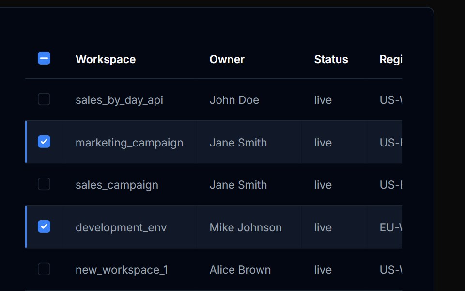 Table Action 04Tremor Blocks · React
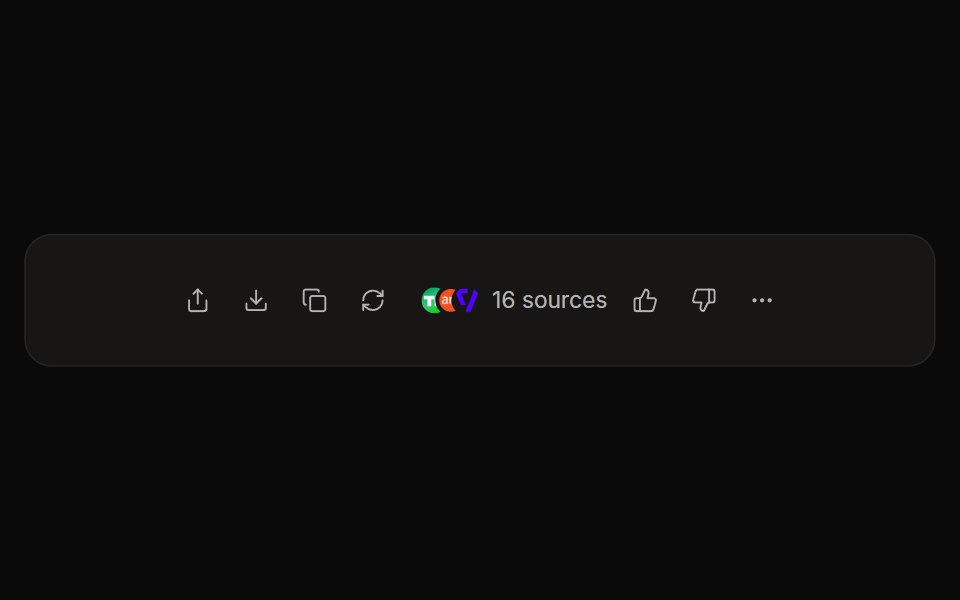 Perplexity ActionsNotra · ReactThe answer action bar with share, copy, rewrite, feedback and a sources button, built on shadcn Button and Tooltip.
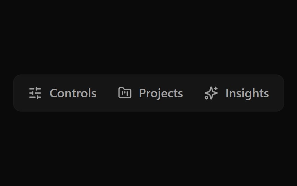 Button Group 12Watermelon UI · React
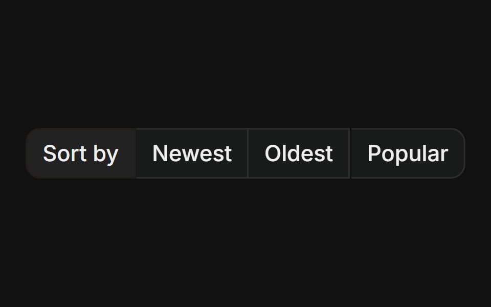 With label prefixFLX UI · ReactStatic text label leading a group of action buttons, useful for labelled sort or filter controls.
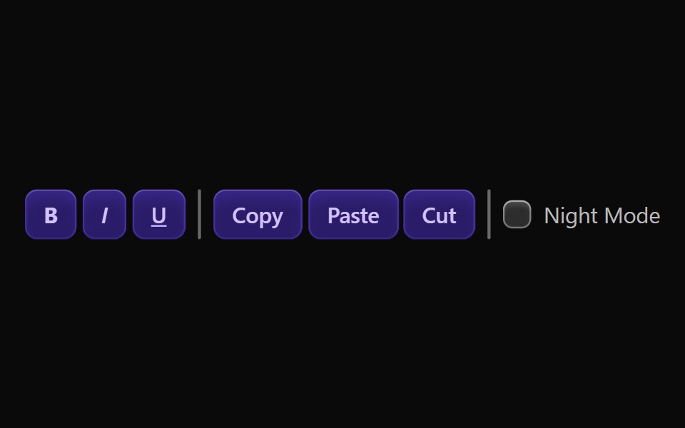 Vanilla ToolbarReact Spectrum · React
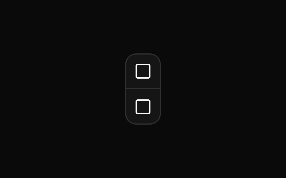 Vertical button group orientationReUI · ReactVertical button group orientation
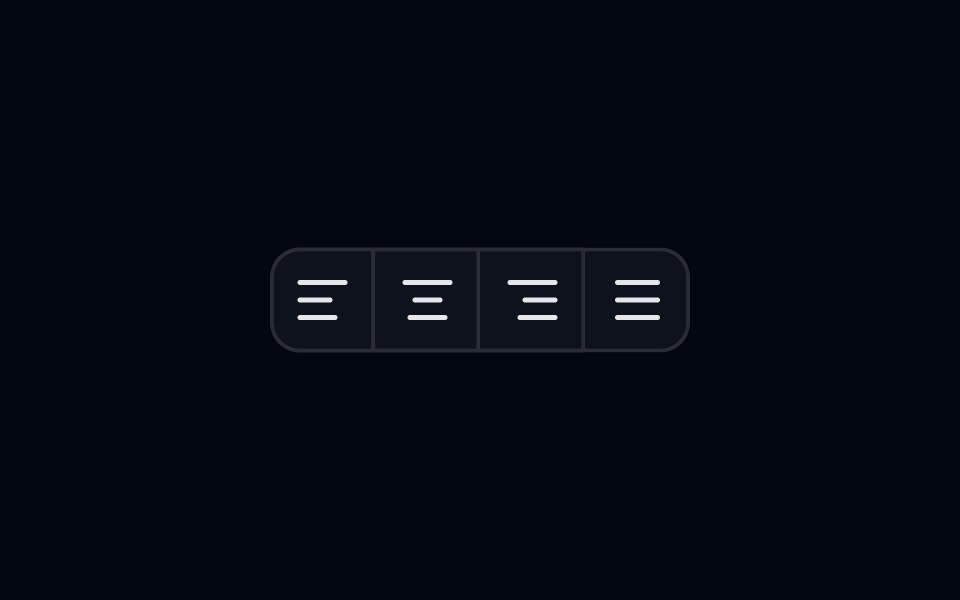 Button Group 07 - AlignmentShadcn Space · ReactAlignment style button group component
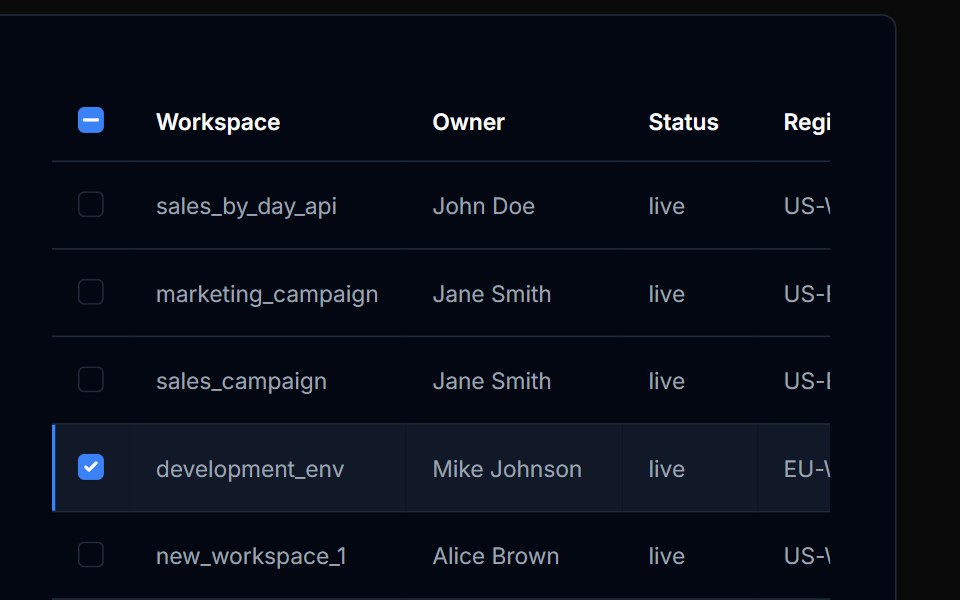 Table Action 05Tremor Blocks · React
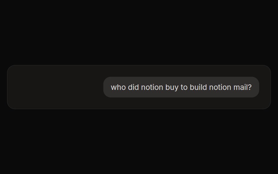 Perplexity User ActionsNotra · ReactThe time, edit and copy controls beside a user message.
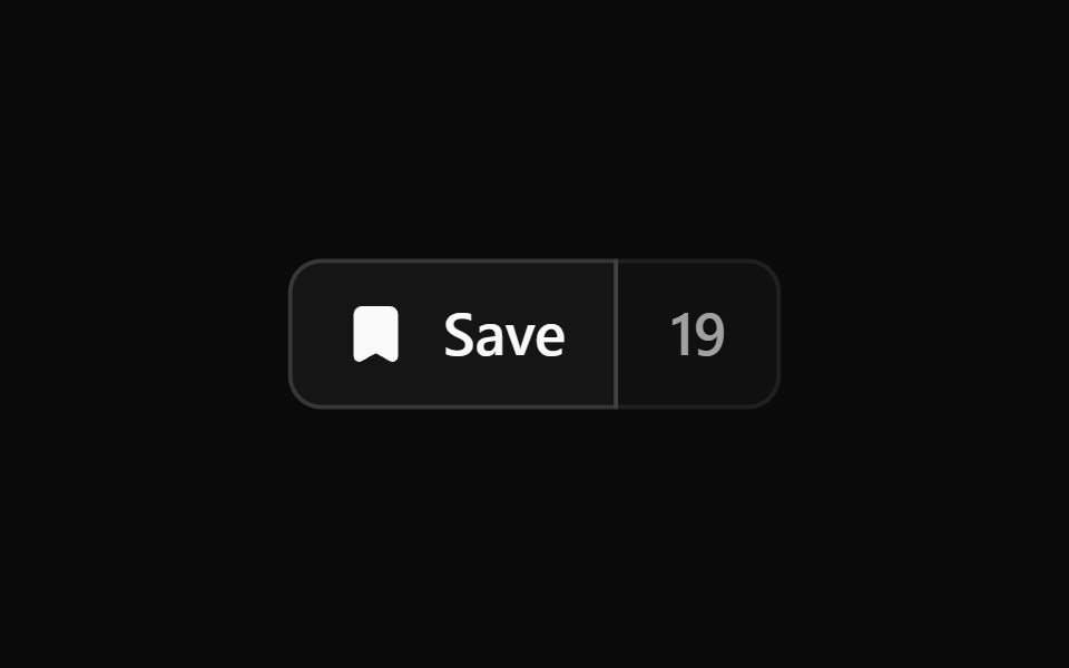 Button Group 2Watermelon UI · React
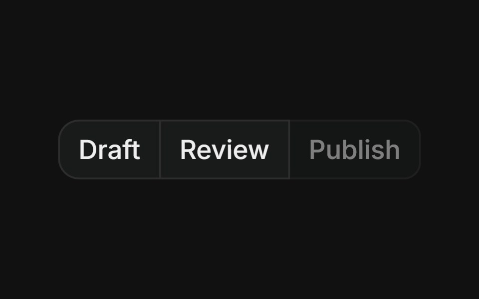 Group with disabledFLX UI · ReactMerged-border button row where one step is visually disabled and non-interactive.
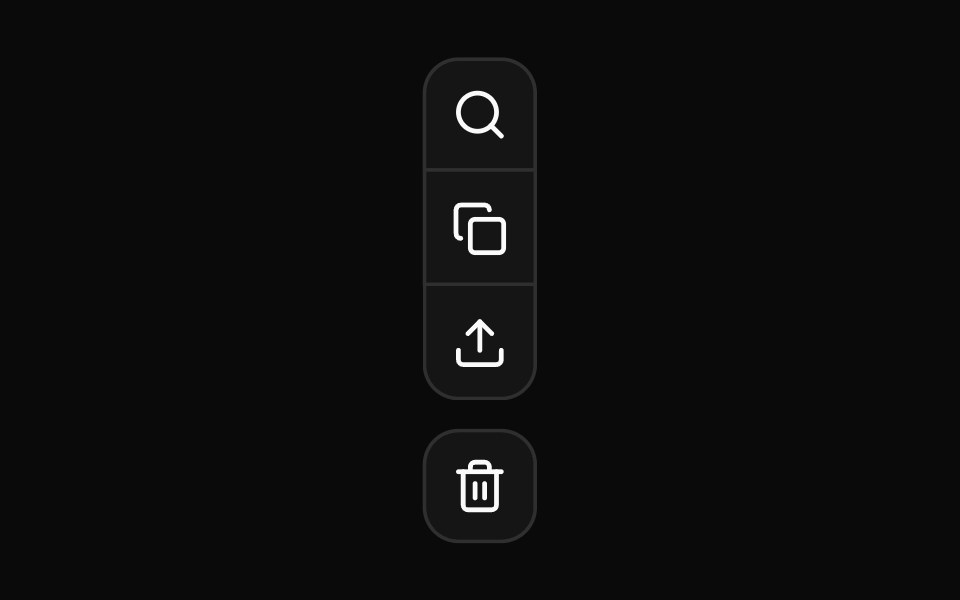 Nested vertical button group for complex tool palettesReUI · ReactNested vertical button group for complex tool palettes
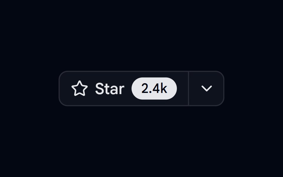 Button Group 08 - Github star barShadcn Space · ReactGithub star bar style button group component
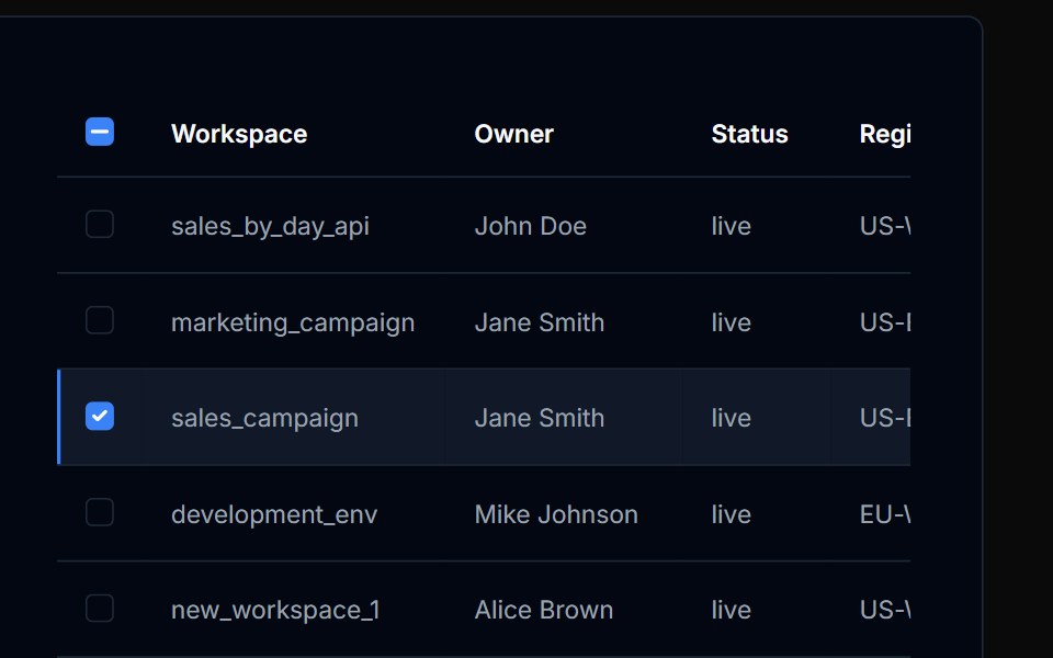 Table Action 06Tremor Blocks · React
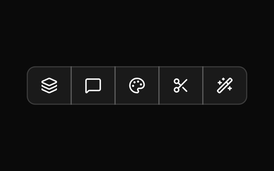 Button Group 3Watermelon UI · React
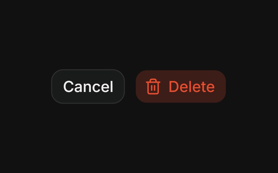 Destructive pairFLX UI · ReactCancel + Delete spaced action pair.
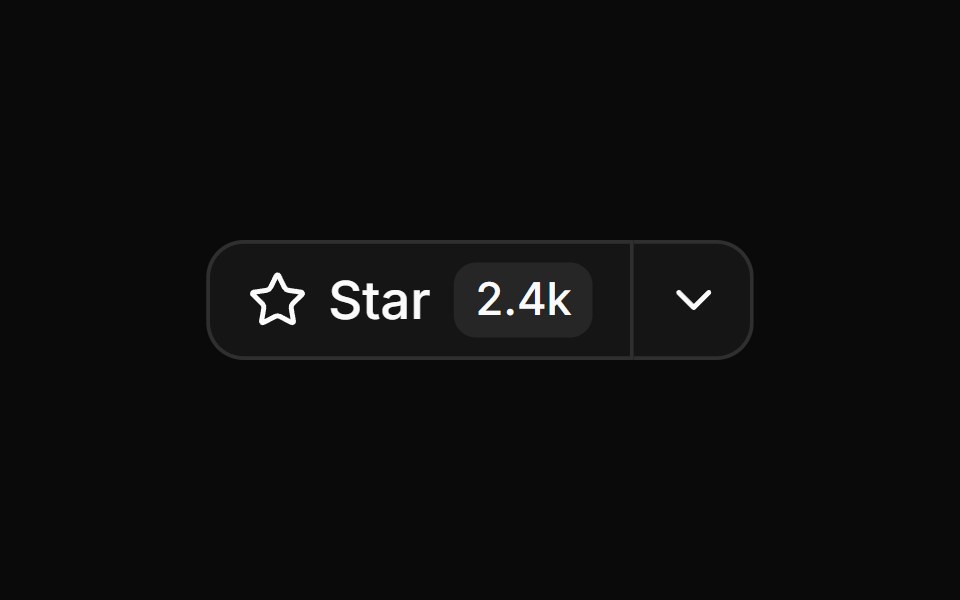 Star button group with count and dropdownReUI · ReactStar button group with count and dropdown
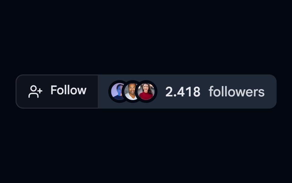 Button Group 09 - FollowShadcn Space · ReactFollow style button group component
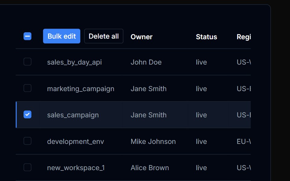 Table Action 07Tremor Blocks · React
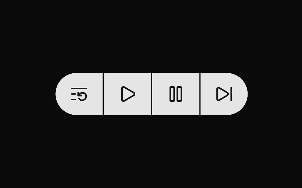 Button Group 4Watermelon UI · React
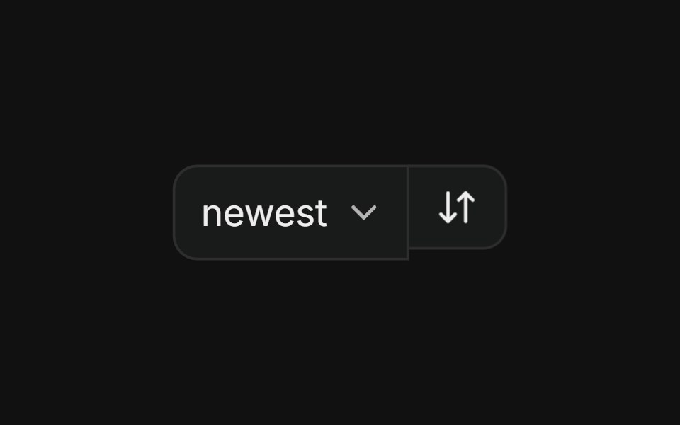 With selectFLX UI · ReactSort dropdown paired with a direction-toggle icon button in a merged-border row.
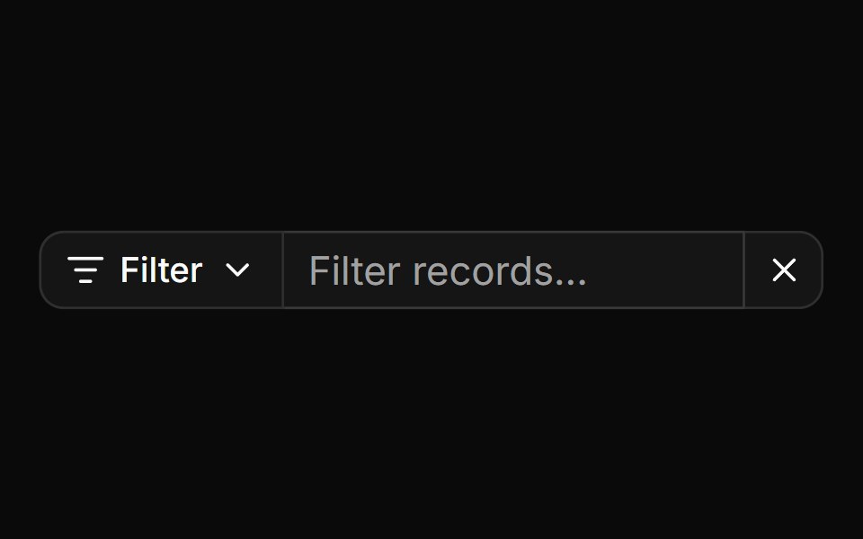 Search input with filter menu and clear buttonReUI · ReactSearch input with filter menu and clear button
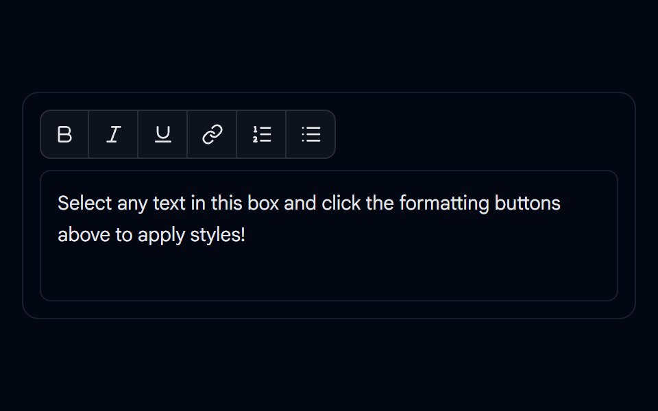 Button Group 10 - Editor ToolbarShadcn Space · ReactRich-text formatting toolbar button group component
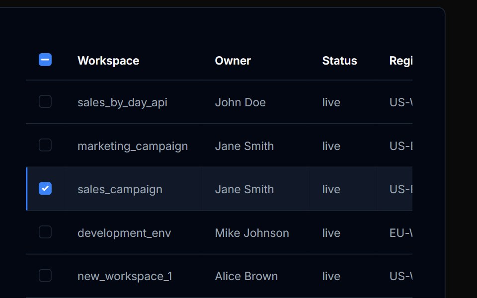 Table Action 08Tremor Blocks · React
Libraries with React button group components
Related categories
- Button Group Components
- Tailwind CSS Button Group Components
- Animated Button Group Components
- shadcn/ui Button Group Components
- React Action Components
- React Button Components
- React Toggle Button Components
- React Icon Button Components
- React Theme Toggle Components
- React Link Components
- React Copy Button Components
- React CTA Button Components
- React Like Button Components
- React FAB Components
- React Share Button Components
- React Slide To Confirm Components
- React Social Login Button Components
- React Download Button Components
- React Hold Button Components
- React Submit Button Components