 Dev Design Library
Tailwind CSS CTA Button Components
Dev Design Library indexes 51 Tailwind CSS cta button components from 21 open-source UI libraries, with the most coming from MicroKit, Oxbow UI, Watermelon UI, FLX UI and cnblocks. Each one links to its page with the source code, a live preview where available, the library license and the install command. Every library in this list styles its components with Tailwind CSS utility classes. Cta button components belong to the Actions group.
 Button SubscribeAmicro Micro Transitions · React
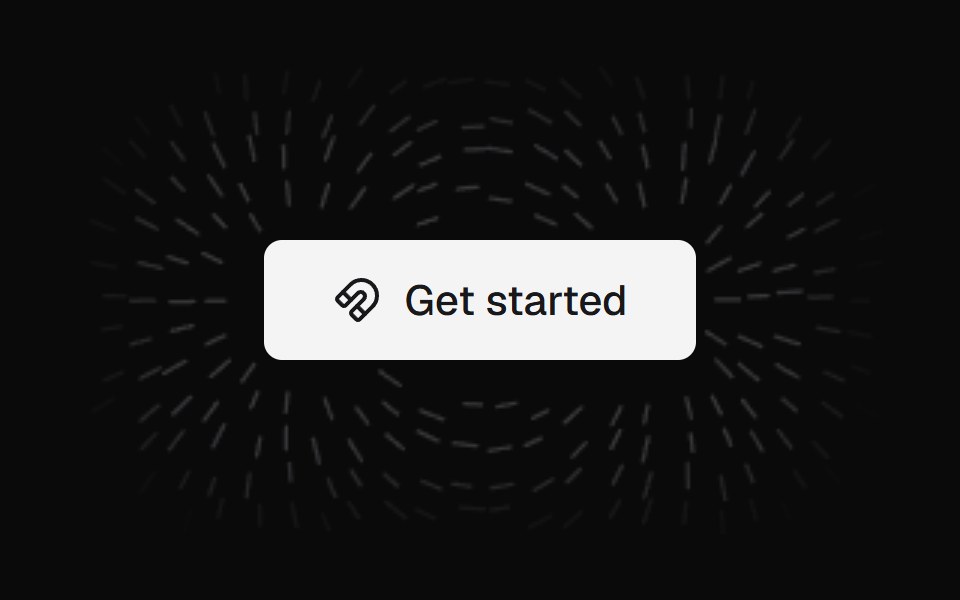 Magnet ButtonKokonut UI · ReactA call-to-action button wrapped in a field of iron filings that align to its magnetic field and lean toward your cursor.
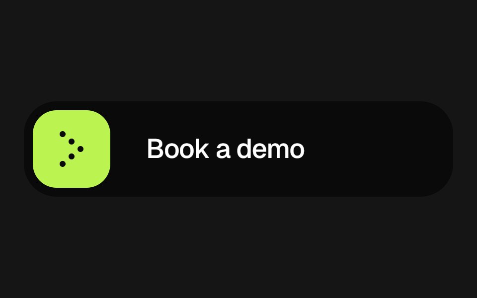 Expanding Arrow ButtonbeUI · React
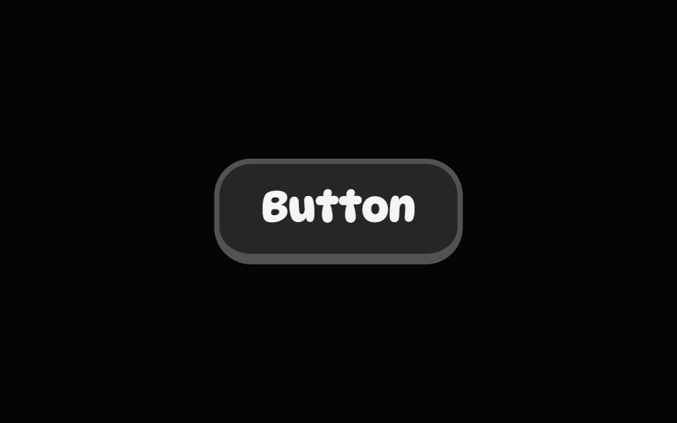 Pop ButtonSpell UI · ReactA playful 3D-style button with push-down animation effect.
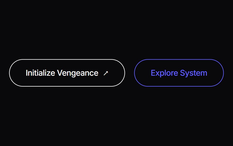 Liquid ButtonVengeance UI · ReactLiving organic fluid ink button with cursor displacement tracking and tactile shockwave recoil
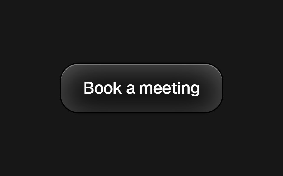 Framer Cta ButtonPixel Perfect · ReactFramer-style CTA pill button with brand icon and dark/light variants.
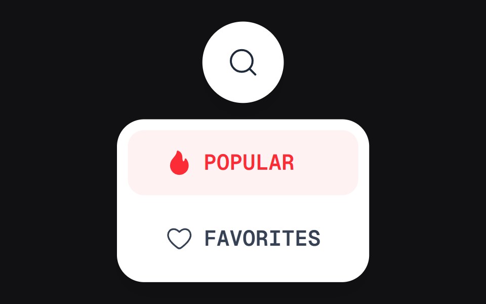 Discover Buttonuselayouts · ReactAn interactive button with expanding discovery state.
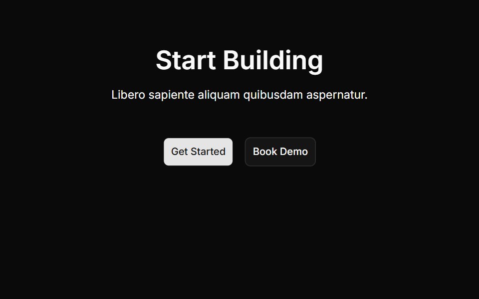 Cta Onecnblocks · SvelteCall-to-action block with centered heading and buttons
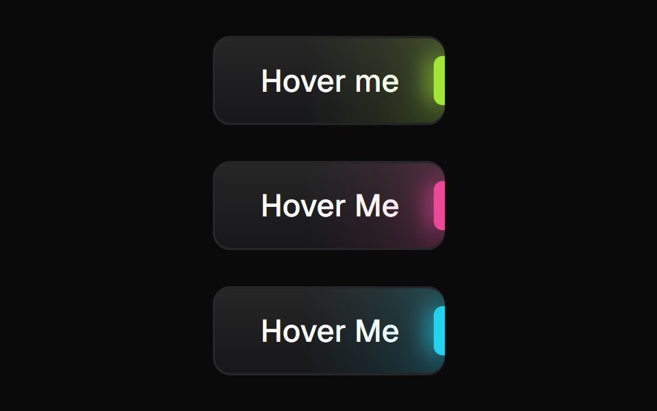 Glowing ButtonBadtz UI · ReactA visually distinct button component featuring a configurable, animated glow effect to highlight calls to action or…
 Interactive Hover ButtonObsidianUI · React
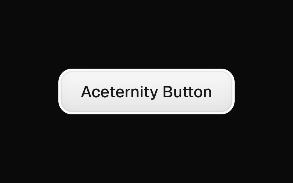 Aceternity ButtonGreatUI · React
 Cta 01Oxbow UI · AstroCentered CTA with logo, image and text
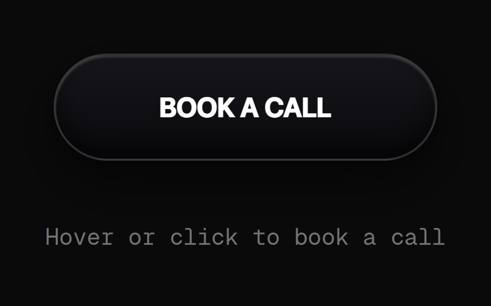 Book A Call ButtonRewamp UI · React
 ClickPowerUpEvil Buttons · ReactA bracketed button that arms on hover and powers up with an accent flash and bracket burst on every click.
 Cta 1Watermelon UI · React
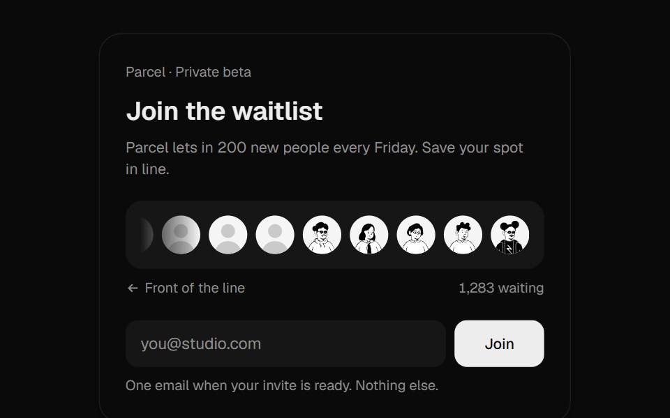 Waitlist JoinUI Lab · ReactDrops your face into a real queue and rolls out your place in line.
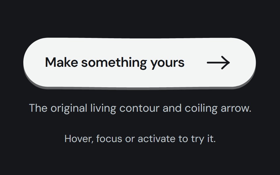 Hero buttonCojeev UI · ReactTwelve tactile calls to action: living ink, paper, keys, tickets and small moments of motion around one native button.
 Circle Surface ButtonMicroKit · ReactA circular CTA whose dark surface expands into an orange fill.
 Hover slide arrowFLX UI · ReactCTA arrow nudges right on hover.
 Get Startedsv-particles · Svelte
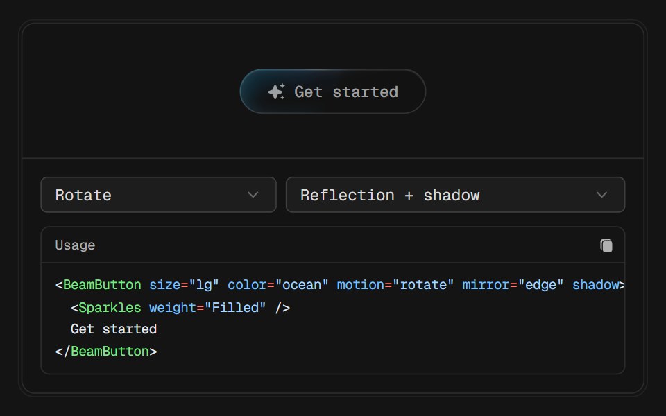 Beam ButtonD2Studio UI · ReactA glass pill with a beam travelling along its lower edge. The chip under it is deliberately quiet, one tinted plate…
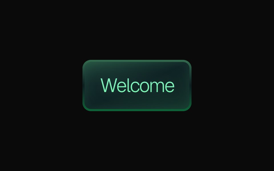 Gradient ButtonKokonut UI · ReactLayered gradient button with emerald, purple and orange variants, a gradient border, a soft inner glow, press feedback…
 Get In Touchuselayouts · ReactA glossy contact pill. Hover and the label lifts away so a portrait and YOU merge, then Let’s Talk! writes in.
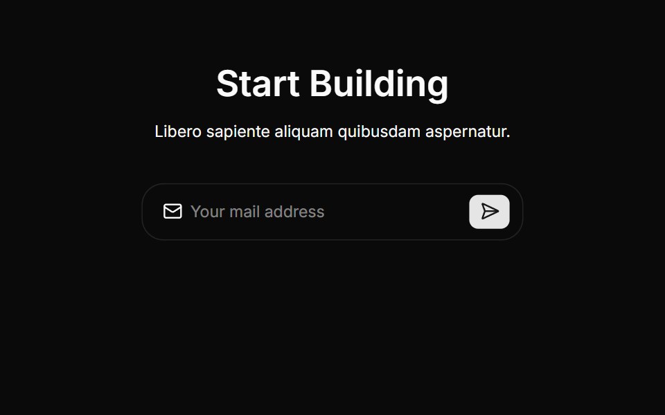 Cta Threecnblocks · SvelteCTA section with background gradient
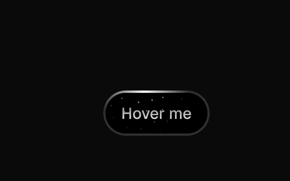 Star ButtonBadtz UI · ReactThe StarButton is a visually striking button that features a radial light animation with a starry background.
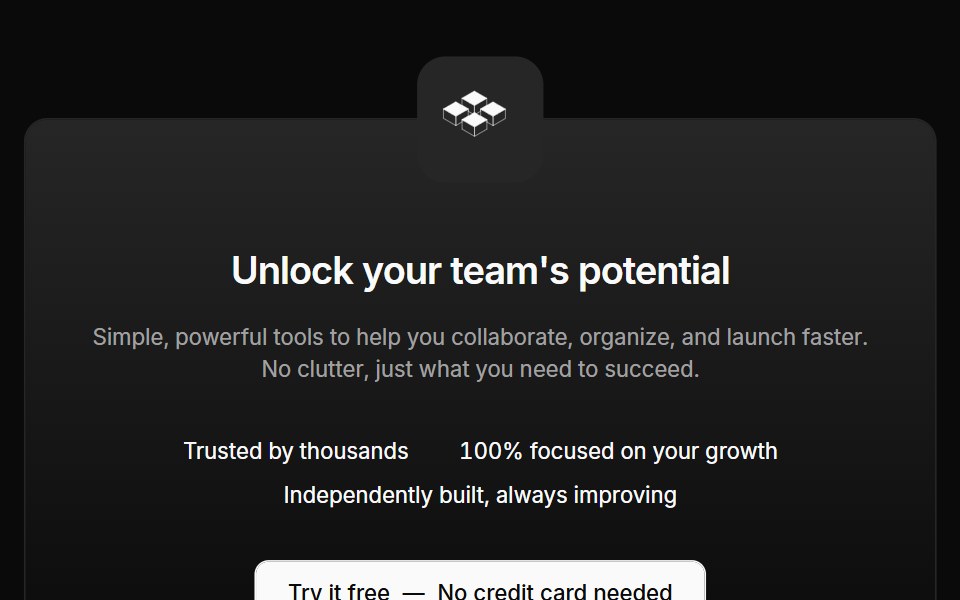 Cta 02Oxbow UI · AstroCentered CTA with logo and text
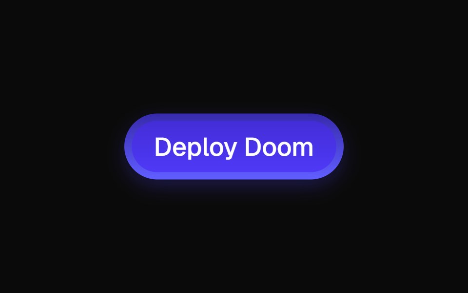 ShinyButtonEvil Buttons · ReactA glossy, gradient-styled button with a layered inner glow and a glint that sweeps across on every click.
 Cta 2Watermelon UI · React
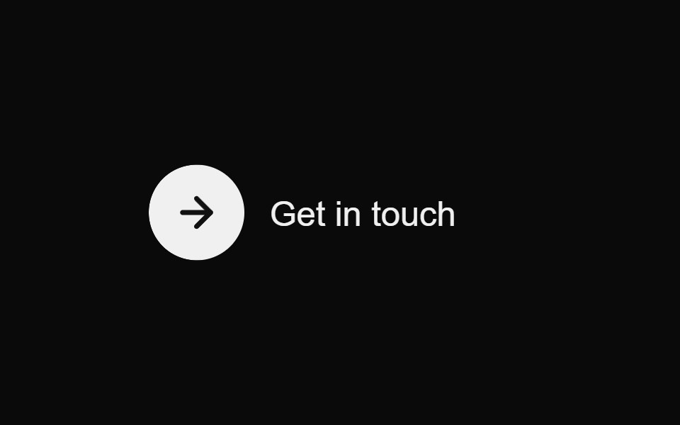 Contact Reveal ButtonMicroKit · ReactA circular arrow and label that resolve into a polished contact pill on hover.
 Image overlayFLX UI · ReactText and a CTA over a gradient-darkened cover image.
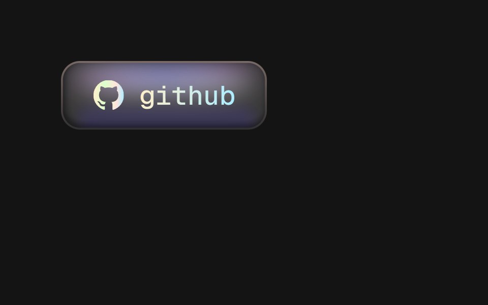 Matte ButtonD2Studio UI · ReactA matte chip button with a holographic rim: three blurred glows pinned under the top edge, a bounce light along the…
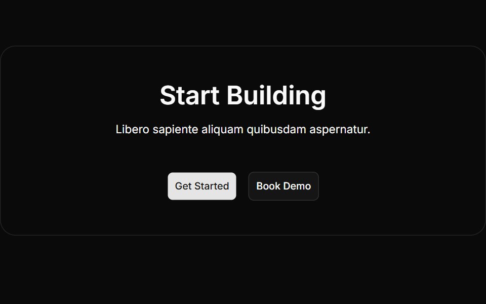 Cta Twocnblocks · SvelteTwo-column CTA with text and action buttons
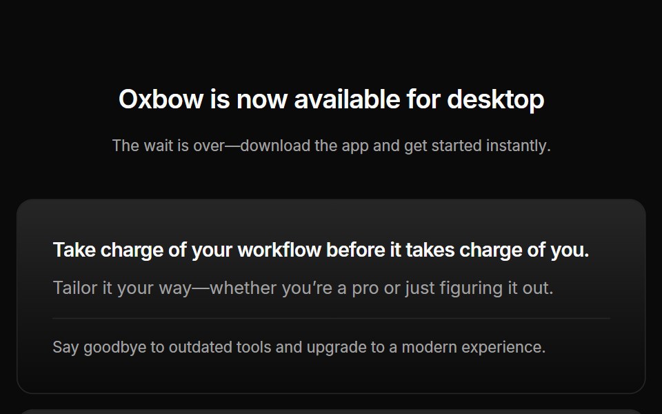 Cta 03Oxbow UI · AstroCentered CTA with download buttons
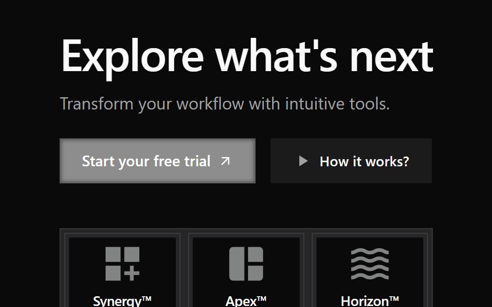 Cta 3Watermelon UI · React
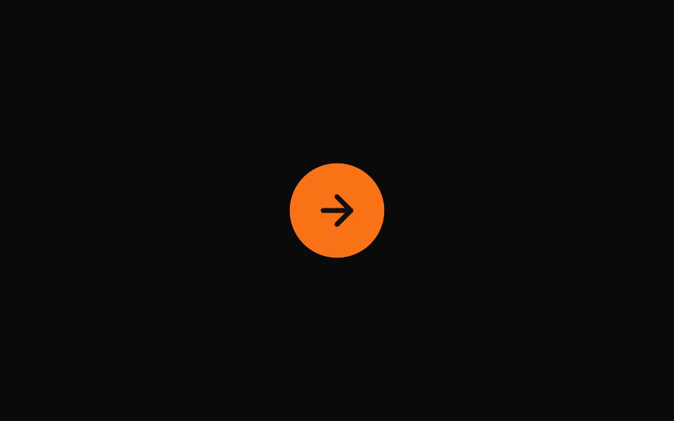 Expanding Contact ButtonMicroKit · ReactA pill-shaped call-to-action with an expanding background and arrow icon, adapted from the supplied Webflow export.
 CTA (Call to Action)FLX UI · ReactShared CTA component with link and button variant
 Logocloud Twocnblocks · SvelteInteractive logo cloud with hover call-to-action
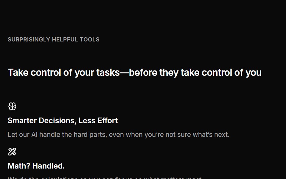 Cta 04Oxbow UI · AstroCentered CTA with grid banner
 Cta 4Watermelon UI · React
 Expanding Newsletter ButtonMicroKit · ReactAn orange newsletter pill with a growing dark circle and an arrow that slides in from the left.
 Call to Action 01FLX UI · ReactA centered text block with a title, description, and CTA.
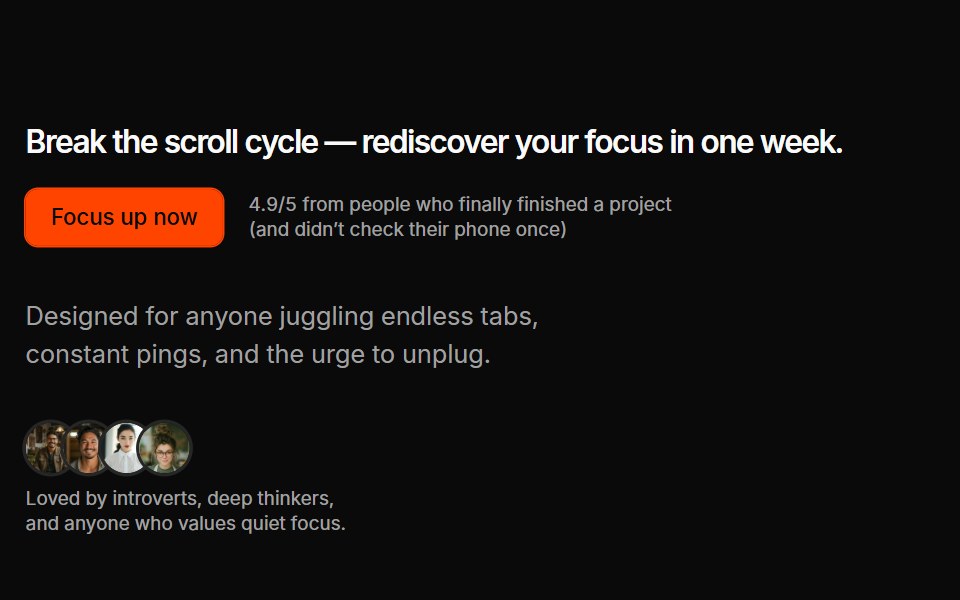 Cta 07Oxbow UI · AstroSplit CTA with custom avatars
 Cta 5Watermelon UI · React
 Get Started Circle SwapMicroKit · ReactA bordered CTA whose orange circle exits right as a directional arrow slides into place.
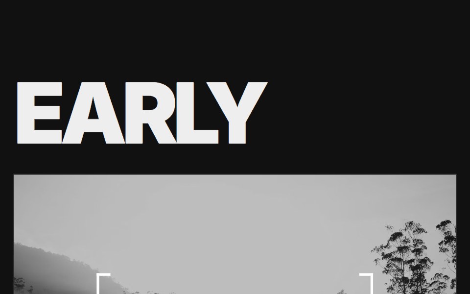 Call to Action 02FLX UI · ReactAn oversized two-word headline split around a full-bleed photo, with a bracketed call to action at its center.
 Cta 05Oxbow UI · Astro
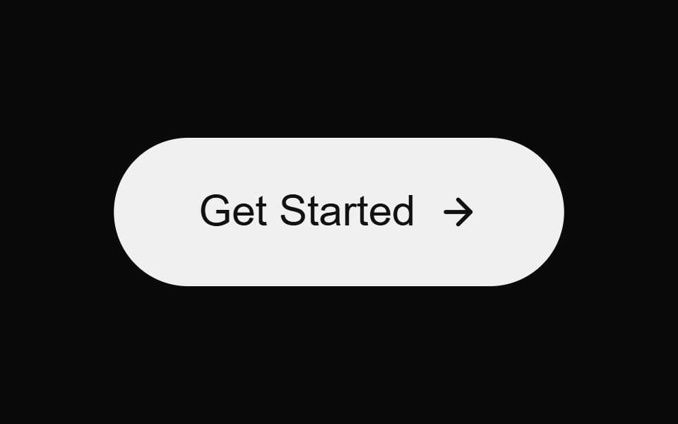 Glow Arrow ButtonMicroKit · ReactA bright CTA with a soft glow and a moving arrow on hover.
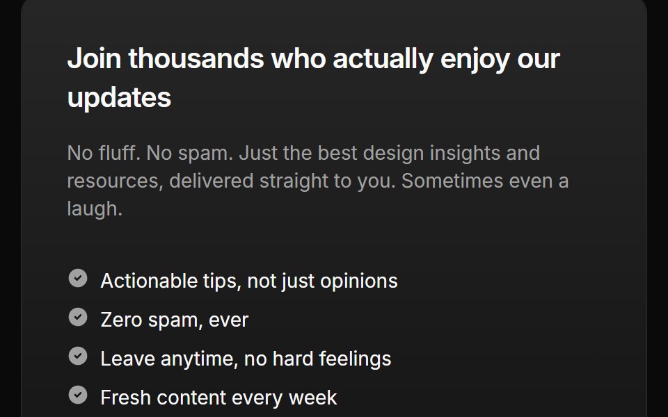 Cta 06Oxbow UI · Astro
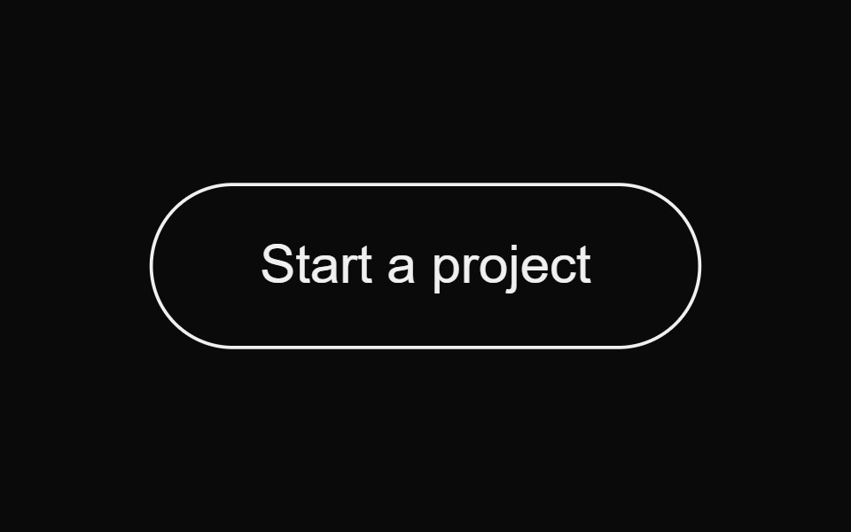 Magnetic Fill ButtonMicroKit · ReactA magnetic pill button with a bottom-to-top background fill.
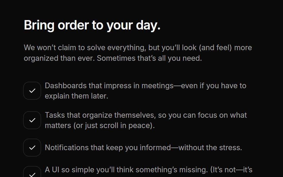 Cta 08Oxbow UI · Astro
 Neon Invert ButtonMicroKit · ReactA bold orange CTA that inverts into a dark, softly glowing surface on hover.
Libraries with Tailwind CSS cta button components
Related categories
- CTA Button Components
- React CTA Button Components
- Animated CTA Button Components
- shadcn/ui CTA Button Components
- Tailwind CSS Action Components
- Tailwind CSS Button Components
- Tailwind CSS Button Group Components
- Tailwind CSS Toggle Button Components
- Tailwind CSS Icon Button Components
- Tailwind CSS Link Components
- Tailwind CSS Copy Button Components
- Tailwind CSS Theme Toggle Components
- Tailwind CSS Like Button Components
- Tailwind CSS Social Login Button Components
- Tailwind CSS FAB Components
- Tailwind CSS Download Button Components
- Tailwind CSS Slide To Confirm Components
- Tailwind CSS Hold Button Components
- Tailwind CSS Submit Button Components
- Tailwind CSS Send Button Components