 Dev Design Library
CTA Button Components
Dev Design Library indexes 54 cta button components from 23 open-source UI libraries, with the most coming from MicroKit, Oxbow UI, Watermelon UI, FLX UI and cnblocks. Each one links to its page with the source code, a live preview where available, the library license and the install command. Cta button components belong to the Actions group.
 Get Pro Buttontransitions.dev · HTML/CSS
 Button SubscribeAmicro Micro Transitions · React
 Awesome Bottom Gradient ButtonLobe UI · React
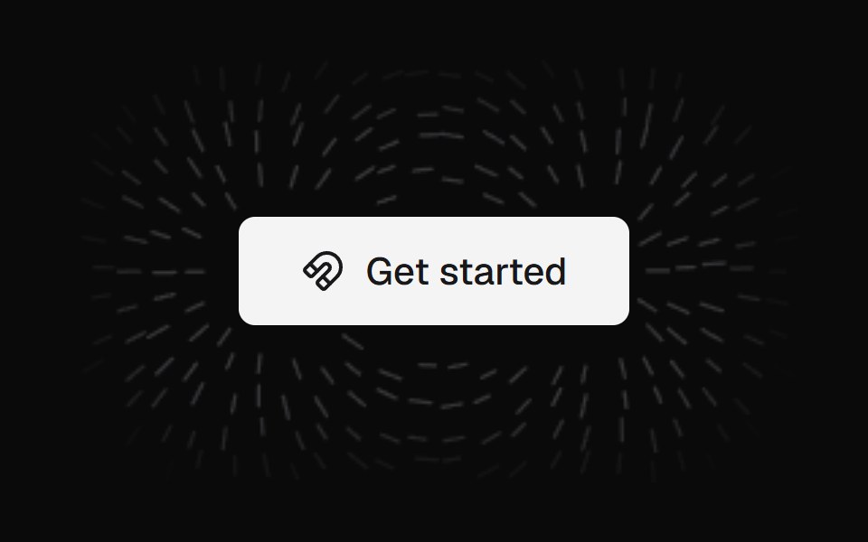 Magnet ButtonKokonut UI · ReactA call-to-action button wrapped in a field of iron filings that align to its magnetic field and lean toward your cursor.
 Expanding Arrow ButtonbeUI · React
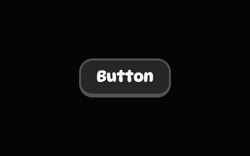 Pop ButtonSpell UI · ReactA playful 3D-style button with push-down animation effect.
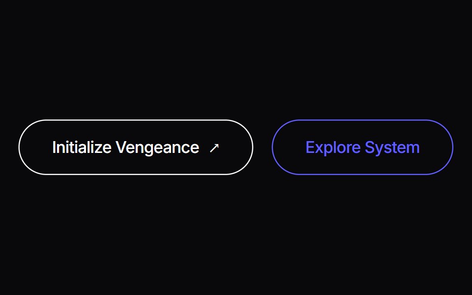 Liquid ButtonVengeance UI · ReactLiving organic fluid ink button with cursor displacement tracking and tactile shockwave recoil
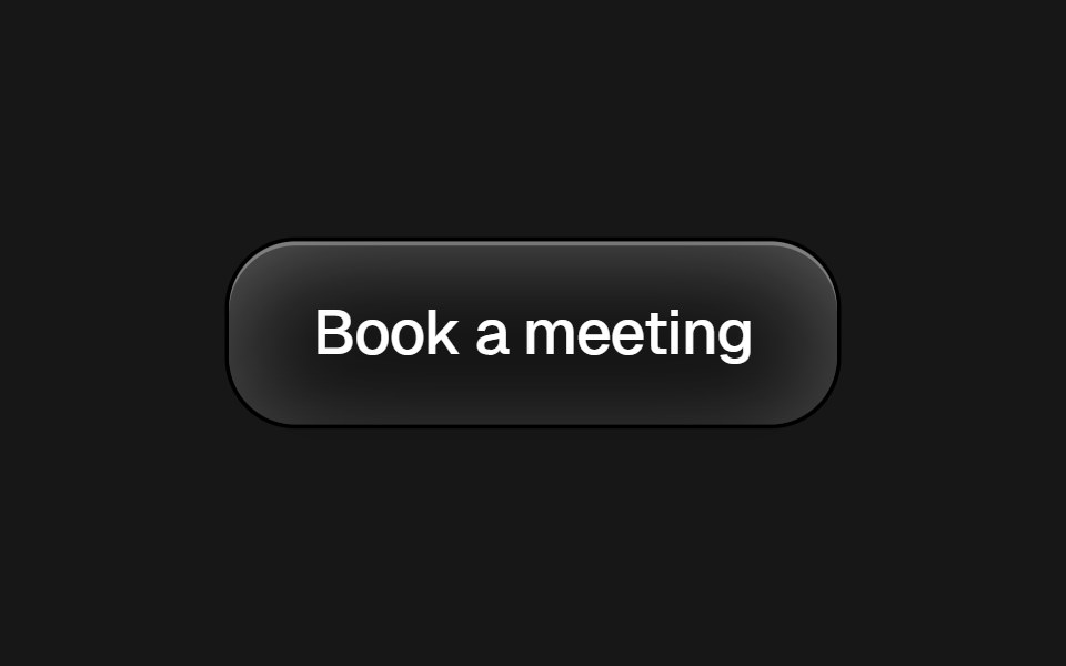 Framer Cta ButtonPixel Perfect · ReactFramer-style CTA pill button with brand icon and dark/light variants.
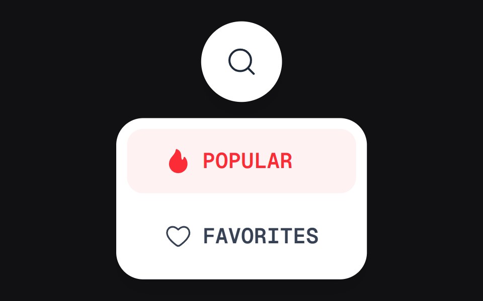 Discover Buttonuselayouts · ReactAn interactive button with expanding discovery state.
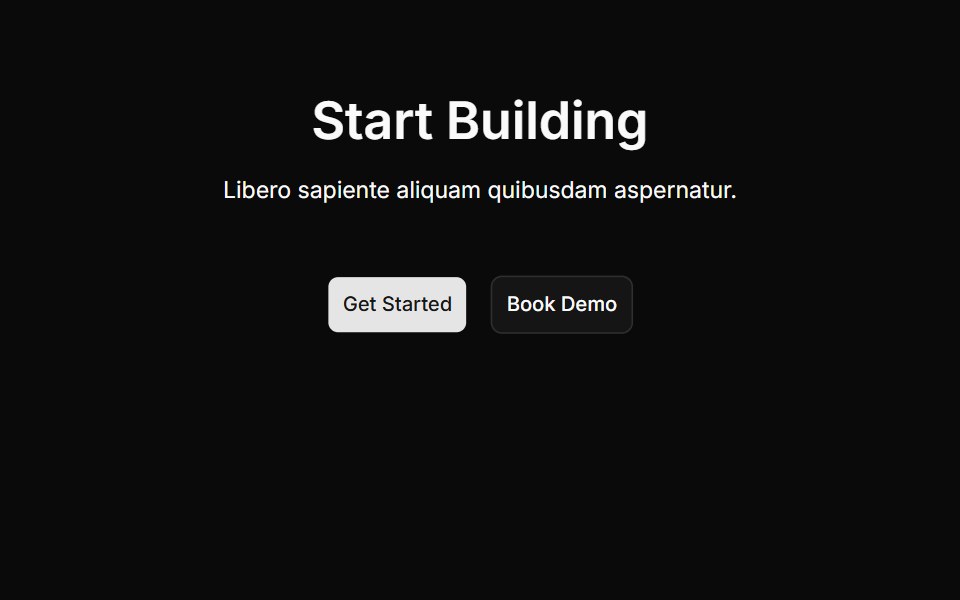 Cta Onecnblocks · SvelteCall-to-action block with centered heading and buttons
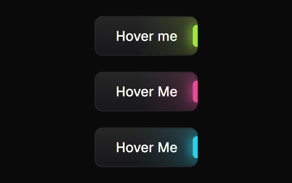 Glowing ButtonBadtz UI · ReactA visually distinct button component featuring a configurable, animated glow effect to highlight calls to action or…
 Interactive Hover ButtonObsidianUI · React
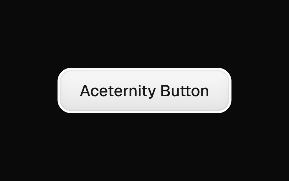 Aceternity ButtonGreatUI · React
 Cta 01Oxbow UI · AstroCentered CTA with logo, image and text
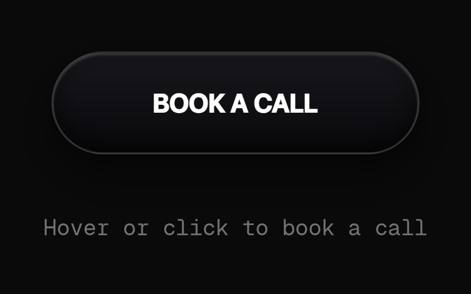 Book A Call ButtonRewamp UI · React
 ClickPowerUpEvil Buttons · ReactA bracketed button that arms on hover and powers up with an accent flash and bracket burst on every click.
 Cta 1Watermelon UI · React
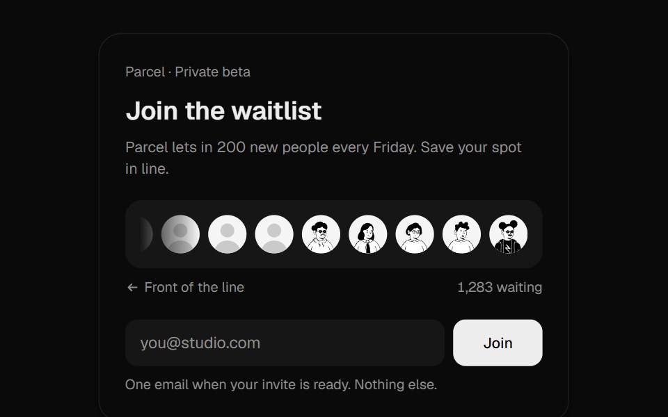 Waitlist JoinUI Lab · ReactDrops your face into a real queue and rolls out your place in line.
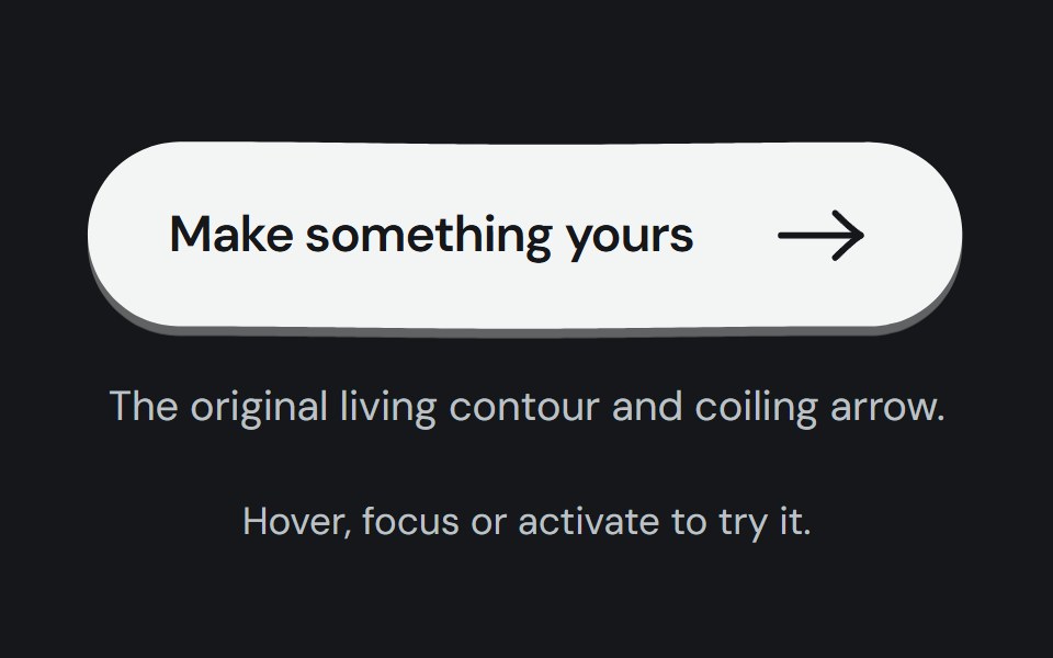 Hero buttonCojeev UI · ReactTwelve tactile calls to action: living ink, paper, keys, tickets and small moments of motion around one native button.
 Circle Surface ButtonMicroKit · ReactA circular CTA whose dark surface expands into an orange fill.
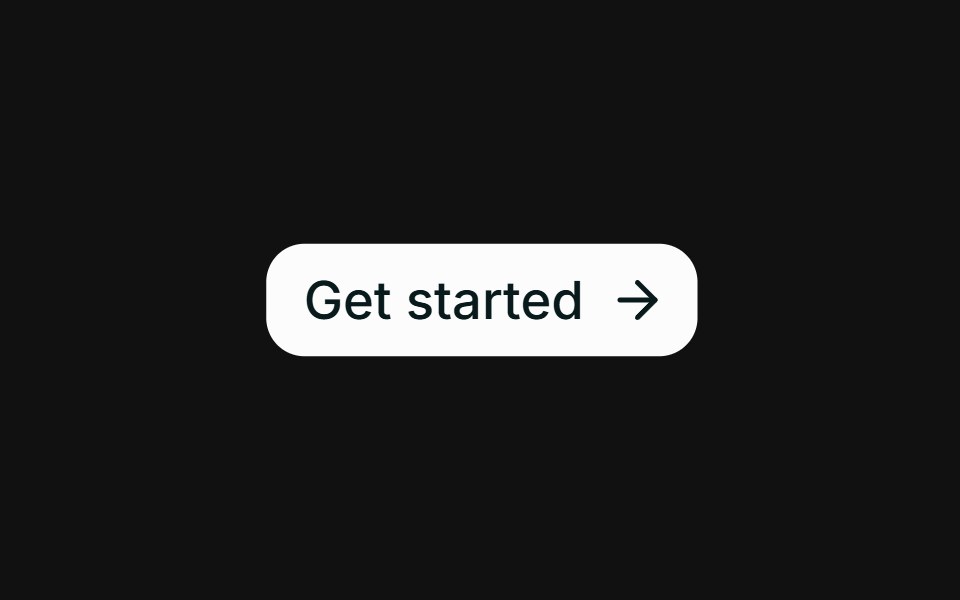 Hover slide arrowFLX UI · ReactCTA arrow nudges right on hover.
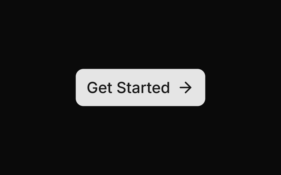 Get Startedsv-particles · Svelte
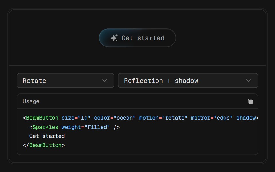 Beam ButtonD2Studio UI · ReactA glass pill with a beam travelling along its lower edge. The chip under it is deliberately quiet, one tinted plate…
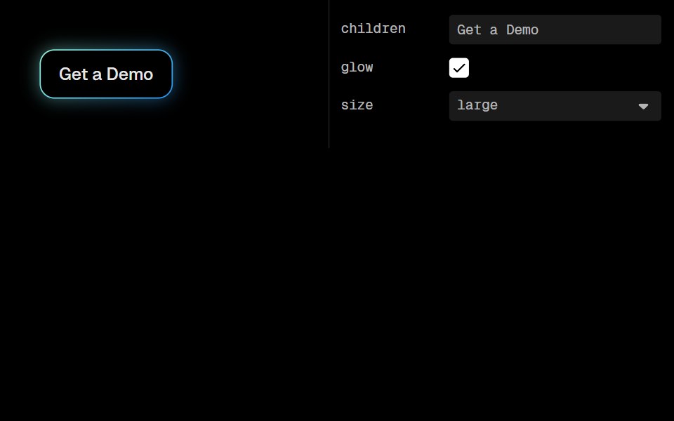 Awesome Gradient ButtonLobe UI · React
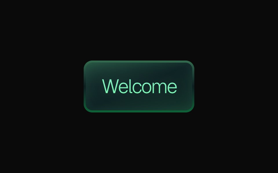 Gradient ButtonKokonut UI · ReactLayered gradient button with emerald, purple and orange variants, a gradient border, a soft inner glow, press feedback…
 Get In Touchuselayouts · ReactA glossy contact pill. Hover and the label lifts away so a portrait and YOU merge, then Let’s Talk! writes in.
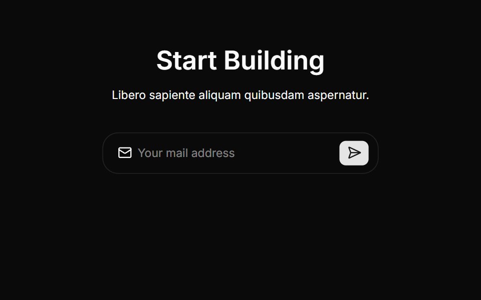 Cta Threecnblocks · SvelteCTA section with background gradient
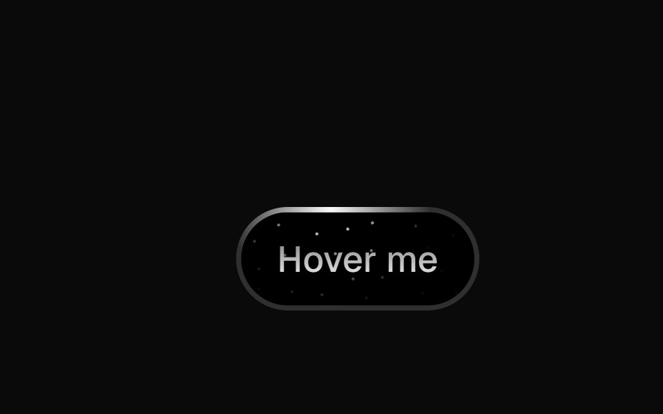 Star ButtonBadtz UI · ReactThe StarButton is a visually striking button that features a radial light animation with a starry background.
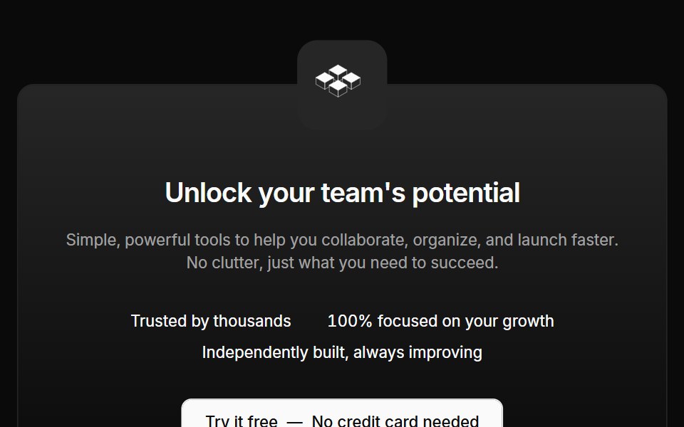 Cta 02Oxbow UI · AstroCentered CTA with logo and text
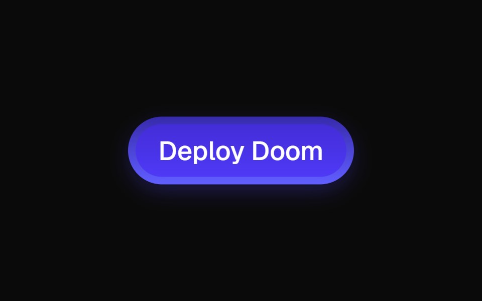 ShinyButtonEvil Buttons · ReactA glossy, gradient-styled button with a layered inner glow and a glint that sweeps across on every click.
 Cta 2Watermelon UI · React
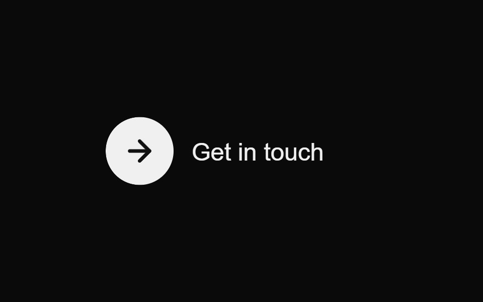 Contact Reveal ButtonMicroKit · ReactA circular arrow and label that resolve into a polished contact pill on hover.
 Image overlayFLX UI · ReactText and a CTA over a gradient-darkened cover image.
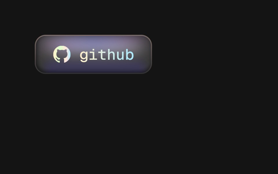 Matte ButtonD2Studio UI · ReactA matte chip button with a holographic rim: three blurred glows pinned under the top edge, a bounce light along the…
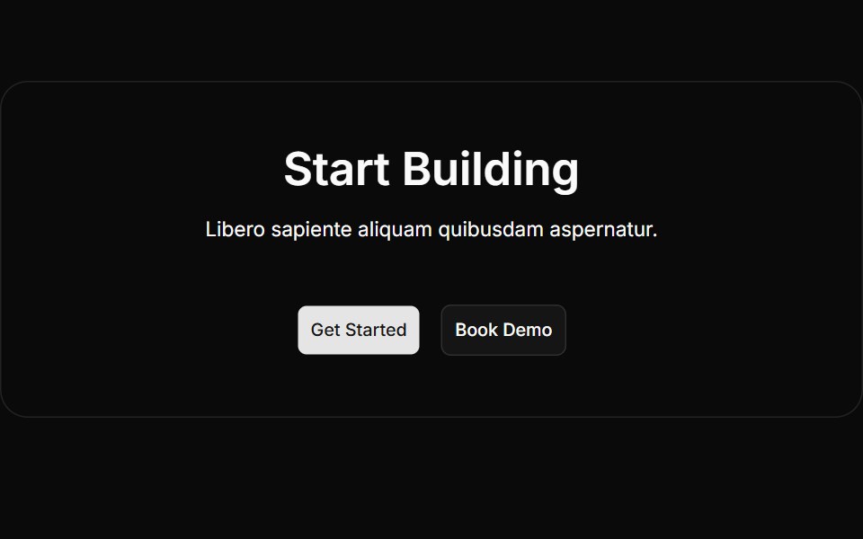 Cta Twocnblocks · SvelteTwo-column CTA with text and action buttons
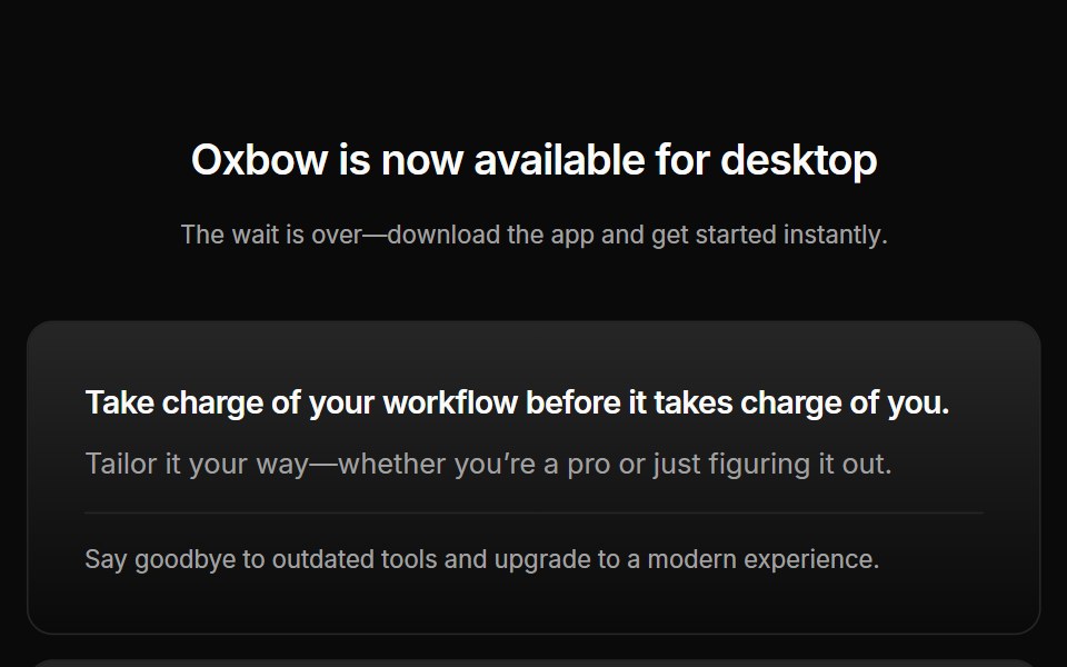 Cta 03Oxbow UI · AstroCentered CTA with download buttons
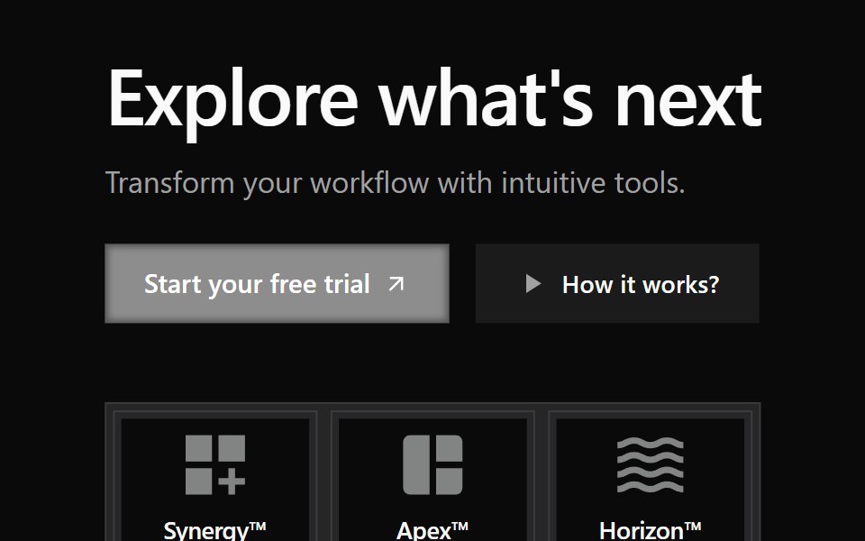 Cta 3Watermelon UI · React
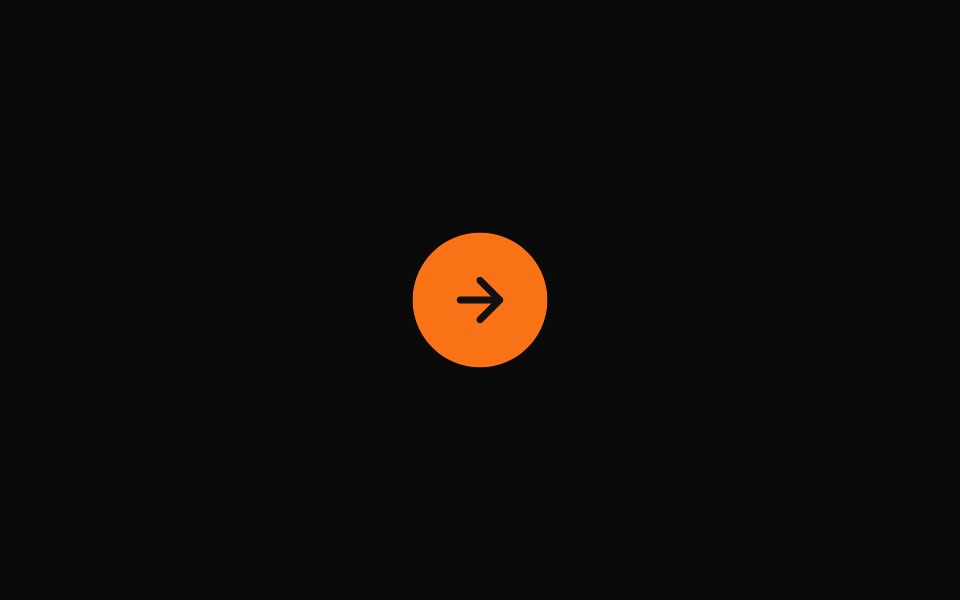 Expanding Contact ButtonMicroKit · ReactA pill-shaped call-to-action with an expanding background and arrow icon, adapted from the supplied Webflow export.
 CTA (Call to Action)FLX UI · ReactShared CTA component with link and button variant
 Logocloud Twocnblocks · SvelteInteractive logo cloud with hover call-to-action
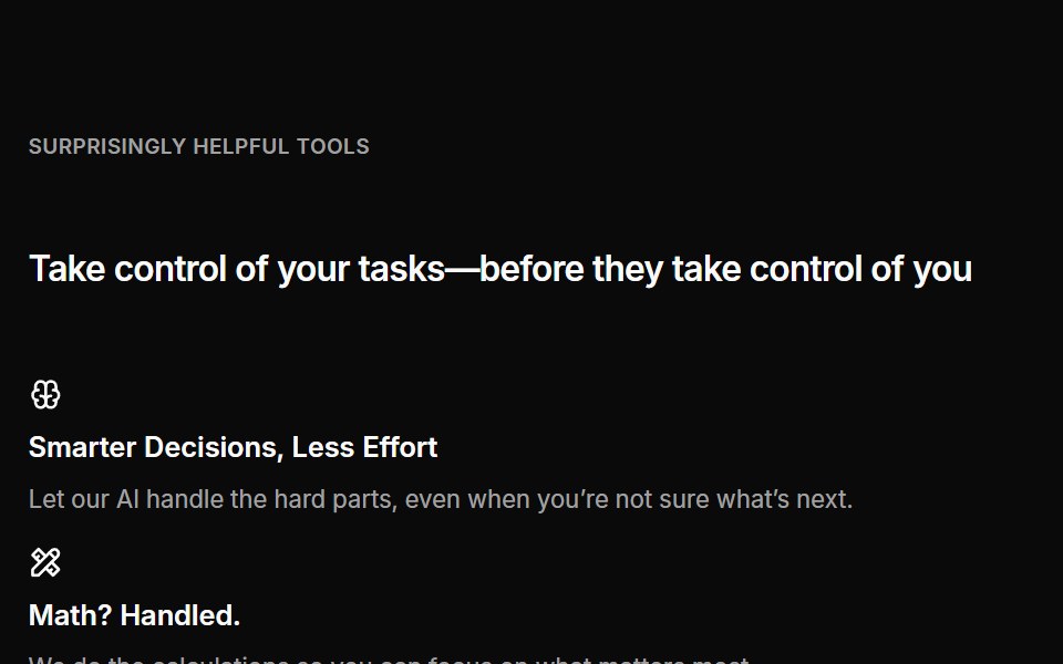 Cta 04Oxbow UI · AstroCentered CTA with grid banner
 Cta 4Watermelon UI · React
 Expanding Newsletter ButtonMicroKit · ReactAn orange newsletter pill with a growing dark circle and an arrow that slides in from the left.
 Call to Action 01FLX UI · ReactA centered text block with a title, description, and CTA.
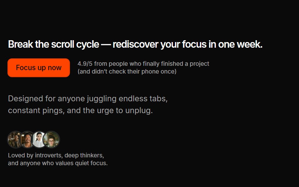 Cta 07Oxbow UI · AstroSplit CTA with custom avatars
 Cta 5Watermelon UI · React
 Get Started Circle SwapMicroKit · ReactA bordered CTA whose orange circle exits right as a directional arrow slides into place.
 Call to Action 02FLX UI · ReactAn oversized two-word headline split around a full-bleed photo, with a bracketed call to action at its center.
 Cta 05Oxbow UI · Astro
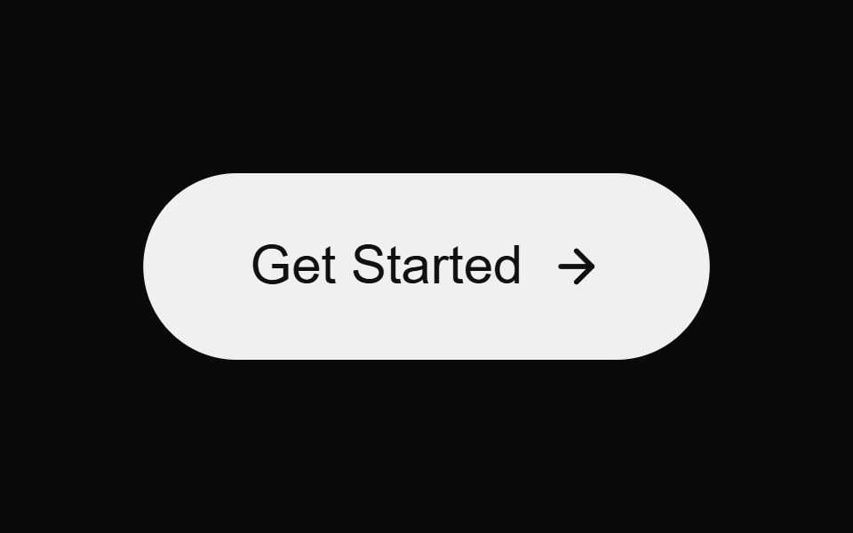 Glow Arrow ButtonMicroKit · ReactA bright CTA with a soft glow and a moving arrow on hover.
 Cta 06Oxbow UI · Astro
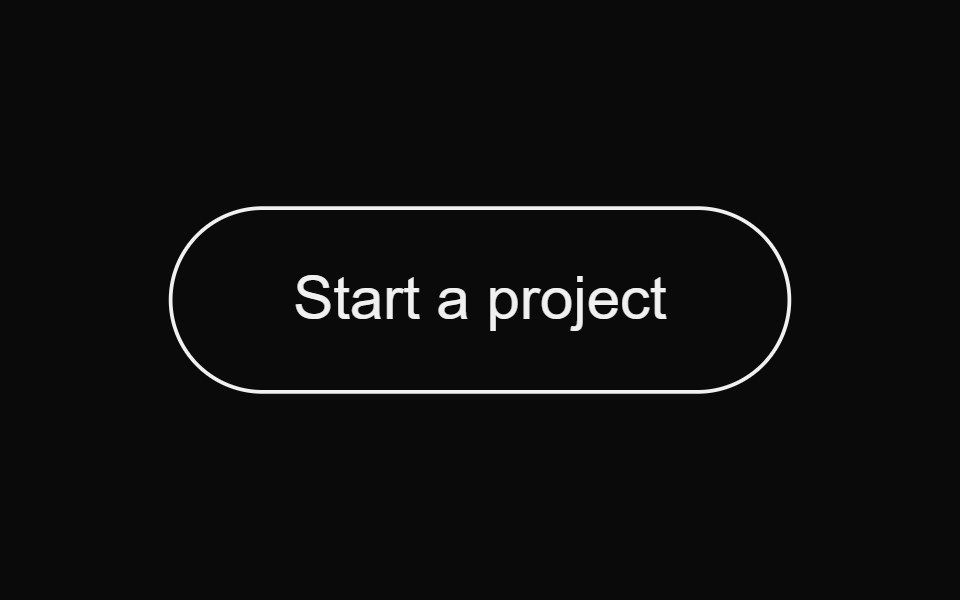 Magnetic Fill ButtonMicroKit · ReactA magnetic pill button with a bottom-to-top background fill.
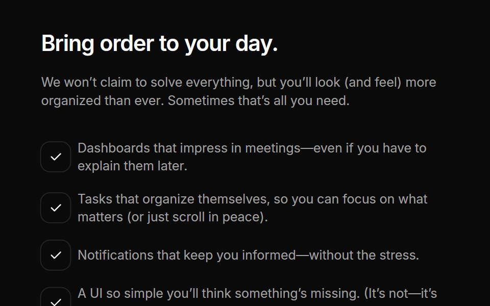 Cta 08Oxbow UI · Astro
 Neon Invert ButtonMicroKit · ReactA bold orange CTA that inverts into a dark, softly glowing surface on hover.
Libraries with cta button components
Related categories
- React CTA Button Components
- Tailwind CSS CTA Button Components
- Animated CTA Button Components
- shadcn/ui CTA Button Components
- Action Components
- Button Components
- Button Group Components
- Toggle Button Components
- Icon Button Components
- Link Components
- Theme Toggle Components
- Copy Button Components
- Like Button Components
- FAB Components
- Social Login Button Components
- Hold Button Components
- Share Button Components
- Slide To Confirm Components
- Download Button Components
- Submit Button Components