 Dev Design Library
Icon Button Components
Dev Design Library indexes 73 icon button components from 33 open-source UI libraries, with the most coming from Amicro Micro Transitions, Oxbow UI, Notra, beUI and OpenSourceUI. Each one links to its page with the source code, a live preview where available, the library license and the install command. Icon button components belong to the Actions group.
 Icon ButtonMUI / Material UI · React
 Close ButtonChakra UI · ReactUsed to trigger close functionality
 Close ButtonHeroUI · ReactButton component for closing dialogs, modals, or dismissing content.
 Close ButtonHeadless UI · React
 Action MenuReact Spectrum · ReactActionMenu combines an ActionButton with a Menu for simple "more actions" use cases.
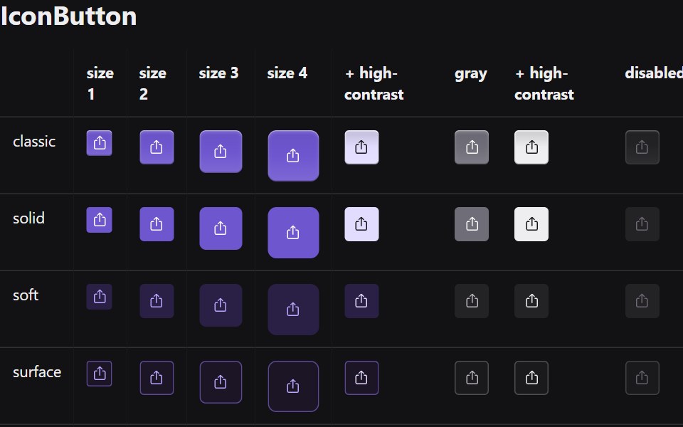 Icon ButtonRadix Themes · React
 Icon Swaptransitions.dev · HTML/CSS
 Bookmark Save PillAmicro Micro Transitions · ReactInteractive Save / Saved state pill toggle with icon morph.
 Close ButtonPark UI · ReactA button component specifically designed for closing modals and overlays.
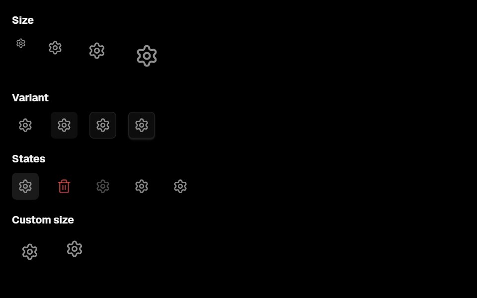 Action IconLobe UI · ReactActionIcon is a component for rendering icon buttons with background, supporting multiple style variants, sizes, and…
 Play Button IconUntitled UI React · ReactRounded play icon with blurred background and a filled triangle in the middle.
 Action SwapbeUI · React
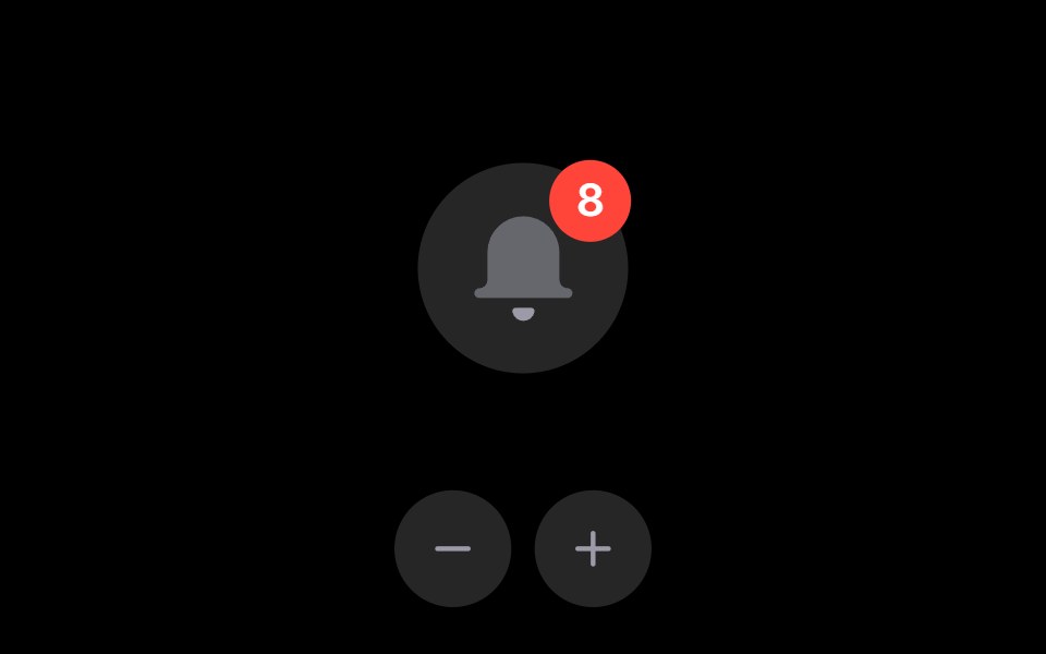 Notification BellRare UI · ReactAn iOS-style notification bell with an unread count badge.
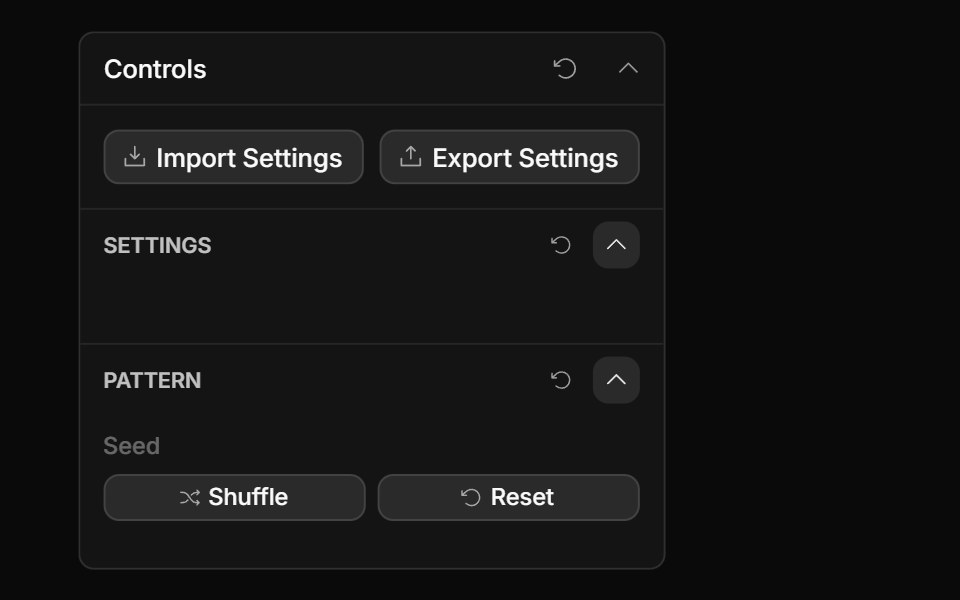 Actions ControlToolcraft · React
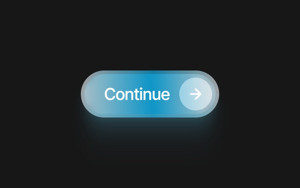 Glass Icon ButtonPixel Perfect · ReactA frosted glass pill button with an embedded icon capsule. 10 color variants and a swappable Lucide icon.
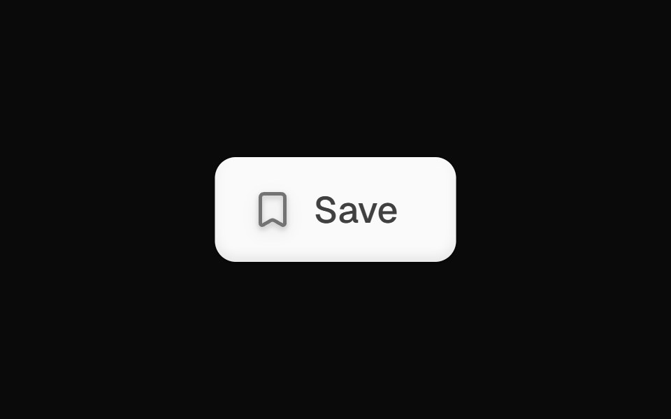 Bookmark Save ButtonOpenSourceUI · React
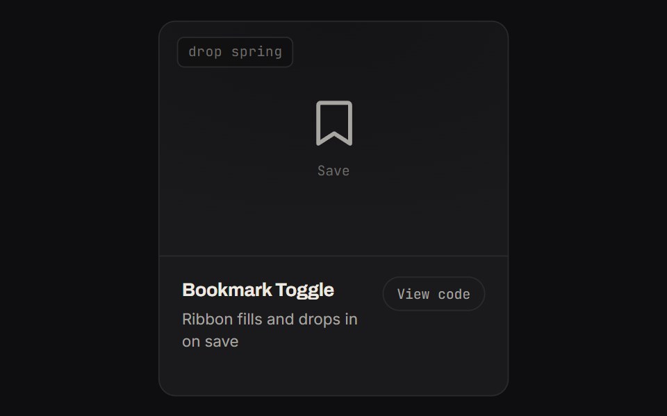 Bookmark ToggleKinetics · HTML/CSSRibbon fills and drops in on save
 ButtonsBoardUI · React
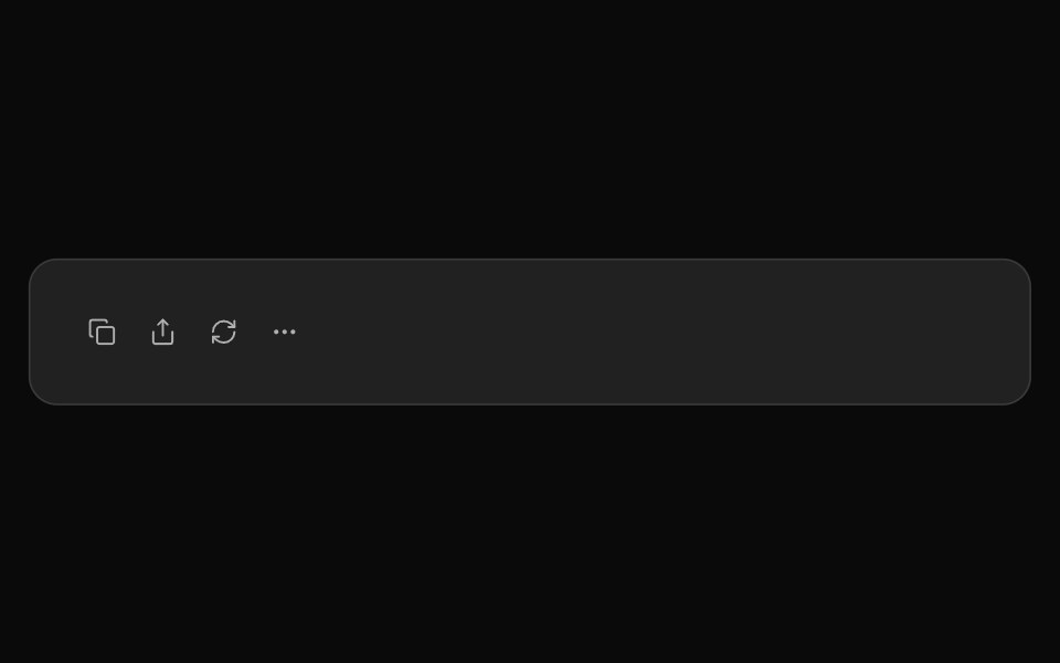 ChatGPT ActionsNotra · ReactCopy, share, redo and more buttons, built on shadcn Button and Tooltip.
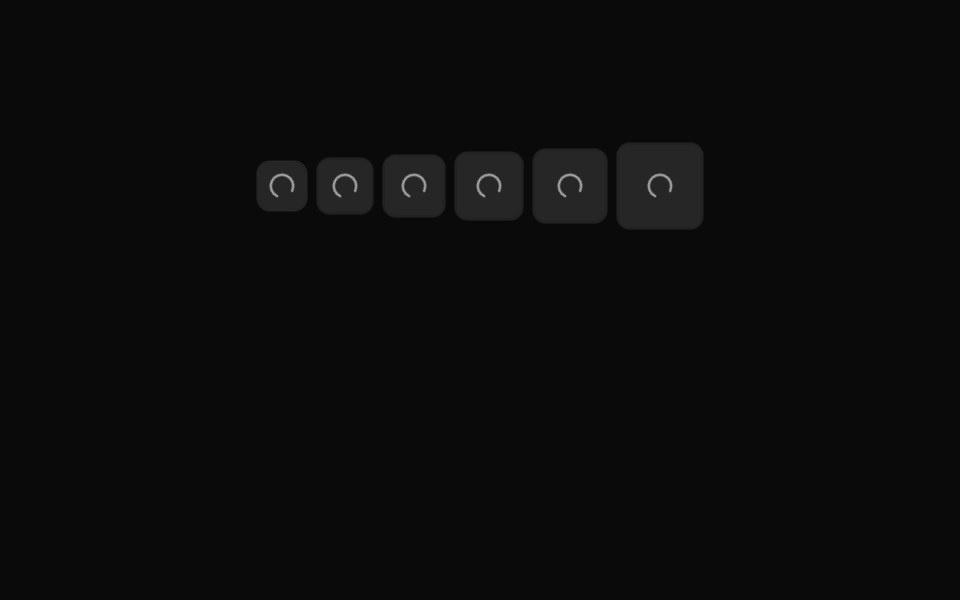 Button Icon 08Oxbow UI · AstroMuted loading icon button
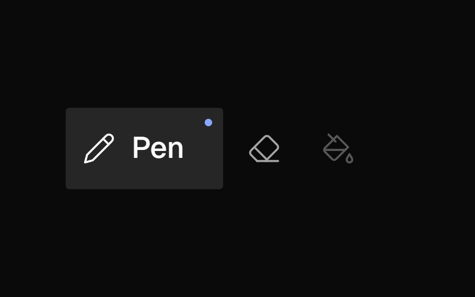 Icon BarNexvyn UI · ReactA horizontal toolbar of icon buttons with bloom-open label reveal on hover/selection, accent dot indicator, and roving…
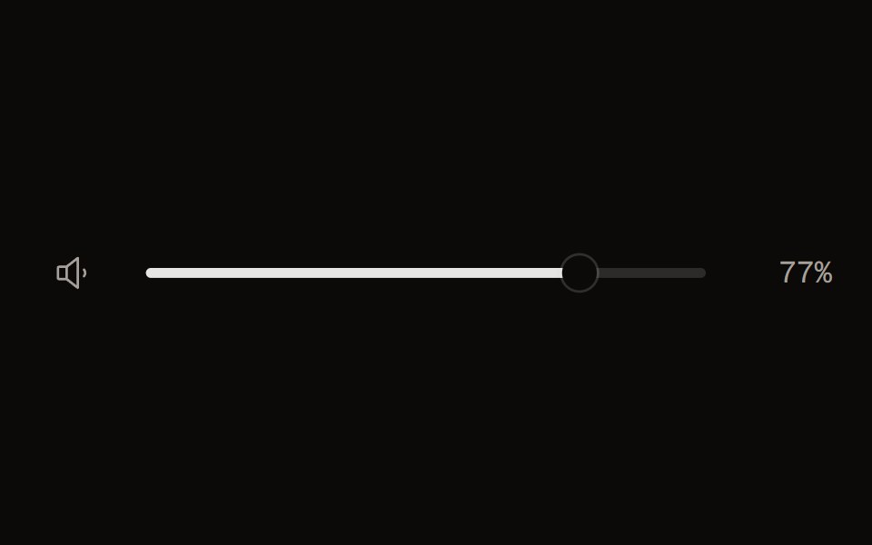 Volume Controlaudiocn · ReactA 0..1 volume slider with a mute button and a perceptual curve, for players.
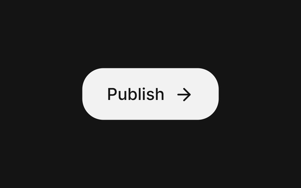 Action buttonArc Library · ReactA compact button for frequent toolbar actions.
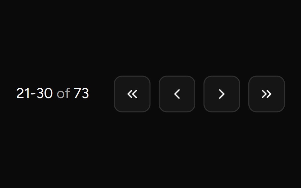 Pagination Arrowsv-table · SvelteCompact arrow pagination for table footers.
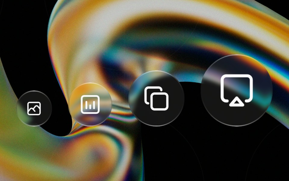 Glass Iconglasscn · ReactA circular glass chip that wraps any icon, iOS-control-center style. Preset sizes scale the circle and icon together…
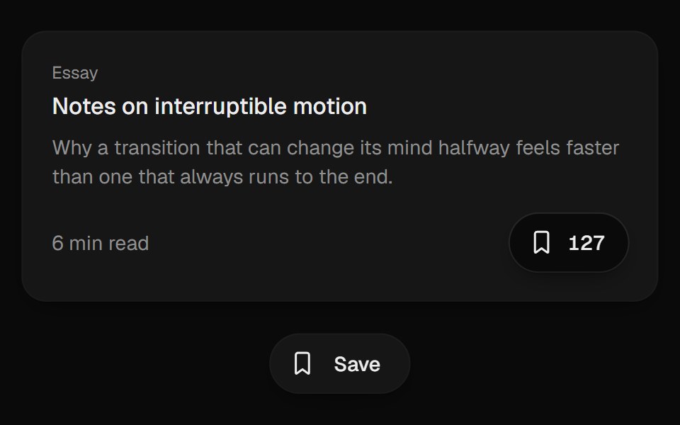 Bookmark ButtonUI Lab · ReactFills from the bottom up and lands with a small squash.
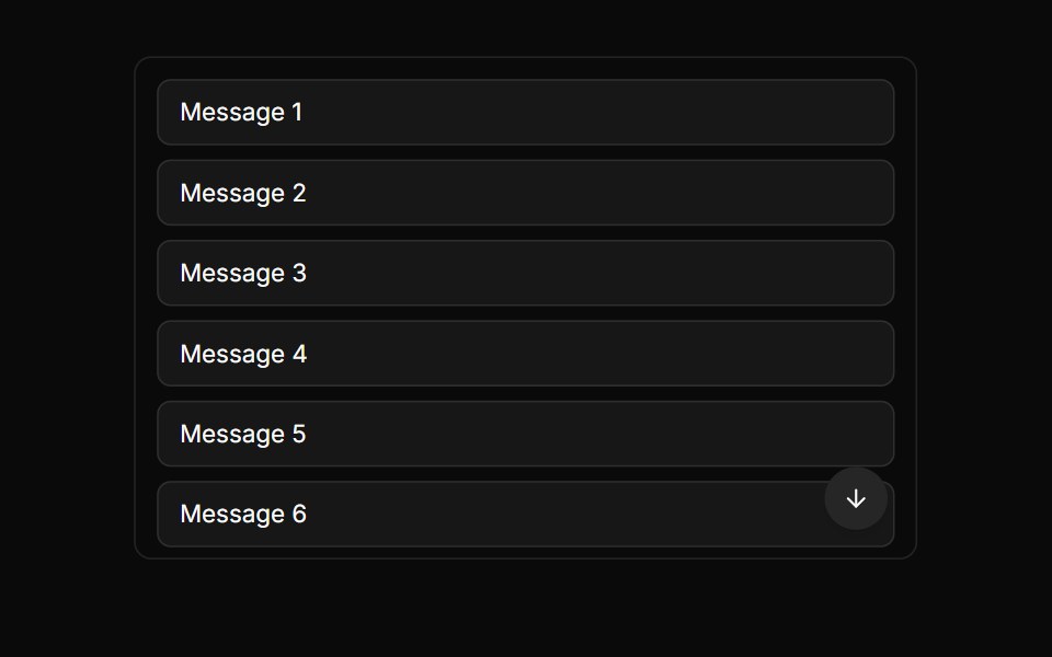 Scroll To Bottom ButtonLocalMode · ReactA floating scroll-to-bottom affordance tied to a chat container's scroll state — appears when the user scrolls up…
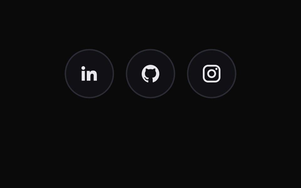 Social Icon ButtonsMicroKit · ReactCircular social links that trade their icon for a brand-colored arrow and glow on hover.
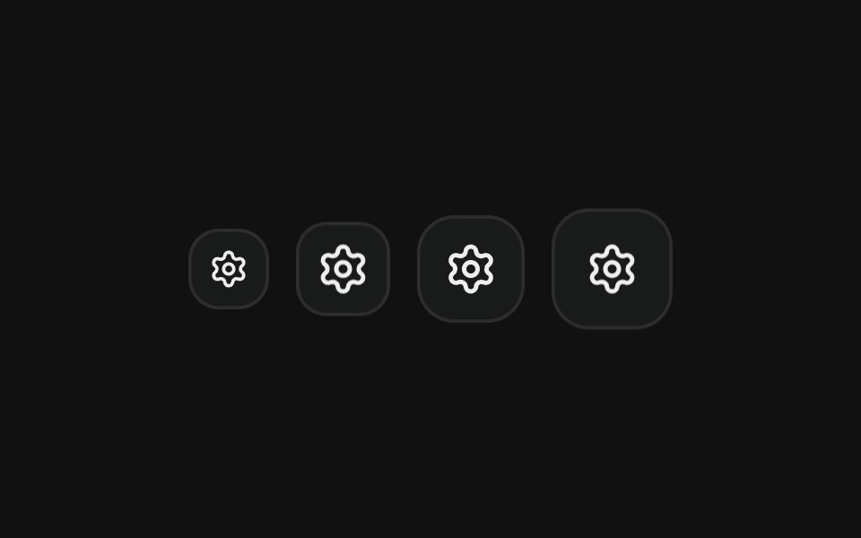 Icon onlyFLX UI · ReactSquare icon-only buttons in every icon size.
 Icon ButtonHalaska UI · React
 Iconsv-particles · Svelte
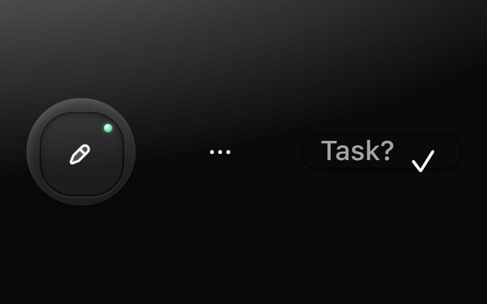 Icon buttonMetal UI · React + SwiftUIA pressable cap with only a glyph: tool (a graphite cap that latches with a green LED), ghost (flat, round) and mini…
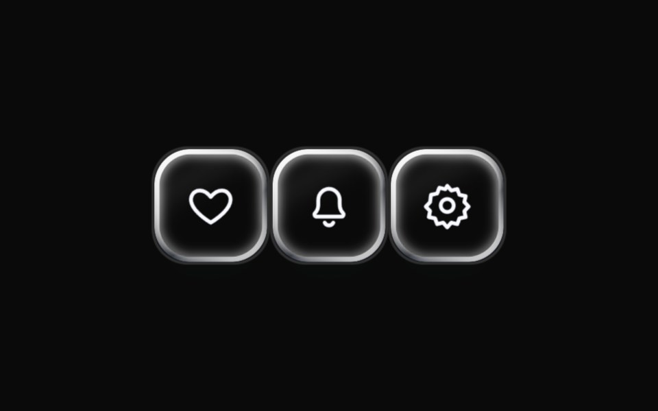 Liquid Icon ButtonLiquefy UI · ReactIcon-only button in liquid glass style.
 Icon ButtonChakra UI · ReactUsed to render an icon within a button
 Contextual HelpReact Spectrum · ReactContextual help shows a user extra information about the state of an adjacent component, or a total view.
 Button CameraAmicro Micro Transitions · ReactCamera button whose video icon morphs into the video-off icon.
 Icon ButtonPark UI · ReactA button component designed specifically for displaying icons.
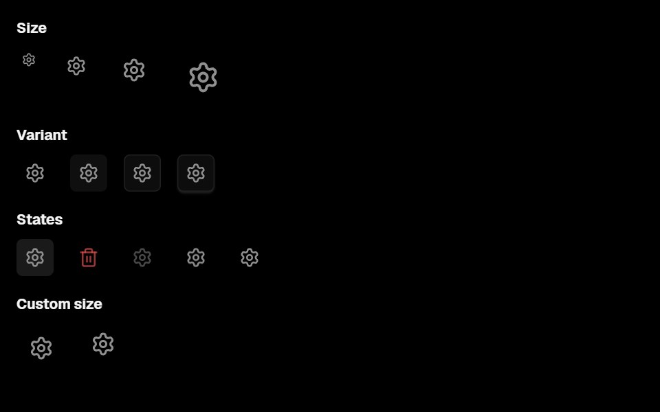 Base Ui Action IconLobe UI · React
 ButtonsUntitled UI React · React
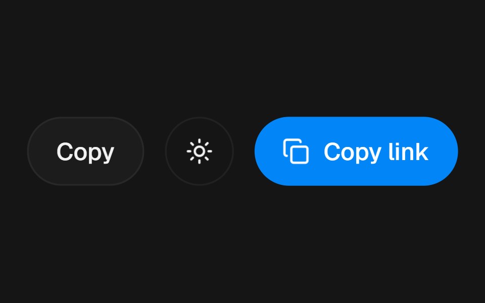 Action Swap BlurbeUI · React
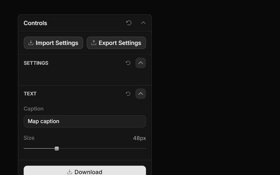 Panel Icon ButtonToolcraft · React
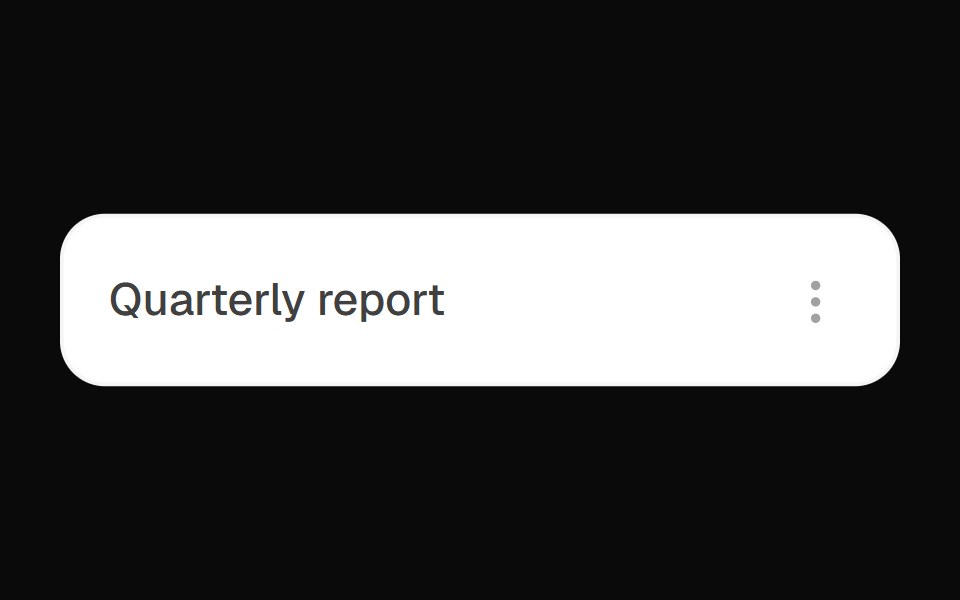 Kebab Actions DropdownOpenSourceUI · React
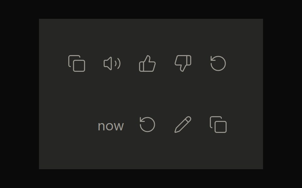 Claude ActionsNotra · ReactCopy, feedback and retry actions built on shadcn Button and Tooltip.
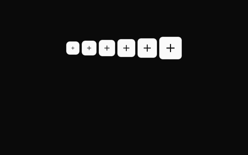 Button Icon 01Oxbow UI · Astro
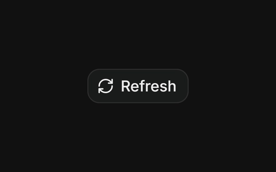 Hover rotate refreshFLX UI · ReactRefresh button whose icon rotates a full 360° on each click.
 Large Iconsv-particles · Svelte
 Plus Minus ToggleAmicro Micro Transitions · ReactDual square toggle buttons with solid color fills and spring micro-bounce.
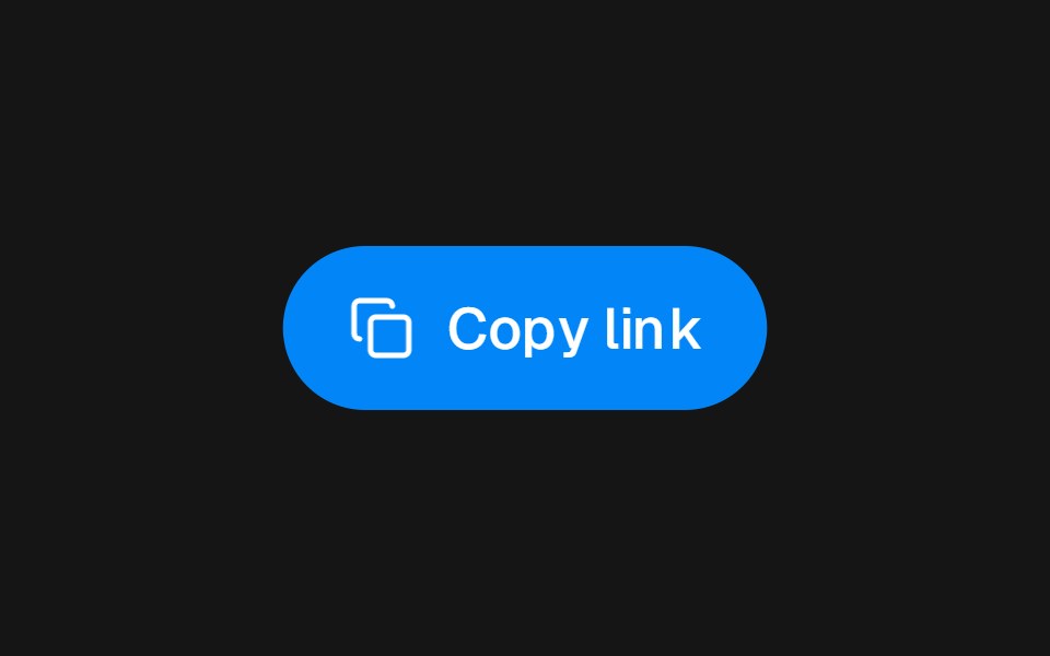 Action Swap CascadebeUI · React
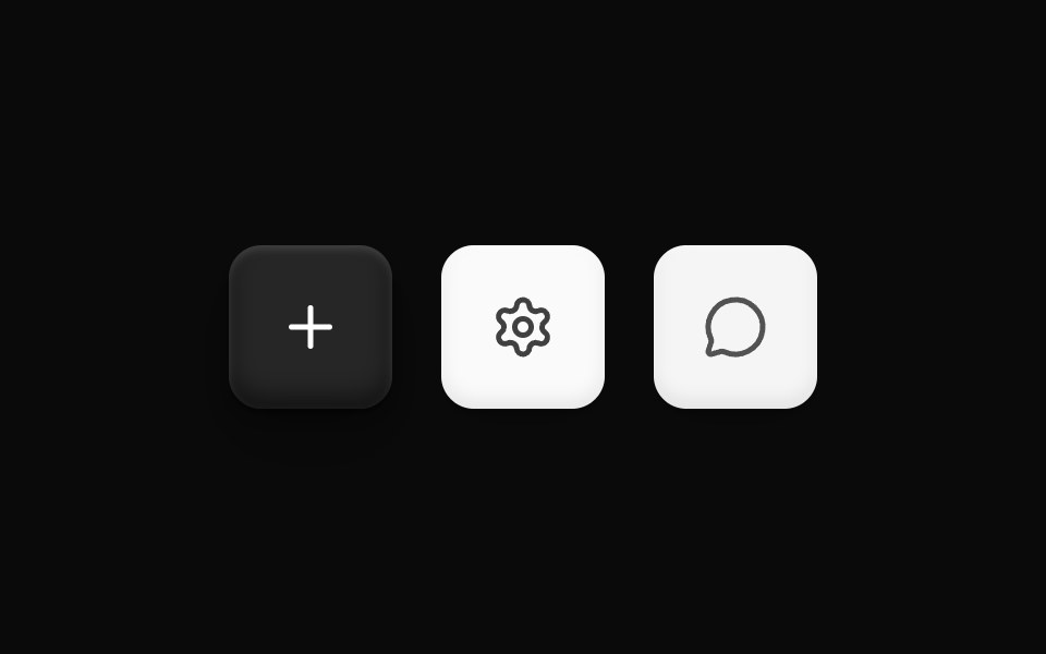 Three D Icon ButtonOpenSourceUI · React
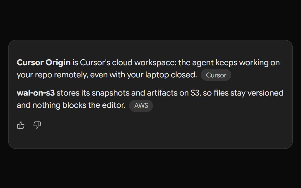 Gemini ActionsNotra · ReactFeedback, share, copy and more buttons built on shadcn Button and Tooltip.
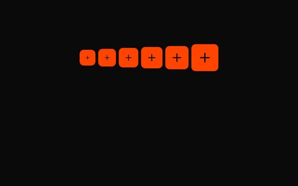 Button Icon 02Oxbow UI · Astro
 Small Iconsv-particles · Svelte
 Button DirectoryAmicro Micro Transitions · React
 Action Swap RollbeUI · React
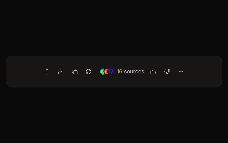 Perplexity ActionsNotra · ReactThe answer action bar with share, copy, rewrite, feedback and a sources button, built on shadcn Button and Tooltip.
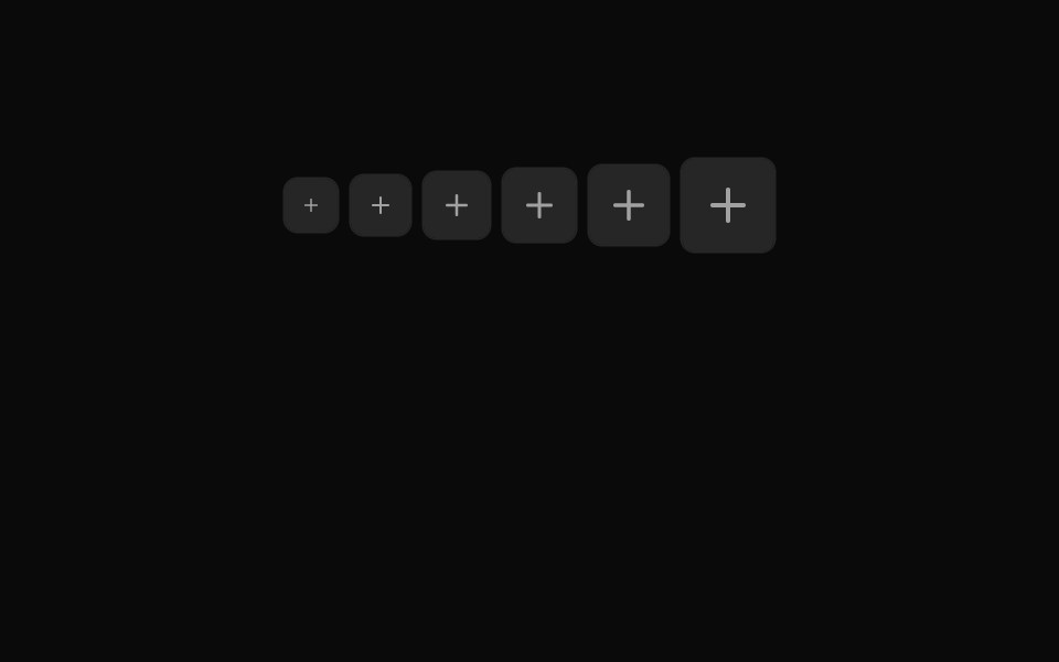 Button Icon 03Oxbow UI · Astro
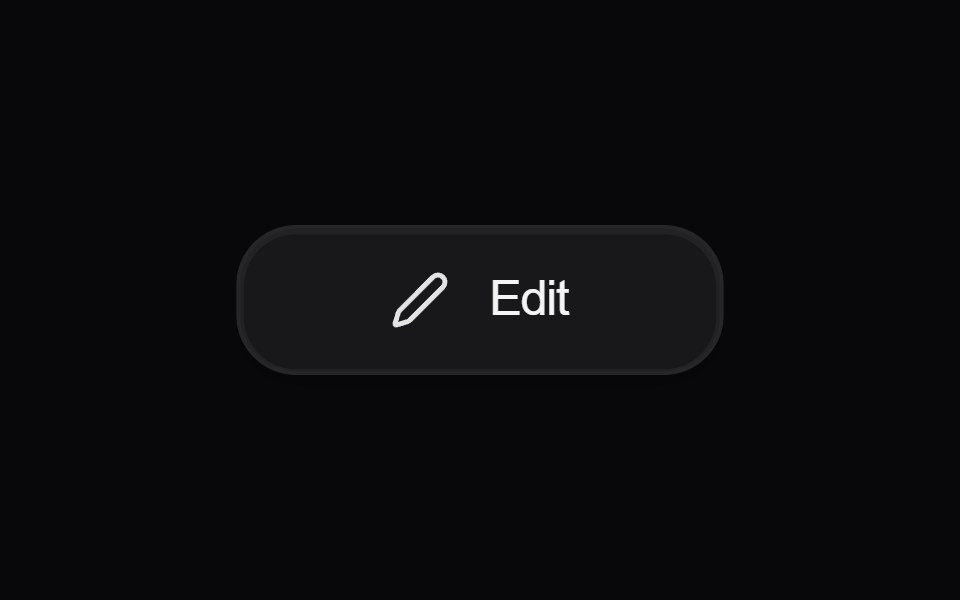 Button EditAmicro Micro Transitions · React
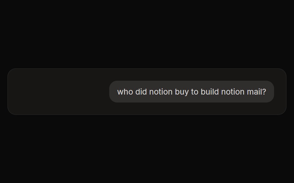 Perplexity User ActionsNotra · ReactThe time, edit and copy controls beside a user message.
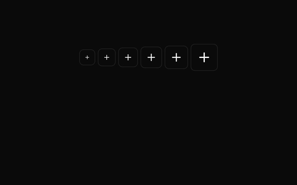 Button Icon 04Oxbow UI · Astro
 Button LockAmicro Micro Transitions · React
 Button Icon 05Oxbow UI · Astro
 Button MicrophoneAmicro Micro Transitions · React
 Button Icon 06Oxbow UI · Astro
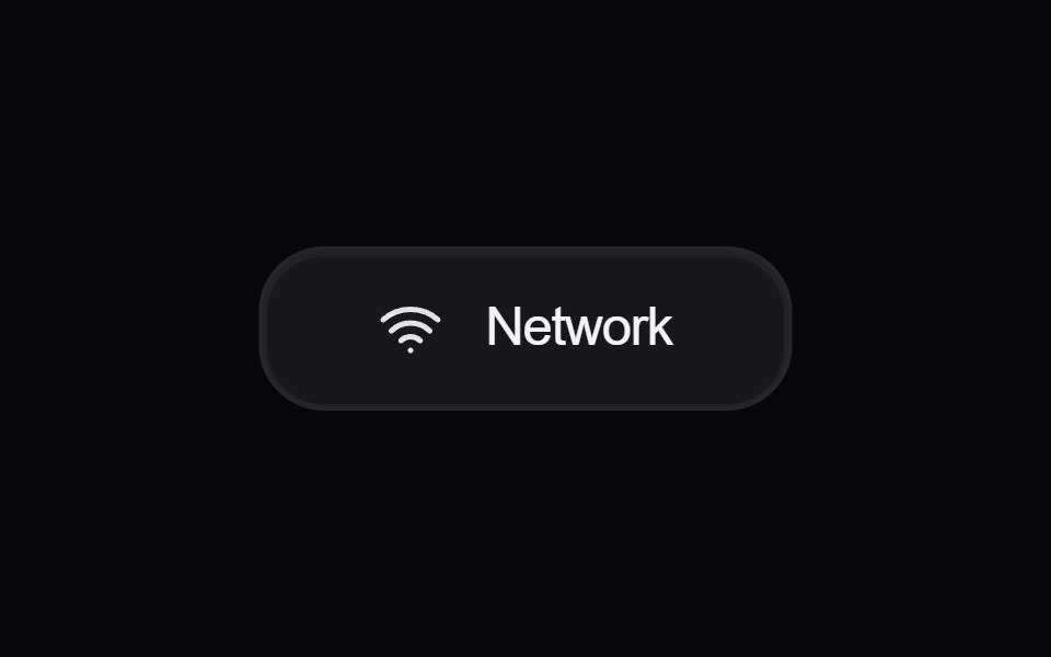 Button NetworkAmicro Micro Transitions · React
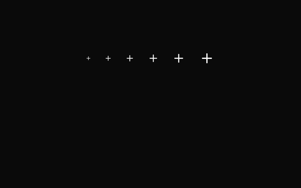 Button Icon 07Oxbow UI · Astro
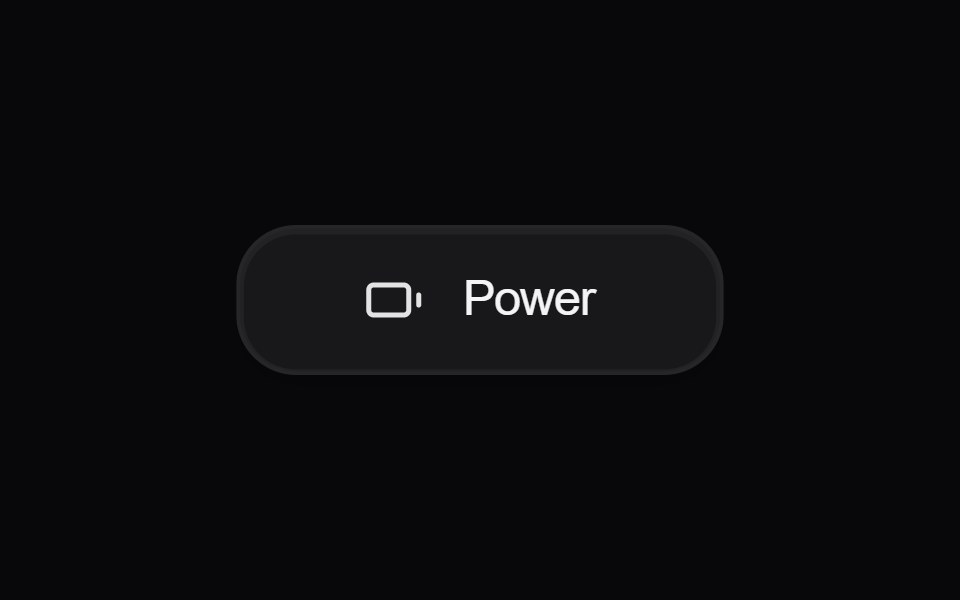 Button PowerAmicro Micro Transitions · React
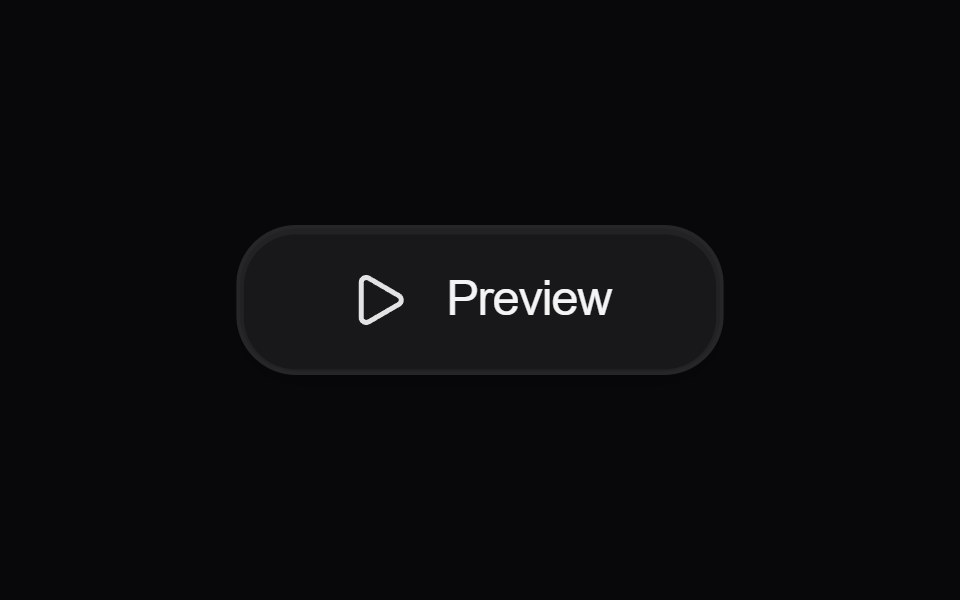 Button PreviewAmicro Micro Transitions · React
 Button ReloadAmicro Micro Transitions · React
 Button Save LaterAmicro Micro Transitions · React
 Button SearchAmicro Micro Transitions · React
 Button SettingsAmicro Micro Transitions · React
 Button VisibilityAmicro Micro Transitions · React
 Button VolumeAmicro Micro Transitions · React
Libraries with icon button components
Related categories
- React Icon Button Components
- Tailwind CSS Icon Button Components
- Animated Icon Button Components
- shadcn/ui Icon Button Components
- Action Components
- Button Components
- Button Group Components
- Toggle Button Components
- Link Components
- Theme Toggle Components
- CTA Button Components
- Copy Button Components
- Like Button Components
- FAB Components
- Social Login Button Components
- Hold Button Components
- Share Button Components
- Slide To Confirm Components
- Download Button Components
- Submit Button Components