Bell Toggle
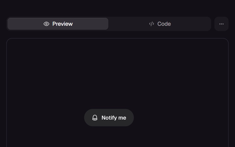
Pill toggle that answers a press at three tempos: the bell rings on damped keyframes, the label blur-crossfades, and the pill unfurls to the longer label through a clip-path on a critically damped spring. The pressed state is the receipt.
- Library
- React Bits
- Framework
- React
- Type
- component
- License
- Commons-Clause+MIT
- Install
npx shadcn@latest add @react-bits/BellToggle- Files
src/content/Micro/BellToggle/BellToggle.csssrc/content/Micro/BellToggle/BellToggle.jsx
- Source
- https://github.com/DavidHDev/react-bits
Categories
- Action Components
- React Action Components
- Animated Action Components
- Animated Icon Components
- React Animated Icon Components
- Button Components
- React Button Components
- Animated Button Components
- Icon Components
- React Icon Components
- Animated Icon Components
- Media Components