 Dev Design Library
Icon Components
Dev Design Library indexes 168 icon components from 41 open-source UI libraries, with the most coming from ReUI, Lobe UI, Amicro Micro Transitions, Shadcn Space and cnblocks. Each one links to its page with the source code, a live preview where available, the library license and the install command. Icon components belong to the Media group.
Showing 120 of 168, a mix from every library. Open a library to see all of its components.
 IconMUI / Material UI · React
 Bell ToggleReact Bits · ReactPill toggle that answers a press at three tempos: the bell rings on damped keyframes, the label blur-crossfades, and…
 IconChakra UI · ReactUsed to display an svg icon
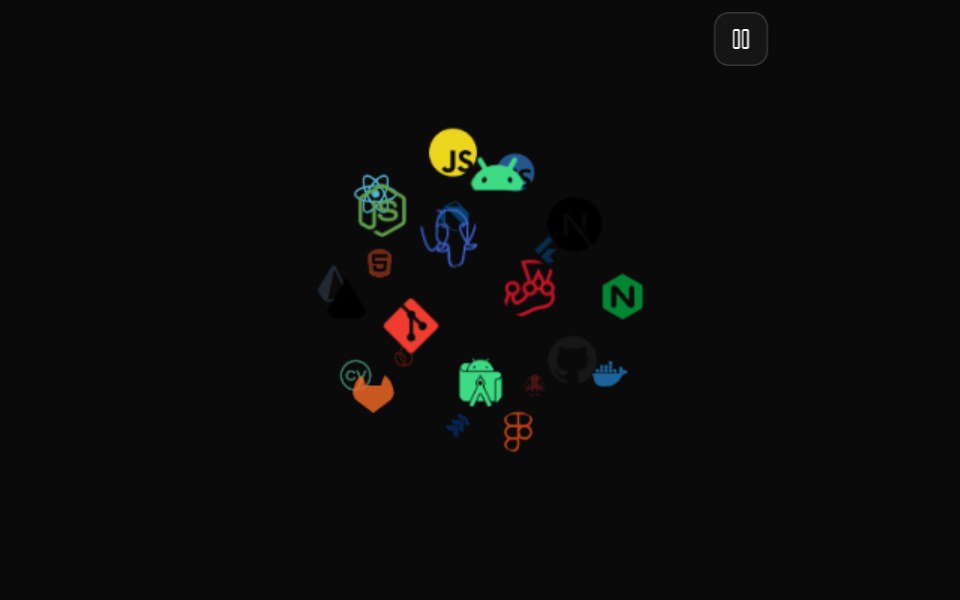 Icon CloudMagic UI · ReactAn interactive 3D tag cloud component
 IconReact Spectrum · ReactSpectrum icons are clear, minimal, and consistent across platforms. They follow the focused and rational principles of…
 Accessible IconRadix Themes · React
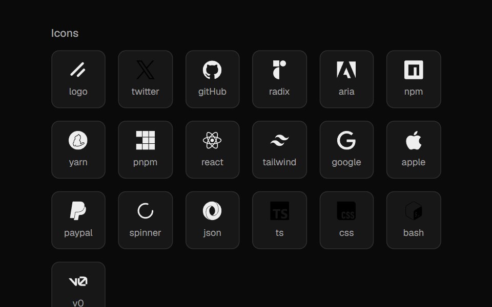 File IconsCult UI · ReactIcon set for file types and languages
 SwapArk UI · ReactAnimate between two visual states with smooth transitions.
 Icon Swaptransitions.dev · HTML/CSS
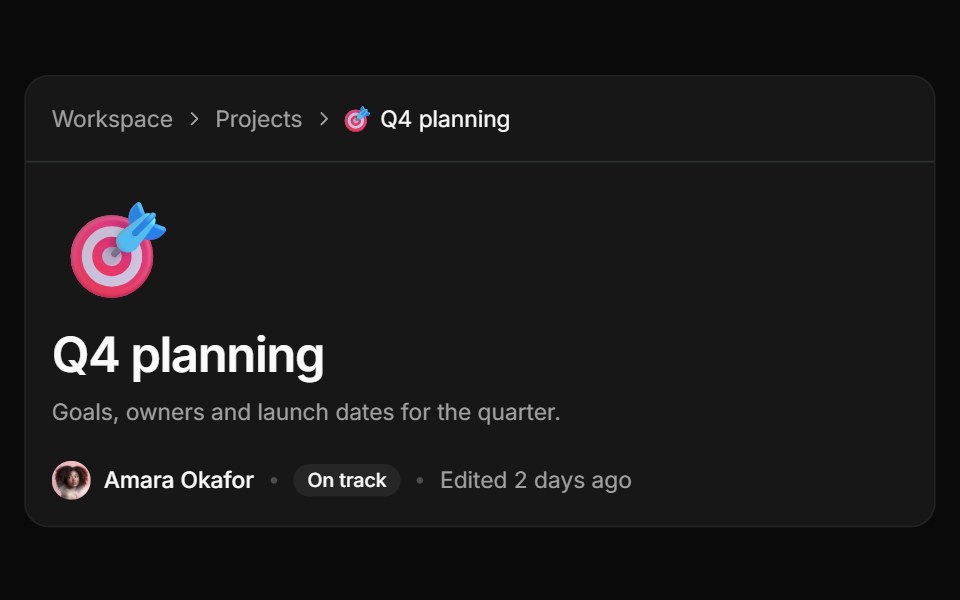 Page iconReUI · ReactA page header with an emoji icon above the title, plus Random and Remove in the picker.
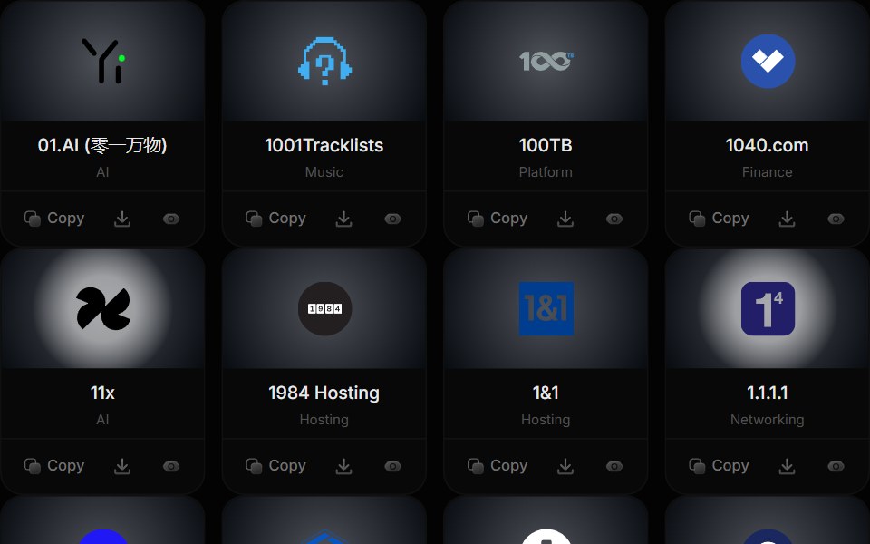 Brand IconstheSVG
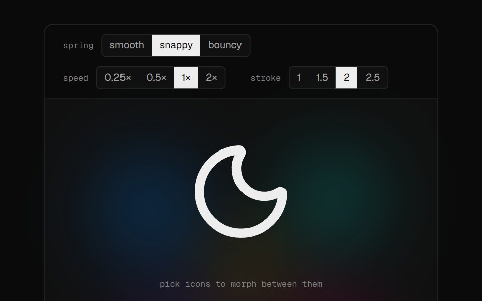 Morphiconsmorphicons · ReactUniversal morphing for stroke-based icons with spring physics — zero runtime dependencies
 App Icon LoadAmicro Micro Transitions · ReactApp Icon Load loading animation.
 IconPark UI · ReactA component for displaying scalable vector icons.
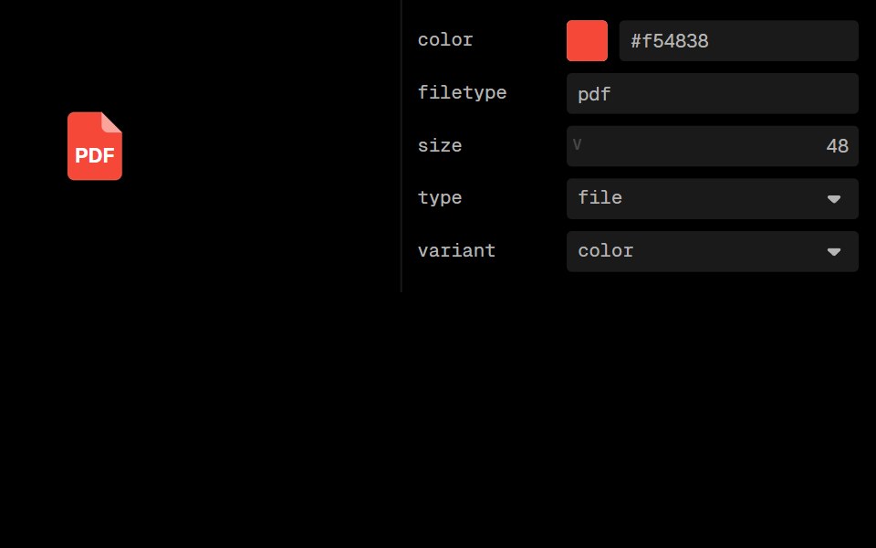 File Type IconLobe UI · ReactFileTypeIcon is a component that displays icons based on file types. It supports different file and folder types…
 Text Icon CursorCursify · React
 Play Button IconUntitled UI React · ReactRounded play icon with blurred background and a filled triangle in the middle.
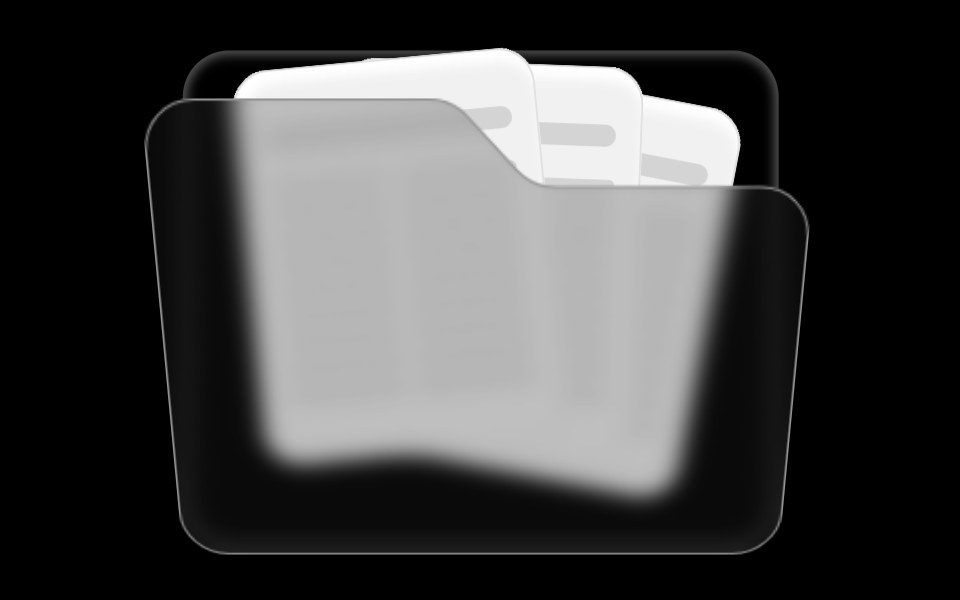 Folder ComponentRare UI · ReactAn animated folder whose cards fan out on hover and lift open on click, with a 3D-tilted flap. Supports color and size…
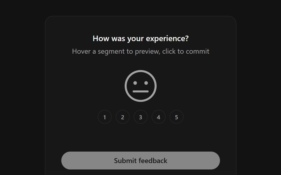 Face RatingSpectrum UI · ReactA five-level feedback rating where one large SVG face morphs its mouth, eyes and color between moods as you hover and…
 ArrowsUser Interface Wiki · React
 FigmaLaunch UI · React
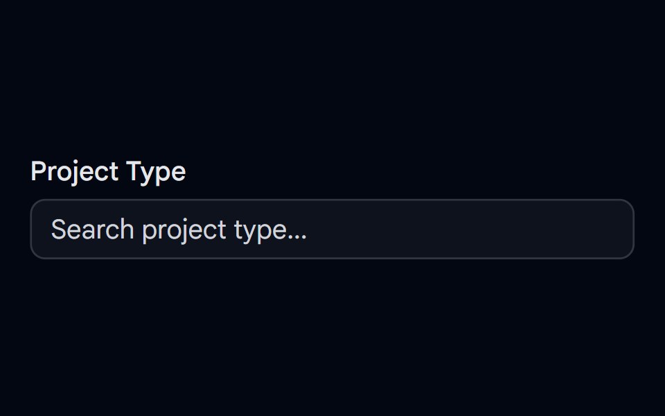 Autocomplete-06 - With IconShadcn Space · ReactAutocomplete for selecting a project type with unique icons, selected icon shown in input, and spring-animated list…
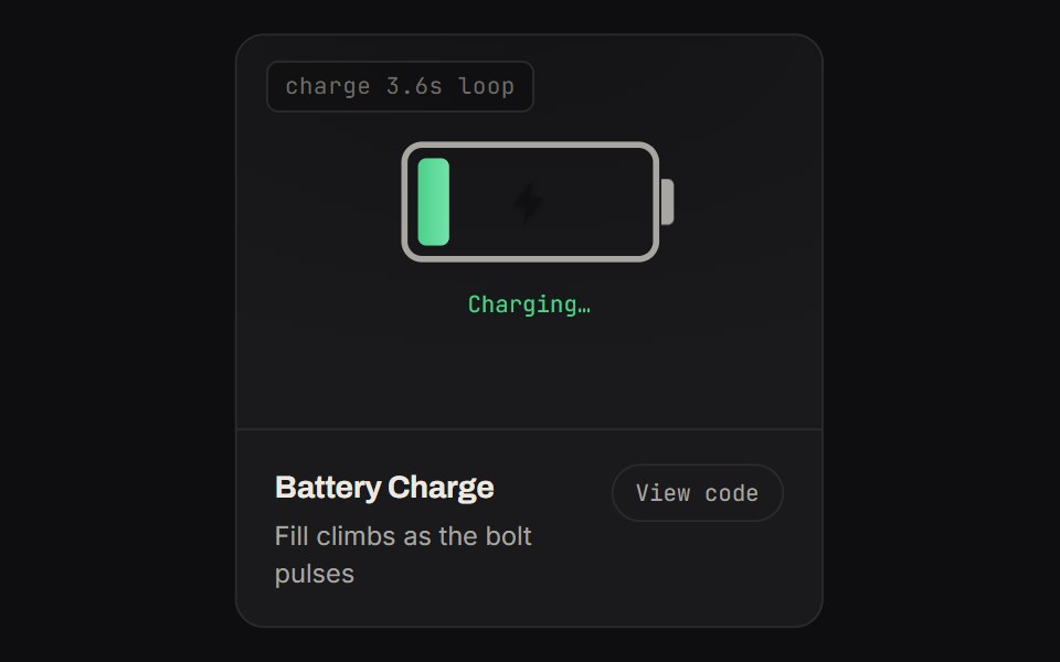 Battery ChargeKinetics · HTML/CSSFill climbs as the bolt pulses
 IconsBoardUI · React
 Logo Collectioncnblocks · SvelteLogo collection utilities and exports
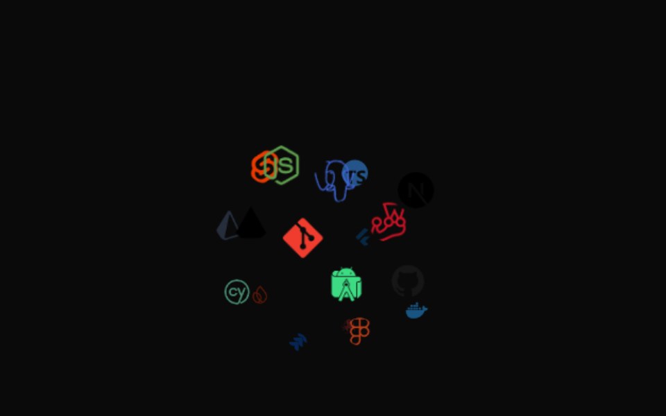 Icon CloudAnimations (Svelte) · SvelteAn interactive 3D tag cloud component that displays icons or images in a sphere formation with smooth rotation and…
 Perplexity FaviconNotra · ReactA site favicon on shadcn Avatar with a gray fallback.
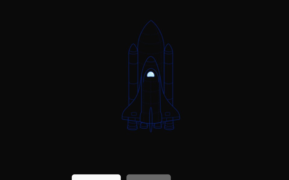 Rocket LaunchNexvyn UI · ReactA hand-drawn rocket illustration that ignites its engines and lifts off the pad on demand, with a reset back to rest.
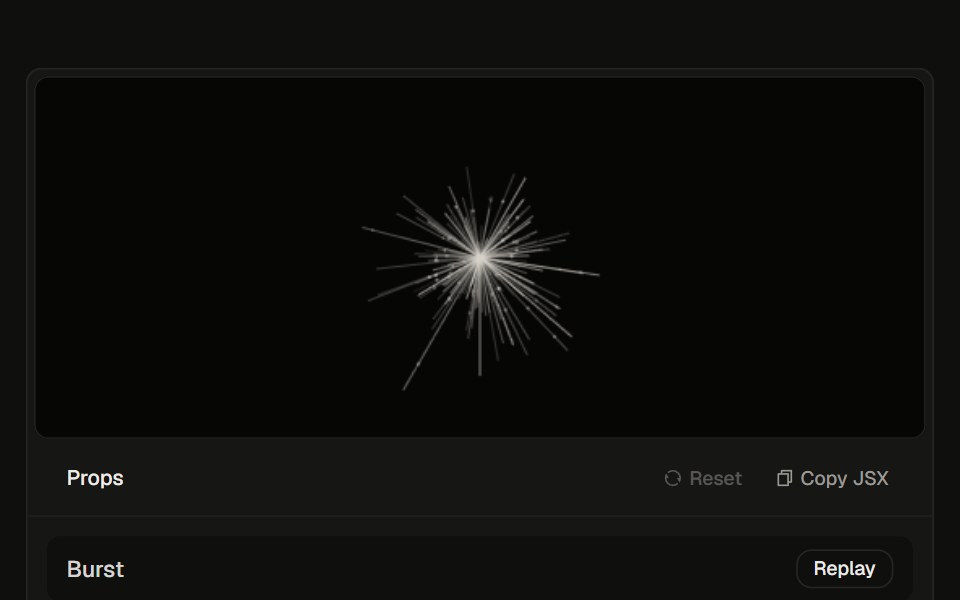 Logo Burst23rd.dev · ReactHair-line tentacles explode from the center, then keep a slow inhale. Follows light and dark.
 IconWatermelon UI · React
 Decor iconsv-efferd · Svelte
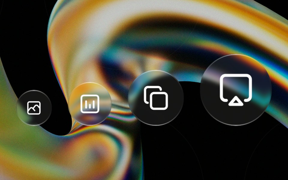 Glass Iconglasscn · ReactA circular glass chip that wraps any icon, iOS-control-center style. Preset sizes scale the circle and icon together…
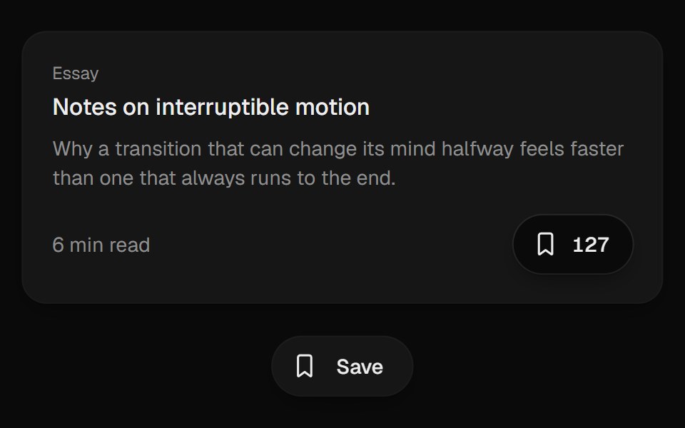 Bookmark ButtonUI Lab · ReactFills from the bottom up and lands with a small squash.
 Animated iconCojeev UI · ReactReplayable micro-interactions for the full Cojeev icon library, with semantic motion families and optional visual…
 Dynamic IconFLX UI · ReactA dynamic icon component with a name and size.
 Agent GlyphHalaska UI · React
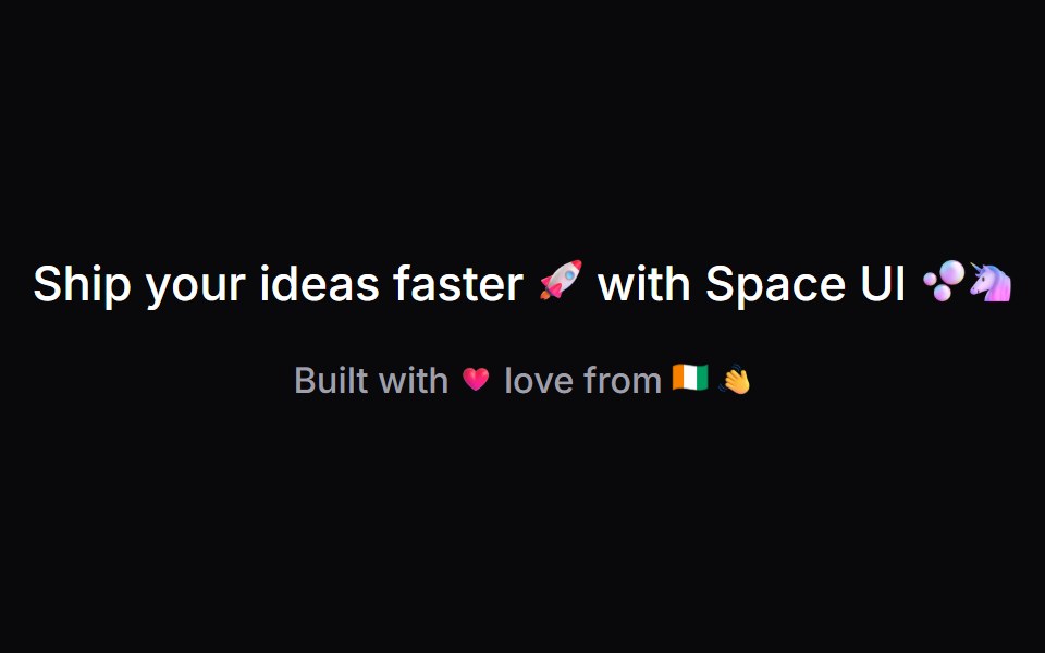 AnimojiSpaceUI · ReactRenders every Unicode emoji in a string as an animated image sized to the surrounding text.
 Arrow RightSora UI · ReactAnimated right arrow that nudges forward and redraws its stroke on hover using a pure CSS stroke-dash animation.
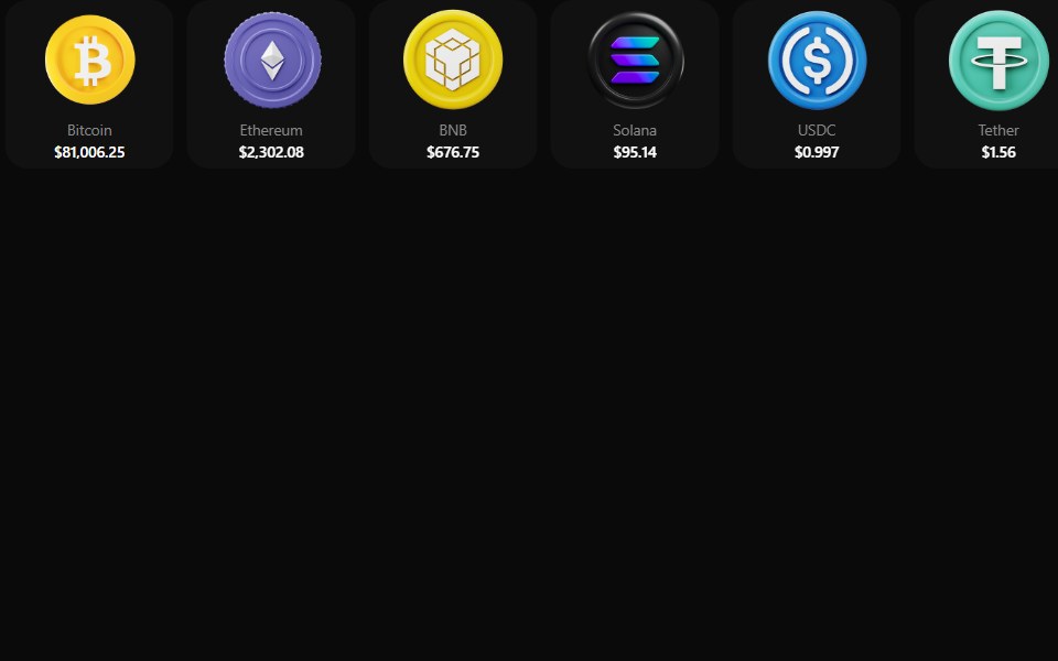 Coin MorphZAYX · React NativeReact Native crypto coin list (CoinMorphList) with an animated counter and a coin detail modal.
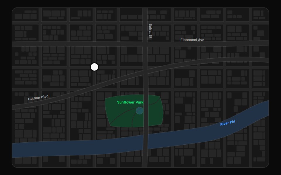 Map PinFibo · ReactA pin for a point on a map, with a preview that opens on click or tap.
 Swapark-cn · ReactA shadcn-style swap component built with Ark UI primitives.
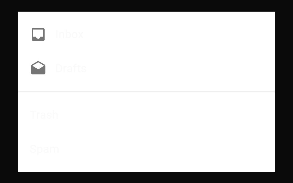 List Item IconMUI / Material UI · React
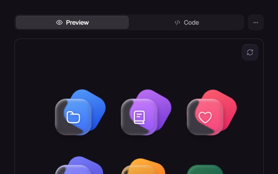 Glass IconsReact Bits · ReactIcon set styled with frosted glass blur.
 Isometric icon stackReUI · ReactLayered isometric icon
 Apple Icon MorphAmicro Micro Transitions · ReactApple Icon Morph loading animation.
 IconLobe UI · ReactIcon is a component based on lucide-react that provides rich icon selection and customization options. It supports…
 Dot IconUntitled UI React · React
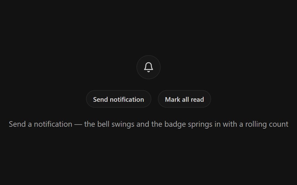 Notification BellSpectrum UI · ReactA bell icon button with a ring-shake swing, springy unread badge with rolling odometer count, and a pinging dot mode
 Interface GeneralUser Interface Wiki · React
 GithubLaunch UI · React
 Badge-04 - With IconShadcn Space · ReactBadge component
 Bookmark ToggleKinetics · HTML/CSSRibbon fills and drops in on save
 Logo Geminicnblocks · SvelteGoogle Gemini AI logo SVG component
 Perplexity Model IconNotra · ReactGrayscale provider logos for the model list.
 Icon MorphUI Lab · ReactIcons reshape themselves between states instead of swapping.
 Icon libraryCojeev UI · React1,722 icon names with Cojeev micro-interactions, outline, duotone and organic treatments, built on Lucide geometry.
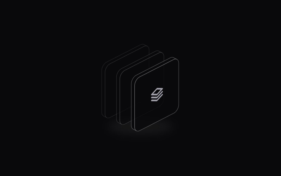 Icon StackSpaceUI · ReactDisplays an overlapping cluster of icons or avatars that expands smoothly when hovered to reveal every individual item.
 ChevronsSora UI · ReactAnimated double up-chevron that cross-fades between the two carets on trigger.
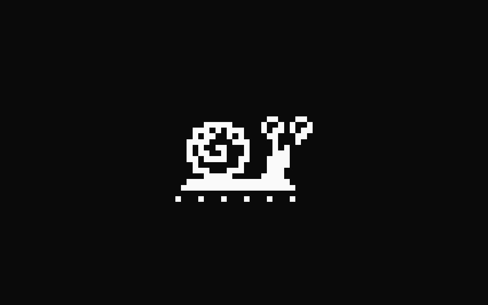 Pixel SnailFibo · ReactA one-colour pixel snail that crawls on a loop while something loads.
 Speed Dial IconMUI / Material UI · React
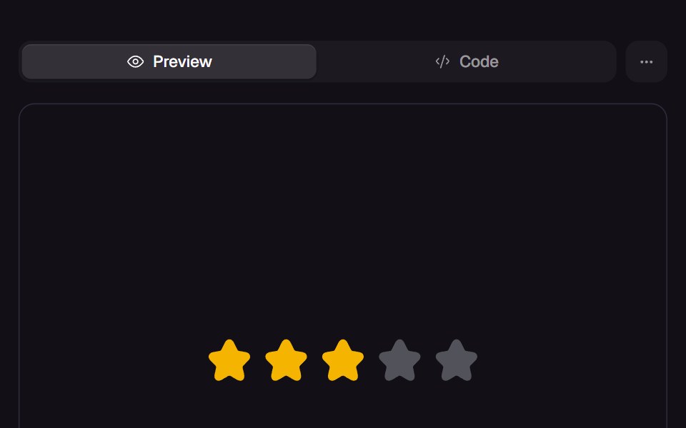 Peek RatingReact Bits · ReactStar rating you can try before you commit: sweeping the row lifts a trailing wave of stars up to the pointer while a…
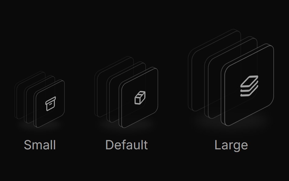 Icon stack sizesReUI · ReactResponsive icon stack sizes
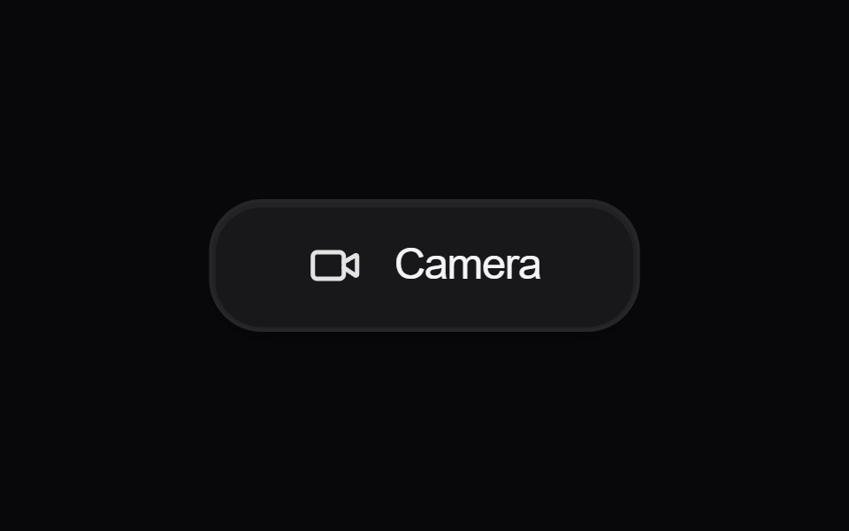 Button CameraAmicro Micro Transitions · ReactCamera button whose video icon morphs into the video-off icon.
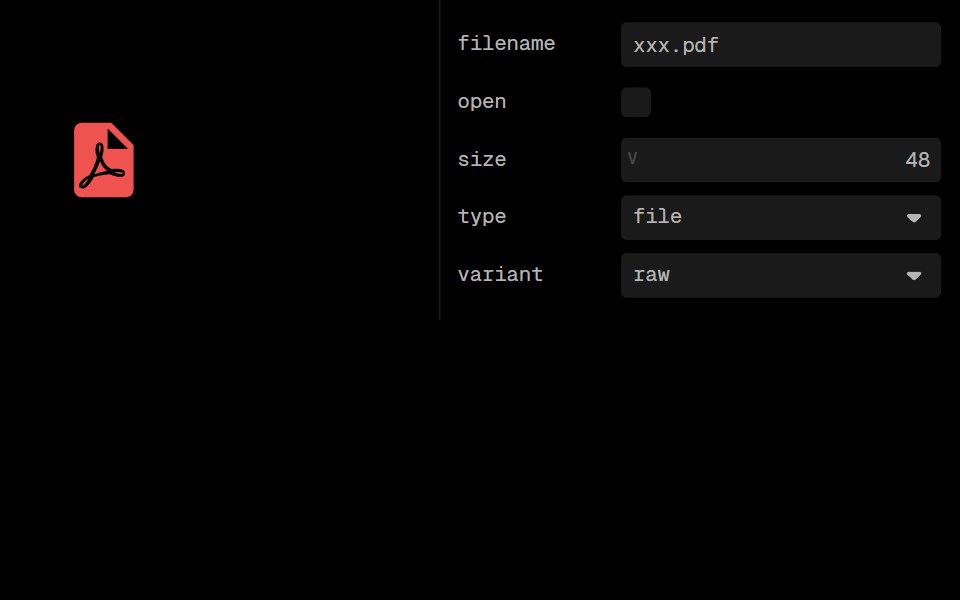 Material File Type IconLobe UI · ReactMaterialFileTypeIcon displays file and folder icons in Material Design style based on file extensions or folder names…
 Featured IconUntitled UI React · React
 Morphing IconUser Interface Wiki · React
 Launch UiLaunch UI · React
 Button 01 - With IconShadcn Space · ReactWith Icon button component
 Icon Morph SwapKinetics · HTML/CSSOutgoing icon blurs and rotates out, incoming settles in
 Logo Google Palmcnblocks · SvelteGoogle PaLM AI logo SVG component
 Notification BellUI Lab · ReactRings when something new arrives, and the badge rolls up with each one.
 Morph IconSpaceUI · ReactTransforms one vector icon smoothly into another with fluid shape morphing animations when state changes.
 VolumeSora UI · ReactAnimated volume icon that morphs smoothly between sound waves and a mute slash with speaker shake effect.
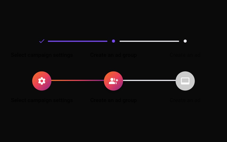 Step IconMUI / Material UI · React
 Status MarkReact Bits · ReactA 20px status glyph for agent task lists that morphs in place from a dashed idle ring to a spinning or real-progress…
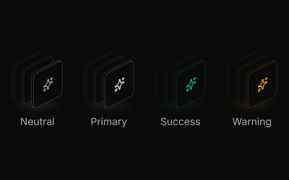 Icon stack colorsReUI · ReactSemantic icon stack colors
 Face Id ScanAmicro Micro Transitions · ReactFace Id Scan loading animation.
 Icon Auth0Lobe UI · React
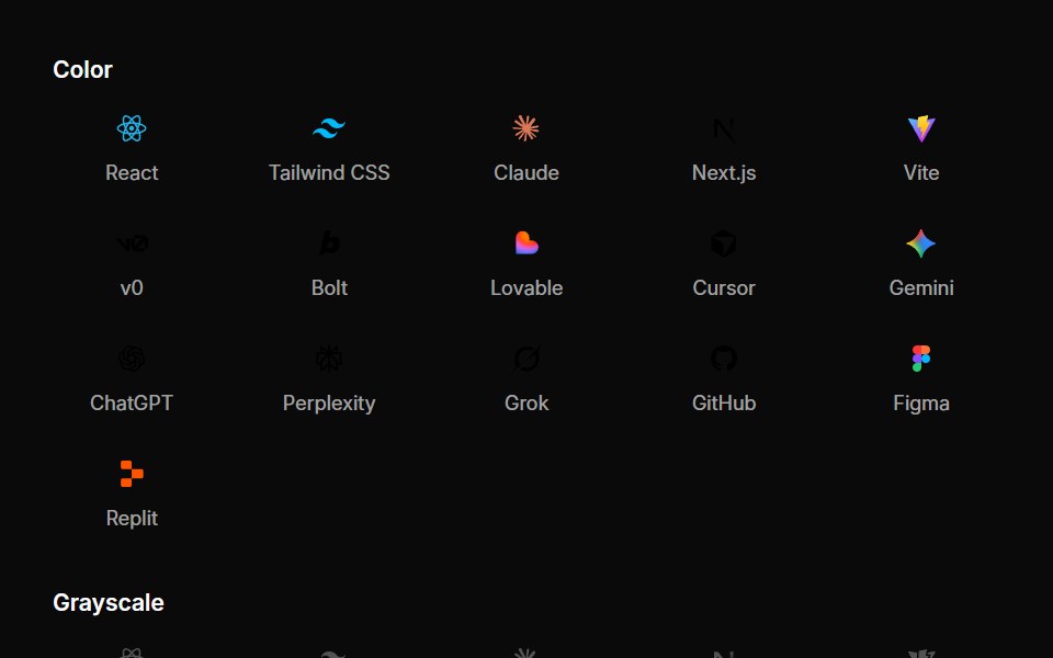 Integration IconsUntitled UI React · React
 Social Media And BrandsUser Interface Wiki · React
 ReactLaunch UI · React
 Button 08 - Social IconShadcn Space · ReactSocial Icon button component
 Logo Magic Uicnblocks · SvelteMagic UI logo SVG component
 TextmojiSpaceUI · ReactRenders every Unicode emoji in a string as an image sized to the surrounding text.
 Svg IconMUI / Material UI · React
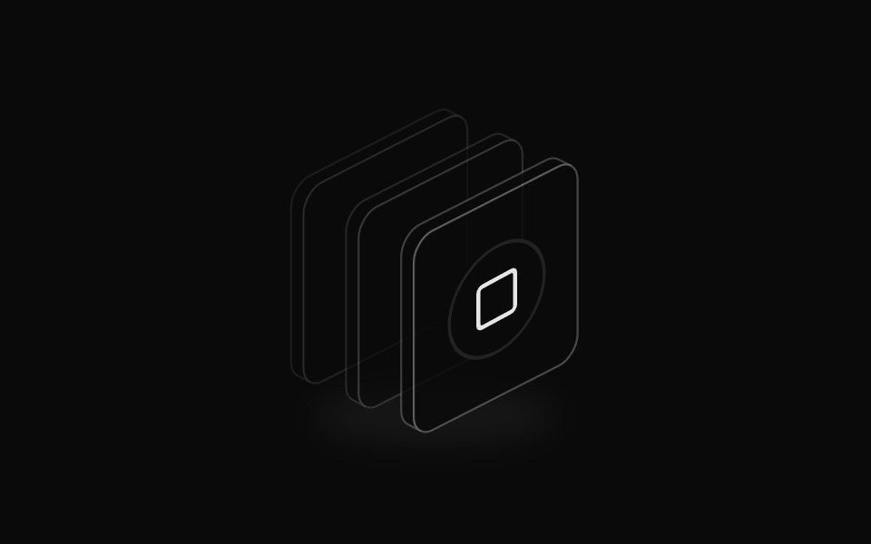 Icon badge stackReUI · ReactIcon stack with badge overlay
 Haptic RingAmicro Micro Transitions · ReactHaptic Ring loading animation.
 Icon AutheliaLobe UI · React
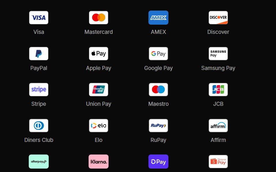 Payment IconsUntitled UI React · React
 Sound And MusicUser Interface Wiki · React
 Shadcn UiLaunch UI · React
 Button 09 - Outline With IconShadcn Space · ReactOutline With Icon button component
 Logo Media Wikicnblocks · SvelteMediaWiki logo SVG component
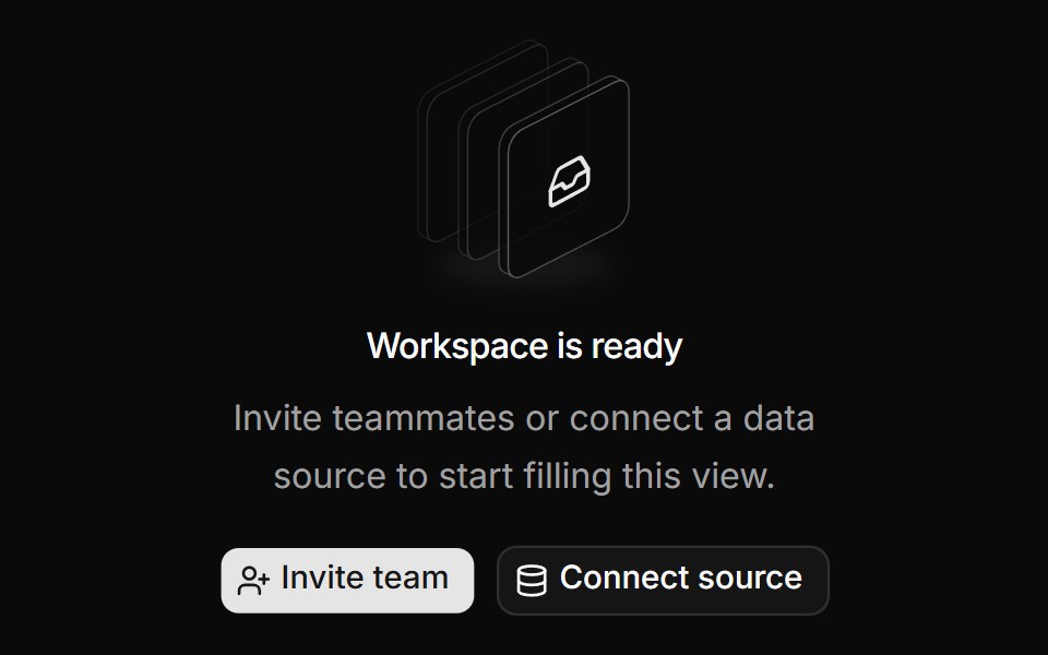 Empty state illustrationReUI · ReactShadcn empty state illustration
 HeartbeatAmicro Micro Transitions · ReactHeartbeat loading animation.
 Icon AuthentikLobe UI · React
 Social IconsUntitled UI React · React
 TailwindLaunch UI · React
 Checkbox-07 - Checkbox with custom iconsShadcn Space · ReactCheckbox component
 Logo Replitcnblocks · SvelteReplit logo SVG component
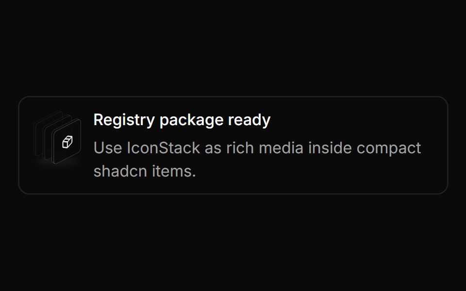 Item media stackReUI · ReactIcon stack in shadcn item
 Pumping HeartAmicro Micro Transitions · ReactPumping Heart loading animation.
 Icon CasdoorLobe UI · React
 TypescriptLaunch UI · React
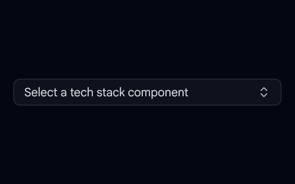 Combobox 01 - With IconsShadcn Space · ReactCombobox component with icons
 Logo Vscodiumcnblocks · SvelteVSCodium logo SVG component
 Default icon tileReUI · ReactDefault icon tile
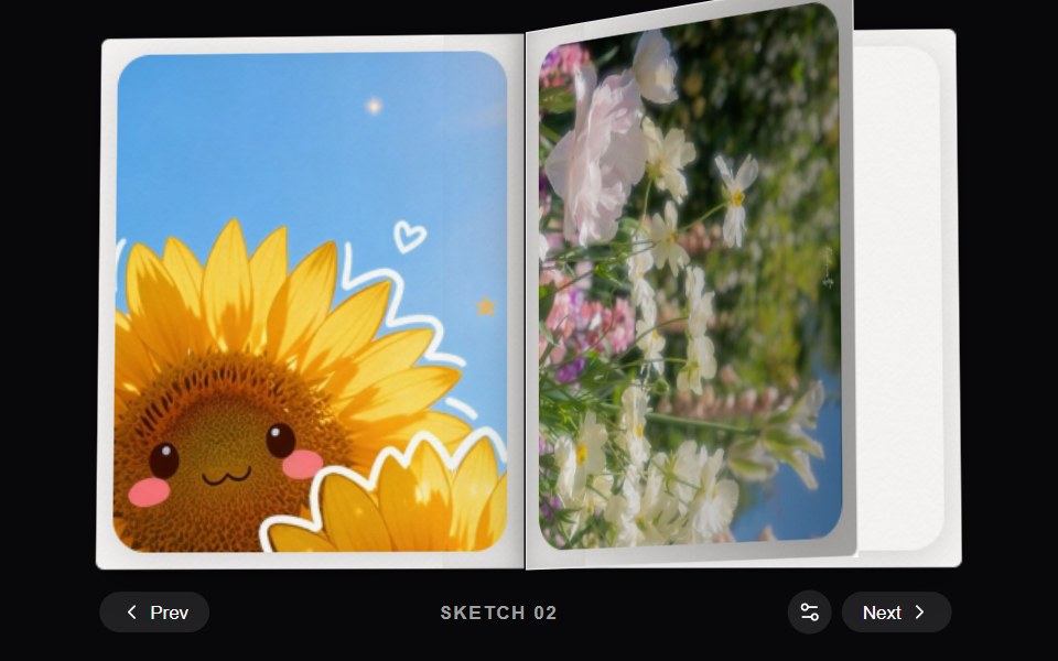 Dither BookAmicro Micro Transitions · React
 Icon ClerkLobe UI · React
 Combobox 02 - With Custom Check IconShadcn Space · ReactCombobox component
 Svgscnblocks · SvelteShared SVG logo and icon components
 List rowReUI · ReactIcon tile in a list row
 Button DirectoryAmicro Micro Transitions · React
 Icon Ding TalkLobe UI · React
 Feature 02 - Three Columns Feature with IconsShadcn Space · ReactA clean three card feature grid with icons and concise copy, built for product or SaaS pages to communicate core…
 Feature cardReUI · ReactIcon tile in a feature card
 Button EditAmicro Micro Transitions · React
 Icon DiscordLobe UI · React
 Select-02 - Select with iconShadcn Space · ReactSelect component
 Empty stateReUI · ReactIcon tile in an empty state
Libraries with icon components
Related categories
- React Icon Components
- Tailwind CSS Icon Components
- Svelte Icon Components
- Animated Icon Components
- shadcn/ui Icon Components
- Media Components
- Image Components
- Gallery Components
- Logo Components
- Illustration Components
- Mockup Components
- Animated Icon Components
- Audio Visualizer Components
- Scene 3D Components
- Video Player Components
- QR Code Components
- Icon Set Components
- Audio Player Components
- Image Zoom Components
- Image Compare Components
- Model Viewer Components