 Dev Design Library
Media Components
Dev Design Library indexes 702 media components from 80 open-source UI libraries, with the most coming from Pixel Perfect, Lobe UI, ReUI, Amicro Micro Transitions and OpenSourceUI. Each one links to its page with the source code, a live preview where available, the library license and the install command.
Showing 120 of 702, a mix from every library. Open a library to see all of its components.
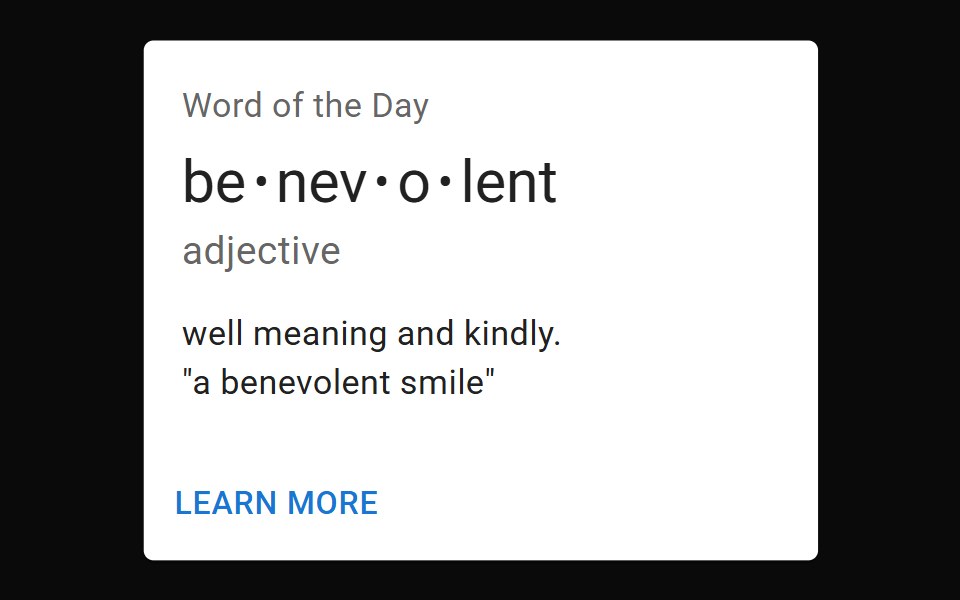 Card MediaMUI / Material UI · React
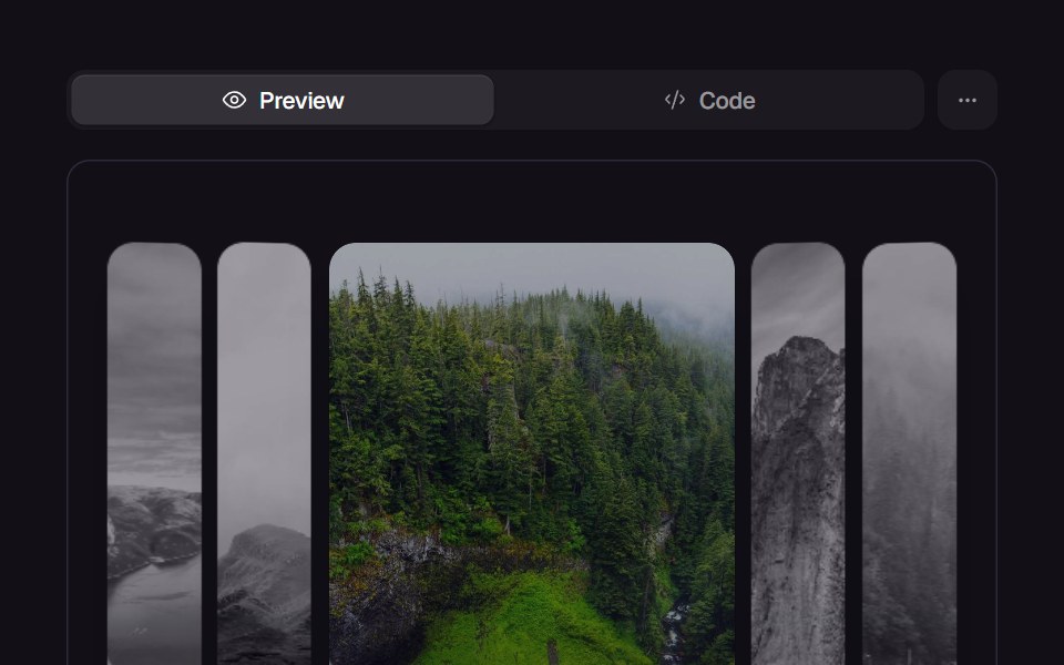 Accordion GalleryReact Bits · ReactPanels expand on hover or focus, revealing parallax imagery and captions.
 MockupdaisyUI · CSS (Tailwind)
 IconChakra UI · ReactUsed to display an svg icon
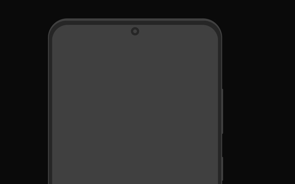 AndroidMagic UI · ReactA mockup of an Android device.
 IconReact Spectrum · ReactSpectrum icons are clear, minimal, and consistent across platforms. They follow the focused and rational principles of…
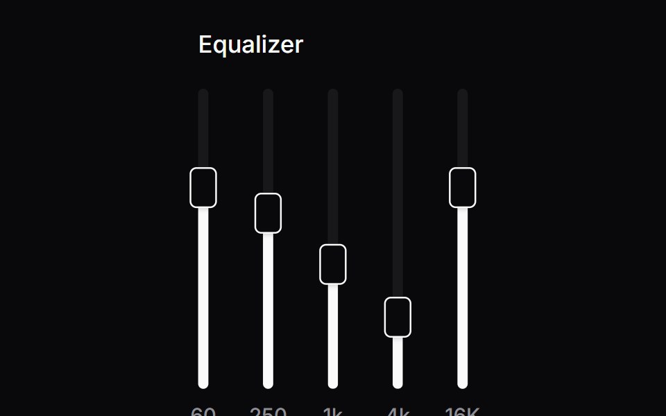 Comp 266Origin UI · React
 Accessible IconRadix Themes · React
 Bg MediaCult UI · ReactBackground media component with video/image support and overlay effects
 Qr CodeArk UI · ReactA component that generates a QR code based on the provided data.
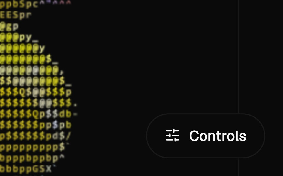 Ascii ObjectCanvas UI · ReactA 3D model or image redrawn as shape-matched ASCII.
 Icon Swaptransitions.dev · HTML/CSS
- Img FxLibraries.dev · ReactAnimated WebGL image-generation / loader effect for React cards
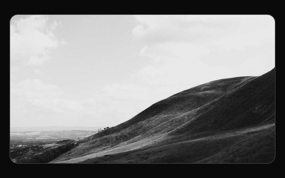 16:9 widescreen aspect ratioReUI · React16:9 widescreen aspect ratio
 Brand IconstheSVG
 Morphiconsmorphicons · ReactUniversal morphing for stroke-based icons with spring physics — zero runtime dependencies
 Event Ticketpdfcn · ReactEvent Ticket PDF block (forme)
 App Icon LoadAmicro Micro Transitions · ReactApp Icon Load loading animation.
 Audio PlayerAI Elements · ReactA composable audio player component built on media-chrome, with shadcn styling and flexible controls.
 IconPark UI · ReactA component for displaying scalable vector icons.
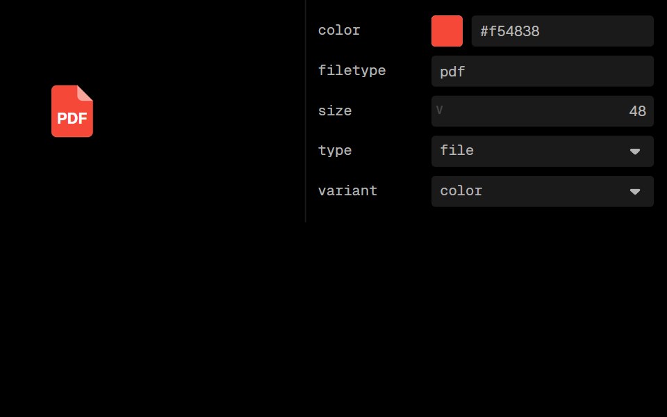 File Type IconLobe UI · ReactFileTypeIcon is a component that displays icons based on file types. It supports different file and folder types…
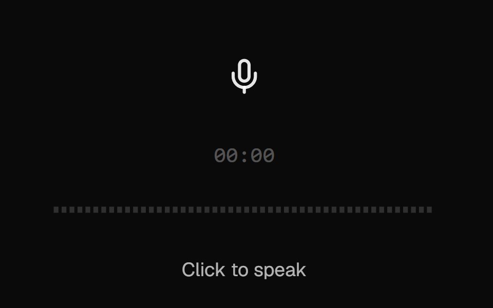 AI VoiceKokonut UI · ReactVoice input with a scrolling waveform, then a take you can play back, discard or send.
 Text Icon CursorCursify · React
 Play Button IconUntitled UI React · ReactRounded play icon with blurred background and a filled triangle in the middle.
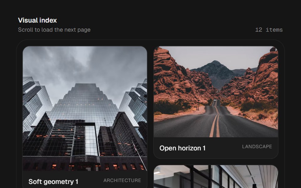 Infinite MasonrybeUI · ReactResponsive virtualized masonry that measures variable-height cards and loads more data as the user nears the end.
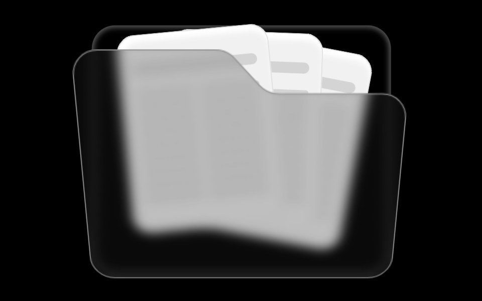 Folder ComponentRare UI · ReactAn animated folder whose cards fan out on hover and lift open on click, with a 3D-tilted flap. Supports color and size…
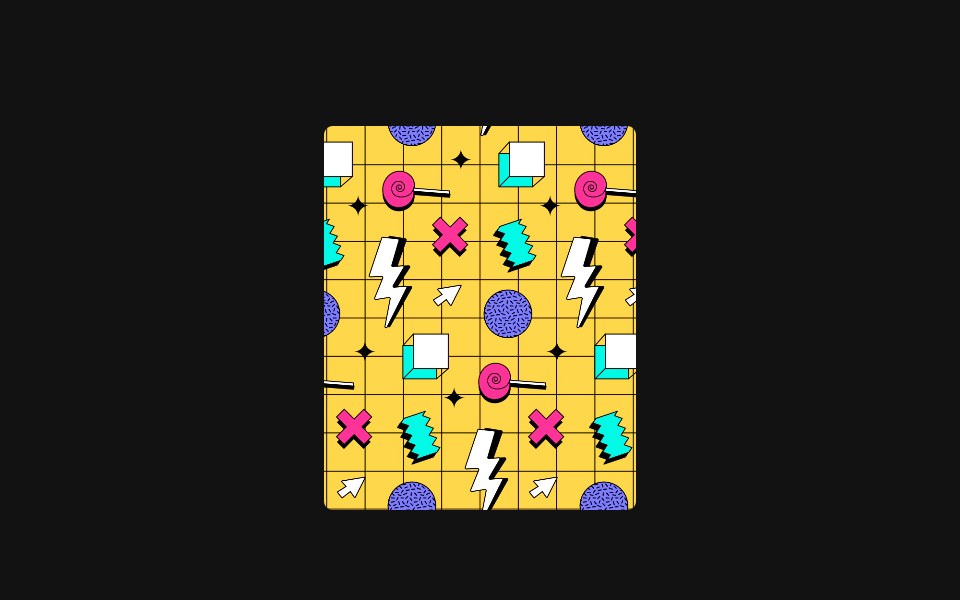 Disclose ImageSpectrum UI · ReactAn image reveal component with animated sliding door panels.
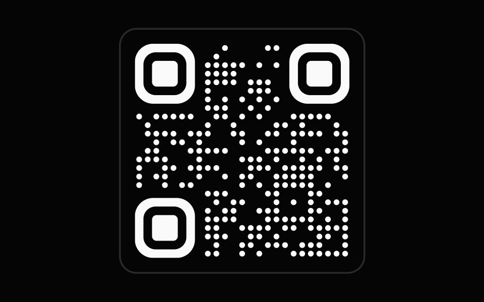 QR CodeSpell UI · ReactQR code generator with rounded finder patterns and dot-style data modules.
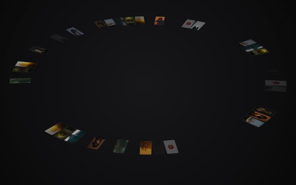 Circular GalleryVengeance UI · ReactRelaxing 3D ring of images with drag-spin, parallax tilt, and center preview
 File ThumbnailFluid Functionalism · ReactRead-only square preview of a File. Images render via object-cover; PDFs render their first page via pdfjs; a spinner…
 ArrowsUser Interface Wiki · React
 FigmaLaunch UI · React
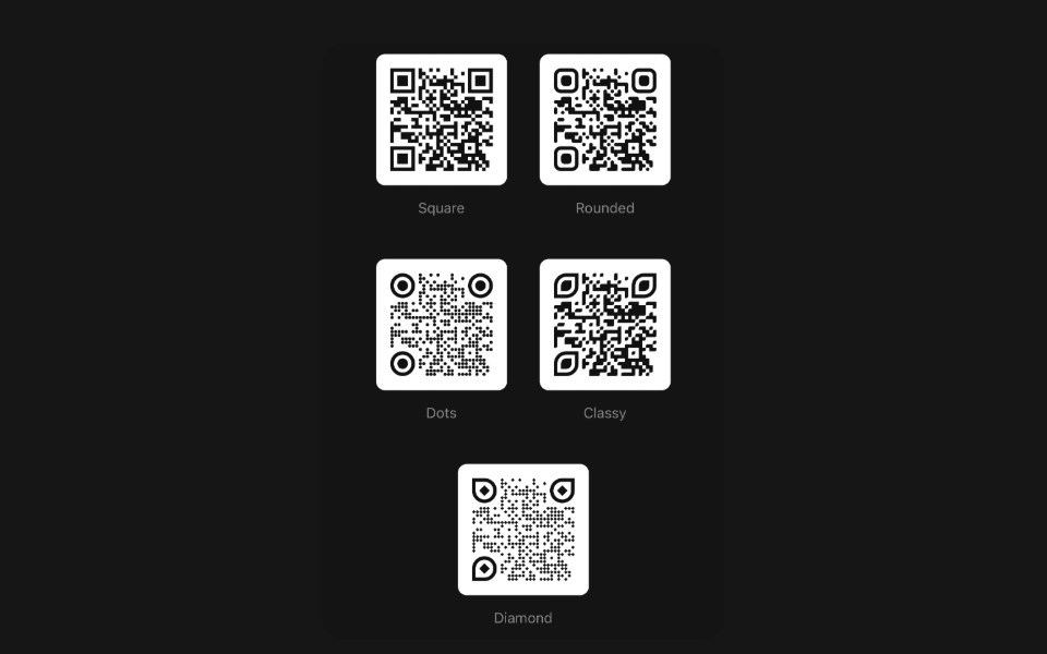 Qr CodePanel UI · React NativeA string a camera can read — framed, titled, or folded away behind a button.
 Accordion-05 - MediaShadcn Space · ReactAccordion with icon trigger, description, and an image revealed on open
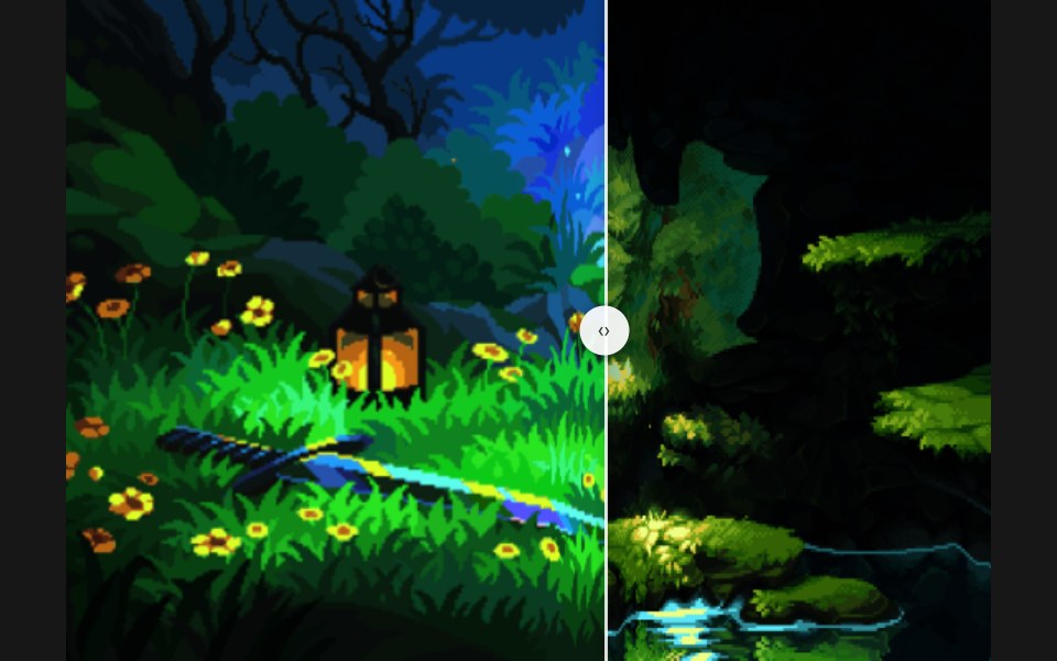 Before AfterPixel Perfect · ReactDrag the handle to wipe between two images with a liquid seam.
 Hard Shadow Polaroid FrameOpenSourceUI · ReactPolaroid frame with a crisp inner border, thick caption chin, and hard offset shadow — pass caption and any image or…
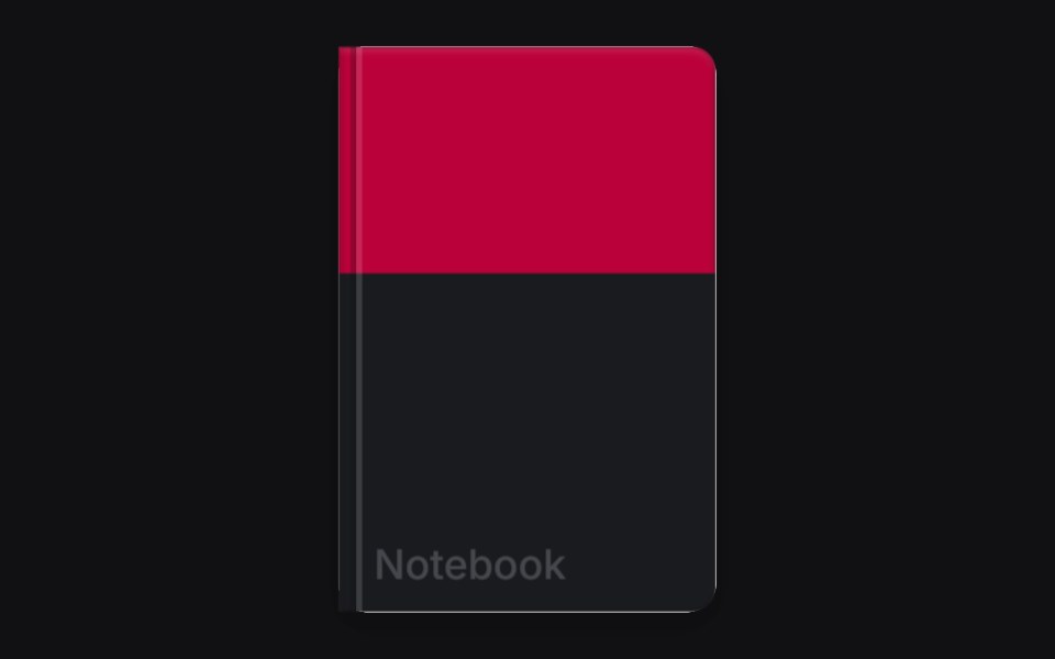 3D Bookuselayouts · ReactAn interactive 3D book component with page flip animations.
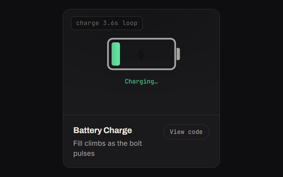 Battery ChargeKinetics · HTML/CSSFill climbs as the bolt pulses
 BrandBoardUI · React
 Circuit BoardComponentry · ReactAnimated circuit board visualization with nodes and connections.
 Comparator Onecnblocks · SvelteBefore/after image comparison slider block
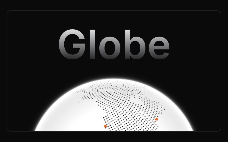 GlobeAnimations (Svelte) · SvelteAn autorotating, interactive, and highly performant globe made using WebGL.
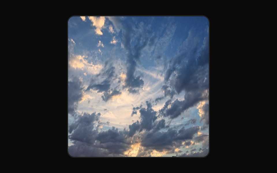 ImageAI Elements (Svelte) · SvelteA data-URL image component with typed props for AI-generated image payloads.
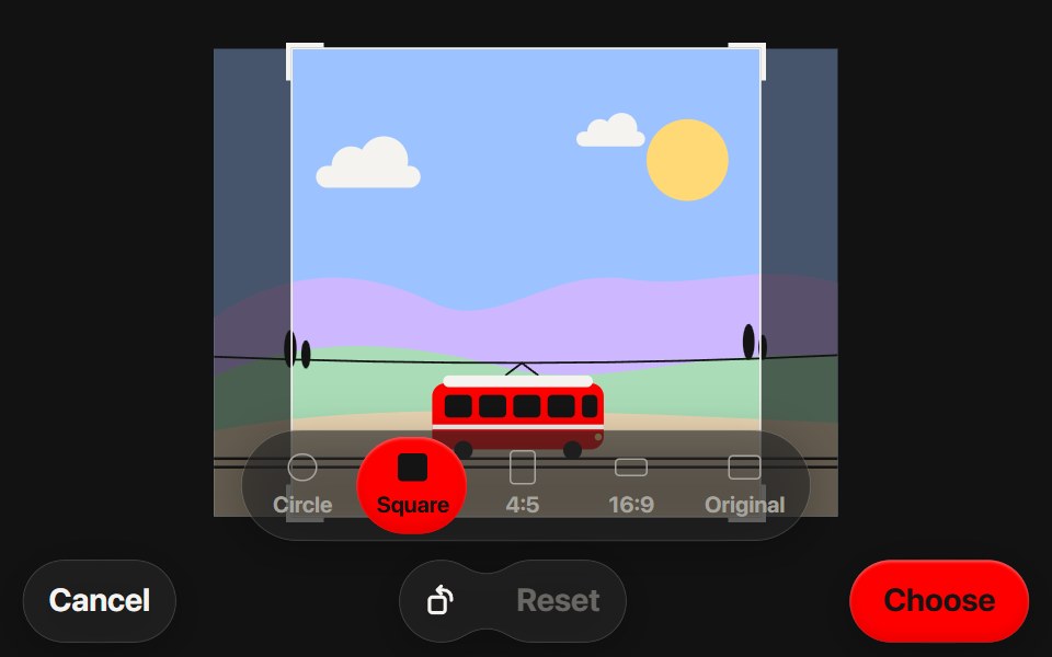 Photo CropperSwiftPieces · SwiftUIA crop step for profile photos and posts with pinch, pan and aspect presets, rendering the crop off the main thread at…
 Image SplitBadtz UI · ReactThis component provides a dynamic and visually captivating way to display images split into multiple sections.
 Art GalleryObsidianUI · ReactA lensed photo grid you can drag through, with barrel distortion and infinite tiled studies.
 Gemini SparkleNotra · ReactGemini's three-dot mark that bounces and folds into a triangle.
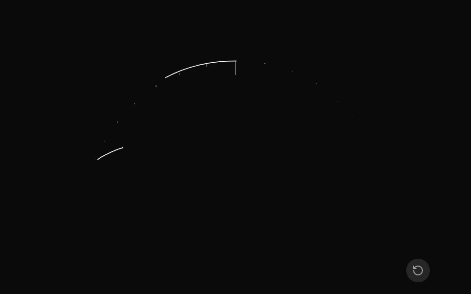 Animated PathGreatUI · ReactSVG path that draws itself from start to end.
 Gallery 01Oxbow UI · Astro
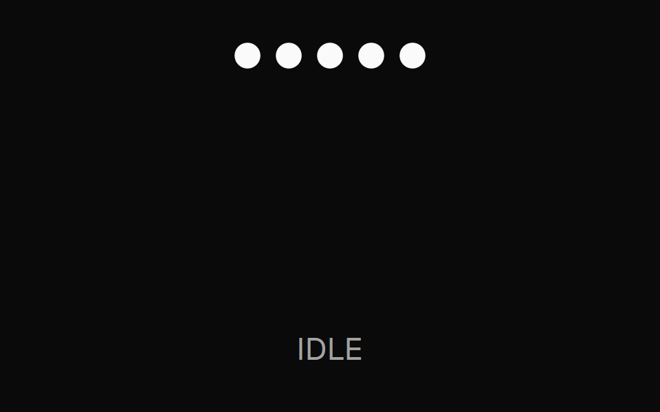 Bars ThemeNexvyn UI · ReactA traveling-wave bars visualization with 5 vertical bars sharing a sine-wave frequency, evenly phase-shifted left to…
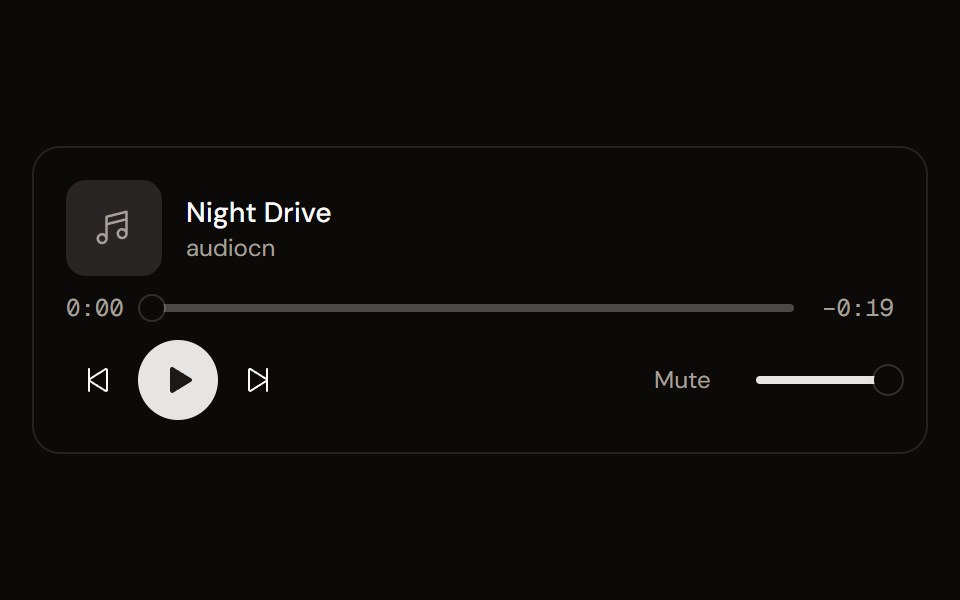 Audio Playeraudiocn · ReactA composable audio player: transport, seek bar with buffering, time, volume, playback rate, loop and keyboard shortcuts.
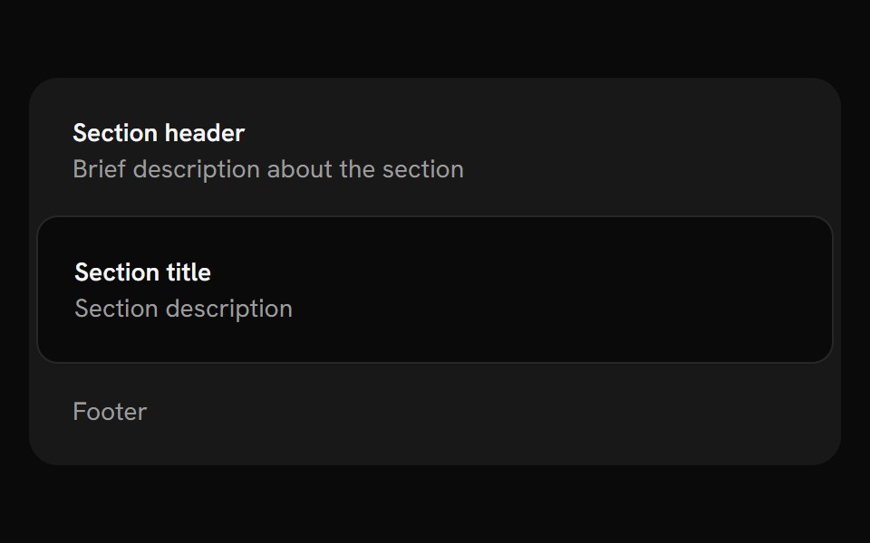 FrameShark UI · ReactBordered box for grouping related content.
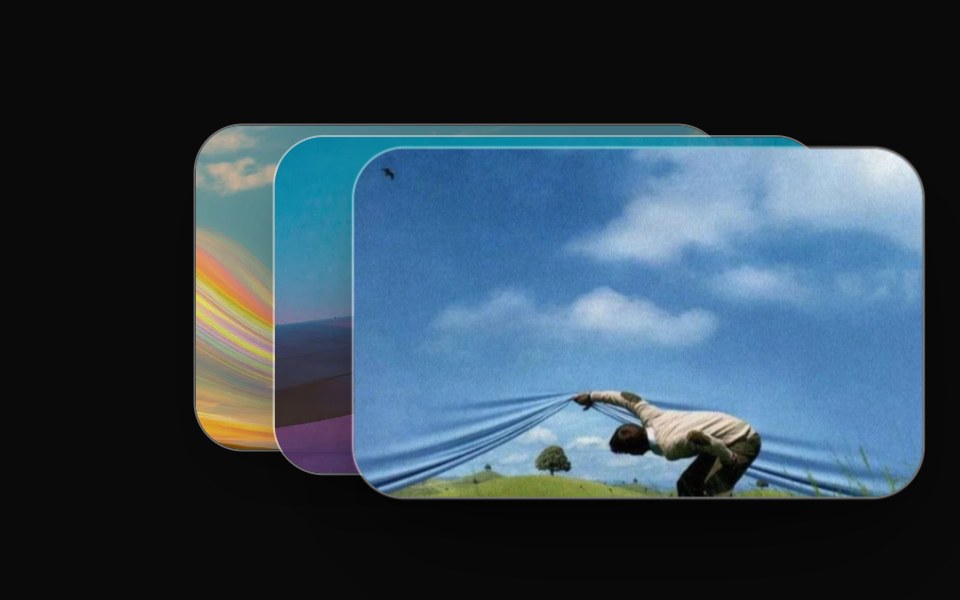 Perspective Flip DeckRewamp UI · ReactExact recreation of Recording 2026-09-15 154736.mp4: 3D isometric perspective fanned card deck. When cycling, the…
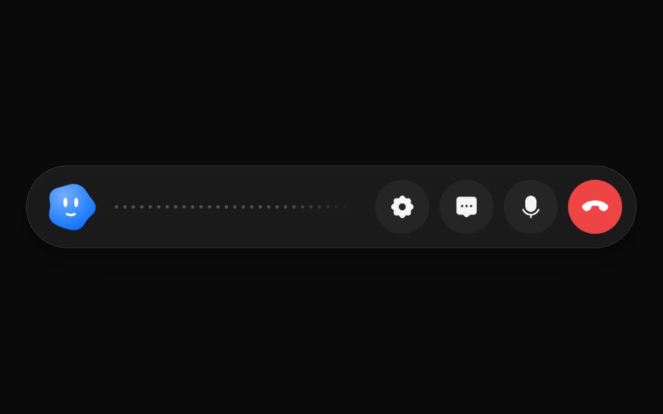 Voice ChatAI CSS · ReactA voice chat screen for an AI assistant: listening state, live waveform, transcript and voice settings.
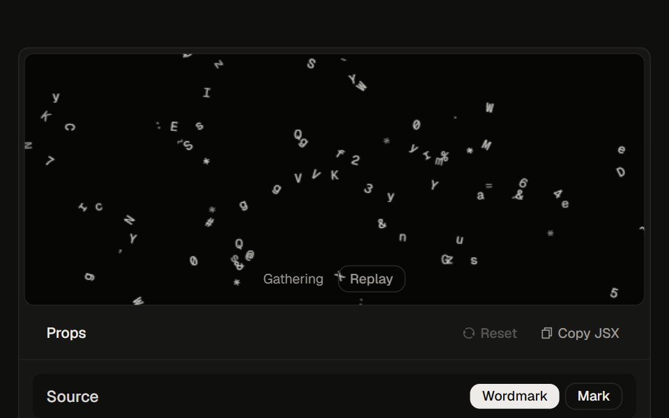 ASCII Logo23rd.dev · ReactInteractive ASCII wordmark: glyphs shove away from the cursor, then click-cycle through scatter, gravity drop, and…
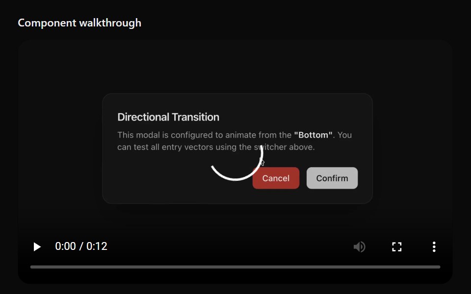 Floating ViewerSona UI · ReactAn in-page media surface that automatically or manually detaches, stays within viewport bounds, snaps to a corner, and…
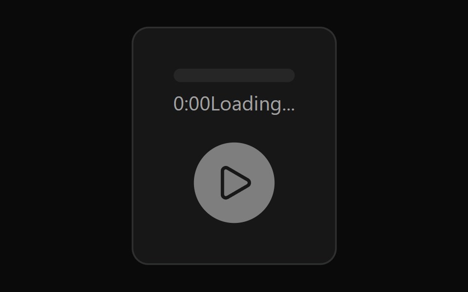 Audio PlayerWatermelon UI · React
 Hero Threesv-efferd · SvelteA modern hero layout with mega-nav header, device mockup spotlight, and compact logo grid.
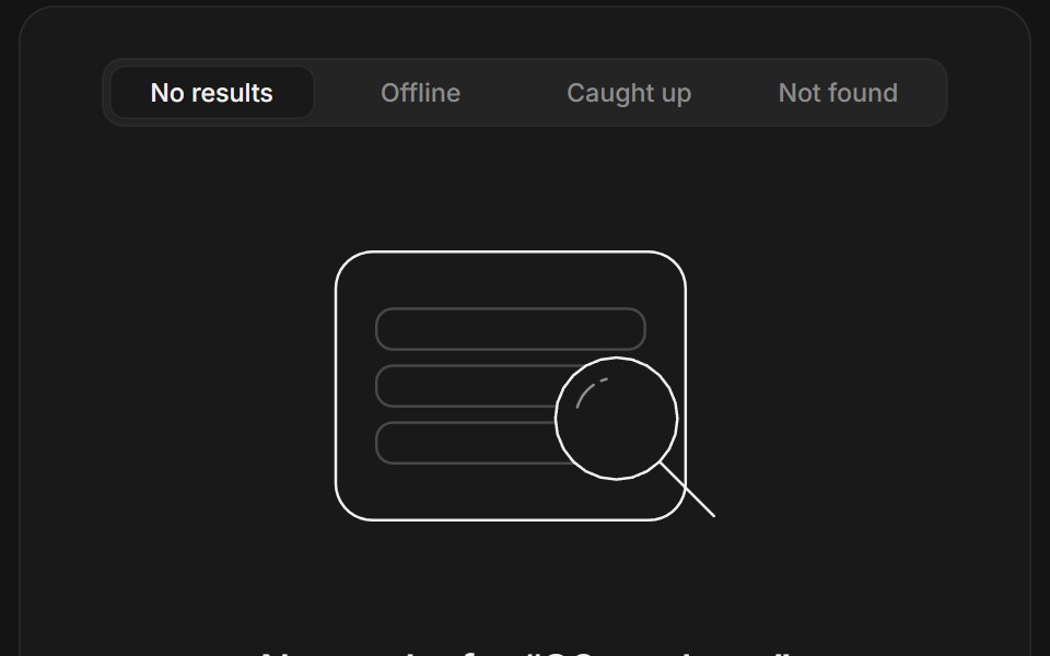 Empty statesArc Library · ReactFour empty states in one illustration whose shapes morph between scenes as you switch tabs.
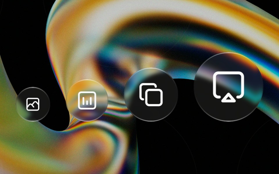 Glass Iconglasscn · ReactA circular glass chip that wraps any icon, iOS-control-center style. Preset sizes scale the circle and icon together…
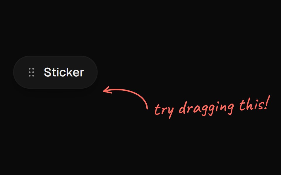 Arrow CalloutUI Lab · ReactA handwritten note whose arrow draws itself to whatever it points at.
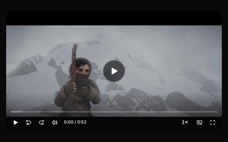 Video playerHextaUI · ReactA video player with a scrubbable seek bar, auto-hiding controls, keyboard shortcuts, speed, picture in picture and…
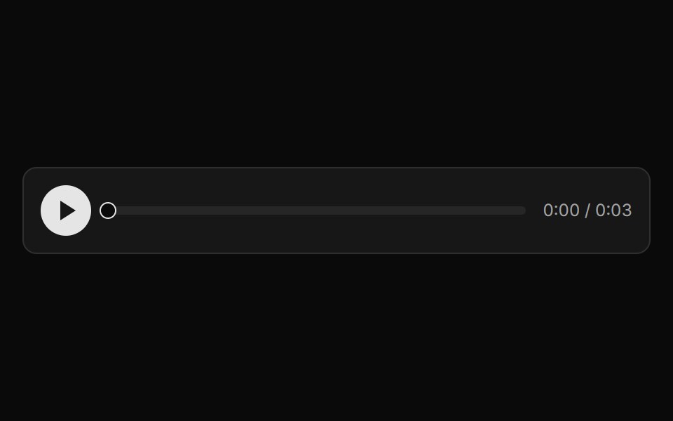 Audio Scrub PlayerLocalMode · ReactA composable scrubbable audio player for local Blob/object-URL audio (Kokoro TTS output or recordings) — play/pause, a…
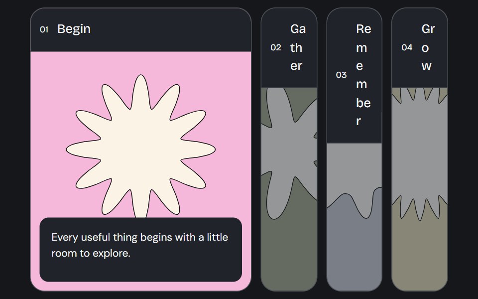 Accordion GalleryCojeev UI · ReactA selected image panel opens to reveal its label, story and action.
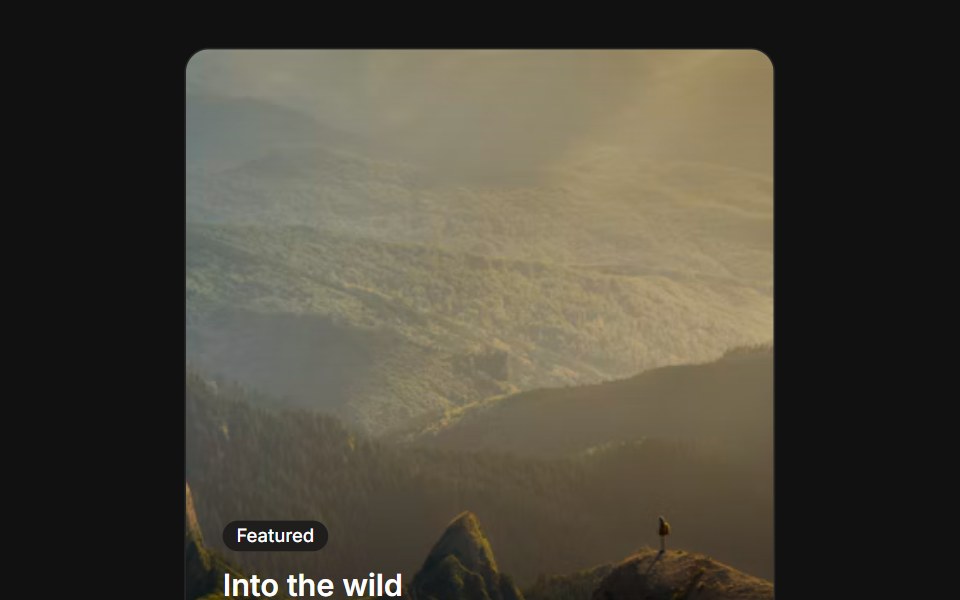 Image overlayFLX UI · ReactText and a CTA over a gradient-darkened cover image.
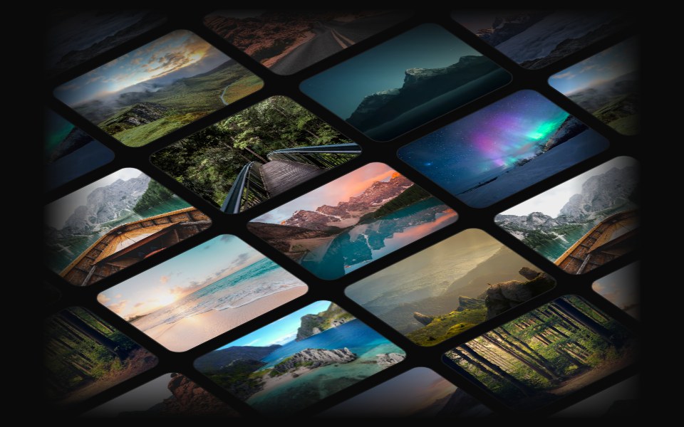 3D MarqueeVelora UI · ReactA tilted 3D grid of images whose columns scroll up and down in an endless loop.
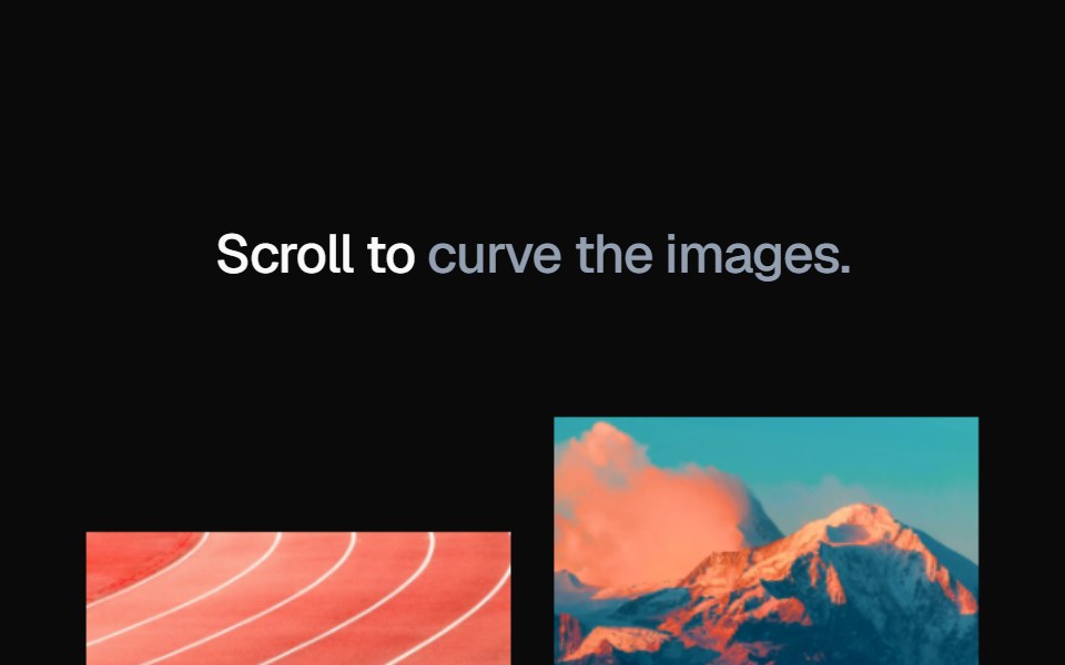 Curve MediaAtelier UI · React
 Agent GlyphHalaska UI · React
 Qr Code Signinsv-particles · Svelte
 Progress ImagePin UI · React
 AnimojiSpaceUI · ReactRenders every Unicode emoji in a string as an animated image sized to the surrounding text.
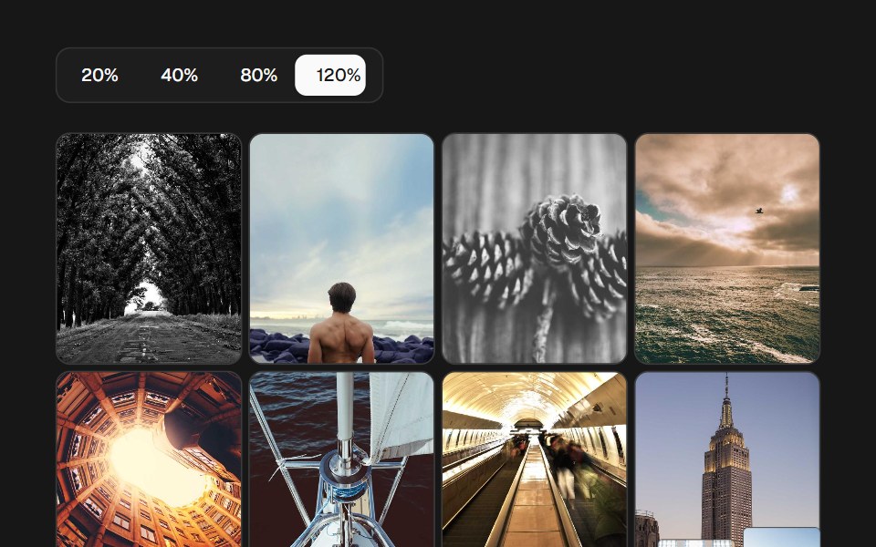 Image Density GridSkecher UI · ReactA percentage-controlled image grid with animated density changes, soft focus, and optional controls.
 Arrow RightSora UI · ReactAnimated right arrow that nudges forward and redraws its stroke on hover using a pure CSS stroke-dash animation.
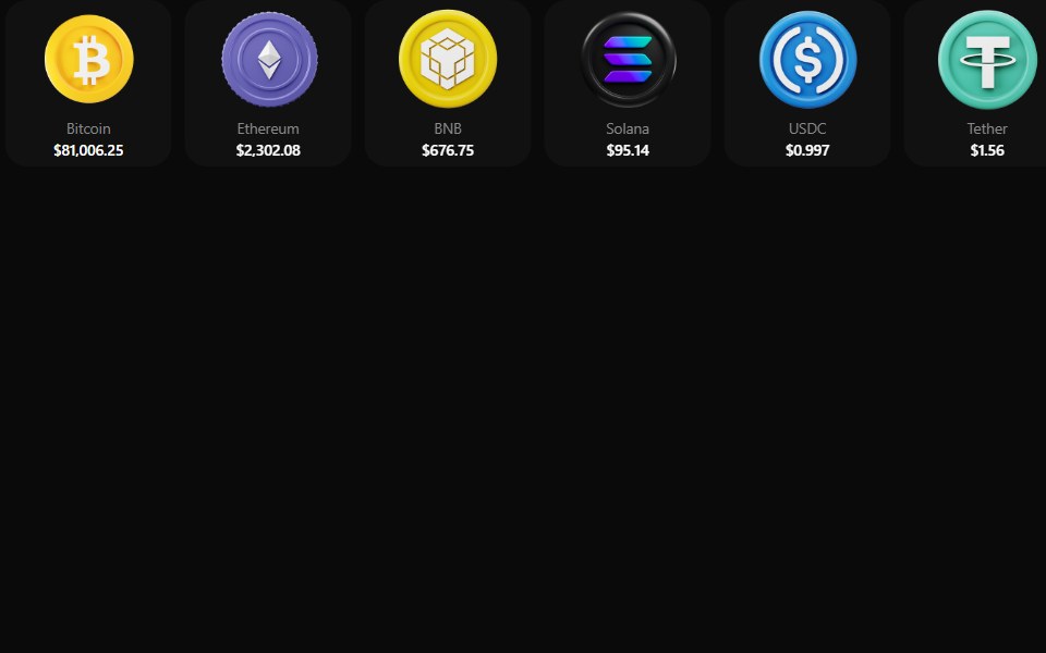 Coin MorphZAYX · React NativeReact Native crypto coin list (CoinMorphList) with an animated counter and a coin detail modal.
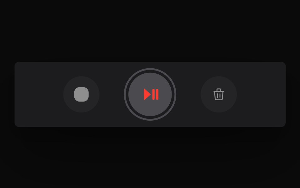 Live Waveform Audio RecorderCue Foundations · React
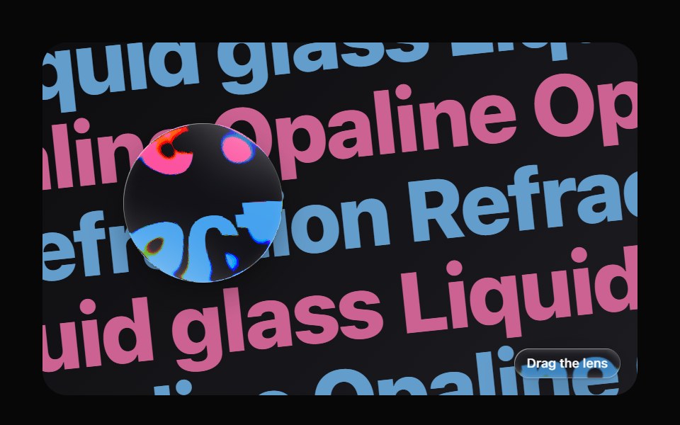 Glass LensOpaline · ReactDraggable magnifying lens that bends whatever is beneath it.
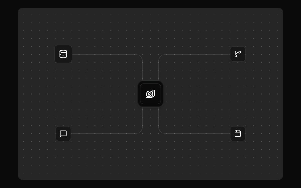 Integration VisualFibo · ReactA hub and the tools wired into it, with pulses along the routes.
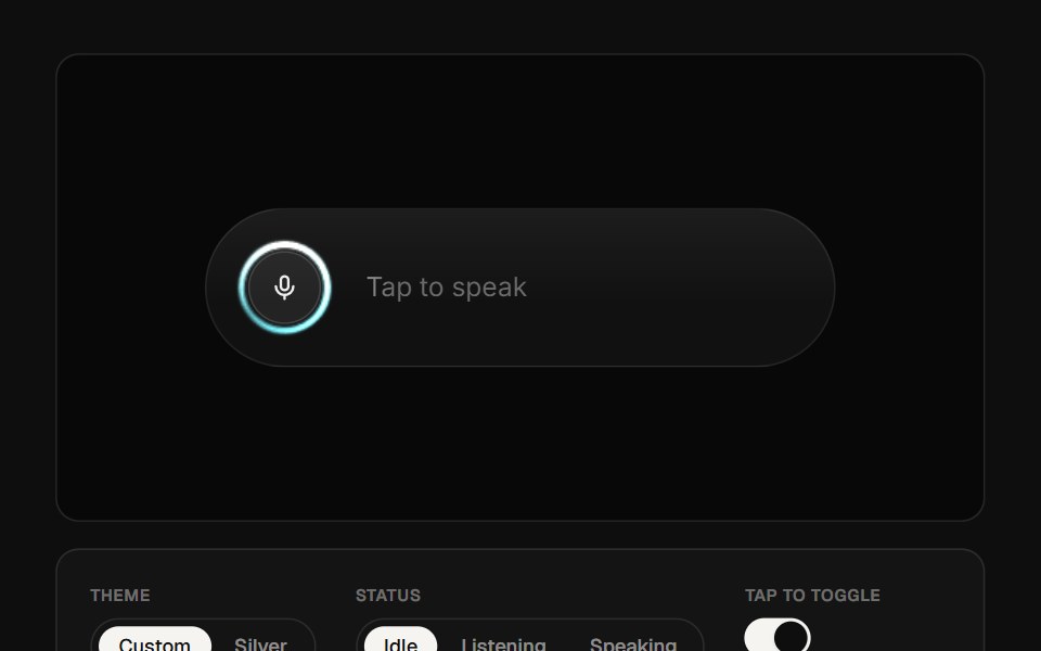 AI Voice 01ReactFrame · ReactA voice-assistant pill with a canvas audio-reactive visualizer, idle/listening/speaking states, a glowing edge ring…
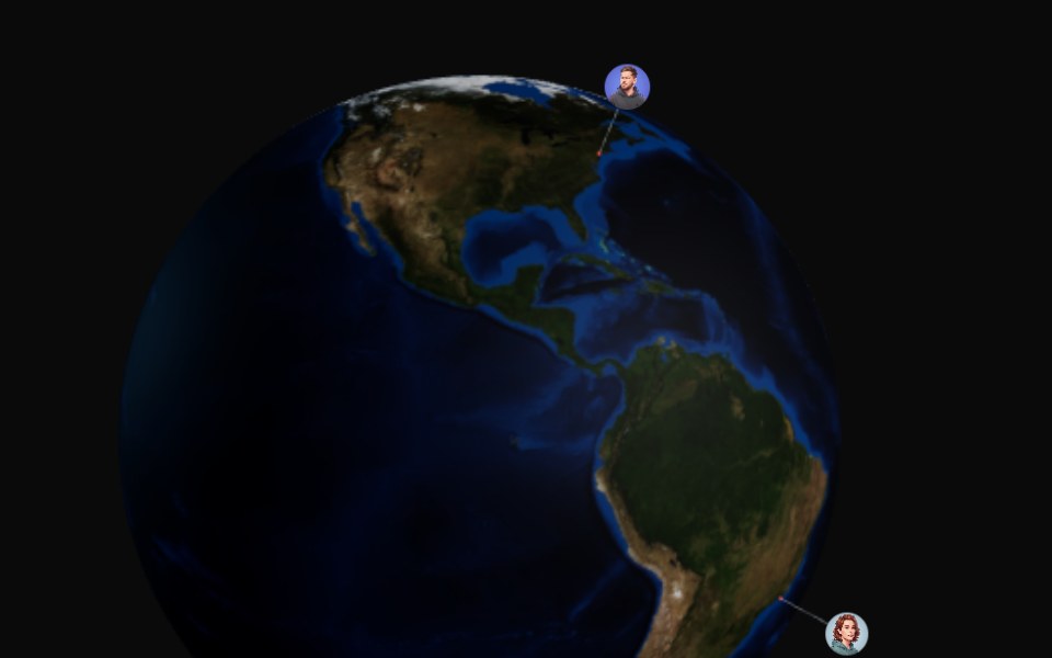 3d GlobeAceternity UI · React
 Qr Codeark-cn · ReactA shadcn-style qr code component built with Ark UI primitives.
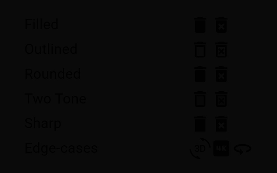 IconMUI / Material UI · React
 Bell ToggleReact Bits · ReactPill toggle that answers a press at three tempos: the bell rings on damped keyframes, the label blur-crossfades, and…
 ImageChakra UI · ReactUsed to display images
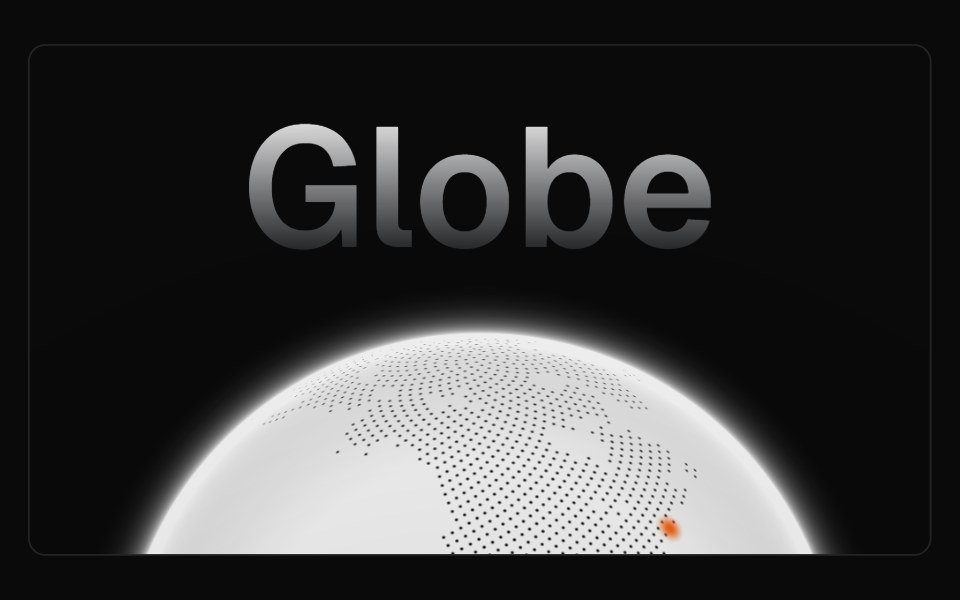 GlobeMagic UI · ReactAn autorotating, interactive, and highly performant globe made using WebGL.
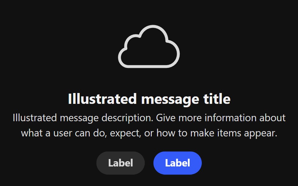 Illustrated MessageReact Spectrum · ReactAn IllustratedMessage displays an illustration and a message, usually for an empty state or an error page.
 Comp 554Origin UI · React
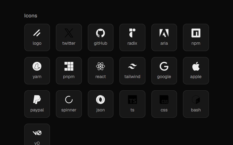 File IconsCult UI · ReactIcon set for file types and languages
 SwapArk UI · ReactAnimate between two visual states with smooth transitions.
 Dithered ObjectCanvas UI · ReactA 3D model or image rendered through a 1-bit dither.
 Image Open Tilttransitions.dev · HTML/CSS
- Voice GlowLibraries.dev · ReactSound-reactive glow for React — a centered, colorful beam along the bottom edge that rises and blooms with voice…
 4:3 standard aspect ratioReUI · React4:3 standard aspect ratio
 Pdf Imagepdfcn · ReactPdf Image PDF component (forme)
 Apple EqualizerAmicro Micro Transitions · ReactApple Equalizer loading animation.
 ImageAI Elements · ReactDisplays AI-generated images from the AI SDK.
 IconLobe UI · ReactIcon is a component based on lucide-react that provides rich icon selection and customization options. It supports…
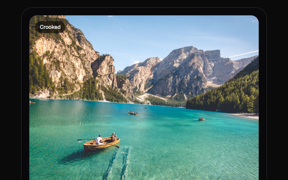 Photo StraightenKokonut UI · ReactLevel a crooked photo on a ruler you drag or flick. The crop grows to hide the corners, and a grid shows while you…
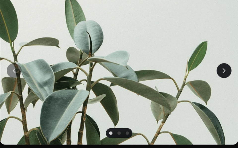 CarouselUntitled UI React · React
 Preview RailbeUI · ReactCodex app-inspired navigation rail with compact ticks that form a hover pyramid and reveal a floating destination…
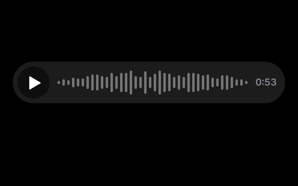 Voice NoteRare UI · ReactA voice message bar with a scrubbable waveform and a play control.
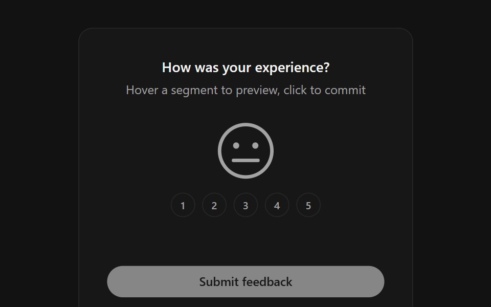 Face RatingSpectrum UI · ReactA five-level feedback rating where one large SVG face morphs its mouth, eyes and color between moods as you hover and…
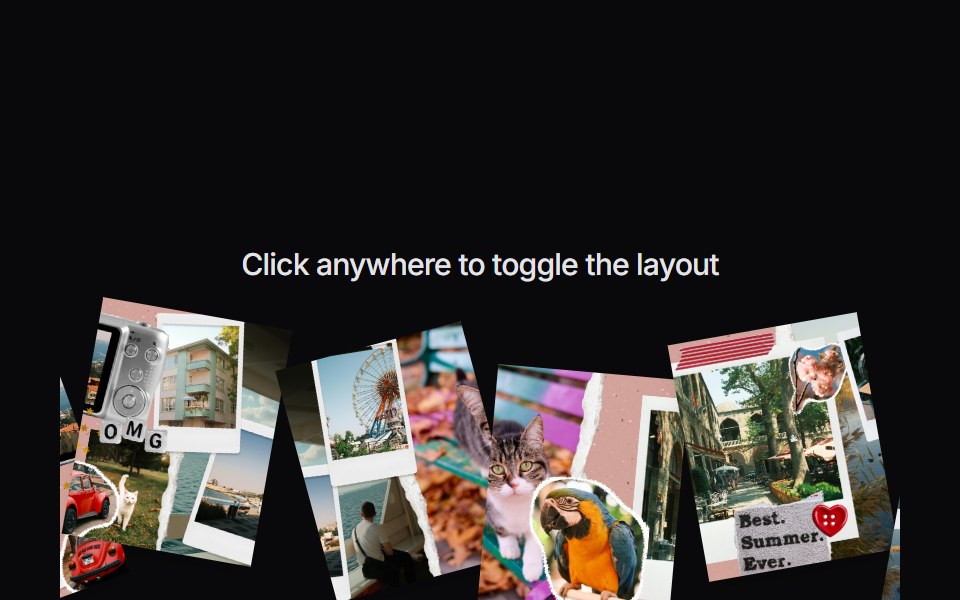 Image CollageVengeance UI · ReactInteractive scattered image collage toggle
 Sidebar Workspace HeaderFluid Functionalism · ReactWorkspace brand row for a sidebar header: 20px tile on the rows' leading axis, name pinned to the 32px text axis…
 Interface GeneralUser Interface Wiki · React
 GithubLaunch UI · React
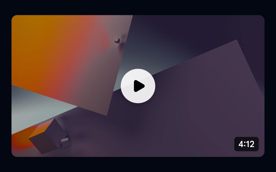 Aspect Ratio 04 - Video ThumbnailShadcn Space · ReactA 16:9 video thumbnail with a play button overlay and duration badge.
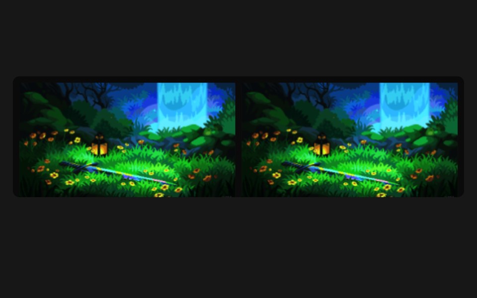 Bend Image RevealPixel Perfect · ReactA pixel-art frame that flies in and warps with an air-friction bend, deformed on a WebGL plane by a GSAP-driven vertex…
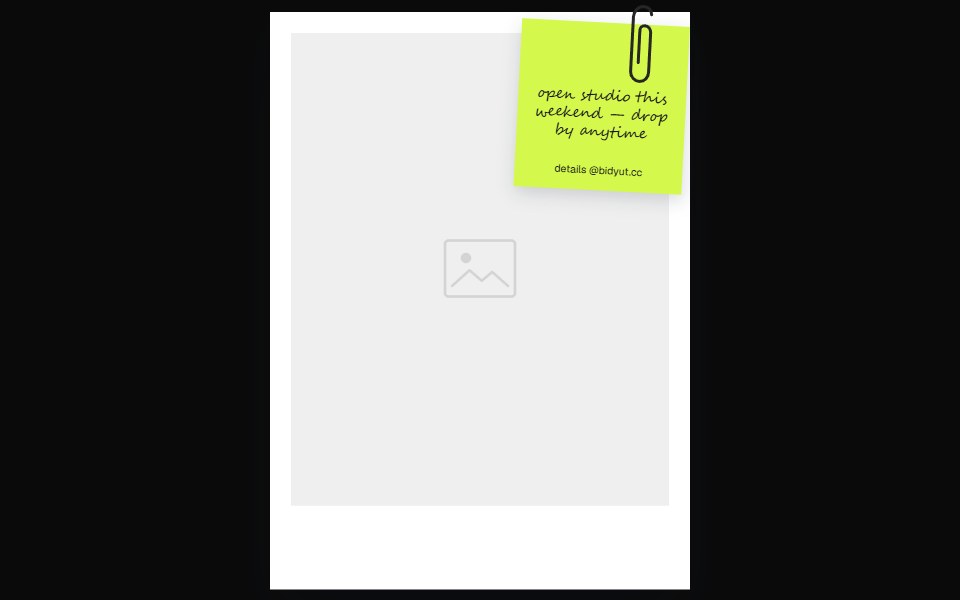 Sticky Note Polaroid FrameOpenSourceUI · ReactPolaroid-style frame with a paper-clipped sticky note overlay — pass noteHeader, noteBody, noteFooter, and any image…
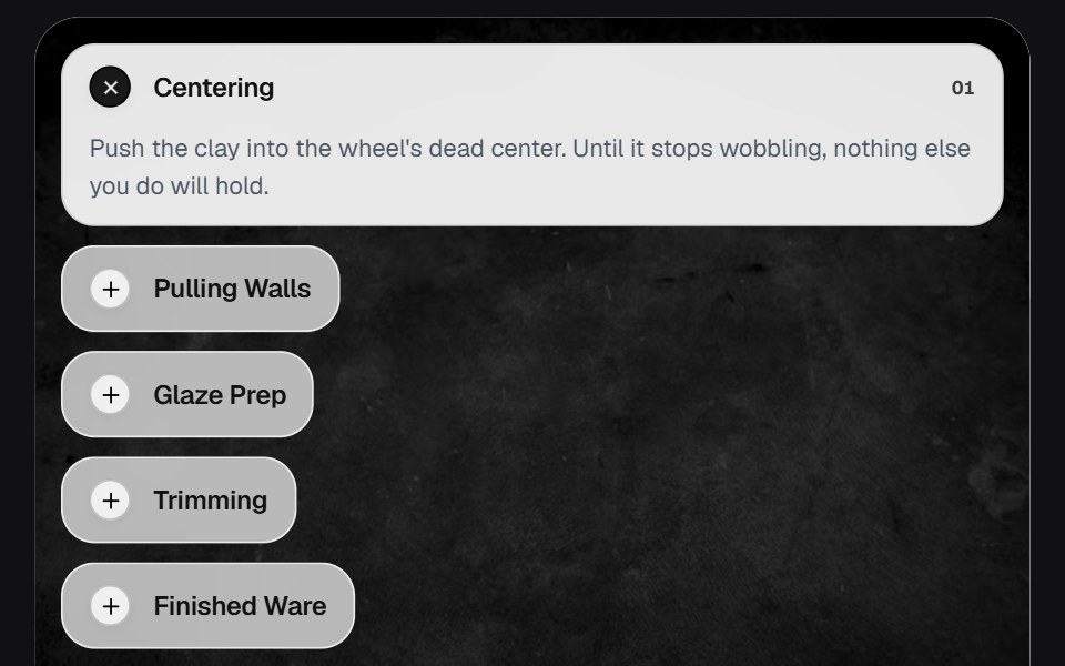 AccordionOSuselayouts · ReactInteractive accordion showcase with animated content, image transitions, hover effects, keyboard navigation, autoplay…
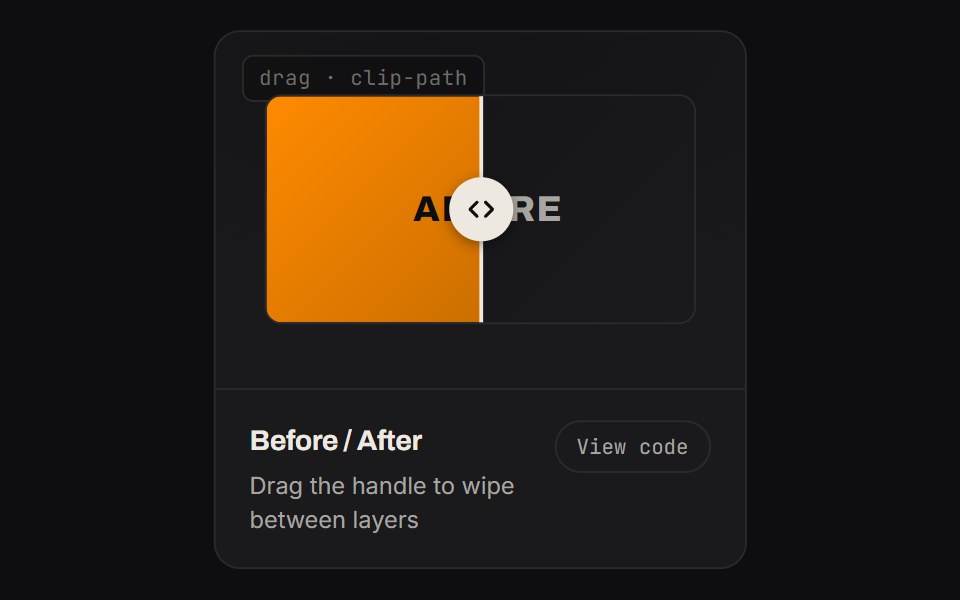 Before AfterKinetics · HTML/CSSDrag the handle to wipe between layers
 IconsBoardUI · React
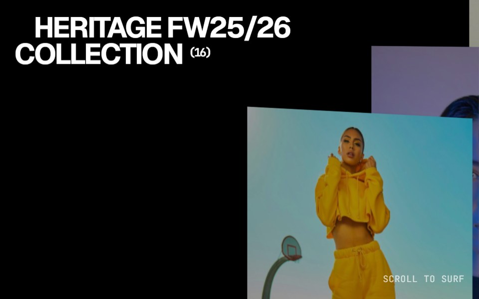 Collection SurferComponentry · ReactSmooth surfing interaction for browsing collections.
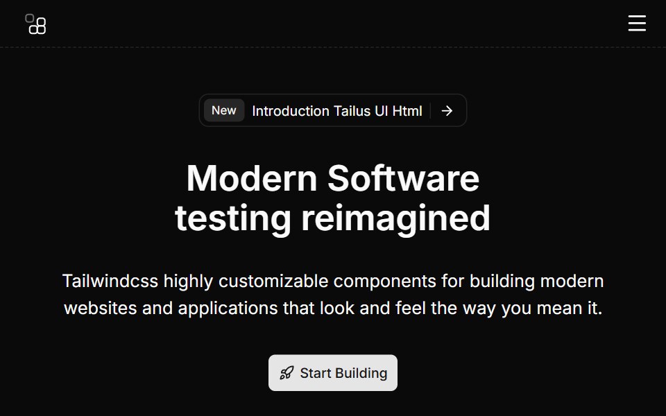 Hero Eightcnblocks · SvelteHero with video background and overlay
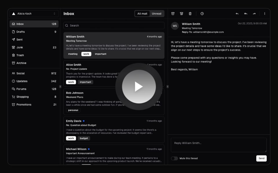 Hero Video DialogAnimations (Svelte) · SvelteA video dialog component with animated entrance effects, thumbnail support, and customizable animation styles.
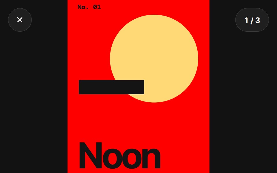 Photo ViewerSwiftPieces · SwiftUIA full-screen photo viewer with anchored pinch zoom, momentum panning, paging and drag to dismiss under glass controls.
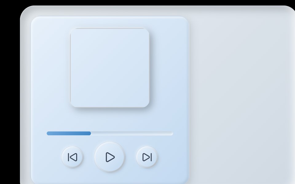 Skeumorphic Music CardObsidianUI · React
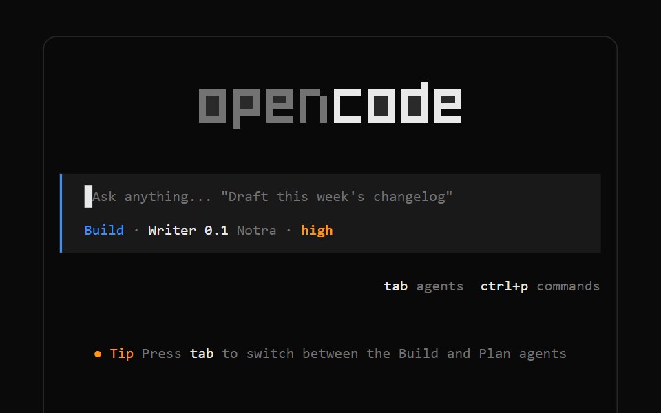 OpenCode LogoNotra · ReactThe block-letter OpenCode wordmark drawn on a cell grid and themed with tokens.
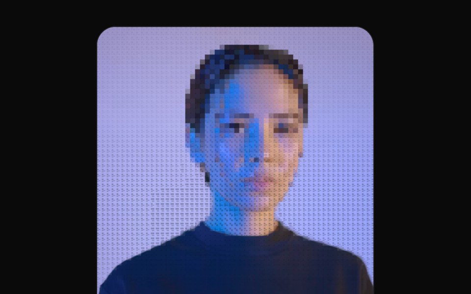 Ascii ImageGreatUI · React
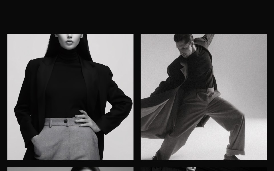 Gallery 02Oxbow UI · Astro
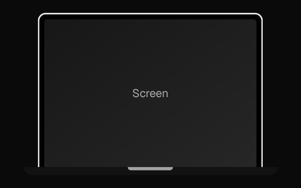 Laptop MockupNexvyn UI · ReactA laptop device-frame illustration for showcasing app screens.
Libraries with media components
Related categories
- React Media Components
- Tailwind CSS Media Components
- Svelte Media Components
- Animated Media Components
- shadcn/ui Media Components
- Icon Components
- Image Components
- Gallery Components
- Logo Components
- Illustration Components
- Mockup Components
- Animated Icon Components
- Audio Visualizer Components
- Scene 3D Components
- Video Player Components
- QR Code Components
- Icon Set Components
- Audio Player Components
- Image Zoom Components
- Image Compare Components
- Model Viewer Components