 Dev Design Library
shadcn/ui Media Components
Dev Design Library indexes 66 shadcn/ui media components from 16 open-source UI libraries, with the most coming from Shadcn Space, FLX UI, Cojeev UI, Velora UI and Notra. Each one links to its page with the source code, a live preview where available, the library license and the install command. They follow the shadcn/ui conventions, so most install with the shadcn CLI and drop into a Tailwind project.
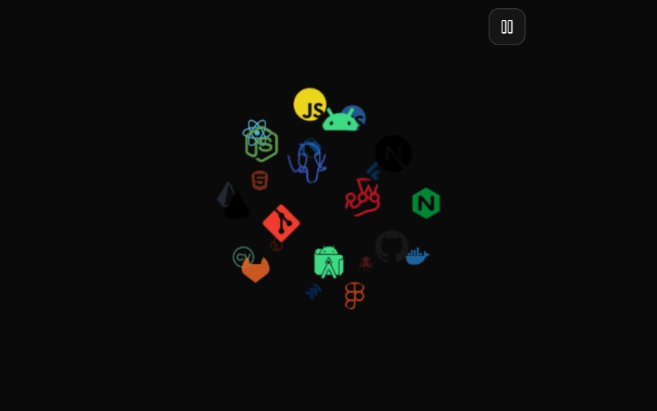 Icon CloudMagic UI · ReactAn interactive 3D tag cloud component
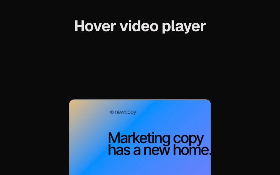 Hover Video PlayerCult UI · ReactVideo player component that plays on hover with smooth animations
 Books ShowcaseVengeance UI · React
 Sidebar Workspace HeaderFluid Functionalism · ReactWorkspace brand row for a sidebar header: 20px tile on the rows' leading axis, name pinned to the 32px text axis…
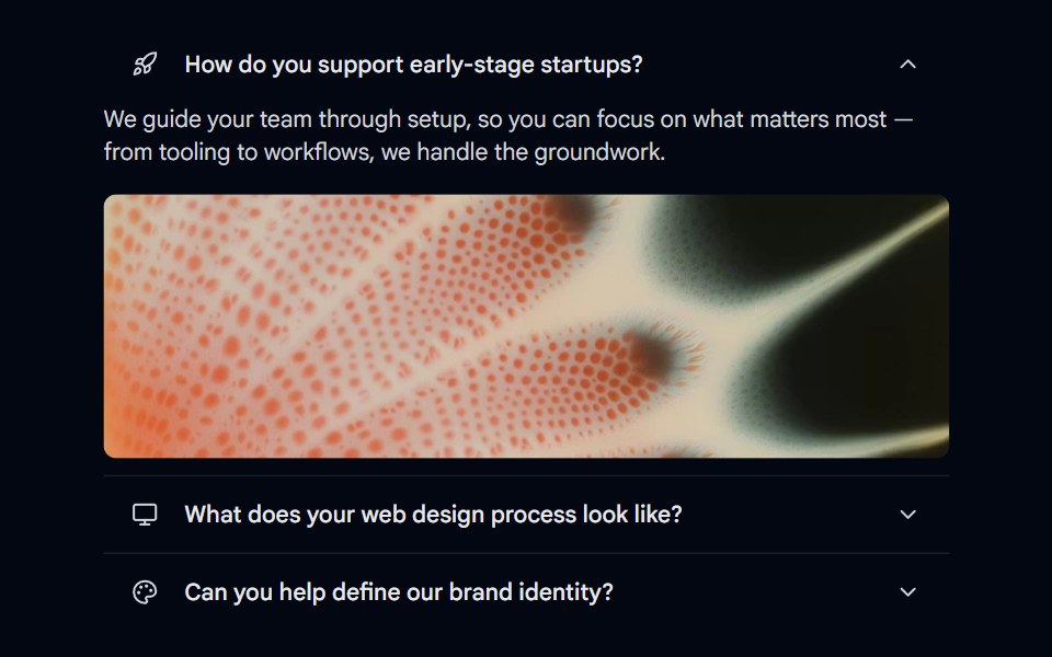 Accordion-05 - MediaShadcn Space · ReactAccordion with icon trigger, description, and an image revealed on open
 Art GalleryObsidianUI · ReactA lensed photo grid you can drag through, with barrel distortion and infinite tiled studies.
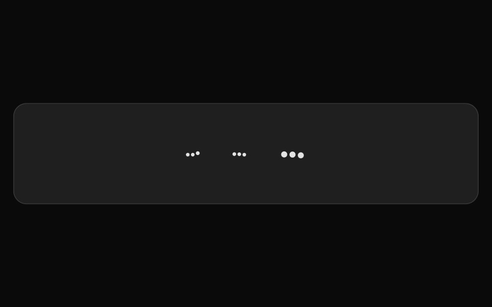 Gemini SparkleNotra · ReactGemini's three-dot mark that bounces and folds into a triangle.
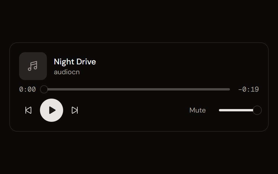 Audio Playeraudiocn · ReactA composable audio player: transport, seek bar with buffering, time, volume, playback rate, loop and keyboard shortcuts.
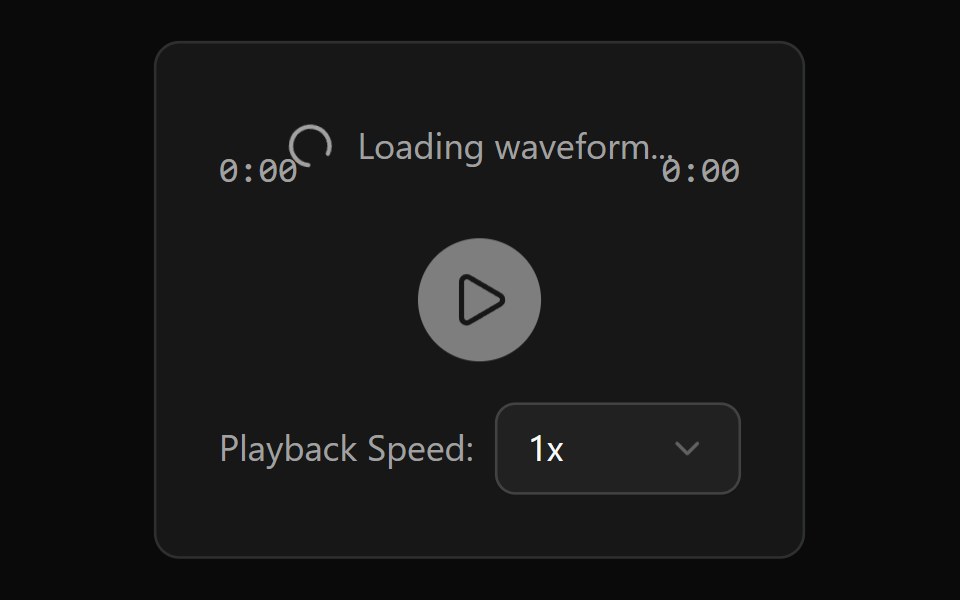 Audio Player With WaveformWatermelon UI · React
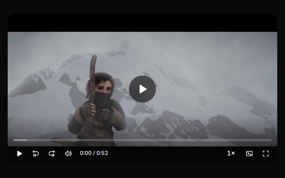 Video playerHextaUI · ReactA video player with a scrubbable seek bar, auto-hiding controls, keyboard shortcuts, speed, picture in picture and…
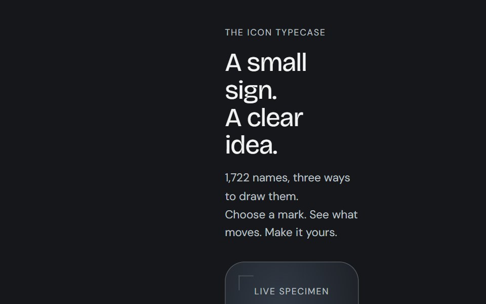 Animated iconCojeev UI · ReactReplayable micro-interactions for the full Cojeev icon library, with semantic motion families and optional visual…
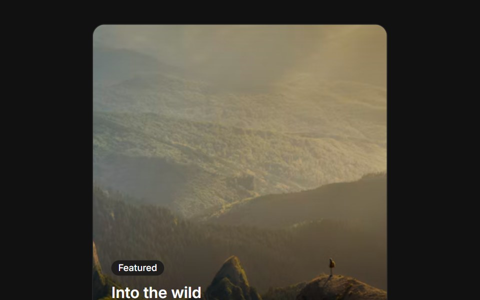 Image overlayFLX UI · ReactText and a CTA over a gradient-darkened cover image.
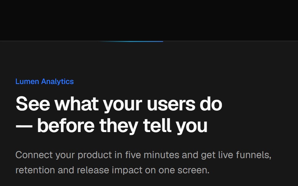 Split CTA with product visualVelora UI · ReactTwo-column CTA card with a benefit list and a dashboard mock-up, traced by an animated border beam.
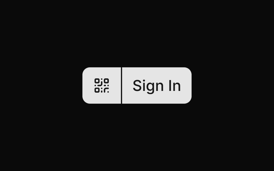 Qr Code Signinsv-particles · Svelte
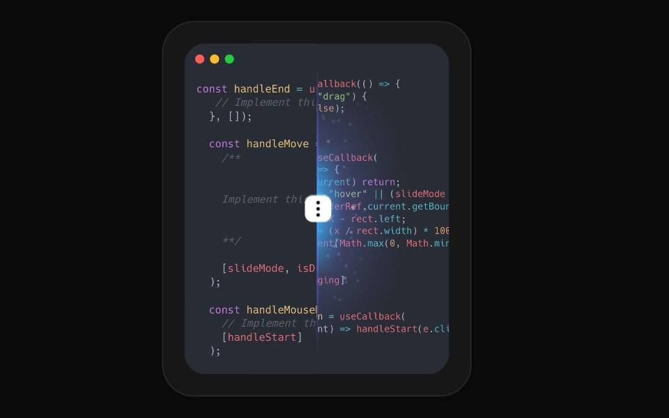 CompareAceternity UI · React
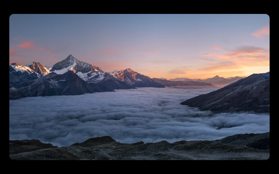 Zoom Imageark-cn · ReactA shadcn-style zoom image component built with Ark UI primitives.
 Youtube Video PlayerCult UI · ReactYouTube video player component with custom controls and smooth animations
 CarouselVengeance UI · React
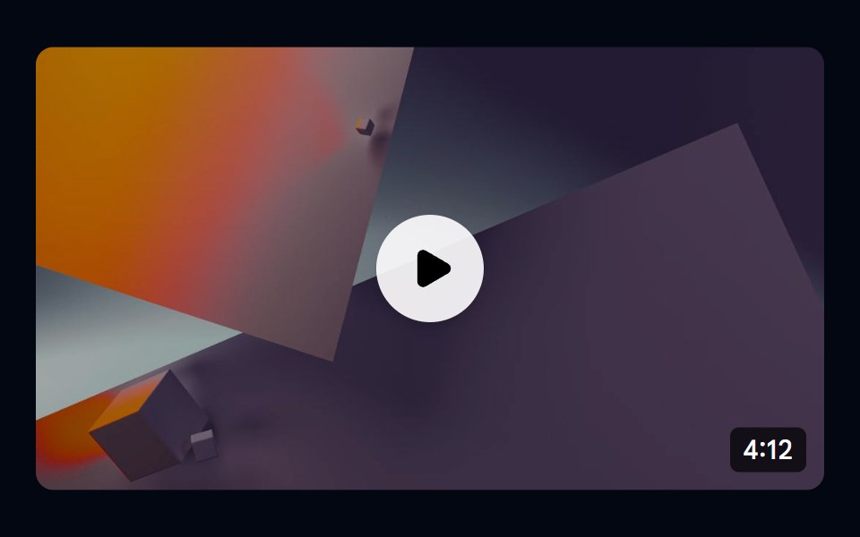 Aspect Ratio 04 - Video ThumbnailShadcn Space · ReactA 16:9 video thumbnail with a play button overlay and duration badge.
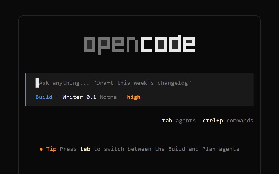 OpenCode LogoNotra · ReactThe block-letter OpenCode wordmark drawn on a cell grid and themed with tokens.
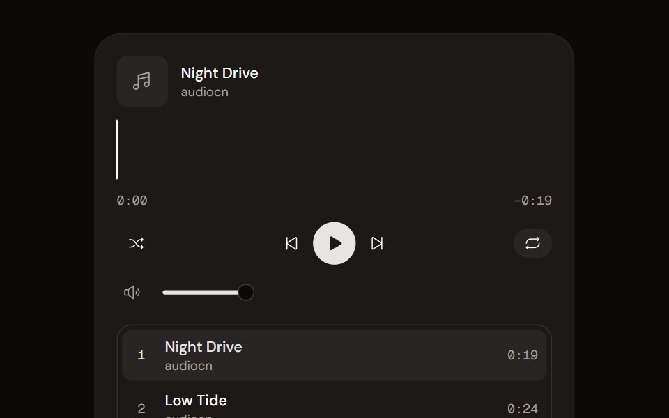 Music Playeraudiocn · ReactA playlist player with a waveform seek bar, shuffle, repeat, volume and optional ducking under the microphone.
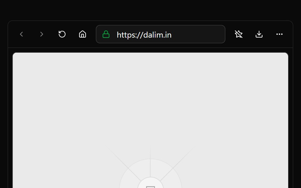 BrowserWatermelon UI · React
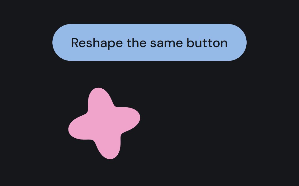 Assembly partCojeev UI · ReactA persistent native component moving between a floating organism and its measured layout.
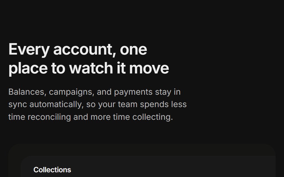 Content 11FLX UI · ReactA billing overview split with a dashboard preview card and two feature highlights, built for the app-shell preset.
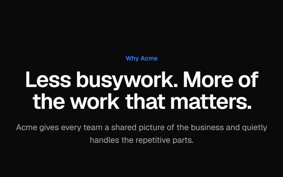 Alternating screenshot rowsVelora UI · ReactTwo alternating rows of copy with a checklist beside a browser-framed dashboard mock, sides swapped.
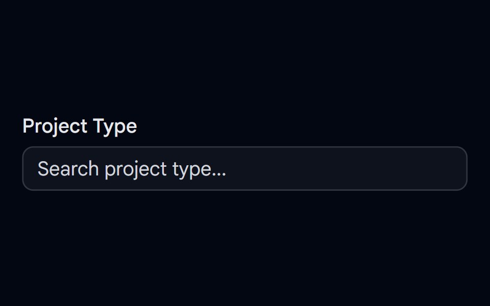 Autocomplete-06 - With IconShadcn Space · ReactAutocomplete for selecting a project type with unique icons, selected icon shown in input, and spring-animated list…
 Perplexity FaviconNotra · ReactA site favicon on shadcn Avatar with a gray fallback.
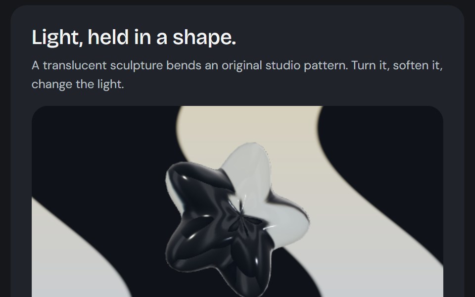 Glass sculptureCojeev UI · ReactTranslucent geometry bends an original patterned studio through a softly lit glass surface.
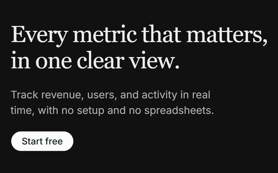 Hero 02FLX UI · ReactA left-aligned serif hero with a media panel: an image backdrop with a floating dashboard mockup on top.
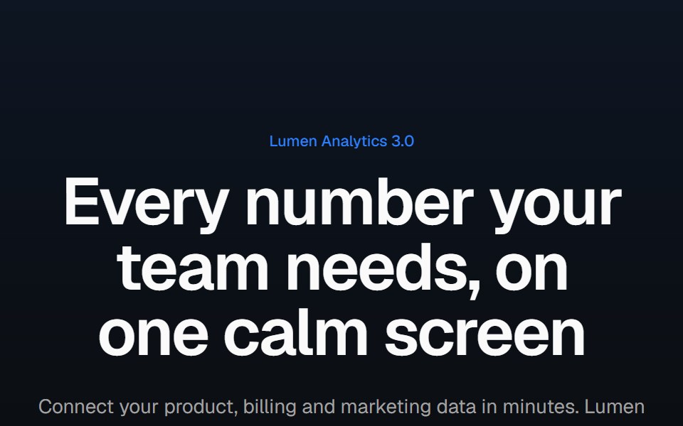 Product screenshot heroVelora UI · ReactCentered headline above a dashboard in a browser frame with a border beam and a logo row.
 Badge-04 - With IconShadcn Space · ReactBadge component
 Perplexity Model IconNotra · ReactGrayscale provider logos for the model list.
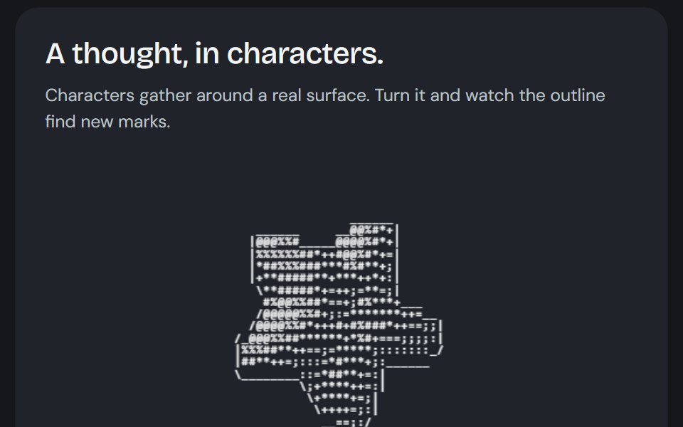 Glyph sculptureCojeev UI · ReactA real 3D surface drawn with glyphs, optional contour marks and your own local geometry.
 Hero 06FLX UI · ReactA split product hero with dual CTA, a compact logo row, and the Spot 01 illustration.
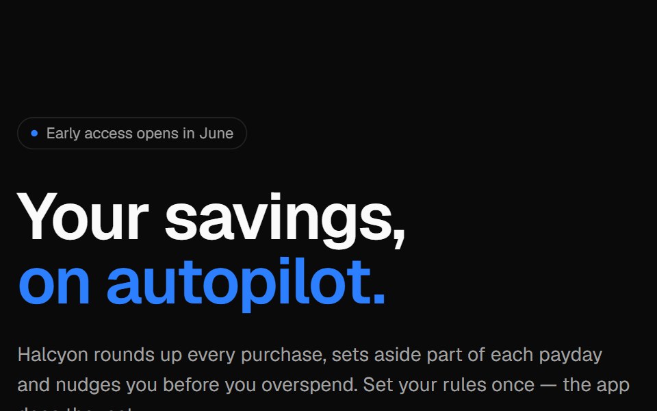 Phone split heroVelora UI · ReactApp launch hero with an email capture on the left and an app screen in an iPhone frame.
 Button 01 - With IconShadcn Space · ReactWith Icon button component
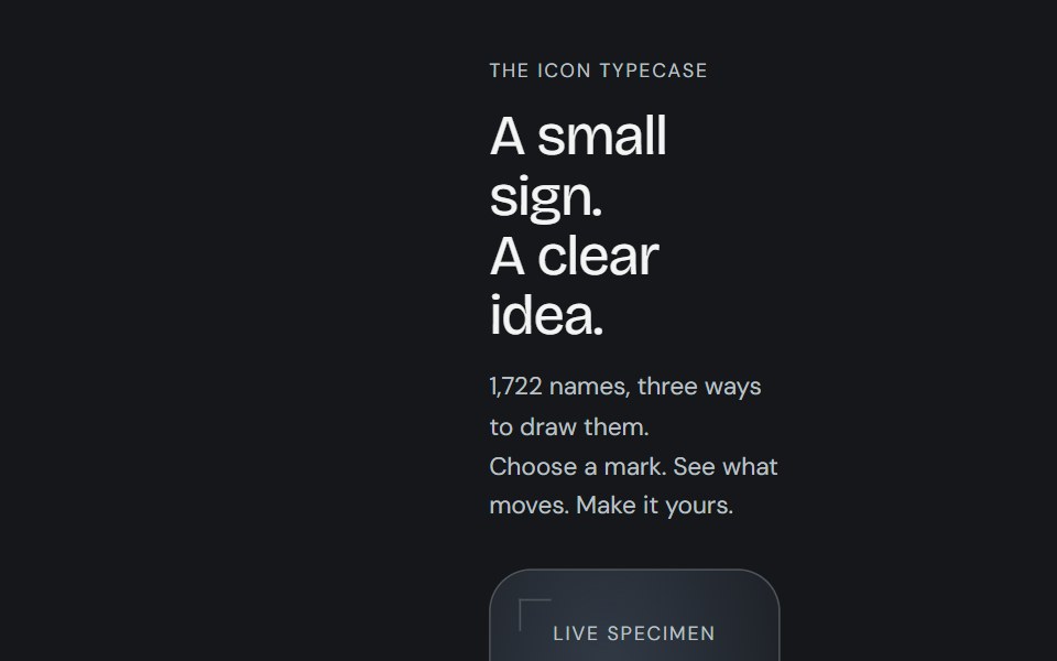 Icon libraryCojeev UI · React1,722 icon names with Cojeev micro-interactions, outline, duotone and organic treatments, built on Lucide geometry.
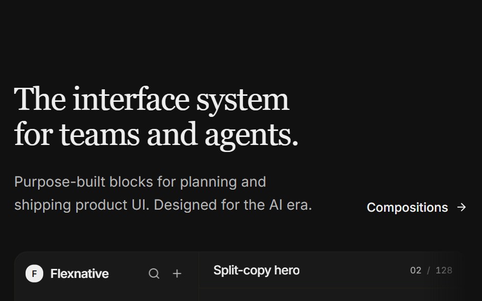 Hero 11FLX UI · ReactA split-copy hero with a light product studio mock — issue feed, properties, and a floating agent panel that fades…
 Button 08 - Social IconShadcn Space · ReactSocial Icon button component
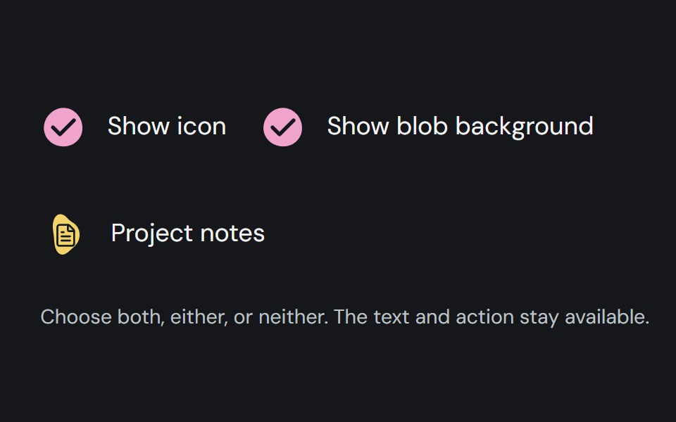 Item adornmentCojeev UI · ReactColoured organic shapes for list items, with deterministic automatic selection and custom icon or no-icon options.
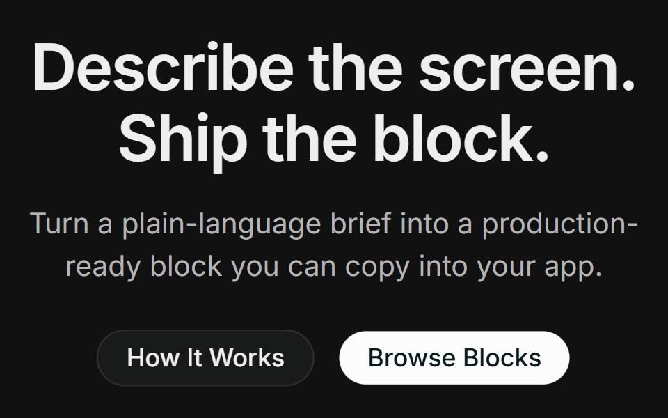 Hero 14FLX UI · ReactA centered product hero with dual CTAs, a full-width photo with a floating block-builder demo panel, and a logo strip.
 Button 09 - Outline With IconShadcn Space · ReactOutline With Icon button component
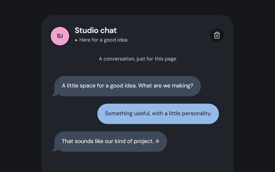 Organism compositionCojeev UI · ReactSix useful compositions made from persistent Cojeev base components, with organic assembly and native controls.
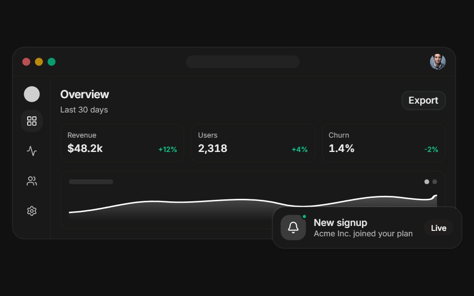 Dashboard previewFLX UI · ReactA layered app dashboard with a floating notification.
 Button 31 - Emoji BurstShadcn Space · ReactLike/react button that launches emoji particles that arc, collide with the button, and settle on top, built with a…
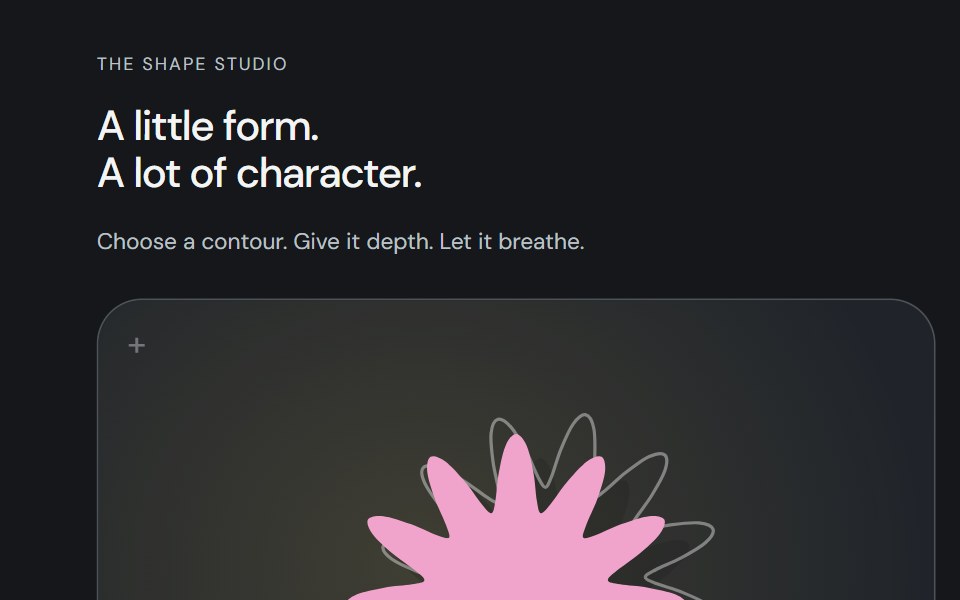 Shape studioCojeev UI · ReactOne shape studio: twelve compatible living contours, layered artwork and the complete original mask inventory. Compose…
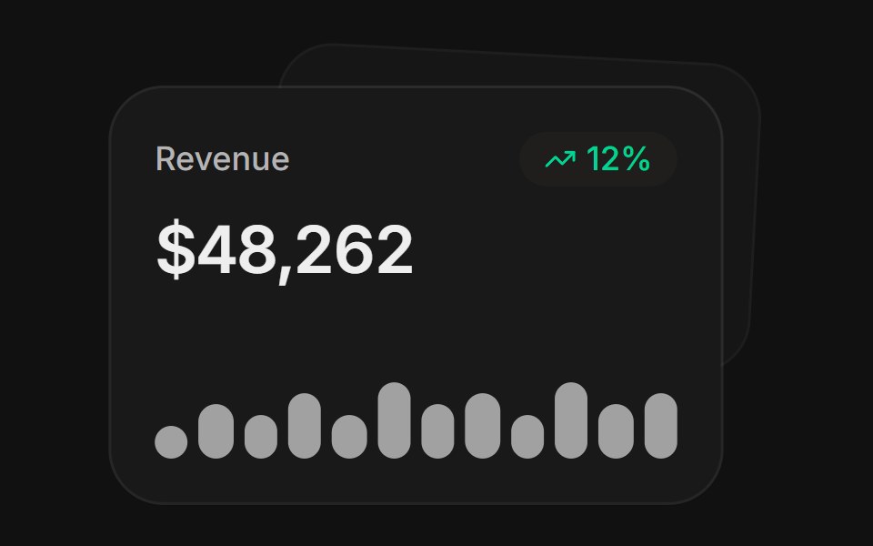 MetricsFLX UI · ReactA stat card with trend and sparkline, layered over a second.
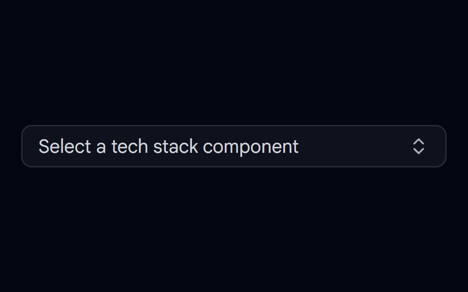 Combobox 01 - With IconsShadcn Space · ReactCombobox component with icons
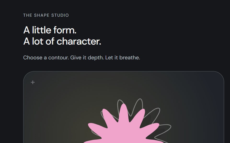 Shape artworkCojeev UI · ReactAn original SVG silhouette with a cast shadow and a rotated rear outline. The same vector layers power its live…
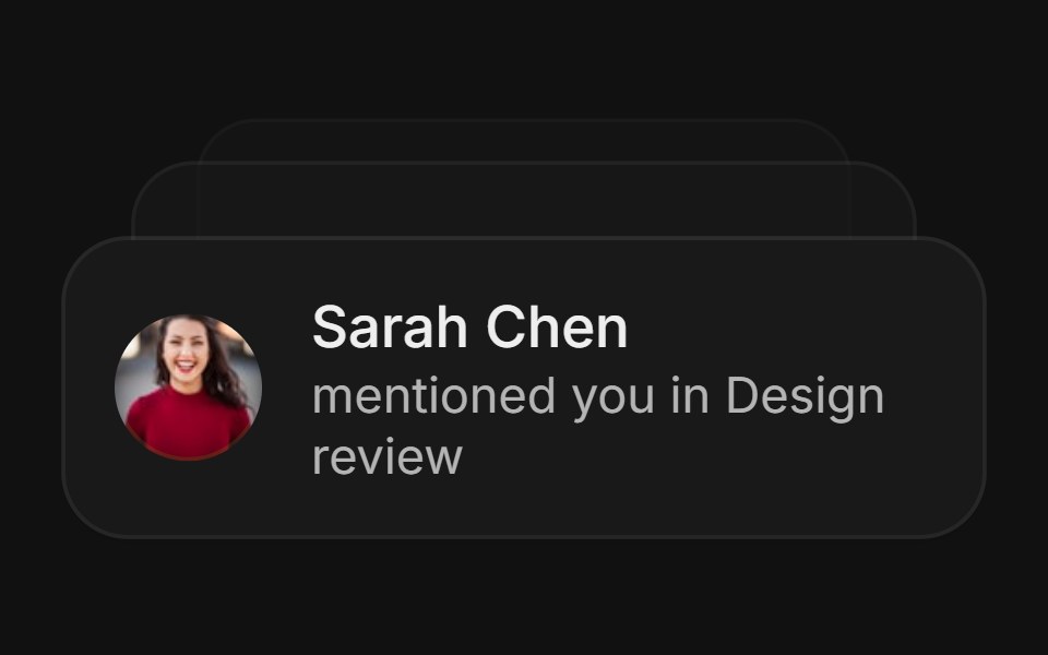 NotificationsFLX UI · ReactA fanned stack of notification cards.
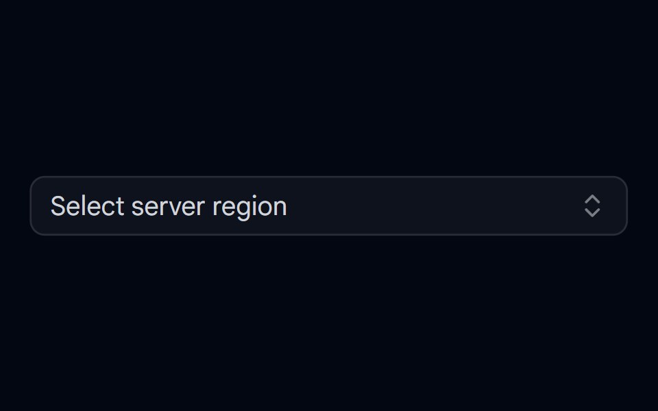 Combobox 02 - With Custom Check IconShadcn Space · ReactCombobox component
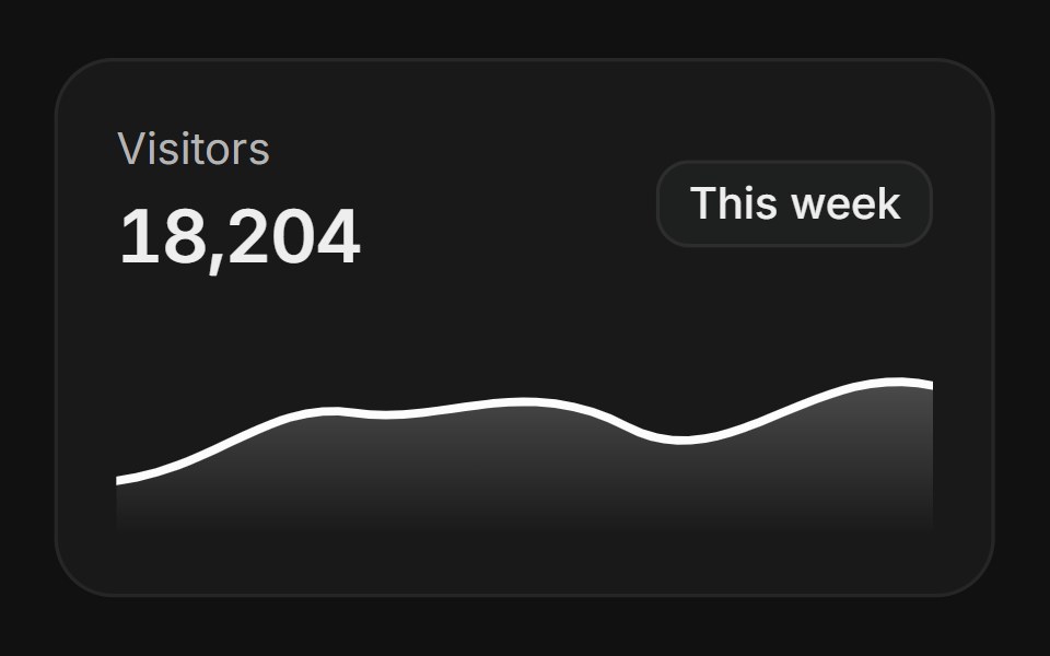 AnalyticsFLX UI · ReactA card with a gradient area chart.
 Feature 02 - Three Columns Feature with IconsShadcn Space · ReactA clean three card feature grid with icons and concise copy, built for product or SaaS pages to communicate core…
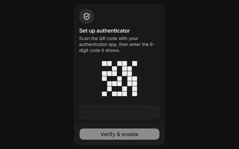 Authenticator AppFLX UI · ReactAuthenticator App for Two-Factor Setup.
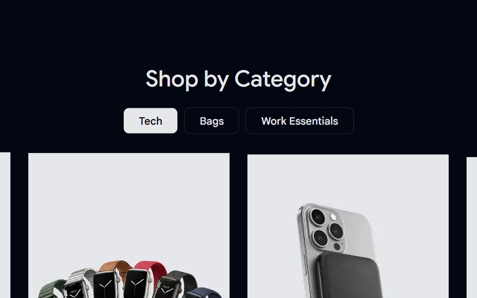 Product Category 02 - Image BasedShadcn Space · ReactA product category section built with image-driven cards and filters, enabling faster discovery through visuals and…
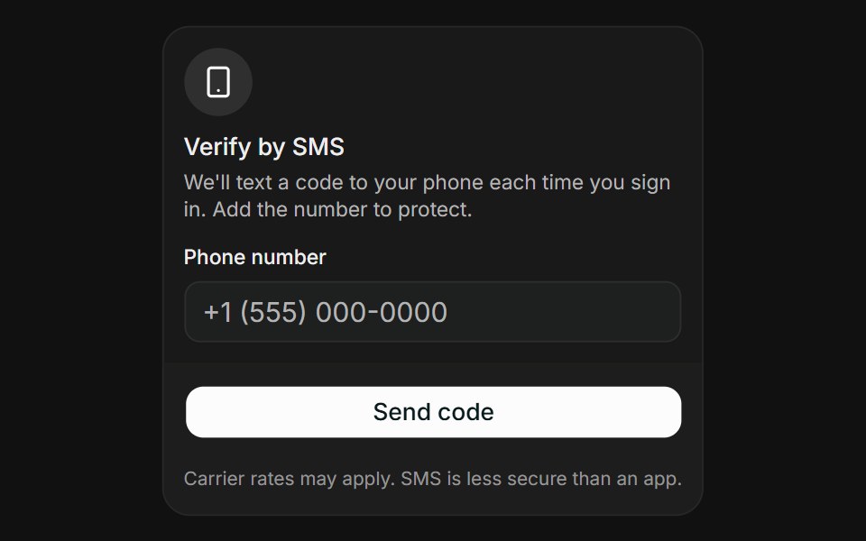 SMS CodeFLX UI · ReactSMS Code for Two-Factor Setup.
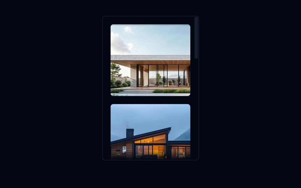 Scroll Area 03 - Vertical Image GalleryShadcn Space · ReactA vertically scrollable image gallery with fade mask edges, built with ScrollArea and project portfolio images.
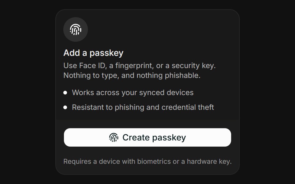 PasskeyFLX UI · ReactPasskey for Two-Factor Setup.
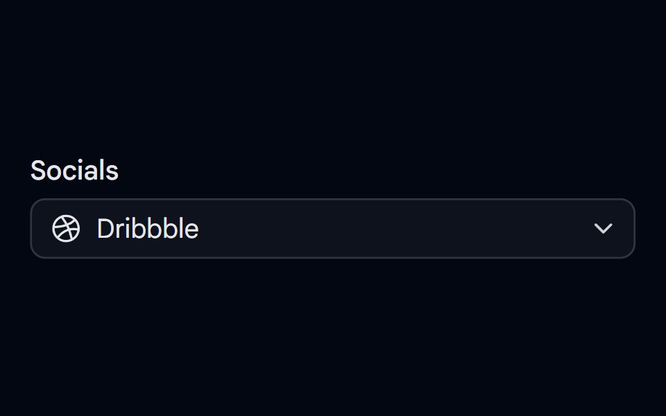 Select-02 - Select with iconShadcn Space · ReactSelect component
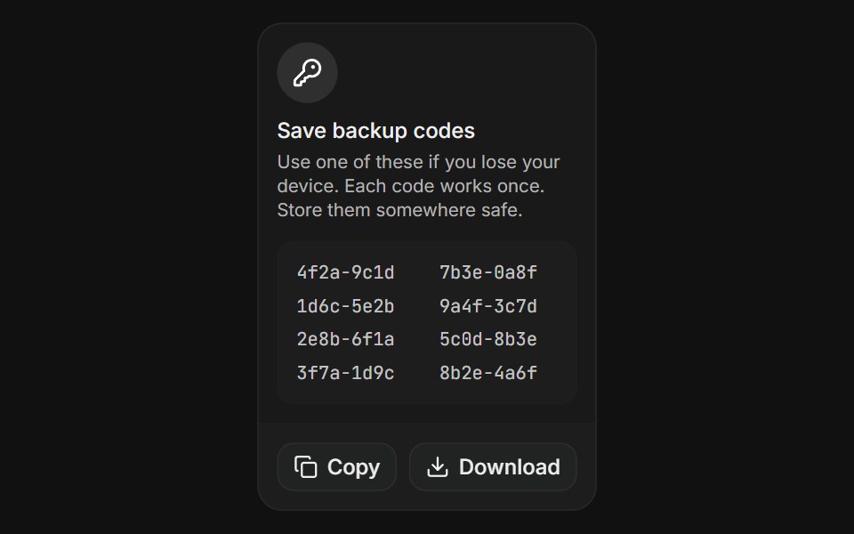 Backup CodesFLX UI · ReactBackup Codes for Two-Factor Setup.
 Separator 08 - With IconShadcn Space · ReactHorizontal separator with centered icon
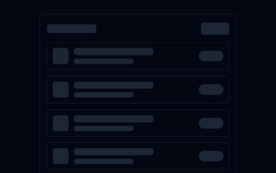 Skeleton 03 - List with IconsShadcn Space · ReactAnimated list skeleton with a title bar, icon+text rows, and badge placeholders — staggered fade-up on scroll into view.
 Switch-02 - With IconShadcn Space · ReactSwitch component
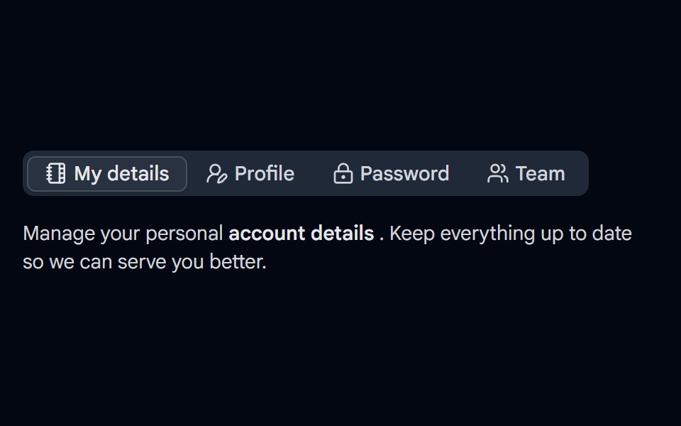 Tabs-03 - With IconShadcn Space · ReactTabs component
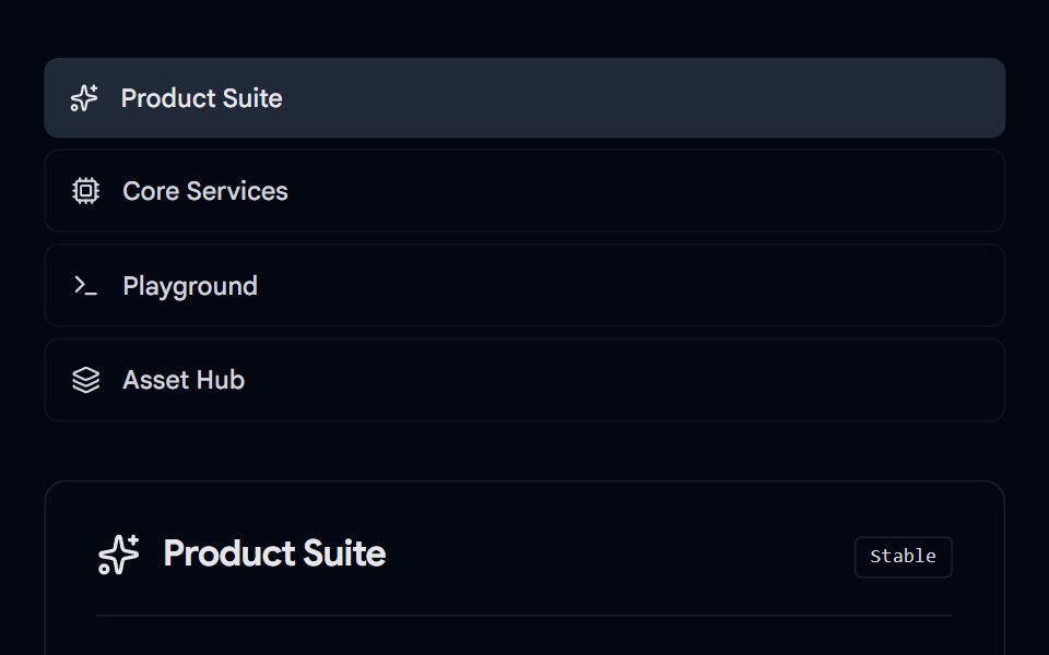 Tabs-07 - Icon & DescriptionShadcn Space · ReactTabs with icon and description component
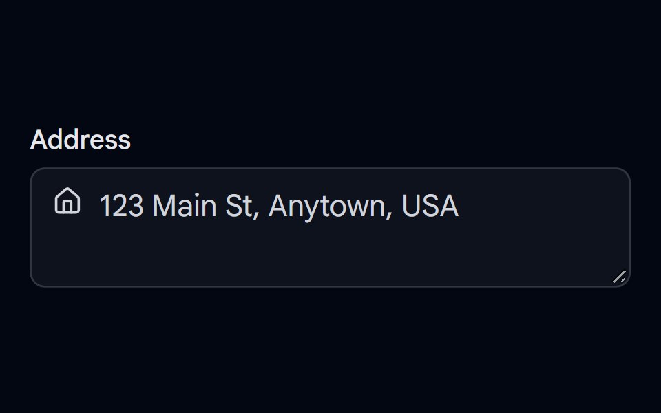 Textarea-02 - Textarea with iconShadcn Space · ReactTextarea component