 Dev Design Library
shadcn/ui Illustration Components
Dev Design Library indexes 9 shadcn/ui illustration components from 2 open-source UI libraries, with the most coming from Cojeev UI and FLX UI. Each one links to its page with the source code, a live preview where available, the library license and the install command. They follow the shadcn/ui conventions, so most install with the shadcn CLI and drop into a Tailwind project. Illustration components belong to the Media group.
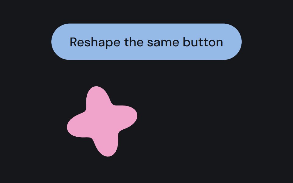 Assembly partCojeev UI · ReactA persistent native component moving between a floating organism and its measured layout.
 Hero 06FLX UI · ReactA split product hero with dual CTA, a compact logo row, and the Spot 01 illustration.
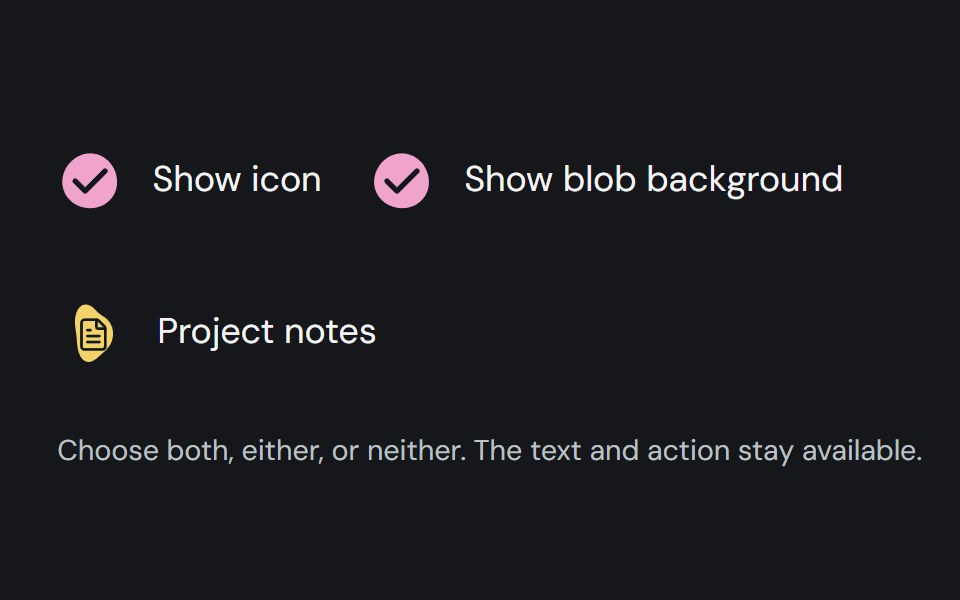 Item adornmentCojeev UI · ReactColoured organic shapes for list items, with deterministic automatic selection and custom icon or no-icon options.
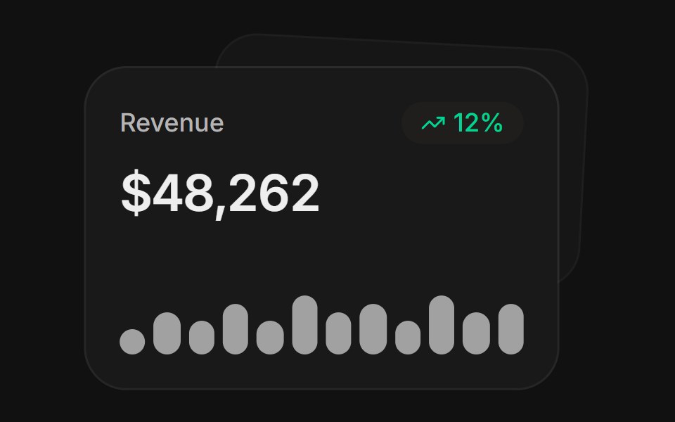 MetricsFLX UI · ReactA stat card with trend and sparkline, layered over a second.
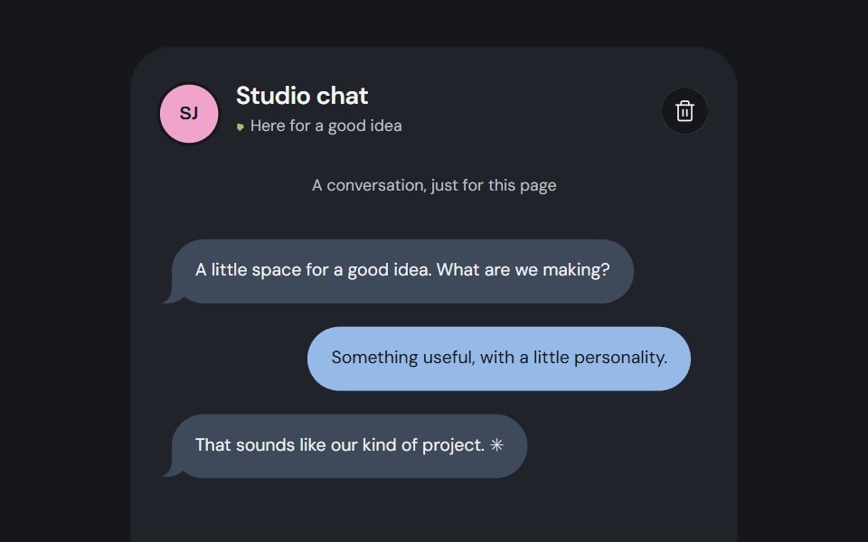 Organism compositionCojeev UI · ReactSix useful compositions made from persistent Cojeev base components, with organic assembly and native controls.
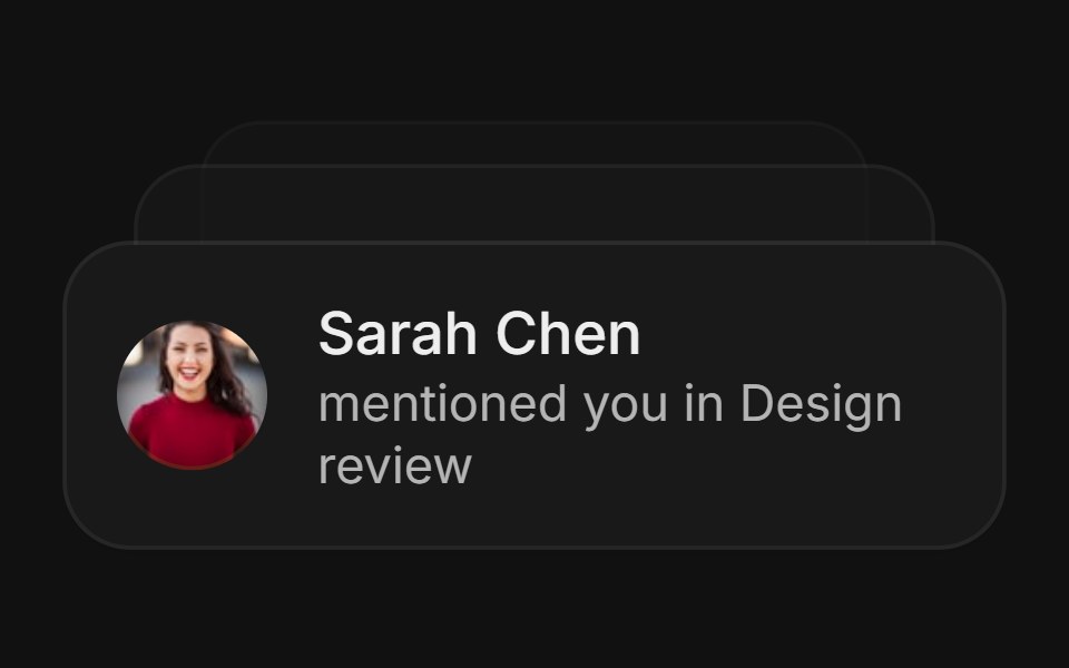 NotificationsFLX UI · ReactA fanned stack of notification cards.
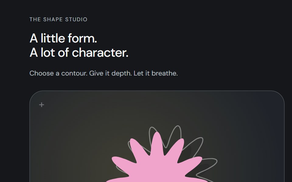 Shape studioCojeev UI · ReactOne shape studio: twelve compatible living contours, layered artwork and the complete original mask inventory. Compose…
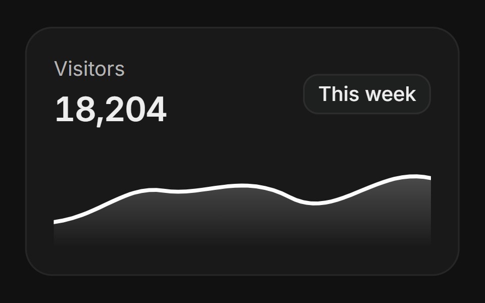 AnalyticsFLX UI · ReactA card with a gradient area chart.
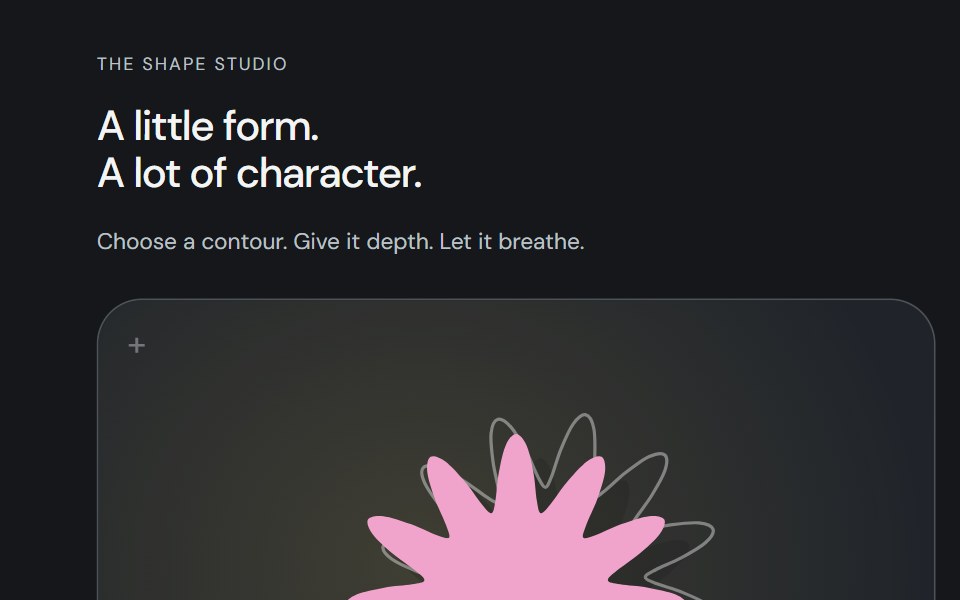 Shape artworkCojeev UI · ReactAn original SVG silhouette with a cast shadow and a rotated rear outline. The same vector layers power its live…