 Dev Design Library
shadcn/ui Icon Components
Dev Design Library indexes 20 shadcn/ui icon components from 4 open-source UI libraries, with the most coming from Shadcn Space, Cojeev UI, Notra and Magic UI. Each one links to its page with the source code, a live preview where available, the library license and the install command. They follow the shadcn/ui conventions, so most install with the shadcn CLI and drop into a Tailwind project. Icon components belong to the Media group.
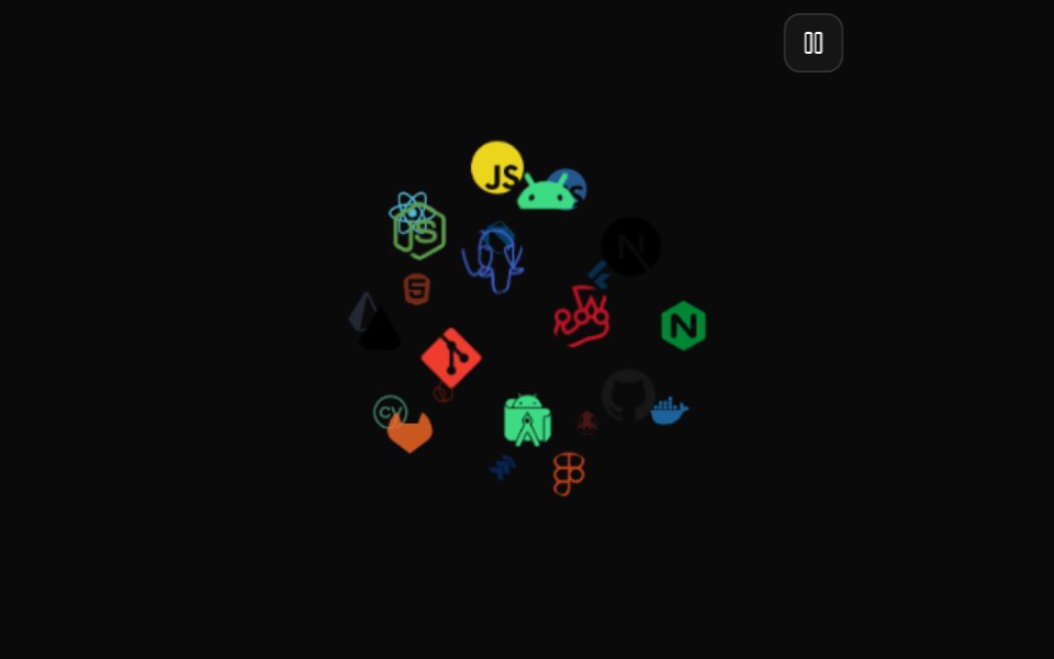 Icon CloudMagic UI · ReactAn interactive 3D tag cloud component
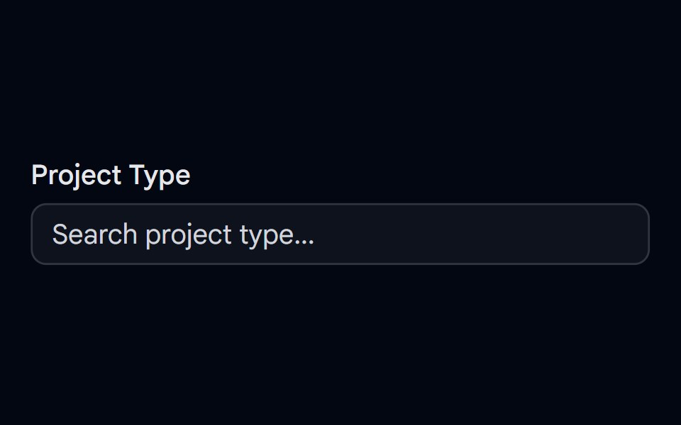 Autocomplete-06 - With IconShadcn Space · ReactAutocomplete for selecting a project type with unique icons, selected icon shown in input, and spring-animated list…
 Perplexity FaviconNotra · ReactA site favicon on shadcn Avatar with a gray fallback.
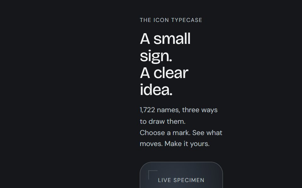 Animated iconCojeev UI · ReactReplayable micro-interactions for the full Cojeev icon library, with semantic motion families and optional visual…
 Badge-04 - With IconShadcn Space · ReactBadge component
 Perplexity Model IconNotra · ReactGrayscale provider logos for the model list.
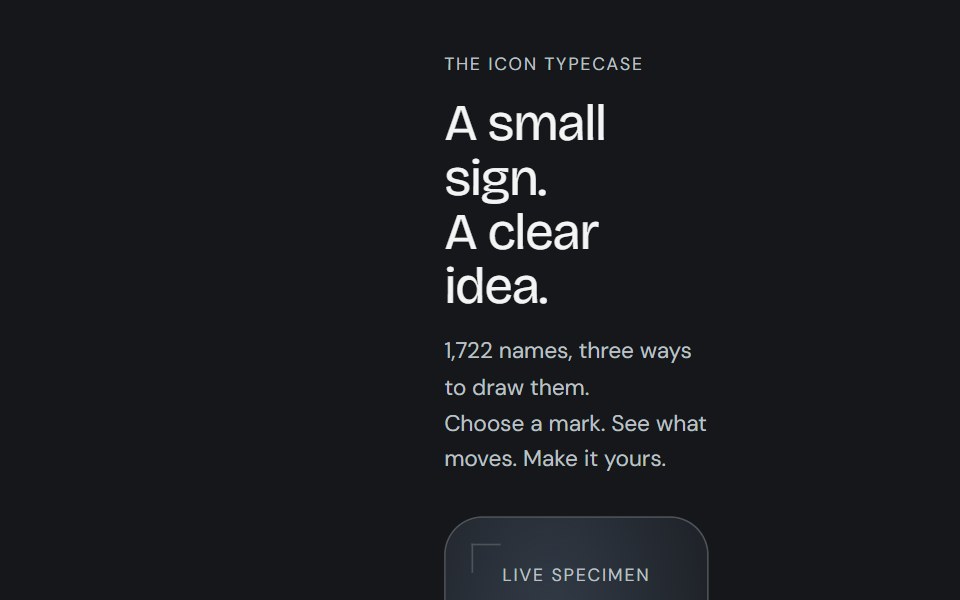 Icon libraryCojeev UI · React1,722 icon names with Cojeev micro-interactions, outline, duotone and organic treatments, built on Lucide geometry.
 Button 01 - With IconShadcn Space · ReactWith Icon button component
 Button 08 - Social IconShadcn Space · ReactSocial Icon button component
 Button 09 - Outline With IconShadcn Space · ReactOutline With Icon button component
 Combobox 01 - With IconsShadcn Space · ReactCombobox component with icons
 Combobox 02 - With Custom Check IconShadcn Space · ReactCombobox component
 Feature 02 - Three Columns Feature with IconsShadcn Space · ReactA clean three card feature grid with icons and concise copy, built for product or SaaS pages to communicate core…
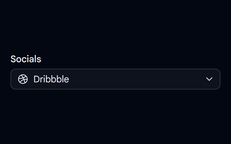 Select-02 - Select with iconShadcn Space · ReactSelect component
 Separator 08 - With IconShadcn Space · ReactHorizontal separator with centered icon
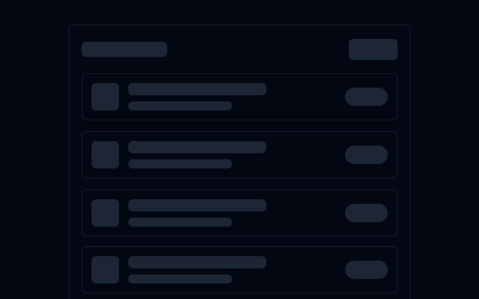 Skeleton 03 - List with IconsShadcn Space · ReactAnimated list skeleton with a title bar, icon+text rows, and badge placeholders — staggered fade-up on scroll into view.
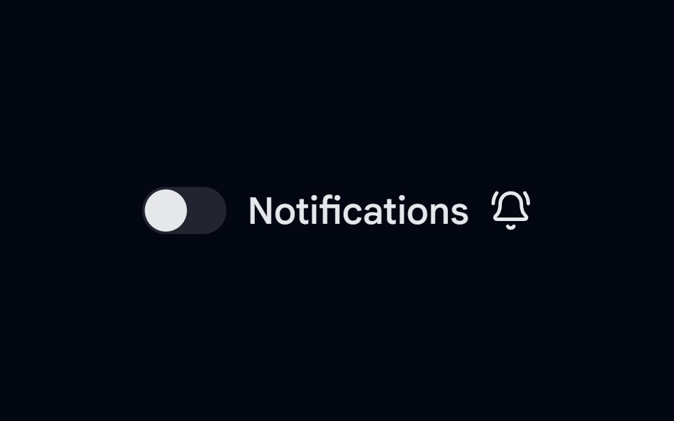 Switch-02 - With IconShadcn Space · ReactSwitch component
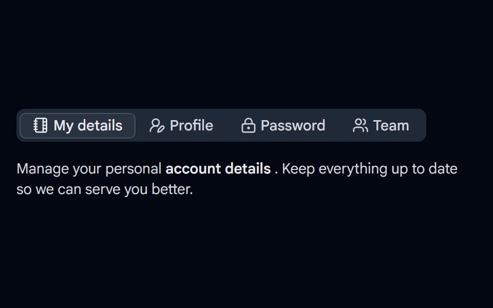 Tabs-03 - With IconShadcn Space · ReactTabs component
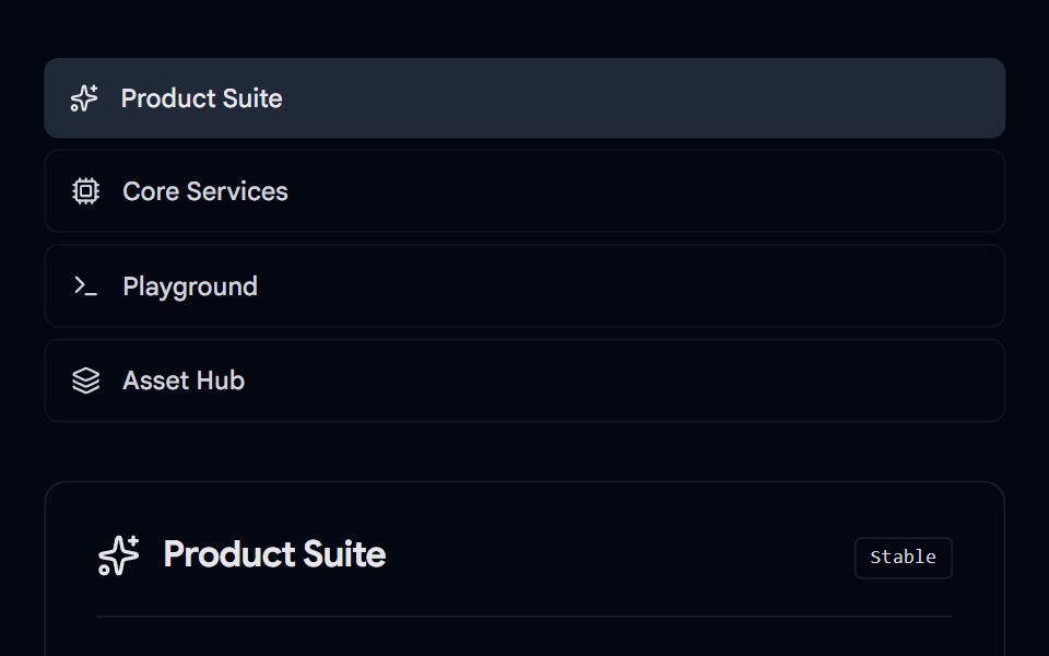 Tabs-07 - Icon & DescriptionShadcn Space · ReactTabs with icon and description component
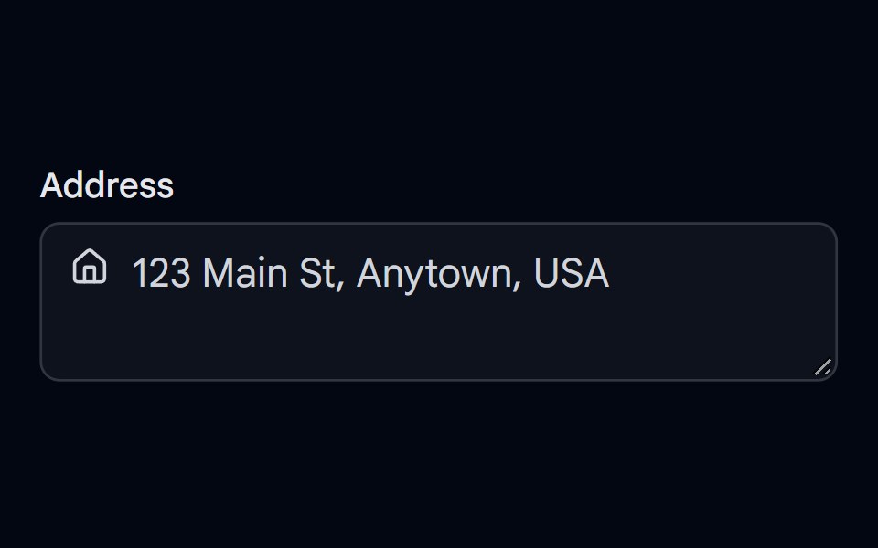 Textarea-02 - Textarea with iconShadcn Space · ReactTextarea component