 Dev Design Library
Tailwind CSS Icon Components
Dev Design Library indexes 117 Tailwind CSS icon components from 27 open-source UI libraries, with the most coming from ReUI, Amicro Micro Transitions, Shadcn Space, cnblocks and Launch UI. Each one links to its page with the source code, a live preview where available, the library license and the install command. Every library in this list styles its components with Tailwind CSS utility classes. Icon components belong to the Media group.
 Icon CloudMagic UI · ReactAn interactive 3D tag cloud component
 IconReact Spectrum · ReactSpectrum icons are clear, minimal, and consistent across platforms. They follow the focused and rational principles of…
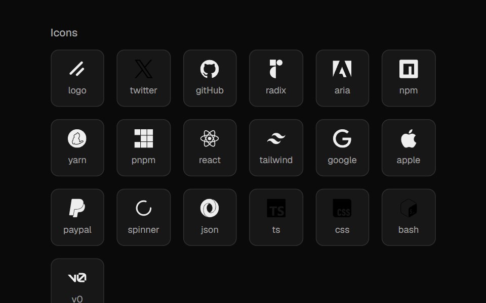 File IconsCult UI · ReactIcon set for file types and languages
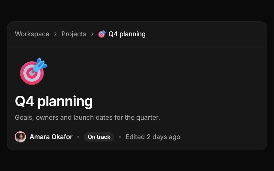 Page iconReUI · ReactA page header with an emoji icon above the title, plus Random and Remove in the picker.
 App Icon LoadAmicro Micro Transitions · ReactApp Icon Load loading animation.
 Text Icon CursorCursify · React
 Play Button IconUntitled UI React · ReactRounded play icon with blurred background and a filled triangle in the middle.
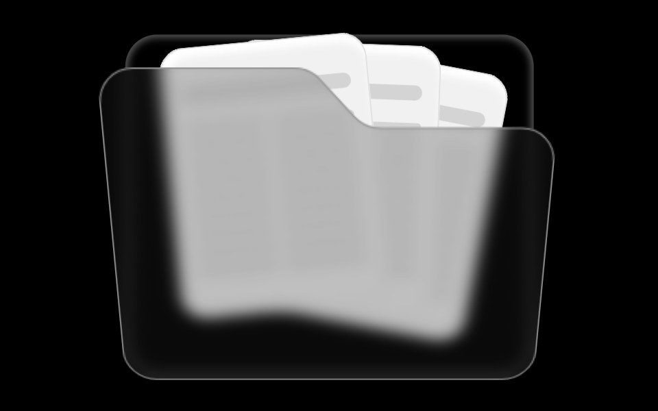 Folder ComponentRare UI · ReactAn animated folder whose cards fan out on hover and lift open on click, with a 3D-tilted flap. Supports color and size…
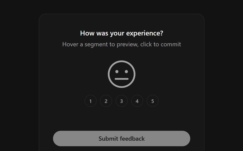 Face RatingSpectrum UI · ReactA five-level feedback rating where one large SVG face morphs its mouth, eyes and color between moods as you hover and…
 FigmaLaunch UI · React
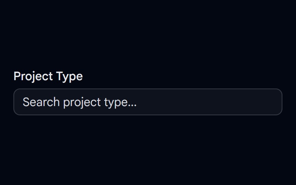 Autocomplete-06 - With IconShadcn Space · ReactAutocomplete for selecting a project type with unique icons, selected icon shown in input, and spring-animated list…
 IconsBoardUI · React
 Logo Collectioncnblocks · SvelteLogo collection utilities and exports
 Icon CloudAnimations (Svelte) · SvelteAn interactive 3D tag cloud component that displays icons or images in a sphere formation with smooth rotation and…
 Perplexity FaviconNotra · ReactA site favicon on shadcn Avatar with a gray fallback.
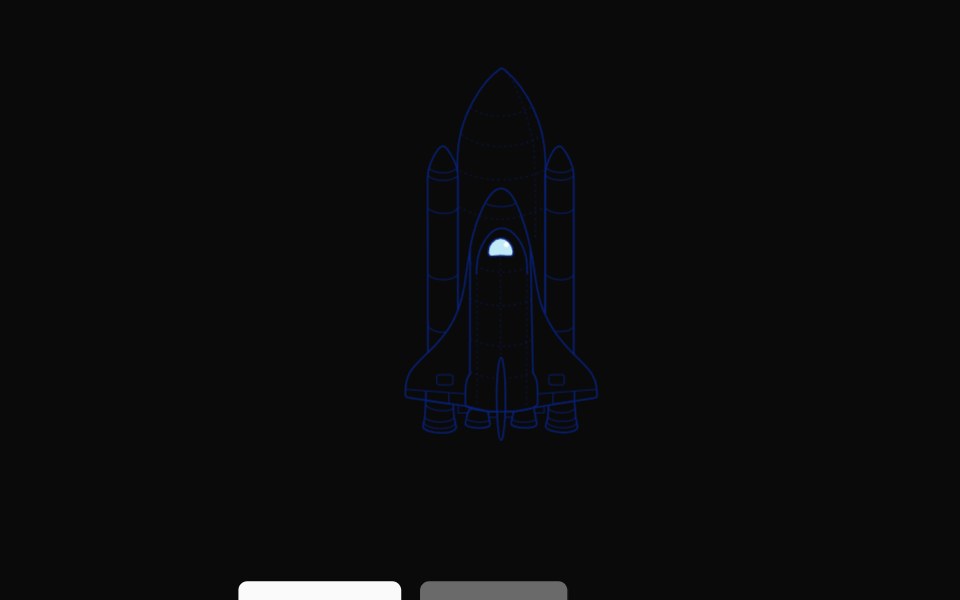 Rocket LaunchNexvyn UI · ReactA hand-drawn rocket illustration that ignites its engines and lifts off the pad on demand, with a reset back to rest.
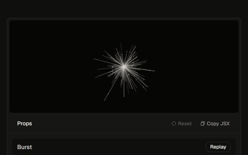 Logo Burst23rd.dev · ReactHair-line tentacles explode from the center, then keep a slow inhale. Follows light and dark.
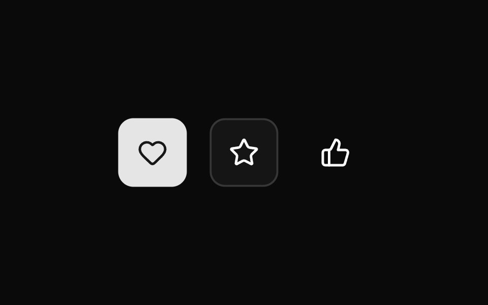 IconWatermelon UI · React
 Decor iconsv-efferd · Svelte
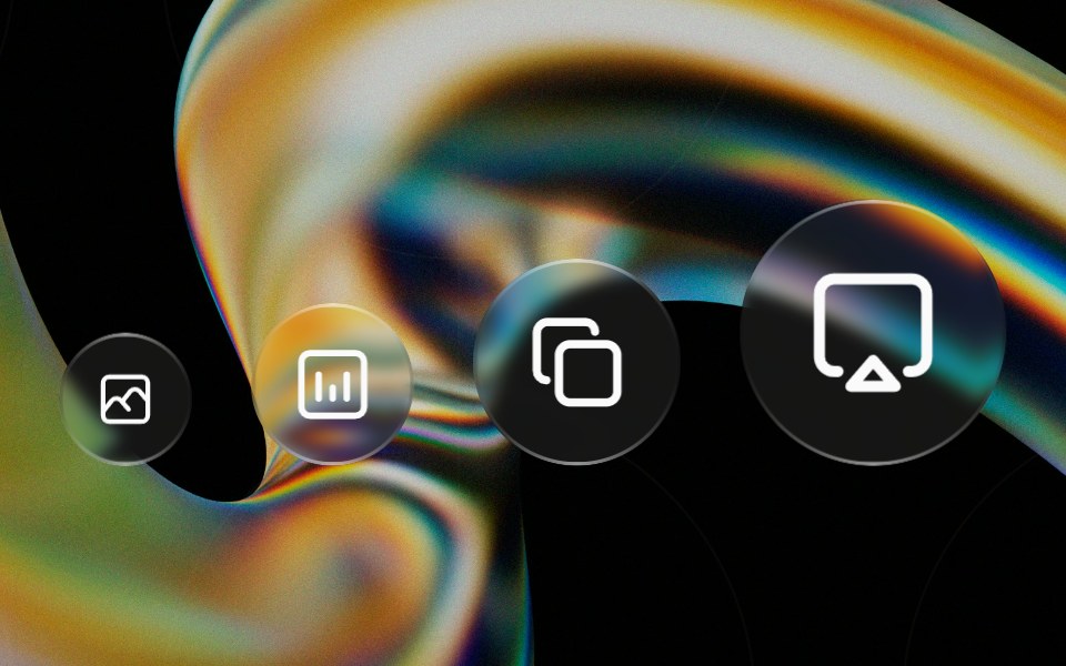 Glass Iconglasscn · ReactA circular glass chip that wraps any icon, iOS-control-center style. Preset sizes scale the circle and icon together…
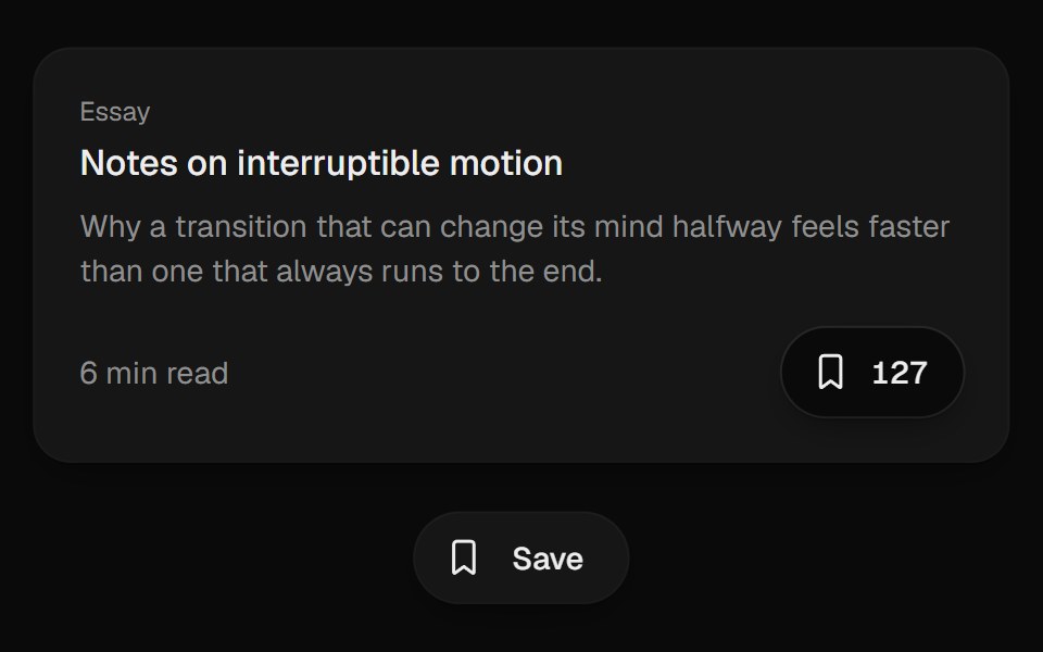 Bookmark ButtonUI Lab · ReactFills from the bottom up and lands with a small squash.
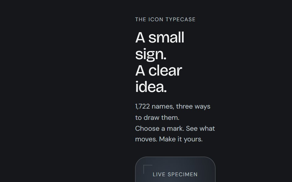 Animated iconCojeev UI · ReactReplayable micro-interactions for the full Cojeev icon library, with semantic motion families and optional visual…
 Dynamic IconFLX UI · ReactA dynamic icon component with a name and size.
 AnimojiSpaceUI · ReactRenders every Unicode emoji in a string as an animated image sized to the surrounding text.
 Arrow RightSora UI · ReactAnimated right arrow that nudges forward and redraws its stroke on hover using a pure CSS stroke-dash animation.
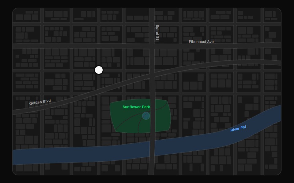 Map PinFibo · ReactA pin for a point on a map, with a preview that opens on click or tap.
 Swapark-cn · ReactA shadcn-style swap component built with Ark UI primitives.
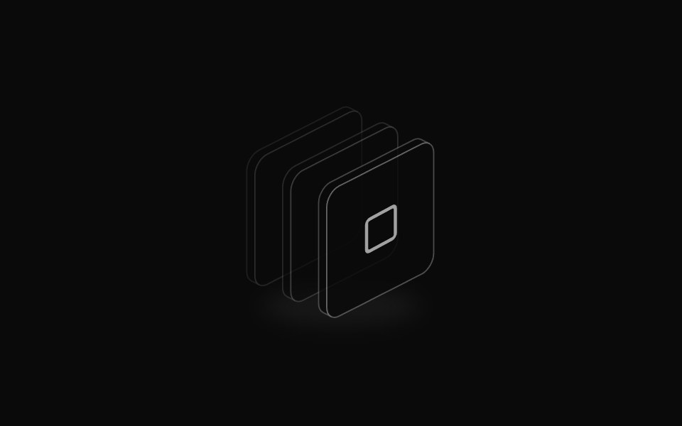 Isometric icon stackReUI · ReactLayered isometric icon
 Apple Icon MorphAmicro Micro Transitions · ReactApple Icon Morph loading animation.
 Dot IconUntitled UI React · React
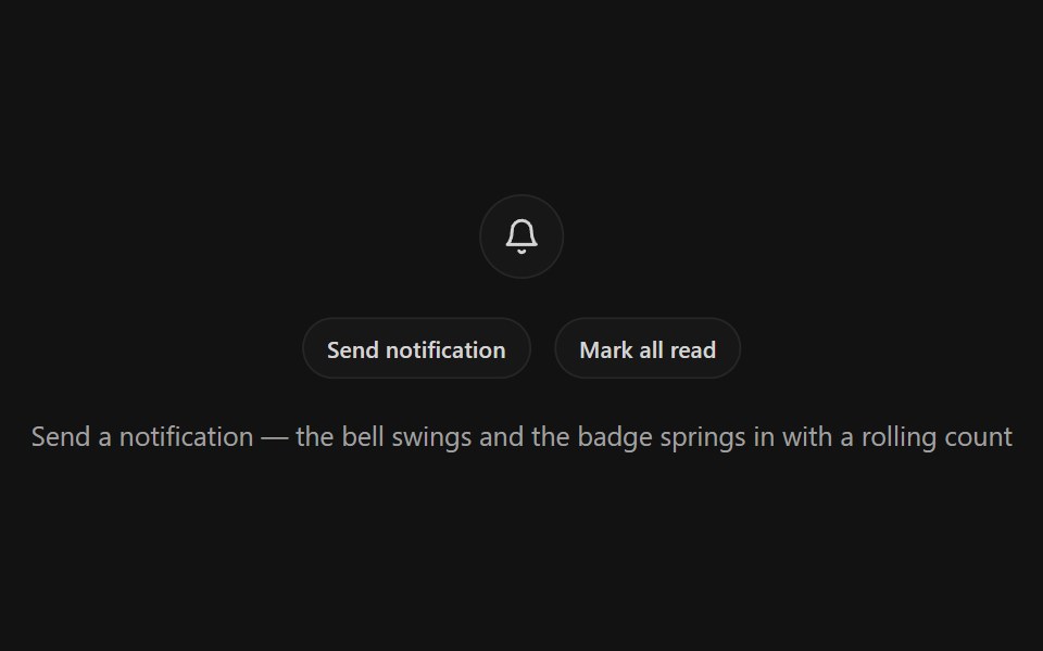 Notification BellSpectrum UI · ReactA bell icon button with a ring-shake swing, springy unread badge with rolling odometer count, and a pinging dot mode
 GithubLaunch UI · React
 Badge-04 - With IconShadcn Space · ReactBadge component
 Logo Geminicnblocks · SvelteGoogle Gemini AI logo SVG component
 Perplexity Model IconNotra · ReactGrayscale provider logos for the model list.
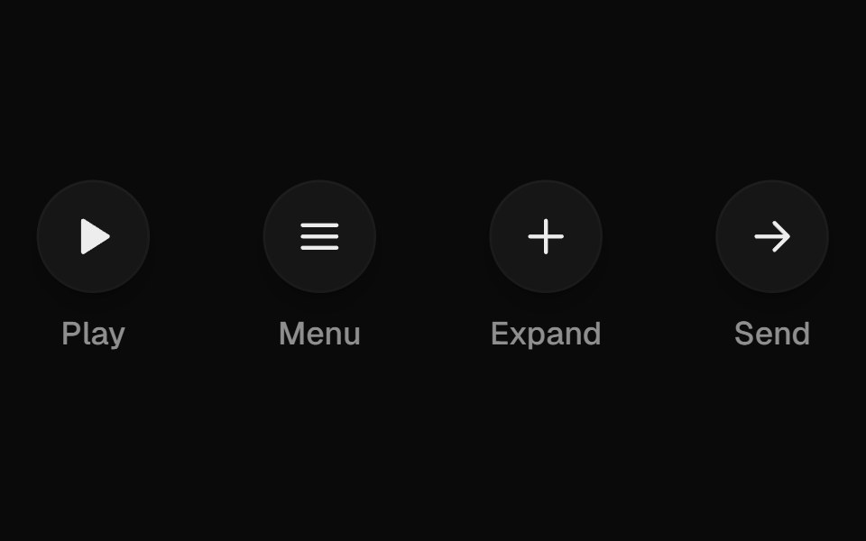 Icon MorphUI Lab · ReactIcons reshape themselves between states instead of swapping.
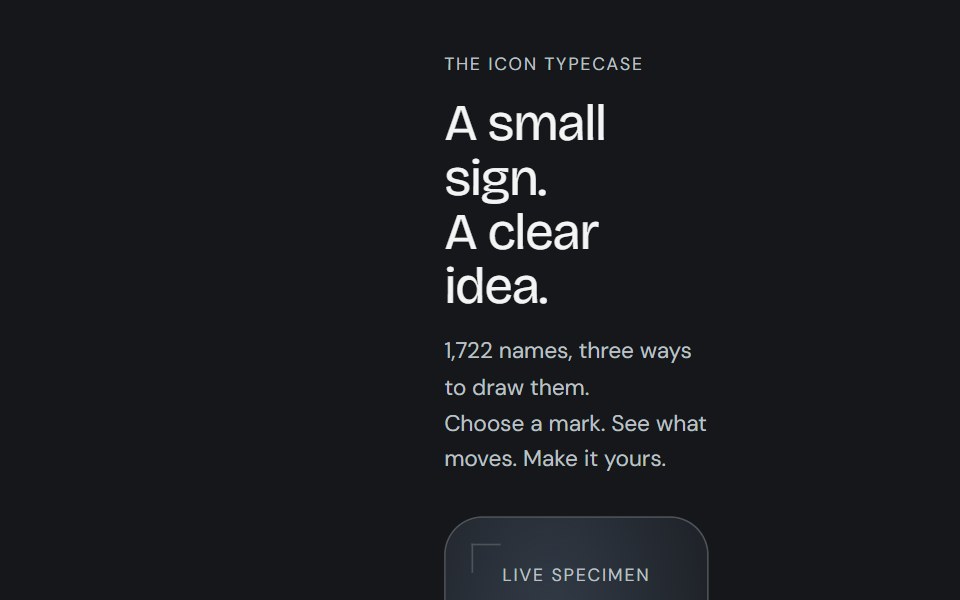 Icon libraryCojeev UI · React1,722 icon names with Cojeev micro-interactions, outline, duotone and organic treatments, built on Lucide geometry.
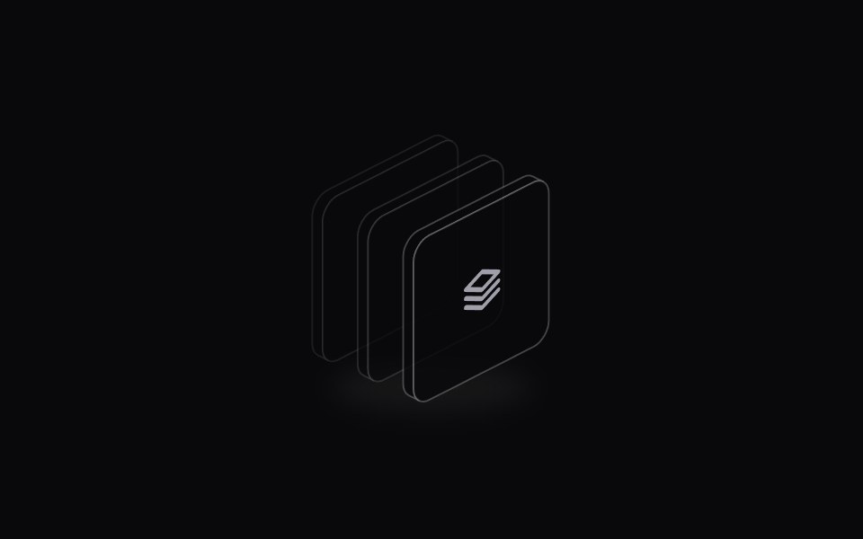 Icon StackSpaceUI · ReactDisplays an overlapping cluster of icons or avatars that expands smoothly when hovered to reveal every individual item.
 ChevronsSora UI · ReactAnimated double up-chevron that cross-fades between the two carets on trigger.
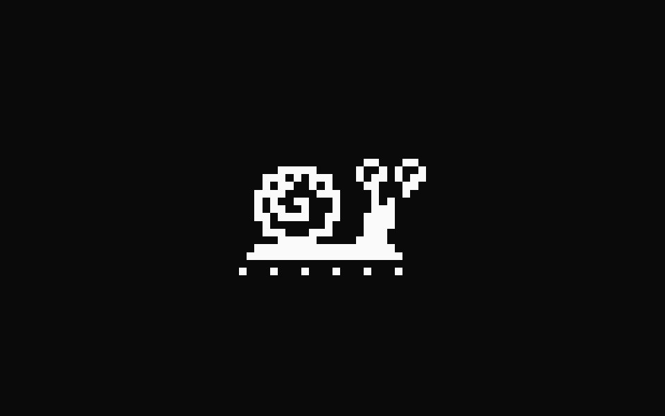 Pixel SnailFibo · ReactA one-colour pixel snail that crawls on a loop while something loads.
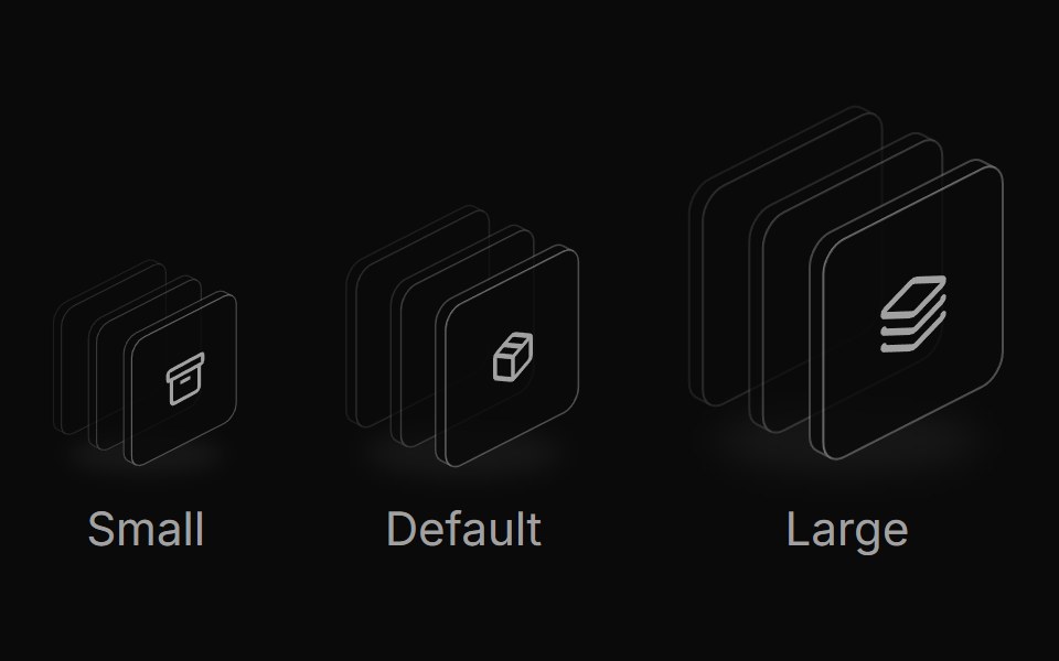 Icon stack sizesReUI · ReactResponsive icon stack sizes
 Button CameraAmicro Micro Transitions · ReactCamera button whose video icon morphs into the video-off icon.
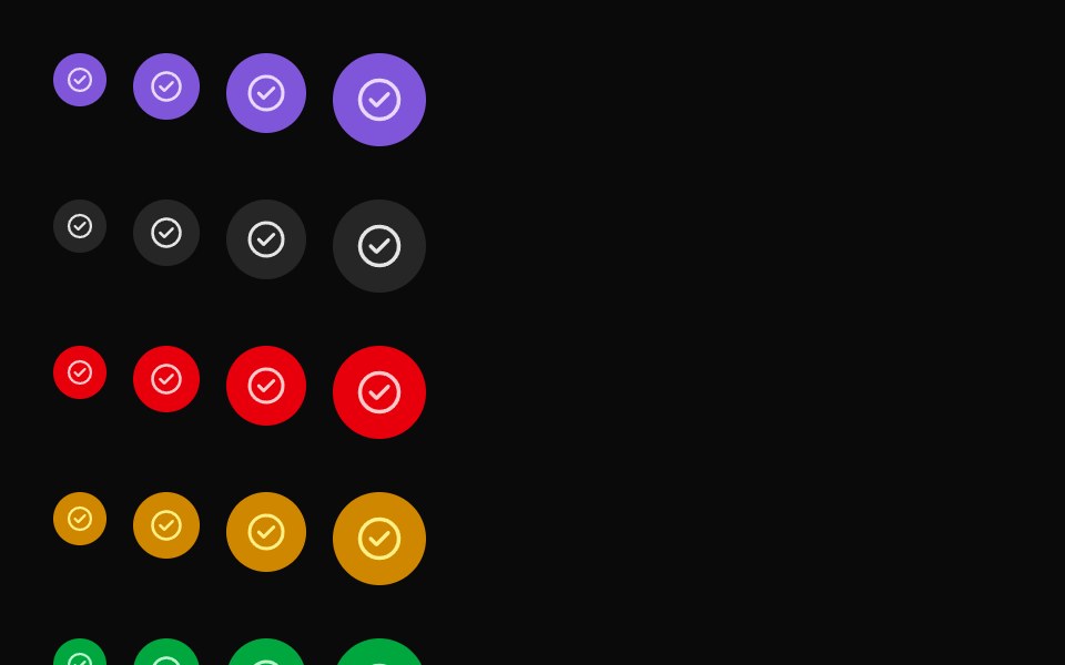 Featured IconUntitled UI React · React
 Launch UiLaunch UI · React
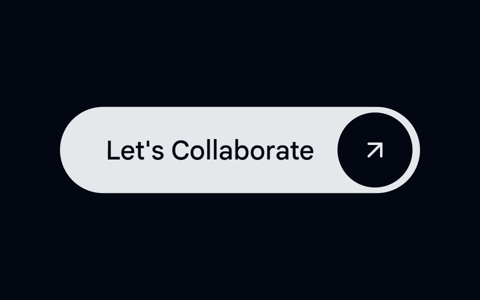 Button 01 - With IconShadcn Space · ReactWith Icon button component
 Logo Google Palmcnblocks · SvelteGoogle PaLM AI logo SVG component
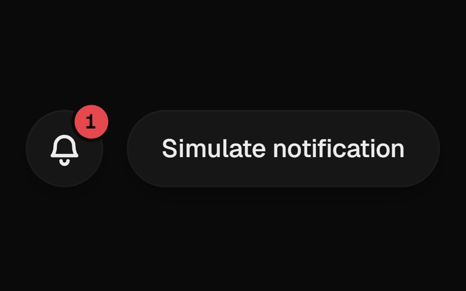 Notification BellUI Lab · ReactRings when something new arrives, and the badge rolls up with each one.
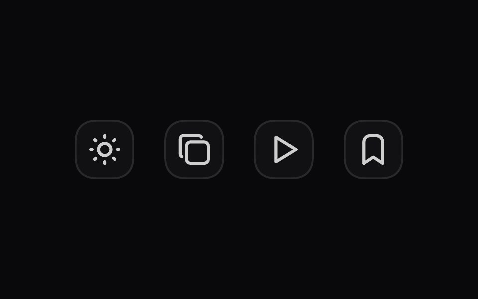 Morph IconSpaceUI · ReactTransforms one vector icon smoothly into another with fluid shape morphing animations when state changes.
 VolumeSora UI · ReactAnimated volume icon that morphs smoothly between sound waves and a mute slash with speaker shake effect.
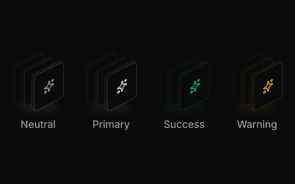 Icon stack colorsReUI · ReactSemantic icon stack colors
 Face Id ScanAmicro Micro Transitions · ReactFace Id Scan loading animation.
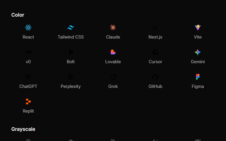 Integration IconsUntitled UI React · React
 ReactLaunch UI · React
 Button 08 - Social IconShadcn Space · ReactSocial Icon button component
 Logo Magic Uicnblocks · SvelteMagic UI logo SVG component
 TextmojiSpaceUI · ReactRenders every Unicode emoji in a string as an image sized to the surrounding text.
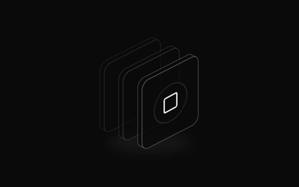 Icon badge stackReUI · ReactIcon stack with badge overlay
 Haptic RingAmicro Micro Transitions · ReactHaptic Ring loading animation.
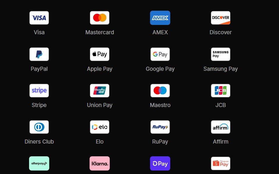 Payment IconsUntitled UI React · React
 Shadcn UiLaunch UI · React
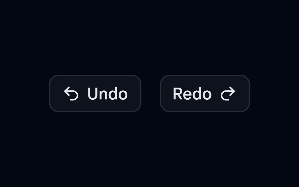 Button 09 - Outline With IconShadcn Space · ReactOutline With Icon button component
 Logo Media Wikicnblocks · SvelteMediaWiki logo SVG component
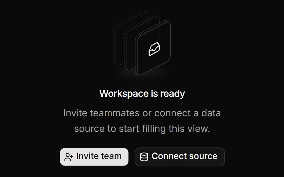 Empty state illustrationReUI · ReactShadcn empty state illustration
 HeartbeatAmicro Micro Transitions · ReactHeartbeat loading animation.
 Social IconsUntitled UI React · React
 TailwindLaunch UI · React
 Checkbox-07 - Checkbox with custom iconsShadcn Space · ReactCheckbox component
 Logo Replitcnblocks · SvelteReplit logo SVG component
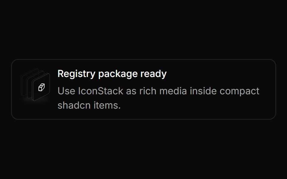 Item media stackReUI · ReactIcon stack in shadcn item
 Pumping HeartAmicro Micro Transitions · ReactPumping Heart loading animation.
 TypescriptLaunch UI · React
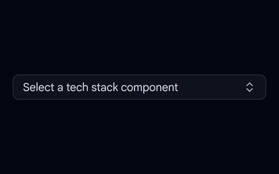 Combobox 01 - With IconsShadcn Space · ReactCombobox component with icons
 Logo Vscodiumcnblocks · SvelteVSCodium logo SVG component
 Default icon tileReUI · ReactDefault icon tile
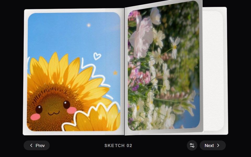 Dither BookAmicro Micro Transitions · React
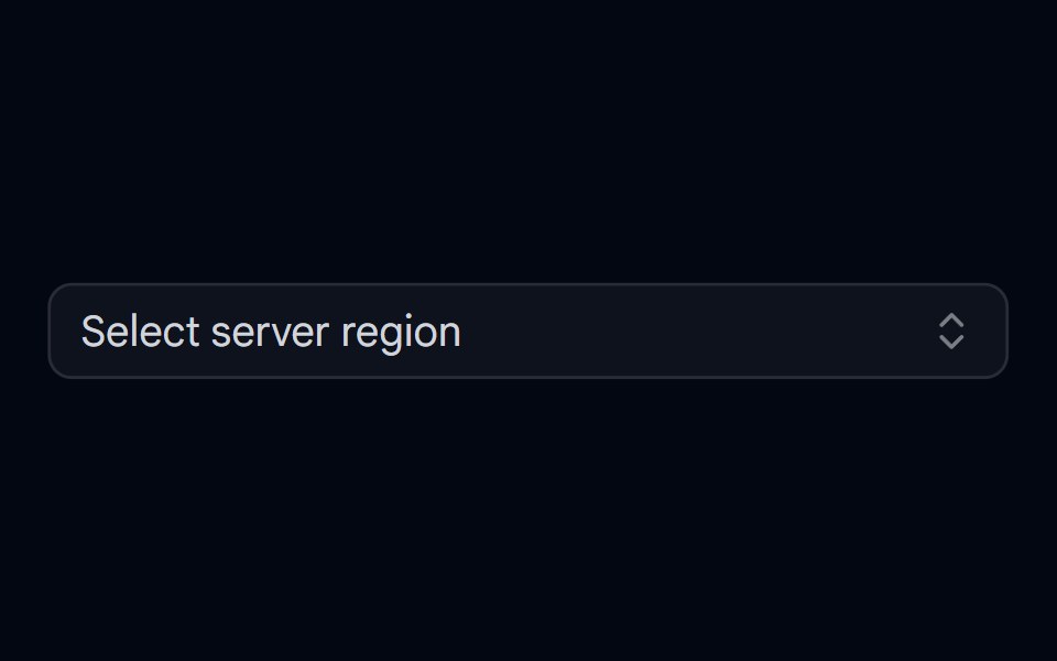 Combobox 02 - With Custom Check IconShadcn Space · ReactCombobox component
 Svgscnblocks · SvelteShared SVG logo and icon components
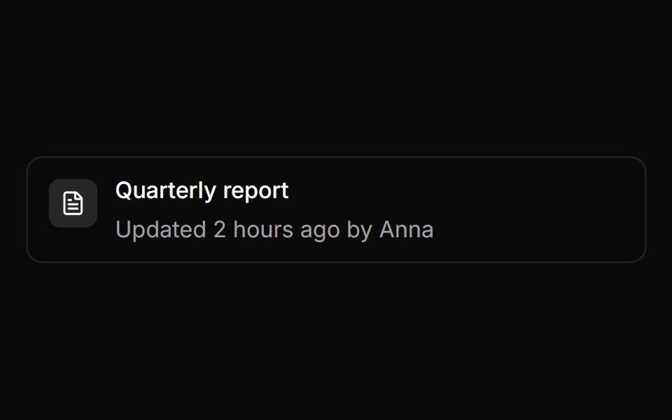 List rowReUI · ReactIcon tile in a list row
 Button DirectoryAmicro Micro Transitions · React
 Feature 02 - Three Columns Feature with IconsShadcn Space · ReactA clean three card feature grid with icons and concise copy, built for product or SaaS pages to communicate core…
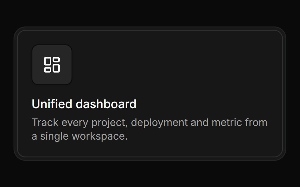 Feature cardReUI · ReactIcon tile in a feature card
 Button EditAmicro Micro Transitions · React
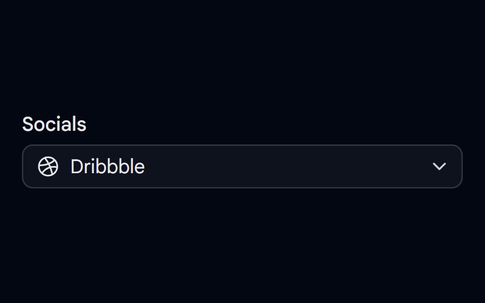 Select-02 - Select with iconShadcn Space · ReactSelect component
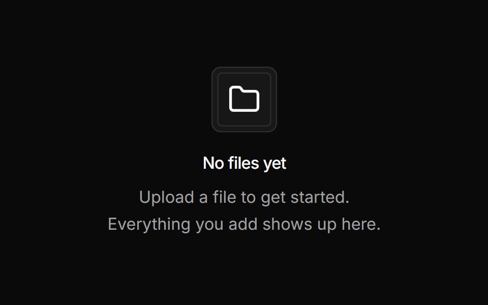 Empty stateReUI · ReactIcon tile in an empty state
 Button LockAmicro Micro Transitions · React
 Separator 08 - With IconShadcn Space · ReactHorizontal separator with centered icon
 Interactive tileReUI · ReactInteractive icon tile
 Button MicrophoneAmicro Micro Transitions · React
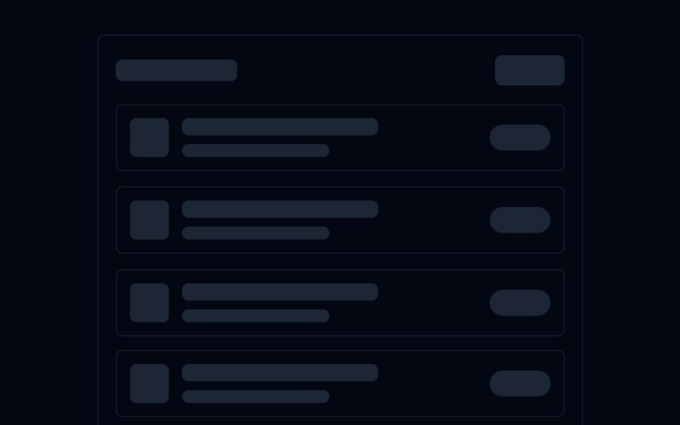 Skeleton 03 - List with IconsShadcn Space · ReactAnimated list skeleton with a title bar, icon+text rows, and badge placeholders — staggered fade-up on scroll into view.
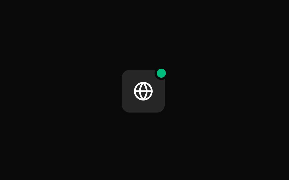 Status overlayReUI · ReactIcon tile with status overlay
 Button NetworkAmicro Micro Transitions · React
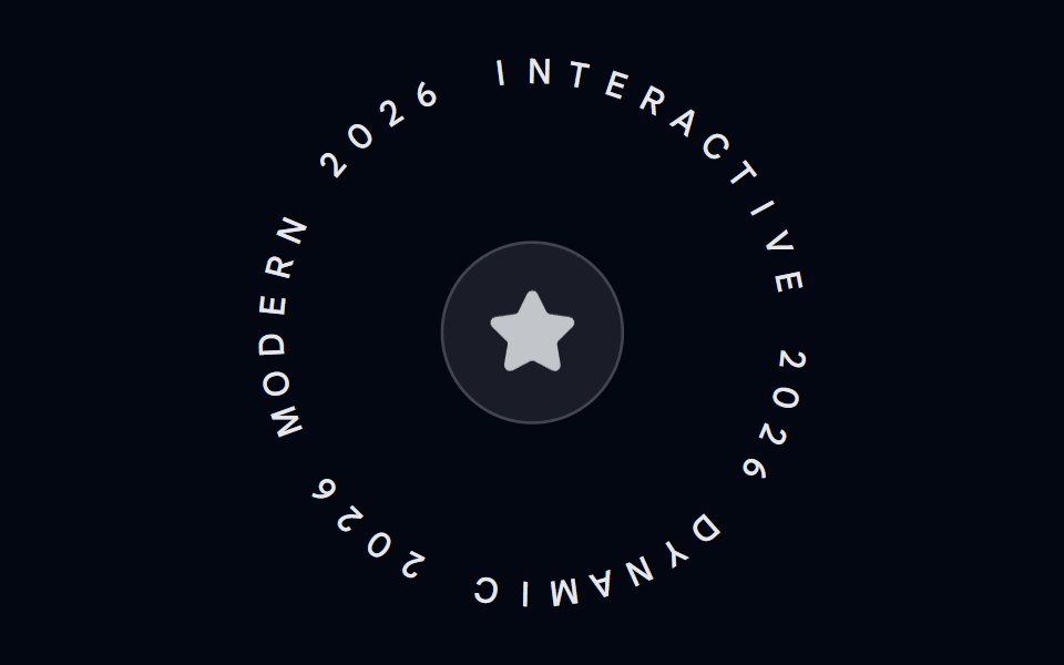 Spinning Text-02 - With IconShadcn Space · ReactSpinning Text component with animated icon
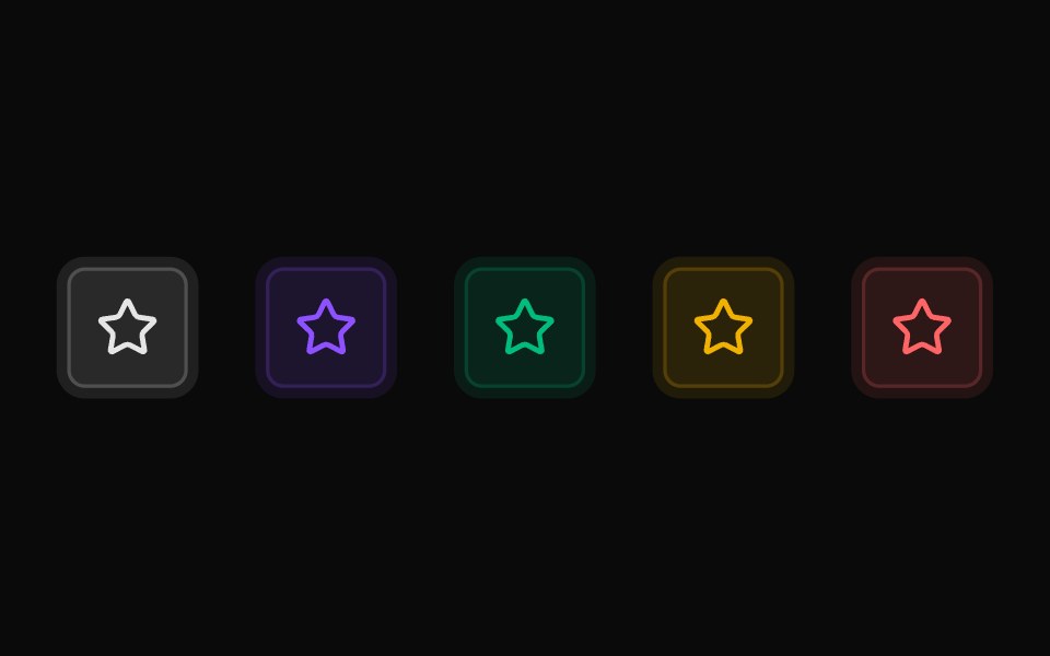 Soft tonesReUI · ReactTone-adjustable soft variant
 Button PowerAmicro Micro Transitions · React
 Switch-02 - With IconShadcn Space · ReactSwitch component
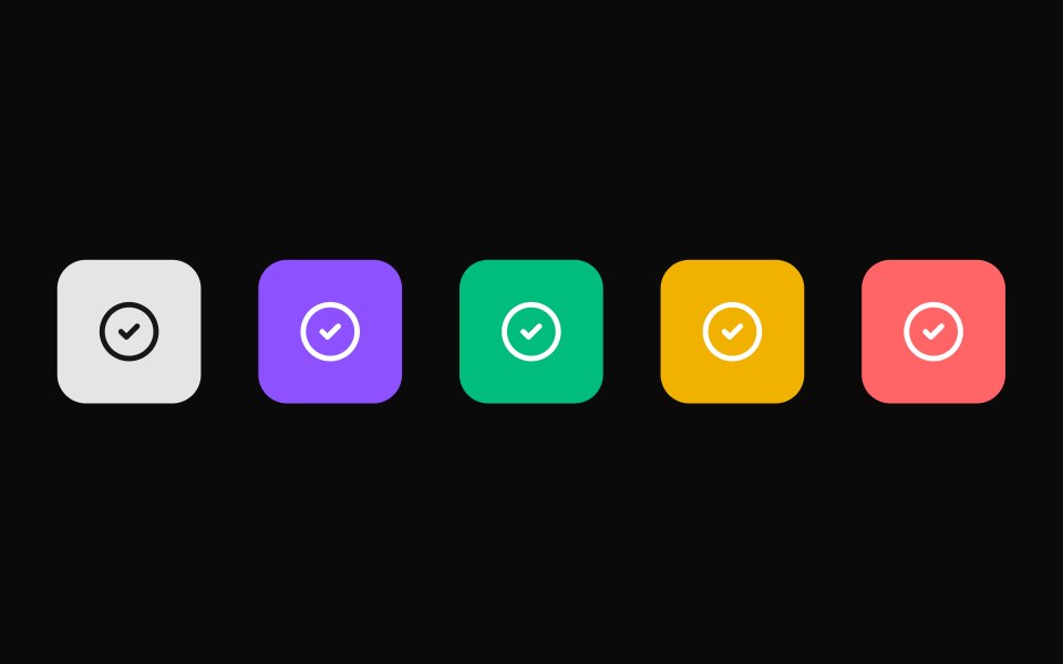 Solid tonesReUI · ReactTone-adjustable solid variant
 Button PreviewAmicro Micro Transitions · React
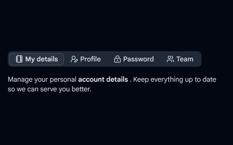 Tabs-03 - With IconShadcn Space · ReactTabs component
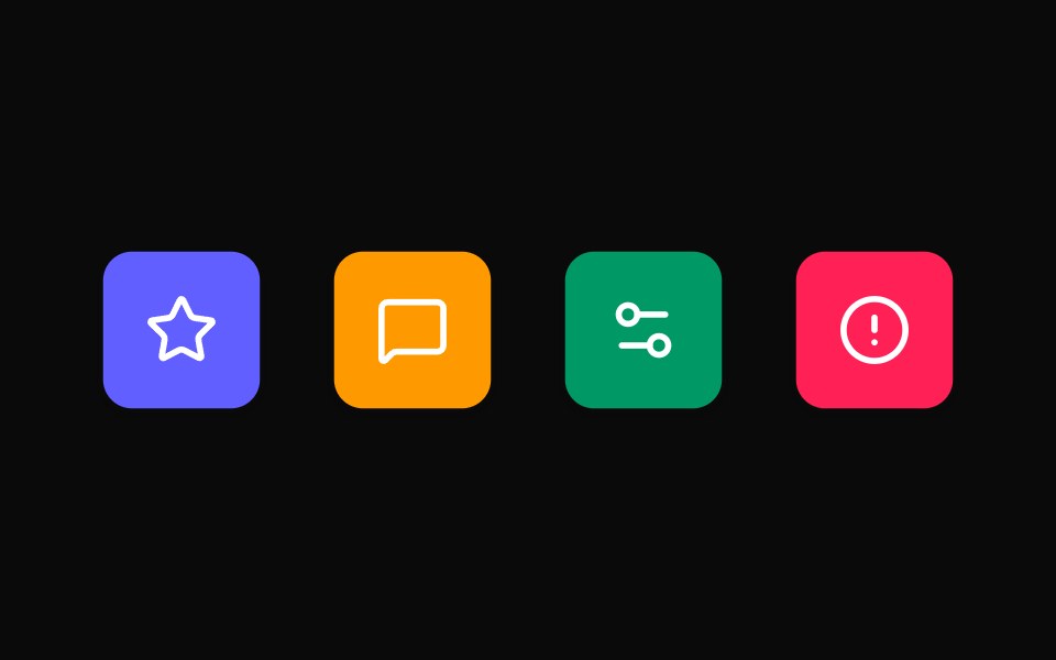 Brand colorsReUI · ReactElevated tile with a Tailwind color fill
 Button ReloadAmicro Micro Transitions · React
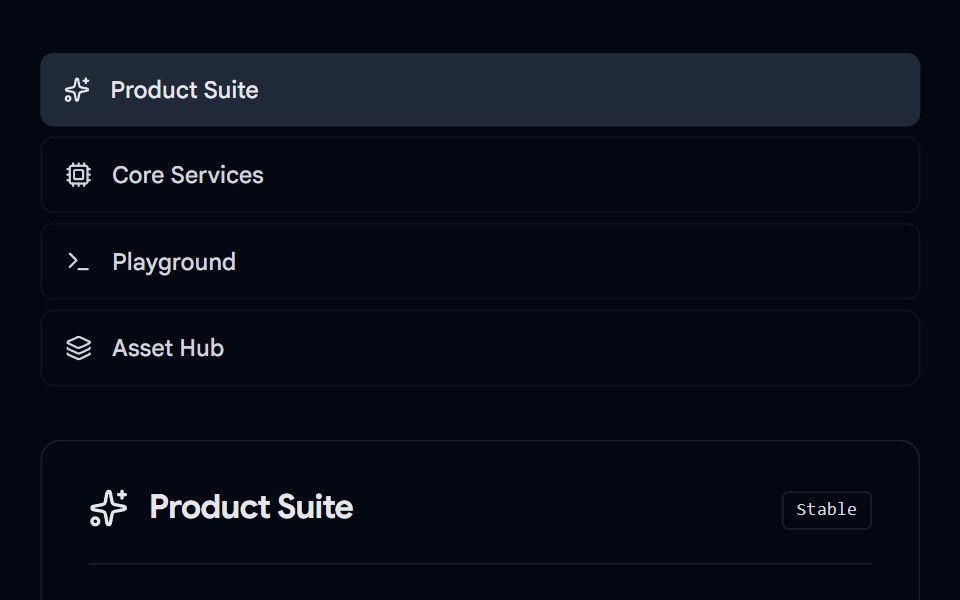 Tabs-07 - Icon & DescriptionShadcn Space · ReactTabs with icon and description component
 Elevated icon tileReUI · ReactIcon tile with elevated surface
 Button SearchAmicro Micro Transitions · React
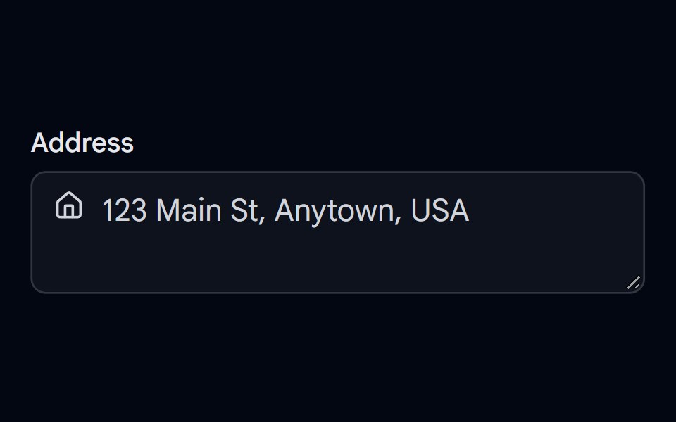 Textarea-02 - Textarea with iconShadcn Space · ReactTextarea component
 Framed icon tileReUI · ReactIcon tile with framed surface
 Button SettingsAmicro Micro Transitions · React
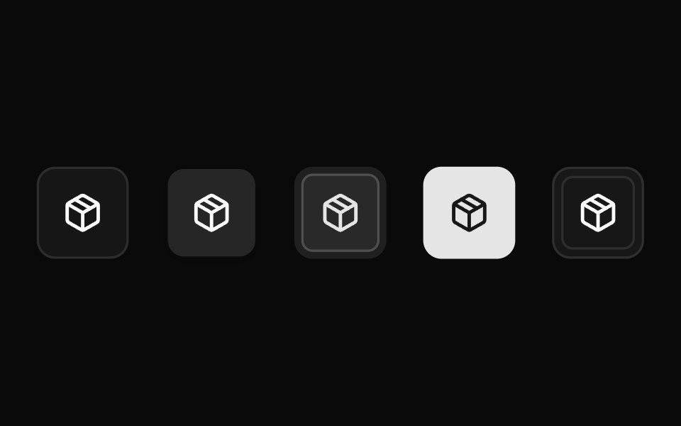 All variantsReUI · ReactEvery icon tile variant
 Button VisibilityAmicro Micro Transitions · React
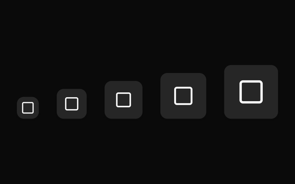 SizesReUI · ReactIcon tile size scale
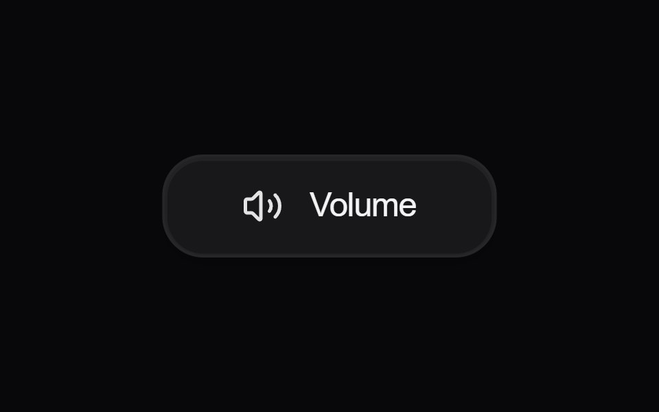 Button VolumeAmicro Micro Transitions · React
 Circular tilesReUI · ReactIcon tiles with circular shape
 Download IconsAmicro Micro Transitions · React
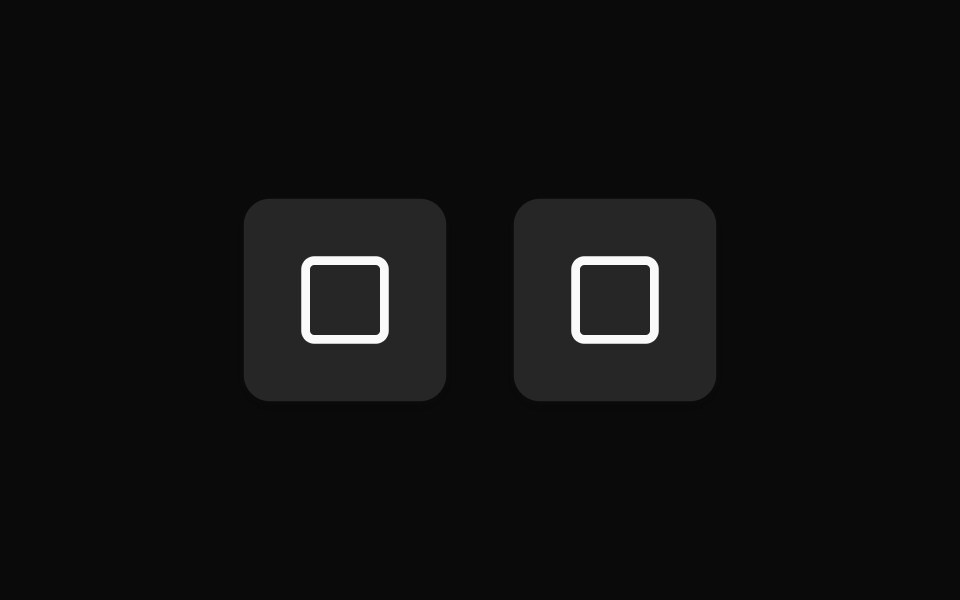 Custom sizingReUI · ReactIcon tile with custom sizing
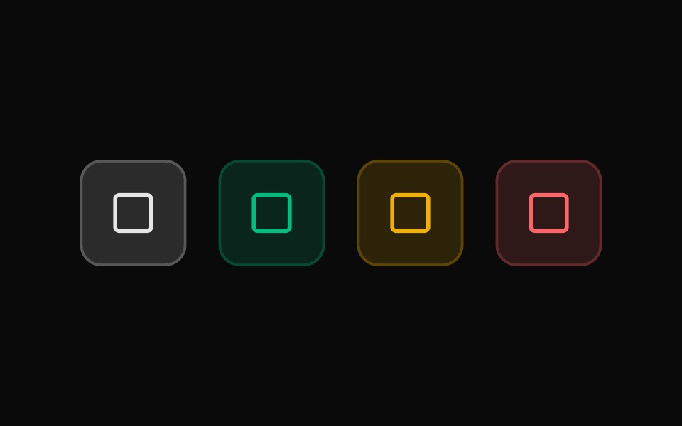 Color tonesReUI · ReactSemantic icon tile color tones
 Text contentReUI · ReactIcon tile with text content
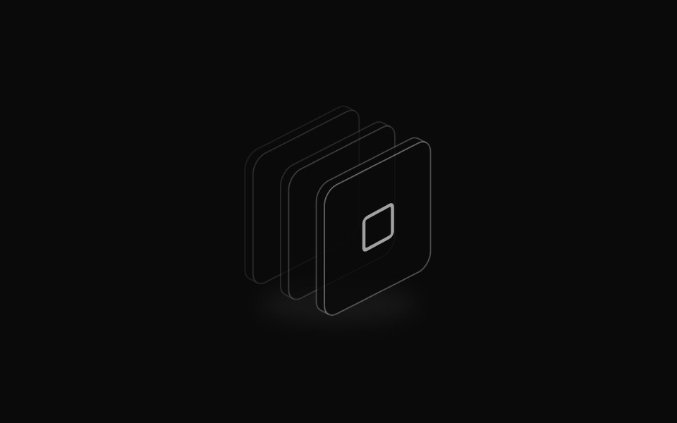 Icon StackReUI · ReactShadcn Icon Stack for isometric icons, layered icon illustrations, and empty-state visuals.
 Icon TileReUI · ReactShadcn Icon Tile that wraps an icon in a consistent square surface for list rows, feature cards, and empty states.
Libraries with Tailwind CSS icon components
Related categories
- Icon Components
- React Icon Components
- Svelte Icon Components
- Animated Icon Components
- shadcn/ui Icon Components
- Tailwind CSS Media Components
- Tailwind CSS Image Components
- Tailwind CSS Gallery Components
- Tailwind CSS Illustration Components
- Tailwind CSS Mockup Components
- Tailwind CSS Animated Icon Components
- Tailwind CSS Audio Visualizer Components
- Tailwind CSS Logo Components
- Tailwind CSS Scene 3D Components
- Tailwind CSS Video Player Components
- Tailwind CSS QR Code Components
- Tailwind CSS Icon Set Components
- Tailwind CSS Image Compare Components