 Dev Design Library
shadcn/ui Mockup Components
Dev Design Library indexes 10 shadcn/ui mockup components from 3 open-source UI libraries, with the most coming from FLX UI, Velora UI and Watermelon UI. Each one links to its page with the source code, a live preview where available, the library license and the install command. They follow the shadcn/ui conventions, so most install with the shadcn CLI and drop into a Tailwind project. Mockup components belong to the Media group.
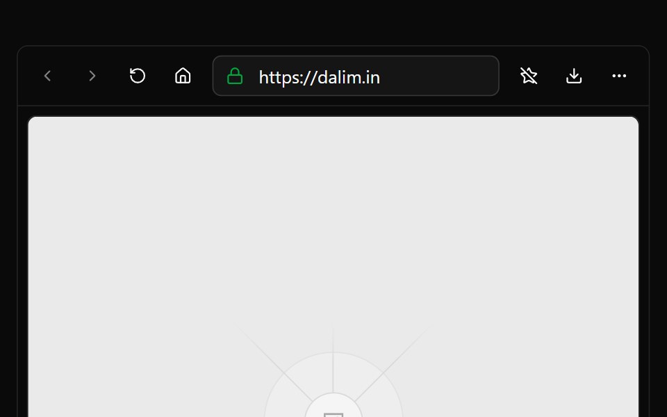 BrowserWatermelon UI · React
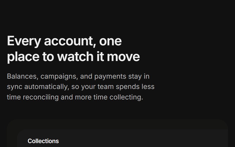 Content 11FLX UI · ReactA billing overview split with a dashboard preview card and two feature highlights, built for the app-shell preset.
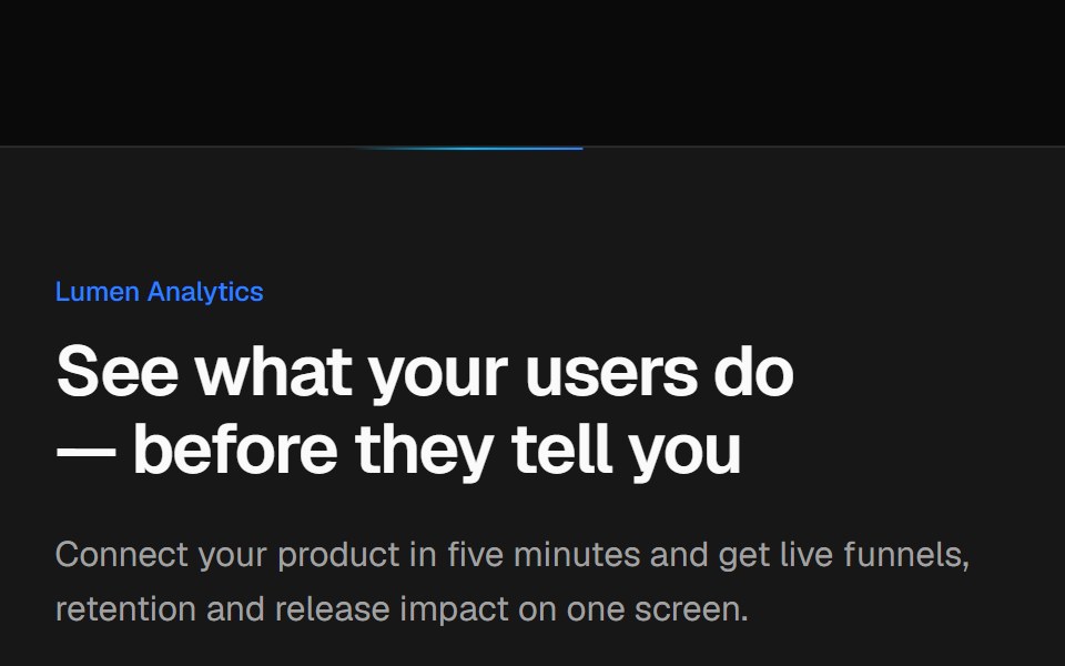 Split CTA with product visualVelora UI · ReactTwo-column CTA card with a benefit list and a dashboard mock-up, traced by an animated border beam.
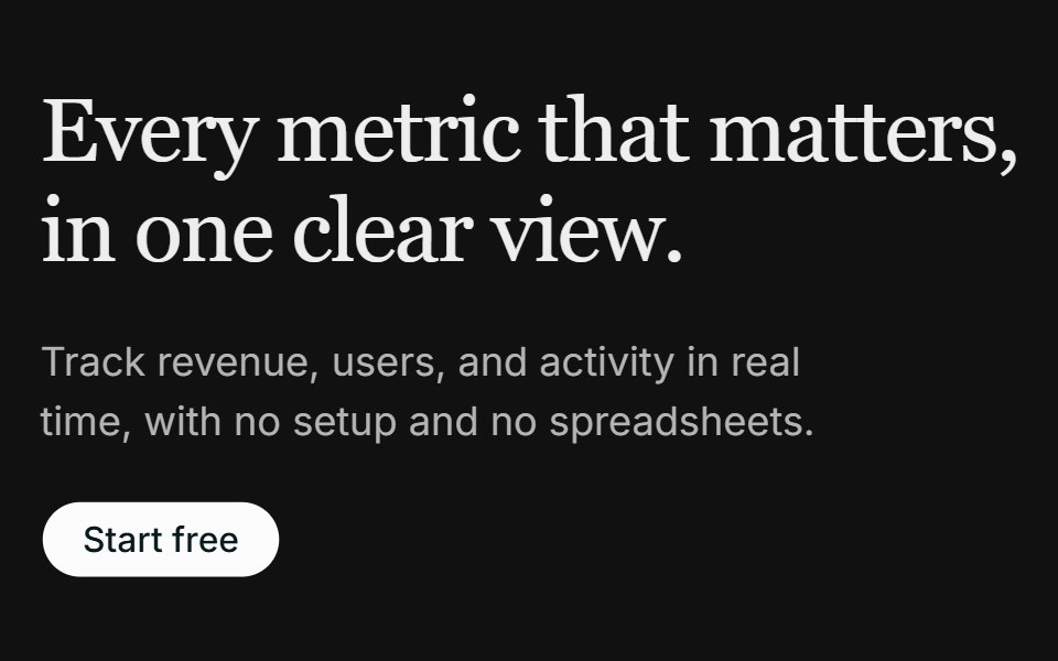 Hero 02FLX UI · ReactA left-aligned serif hero with a media panel: an image backdrop with a floating dashboard mockup on top.
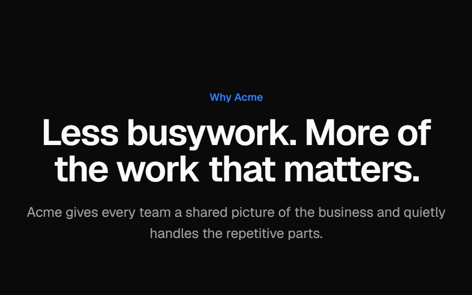 Alternating screenshot rowsVelora UI · ReactTwo alternating rows of copy with a checklist beside a browser-framed dashboard mock, sides swapped.
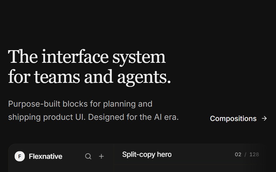 Hero 11FLX UI · ReactA split-copy hero with a light product studio mock — issue feed, properties, and a floating agent panel that fades…
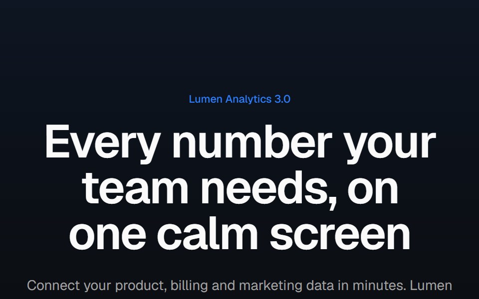 Product screenshot heroVelora UI · ReactCentered headline above a dashboard in a browser frame with a border beam and a logo row.
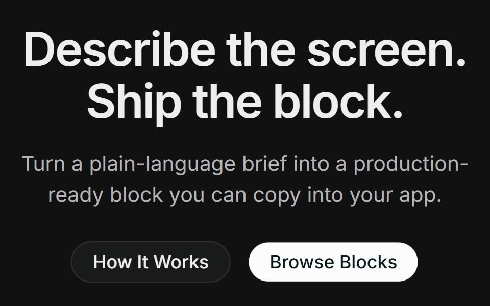 Hero 14FLX UI · ReactA centered product hero with dual CTAs, a full-width photo with a floating block-builder demo panel, and a logo strip.
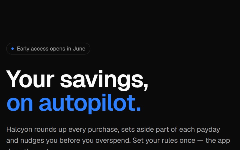 Phone split heroVelora UI · ReactApp launch hero with an email capture on the left and an app screen in an iPhone frame.
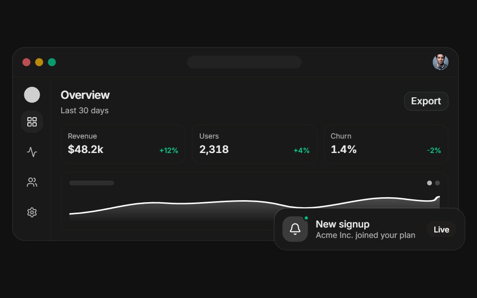 Dashboard previewFLX UI · ReactA layered app dashboard with a floating notification.