Date Range Picker
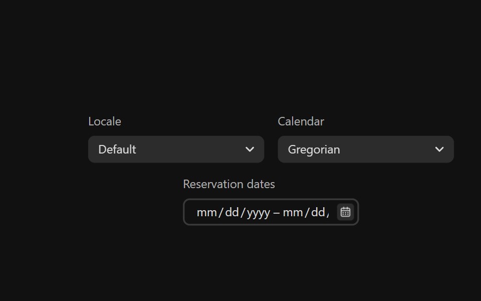
DateRangePickers combine two DateFields and a RangeCalendar popover to allow users to enter or select a date and time range.
- Library
- React Spectrum
- Framework
- React
- Type
- component
- License
- Apache-2.0
- Files
packages/@react-spectrum/s2/src/DateRangePicker.tsxpackages/@react-spectrum/s2/src/DatePicker.tsxpackages/@react-spectrum/s2/src/DateField.tsxpackages/@react-spectrum/s2/src/style-utils.tspackages/@react-spectrum/s2/src/Field.tsxpackages/react-aria-components/src/Form.tsxpackages/react-aria-components/src/Popover.tsxpackages/@react-spectrum/s2/src/RangeCalendar.tsx
- Source
- https://github.com/adobe/react-spectrum
Categories
- Date Picker Components
- React Date Picker Components
- Tailwind CSS Date Picker Components
- Date Range Picker Components
- React Date Range Picker Components
- Tailwind CSS Date Range Picker Components
- Input Components
- React Input Components
- Tailwind CSS Input Components
- Overlay Components
- React Overlay Components
- Tailwind CSS Overlay Components