 Dev Design Library
Tailwind CSS Overlay Components
Dev Design Library indexes 889 Tailwind CSS overlay components from 69 open-source UI libraries, with the most coming from Watermelon UI, ReUI, Origin UI, FLX UI and Shadcn Space. Each one links to its page with the source code, a live preview where available, the library license and the install command. Every library in this list styles its components with Tailwind CSS utility classes.
Showing 120 of 889, a mix from every library. Open a library to see all of its components.
 Alert Dialogshadcn/ui · ReactA modal dialog that interrupts the user with important content and expects a response.
 DrawerdaisyUI · CSS (Tailwind)
 Alert DialogHeroUI · ReactModal dialog for critical confirmations requiring user attention and explicit action
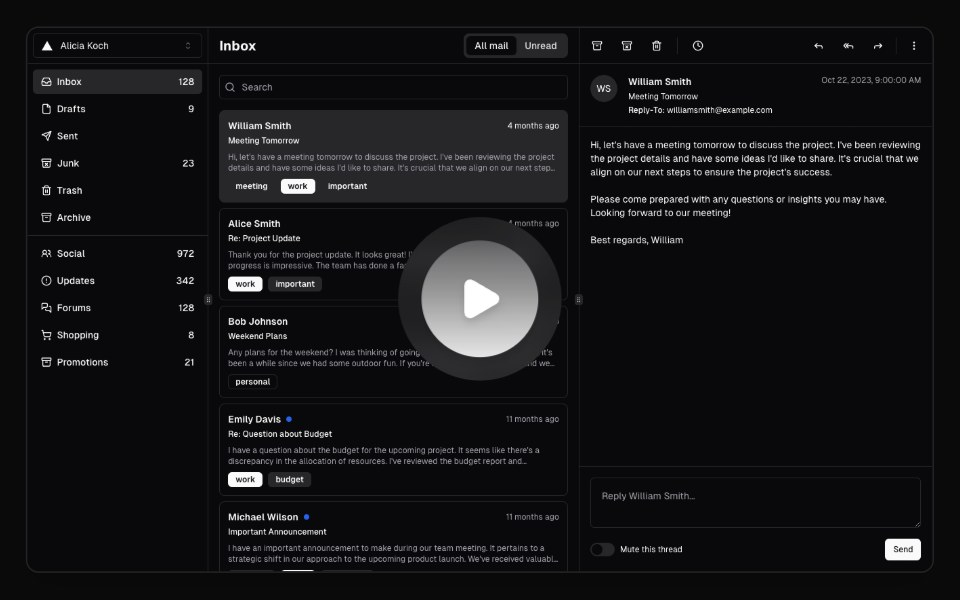 Hero Video DialogMagic UI · ReactA hero video dialog component.
 Alert DialogReact Spectrum · ReactAlertDialogs are a specific type of Dialog. They display important information that users need to acknowledge.
 Alert Dialogcoss ui · ReactA dialog that requires user response to proceed.
 Alert DialogOrigin UI · ReactA dialog that requires user response to proceed.
 OverlayPreline UI · JavaScript (HTML + Tailwind)
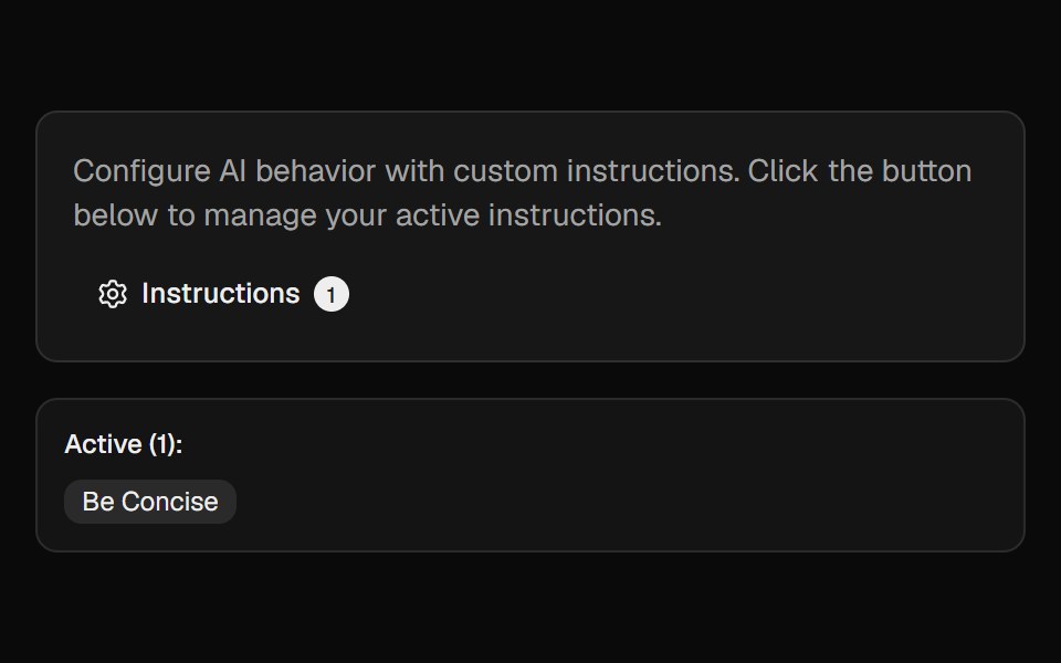 Ai InstructionsCult UI · ReactManage and toggle AI instructions with a popover, search, and create-dialog
 DialogTremor · React
 Basic alert dialog with title, description, and action buttonsReUI · ReactBasic alert dialog with title, description, and action buttons
 Card Preview TileAmicro Micro Transitions · ReactCatalog preview for a card spread / carousel. Hover state lives here so hovering one tile re-renders only that tile…
 ContextAI Elements · ReactA compound component system for displaying AI model context window usage, token consumption, and cost estimation.
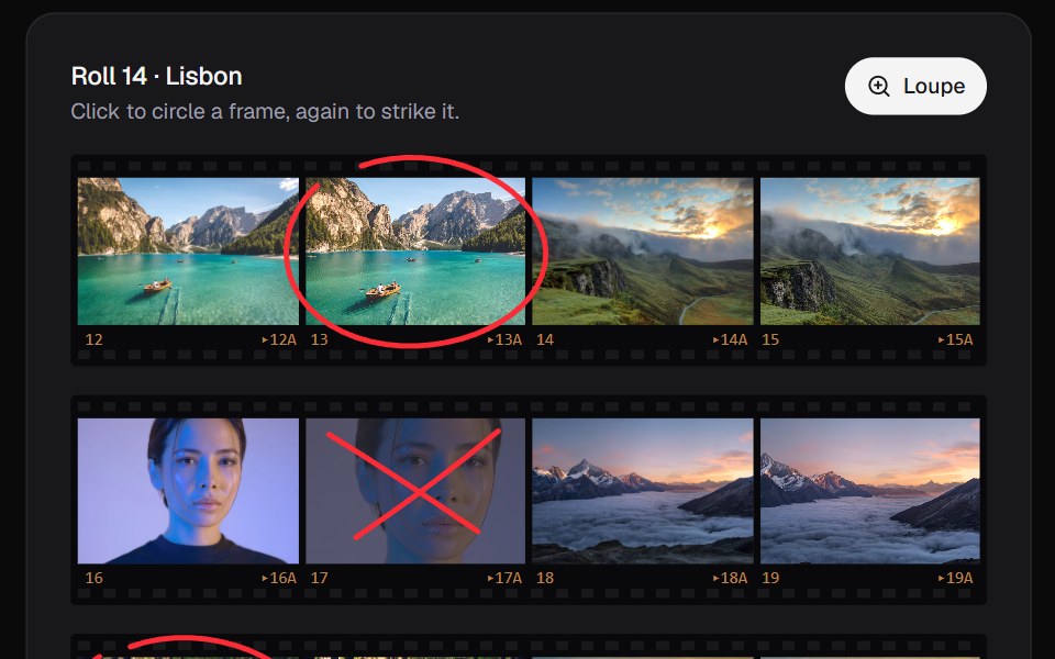 Contact SheetKokonut UI · ReactPick from a shoot the way photographers do. Circle a frame in china marker, click again to strike it, and look through…
 command-menuIntent UI · Reactcommand-menu
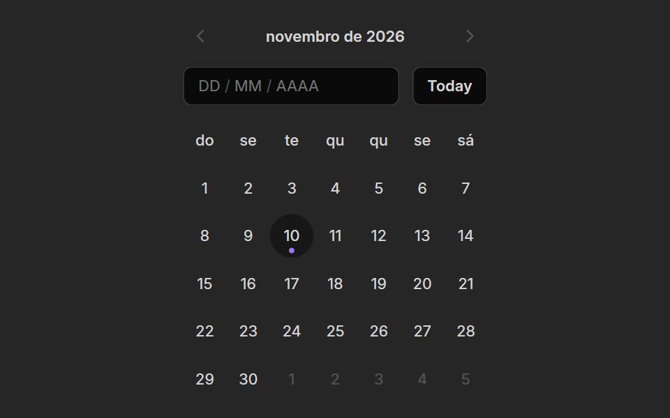 Date PickerUntitled UI React · React
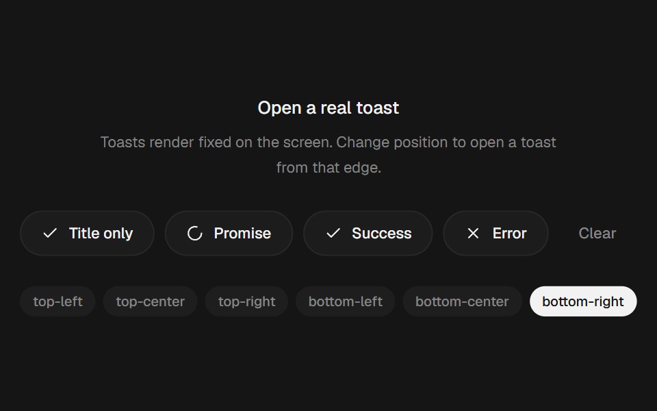 Animated Toast StackbeUI · ReactStacked toasts with status morphs, swipe dismissal, actions and layout-aware motion.
 Alert DialogTailGrids · ReactA modal dialog that interrupts the user with important content and expects a response.
 Family DrawerRare UI · ReactA bottom drawer with smooth, morphing transitions between stacked views, inspired by the Family app. Built on Vaul.
 Animated DrawerSpectrum UI · Reactcomponent for the Animated Drawer
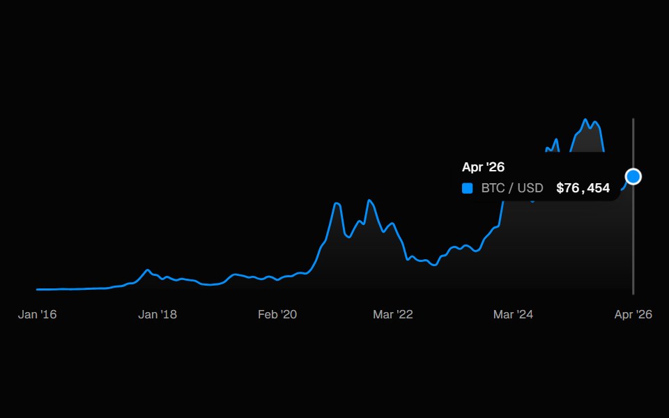 ChartSpell UI · ReactInteractive line chart with a cursor-tracked tooltip card, snap-to-point hover, and built-in X-axis labels.
 Animated TooltipVengeance UI · ReactBouncy SVG-shaped tooltips with spring animations
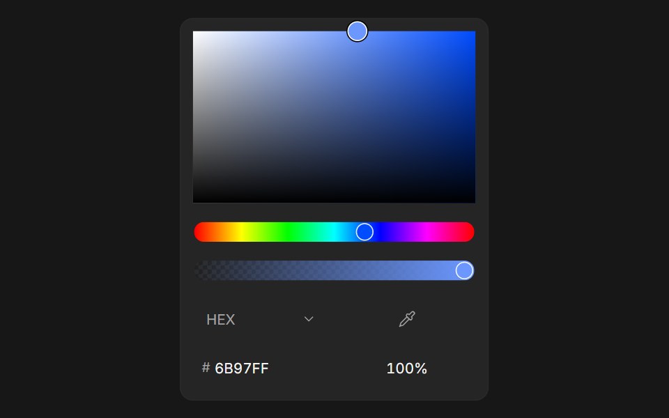 Color PickerFluid Functionalism · ReactColor picker with HEX, RGB, HSL, and OKLCH formats, alpha channel, optional swatches, and a popover trigger. Built on…
 Alert DialogToolcraft · React
 Navbar SectionLaunch UI · React
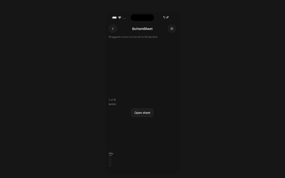 Bottom SheetPanel UI · React NativeDraggable sheet anchored to the bottom of the screen.
 Aspect Ratio 03 - Caption OverlayShadcn Space · ReactA portrait aspect ratio card with a gradient overlay and caption text.
 AnnotationsOpenSourceUI · React
 Corner Videouselayouts · ReactA compact corner video player with smooth open/close morphing, autoplay, mute, enlarge, hover controls, and video…
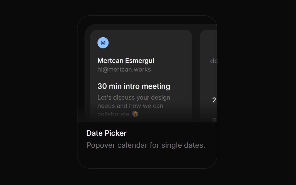 Date PickerBoardUI · ReactPopover calendar for single dates.
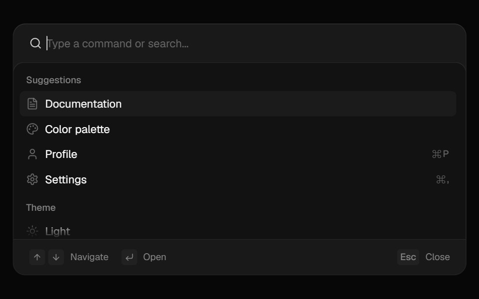 CommandComponentry · React
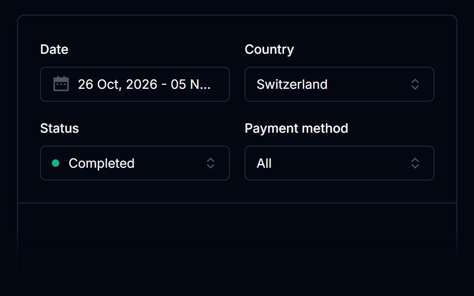 Date PickerTremor Blocks · React
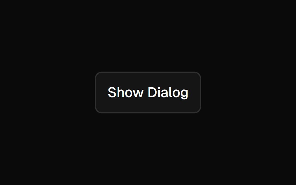 Alert DialogShadcn Dashboard · React
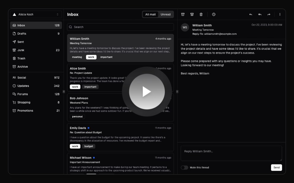 Hero Video DialogAnimations (Svelte) · SvelteA video dialog component with animated entrance effects, thumbnail support, and customizable animation styles.
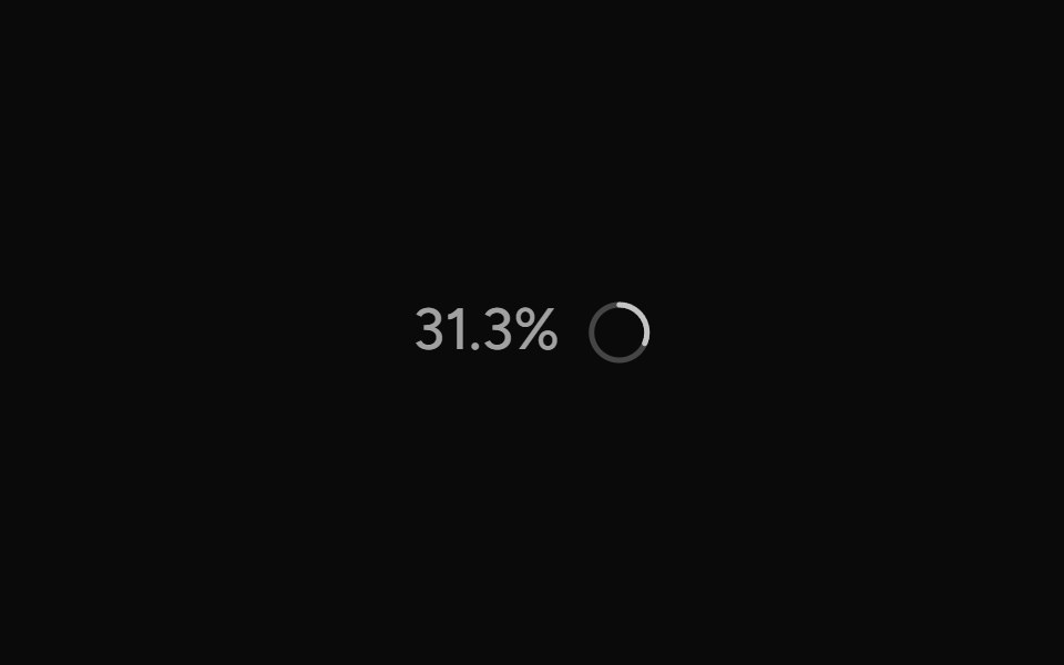 ContextAI Elements (Svelte) · SvelteA hover-card-based context window usage component with token, cost, and model usage breakdowns.
 Expandable CardBadtz UI · ReactA versatile and engaging UI component that allows users to explore content in a more immersive way.
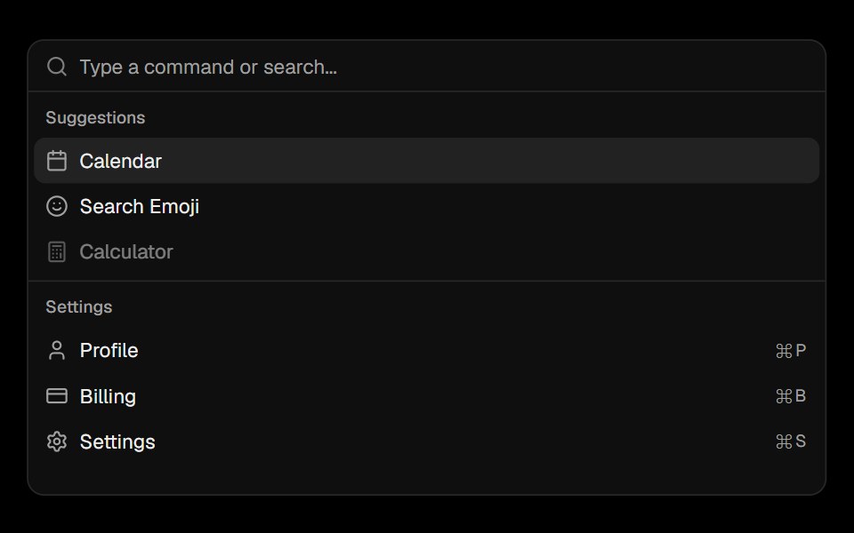 CommandObsidianUI · React
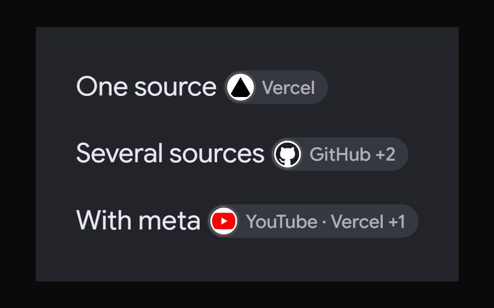 AI Overview CitationNotra · ReactA source chip built on shadcn Badge and HoverCard.
 Image Hover RevealGreatUI · React
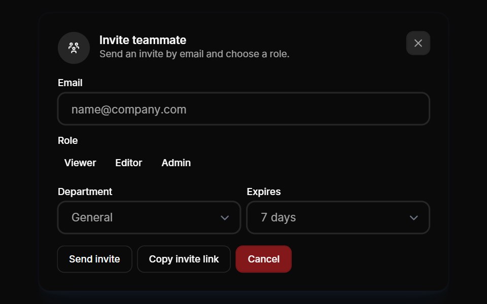 Modals 01Oxbow UI · AstroInvite team members to your account
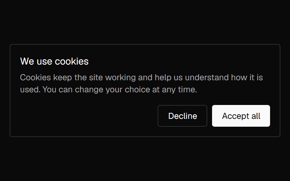 Banner CookieNexvyn UI · ReactA cookie consent card with accept and decline actions that lifts in once and lifts away on a choice.
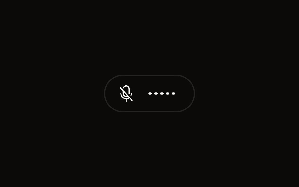 Quick Audio Popoveraudiocn · ReactCompact microphone and system audio controls behind one toolbar button that shows a live level.
 modalBaseLayer · ReactA modal is an overlay element which blocks interaction with elements outside it.
 Alert DialogShark UI · ReactDialog for displaying important content.
 DoubtButtonEvil Buttons · ReactAn escalating-confirmation button that makes you click through increasingly absurd, guilt-tripping prompts before the…
 Gooey Color Picker23rd.dev · ReactA floating color picker with a circular hue wheel, alpha slider, hex field, and motion-powered open/close.
 Animated DialogSona UI · ReactA composable, accessible dialog modal built on Base UI with controlled state, direction-aware enter and exit motion…
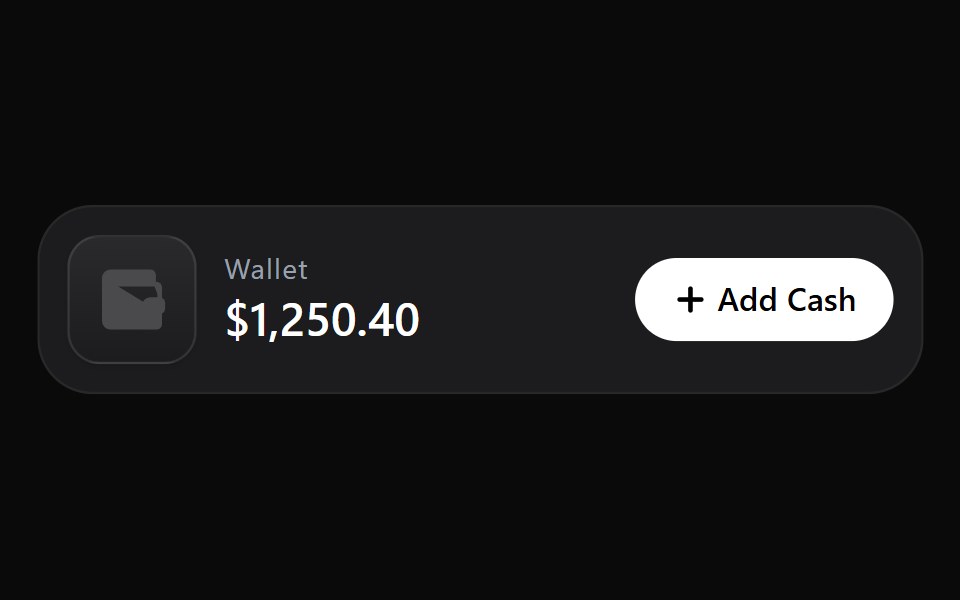 Add Cash DisclosureWatermelon UI · React
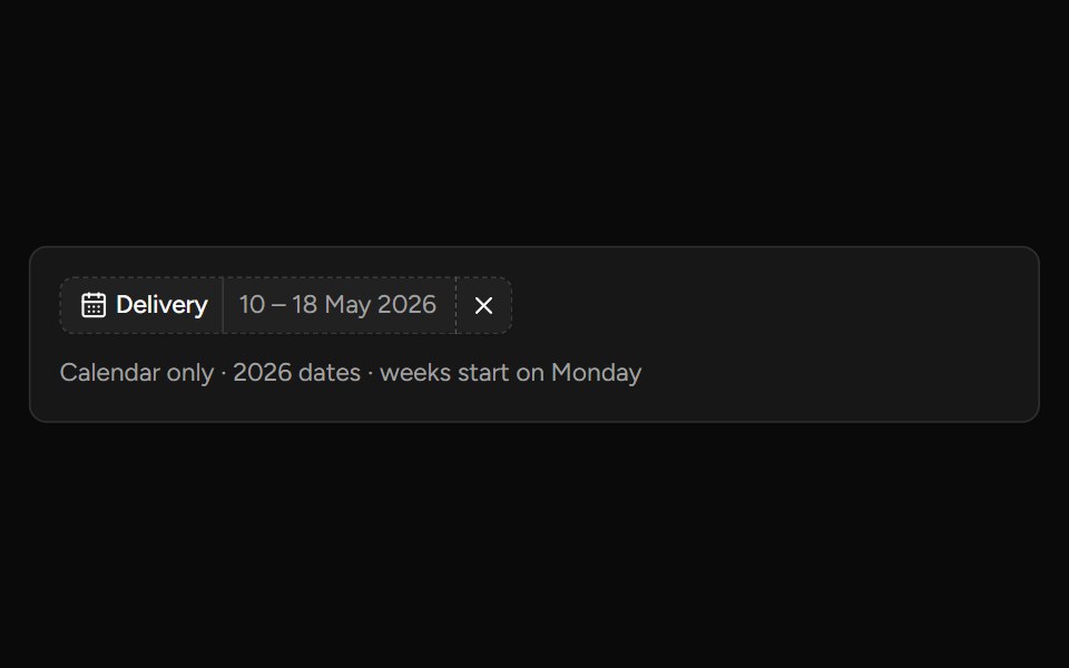 Date Range Filtersv-table · SvelteA responsive date-range picker with presets and explicit apply behavior.
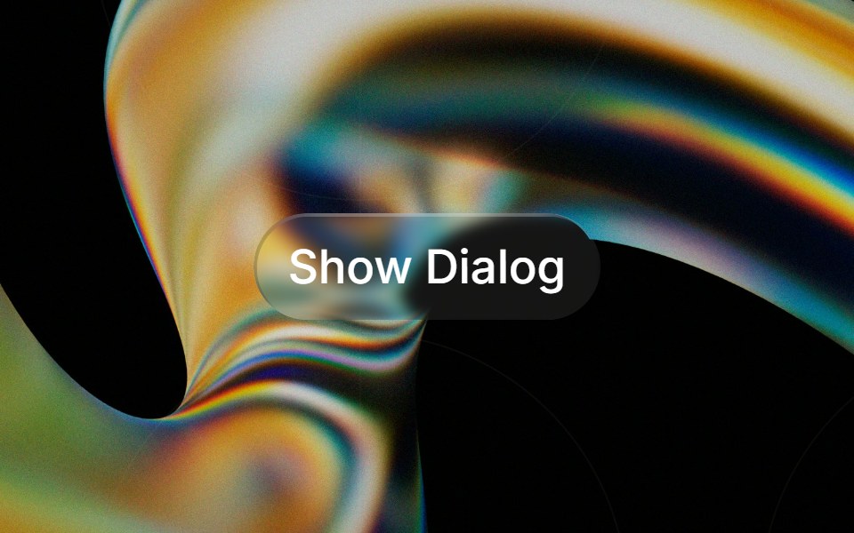 Glass Alert Dialogglasscn · ReactGlass Alert Dialog with five variants: clear, frosted, subtle, liquid, and liquid-refract
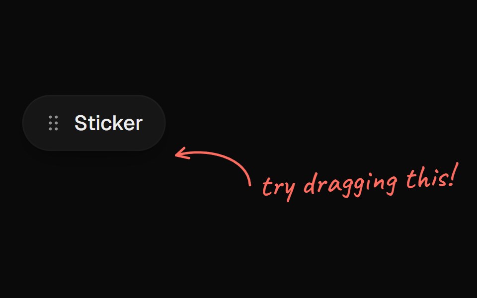 Arrow CalloutUI Lab · ReactA handwritten note whose arrow draws itself to whatever it points at.
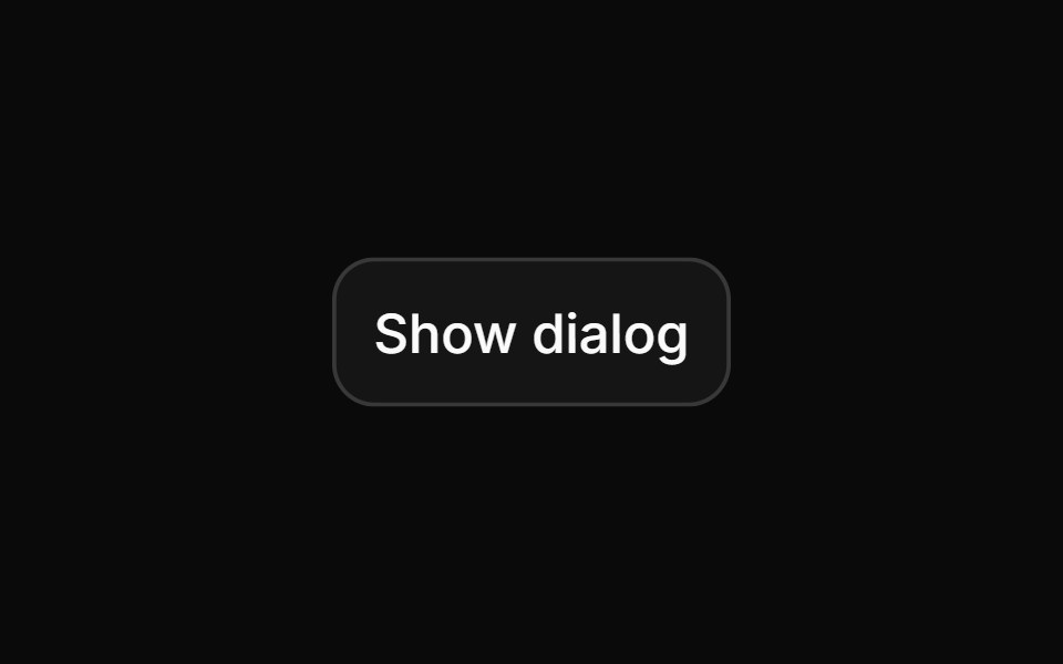 Alert dialogHextaUI · ReactA confirmation dialog for destructive or important actions that waits for async work, and becomes a bottom sheet on…
 DevTools Drawer BlockLocalMode · ReactA global on-device observability drawer: six tabbed surfaces (inference queues, event log, pipeline runs, model cache…
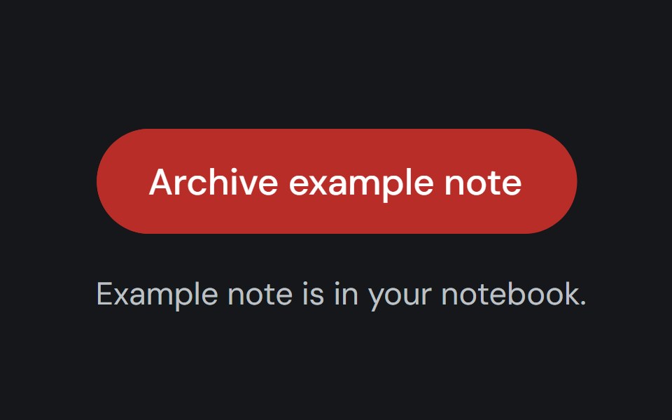 Alert DialogCojeev UI · ReactPauses a workflow for a focused confirmation before a consequential action proceeds.
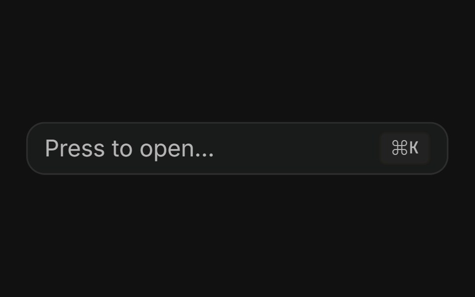 Command dialogFLX UI · ReactSpotlight-style ⌘K palette toggled by a button or keyboard shortcut.
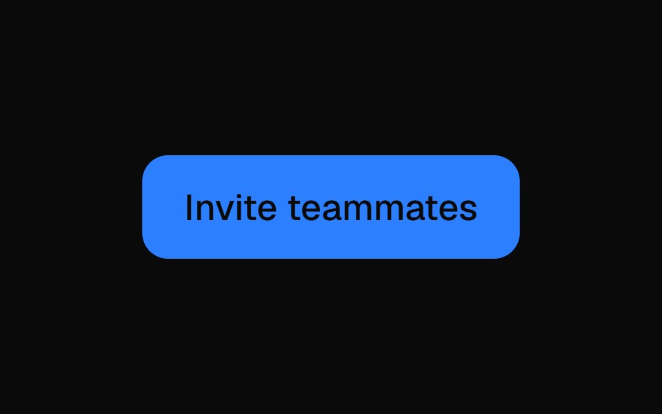 Animated ModalVelora UI · ReactNative dialog whose panel springs in with a tilt over a blurred backdrop.
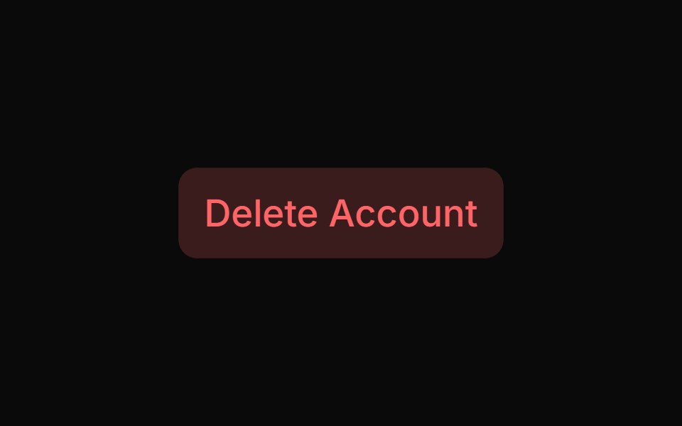 Alert Dialog With Bare Footersv-particles · Svelte
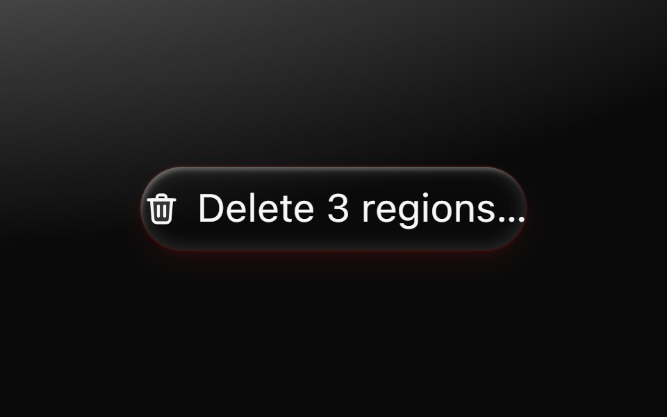 Alert dialogMetal UI · React + SwiftUIA question that must be answered: the dialog's plate and motion; a click outside shakes it once on the refusal spring…
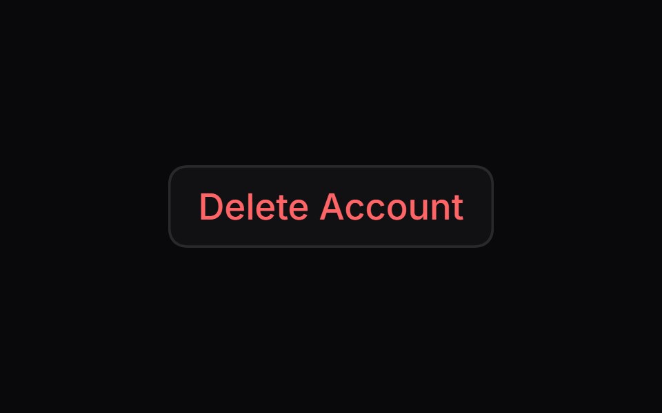 Alert DialogSpaceUI · ReactDisplays a modal window that asks users to confirm important actions before proceeding, helping prevent accidental…
 Cookie ConsentSkecher UI · ReactA paper-and-cobalt cookie notice with an isometric cookie break animation, confirm-and-undo controls, and…
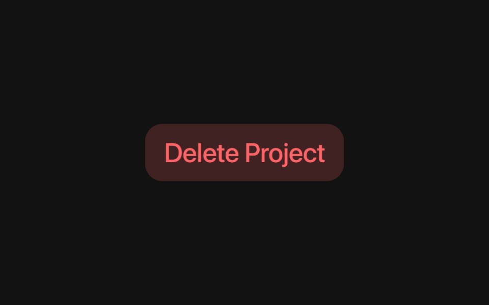 Base Alert DialogSora UI · ReactAn accessible alert dialog built on Base UI with smooth Motion 3D perspective entrance and exit animations…
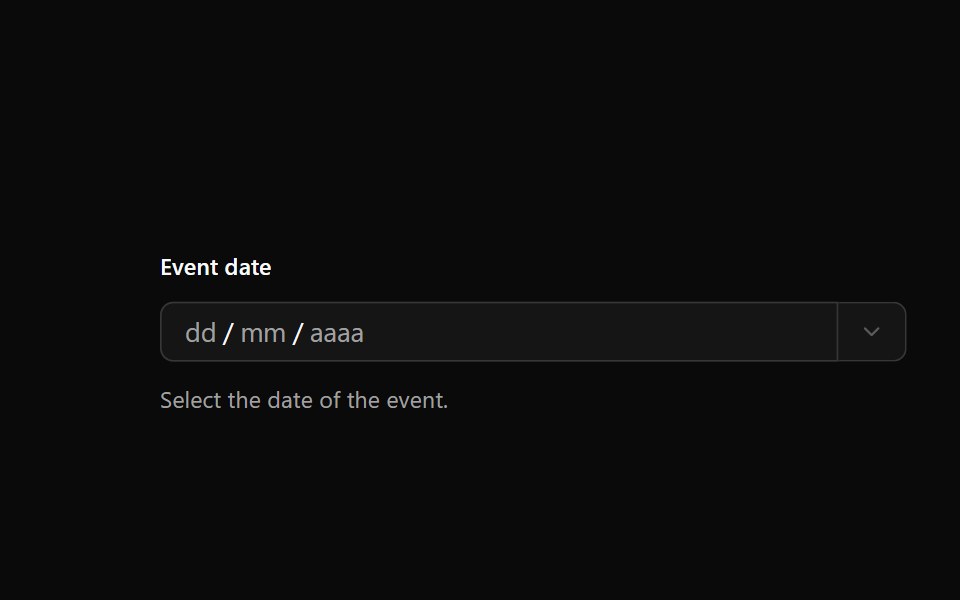 Date PickerOUI · ReactReact aria components DatePicker with shadcn characteristics.
 Alert DialogD2Studio UI · ReactA modal dialog that interrupts the user with important content and expects a response.
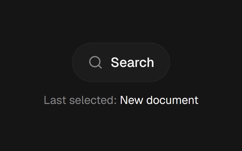 Command PaletteEaseUI · ReactCommand-K style search overlay that filters as you type, with arrow keys to move the highlight and Enter to select.
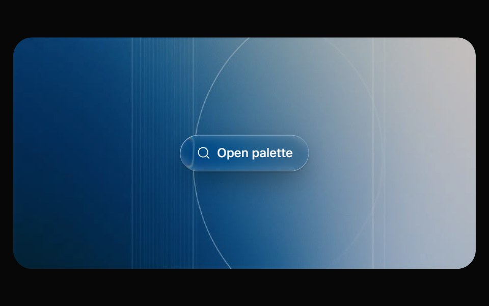 Glass CommandOpaline · React⌘K command palette on a frosted glass sheet, powered by cmdk.
 Alert DialogFibo · ReactAsks for a decision before something that can't be undone, with Cancel focused and no click-outside dismiss.
 AI Dynamic Island 01ReactFrame · ReactA Dynamic Island-style AI status pill that morphs between idle, listening, thinking, working (with an unfolding step…
 Animated ModalAceternity UI · React
 Alert Dialogark-cn · ReactA shadcn-style alert dialog component built with Ark UI primitives.
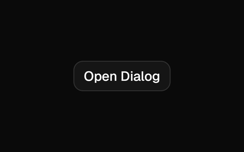 Dialogshadcn/ui · ReactA window overlaid on either the primary window or another dialog window, rendering the content underneath inert.
 ModaldaisyUI · CSS (Tailwind)
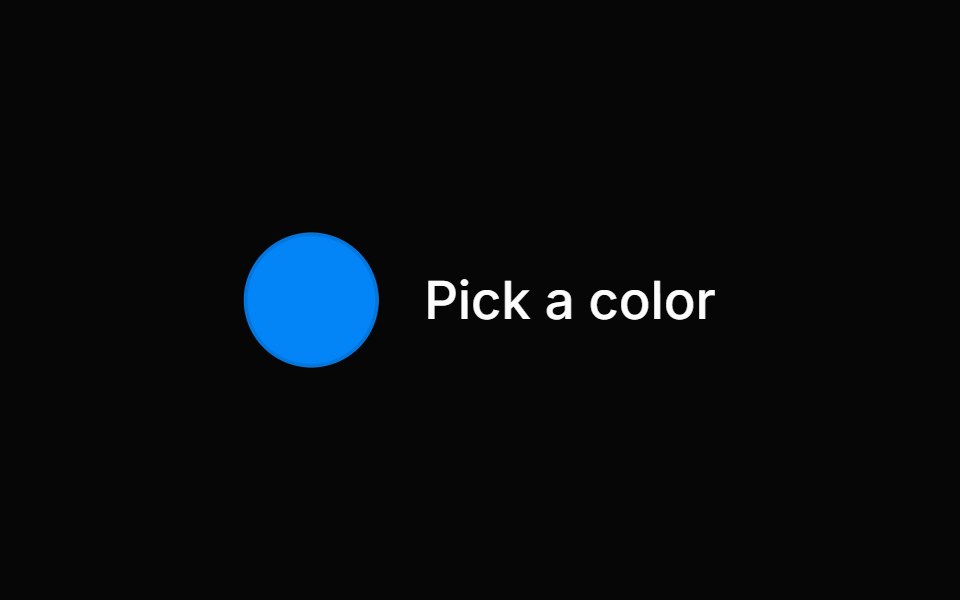 Color PickerHeroUI · ReactA composable color picker that synchronizes color value between multiple color components
 Contextual HelpReact Spectrum · ReactContextual help shows a user extra information about the state of an adjacent component, or a total view.
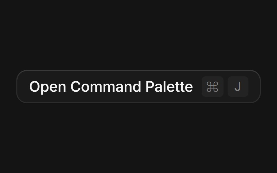 Commandcoss ui · ReactA command palette component built with Dialog and Autocomplete for searching and executing commands.
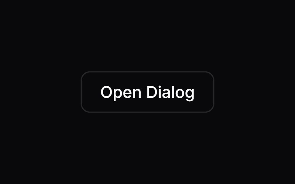 DialogOrigin UI · ReactA popup that opens on top of the entire page.
 TooltipPreline UI · JavaScript (HTML + Tailwind)
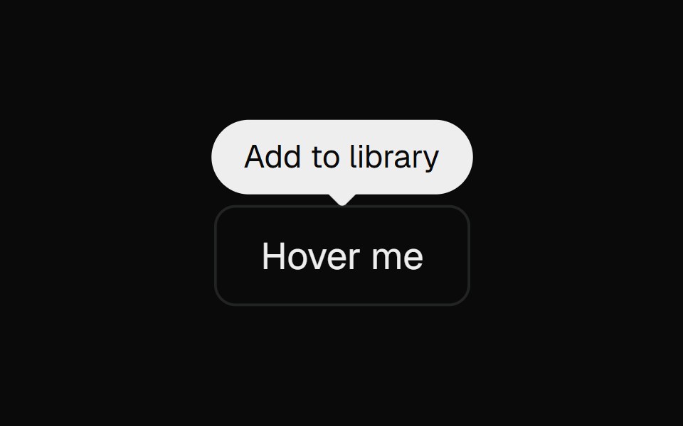 Base TooltipCult UI · ReactBase UI tooltip primitives used by Apple Pro Display XDR
 DrawerTremor · React
 Confirmation for successful e-ticket registrationReUI · ReactConfirmation for successful e-ticket registration
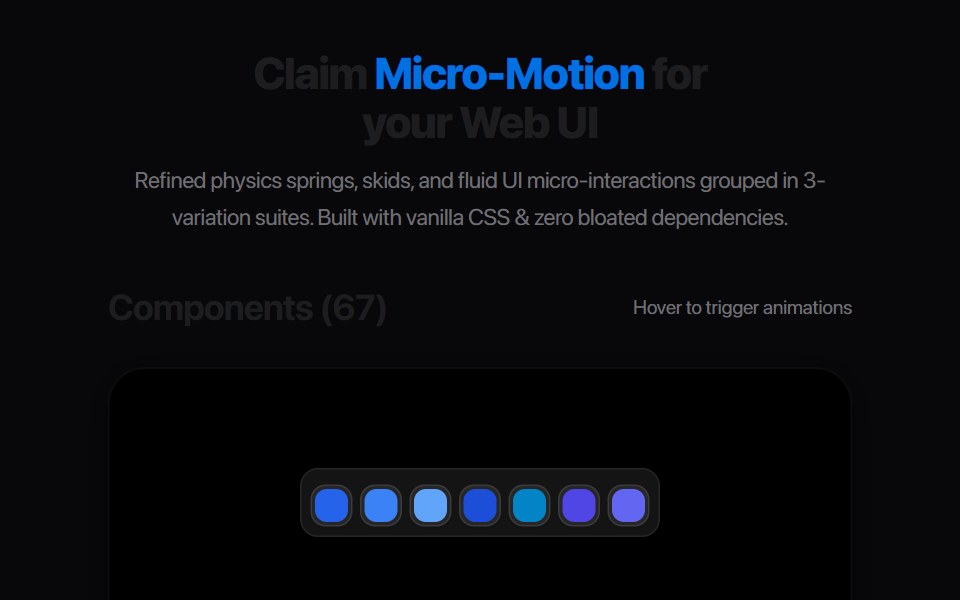 Card Glance PreviewAmicro Micro Transitions · ReactMicro floating glance card popup with status indicator dot.
 Inline CitationAI Elements · ReactA hoverable citation component that displays source information and quotes inline with text, perfect for AI-generated…
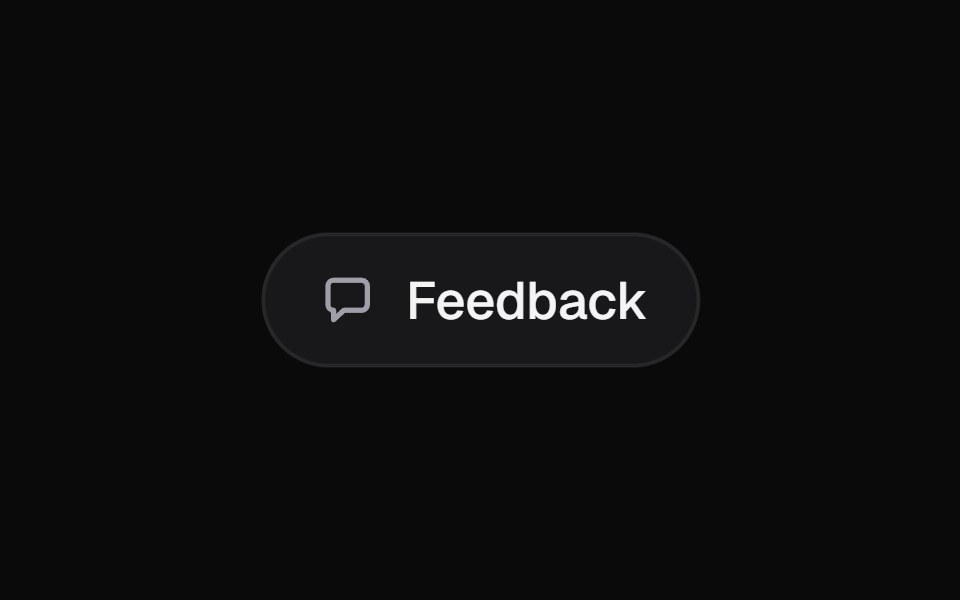 Morph PopoverKokonut UI · ReactA button that grows into the form it opens, with its label sliding up to become the title, then shrinks into a…
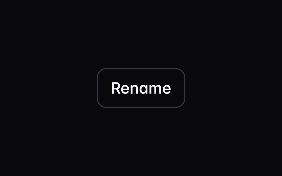 dialogIntent UI · Reactdialog
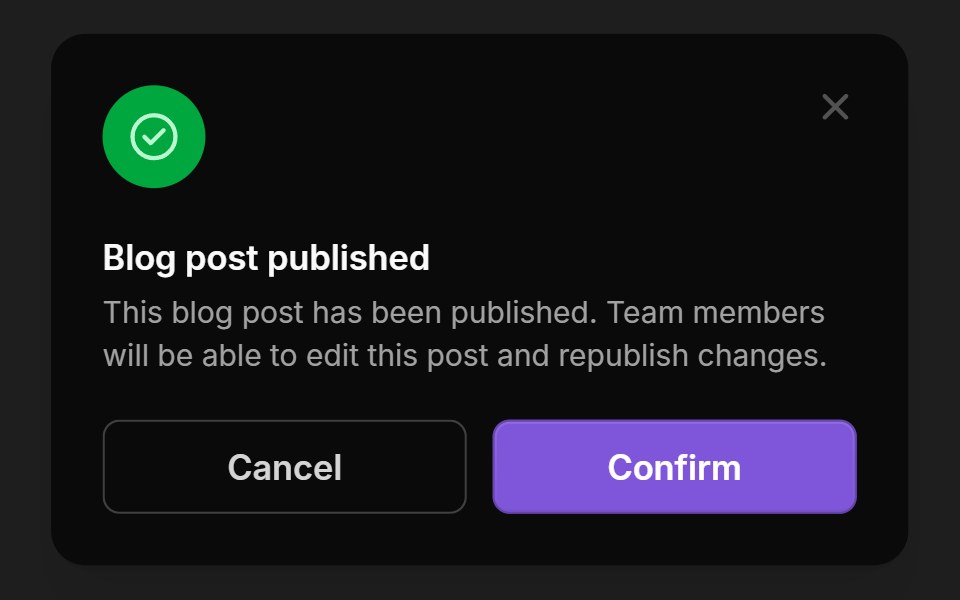 ModalsUntitled UI React · React
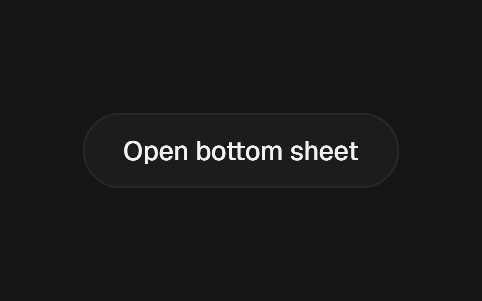 Bottom SheetbeUI · ReactVaul-inspired draggable bottom sheet with snap points, inertia and glass surface.
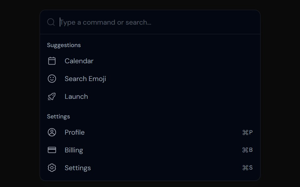 CommandTailGrids · ReactA command menu component with multiple variants.
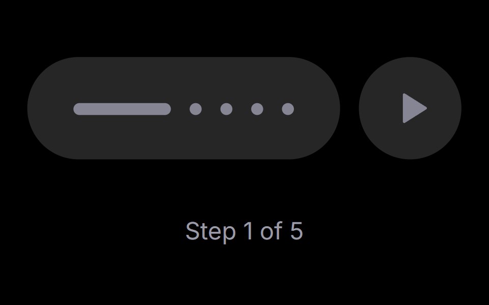 Step PlayerRare UI · ReactAn iOS-style stepped progress track with a play, pause and replay control. The active step stretches into a bar that…
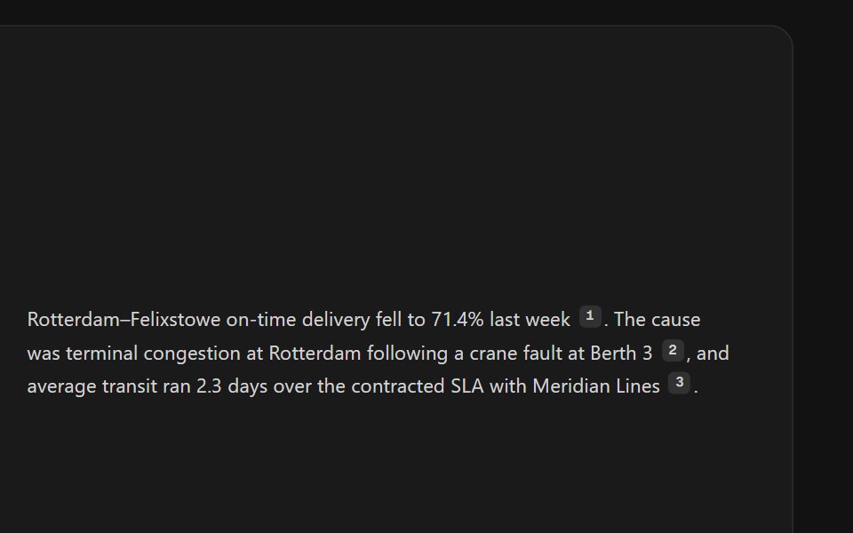 Citation SourcesSpectrum UI · ReactInline citation markers with hover previews or a footnote list.
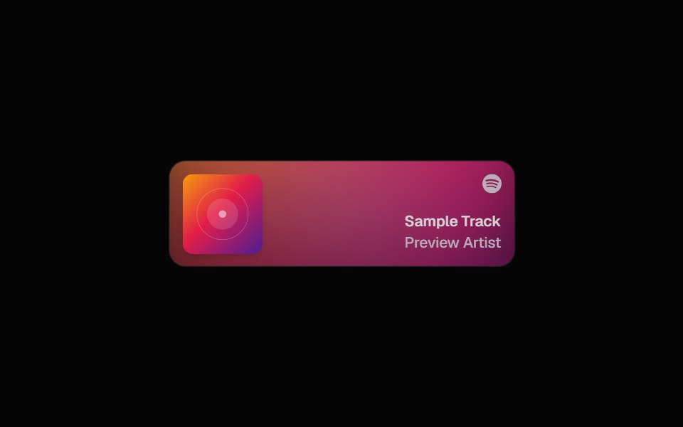 Spotify CardSpell UI · ReactDisplay Spotify tracks with album art and blurred background.
 Awwwards NavVengeance UI · ReactGlass bottom nav that expands into a mega-menu
 Date PickerFluid Functionalism · ReactField or ghost trigger for a date, a range, or a date and a time: a calendar popover that opens on the selected day…
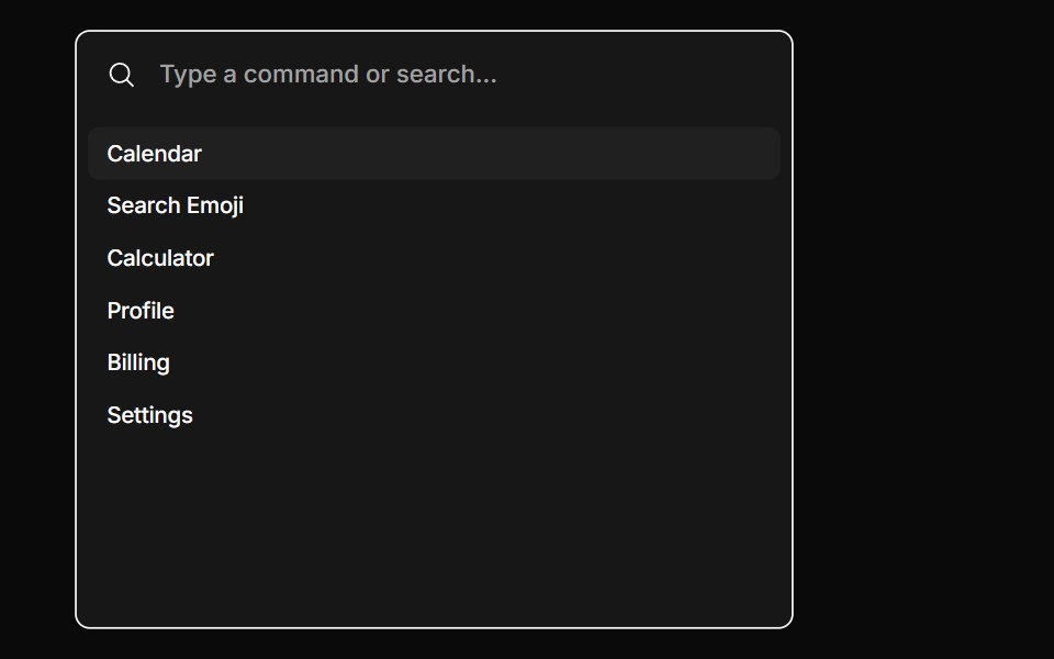 CommandToolcraft · React
 SheetLaunch UI · React
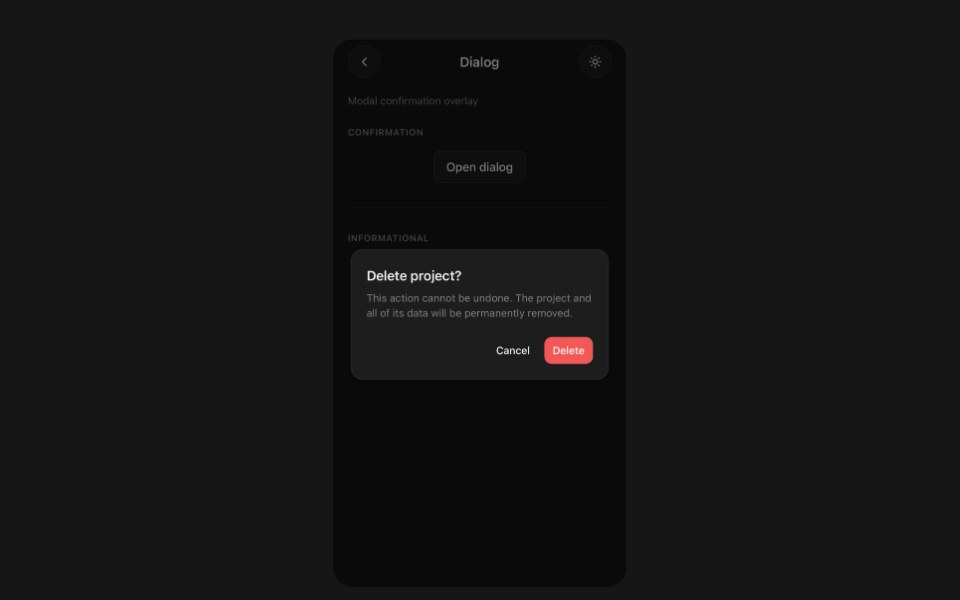 DialogPanel UI · React NativeModal dialog with a backdrop and footer actions.
 Avatar 11 - Group with TooltipsShadcn Space · ReactAvatar group with name tooltips on hover and a +N counter that opens a popover listing the remaining members and their…
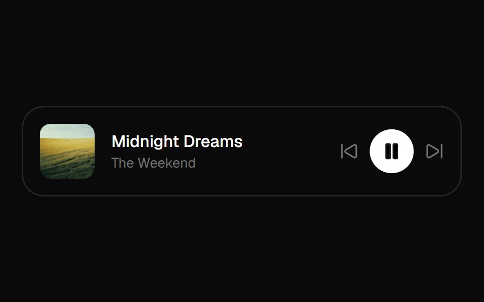 Now Playing BarOpenSourceUI · React
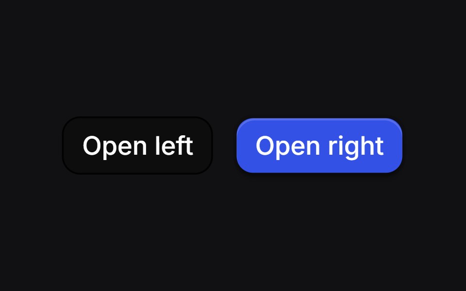 Curve Draweruselayouts · ReactSide drawers whose inner edge starts as a bulge and morphs into a straight line as the panel settles.
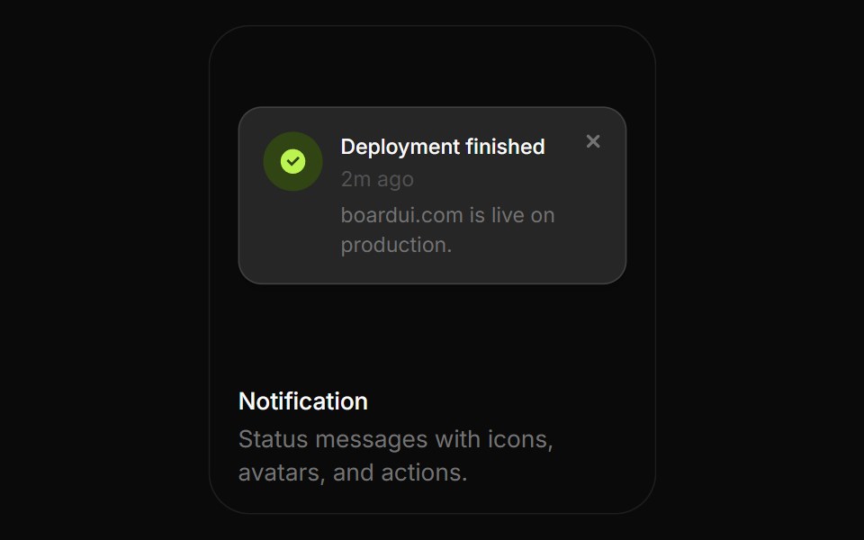 NotificationBoardUI · ReactStatus messages with icons, avatars, and actions.
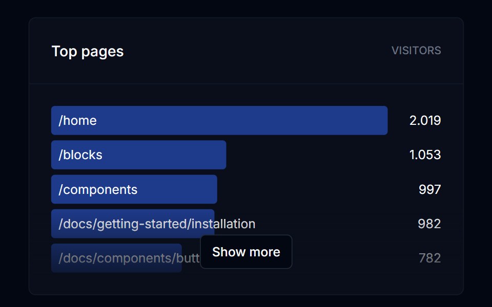 DialogTremor Blocks · React
 DialogShadcn Dashboard · React
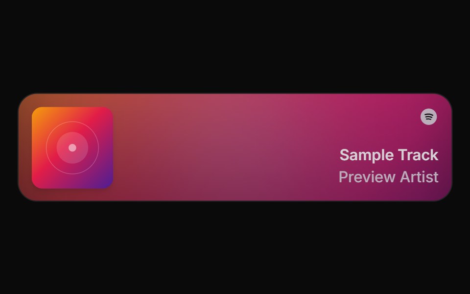 Spell Spotify CardAnimations (Svelte) · Svelte
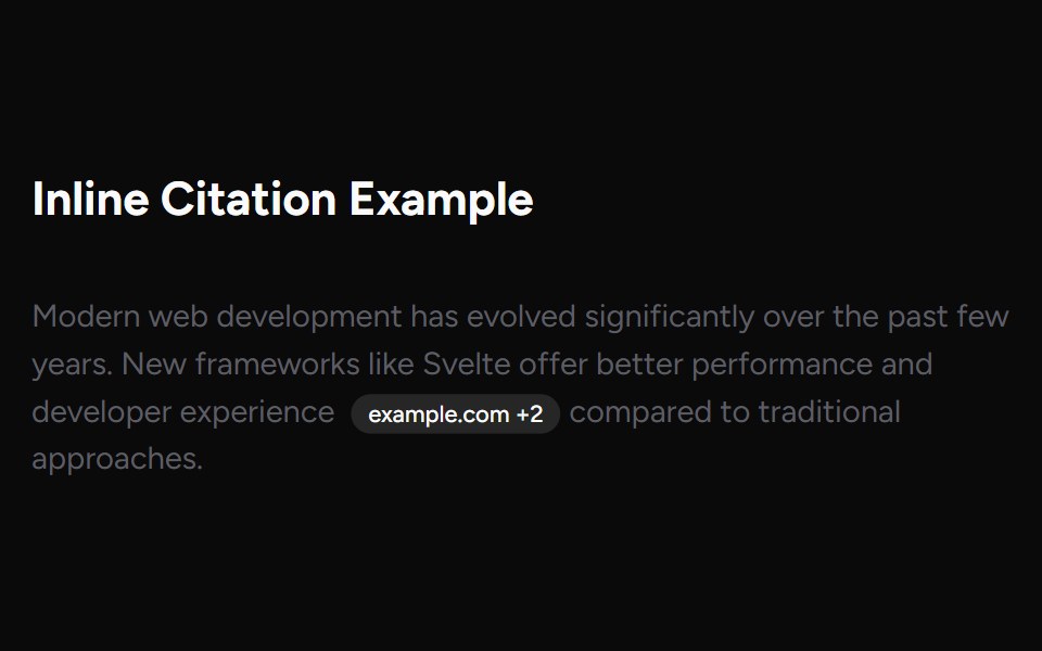 Inline CitationAI Elements (Svelte) · SvelteAn inline citation system with hover cards and carousel views for source-backed AI content.
 DialogObsidianUI · React
 ChatGPT ActivityNotra · ReactThe search activity and sources side sheet, built on shadcn Sheet, Badge and Avatar.
 Modals 02Oxbow UI · AstroChoose AI Chat Plan
 popoverBaseLayer · ReactA popover is an overlay element positioned relative to a trigger.
 Color PickerShark UI · ReactPick colors with hue and alpha controls.
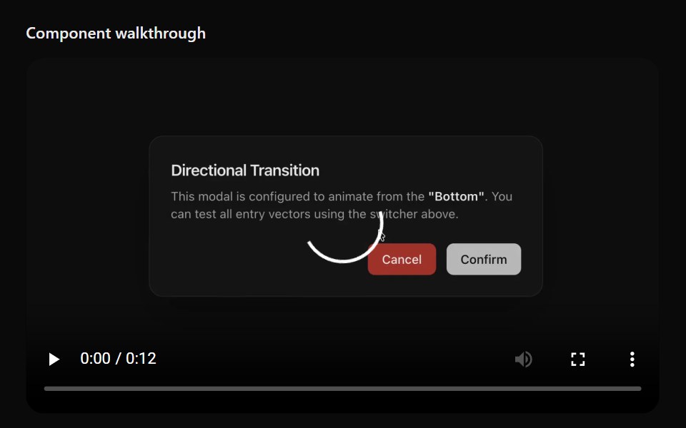 Floating ViewerSona UI · ReactAn in-page media surface that automatically or manually detaches, stays within viewport bounds, snaps to a corner, and…
 Alert DialogWatermelon UI · React
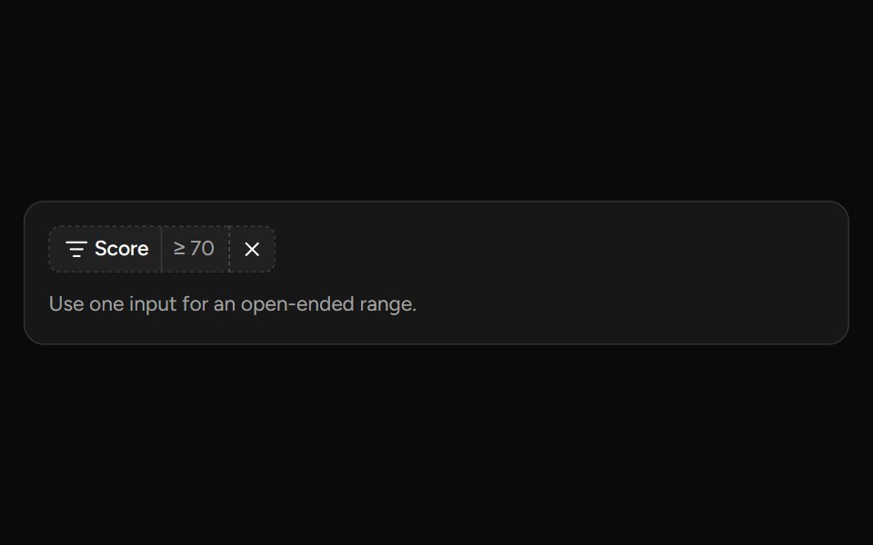 Number Range Filtersv-table · SvelteA number range picker with exact inputs, an optional slider, and explicit apply behavior.
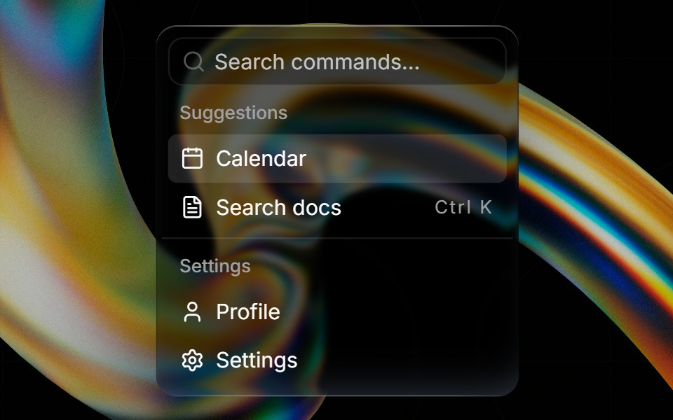 Glass Commandglasscn · ReactGlass Command with five variants: clear, frosted, subtle, liquid, and liquid-refract
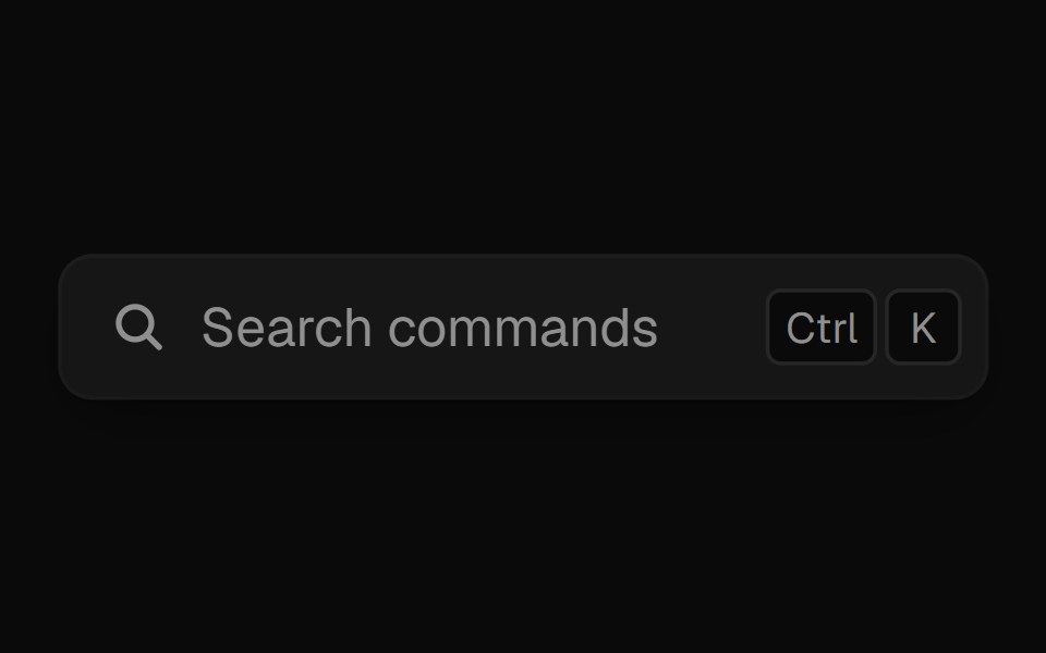 Command PaletteUI Lab · ReactOpens on ⌘K and filters commands as you type.
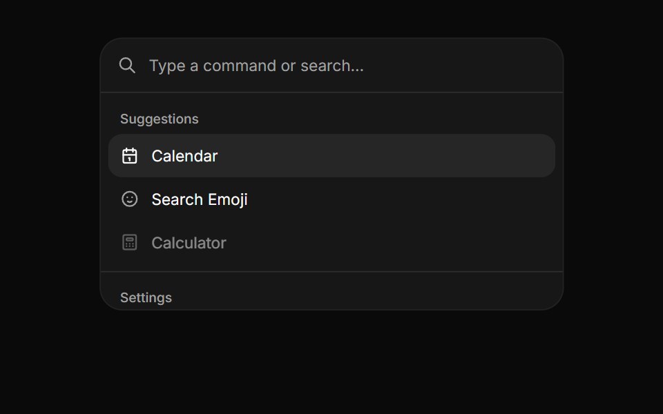 CommandHextaUI · ReactA searchable list of actions, inline or as a ⌘K palette, with pages, shortcuts and highlighted matches.
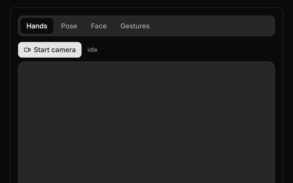 Live Tracker BlockLocalMode · ReactReal-time MediaPipe streaming trackers on live webcam video — one 4-mode block: Hands (21-point skeleton +…
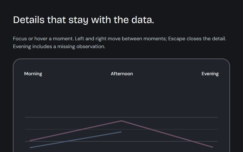 Dynamic chart tooltipCojeev UI · ReactCompare a point, read its known subtotal or rank its series. Values update in place and keep their series colours.
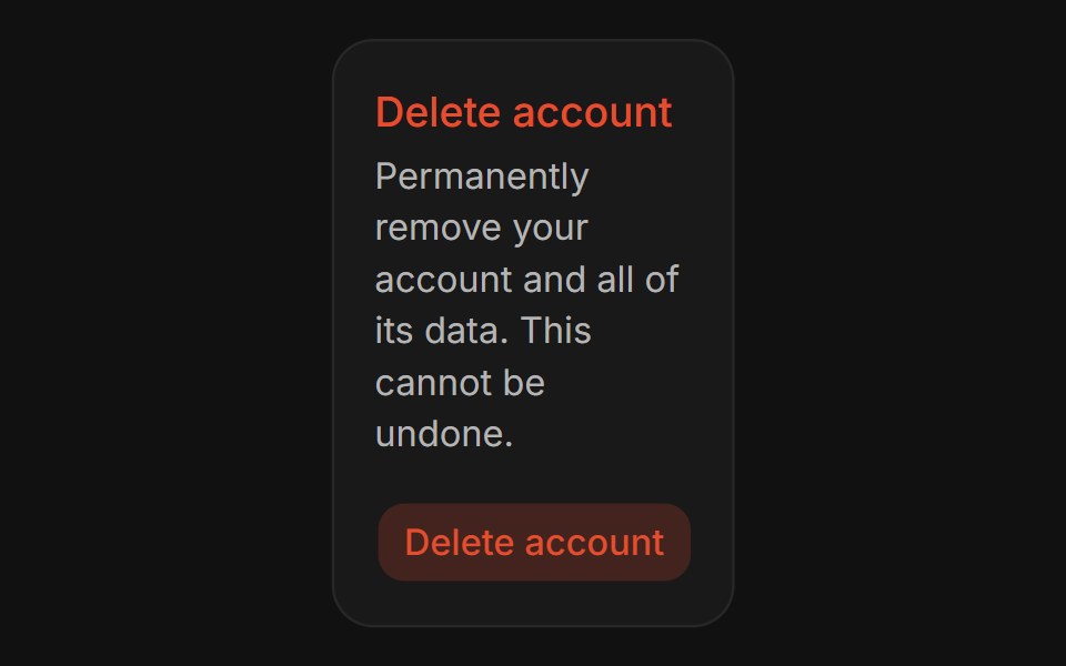 Confirm DialogFLX UI · ReactConfirm Dialog for Delete Account.
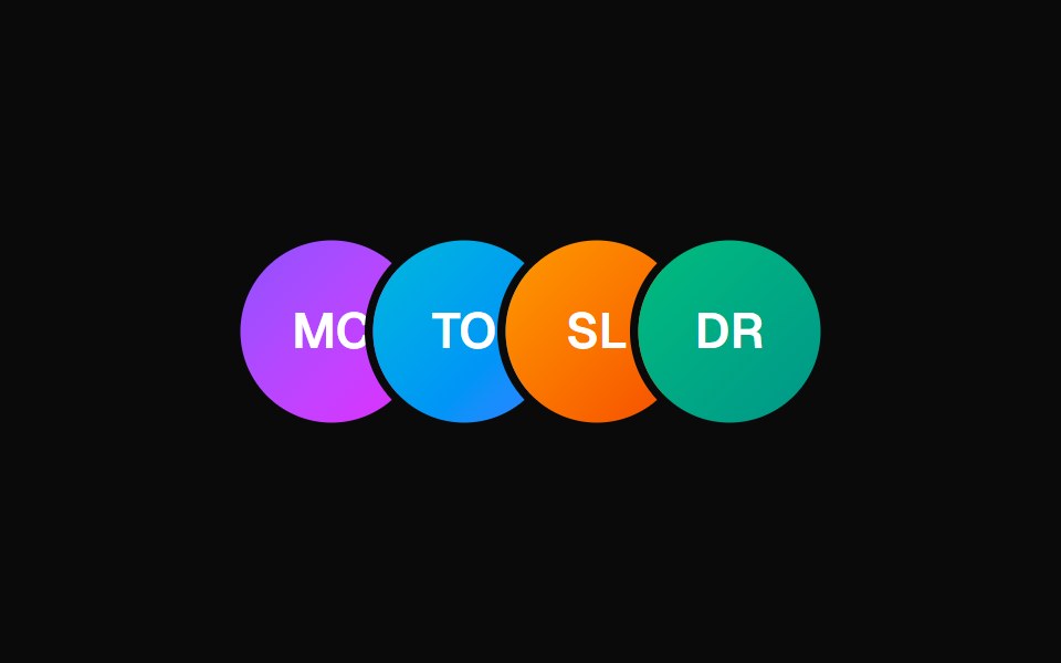 Animated TooltipVelora UI · ReactAvatar row with springy name tooltips on hover.
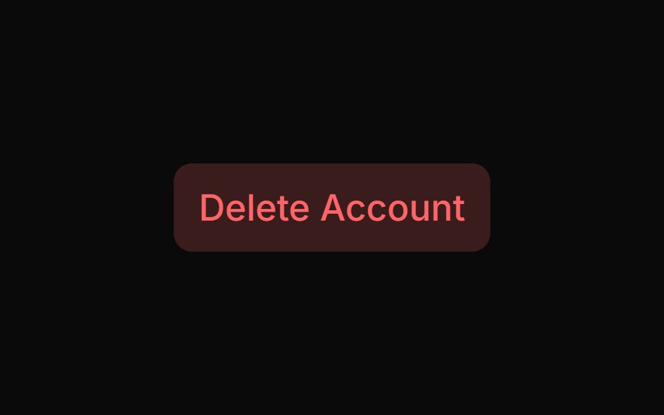 Basic Alert Dialogsv-particles · Svelte
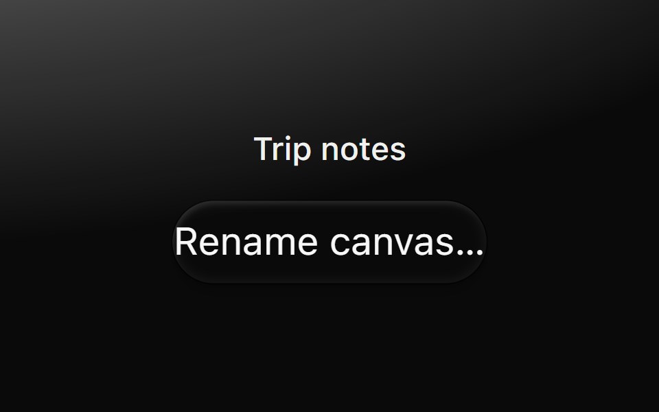 DialogMetal UI · React + SwiftUIA modal layer: a scrim behind a surface; focus stays inside, Escape and a click outside close it.
 BubbleSpaceUI · ReactRenders floating animated bubbles across the background that smoothly move and drift away when users move their mouse.
Libraries with Tailwind CSS overlay components
Related categories
- Overlay Components
- React Overlay Components
- Svelte Overlay Components
- React Native Overlay Components
- Animated Overlay Components
- shadcn/ui Overlay Components
- Tailwind CSS Modal Components
- Tailwind CSS Popover Components
- Tailwind CSS Tooltip Components
- Tailwind CSS Toast Components
- Tailwind CSS Drawer Components
- Tailwind CSS Alert Dialog Components
- Tailwind CSS Hover Card Components
- Tailwind CSS Bottom Sheet Components
- Tailwind CSS Tour Components
- Tailwind CSS Dynamic Island Components
- Tailwind CSS Cookie Banner Components
- Tailwind CSS Lightbox Components