 Dev Design Library
Tailwind CSS Lightbox Components
Dev Design Library indexes 6 Tailwind CSS lightbox components from 6 open-source UI libraries, with the most coming from Spectrum UI, Sona UI, beUI, Skecher UI and ReactFrame. Each one links to its page with the source code, a live preview where available, the library license and the install command. Every library in this list styles its components with Tailwind CSS utility classes. Lightbox components belong to the Overlays group.
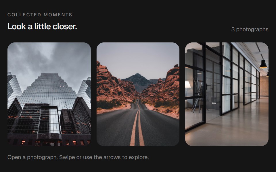 Morphing LightboxbeUI · React
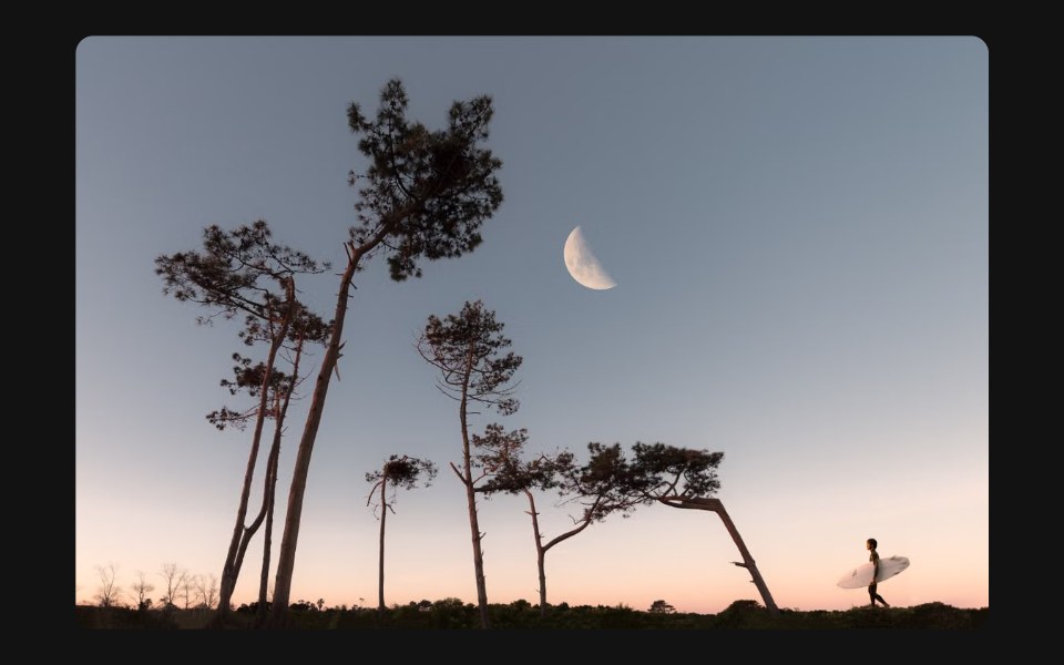 Image PreviewSpectrum UI · Reactcomponent for the Image Preview
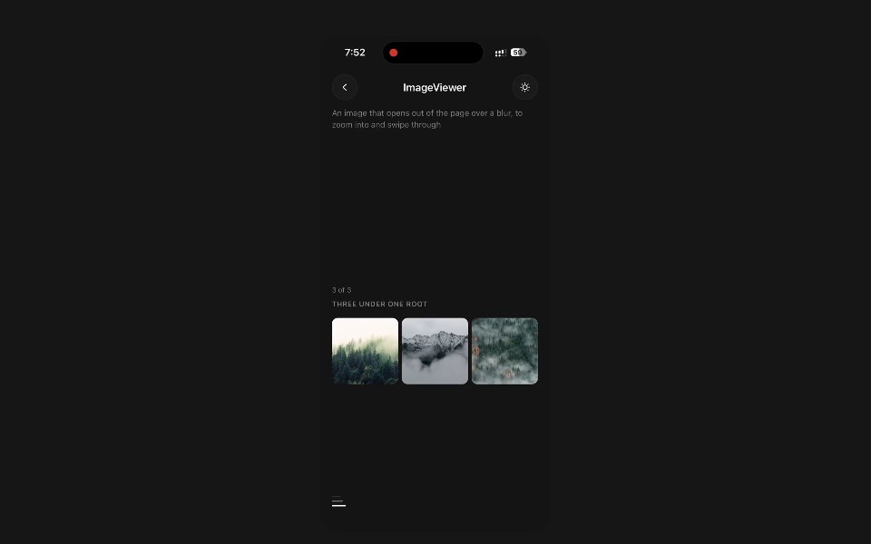 Image ViewerPanel UI · React NativeAn image that opens out of the page over a blur, to zoom into and swipe through.
 LightboxSona UI · ReactAn accessible image preview that expands from its thumbnail and returns to the same spatial origin when dismissed.
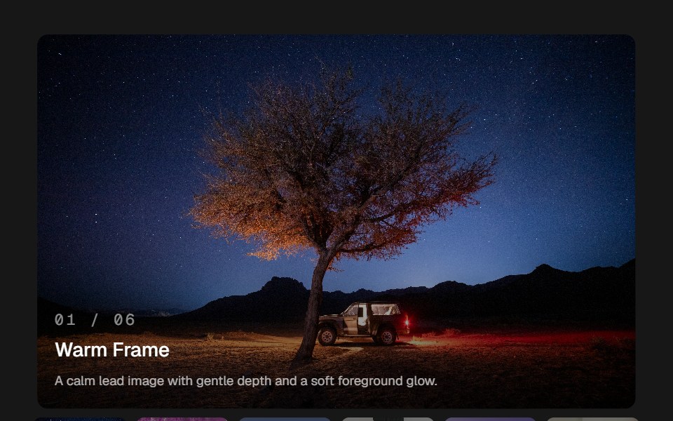 Image GlideSkecher UI · ReactAn image viewer with pointer depth, soft image transitions, and a compact thumbnail rail.
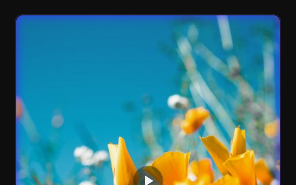 Video Glow LightboxReactFrame · ReactA single video card with a pulsing glow-blob frame that morphs into a fullscreen lightbox on click, supports direct…
Libraries with Tailwind CSS lightbox components
Related categories
- Lightbox Components
- React Lightbox Components
- Tailwind CSS Overlay Components
- Tailwind CSS Modal Components
- Tailwind CSS Popover Components
- Tailwind CSS Tooltip Components
- Tailwind CSS Toast Components
- Tailwind CSS Drawer Components
- Tailwind CSS Alert Dialog Components
- Tailwind CSS Hover Card Components
- Tailwind CSS Bottom Sheet Components
- Tailwind CSS Tour Components
- Tailwind CSS Dynamic Island Components
- Tailwind CSS Cookie Banner Components