 Dev Design Library
Lightbox Components
Dev Design Library indexes 8 lightbox components from 8 open-source UI libraries, with the most coming from Spectrum UI, Sona UI, transitions.dev, beUI and Lobe UI. Each one links to its page with the source code, a live preview where available, the library license and the install command. Lightbox components belong to the Overlays group.
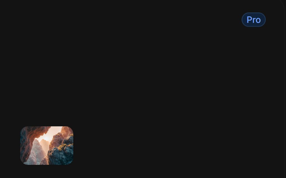 Image Open Tilttransitions.dev · HTML/CSS
 ImageLobe UI · ReactImage is an enhanced image component with a self-contained zoom-and-pan preview viewer, custom actions, and various…
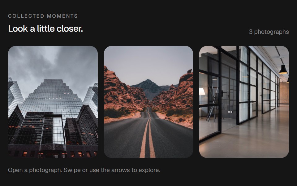 Morphing LightboxbeUI · React
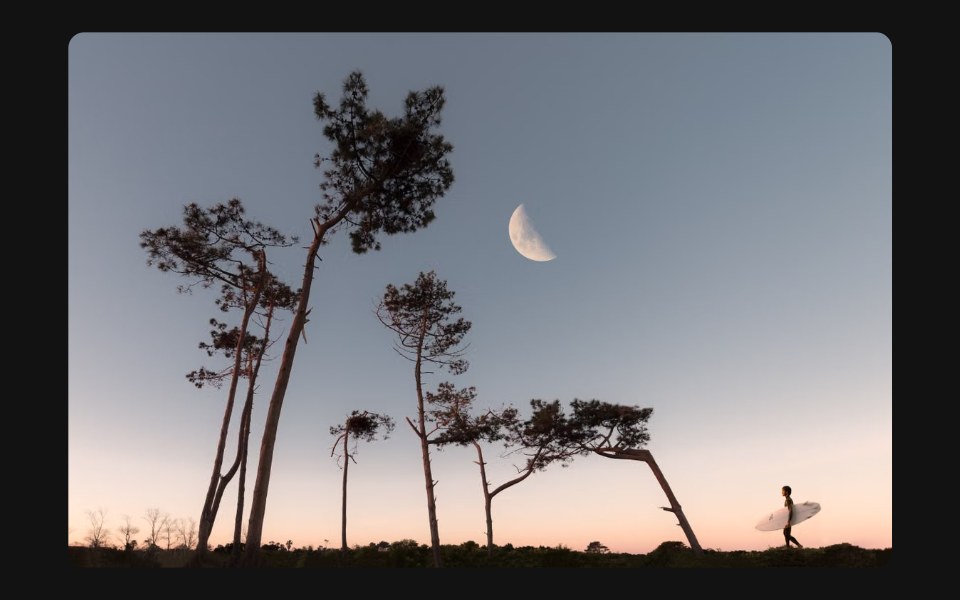 Image PreviewSpectrum UI · Reactcomponent for the Image Preview
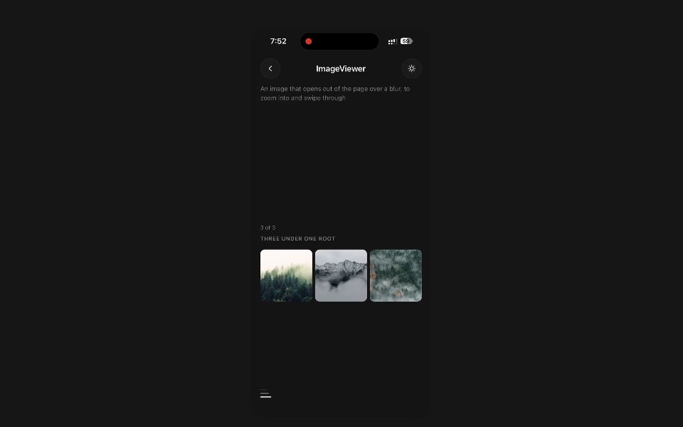 Image ViewerPanel UI · React NativeAn image that opens out of the page over a blur, to zoom into and swipe through.
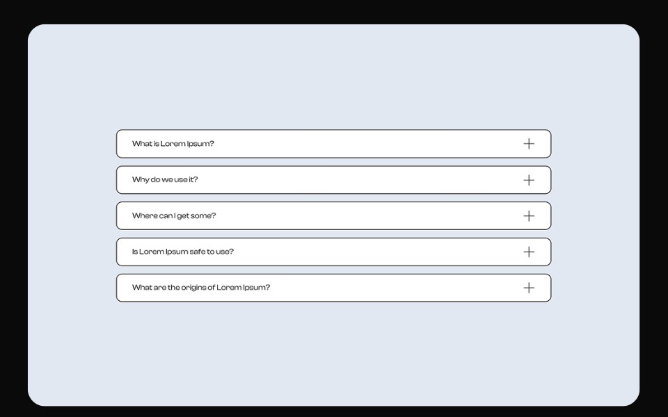 LightboxSona UI · ReactAn accessible image preview that expands from its thumbnail and returns to the same spatial origin when dismissed.
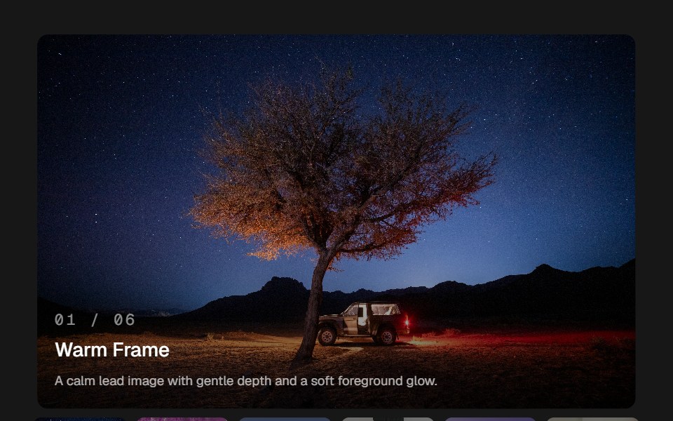 Image GlideSkecher UI · ReactAn image viewer with pointer depth, soft image transitions, and a compact thumbnail rail.
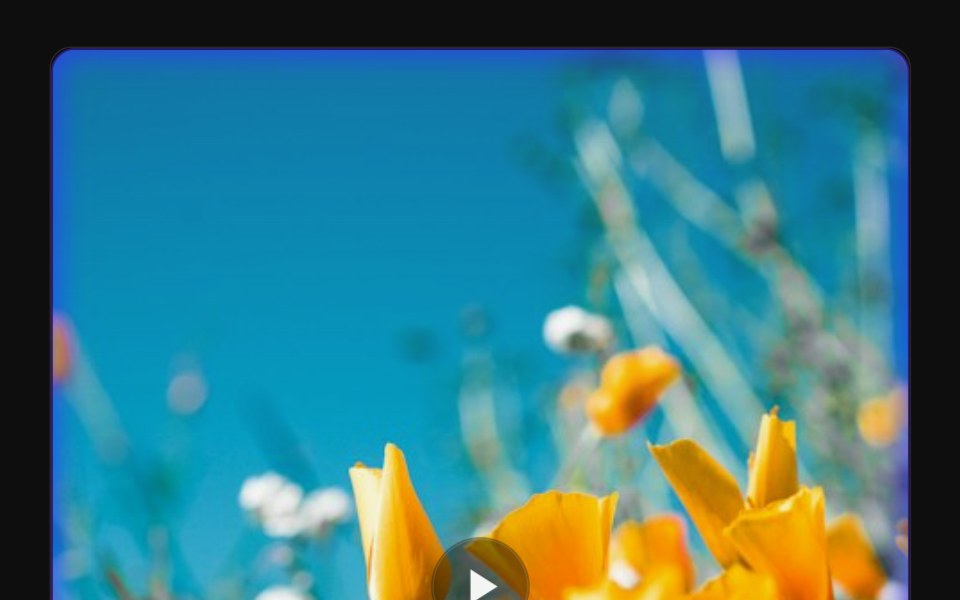 Video Glow LightboxReactFrame · ReactA single video card with a pulsing glow-blob frame that morphs into a fullscreen lightbox on click, supports direct…
Libraries with lightbox components
Related categories
- React Lightbox Components
- Tailwind CSS Lightbox Components
- Overlay Components
- Modal Components
- Popover Components
- Tooltip Components
- Toast Components
- Drawer Components
- Hover Card Components
- Alert Dialog Components
- Bottom Sheet Components
- Dynamic Island Components
- Tour Components
- Cookie Banner Components
- Mini Player Components