 Dev Design Library
Modal Components
Dev Design Library indexes 288 modal components from 67 open-source UI libraries, with the most coming from Watermelon UI, FLX UI, ReUI, Origin UI and Oxbow UI. Each one links to its page with the source code, a live preview where available, the library license and the install command. Modal components belong to the Overlays group.
Showing 120 of 288, a mix from every library. Open a library to see all of its components.
 Alert Dialogshadcn/ui · ReactA modal dialog that interrupts the user with important content and expects a response.
 DialogMUI / Material UI · React
 ModaldaisyUI · CSS (Tailwind)
 DialogChakra UI · ReactUsed to display a dialog prompt
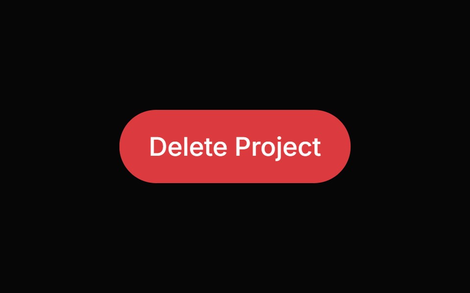 Alert DialogHeroUI · ReactModal dialog for critical confirmations requiring user attention and explicit action
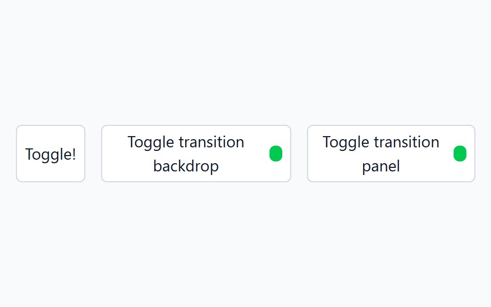 DialogHeadless UI · React
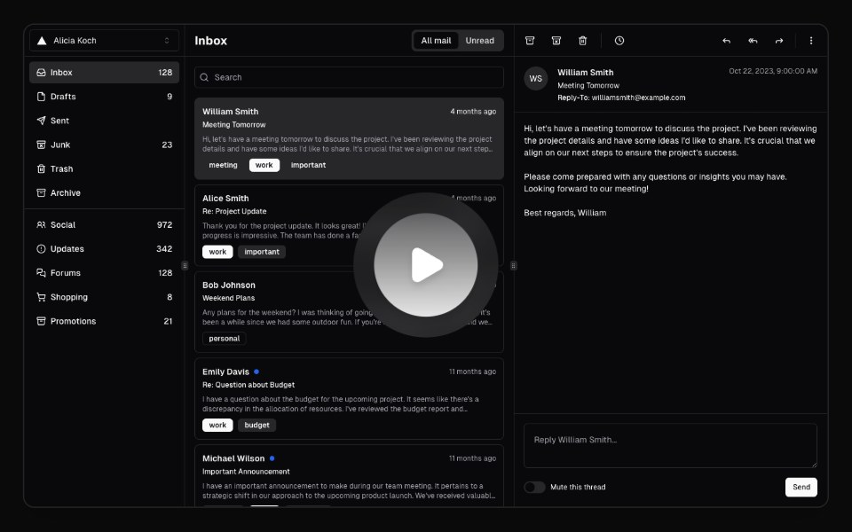 Hero Video DialogMagic UI · ReactA hero video dialog component.
 Alert DialogReact Spectrum · ReactAlertDialogs are a specific type of Dialog. They display important information that users need to acknowledge.
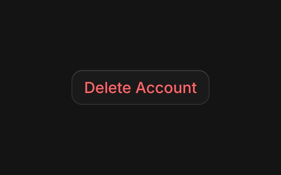 Alert Dialogcoss ui · ReactA dialog that requires user response to proceed.
 Alert DialogOrigin UI · ReactA dialog that requires user response to proceed.
 Alert DialogRadix Themes · React
 Expandable ScreenCult UI · ReactA full-screen expandable component with morphing animations using shared layout IDs for smooth transitions
 DialogArk UI · ReactA modal window that appears on top of the main content.
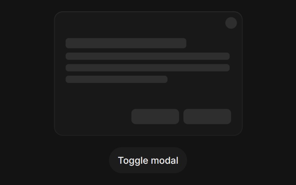 Modal Open Closetransitions.dev · HTML/CSS
 DialogTremor · React
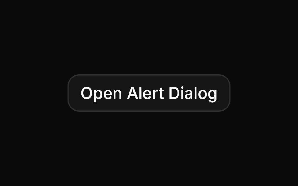 Basic alert dialog with title, description, and action buttonsReUI · ReactBasic alert dialog with title, description, and action buttons
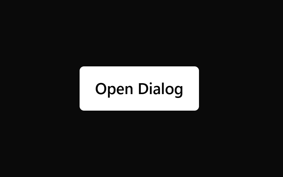 DialogPark UI · ReactA modal component for displaying important content requiring user response.
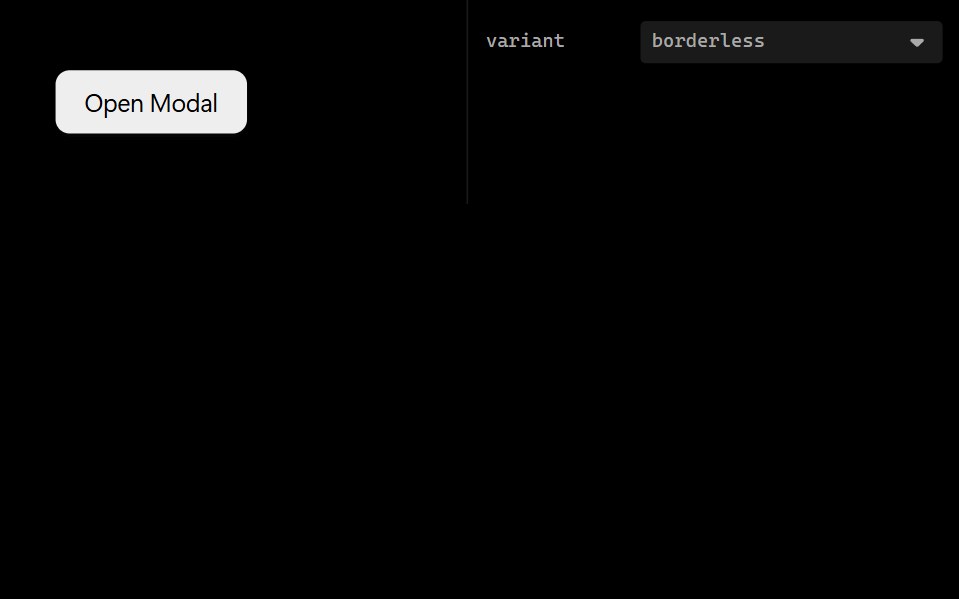 Form ModalLobe UI · ReactFormModal combines Form and Modal components to create a modal dialog with an integrated form. It provides a…
 command-menuIntent UI · Reactcommand-menu
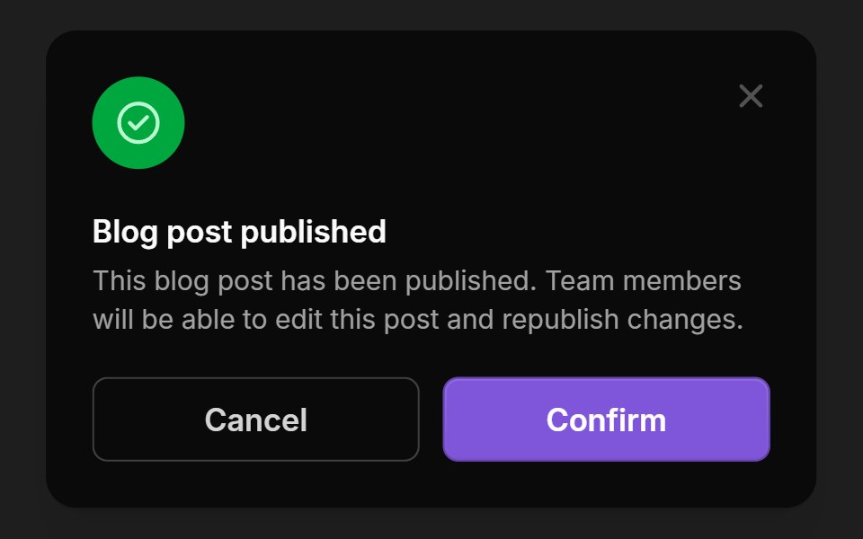 ModalsUntitled UI React · React
 Center Morph ModalbeUI · ReactA composable modal whose full-size surface unfolds from its exact center toward every edge, then folds back the same…
 Alert DialogTailGrids · ReactA modal dialog that interrupts the user with important content and expects a response.
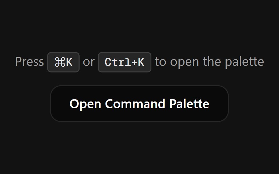 Command PaletteSpectrum UI · ReactA fully customizable, smooth-animated Command Palette (Cmd+K) component
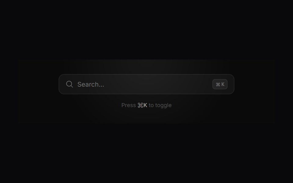 Search ModalVengeance UI · ReactMinimalist command-palette search with live filtering, tags, and actions
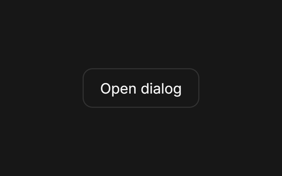 DialogFluid Functionalism · ReactAnimated modal dialog with spring-based scale and opacity transitions in three widths (sm, lg, and an xl canvas for…
 Alert DialogToolcraft · React
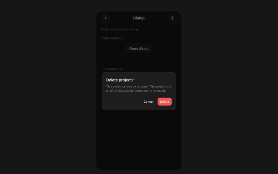 DialogPanel UI · React NativeModal dialog with a backdrop and footer actions.
 Dialog 01 - Slide from TopShadcn Space · ReactDialog that slides in from the top — ideal for notifications and alerts.
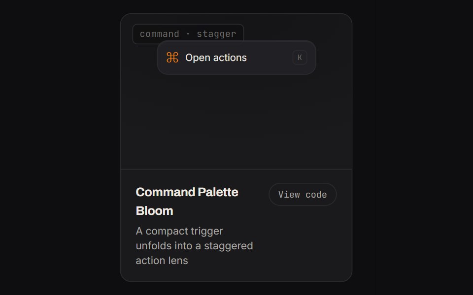 Command Palette BloomKinetics · HTML/CSSA compact trigger unfolds into a staggered action lens
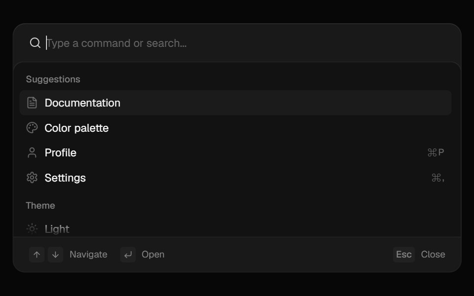 CommandComponentry · React
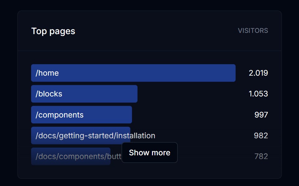 DialogTremor Blocks · React
 Alert DialogShadcn Dashboard · React
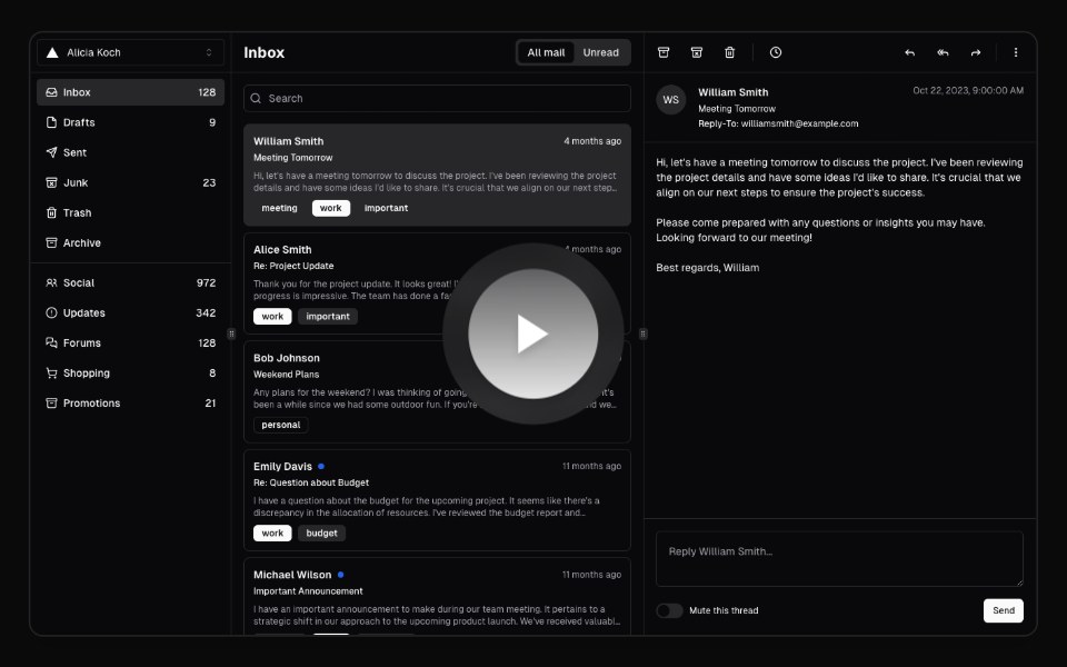 Hero Video DialogAnimations (Svelte) · SvelteA video dialog component with animated entrance effects, thumbnail support, and customizable animation styles.
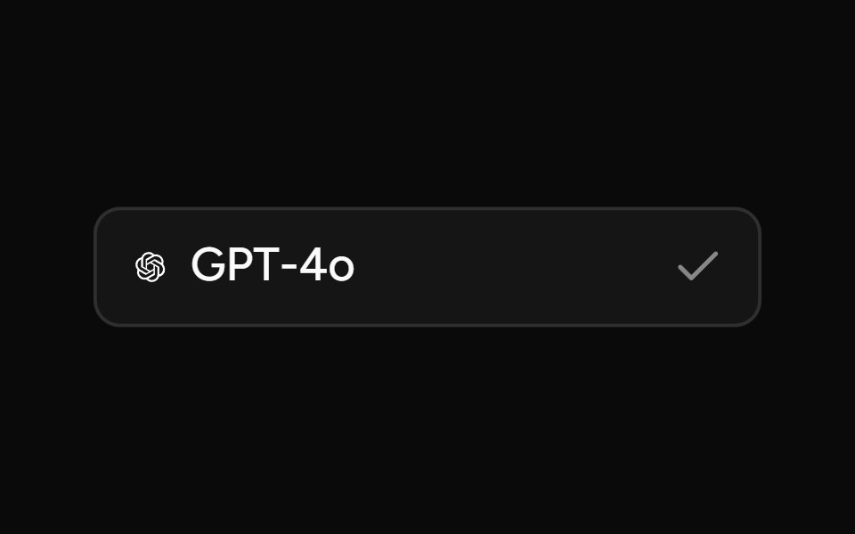 Model SelectorAI Elements (Svelte) · SvelteA searchable model selector dialog built on command and dialog primitives.
 Expandable CardBadtz UI · ReactA versatile and engaging UI component that allows users to explore content in a more immersive way.
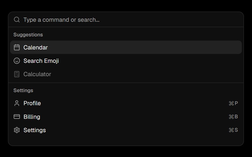 CommandObsidianUI · React
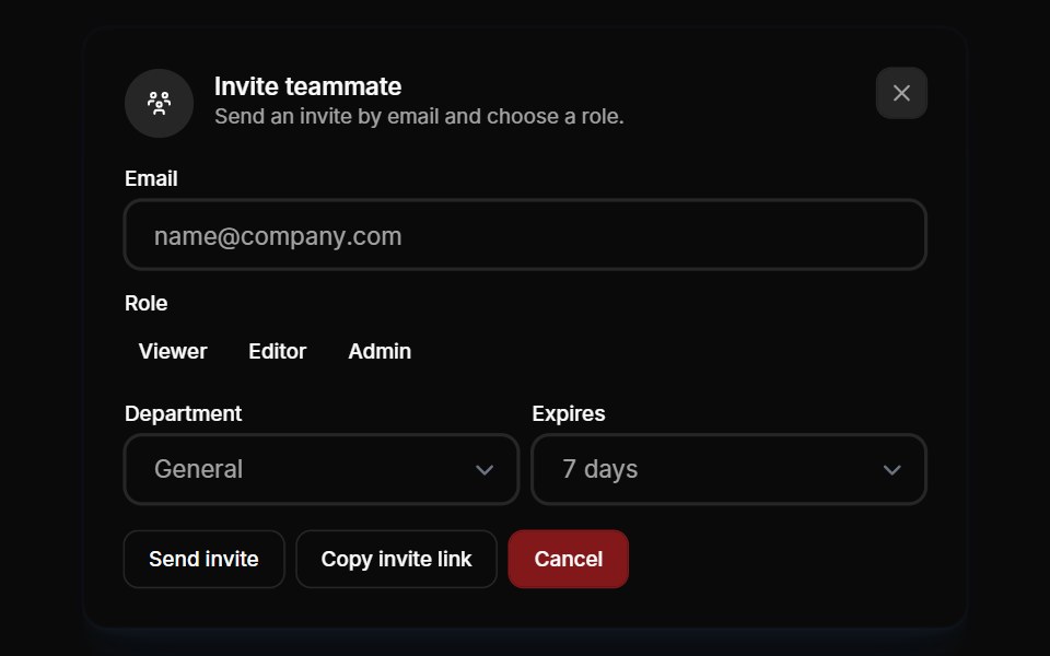 Modals 01Oxbow UI · AstroInvite team members to your account
 modalBaseLayer · ReactA modal is an overlay element which blocks interaction with elements outside it.
 Alert DialogShark UI · ReactDialog for displaying important content.
 DoubtButtonEvil Buttons · ReactAn escalating-confirmation button that makes you click through increasingly absurd, guilt-tripping prompts before the…
 Animated DialogSona UI · ReactA composable, accessible dialog modal built on Base UI with controlled state, direction-aware enter and exit motion…
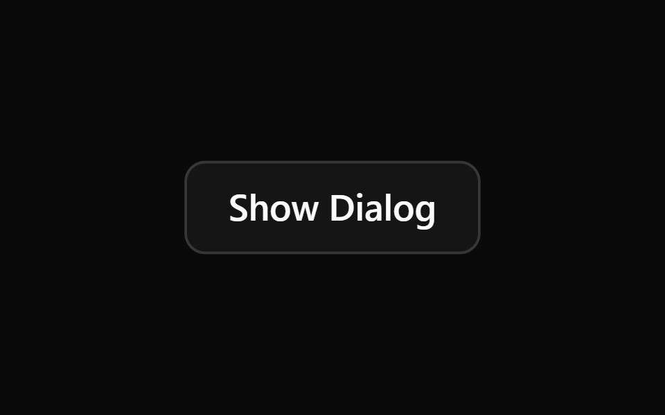 Alert DialogWatermelon UI · React
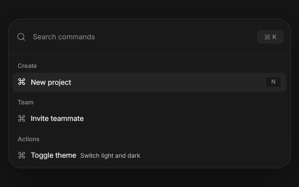 Command paletteArc Library · ReactA complete keyboard driven action surface with search, grouped results, and shortcuts.
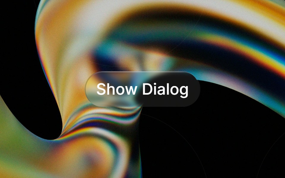 Glass Alert Dialogglasscn · ReactGlass Alert Dialog with five variants: clear, frosted, subtle, liquid, and liquid-refract
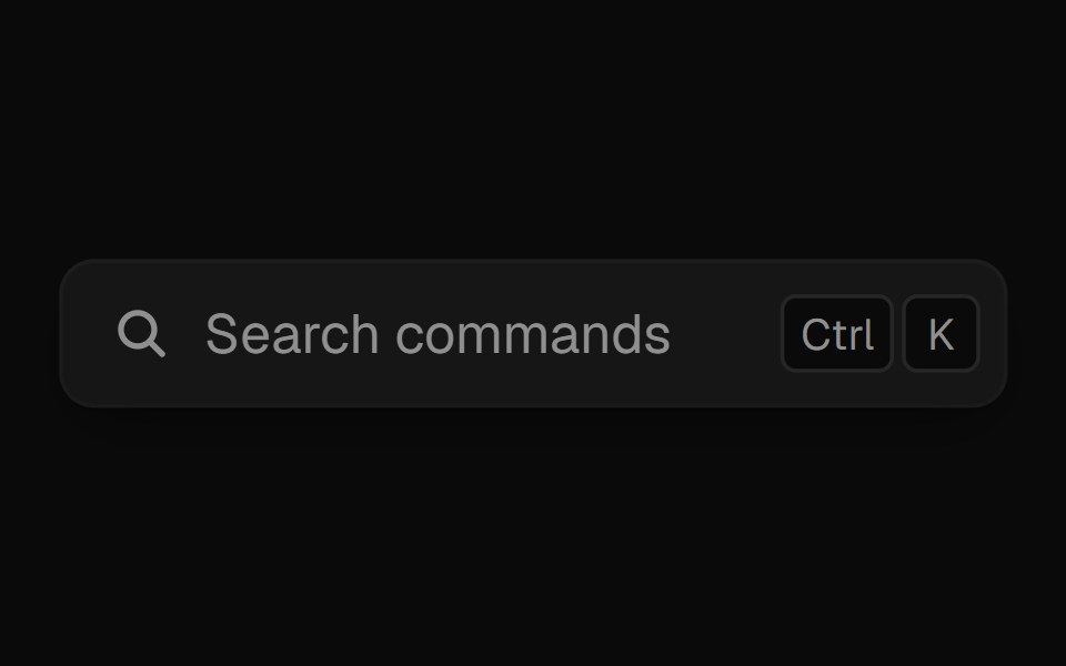 Command PaletteUI Lab · ReactOpens on ⌘K and filters commands as you type.
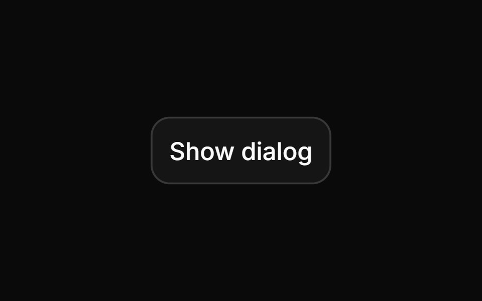 Alert dialogHextaUI · ReactA confirmation dialog for destructive or important actions that waits for async work, and becomes a bottom sheet on…
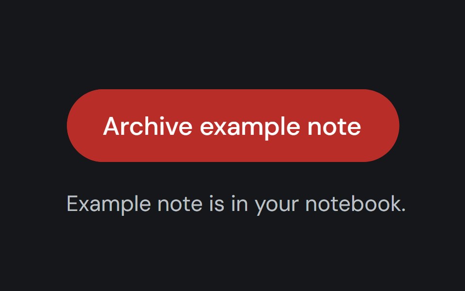 Alert DialogCojeev UI · ReactPauses a workflow for a focused confirmation before a consequential action proceeds.
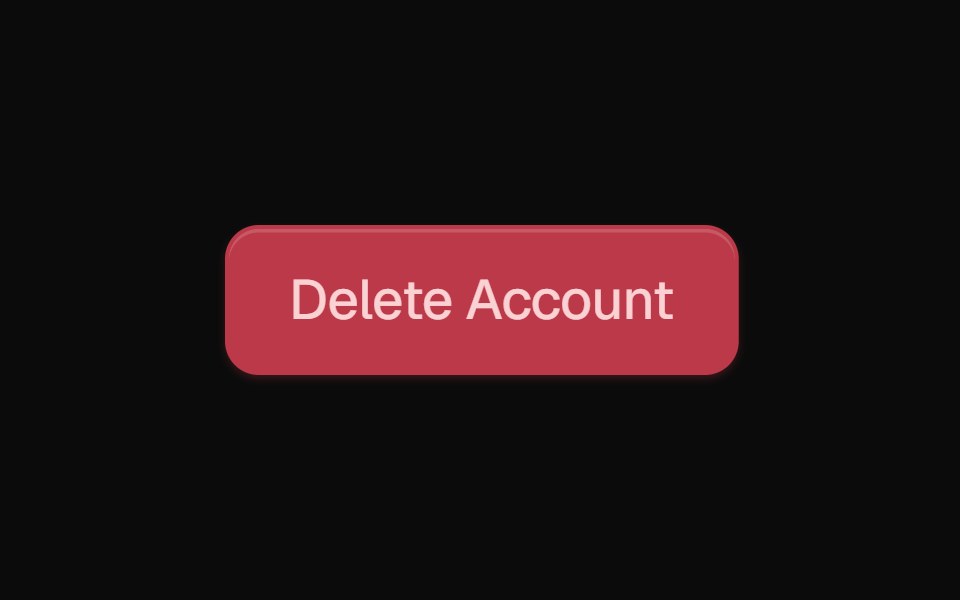 Alert DialogROI UI · ReactA modal dialog that interrupts the user with important content.
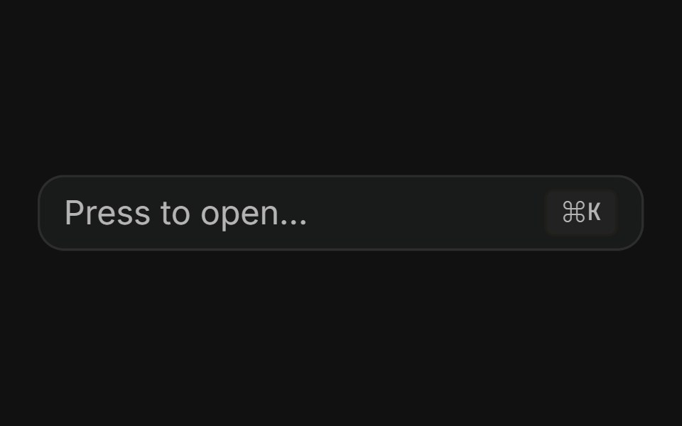 Command dialogFLX UI · ReactSpotlight-style ⌘K palette toggled by a button or keyboard shortcut.
 Animated ModalVelora UI · ReactNative dialog whose panel springs in with a tilt over a blurred backdrop.
 Alert DialogHalaska UI · React
 Alert Dialog With Bare Footersv-particles · Svelte
 Alert dialogMetal UI · React + SwiftUIA question that must be answered: the dialog's plate and motion; a click outside shakes it once on the refusal spring…
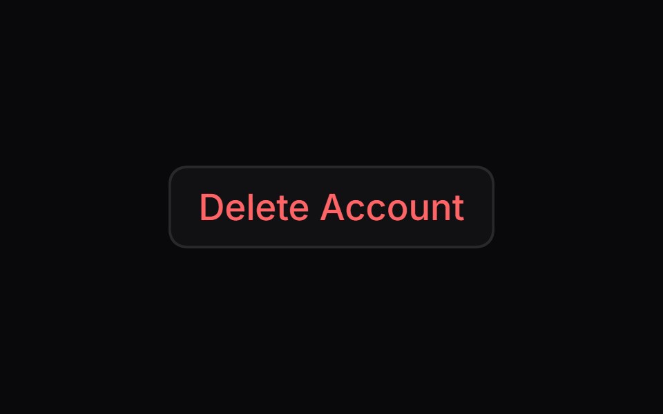 Alert DialogSpaceUI · ReactDisplays a modal window that asks users to confirm important actions before proceeding, helping prevent accidental…
 Aria Alert DialogReScript shadcn · ReScript
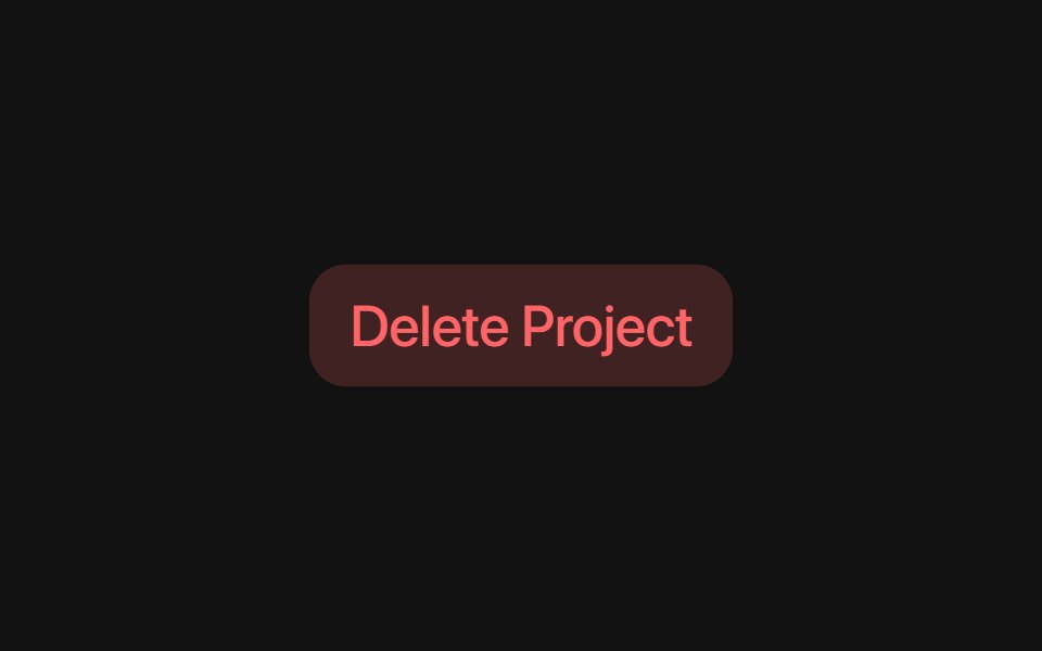 Base Alert DialogSora UI · ReactAn accessible alert dialog built on Base UI with smooth Motion 3D perspective entrance and exit animations…
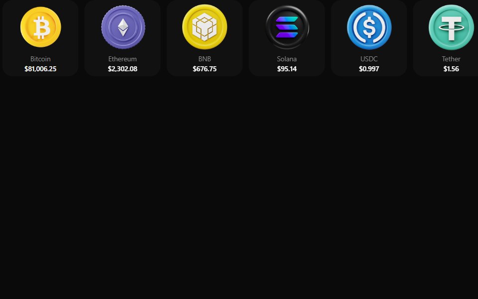 Coin MorphZAYX · React NativeReact Native crypto coin list (CoinMorphList) with an animated counter and a coin detail modal.
 Add Product Wizard ModalCue Foundations · React
 DialogOUI · ReactReact aria components Dialog with shadcn characteristics.
 Liquid DialogLiquefy UI · ReactModal dialog in liquid glass style. Janela modal em estilo vidro líquido.
 Alert DialogD2Studio UI · ReactA modal dialog that interrupts the user with important content and expects a response.
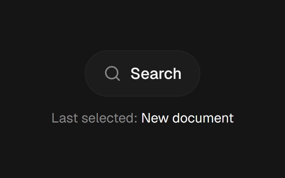 Command PaletteEaseUI · ReactCommand-K style search overlay that filters as you type, with arrow keys to move the highlight and Enter to select.
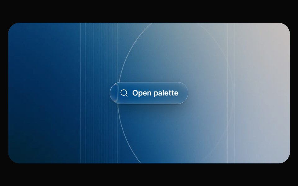 Glass CommandOpaline · React⌘K command palette on a frosted glass sheet, powered by cmdk.
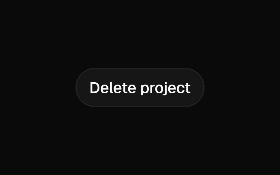 Alert DialogFibo · ReactAsks for a decision before something that can't be undone, with Cancel focused and no click-outside dismiss.
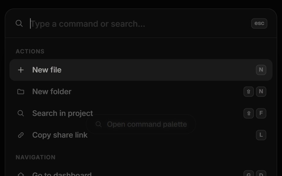 Command PaletteReactFrame · ReactA Cmd/Ctrl+K command palette with fuzzy search and match highlighting, grouped results, keyboard navigation, shortcuts…
 Animated ModalAceternity UI · React
 Alert Dialogark-cn · ReactA shadcn-style alert dialog component built with Ark UI primitives.
 Dialogshadcn/ui · ReactA window overlaid on either the primary window or another dialog window, rendering the content underneath inert.
 Dialog ContentMUI / Material UI · React
 Floating PanelChakra UI · ReactUsed to render a draggable, resizable panel that floats above the page content.
 ModalHeroUI · ReactDialog overlay for focused user interactions and important content
 Custom DialogReact Spectrum · ReactA CustomDialog is a floating window with a custom layout.
 Commandcoss ui · ReactA command palette component built with Dialog and Autocomplete for searching and executing commands.
 DialogOrigin UI · ReactA popup that opens on top of the entire page.
 DialogRadix Themes · React
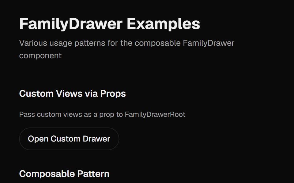 Family DrawerCult UI · ReactA multi-view drawer component with smooth animations, view navigation, and customizable content views
 Confirmation for successful e-ticket registrationReUI · ReactConfirmation for successful e-ticket registration
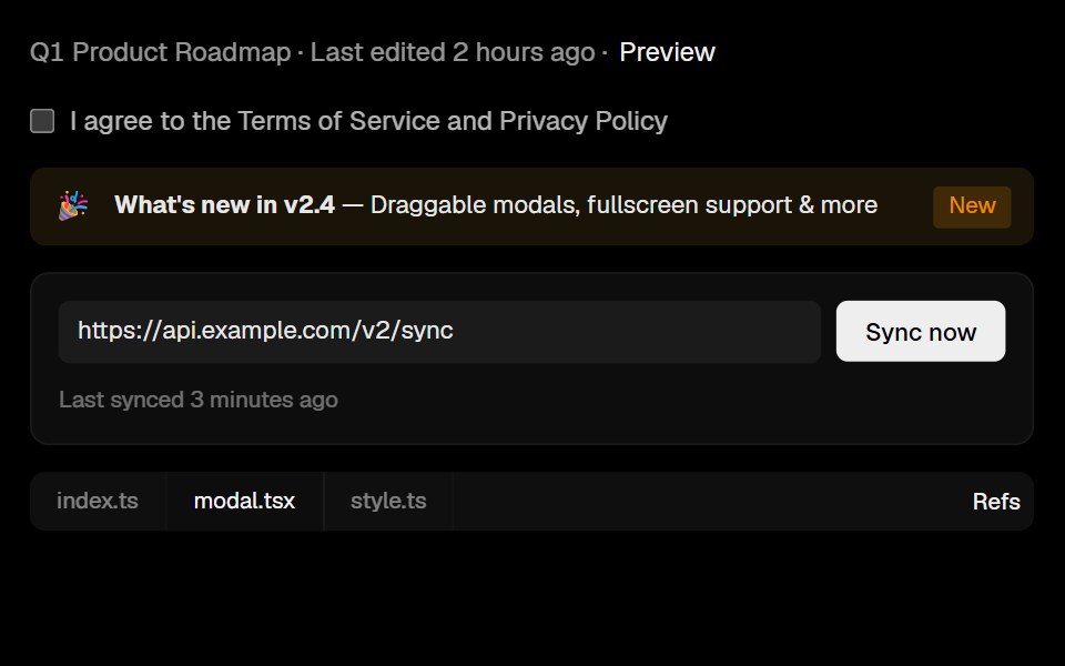 ModalLobe UI · ReactBase UI-powered Modal with antd-compatible API, supporting declarative, imperative, and atomic usage.
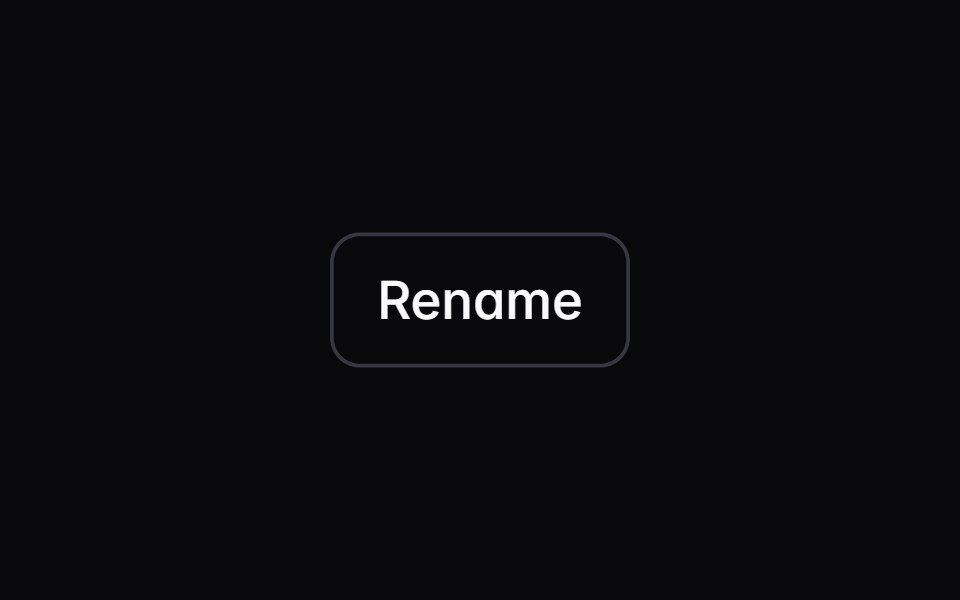 dialogIntent UI · Reactdialog
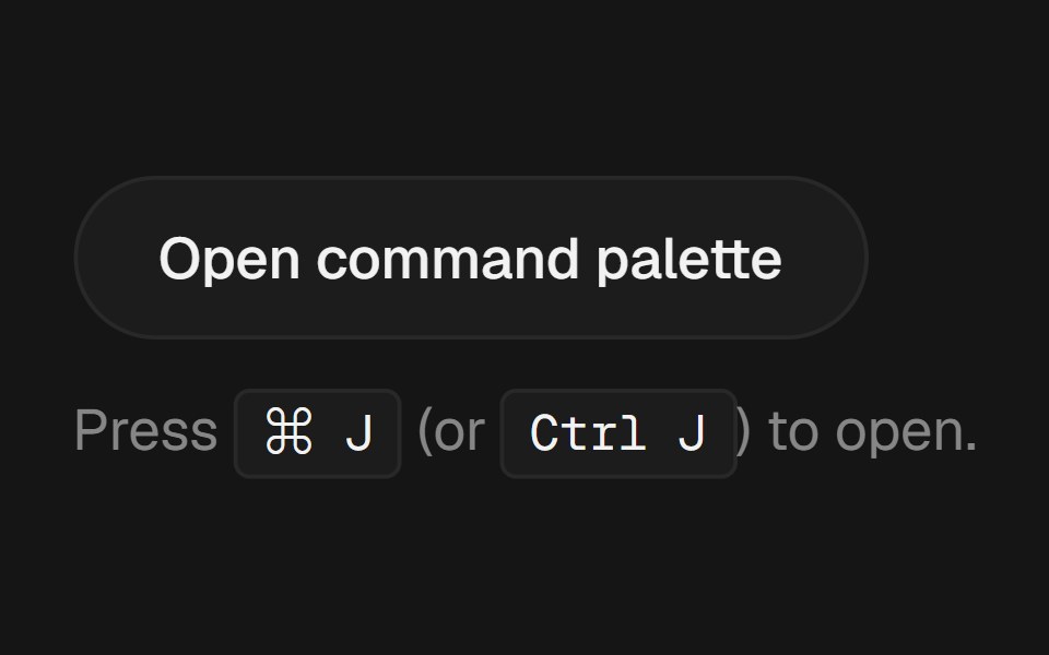 Command PalettebeUI · React⌘K palette with fuzzy filter, spring-animated active row and glass surface.
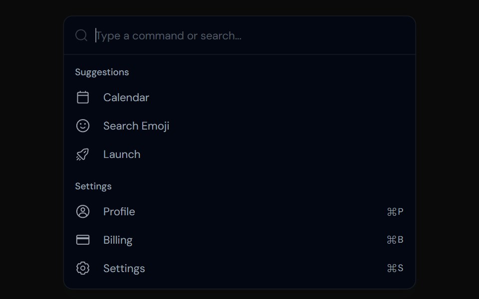 CommandTailGrids · ReactA command menu component with multiple variants.
 Responsive ModalSpectrum UI · Reactcomponent for the Responsive Modal
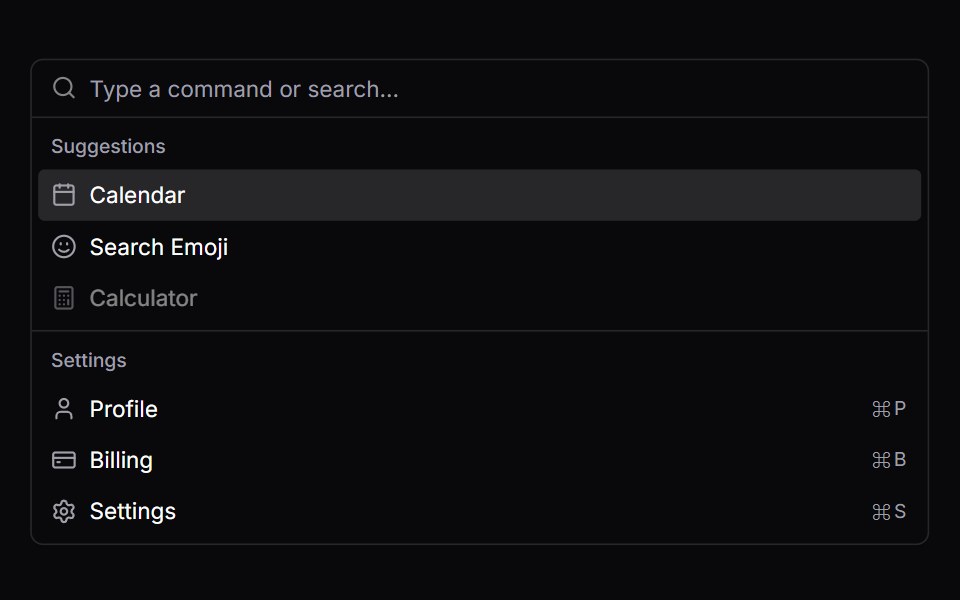 CommandVengeance UI · React
 Dialog (Base UI)Fluid Functionalism · ReactAnimated modal dialog with spring-based scale and opacity transitions in three widths (sm, lg, and an xl canvas for…
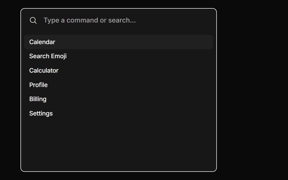 CommandToolcraft · React
 Web Alert DialogPanel UI · React Native
 Dialog 02 - Slide from BottomShadcn Space · ReactDialog that slides in from the bottom — ideal for confirmations and destructive actions.
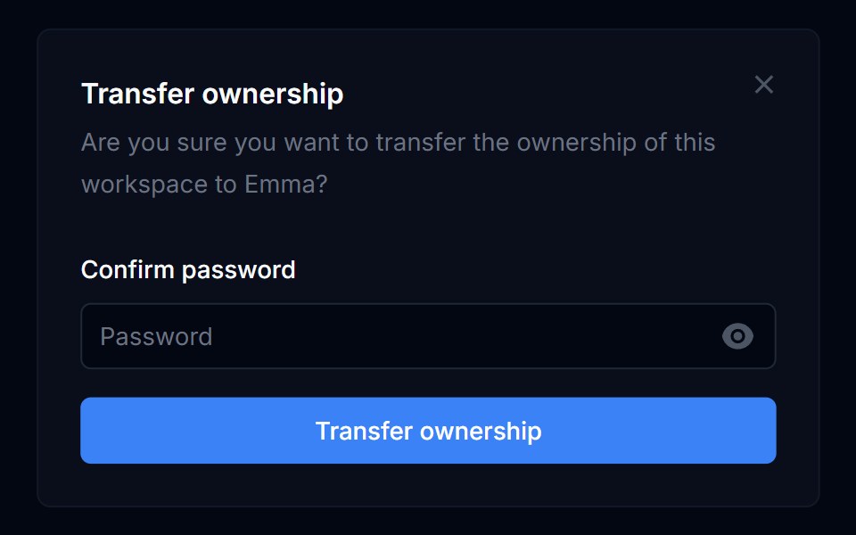 Dialog 01Tremor Blocks · React
 DialogShadcn Dashboard · React
 DialogObsidianUI · React
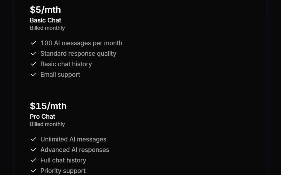 Modals 02Oxbow UI · AstroChoose AI Chat Plan
 DialogShark UI · ReactA dialog for displaying content.
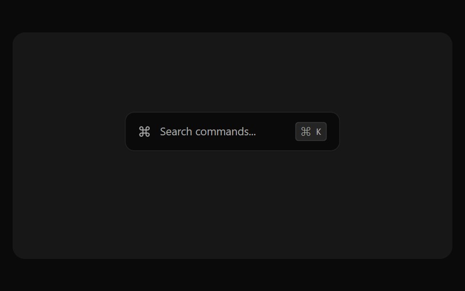 Command Palette PreviewSona UI · React
 Alert Dialog 01Watermelon UI · React
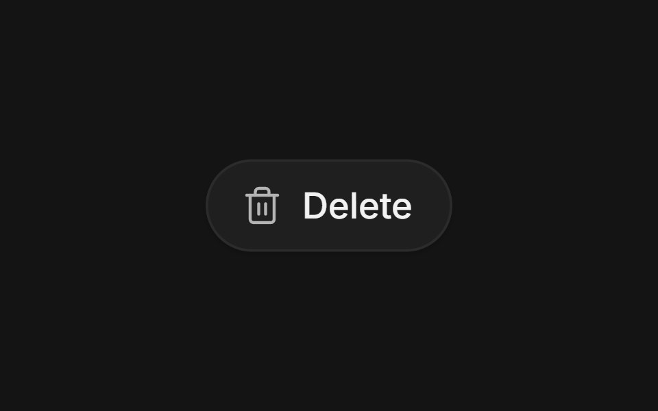 Confirm morphArc Library · ReactA destructive button that morphs into an inline confirmation, a spinner, and a result with undo.
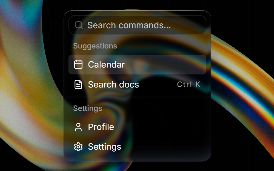 Glass Commandglasscn · ReactGlass Command with five variants: clear, frosted, subtle, liquid, and liquid-refract
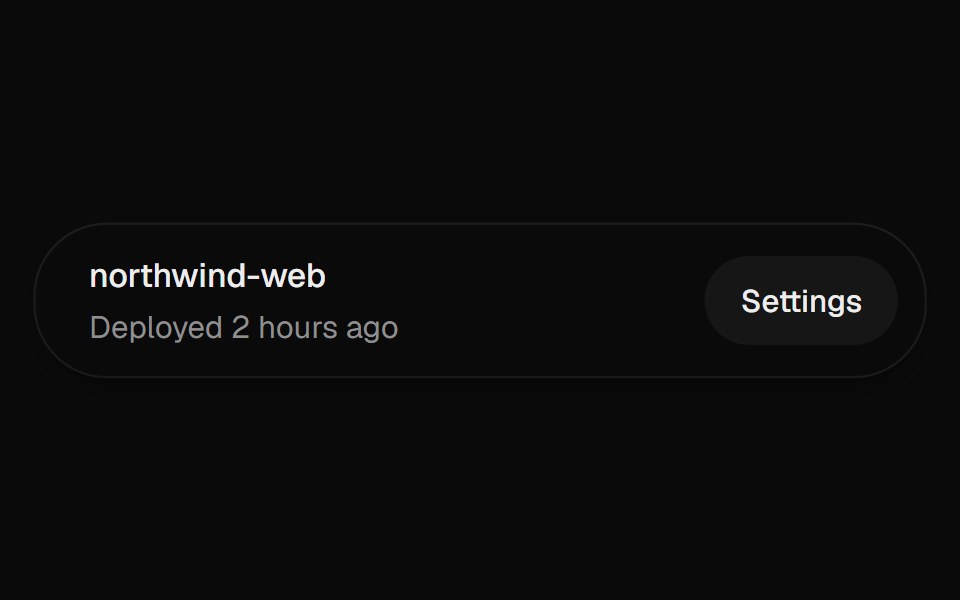 DialogUI Lab · ReactOpens a modal over the page, with a confirmation that stacks on top of it.
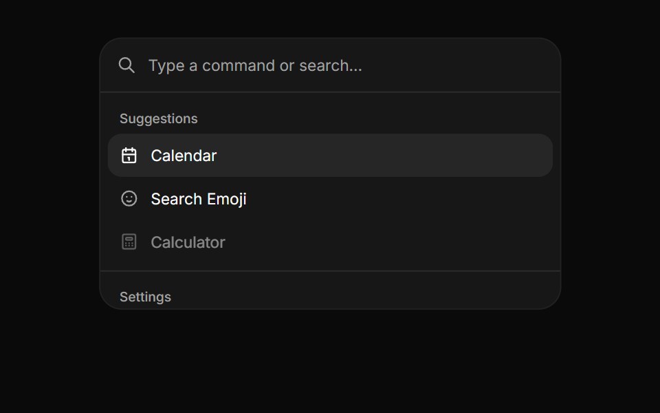 CommandHextaUI · ReactA searchable list of actions, inline or as a ⌘K palette, with pages, shortcuts and highlighted matches.
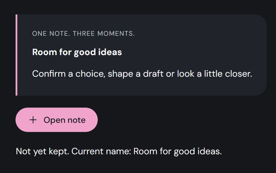 DialogCojeev UI · ReactA decision slip, focused editor or illustrated exhibit. Give one task your attention without losing your place.
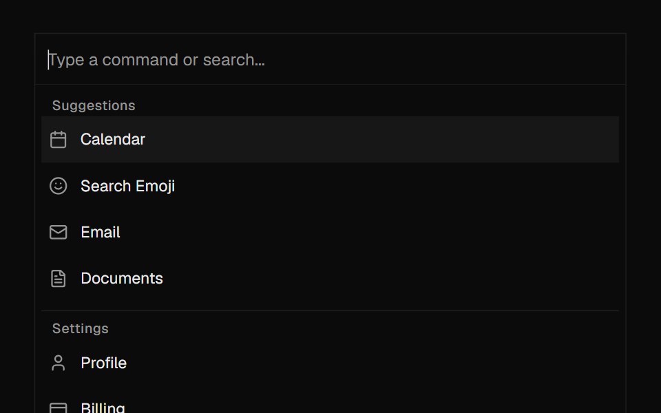 CommandROI UI · ReactA command palette component.
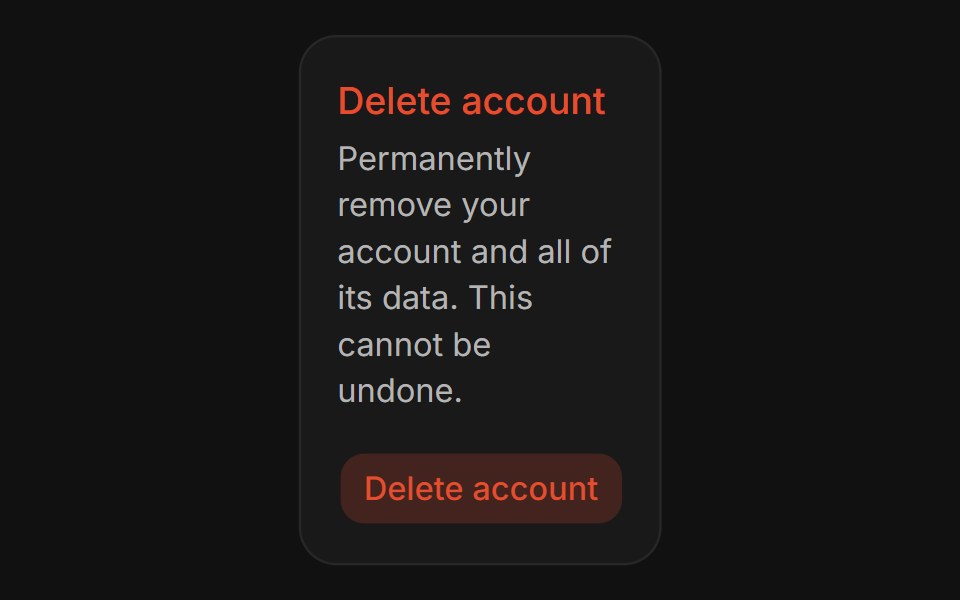 Confirm DialogFLX UI · ReactConfirm Dialog for Delete Account.
 Apple Cards CarouselVelora UI · ReactSnap-scrolling row of tall image cards that morph into a full modal story.
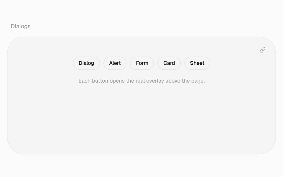 Card DialogHalaska UI · React
 Basic Alert Dialogsv-particles · Svelte
 DialogMetal UI · React + SwiftUIA modal layer: a scrim behind a surface; focus stays inside, Escape and a click outside close it.
 DialogSpaceUI · ReactOpens a focused popup window over the main page, allowing users to complete a dedicated task or view details without…
 Aria DialogReScript shadcn · ReScript
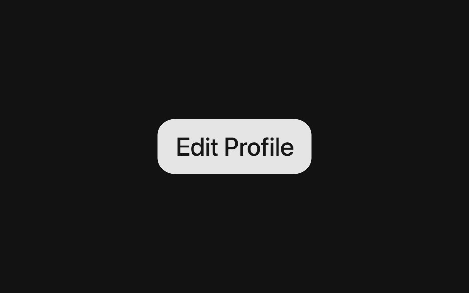 Base DialogSora UI · ReactAn accessible modal dialog built on Base UI with smooth Motion spring entrance and exit animations.
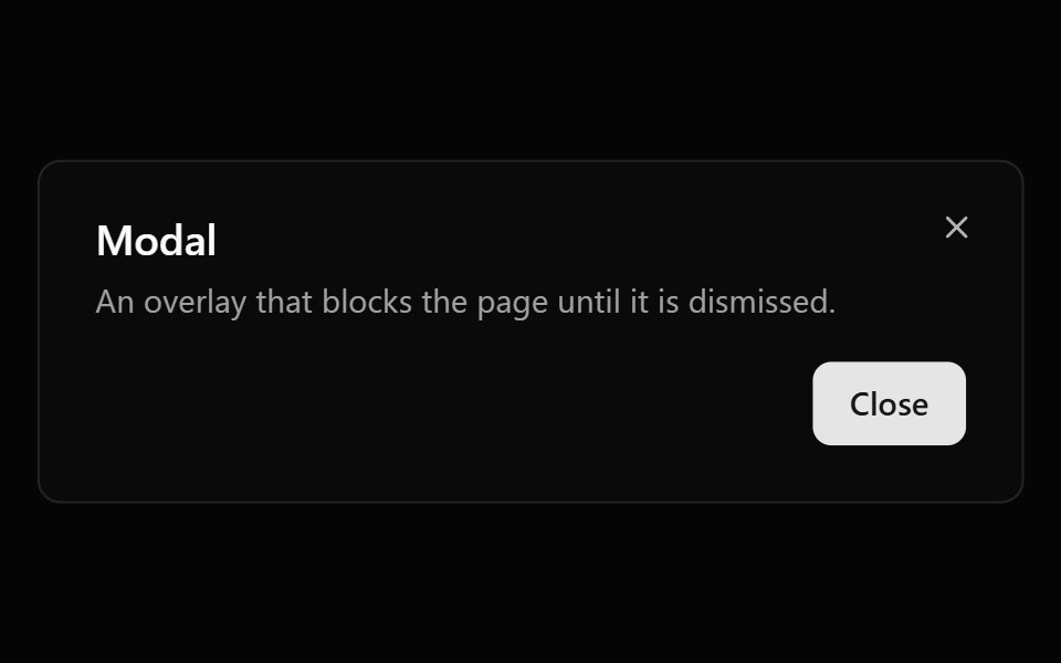 ModalOUI · ReactReact aria components Modal with shadcn characteristics.
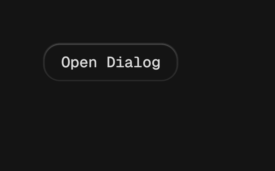 DialogD2Studio UI · ReactA window overlaid on either the primary window or another dialog window, rendering the content underneath inert.
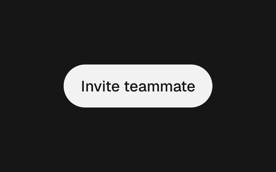 ModalEaseUI · ReactCentered dialog on the native dialog element that fades and scales in, leaves faster than it arrives, and keeps focus…
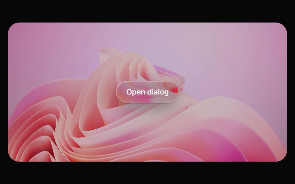 Glass DialogOpaline · ReactModal on a frosted glass sheet with springy transform-only motion.
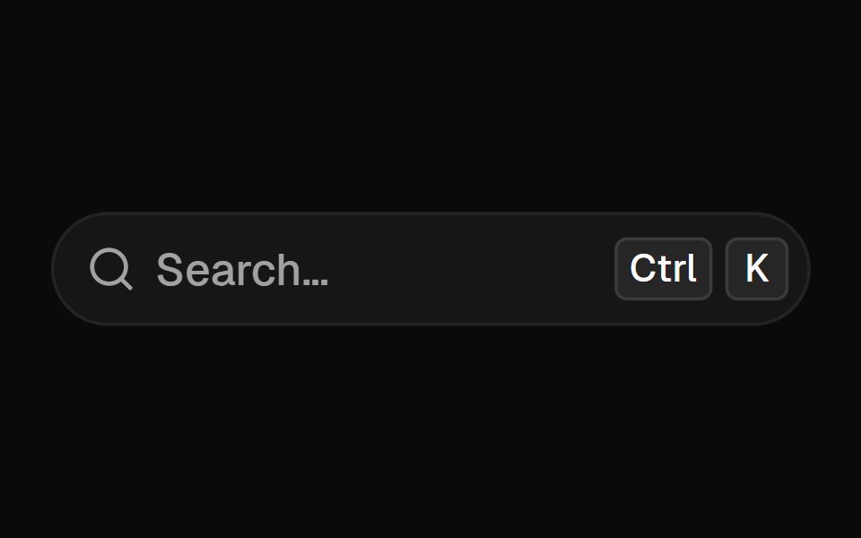 Command MenuFibo · ReactA Cmd+K palette with nested pages, recent commands, ranked search and a preview pane.
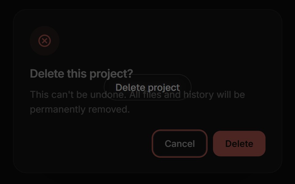 Confirm DialogReactFrame · ReactA focused alert dialog for confirming an action, with default/warning/danger variants, an async-aware confirm button…
 Apple Cards CarouselAceternity UI · React
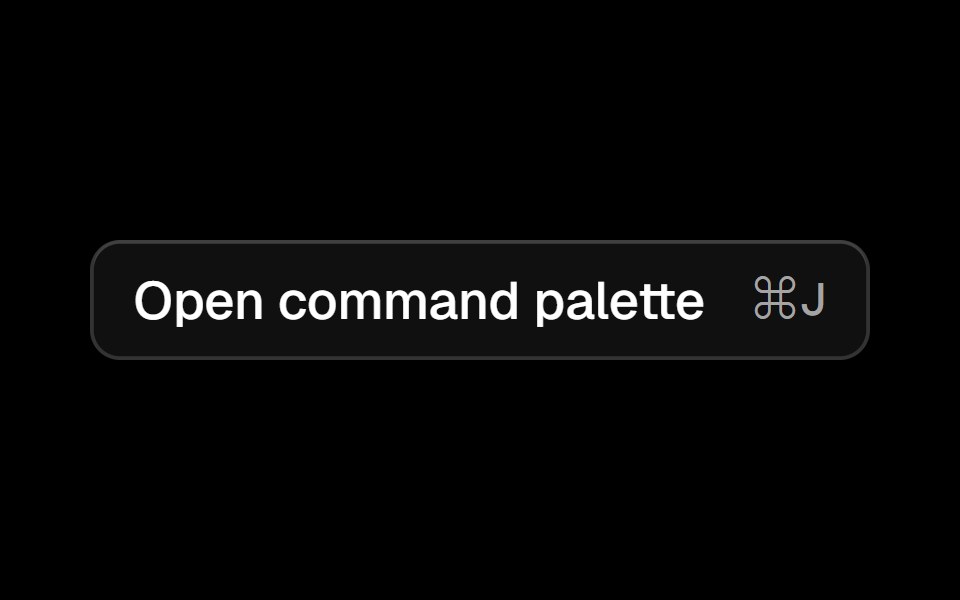 Commandark-cn · ReactA shadcn-style command component built with Ark UI primitives.
 Sidebar 13shadcn/ui · ReactA sidebar in a dialog.
 ModalMUI / Material UI · React
 DialogReact Spectrum · ReactDialogs are windows containing contextual information, tasks, or workflows that appear over the user interface…
 Dialogcoss ui · ReactA popup that opens on top of the entire page.
Libraries with modal components
Related categories
- React Modal Components
- Tailwind CSS Modal Components
- Animated Modal Components
- shadcn/ui Modal Components
- Overlay Components
- Popover Components
- Tooltip Components
- Toast Components
- Drawer Components
- Hover Card Components
- Alert Dialog Components
- Bottom Sheet Components
- Dynamic Island Components
- Tour Components
- Lightbox Components
- Cookie Banner Components
- Mini Player Components