 Dev Design Library
Tailwind CSS Modal Components
Dev Design Library indexes 252 Tailwind CSS modal components from 51 open-source UI libraries, with the most coming from Watermelon UI, FLX UI, ReUI, Origin UI and Oxbow UI. Each one links to its page with the source code, a live preview where available, the library license and the install command. Every library in this list styles its components with Tailwind CSS utility classes. Modal components belong to the Overlays group.
Showing 120 of 252, a mix from every library. Open a library to see all of its components.
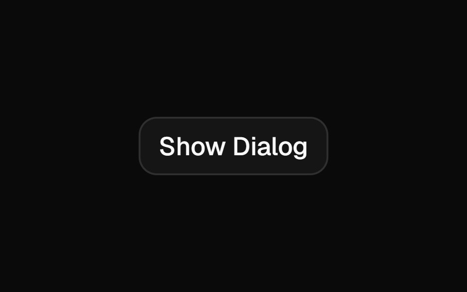 Alert Dialogshadcn/ui · ReactA modal dialog that interrupts the user with important content and expects a response.
 ModaldaisyUI · CSS (Tailwind)
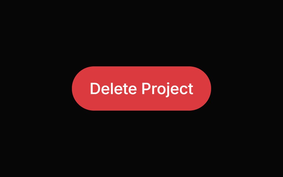 Alert DialogHeroUI · ReactModal dialog for critical confirmations requiring user attention and explicit action
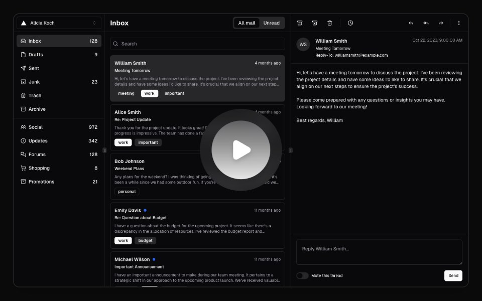 Hero Video DialogMagic UI · ReactA hero video dialog component.
 Alert DialogReact Spectrum · ReactAlertDialogs are a specific type of Dialog. They display important information that users need to acknowledge.
 Alert Dialogcoss ui · ReactA dialog that requires user response to proceed.
 Alert DialogOrigin UI · ReactA dialog that requires user response to proceed.
 Expandable ScreenCult UI · ReactA full-screen expandable component with morphing animations using shared layout IDs for smooth transitions
 DialogTremor · React
 Basic alert dialog with title, description, and action buttonsReUI · ReactBasic alert dialog with title, description, and action buttons
 command-menuIntent UI · Reactcommand-menu
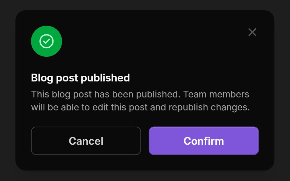 ModalsUntitled UI React · React
 Center Morph ModalbeUI · ReactA composable modal whose full-size surface unfolds from its exact center toward every edge, then folds back the same…
 Alert DialogTailGrids · ReactA modal dialog that interrupts the user with important content and expects a response.
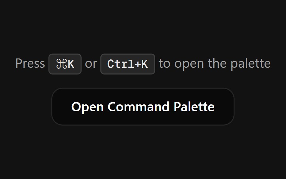 Command PaletteSpectrum UI · ReactA fully customizable, smooth-animated Command Palette (Cmd+K) component
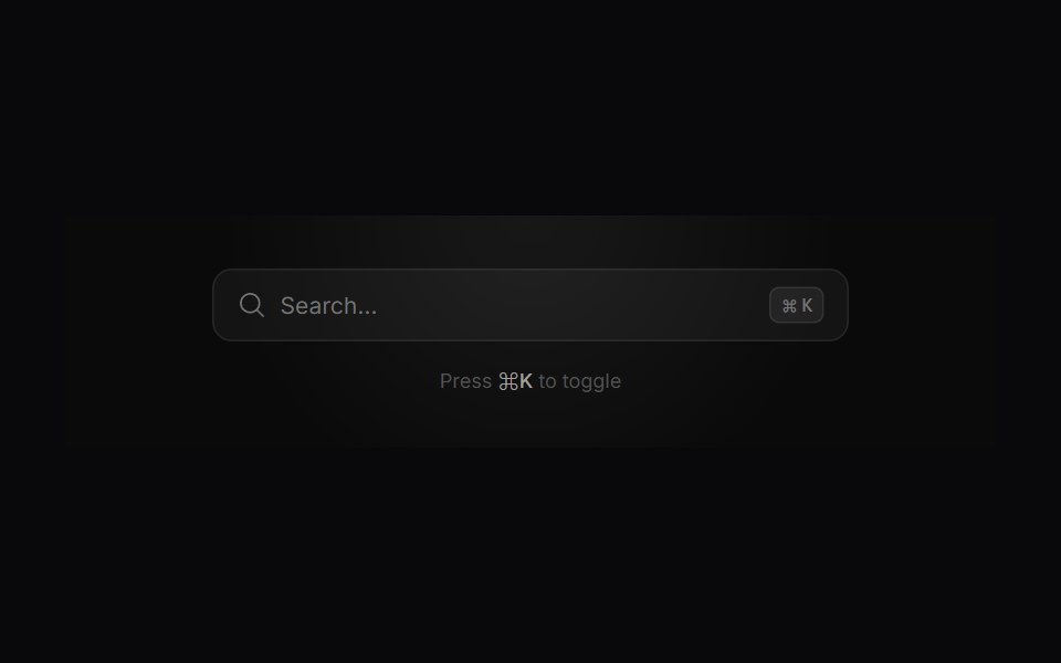 Search ModalVengeance UI · ReactMinimalist command-palette search with live filtering, tags, and actions
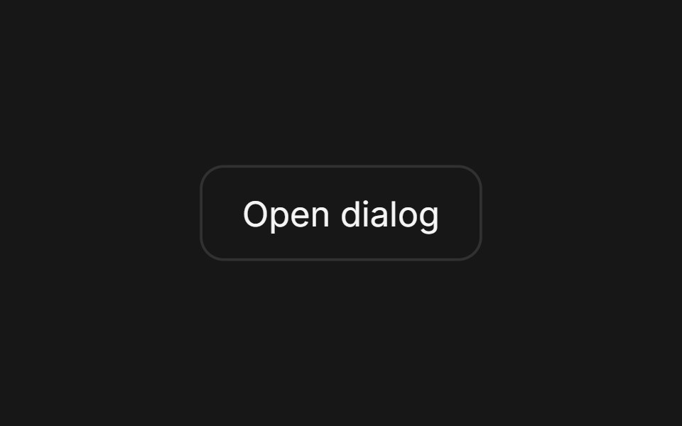 DialogFluid Functionalism · ReactAnimated modal dialog with spring-based scale and opacity transitions in three widths (sm, lg, and an xl canvas for…
 Alert DialogToolcraft · React
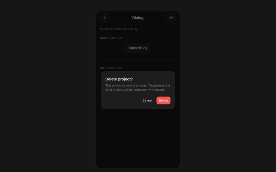 DialogPanel UI · React NativeModal dialog with a backdrop and footer actions.
 Dialog 01 - Slide from TopShadcn Space · ReactDialog that slides in from the top — ideal for notifications and alerts.
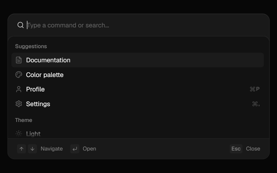 CommandComponentry · React
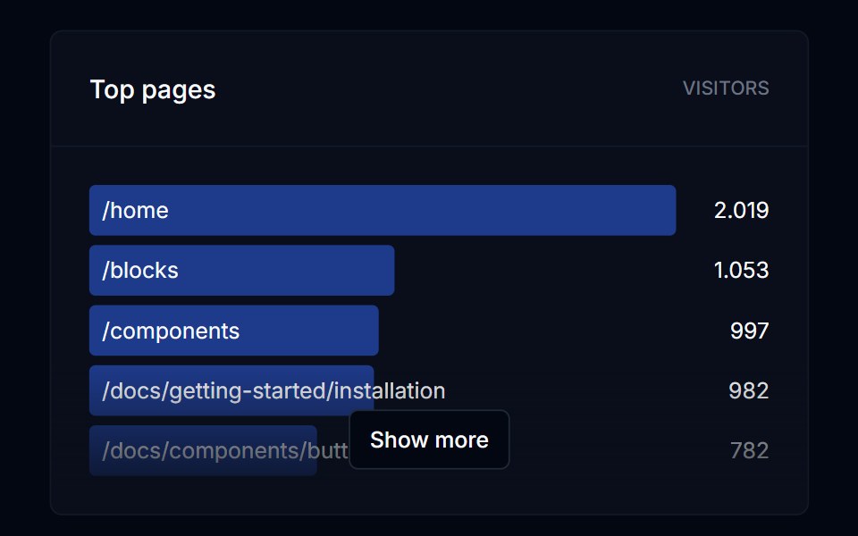 DialogTremor Blocks · React
 Alert DialogShadcn Dashboard · React
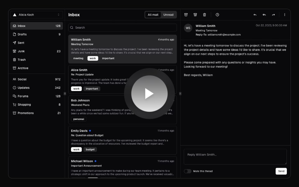 Hero Video DialogAnimations (Svelte) · SvelteA video dialog component with animated entrance effects, thumbnail support, and customizable animation styles.
 Model SelectorAI Elements (Svelte) · SvelteA searchable model selector dialog built on command and dialog primitives.
 Expandable CardBadtz UI · ReactA versatile and engaging UI component that allows users to explore content in a more immersive way.
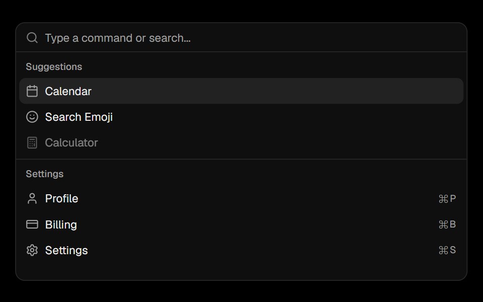 CommandObsidianUI · React
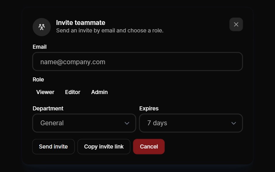 Modals 01Oxbow UI · AstroInvite team members to your account
 modalBaseLayer · ReactA modal is an overlay element which blocks interaction with elements outside it.
 Alert DialogShark UI · ReactDialog for displaying important content.
 DoubtButtonEvil Buttons · ReactAn escalating-confirmation button that makes you click through increasingly absurd, guilt-tripping prompts before the…
 Animated DialogSona UI · ReactA composable, accessible dialog modal built on Base UI with controlled state, direction-aware enter and exit motion…
 Alert DialogWatermelon UI · React
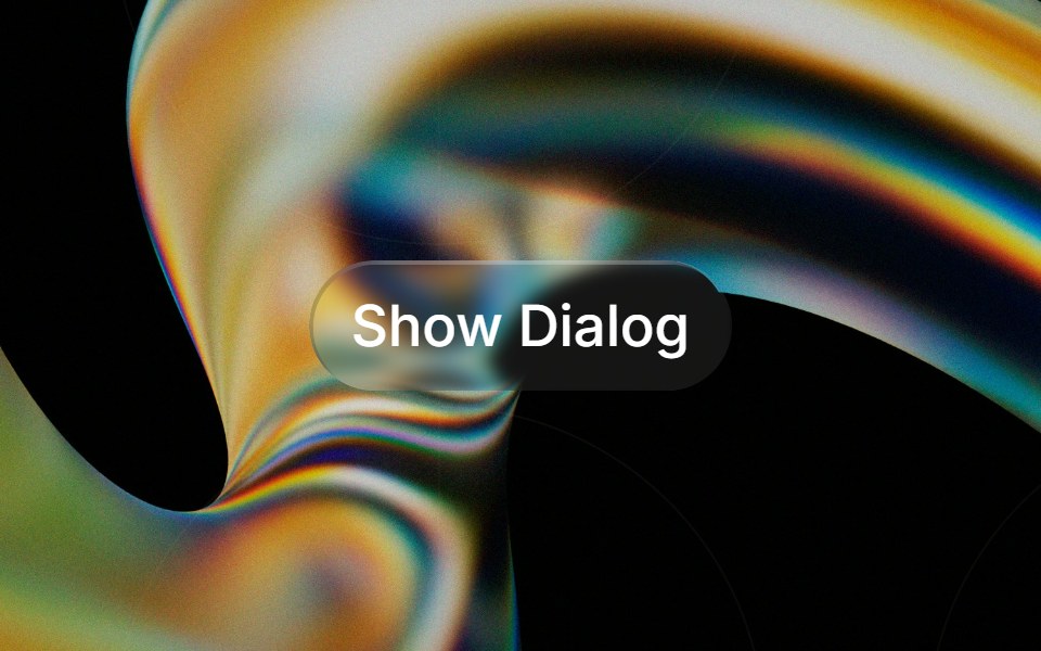 Glass Alert Dialogglasscn · ReactGlass Alert Dialog with five variants: clear, frosted, subtle, liquid, and liquid-refract
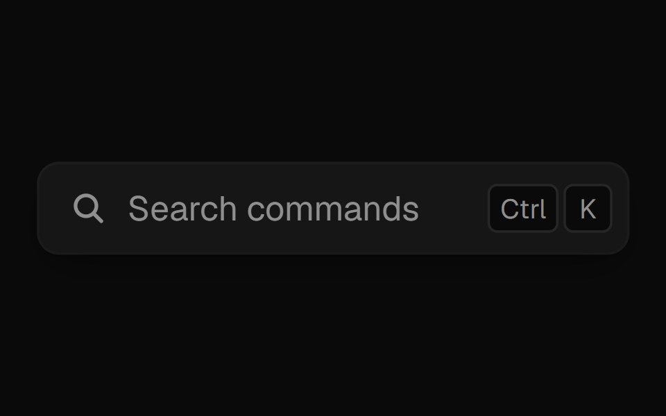 Command PaletteUI Lab · ReactOpens on ⌘K and filters commands as you type.
 Alert dialogHextaUI · ReactA confirmation dialog for destructive or important actions that waits for async work, and becomes a bottom sheet on…
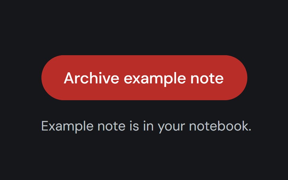 Alert DialogCojeev UI · ReactPauses a workflow for a focused confirmation before a consequential action proceeds.
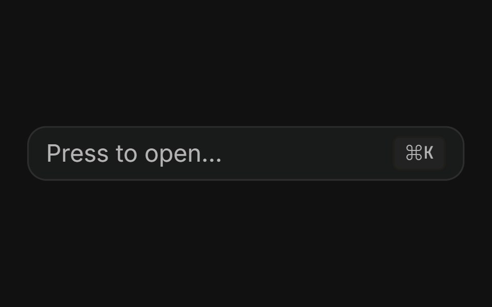 Command dialogFLX UI · ReactSpotlight-style ⌘K palette toggled by a button or keyboard shortcut.
 Animated ModalVelora UI · ReactNative dialog whose panel springs in with a tilt over a blurred backdrop.
 Alert Dialog With Bare Footersv-particles · Svelte
 Alert dialogMetal UI · React + SwiftUIA question that must be answered: the dialog's plate and motion; a click outside shakes it once on the refusal spring…
 Alert DialogSpaceUI · ReactDisplays a modal window that asks users to confirm important actions before proceeding, helping prevent accidental…
 Base Alert DialogSora UI · ReactAn accessible alert dialog built on Base UI with smooth Motion 3D perspective entrance and exit animations…
 DialogOUI · ReactReact aria components Dialog with shadcn characteristics.
 Alert DialogD2Studio UI · ReactA modal dialog that interrupts the user with important content and expects a response.
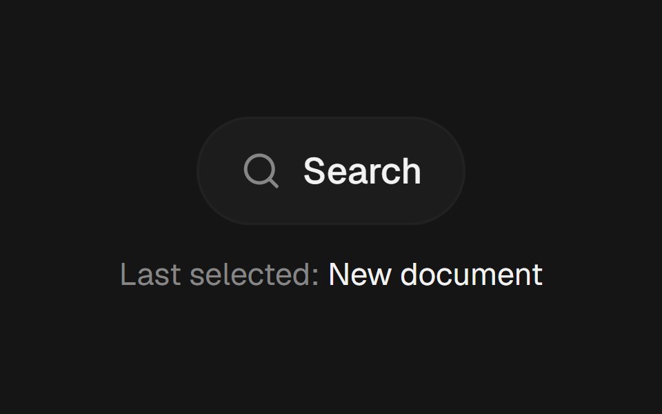 Command PaletteEaseUI · ReactCommand-K style search overlay that filters as you type, with arrow keys to move the highlight and Enter to select.
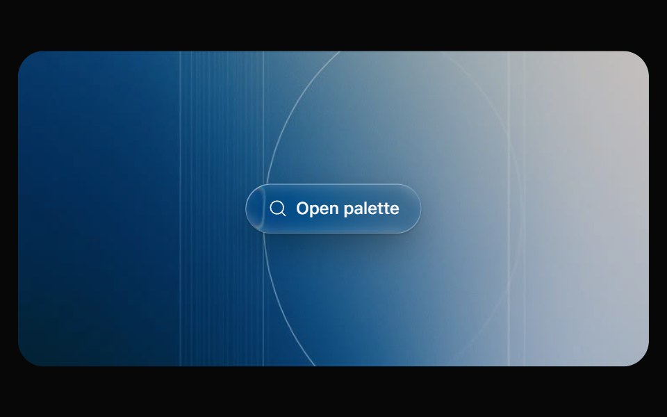 Glass CommandOpaline · React⌘K command palette on a frosted glass sheet, powered by cmdk.
 Alert DialogFibo · ReactAsks for a decision before something that can't be undone, with Cancel focused and no click-outside dismiss.
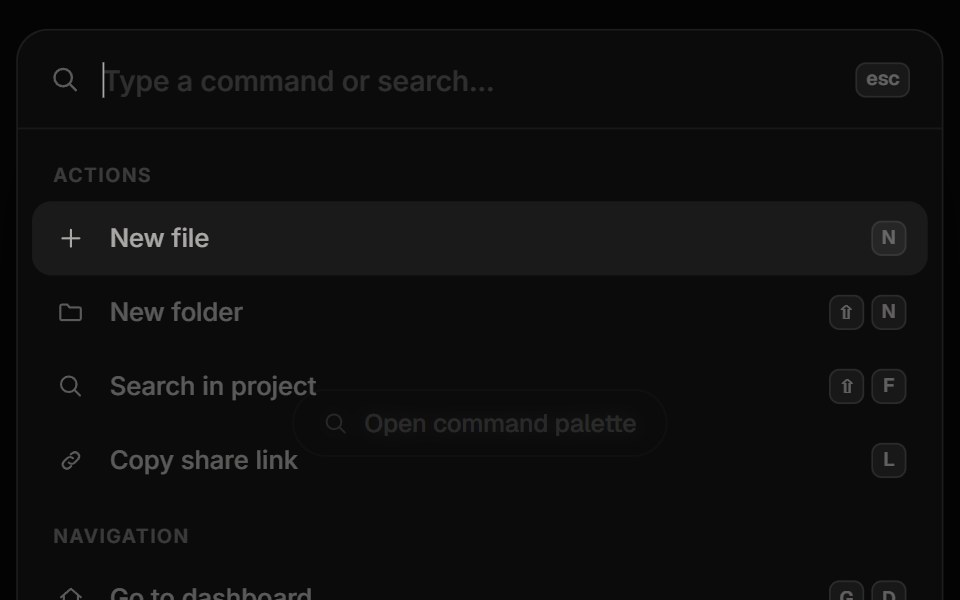 Command PaletteReactFrame · ReactA Cmd/Ctrl+K command palette with fuzzy search and match highlighting, grouped results, keyboard navigation, shortcuts…
 Animated ModalAceternity UI · React
 Alert Dialogark-cn · ReactA shadcn-style alert dialog component built with Ark UI primitives.
 Dialogshadcn/ui · ReactA window overlaid on either the primary window or another dialog window, rendering the content underneath inert.
 ModalHeroUI · ReactDialog overlay for focused user interactions and important content
 Custom DialogReact Spectrum · ReactA CustomDialog is a floating window with a custom layout.
 Commandcoss ui · ReactA command palette component built with Dialog and Autocomplete for searching and executing commands.
 DialogOrigin UI · ReactA popup that opens on top of the entire page.
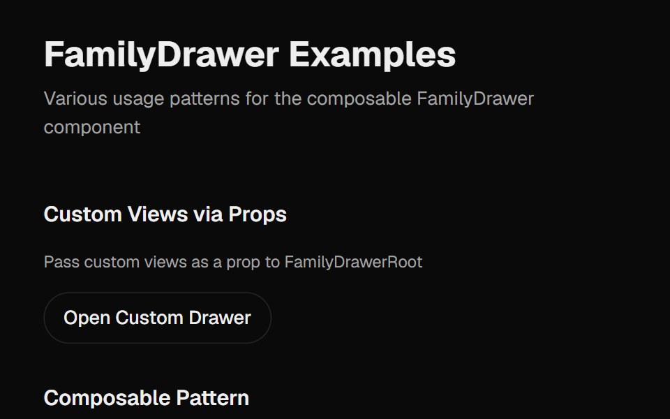 Family DrawerCult UI · ReactA multi-view drawer component with smooth animations, view navigation, and customizable content views
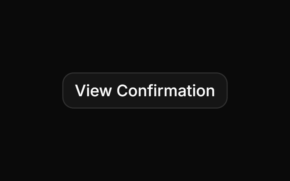 Confirmation for successful e-ticket registrationReUI · ReactConfirmation for successful e-ticket registration
 dialogIntent UI · Reactdialog
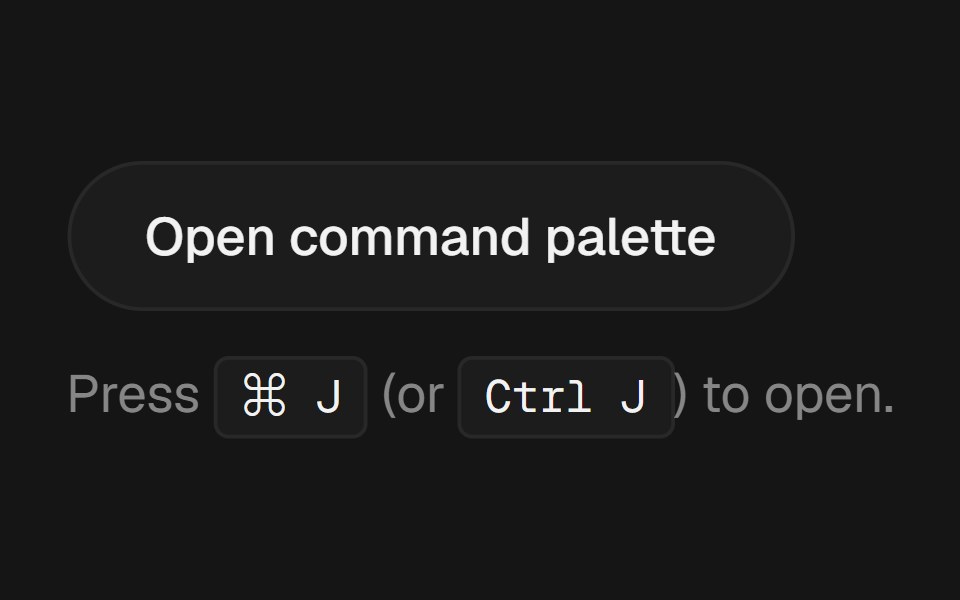 Command PalettebeUI · React⌘K palette with fuzzy filter, spring-animated active row and glass surface.
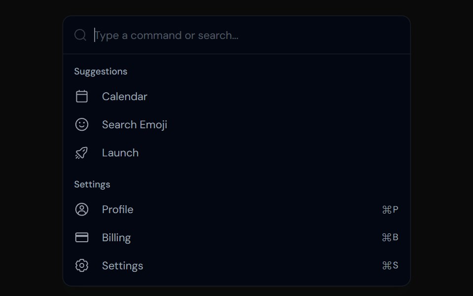 CommandTailGrids · ReactA command menu component with multiple variants.
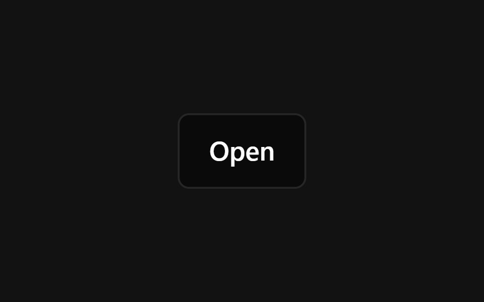 Responsive ModalSpectrum UI · Reactcomponent for the Responsive Modal
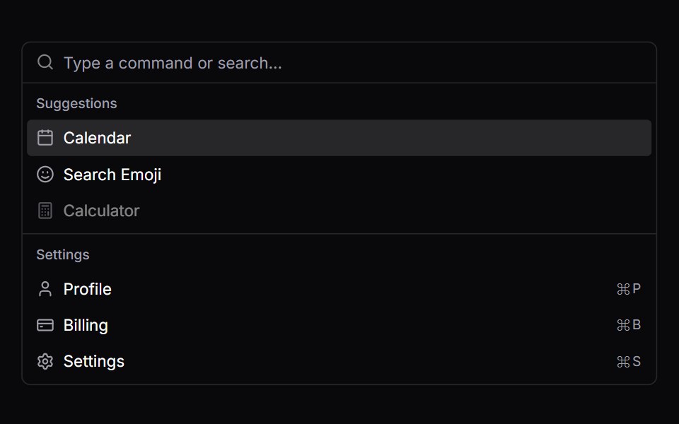 CommandVengeance UI · React
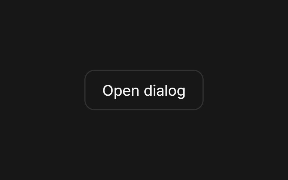 Dialog (Base UI)Fluid Functionalism · ReactAnimated modal dialog with spring-based scale and opacity transitions in three widths (sm, lg, and an xl canvas for…
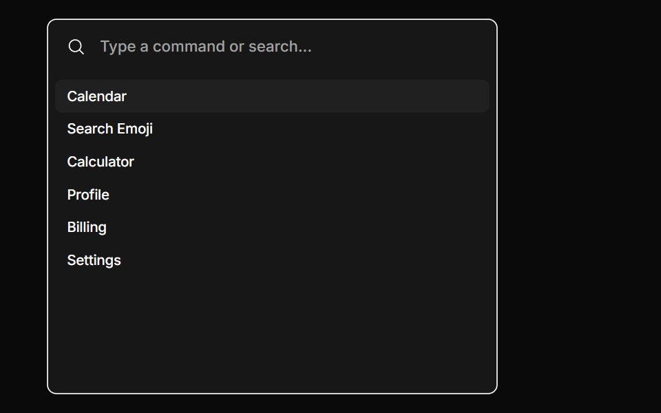 CommandToolcraft · React
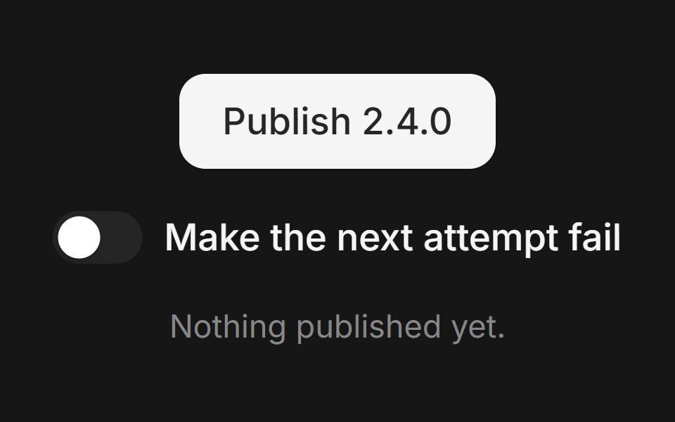 Web Alert DialogPanel UI · React Native
 Dialog 02 - Slide from BottomShadcn Space · ReactDialog that slides in from the bottom — ideal for confirmations and destructive actions.
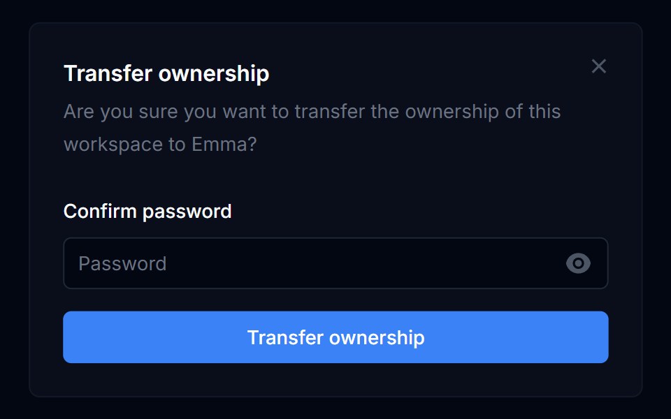 Dialog 01Tremor Blocks · React
 DialogShadcn Dashboard · React
 DialogObsidianUI · React
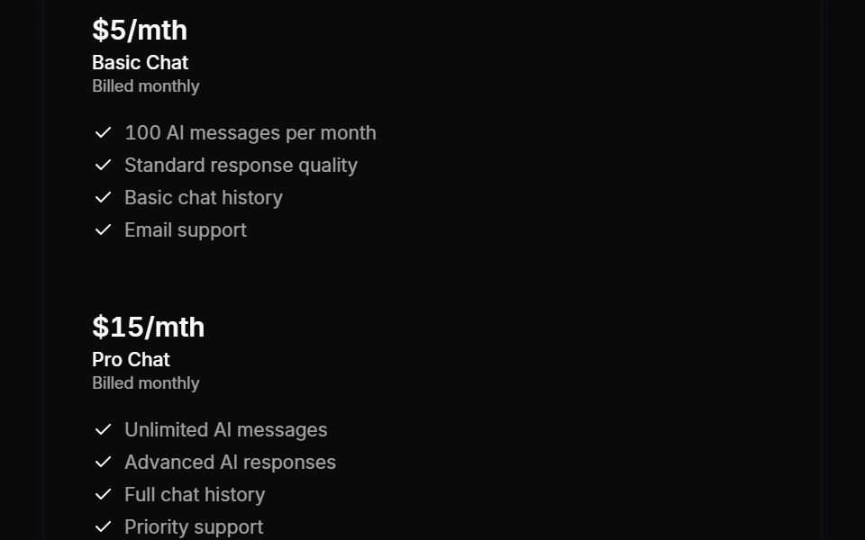 Modals 02Oxbow UI · AstroChoose AI Chat Plan
 DialogShark UI · ReactA dialog for displaying content.
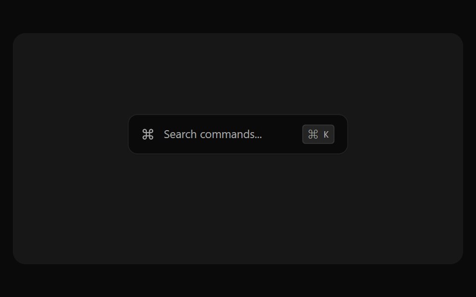 Command Palette PreviewSona UI · React
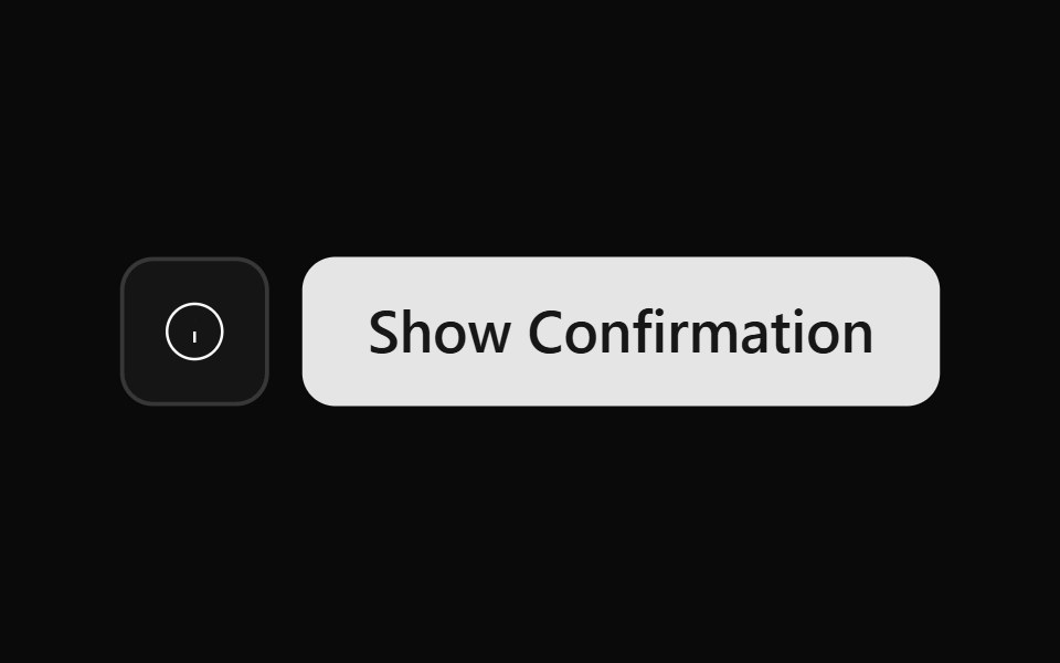 Alert Dialog 01Watermelon UI · React
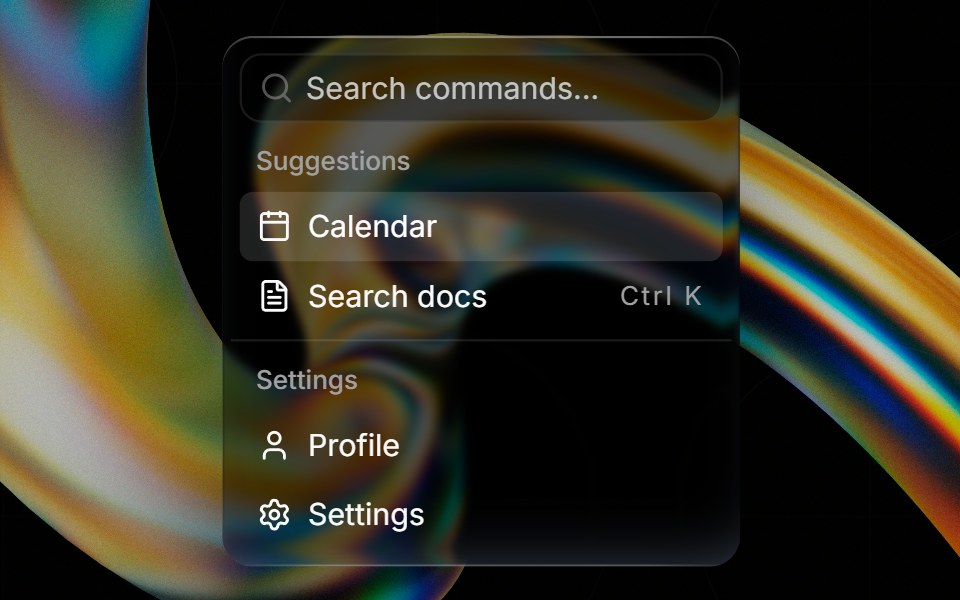 Glass Commandglasscn · ReactGlass Command with five variants: clear, frosted, subtle, liquid, and liquid-refract
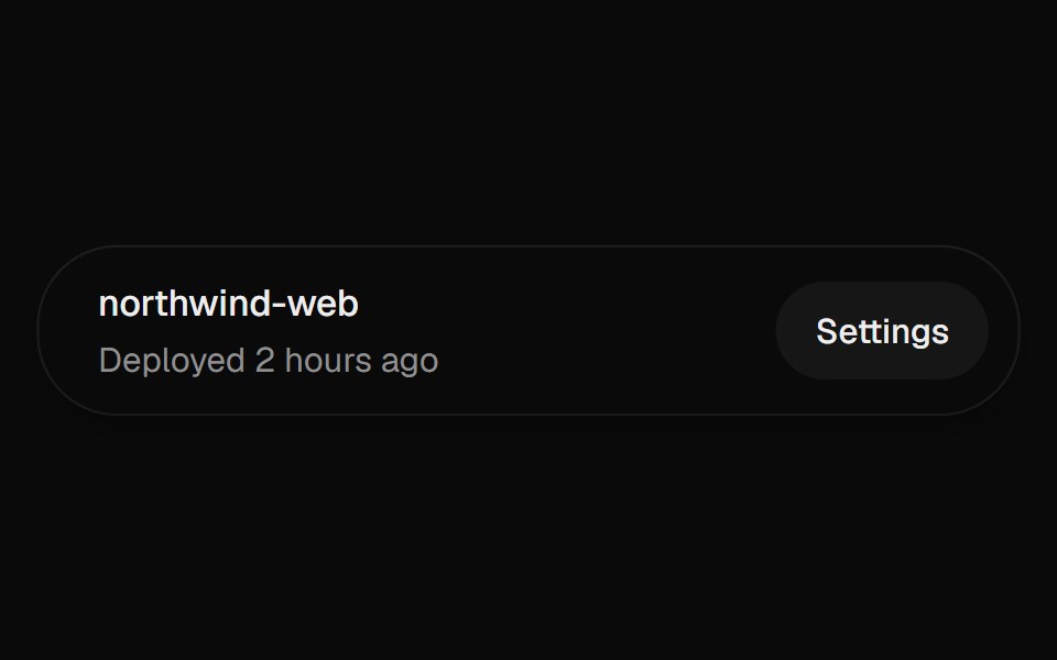 DialogUI Lab · ReactOpens a modal over the page, with a confirmation that stacks on top of it.
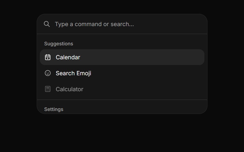 CommandHextaUI · ReactA searchable list of actions, inline or as a ⌘K palette, with pages, shortcuts and highlighted matches.
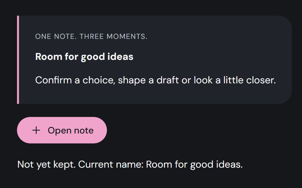 DialogCojeev UI · ReactA decision slip, focused editor or illustrated exhibit. Give one task your attention without losing your place.
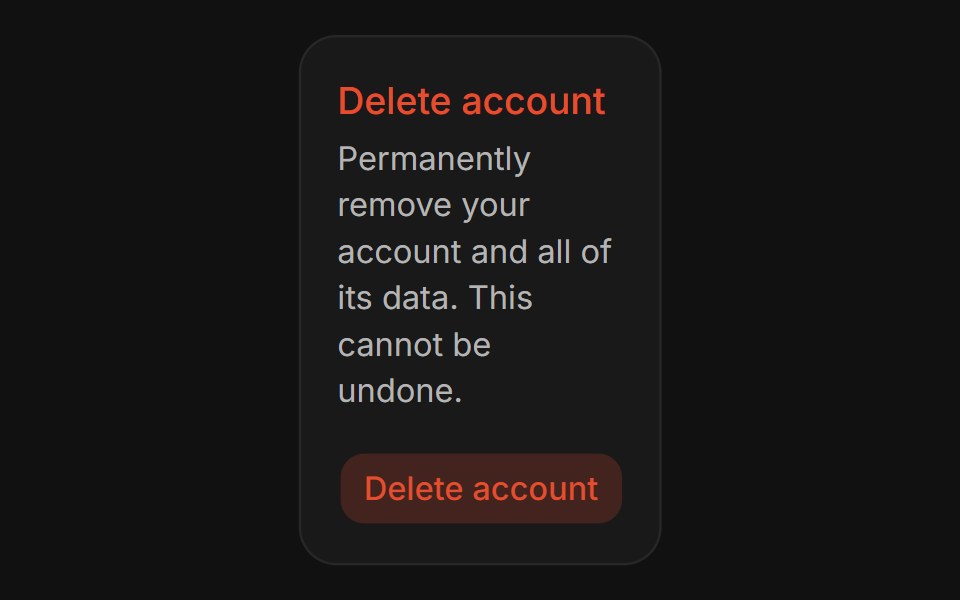 Confirm DialogFLX UI · ReactConfirm Dialog for Delete Account.
 Apple Cards CarouselVelora UI · ReactSnap-scrolling row of tall image cards that morph into a full modal story.
 Basic Alert Dialogsv-particles · Svelte
 DialogMetal UI · React + SwiftUIA modal layer: a scrim behind a surface; focus stays inside, Escape and a click outside close it.
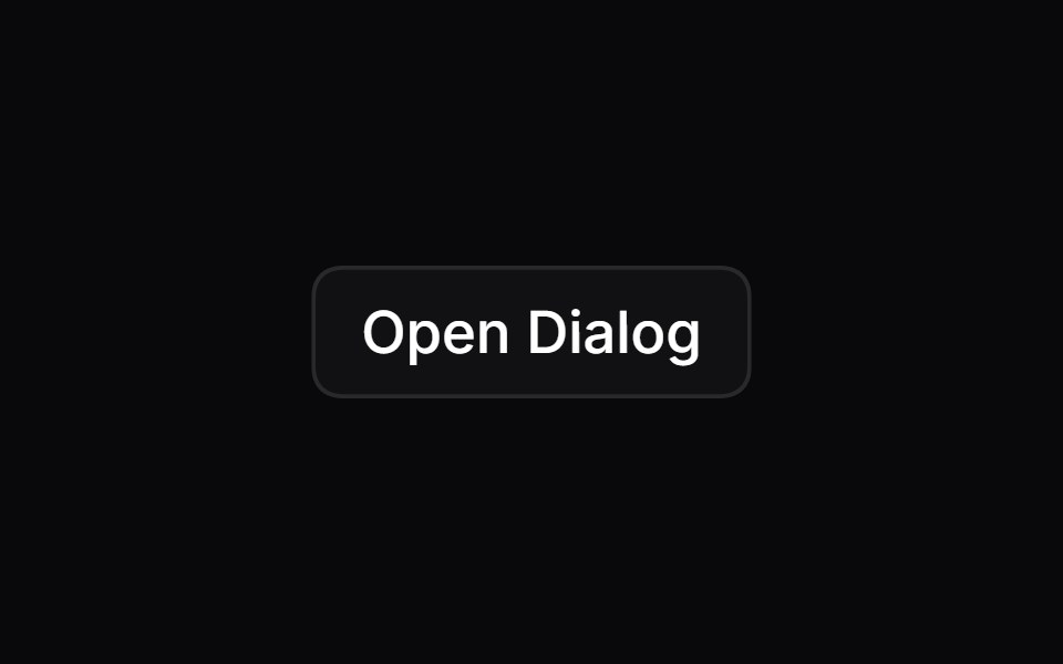 DialogSpaceUI · ReactOpens a focused popup window over the main page, allowing users to complete a dedicated task or view details without…
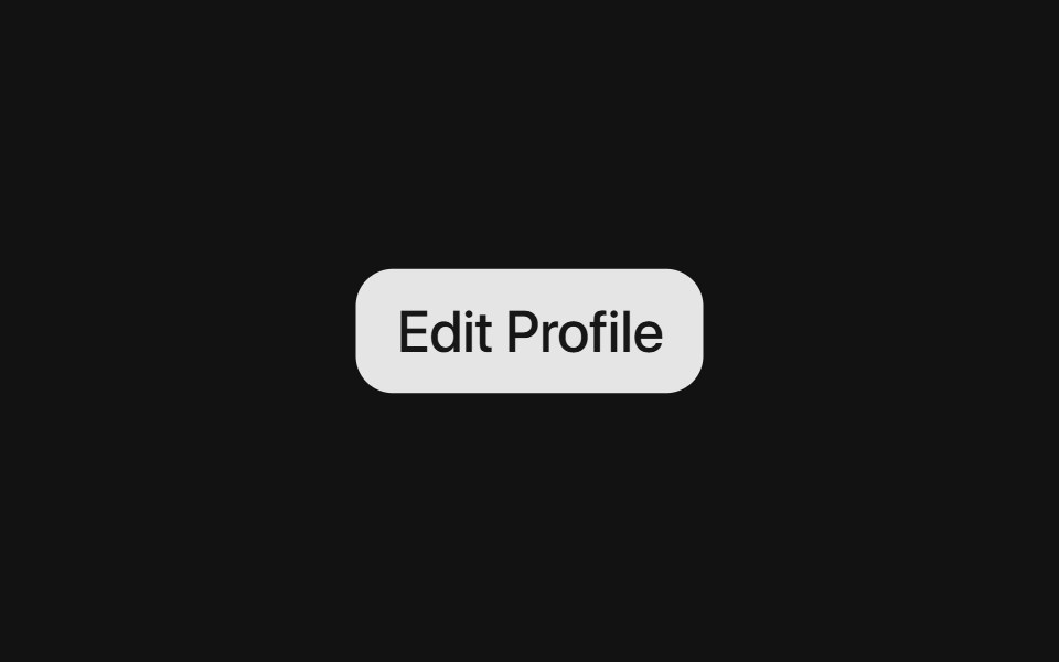 Base DialogSora UI · ReactAn accessible modal dialog built on Base UI with smooth Motion spring entrance and exit animations.
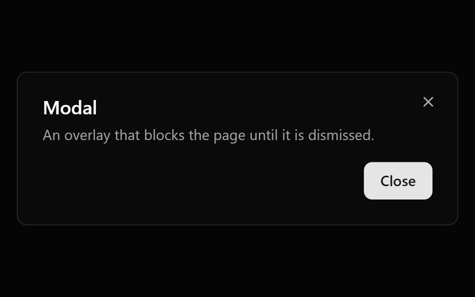 ModalOUI · ReactReact aria components Modal with shadcn characteristics.
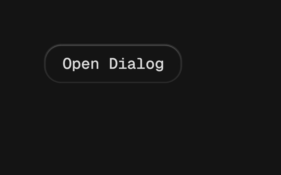 DialogD2Studio UI · ReactA window overlaid on either the primary window or another dialog window, rendering the content underneath inert.
 ModalEaseUI · ReactCentered dialog on the native dialog element that fades and scales in, leaves faster than it arrives, and keeps focus…
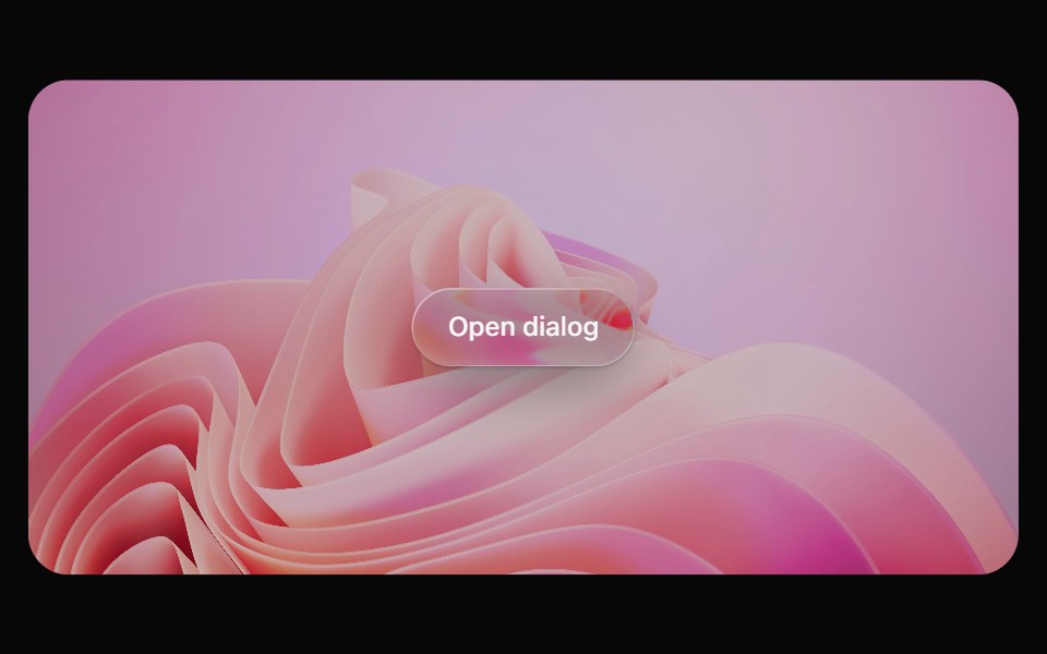 Glass DialogOpaline · ReactModal on a frosted glass sheet with springy transform-only motion.
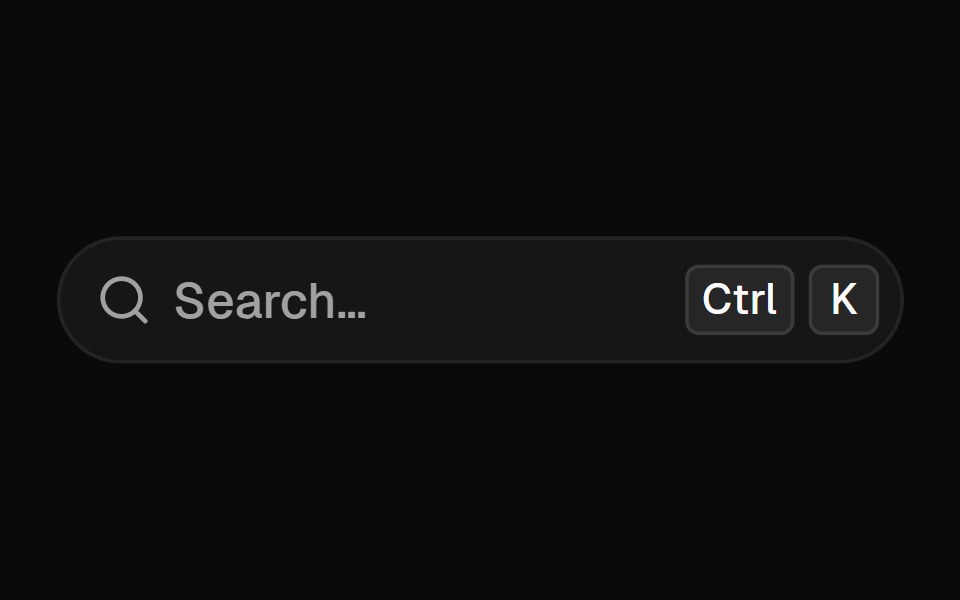 Command MenuFibo · ReactA Cmd+K palette with nested pages, recent commands, ranked search and a preview pane.
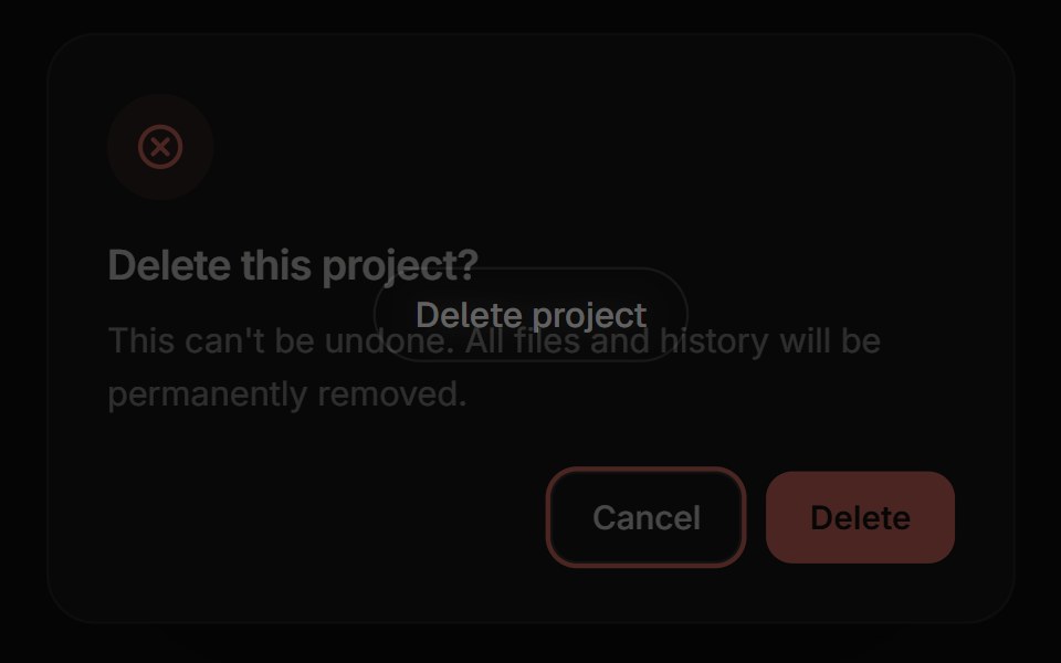 Confirm DialogReactFrame · ReactA focused alert dialog for confirming an action, with default/warning/danger variants, an async-aware confirm button…
 Apple Cards CarouselAceternity UI · React
 Commandark-cn · ReactA shadcn-style command component built with Ark UI primitives.
 Sidebar 13shadcn/ui · ReactA sidebar in a dialog.
 DialogReact Spectrum · ReactDialogs are windows containing contextual information, tasks, or workflows that appear over the user interface…
 Dialogcoss ui · ReactA popup that opens on top of the entire page.
 Comp 313Origin UI · React
 System update notification requiring application restartReUI · ReactSystem update notification requiring application restart
- modalIntent UI · Reactmodal
 Morphing ModalbeUI · ReactFamily-app-style modal. A single panel that morphs its height as you navigate between inner views, with blur…
 DialogTailGrids · ReactA dialog component that display a modal overlay above the main page content.
 DialogVengeance UI · React
 Settings Dialog (Sidebar in a Dialog)Fluid Functionalism · ReactA settings dialog: the xl Dialog as a canvas, a non-collapsing Sidebar of sections down its left edge, and a scrolling…
 DialogToolcraft · React
 Web DialogPanel UI · React Native
 Dialog 03 - Slide from LeftShadcn Space · ReactDialog that slides in from the left — ideal for subscription forms and quick inputs.
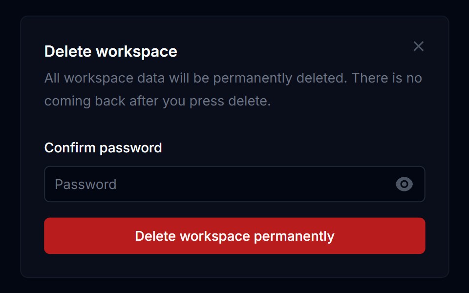 Dialog 02Tremor Blocks · React
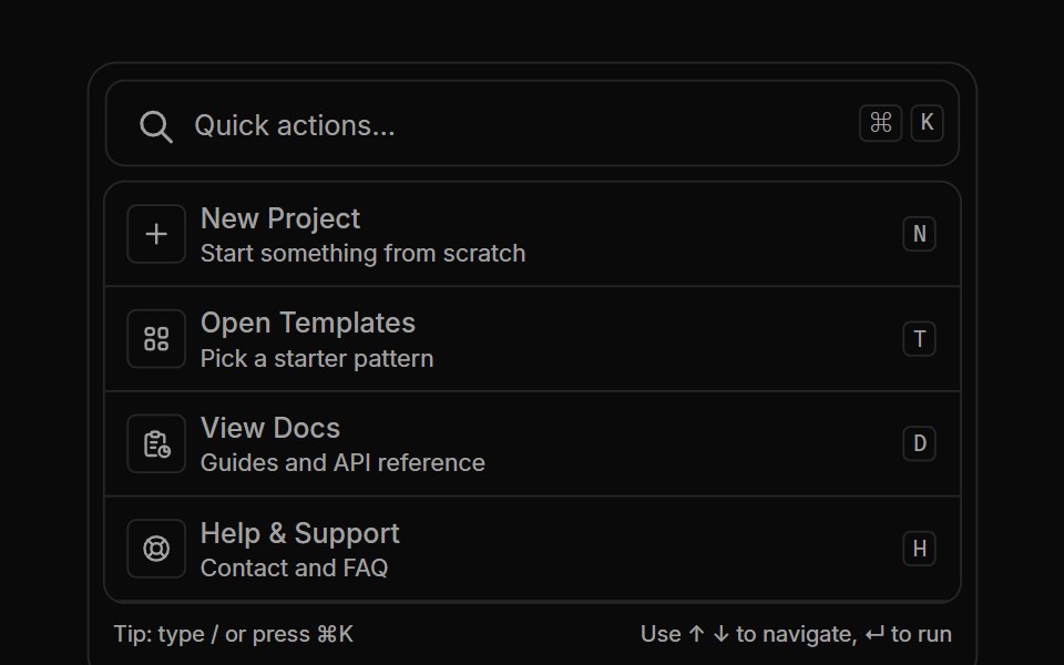 Commandbar 01Oxbow UI · Astro
 Floating PanelShark UI · ReactDisplays content in a floating window.
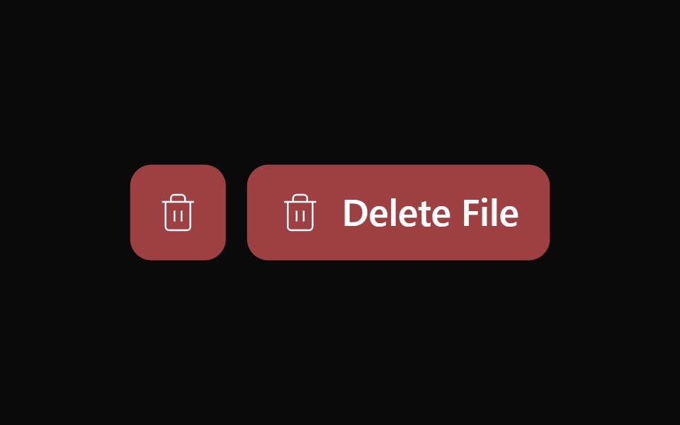 Alert Dialog 02Watermelon UI · React
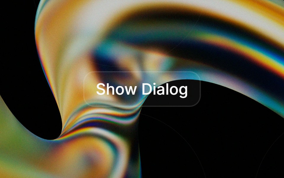 Alert Dialogglasscn · React
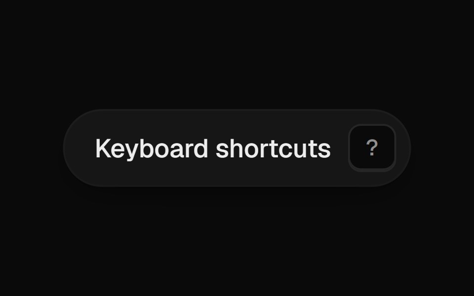 Shortcut SheetUI Lab · ReactPress ? anywhere to see every shortcut, then press one to watch it light up.
 DialogHextaUI · ReactA window over the page for forms and focused tasks, with a pinned header and footer, nesting, and a swipeable bottom…
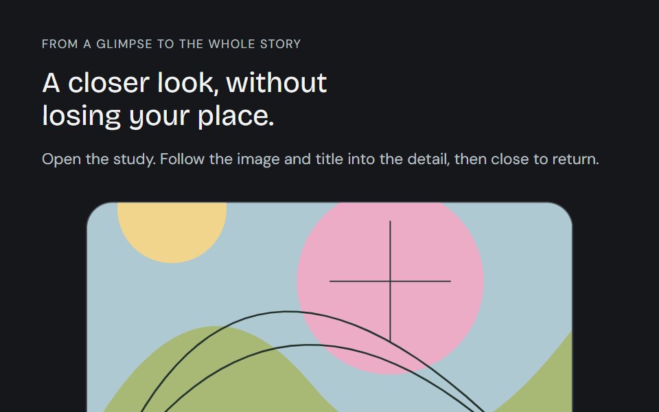 Linear ModalCojeev UI · ReactFollow a card, image and title into a full detail, then back. Card, Centered and browsable Gallery preserve the…
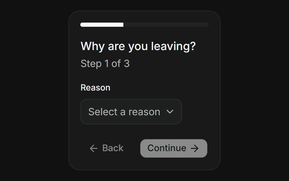 Multi-StepFLX UI · ReactMulti-Step for Delete Account.
 Radix Alert DialogSora UI · ReactAn accessible alert dialog built on Radix UI with smooth Motion 3D perspective entrance and exit animations…
 DialogFibo · ReactA window over the page for a short task, such as editing a few fields, that keeps focus until it's done or dismissed.
 Dice Discount PopupReactFrame · ReactA gamified discount popup, roll two animated 3D dice for a reward tier (with a doubles bonus), copy the code, and…
 Dialogark-cn · ReactA shadcn-style dialog component built with Ark UI primitives.
 Fullscreen DialogReact Spectrum · ReactTakeover dialogs are large types of dialogs. They use the totality of the screen and should be used for modal…
 Comp 314Origin UI · React
Libraries with Tailwind CSS modal components
Related categories
- Modal Components
- React Modal Components
- Animated Modal Components
- shadcn/ui Modal Components
- Tailwind CSS Overlay Components
- Tailwind CSS Popover Components
- Tailwind CSS Tooltip Components
- Tailwind CSS Toast Components
- Tailwind CSS Drawer Components
- Tailwind CSS Alert Dialog Components
- Tailwind CSS Hover Card Components
- Tailwind CSS Bottom Sheet Components
- Tailwind CSS Tour Components
- Tailwind CSS Dynamic Island Components
- Tailwind CSS Cookie Banner Components
- Tailwind CSS Lightbox Components