 Dev Design Library
Tailwind CSS Hover Card Components
Dev Design Library indexes 49 Tailwind CSS hover card components from 30 open-source UI libraries, with the most coming from ReUI, Notra, SpaceUI, Sona UI and AI Elements. Each one links to its page with the source code, a live preview where available, the library license and the install command. Every library in this list styles its components with Tailwind CSS utility classes. Hover card components belong to the Overlays group.
 Hover Cardshadcn/ui · ReactA popover that appears on hover, focus, or long press to preview content available behind a link.
 Preview Cardcoss ui · ReactA popup that appears when a link is hovered, showing a preview for sighted users.
 Hover CardOrigin UI · React
 Basic hover card.ReUI · ReactBasic hover card.
 Card Preview TileAmicro Micro Transitions · ReactCatalog preview for a card spread / carousel. Hover state lives here so hovering one tile re-renders only that tile…
 ContextAI Elements · ReactA compound component system for displaying AI model context window usage, token consumption, and cost estimation.
 Hover CardTailGrids · ReactA hover card component that displays information when the user hovers over an element.
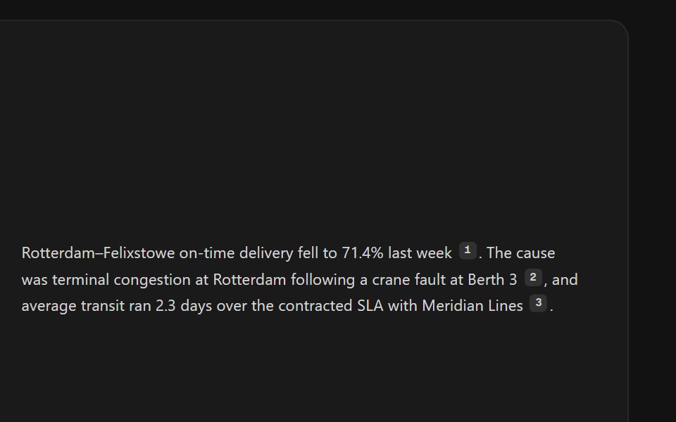 Citation SourcesSpectrum UI · ReactInline citation markers with hover previews or a footnote list.
 Hover CardVengeance UI · React
 Hover CardToolcraft · React
 Card-01 - ArticlePreviewCardShadcn Space · ReactCard component
 Hover CardShadcn Dashboard · React
 ContextAI Elements (Svelte) · SvelteA hover-card-based context window usage component with token, cost, and model usage breakdowns.
 Hover CardObsidianUI · React
 AI Overview CitationNotra · ReactA source chip built on shadcn Badge and HoverCard.
 Image Hover RevealGreatUI · React
 Hover CardShark UI · ReactPopover that appears on hover.
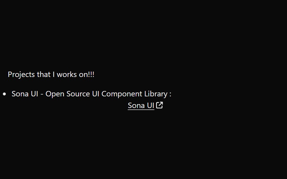 LinkPreviewSona UI · ReactThe `LinkPreview` component is an interactive UI element that displays a preview of a link when hovered over. It…
 Hover CardWatermelon UI · React
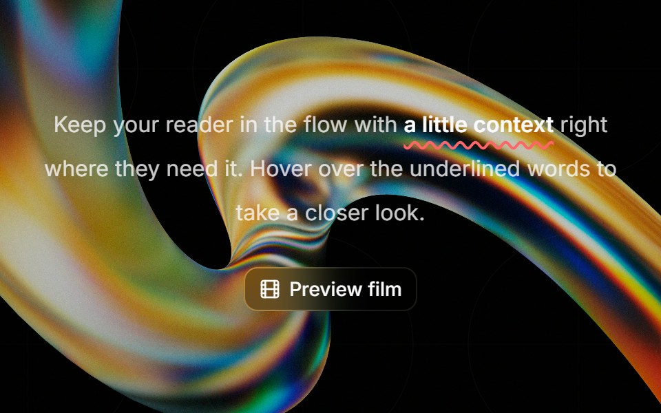 Highlight Phraseglasscn · ReactA smooth glass hover popover for text, video, and rich content, with click and keyboard access.
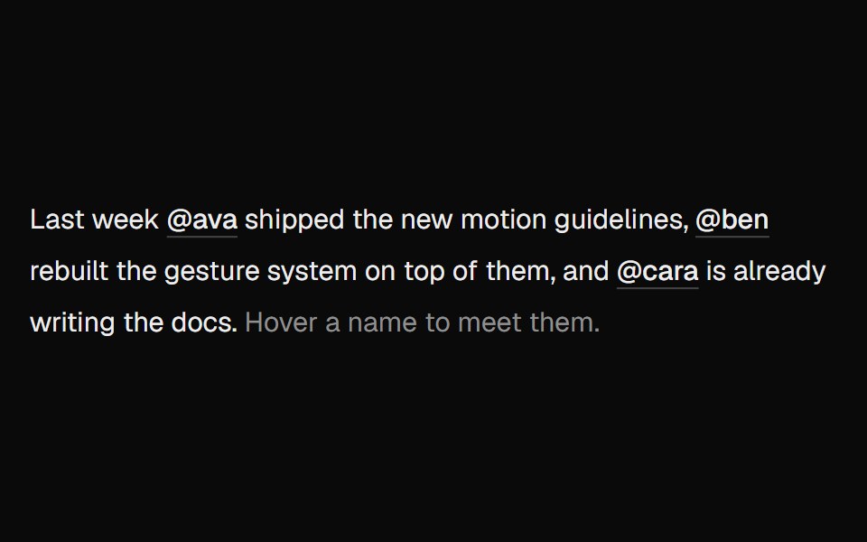 Hover CardUI Lab · ReactOne card travels between names as you hover them.
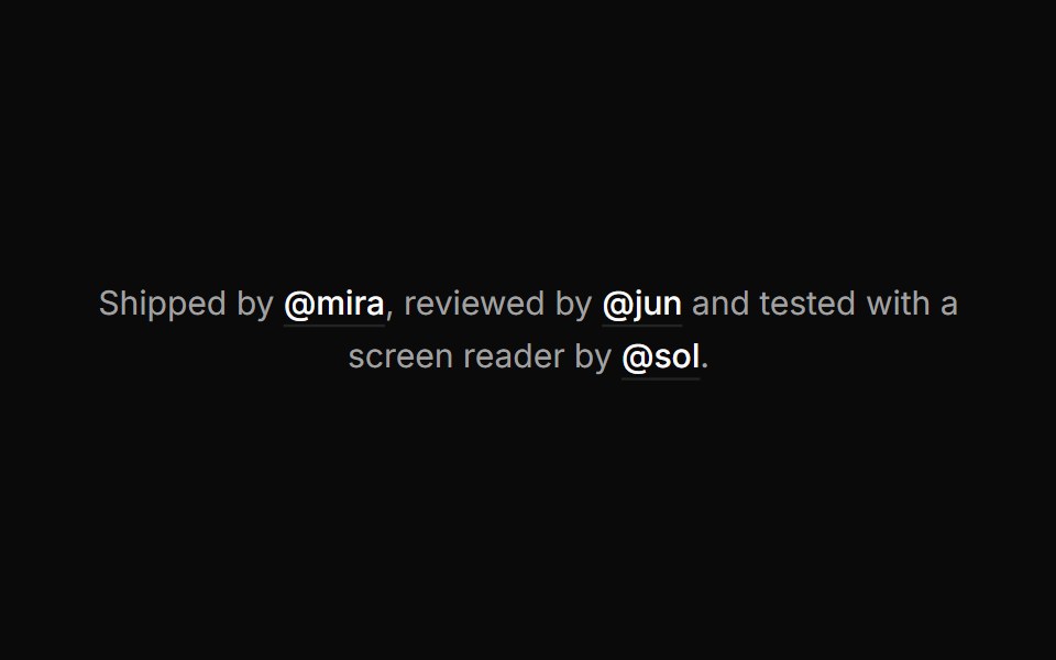 Hover cardHextaUI · ReactA preview card that opens when a link is hovered or focused, for content sighted users can glance at.
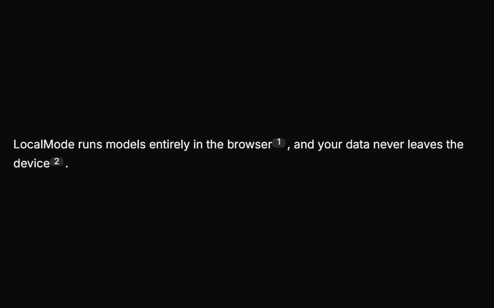 Inline CitationLocalMode · ReactInline superscript citation markers in prose that open a hovercard with the cited local chunk (title, excerpt, quoted…
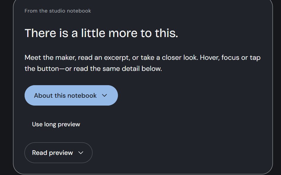 Hover CardCojeev UI · ReactA person, an excerpt or a small visual study—three considered previews, close to the thing you are exploring.
 Profile cardFLX UI · ReactBanner image, avatar, bio, and follow / message actions.
 Preview cardMetal UI · React + SwiftUIWhat is behind a link, seen by resting on it: after a steady hover the popover's plate rises out of the link with an…
 Card InfoSpaceUI · ReactResponsive feature and philosophy cards with gradient icons, clean typography, and layered container aesthetics.
 Hover CardD2Studio UI · ReactFor sighted users to preview content available behind a link.
 Hover CardReactFrame · ReactA hover-triggered rich preview card with open/close delays, a hover bridge so moving into the card keeps it open…
 Hover Cardark-cn · ReactA shadcn-style hover card component built with Ark UI primitives.
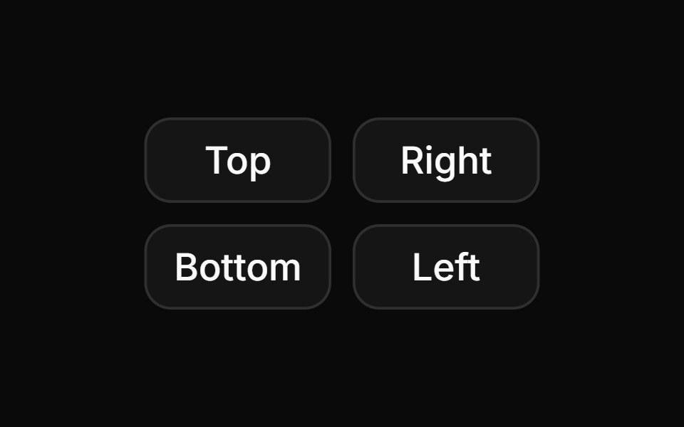 Hover card with positions.ReUI · ReactHover card with positions.
 Card Glance PreviewAmicro Micro Transitions · ReactMicro floating glance card popup with status indicator dot.
 Inline CitationAI Elements · ReactA hoverable citation component that displays source information and quotes inline with text, perfect for AI-generated…
 Card-02 - Preview CardShadcn Space · ReactCard component
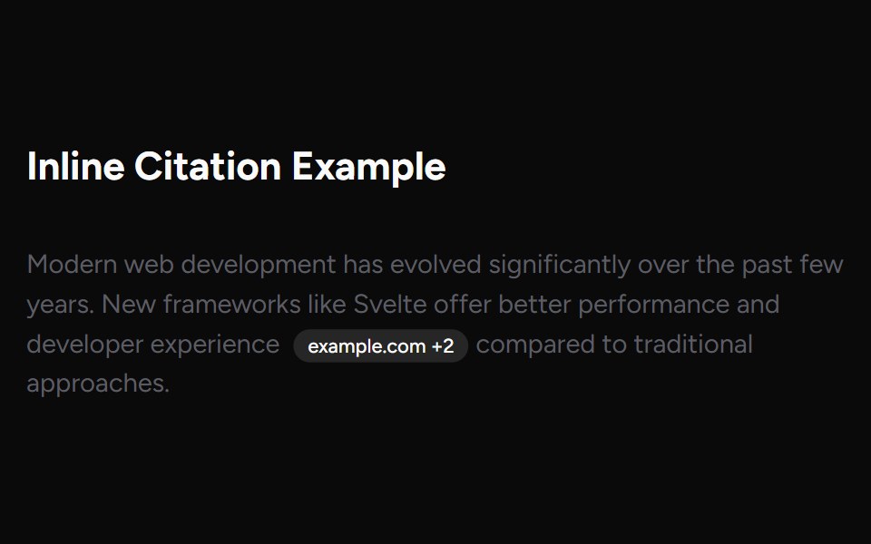 Inline CitationAI Elements (Svelte) · SvelteAn inline citation system with hover cards and carousel views for source-backed AI content.
 ChatGPT Source ChipNotra · ReactAn inline citation pill with a hover card.
 Cursor Hover CardSona UI · React
 Preview Link CardWatermelon UI · React
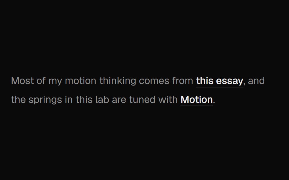 Hover Preview LinkUI Lab · ReactHover a link to get a preview card that trails your cursor and leans as it moves.
 Preview CardSpaceUI · ReactDisplays an informative preview card when users hover over a link, giving them a summary of the linked page before…
 Hover card with profile information.ReUI · ReactHover card with profile information.
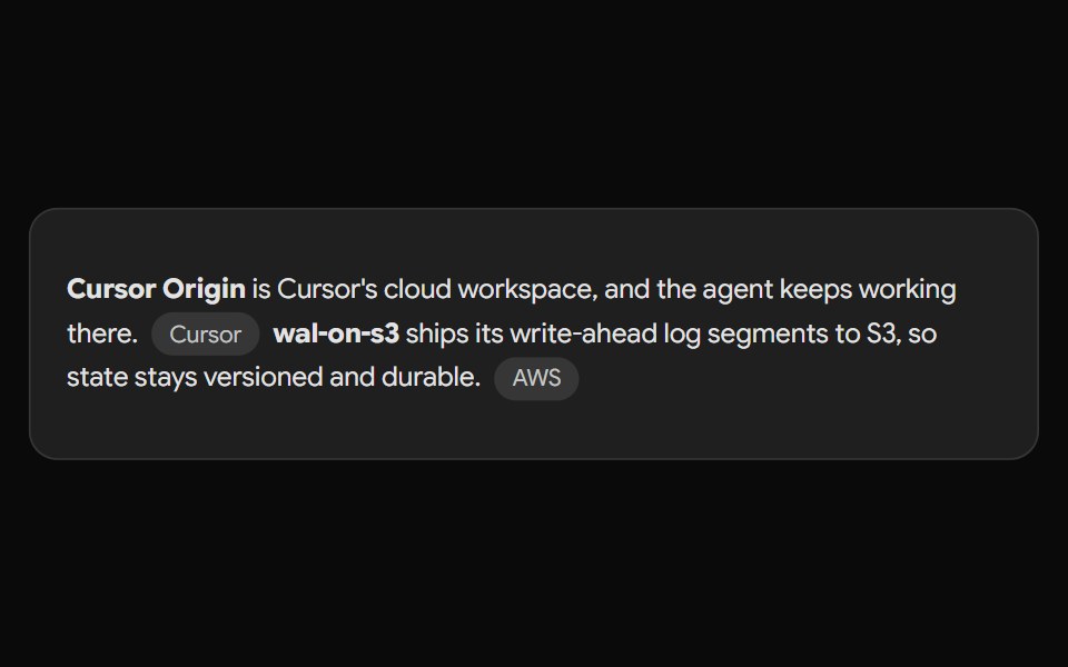 Gemini Source ChipNotra · ReactAn inline source pill with a hover card.
 Preview Link CardSpaceUI · ReactDisplays an interactive card preview of a website with its thumbnail, title, and domain name when shared or hovered.
 Hover card with iconReUI · ReactHover card with icon
 Perplexity CitationNotra · ReactAn inline source pill with favicon, label and +N count, built on shadcn Badge.
 Hover card with an image and text content.ReUI · ReactHover card with an image and text content.
 Hover card inside a dialog.ReUI · ReactHover card inside a dialog.
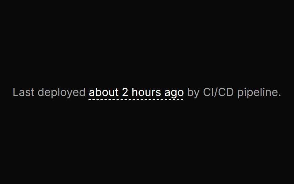 Timestamp hover card with active relative timeReUI · ReactTimestamp hover card with active relative time
 Hover card with paginated release notesReUI · ReactHover card with paginated release notes
Libraries with Tailwind CSS hover card components
Related categories
- Hover Card Components
- React Hover Card Components
- Animated Hover Card Components
- shadcn/ui Hover Card Components
- Tailwind CSS Overlay Components
- Tailwind CSS Modal Components
- Tailwind CSS Popover Components
- Tailwind CSS Tooltip Components
- Tailwind CSS Toast Components
- Tailwind CSS Drawer Components
- Tailwind CSS Alert Dialog Components
- Tailwind CSS Bottom Sheet Components
- Tailwind CSS Tour Components
- Tailwind CSS Dynamic Island Components
- Tailwind CSS Cookie Banner Components
- Tailwind CSS Lightbox Components