 Dev Design Library
Tailwind CSS Tooltip Components
Dev Design Library indexes 170 Tailwind CSS tooltip components from 49 open-source UI libraries, with the most coming from Tremor Blocks, Watermelon UI, ReUI, Origin UI and Shark UI. Each one links to its page with the source code, a live preview where available, the library license and the install command. Every library in this list styles its components with Tailwind CSS utility classes. Tooltip components belong to the Overlays group.
Showing 120 of 170, a mix from every library. Open a library to see all of its components.
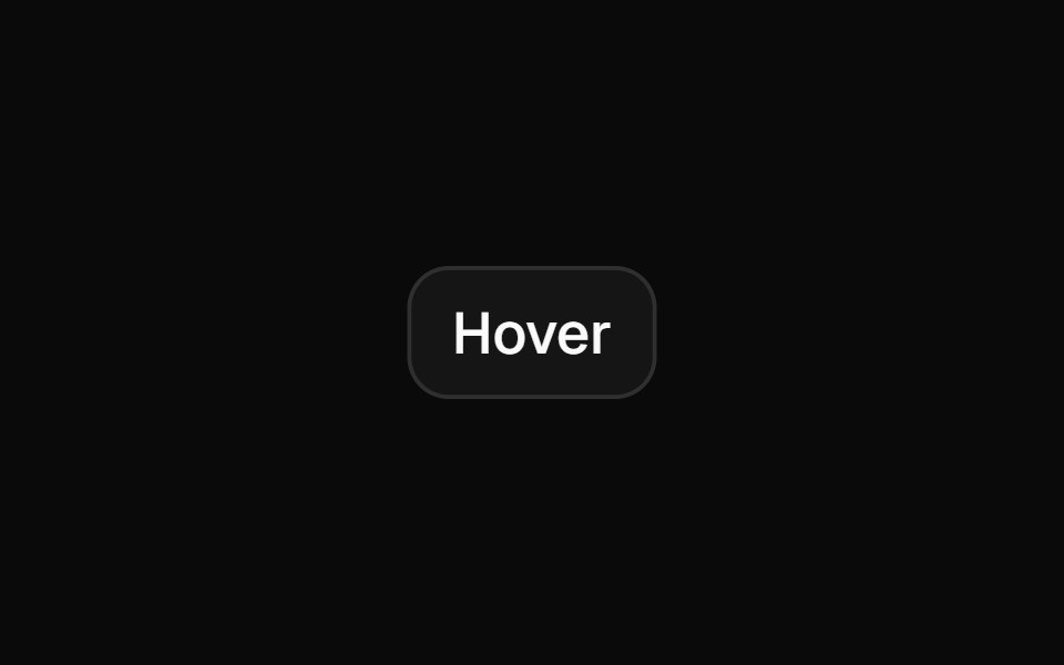 Tooltipshadcn/ui · ReactA popup that displays information related to an element when the element receives keyboard focus or the mouse hovers…
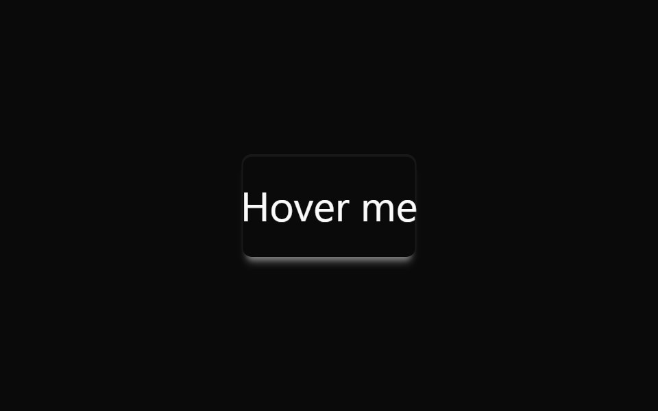 TooltipdaisyUI · CSS (Tailwind)
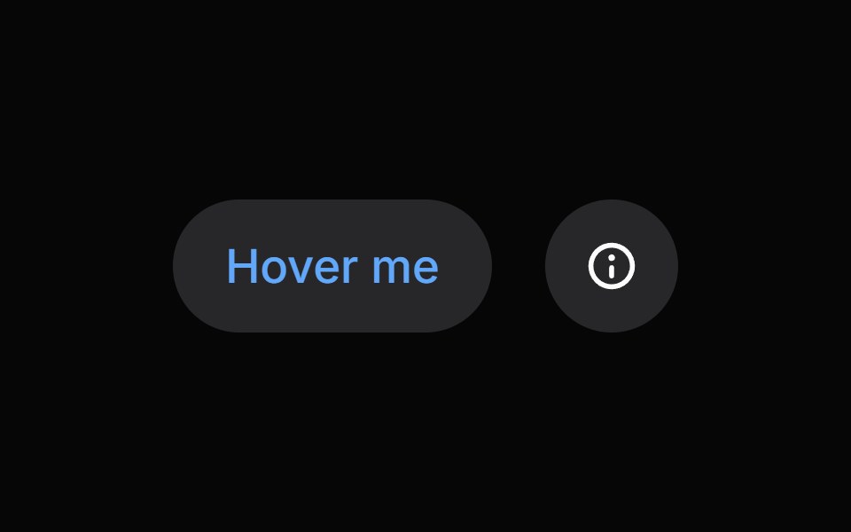 TooltipHeroUI · ReactDisplays informative text when users hover over or focus on an element
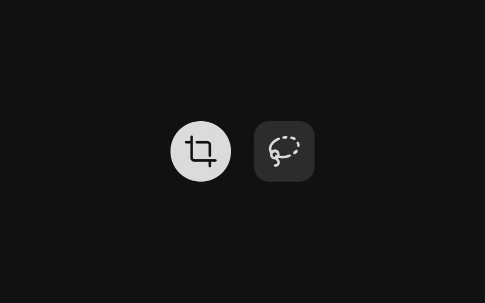 TooltipReact Spectrum · ReactDisplay container for Tooltip content. Has a directional arrow dependent on its placement.
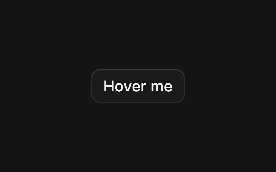 Tooltipcoss ui · ReactA popup that appears when an element is hovered or focused, showing a hint for sighted users.
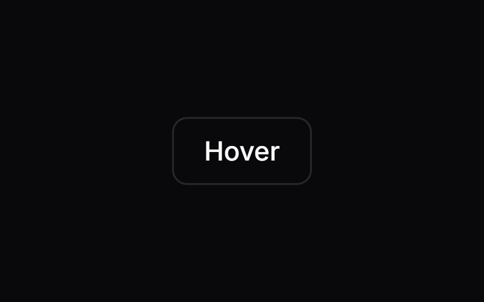 TooltipOrigin UI · ReactA popup that appears when an element is hovered or focused, showing a hint for sighted users.
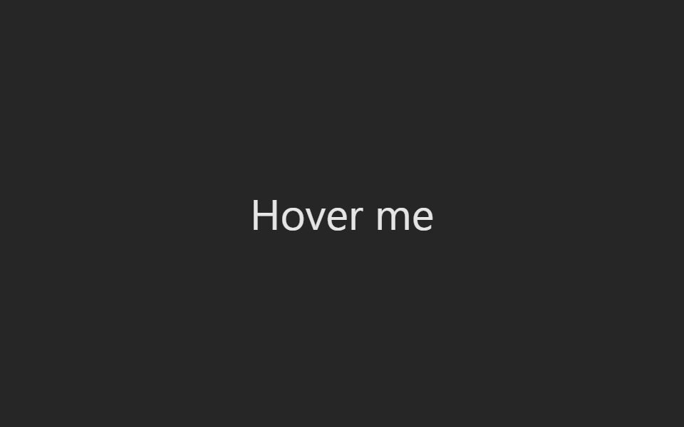 TooltipPreline UI · JavaScript (HTML + Tailwind)
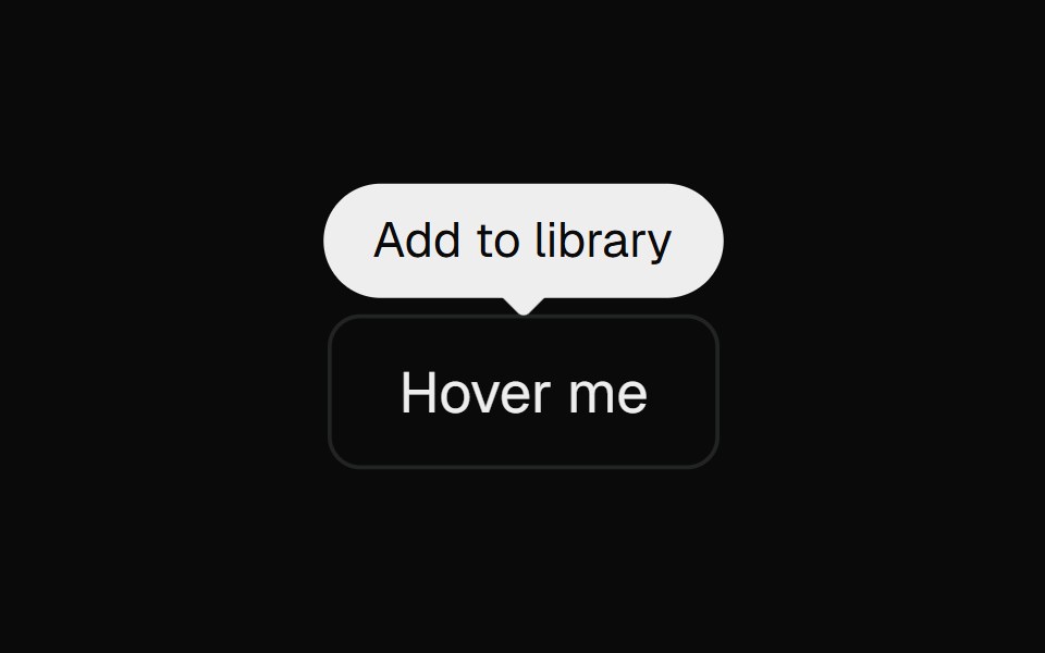 Base TooltipCult UI · ReactBase UI tooltip primitives used by Apple Pro Display XDR
 TooltipTremor · React
 Basic tooltip.ReUI · ReactBasic tooltip.
 tooltipIntent UI · Reacttooltip
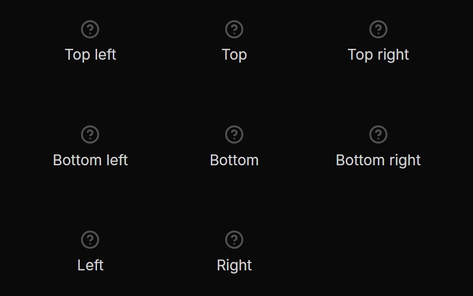 TooltipUntitled UI React · React
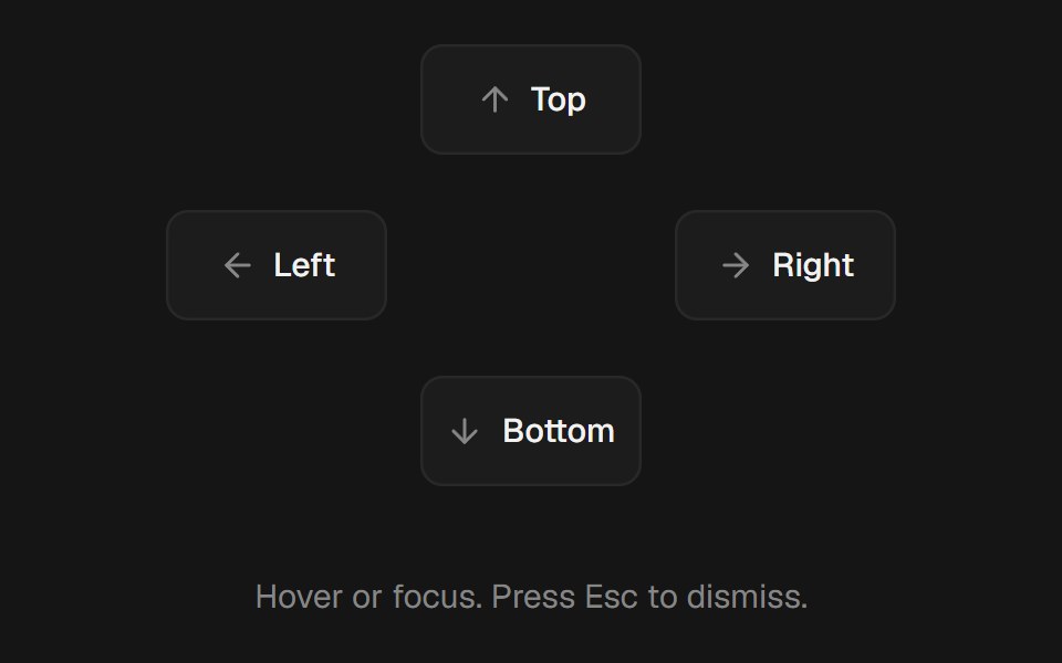 TooltipbeUI · ReactHover or focus tooltip with a subtle scale and fade, collision-aware placement, and optional cursor tracking.
 TooltipTailGrids · ReactA tooltip component.
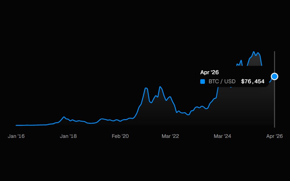 ChartSpell UI · ReactInteractive line chart with a cursor-tracked tooltip card, snap-to-point hover, and built-in X-axis labels.
 Animated TooltipVengeance UI · ReactBouncy SVG-shaped tooltips with spring animations
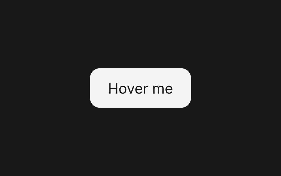 TooltipFluid Functionalism · ReactFloating tooltip with spring-based animations, configurable placement, and rich content support.
 TooltipToolcraft · React
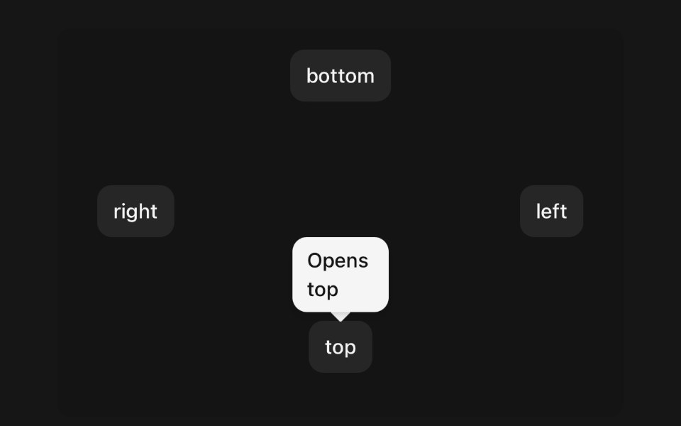 TooltipPanel UI · React NativeA small label that names the control under your finger.
 Avatar 11 - Group with TooltipsShadcn Space · ReactAvatar group with name tooltips on hover and a +N counter that opens a popover listing the remaining members and their…
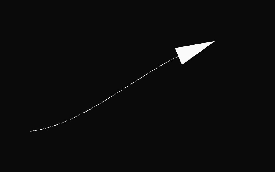 AnnotationsOpenSourceUI · React
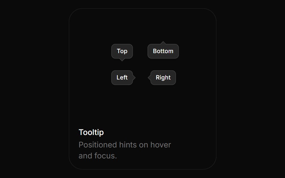 TooltipBoardUI · ReactPositioned hints on hover and focus.
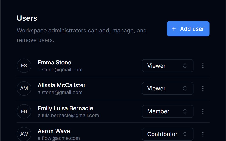 TooltipTremor Blocks · React
 TooltipShadcn Dashboard · React
 TooltipObsidianUI · React
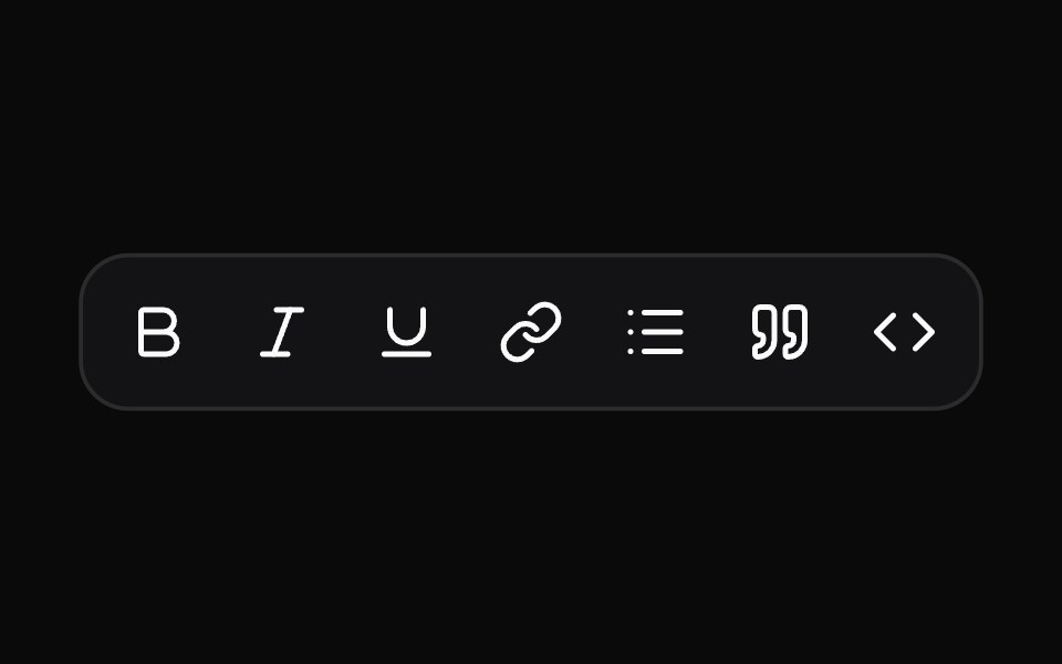 TooltipNotra · ReactA Base UI tooltip with the Depth surface of the buttons that glides between neighbouring triggers.
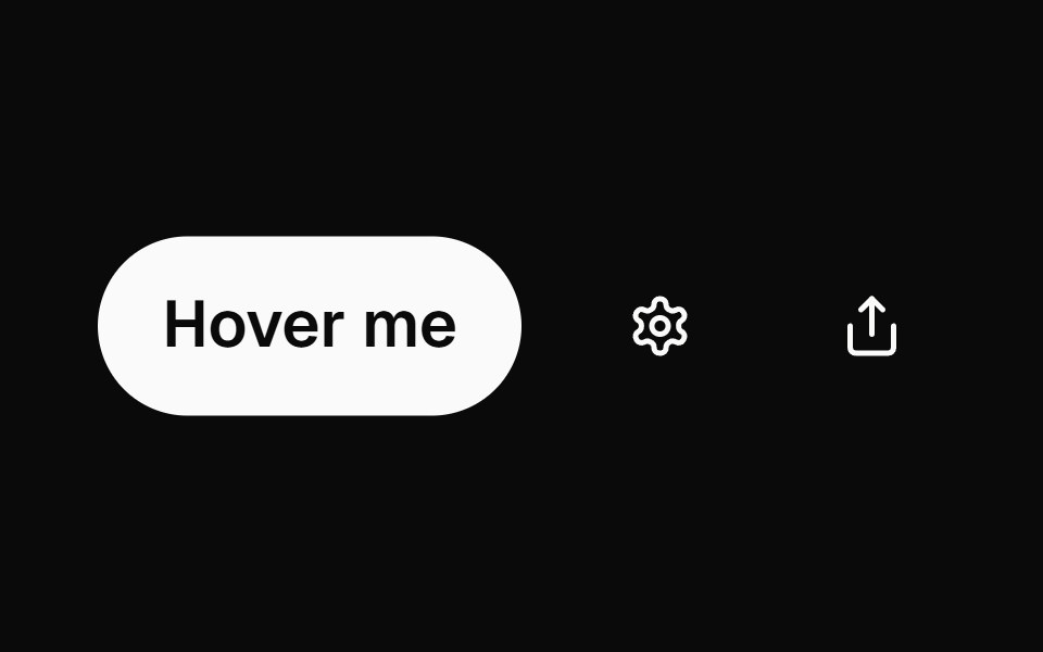 tooltipBaseLayer · ReactA tooltip displays a description of an element on hover or focus.
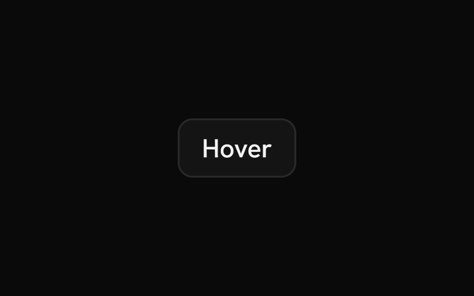 HintShark UI · ReactMinimal tooltip for showing information.
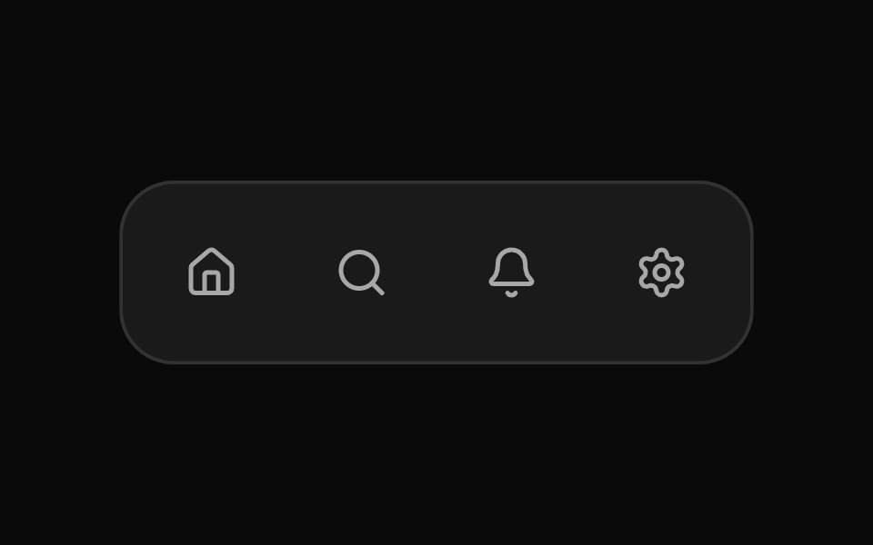 Fluid TooltipSona UI · ReactA grouped Base UI tooltip system with a deliberate first appearance and fast directional handoffs between related…
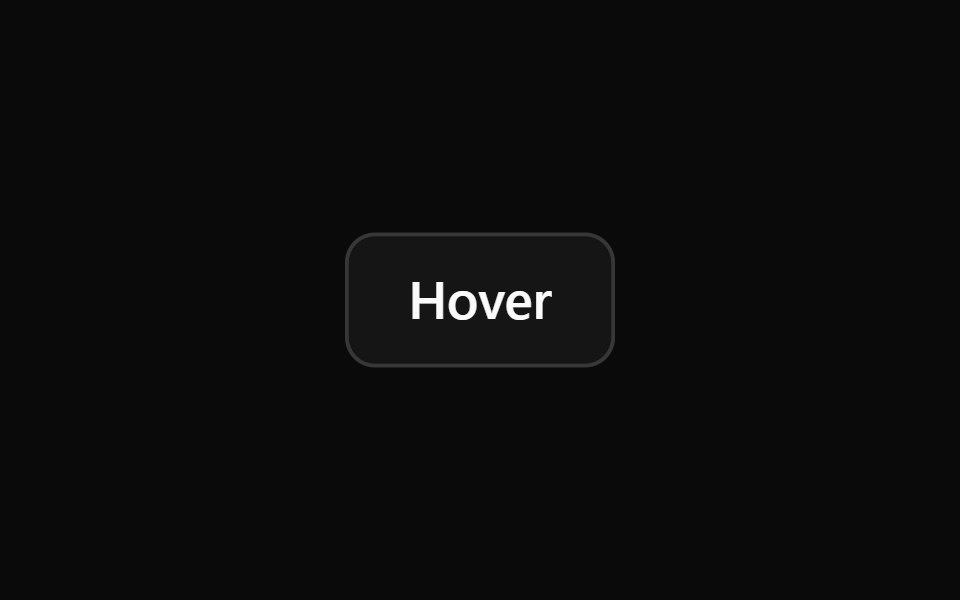 TooltipWatermelon UI · React
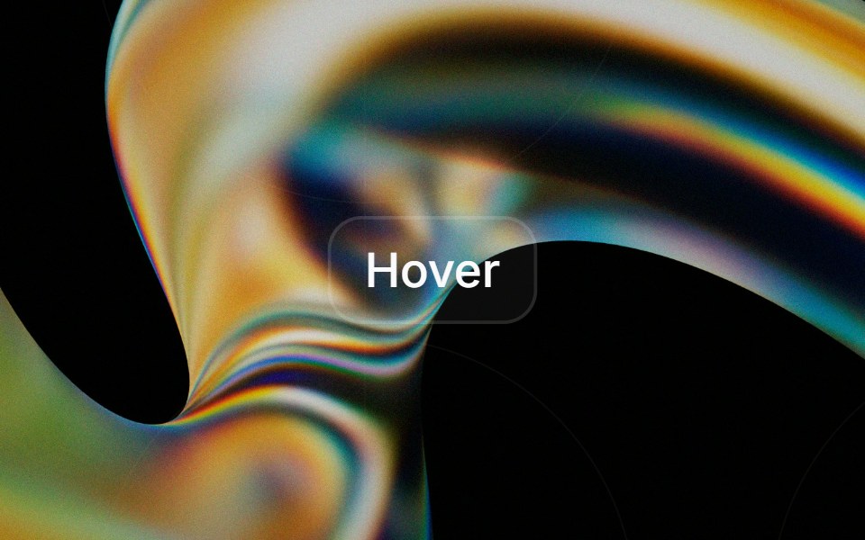 Tooltipglasscn · React
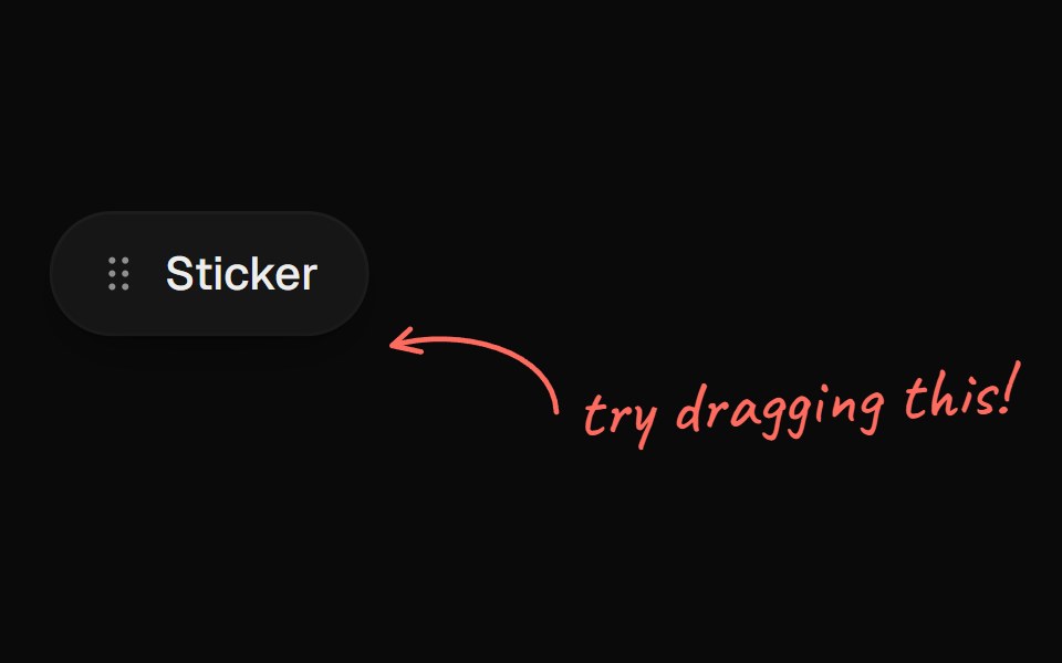 Arrow CalloutUI Lab · ReactA handwritten note whose arrow draws itself to whatever it points at.
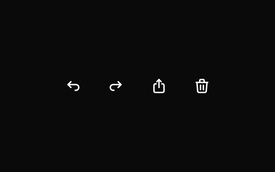 TooltipHextaUI · ReactA short hint on hover or keyboard focus that opens after a brief rest, switches instantly between neighbours and shows…
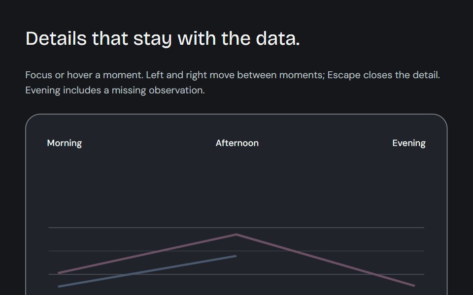 Dynamic chart tooltipCojeev UI · ReactCompare a point, read its known subtotal or rank its series. Values update in place and keep their series colours.
 BasicFLX UI · ReactDefault dark tooltip on a button.
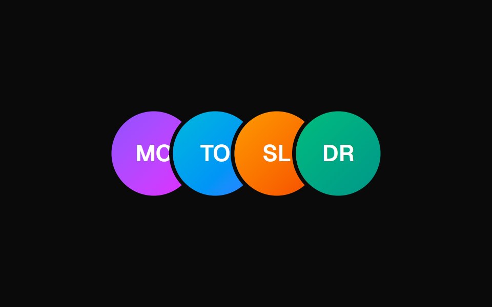 Animated TooltipVelora UI · ReactAvatar row with springy name tooltips on hover.
 End Tooltipsv-particles · Svelte
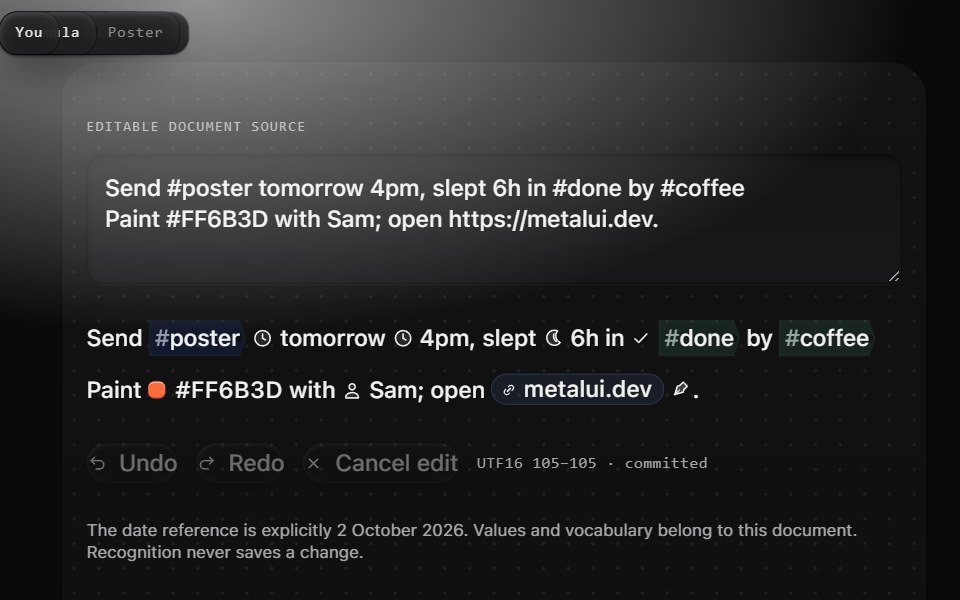 Provenance tooltipMetal UI · React + SwiftUIOne hover away from every cue: a wrapped Tooltip that says where the cue came from (Rule · date parser, Recognizer ·…
 BubbleSpaceUI · ReactRenders floating animated bubbles across the background that smoothly move and drift away when users move their mouse.
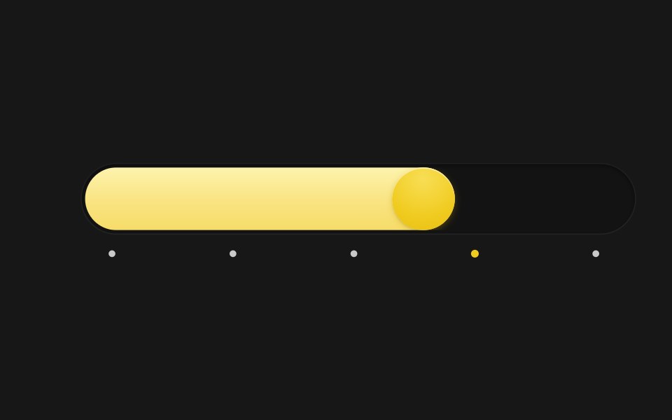 Spring SliderSkecher UI · ReactA pill-track slider with a spring-driven fill and thumb, tick markers, and a tooltip that blurs in and out.
 Base TooltipSora UI · ReactAn accessible tooltip built on Base UI with spring-based keyframe scale and translation animations powered by Motion.
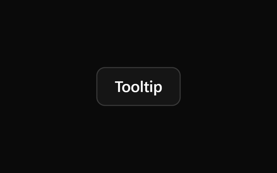 TooltipOUI · ReactReact aria components Tooltip with shadcn characteristics.
 TooltipD2Studio UI · ReactA popup that displays information related to an element when the element receives keyboard focus or the mouse hovers…
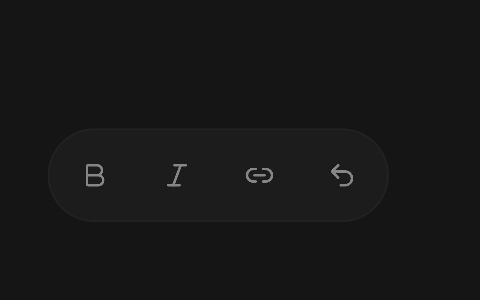 TooltipEaseUI · ReactTooltip that shows a label with its keyboard shortcut, using Command on Mac and Ctrl elsewhere. Moving along a toolbar…
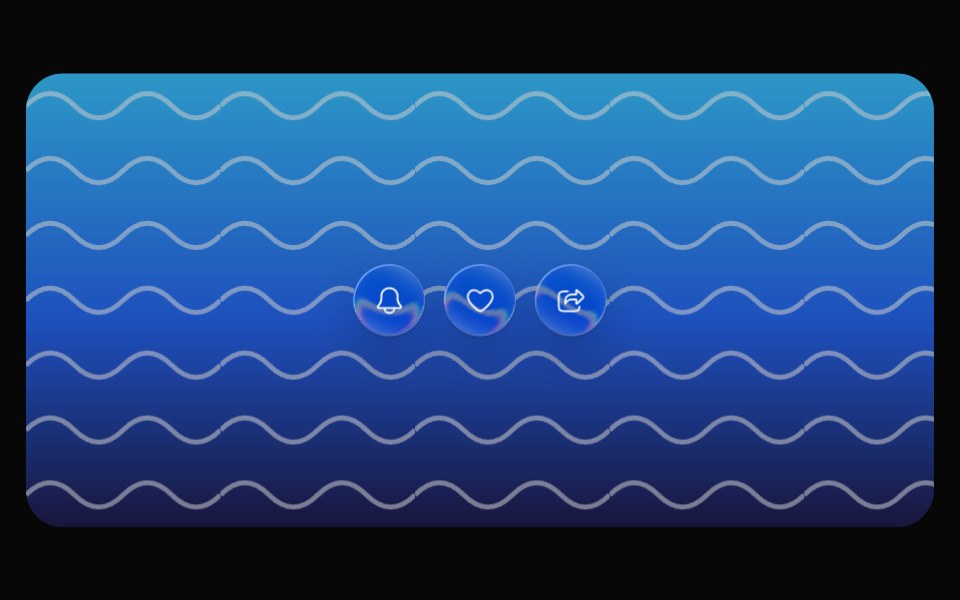 Glass TooltipOpaline · ReactCapsule tooltip that springs out of its trigger.
 TooltipFibo · ReactA short label that appears when a control is hovered or focused.
 TooltipReactFrame · ReactAn accessible tooltip with 4 placements, auto-flip near the screen edge, a hover delay, keyboard-focus support, an…
 Animated TooltipAceternity UI · React
 Tooltipark-cn · ReactA shadcn-style tooltip component built with Ark UI primitives.
 Chart Tooltip Advancedshadcn/ui · React
 Tailwind TooltipReact Spectrum · React
 Comp 354Origin UI · React
 Tooltip with feature badge and upgrade linkReUI · ReactTooltip with feature badge and upgrade link
 Tooltip SurfacebeUI · ReactPresentation only: the unanimated parent owns measurement and positioning.
 Shared Tooltip AvatarsVengeance UI · ReactAvatar stack with a sliding shared tooltip
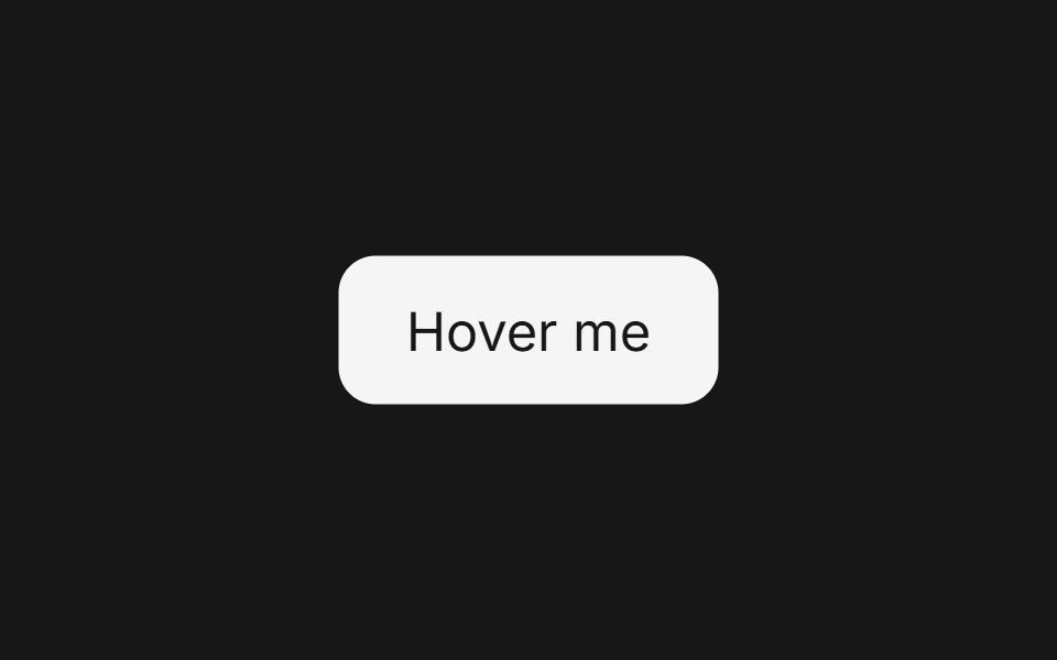 Tooltip (Base UI)Fluid Functionalism · ReactFloating tooltip with spring-based animations, configurable placement, and rich content support. Base UI flavor.
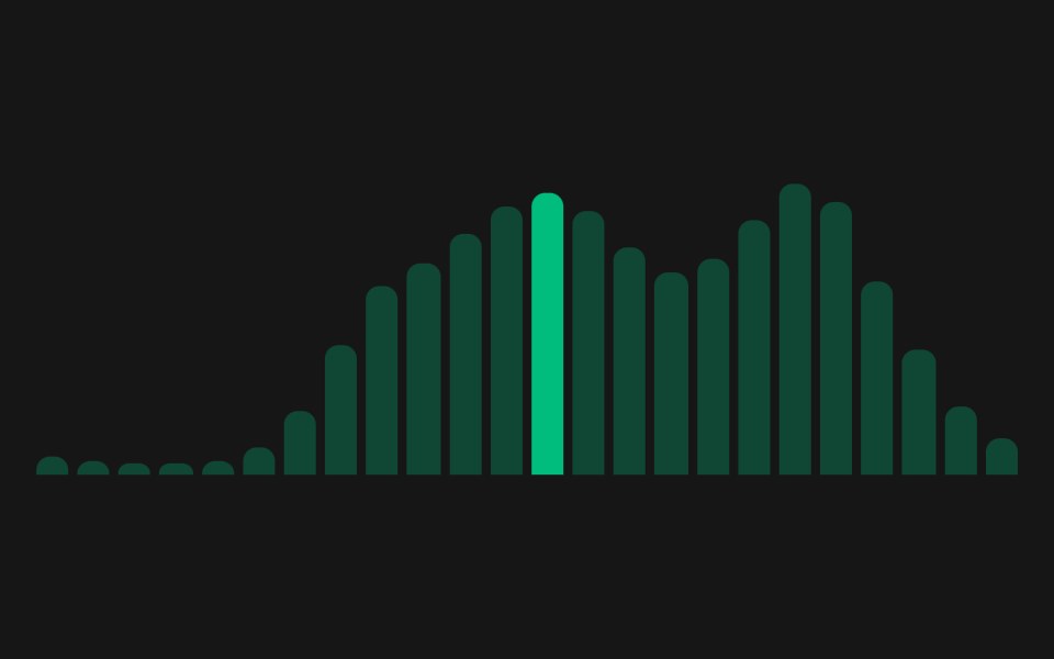 Web TooltipPanel UI · React NativeTooltips with icons, longer descriptions and keyboard access.
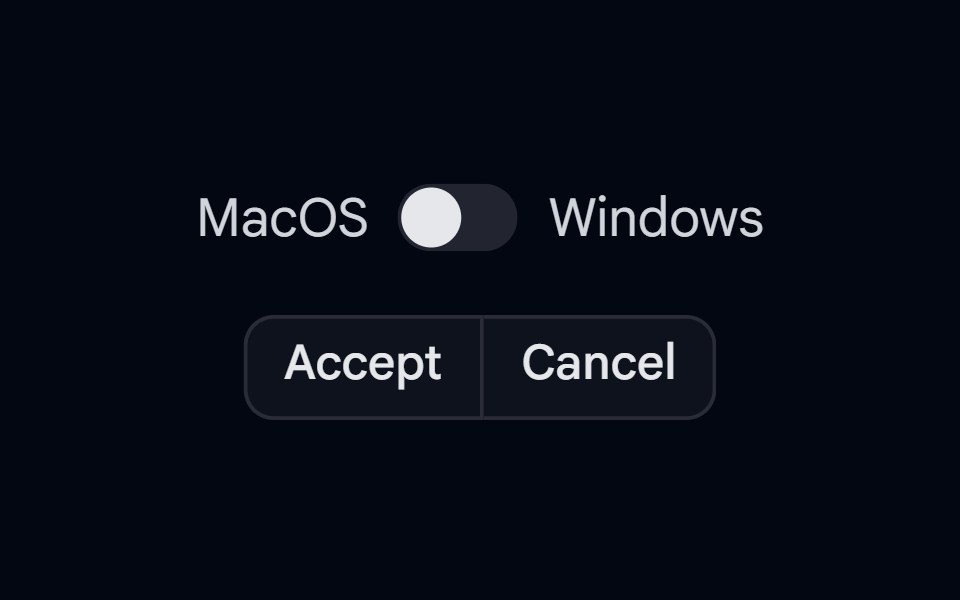 KBD 03 - KBD in TooltipShadcn Space · ReactButtonGroup with KBD shortcut hints shown inside tooltips on hover, with Mac/Windows platform switch
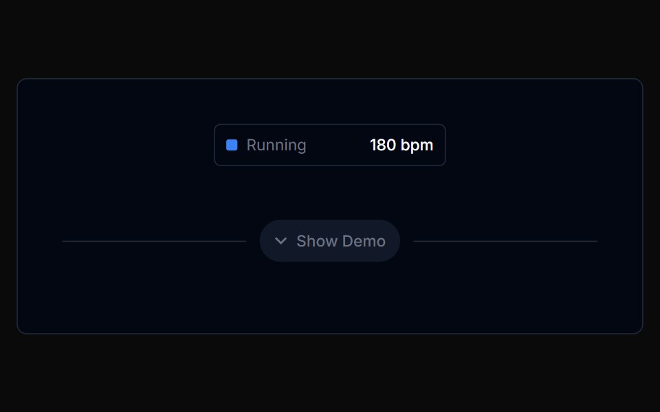 Chart Tooltip 01Tremor Blocks · React
 Toggle TooltipShark UI · ReactDisplay information on click.
 Tooltip 1Watermelon UI · React
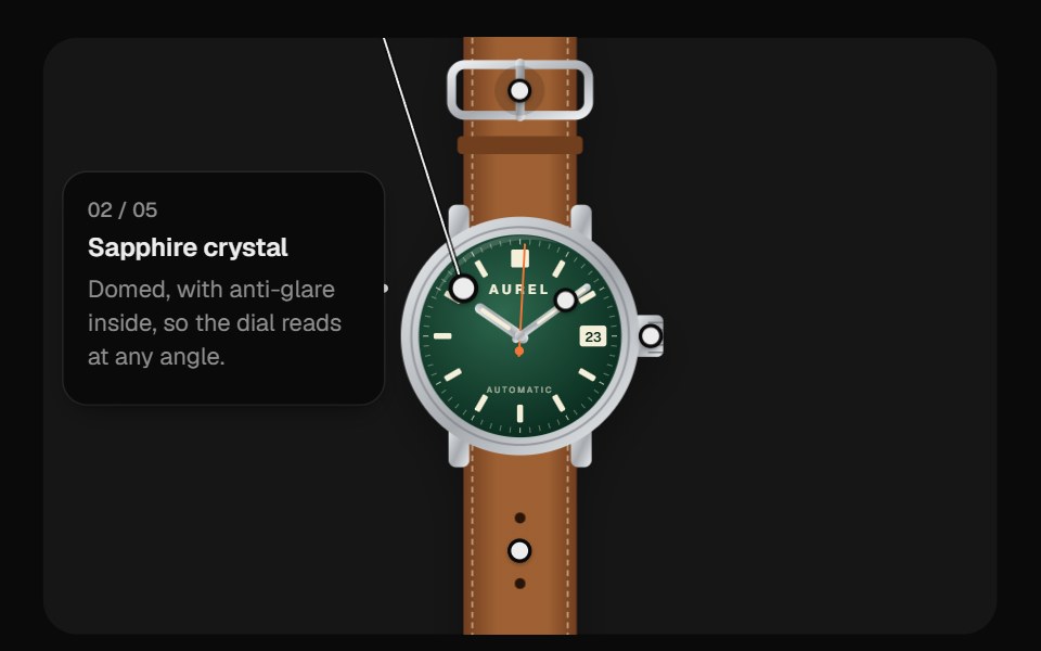 Image HotspotsUI Lab · ReactDraws a leader line to one label card that travels between a watch's features, never covering the product.
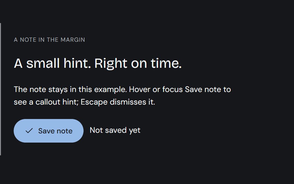 TooltipCojeev UI · ReactPrecise ink callouts, useful keyboard hints and small paper annotations. Short explanations that appear where…
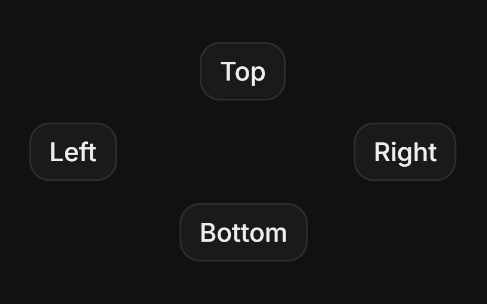 SidesFLX UI · ReactPlace the tooltip on top, right, bottom, or left.
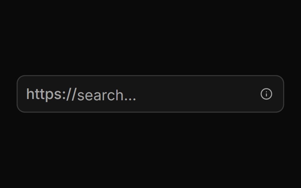 With Start Text End Tooltipsv-particles · Svelte
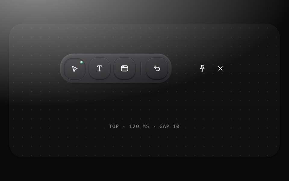 TooltipMetal UI · React + SwiftUINames an icon-only control and its key: a graphite pill chip in the label role, SELECT · V with the key dimmed, 10…
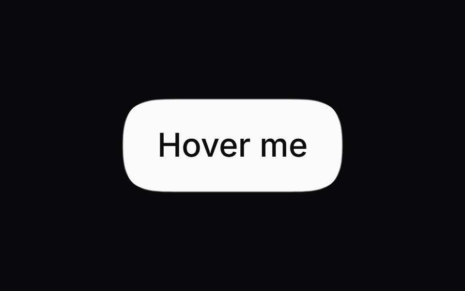 Gooey TooltipSpaceUI · ReactA tooltip bubble that mouse-follows and gooey-connects to its trigger button on hover.
 Radix TooltipSora UI · ReactAn accessible tooltip built on Radix UI with spring-based keyframe scale and translation animations powered by Motion.
 Tooltip CardAceternity UI · React
 Chart Tooltip Defaultshadcn/ui · React
 Vanilla TooltipReact Spectrum · React
 Comp 355Origin UI · React
 Tooltip with avatar and role badgeReUI · ReactTooltip with avatar and role badge
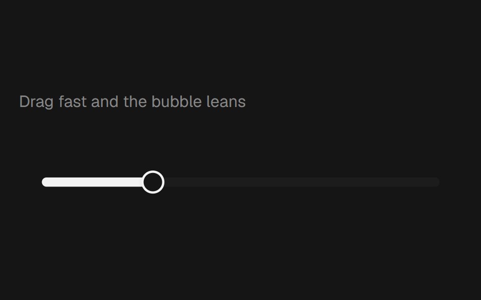 Range Slider BubblebeUI · React
 TooltipVengeance UI · React
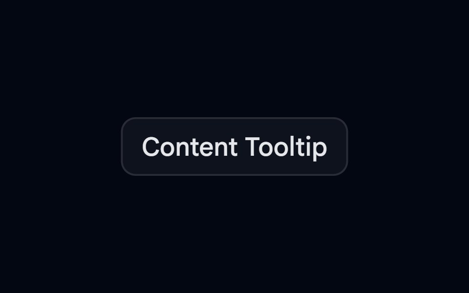 Tooltip-02 - Content TooltipShadcn Space · ReactTooltip component
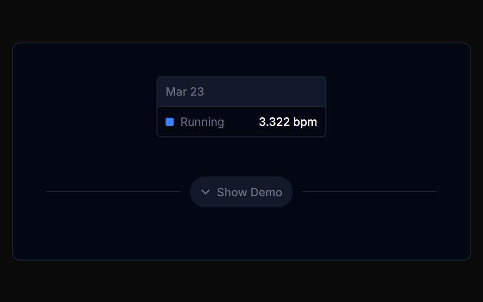 Chart Tooltip 02Tremor Blocks · React
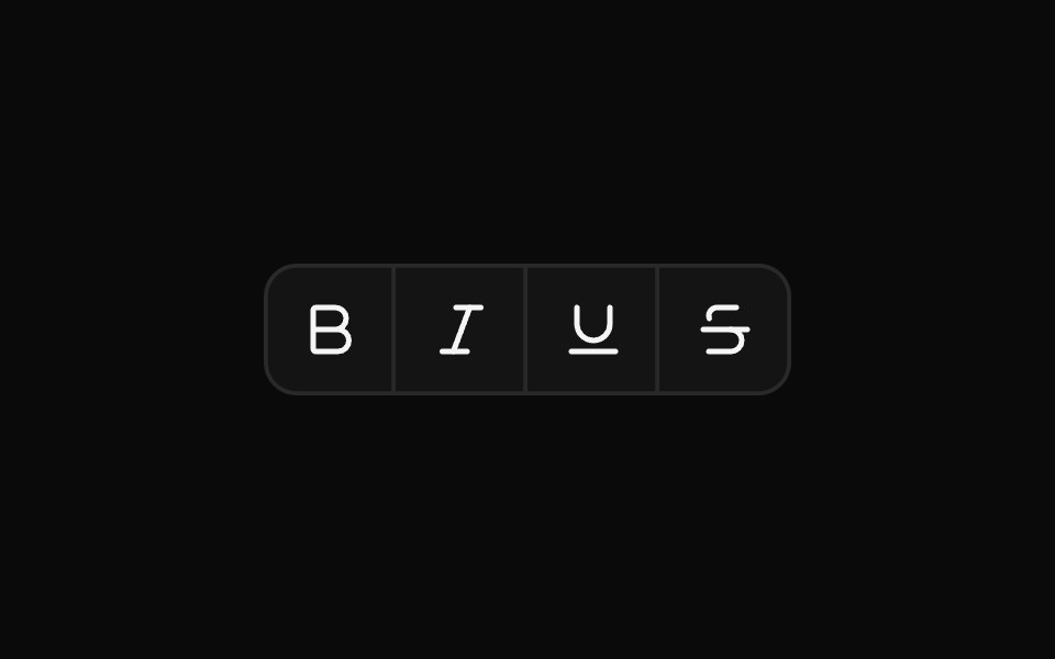 TooltipShark UI · ReactDisplay information on hover or focus.
 Tooltip 10Watermelon UI · React
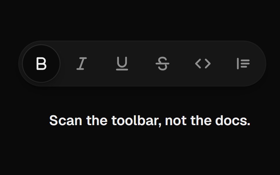 Tooltip GroupUI Lab · ReactOne tooltip slides from button to button and reshapes around each label.
 With shortcutFLX UI · ReactLabel paired with a keyboard shortcut badge inside the tooltip.
 With Start Tooltipsv-particles · Svelte
 TooltipSpaceUI · ReactDisplays a small floating text bubble when users hover over or focus on an element, explaining what that button or…
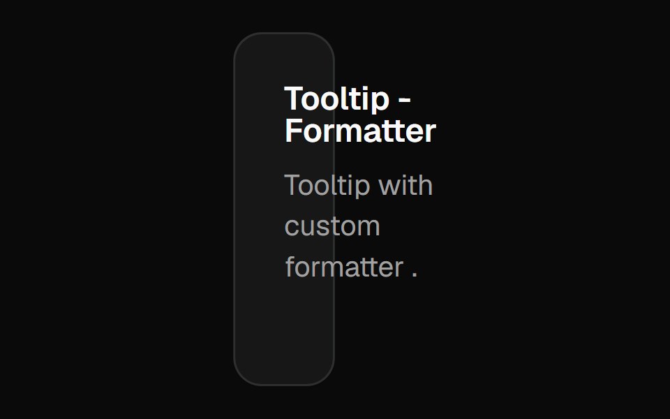 Chart Tooltip Formattershadcn/ui · React
 Comp 356Origin UI · React
 Tooltip on disabled button with wrapperReUI · ReactTooltip on disabled button with wrapper
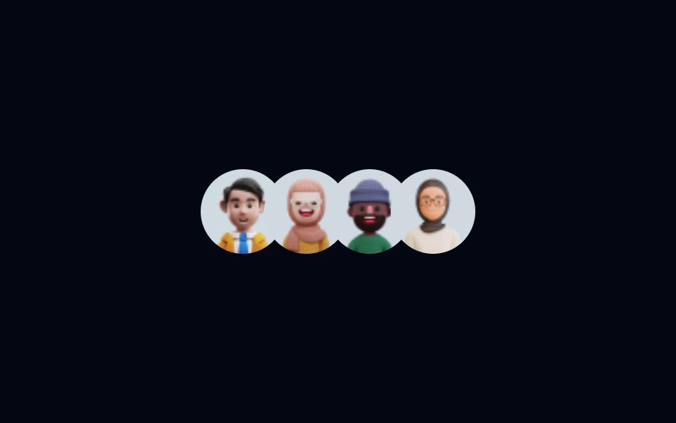 Tooltip-03 - Animated TooltipShadcn Space · ReactAnimated Tooltip component
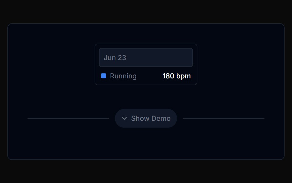 Chart Tooltip 03Tremor Blocks · React
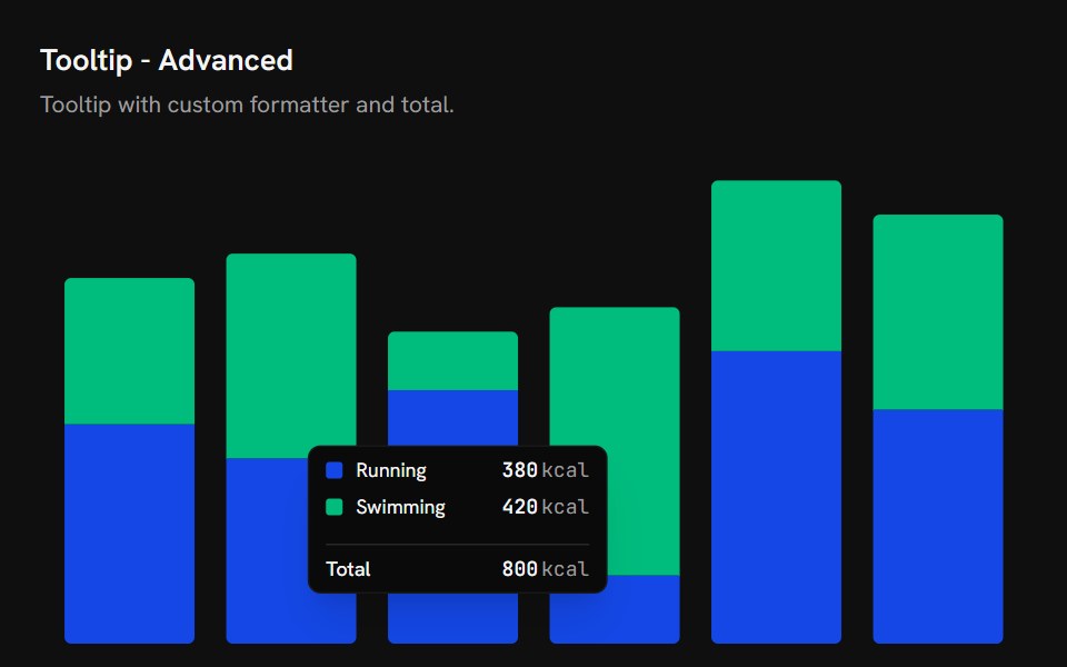 Chart Tooltip AdvancedShark UI · React
 Tooltip 11Watermelon UI · React
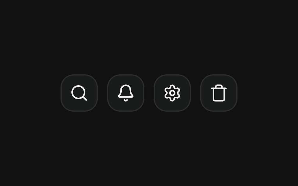 On icon buttonFLX UI · ReactLabels icon-only buttons in a toolbar.
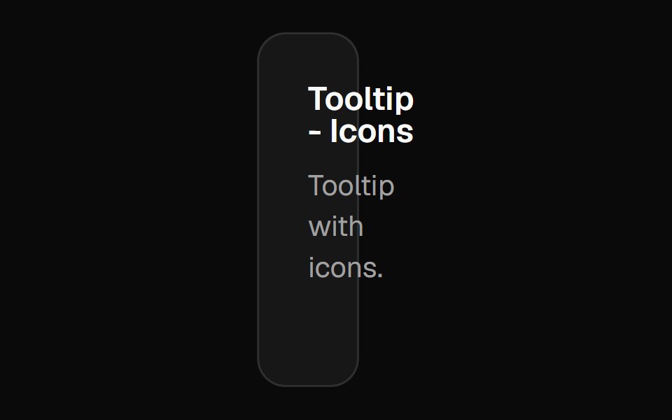 Chart Tooltip Iconsshadcn/ui · React
 Comp 357Origin UI · React
 Tooltip with online status indicatorReUI · ReactTooltip with online status indicator
 Tooltip-04 - Rounded TooltipShadcn Space · ReactTooltip component
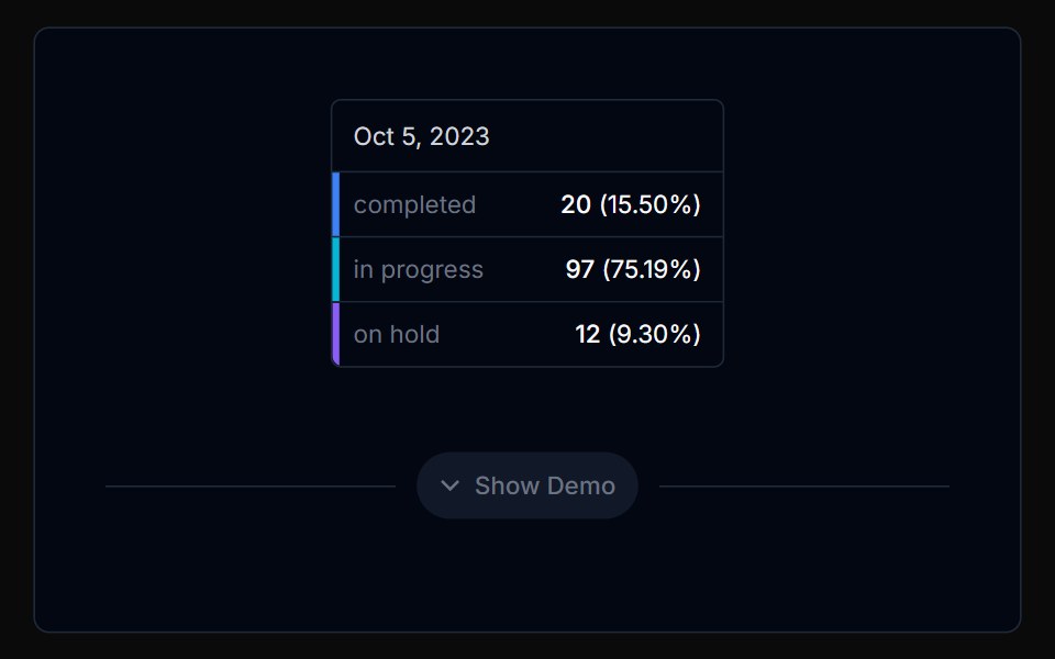 Chart Tooltip 04Tremor Blocks · React
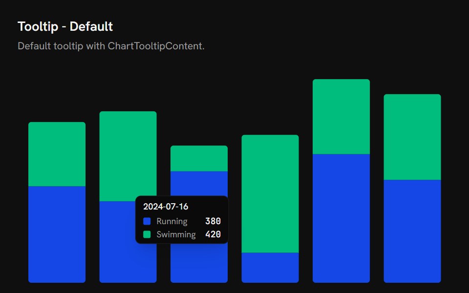 Chart Tooltip DefaultShark UI · React
 Tooltip 12Watermelon UI · React
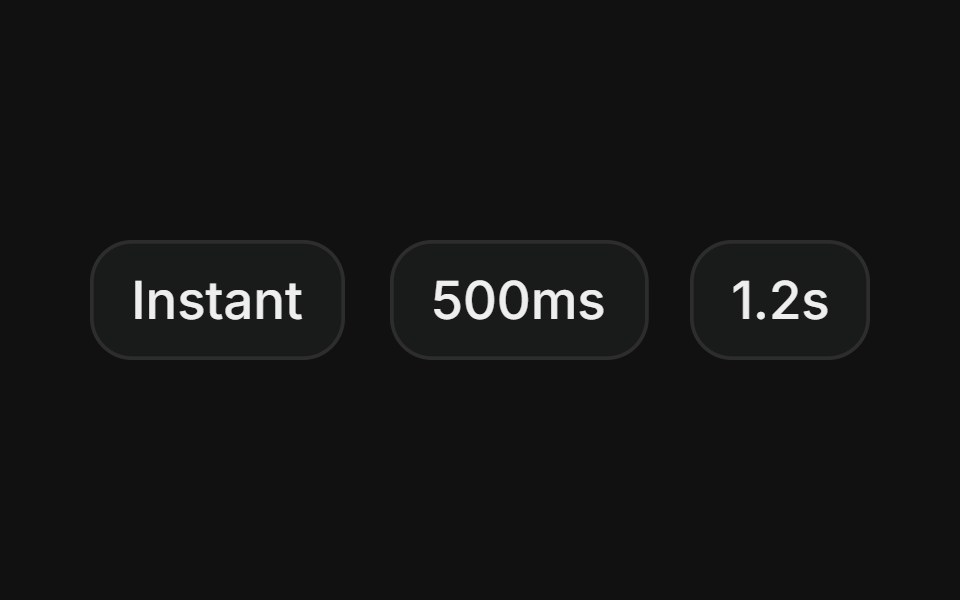 Custom delayFLX UI · ReactTooltips that open instantly, after 500ms, or after 1.2s, showing different hover delay behaviors.
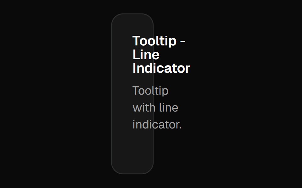 Chart Tooltip Indicator Lineshadcn/ui · React
 Comp 358Origin UI · React
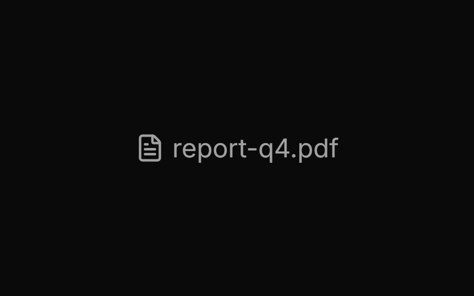 Tooltip with file info and badgesReUI · ReactTooltip with file info and badges
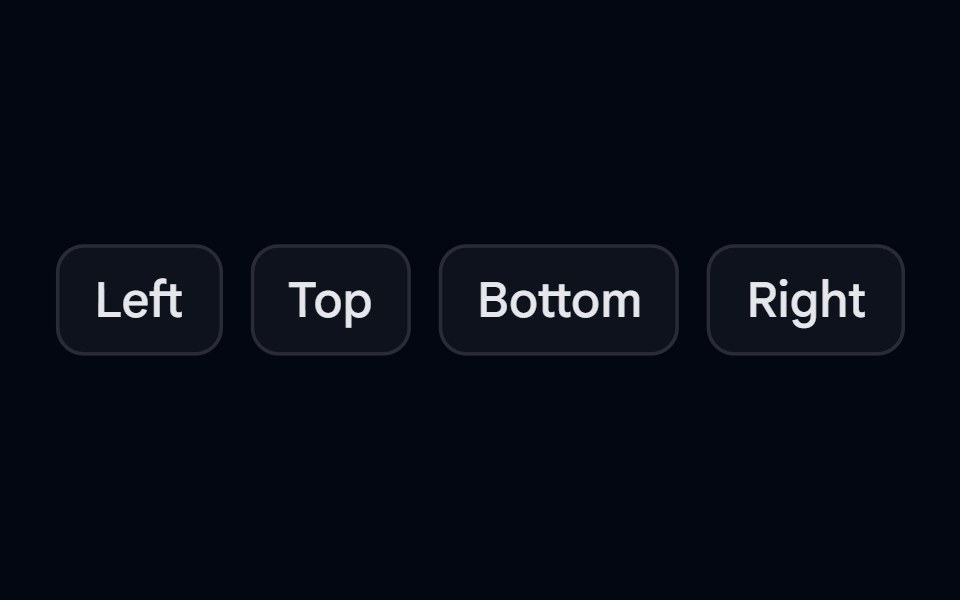 Tooltip-05 - Tooltip PositionShadcn Space · ReactTooltip component
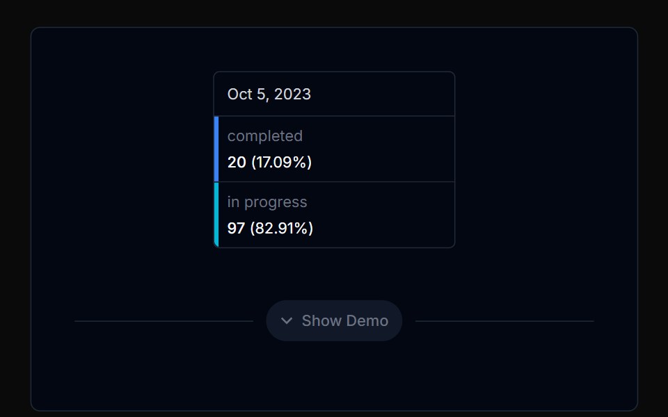 Chart Tooltip 05Tremor Blocks · React
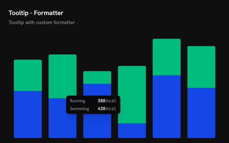 Chart Tooltip FormatterShark UI · React
 Tooltip 13Watermelon UI · React
 Rich contentFLX UI · ReactTitle plus supporting description in the content.
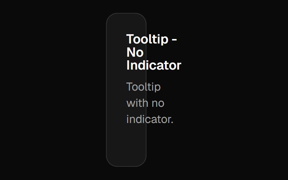 Chart Tooltip Indicator Noneshadcn/ui · React
 Comp 359Origin UI · React
 Tooltip with label badgesReUI · ReactTooltip with label badges
 Tooltip-06 - Avatar TooltipShadcn Space · ReactTooltip component
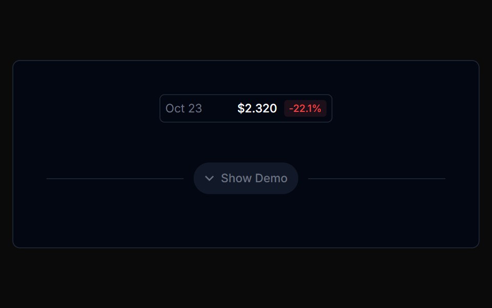 Chart Tooltip 06Tremor Blocks · React
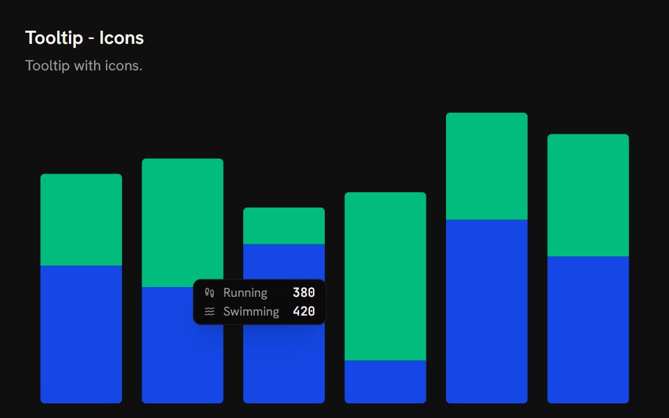 Chart Tooltip IconsShark UI · React
 Tooltip 14Watermelon UI · React
 Light via dark classFLX UI · ReactA light-colored tooltip that appears in light mode, inverted from the default dark style.
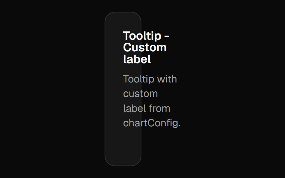 Chart Tooltip Label Customshadcn/ui · React
 Comp 360Origin UI · React
 Tooltip with action button insideReUI · ReactTooltip with action button inside
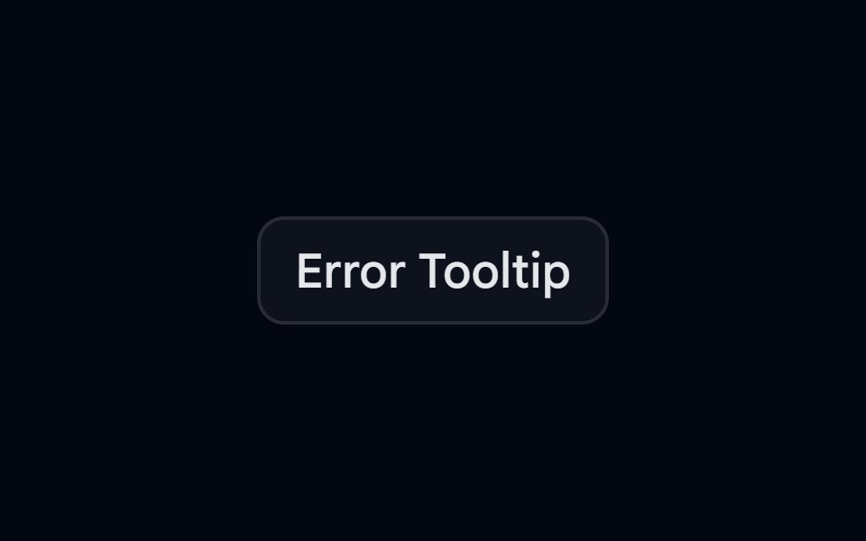 Tooltip-07 - Error TooltipShadcn Space · ReactTooltip component
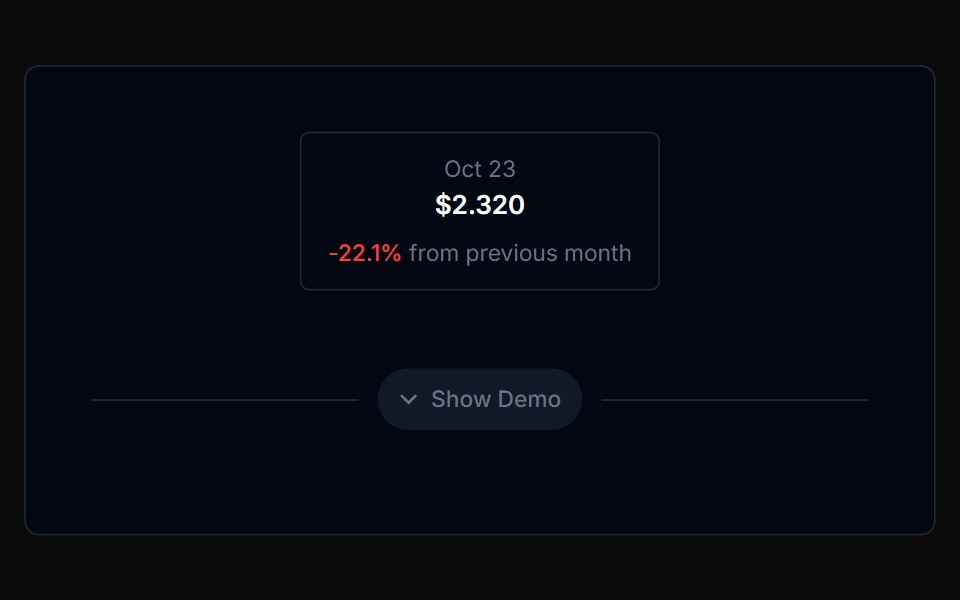 Chart Tooltip 07Tremor Blocks · React
Libraries with Tailwind CSS tooltip components
Related categories
- Tooltip Components
- React Tooltip Components
- Animated Tooltip Components
- shadcn/ui Tooltip Components
- Tailwind CSS Overlay Components
- Tailwind CSS Modal Components
- Tailwind CSS Popover Components
- Tailwind CSS Toast Components
- Tailwind CSS Drawer Components
- Tailwind CSS Alert Dialog Components
- Tailwind CSS Hover Card Components
- Tailwind CSS Bottom Sheet Components
- Tailwind CSS Tour Components
- Tailwind CSS Dynamic Island Components
- Tailwind CSS Cookie Banner Components
- Tailwind CSS Lightbox Components