Tooltip
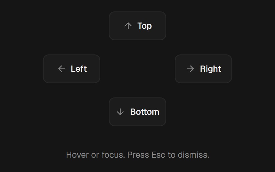
Hover or focus tooltip with a subtle scale and fade, collision-aware placement, and optional cursor tracking.
- Library
- beUI
- Framework
- React
- Type
- component
- License
- MIT
- Install
npx shadcn@latest add @beui/tooltip- Files
components/motion/tooltip/grace.tscomponents/motion/tooltip/positioner.tsxcomponents/motion/tooltip/use-position.tscomponents/motion/tooltip.tsxcomponents/motion/tooltip-surface.tsxlib/hooks/use-dismiss.tslib/hooks/use-hover-gesture.tslib/hooks/use-tap-gesture.ts
- Source
- https://github.com/starc007/ui-components
Categories
- Overlay Components
- React Overlay Components
- Tailwind CSS Overlay Components
- Animated Overlay Components
- Tooltip Components
- React Tooltip Components
- Tailwind CSS Tooltip Components
- Animated Tooltip Components