 Dev Design Library
Animated Overlay Components
Dev Design Library indexes 281 Animated overlay components from 57 open-source UI libraries, with the most coming from Watermelon UI, UI Lab, ReactFrame, Shadcn Space and Arc Library. Each one links to its page with the source code, a live preview where available, the library license and the install command. These are the overlay components tagged as animated: motion on hover, on scroll or on load, usually built with CSS transitions or Framer Motion.
Showing 120 of 281, a mix from every library. Open a library to see all of its components.
 Sonnershadcn/ui · ReactAn opinionated toast component for React.
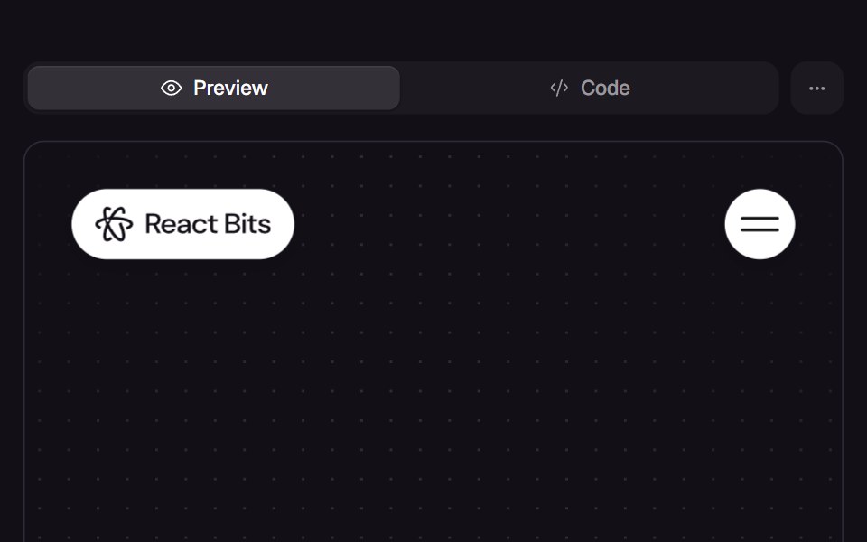 Bubble MenuReact Bits · ReactNavigation bar of round bubbles (logo and toggle) that opens a full-screen overlay of pill-shaped menu links popping in.
 ToastdaisyUI · CSS (Tailwind)
 DialogChakra UI · ReactUsed to display a dialog prompt
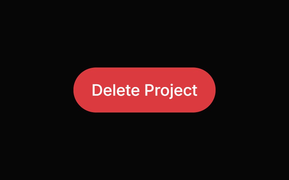 Alert DialogHeroUI · ReactModal dialog for critical confirmations requiring user attention and explicit action
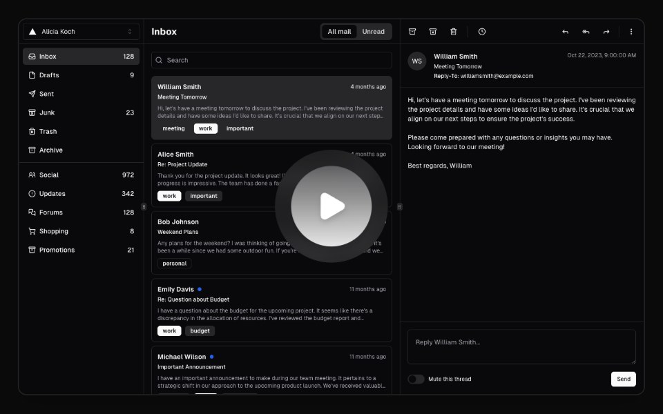 Hero Video DialogMagic UI · ReactA hero video dialog component.
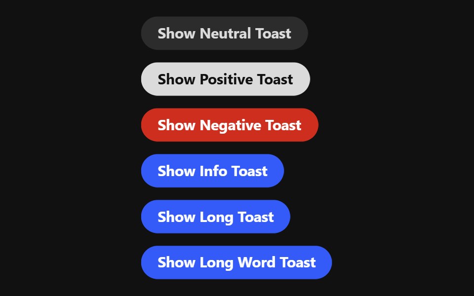 ToastReact Spectrum · React
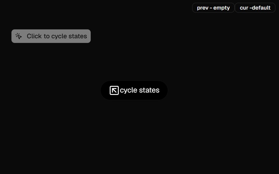 Dynamic IslandCult UI · ReactiOS-style dynamic island component with expandable content and smooth animations
 Banner Stackingtransitions.dev · HTML/CSS
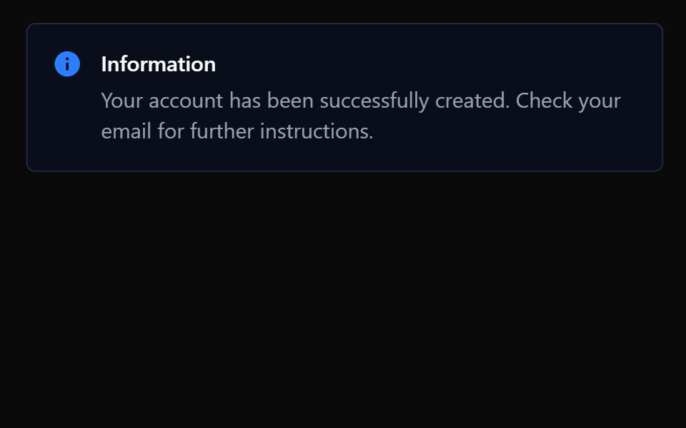 ToastTremor · React
 Card Glance PreviewAmicro Micro Transitions · ReactMicro floating glance card popup with status indicator dot.
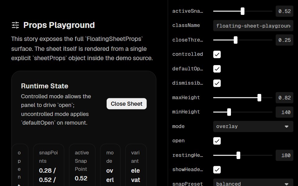 Floating SheetLobe UI · React
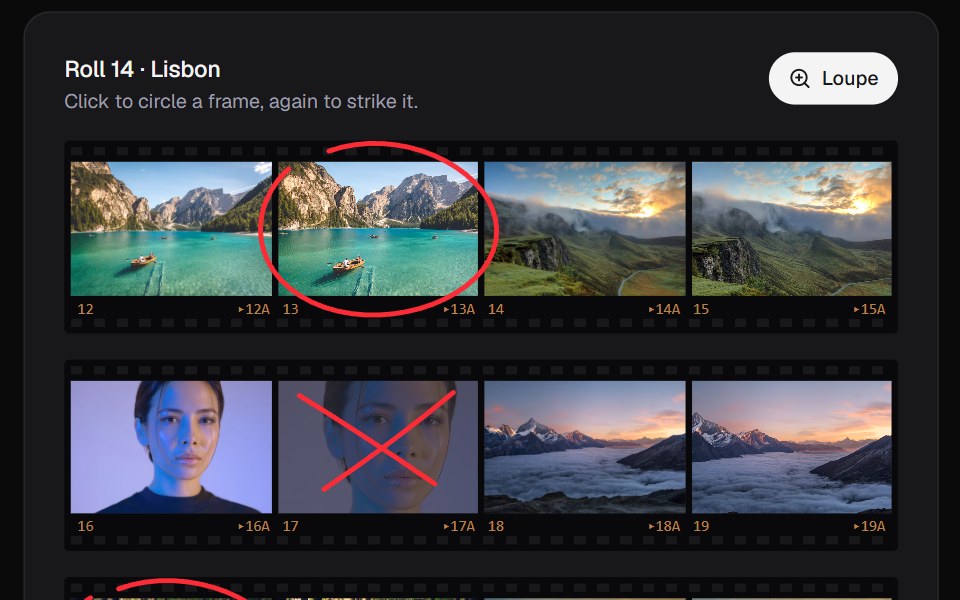 Contact SheetKokonut UI · ReactPick from a shoot the way photographers do. Circle a frame in china marker, click again to strike it, and look through…
 dialogIntent UI · Reactdialog
 Bottom SheetbeUI · ReactVaul-inspired draggable bottom sheet with snap points, inertia and glass surface.
 Family DrawerRare UI · ReactA bottom drawer with smooth, morphing transitions between stacked views, inspired by the Family app. Built on Vaul.
 Animated DrawerSpectrum UI · Reactcomponent for the Animated Drawer
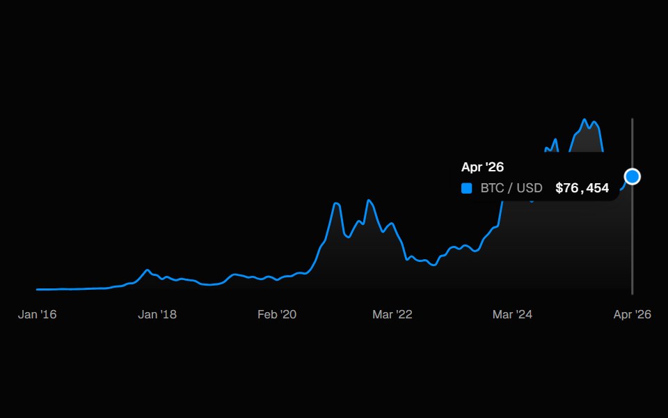 ChartSpell UI · ReactInteractive line chart with a cursor-tracked tooltip card, snap-to-point hover, and built-in X-axis labels.
 Awwwards NavVengeance UI · ReactGlass bottom nav that expands into a mega-menu
 Date PickerFluid Functionalism · ReactField or ghost trigger for a date, a range, or a date and a time: a calendar popover that opens on the selected day…
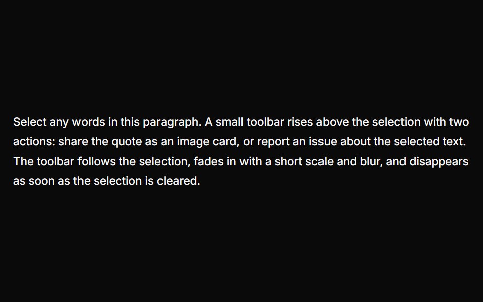 Text Selection PopoverUser Interface Wiki · React
 SonnerToolcraft · React
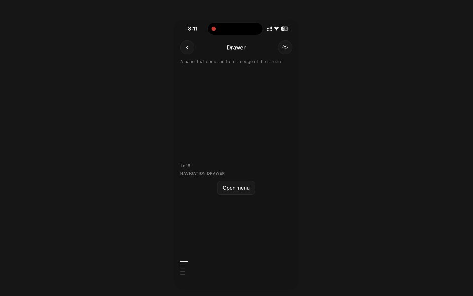 DrawerPanel UI · React NativeA panel that comes in from an edge of the screen and covers the app until dismissed.
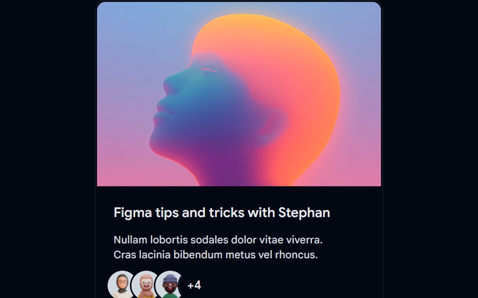 Card-01 - ArticlePreviewCardShadcn Space · ReactCard component
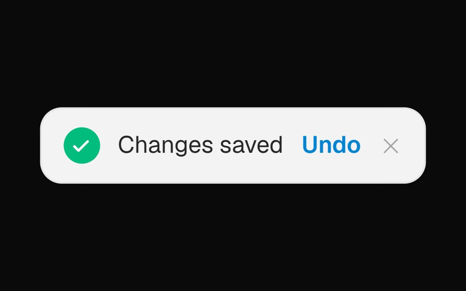 Toast Notification BannerOpenSourceUI · React
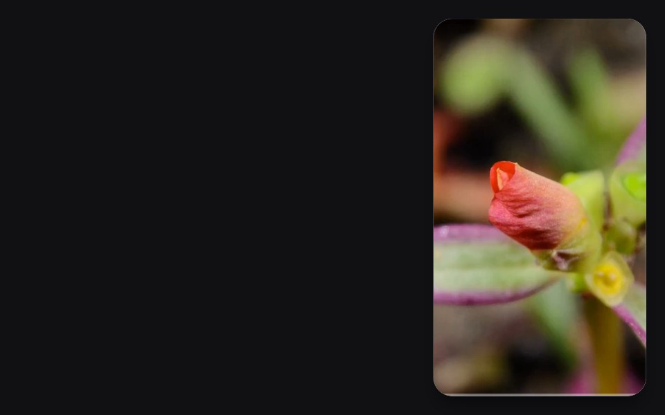 Corner Videouselayouts · ReactA compact corner video player with smooth open/close morphing, autoplay, mute, enlarge, hover controls, and video…
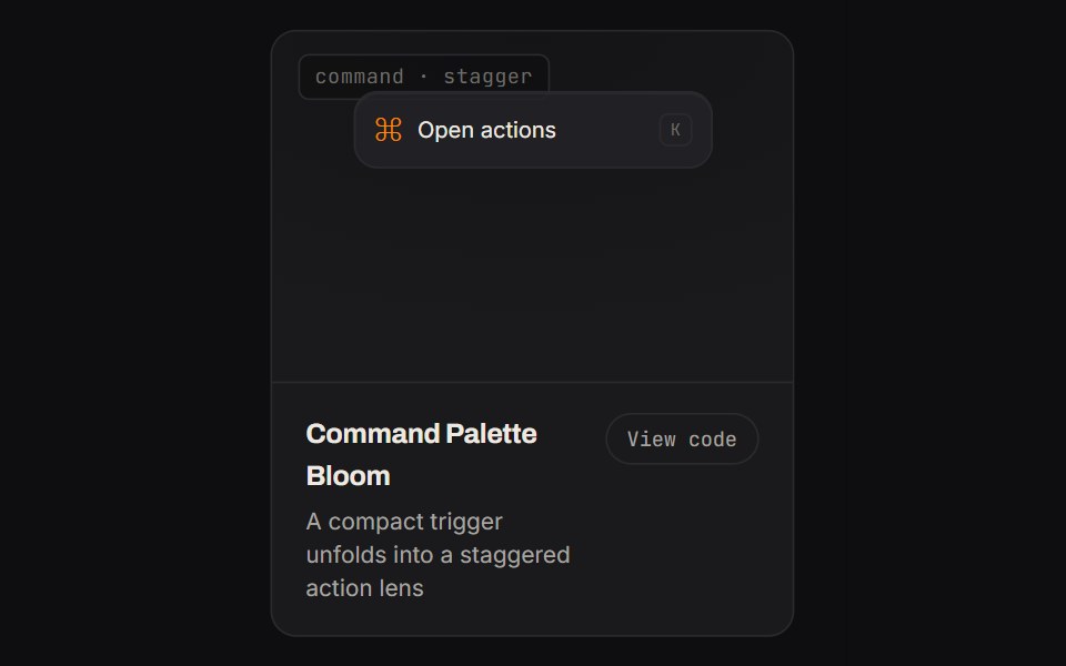 Command Palette BloomKinetics · HTML/CSSA compact trigger unfolds into a staggered action lens
- SonnerShadcn Dashboard · React
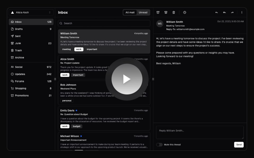 Hero Video DialogAnimations (Svelte) · SvelteA video dialog component with animated entrance effects, thumbnail support, and customizable animation styles.
 Expandable CardBadtz UI · ReactA versatile and engaging UI component that allows users to explore content in a more immersive way.
 SonnerNotra · ReactA Sonner toaster with the Depth surface of the buttons and tinted status icons.
 Image Hover RevealGreatUI · React
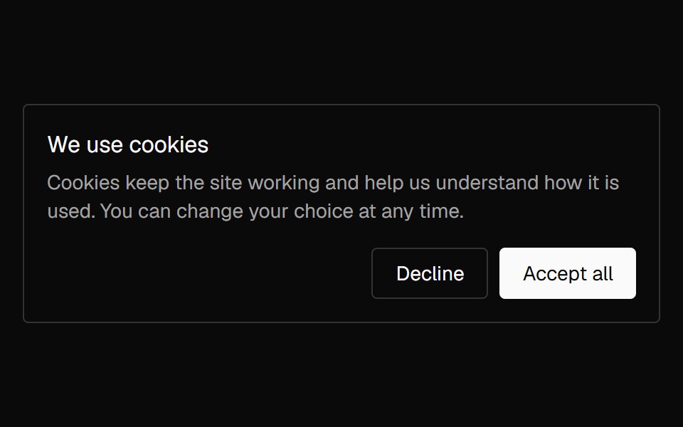 Banner CookieNexvyn UI · ReactA cookie consent card with accept and decline actions that lifts in once and lifts away on a choice.
 ToastShark UI · ReactProvides feedback on an action.
 DoubtButtonEvil Buttons · ReactAn escalating-confirmation button that makes you click through increasingly absurd, guilt-tripping prompts before the…
 Gooey Color Picker23rd.dev · ReactA floating color picker with a circular hue wheel, alpha slider, hex field, and motion-powered open/close.
 Animated DialogSona UI · ReactA composable, accessible dialog modal built on Base UI with controlled state, direction-aware enter and exit motion…
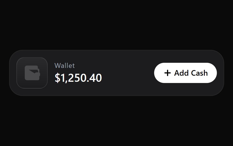 Add Cash DisclosureWatermelon UI · React
 Bottom sheetArc Library · ReactA sheet that rests at a peek or full height and follows your finger.
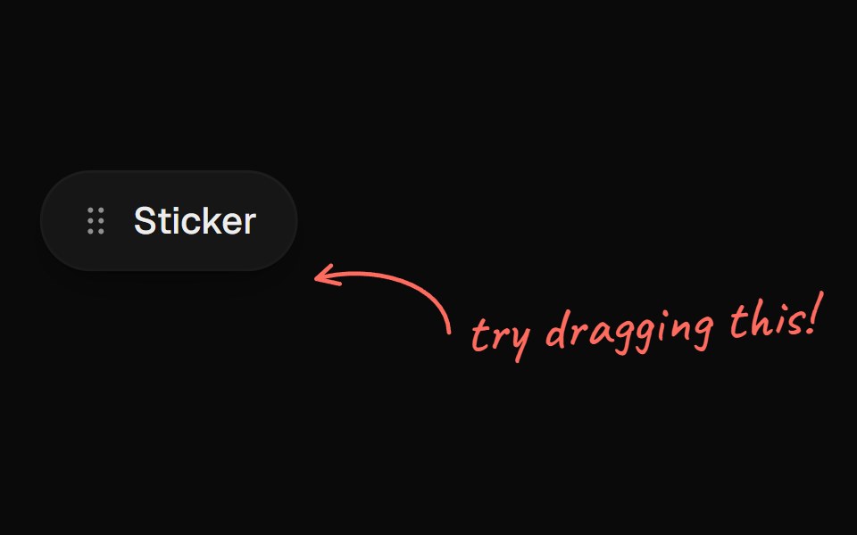 Arrow CalloutUI Lab · ReactA handwritten note whose arrow draws itself to whatever it points at.
 Alert dialogHextaUI · ReactA confirmation dialog for destructive or important actions that waits for async work, and becomes a bottom sheet on…
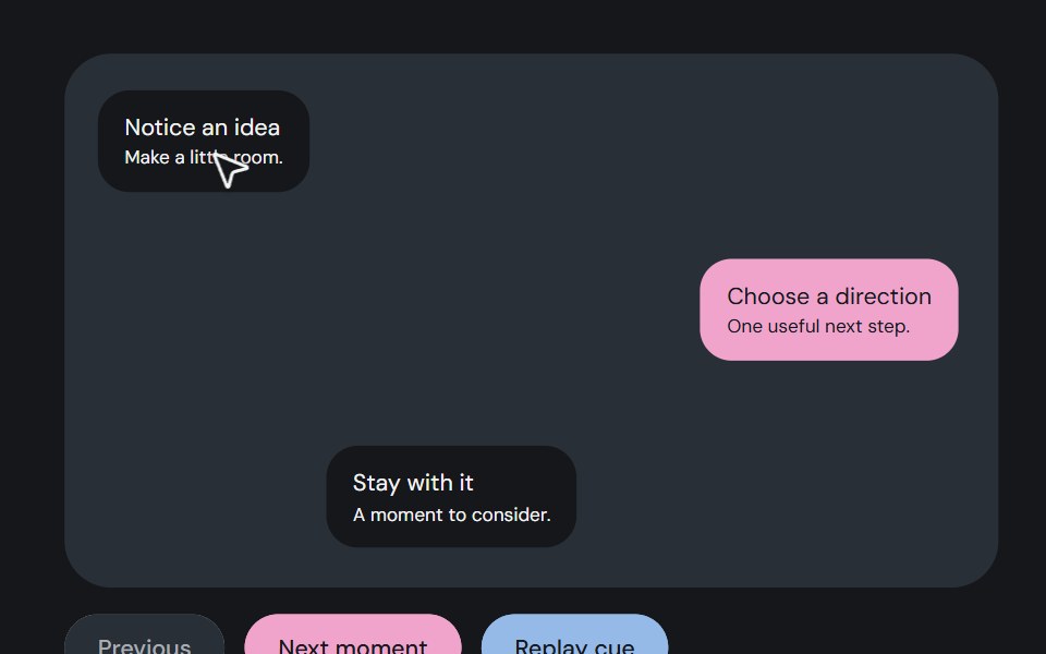 Guided pointerCojeev UI · ReactAn illustrated pointer moves between story waypoints, with a small arrival or hold cue.
 Apple Cards CarouselVelora UI · ReactSnap-scrolling row of tall image cards that morph into a full modal story.
 ToastHalaska UI · React
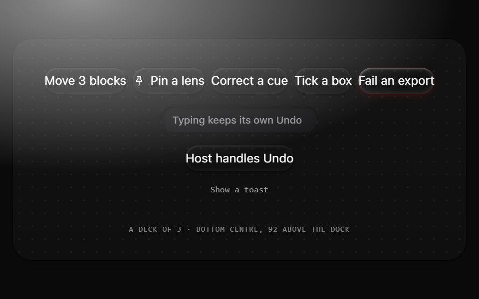 ToastMetal UI · React + SwiftUIThe result of a person's own action, with Undo: a 44 tall pill in the colorway at the bottom centre. Results stack as…
 BubbleSpaceUI · ReactRenders floating animated bubbles across the background that smoothly move and drift away when users move their mouse.
 Aria SonnerReScript shadcn · ReScript
 Cookie ConsentSkecher UI · ReactA paper-and-cobalt cookie notice with an isometric cookie break animation, confirm-and-undo controls, and…
 Base Alert DialogSora UI · ReactAn accessible alert dialog built on Base UI with smooth Motion 3D perspective entrance and exit animations…
 Coin MorphZAYX · React NativeReact Native crypto coin list (CoinMorphList) with an animated counter and a coin detail modal.
 Add Product Wizard ModalCue Foundations · React
 Liquid DialogLiquefy UI · ReactModal dialog in liquid glass style. Janela modal em estilo vidro líquido.
 SonnerD2Studio UI · ReactAn opinionated toast component for React.
 Command PaletteEaseUI · ReactCommand-K style search overlay that filters as you type, with arrow keys to move the highlight and Enter to select.
 Glass CommandOpaline · React⌘K command palette on a frosted glass sheet, powered by cmdk.
 AI Dynamic Island 01ReactFrame · ReactA Dynamic Island-style AI status pill that morphs between idle, listening, thinking, working (with an unfolding step…
 Apple Cards CarouselAceternity UI · React
 Toastshadcn/ui · ReactA succinct message that is displayed temporarily.
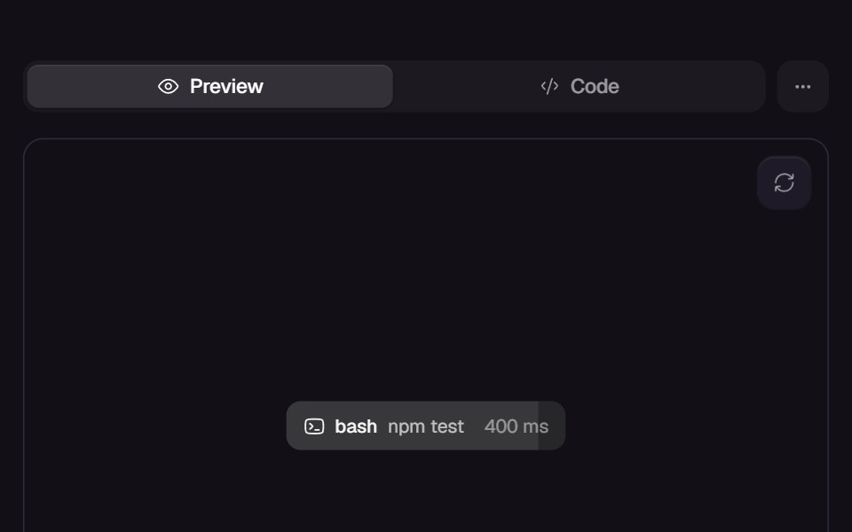 Call ChipReact Bits · ReactInline tool-call chip whose fill wipes across while a live ms counter ticks, completing with a green wash on success…
 DrawerChakra UI · ReactUsed to render a content that slides in from the side of the screen.
 DrawerHeroUI · ReactSlide-out panel for supplementary content and actions
 Tailwind ToastReact Spectrum · React
 Expandable ScreenCult UI · ReactA full-screen expandable component with morphing animations using shared layout IDs for smooth transitions
 Image Open Tilttransitions.dev · HTML/CSS
 Dynamic IslandAmicro Micro Transitions · ReactDynamic Island loading animation.
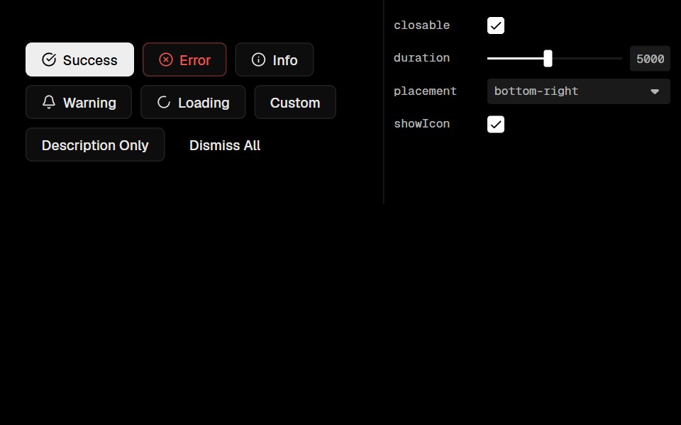 Base Ui ToastLobe UI · React
 Morph PopoverKokonut UI · ReactA button that grows into the form it opens, with its label sliding up to become the title, then shrinks into a…
 drawerIntent UI · Reactdrawer
 Center Morph ModalbeUI · ReactA composable modal whose full-size surface unfolds from its exact center toward every edge, then folds back the same…
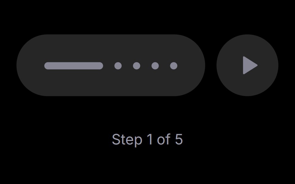 Step PlayerRare UI · ReactAn iOS-style stepped progress track with a play, pause and replay control. The active step stretches into a bar that…
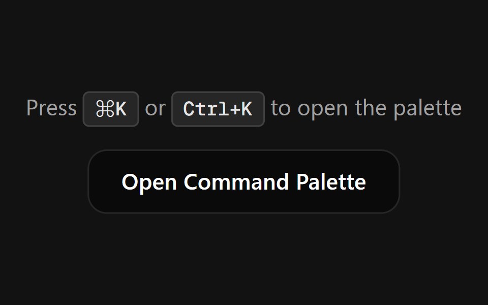 Command PaletteSpectrum UI · ReactA fully customizable, smooth-animated Command Palette (Cmd+K) component
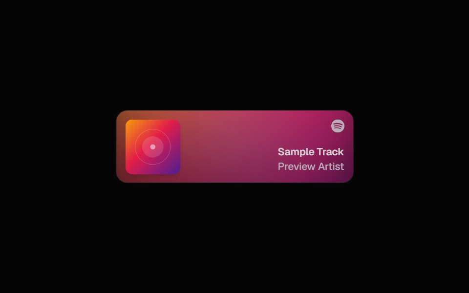 Spotify CardSpell UI · ReactDisplay Spotify tracks with album art and blurred background.
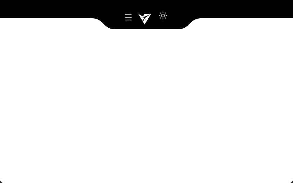 Notch NavbarVengeance UI · ReactResponsive navbar with a sleek cutout notch design
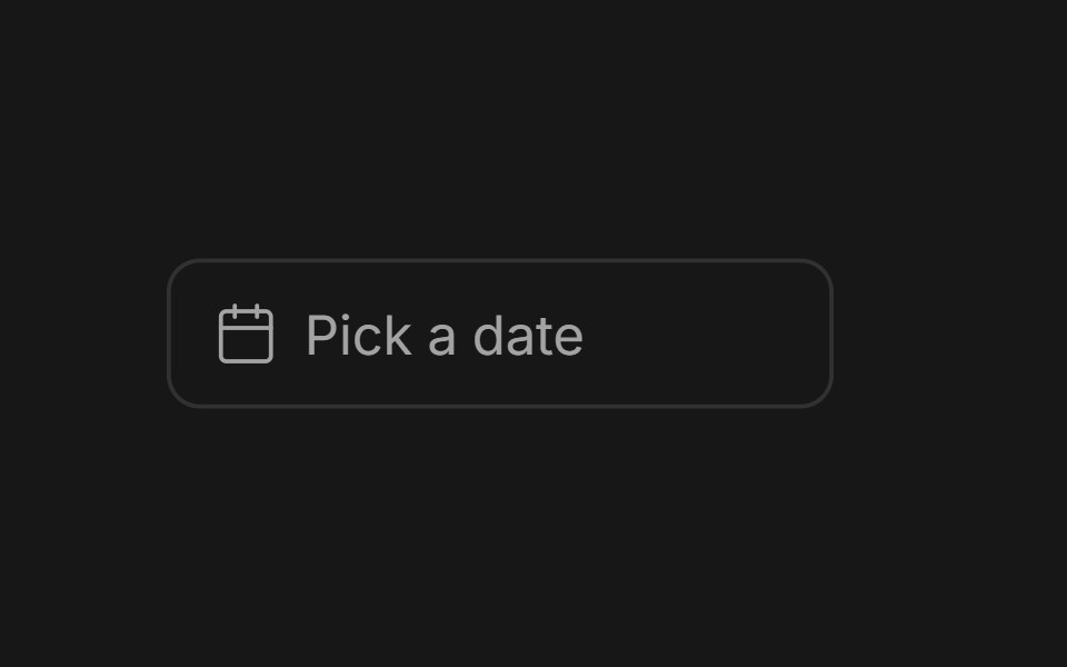 Date PickerFluid Functionalism · ReactField or ghost trigger for a date, a range, or a date and a time: a calendar popover that opens on the selected day…
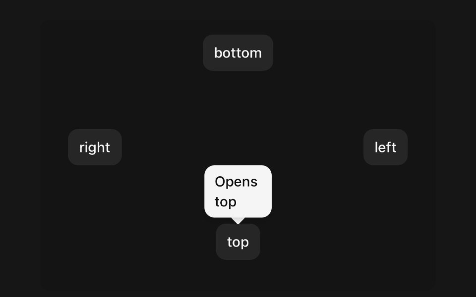 TooltipPanel UI · React NativeA small label that names the control under your finger.
 Dialog 01 - Slide from TopShadcn Space · ReactDialog that slides in from the top — ideal for notifications and alerts.
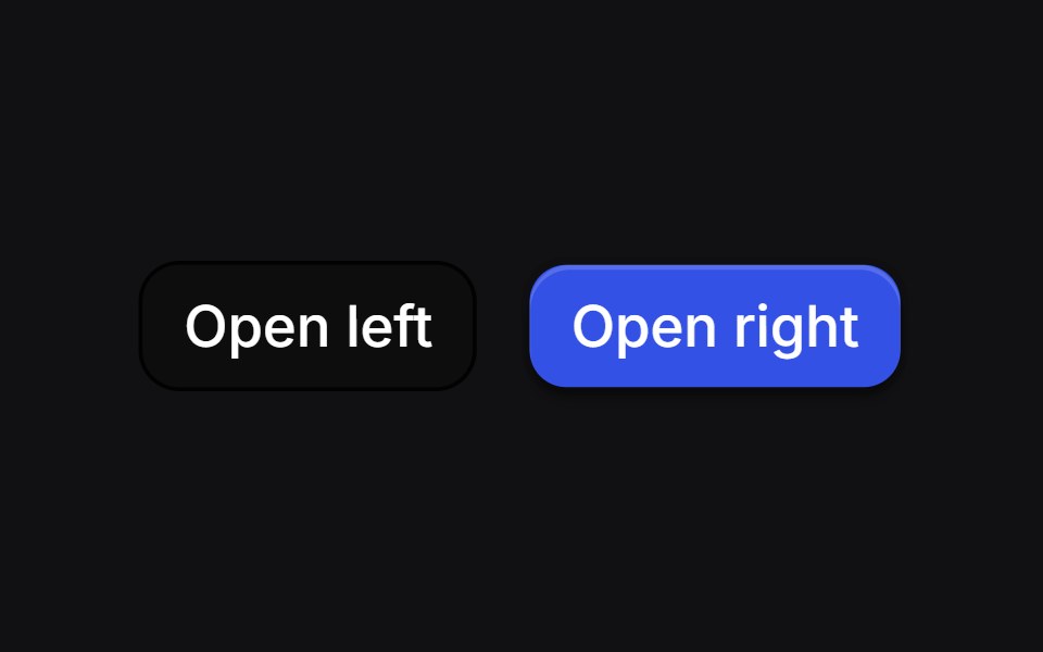 Curve Draweruselayouts · ReactSide drawers whose inner edge starts as a bulge and morphs into a straight line as the panel settles.
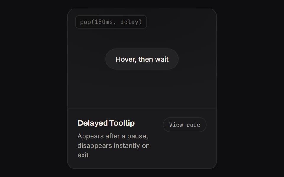 Delayed TooltipKinetics · HTML/CSSAppears after a pause, disappears instantly on exit
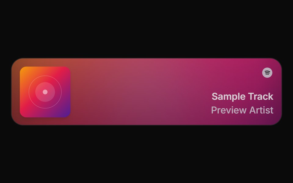 Spell Spotify CardAnimations (Svelte) · Svelte
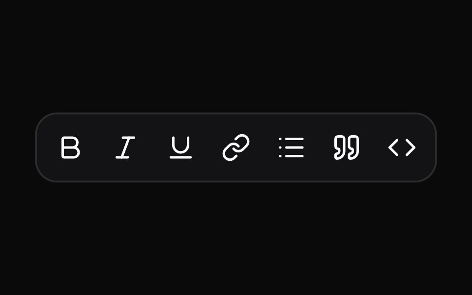 TooltipNotra · ReactA Base UI tooltip with the Depth surface of the buttons that glides between neighbouring triggers.
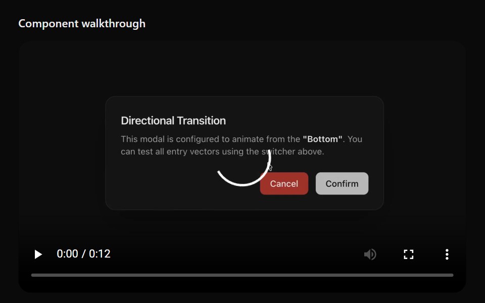 Floating ViewerSona UI · ReactAn in-page media surface that automatically or manually detaches, stays within viewport bounds, snaps to a corner, and…
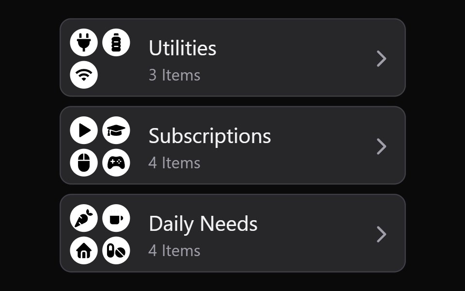 Collection Grid DisclosureWatermelon UI · React
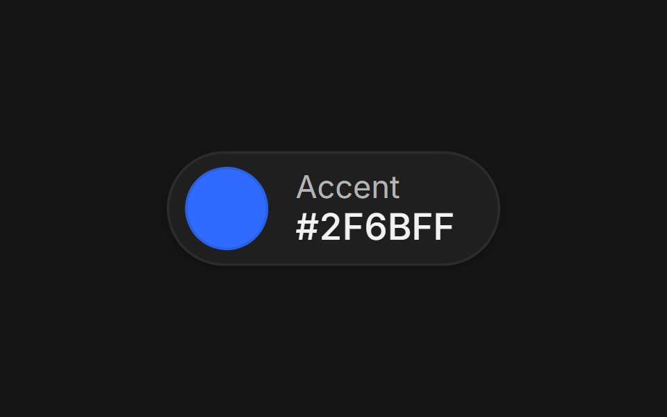 Color pickerArc Library · ReactA swatch that grows into a picker with format morphing, eyedropper, saved swatches, and contrast readout.
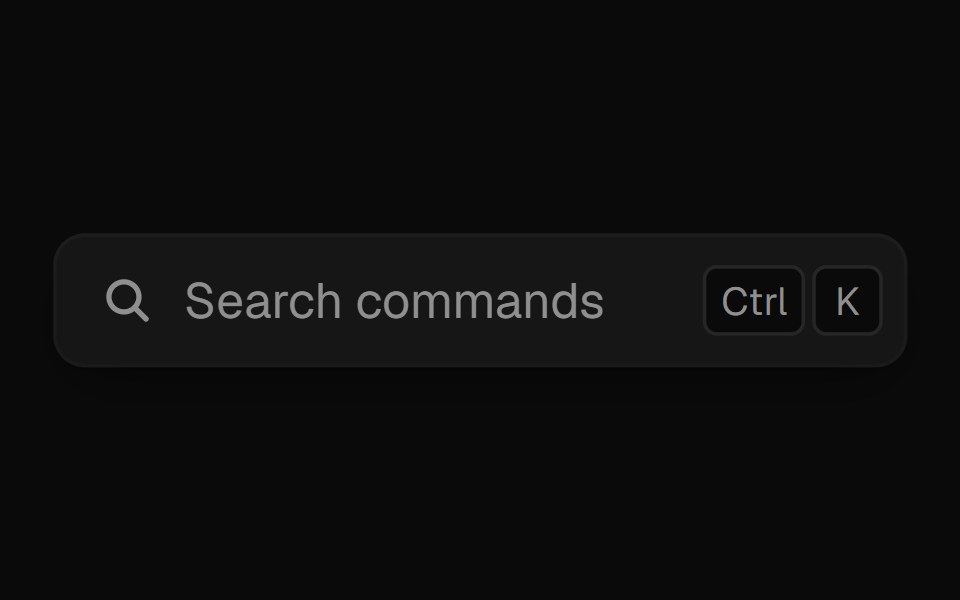 Command PaletteUI Lab · ReactOpens on ⌘K and filters commands as you type.
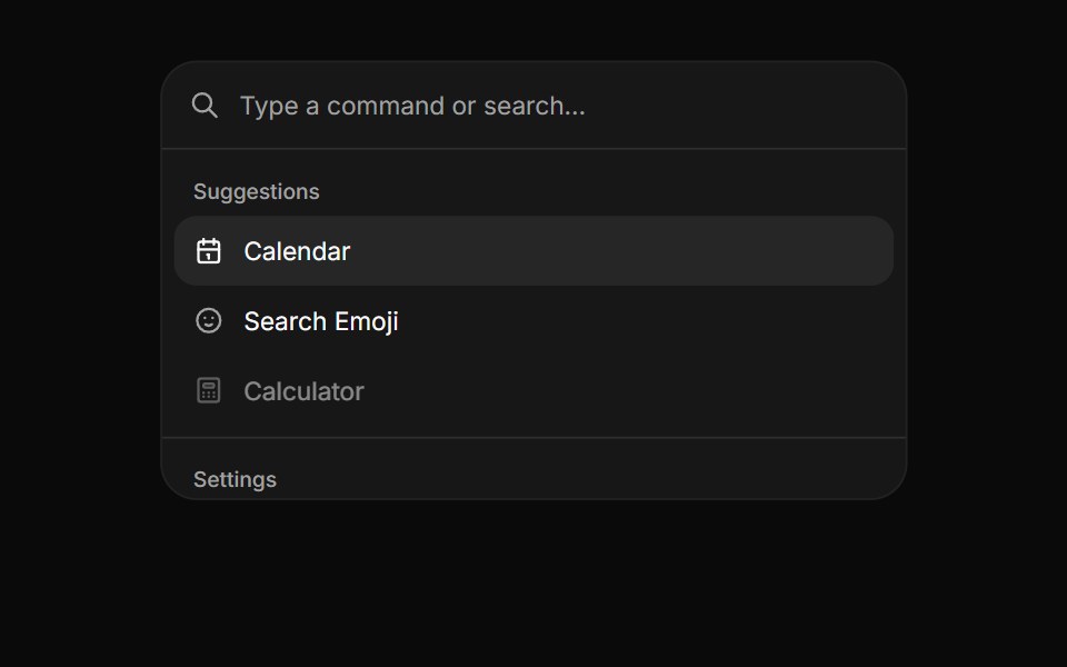 CommandHextaUI · ReactA searchable list of actions, inline or as a ⌘K palette, with pages, shortcuts and highlighted matches.
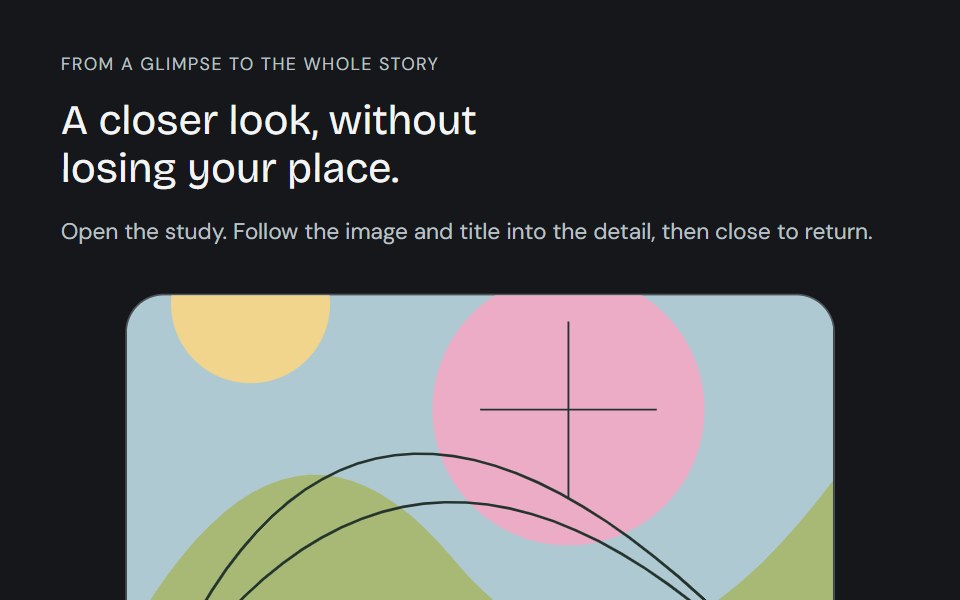 Linear ModalCojeev UI · ReactFollow a card, image and title into a full detail, then back. Card, Centered and browsable Gallery preserve the…
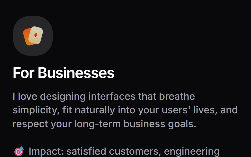 Card InfoSpaceUI · ReactResponsive feature and philosophy cards with gradient icons, clean typography, and layered container aesthetics.
 Base SonnerReScript shadcn · ReScript
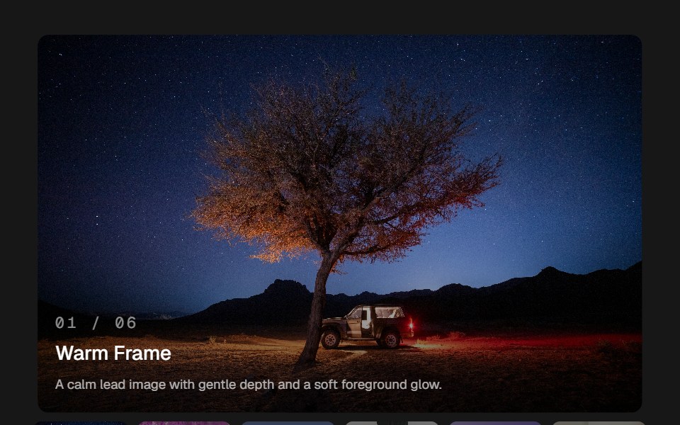 Image GlideSkecher UI · ReactAn image viewer with pointer depth, soft image transitions, and a compact thumbnail rail.
 Base DialogSora UI · ReactAn accessible modal dialog built on Base UI with smooth Motion spring entrance and exit animations.
 Notif MorphZAYX · React NativeA notification stack that morphs between rows like follows and likes, with springy row height changes.
 Dynamic Island Feedback NotchCue Foundations · React
 Liquid DrawerLiquefy UI · ReactDrawer panel sliding from the edge, in liquid glass style. Gaveta lateral em estilo vidro líquido.
 DrawerEaseUI · ReactSheet that slides up from the bottom edge on the native dialog element. Drag the handle down, or flick it, to dismiss.
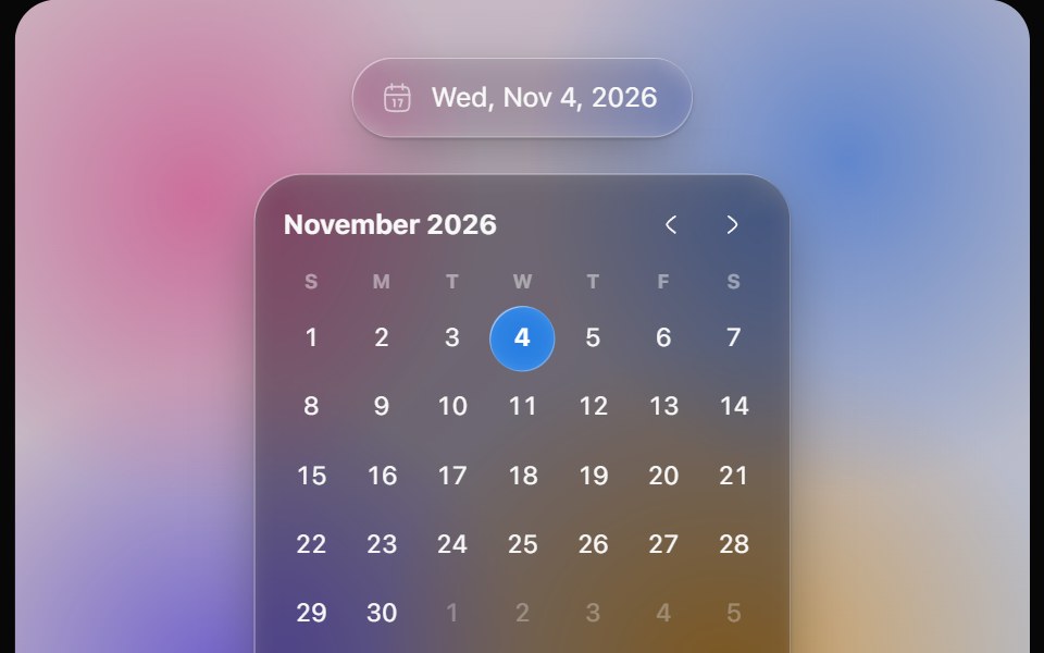 Glass Date PickerOpaline · ReactGlass calendar with a gliding day bubble, and a capsule date picker.
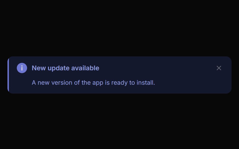 Alert ToastReactFrame · ReactA polished toast/alert notification, 5 tones, stacked or inline layout, icons, primary/secondary actions, dismiss and…
 NotchAceternity UI · React
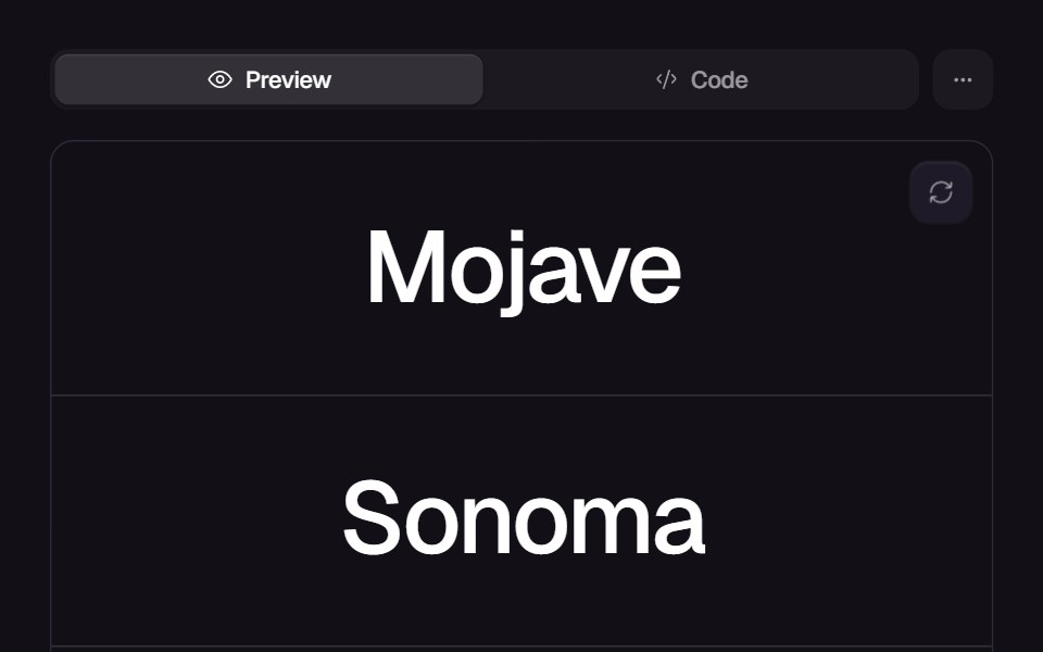 Flowing MenuReact Bits · ReactFull-height menu of large links; hovering one slides in a marquee strip of text and images from the edge the pointer…
 ToastChakra UI · ReactUsed to display a temporary message to the user
 ModalHeroUI · ReactDialog overlay for focused user interactions and important content
 Vanilla ToastReact Spectrum · React
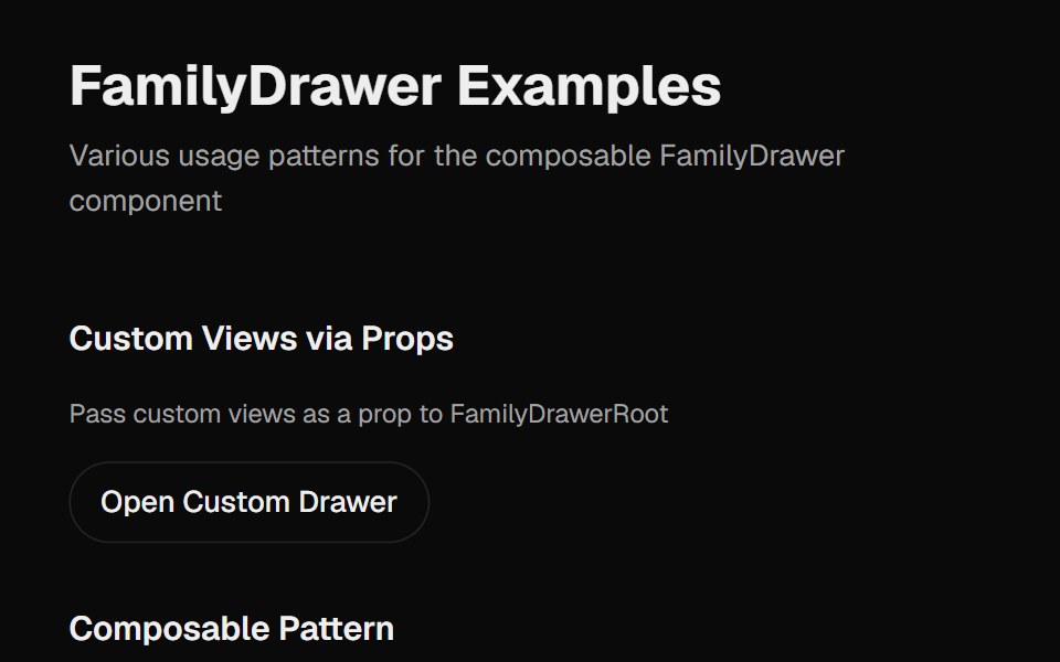 Family DrawerCult UI · ReactA multi-view drawer component with smooth animations, view navigation, and customizable content views
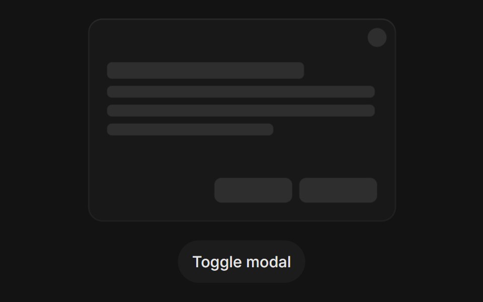 Modal Open Closetransitions.dev · HTML/CSS
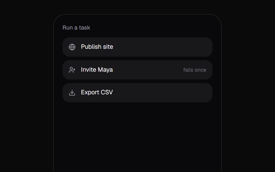 Promise ToastKokonut UI · React"A toast that follows a task: the ring spins while it works, closes into a check or a warning when it lands, and…
 sheetIntent UI · Reactsheet
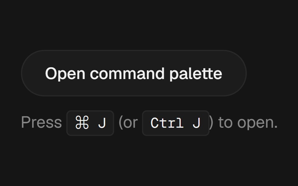 Command PalettebeUI · React⌘K palette with fuzzy filter, spring-animated active row and glass surface.
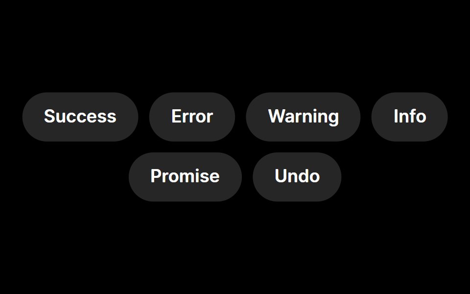 ToastRare UI · ReactA toast notification with animated status icons, built on Sonner.
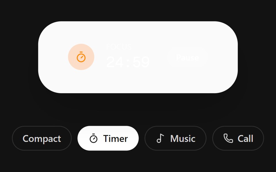 Dynamic IslandSpectrum UI · ReactAn iOS-style island pill that morphs between live activity views with a bouncy resize.
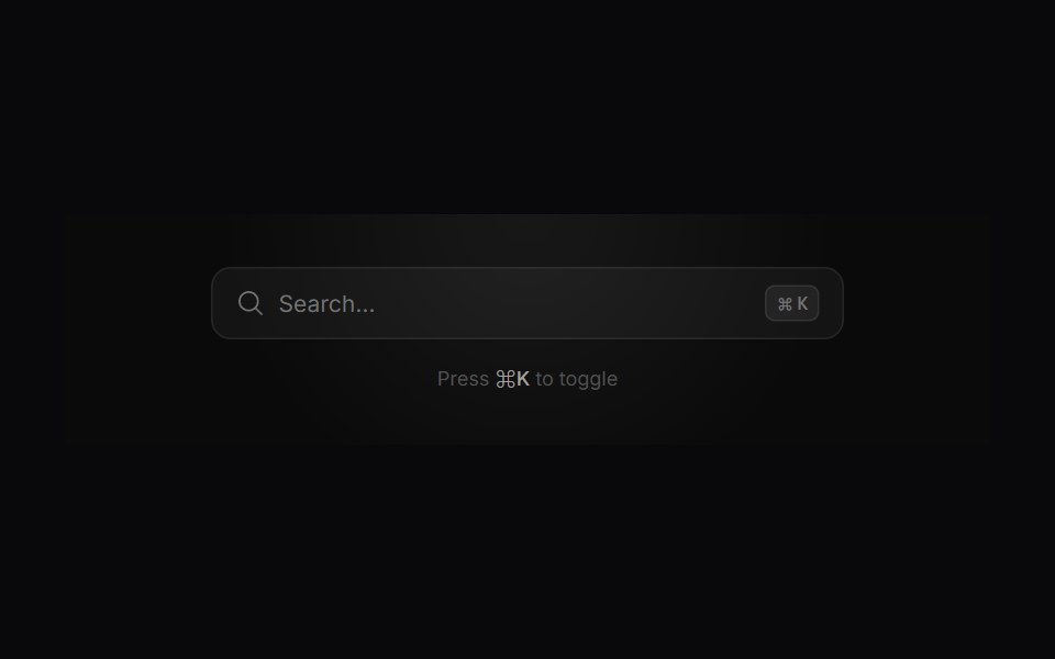 Search ModalVengeance UI · ReactMinimalist command-palette search with live filtering, tags, and actions
 DialogFluid Functionalism · ReactAnimated modal dialog with spring-based scale and opacity transitions in three widths (sm, lg, and an xl canvas for…
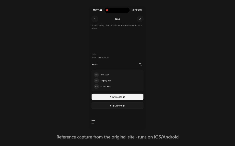 TourPanel UI · React NativeA walkthrough that introduces a screen one control at a time.
 Dialog 02 - Slide from BottomShadcn Space · ReactDialog that slides in from the bottom — ideal for confirmations and destructive actions.
 Drawer Buttonsuselayouts · ReactTwo buttons that open side drawers with a 3D fold. Payment comes from the right, cart from the left, and the fields…
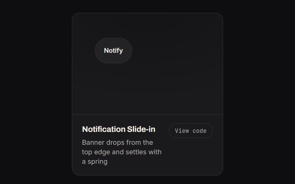 Notification Slide InKinetics · HTML/CSSBanner drops from the top edge and settles with a spring
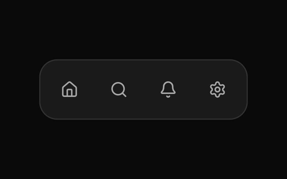 Fluid TooltipSona UI · ReactA grouped Base UI tooltip system with a deliberate first appearance and fast directional handoffs between related…
 Create New DisclosureWatermelon UI · React
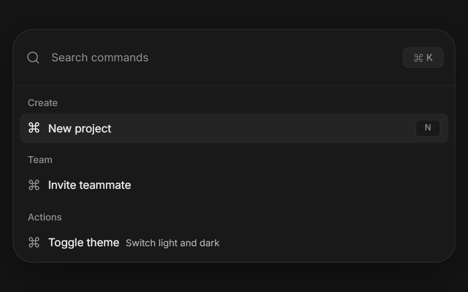 Command paletteArc Library · ReactA complete keyboard driven action surface with search, grouped results, and shortcuts.
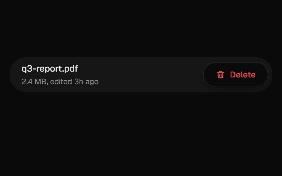 Confirm PopoverUI Lab · ReactAsks before deleting, from a popover that grows out of the button.
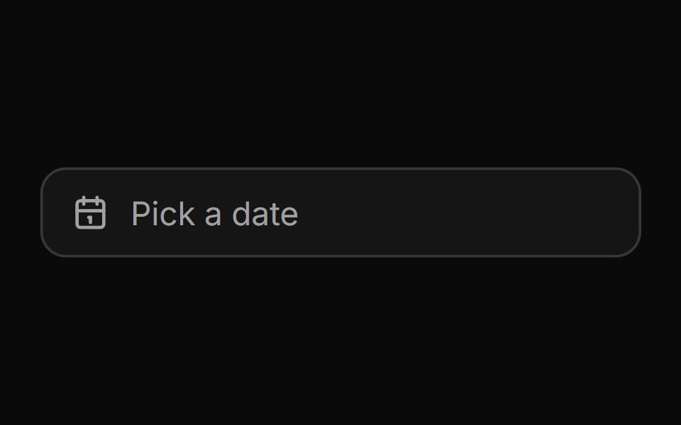 Date pickerHextaUI · ReactA button that opens a calendar in a popover, or a bottom sheet on phones, for single dates and ranges.
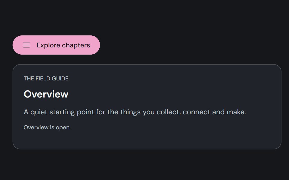 Motion DrawerCojeev UI · ReactA reference-faithful edge drawer, floating quick panel, layered workspace and bottom action tray.
Libraries with Animated overlay components
Related categories
- Overlay Components
- React Overlay Components
- Tailwind CSS Overlay Components
- Svelte Overlay Components
- React Native Overlay Components
- shadcn/ui Overlay Components
- Animated Modal Components
- Animated Popover Components
- Animated Toast Components
- Animated Drawer Components
- Animated Tooltip Components
- Animated Dynamic Island Components
- Animated Hover Card Components
- Animated Bottom Sheet Components
- Animated Alert Dialog Components
- Animated Mini Player Components