Date Picker
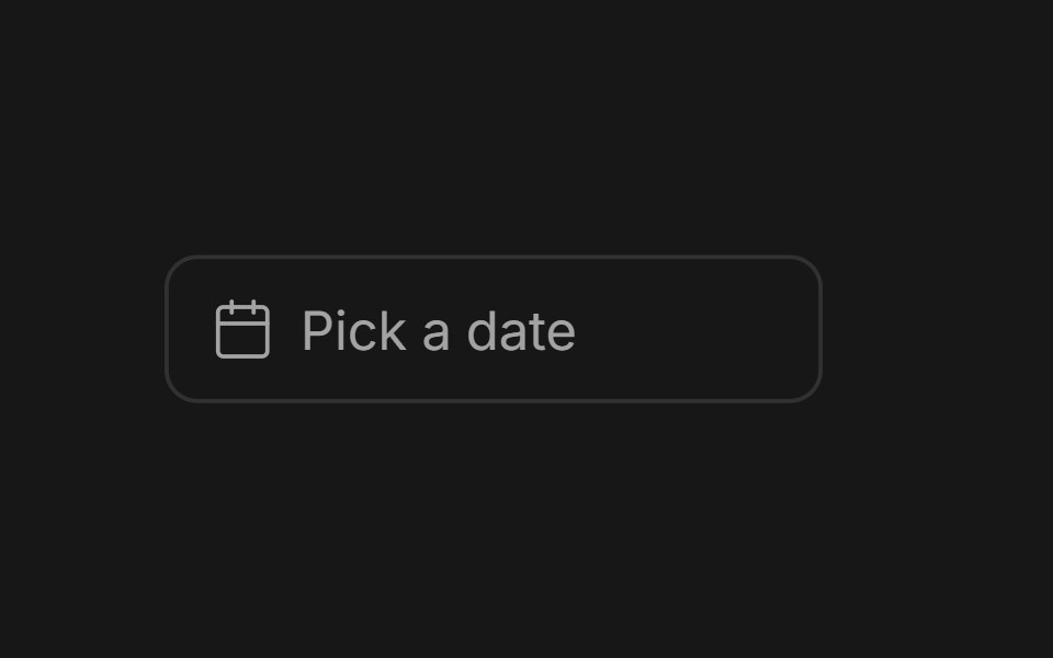
Field or ghost trigger for a date, a range, or a date and a time: a calendar popover that opens on the selected day, optional range presets, and editable time fields with slot lists that show each duration. Base UI flavor.
- Library
- Fluid Functionalism
- Framework
- React
- Type
- ui
- License
- MIT
- Dependencies
- @base-ui/react@^1.9.0, lucide-react, motion
- Install
npx shadcn@latest add @fluid/date-picker-base- Files
registry/base/date-picker.tsxregistry/default/date-picker-core.tsxregistry/default/calendar.tsxregistry/default/lib/utils.tsregistry/default/lib/springs.tsregistry/default/lib/font-weight.tsregistry/default/lib/shape-context.tsxregistry/default/lib/size-context.tsx
- Source
- https://github.com/mickadesign/fluid-functionalism
Categories
- Date Picker Components
- React Date Picker Components
- Tailwind CSS Date Picker Components
- Animated Date Picker Components
- shadcn/ui Date Picker Components
- Input Components
- React Input Components
- Tailwind CSS Input Components
- Animated Input Components
- shadcn/ui Input Components
- Overlay Components
- React Overlay Components