 Dev Design Library
Animated Mini Player Components
Dev Design Library indexes 6 Animated mini player components from 6 open-source UI libraries, with the most coming from uselayouts, Rare UI, Sona UI, Spell UI and Animations (Svelte). Each one links to its page with the source code, a live preview where available, the library license and the install command. These are the mini player components tagged as animated: motion on hover, on scroll or on load, usually built with CSS transitions or Framer Motion. Mini player components belong to the Overlays group.
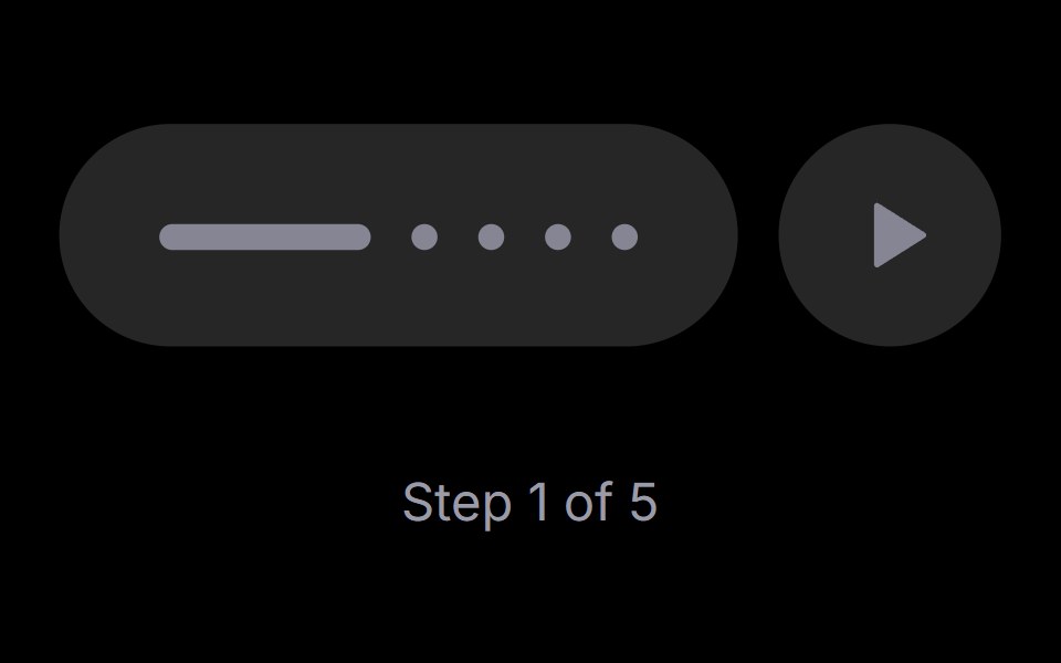 Step PlayerRare UI · ReactAn iOS-style stepped progress track with a play, pause and replay control. The active step stretches into a bar that…
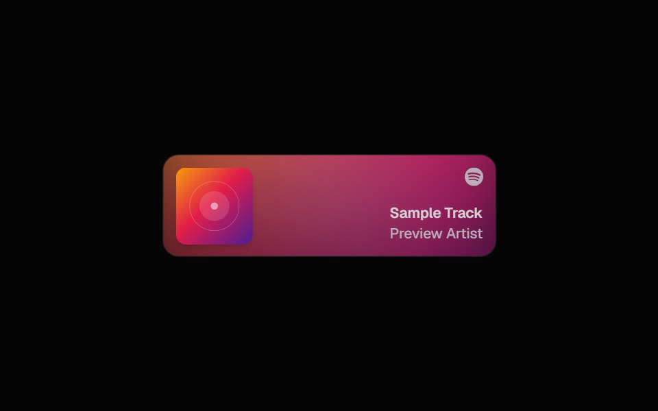 Spotify CardSpell UI · ReactDisplay Spotify tracks with album art and blurred background.
 Corner Videouselayouts · ReactA compact corner video player with smooth open/close morphing, autoplay, mute, enlarge, hover controls, and video…
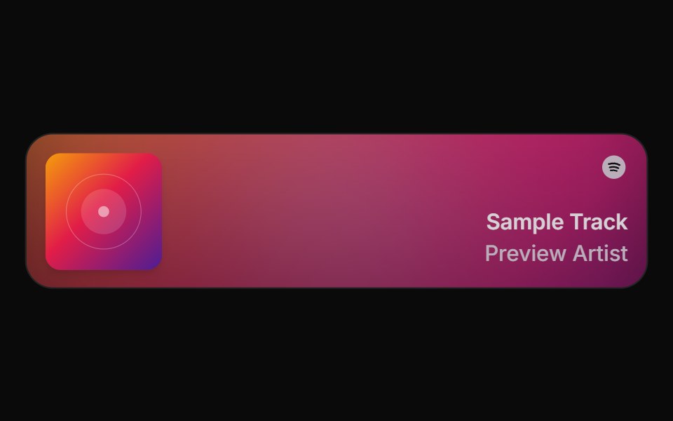 Spell Spotify CardAnimations (Svelte) · Svelte
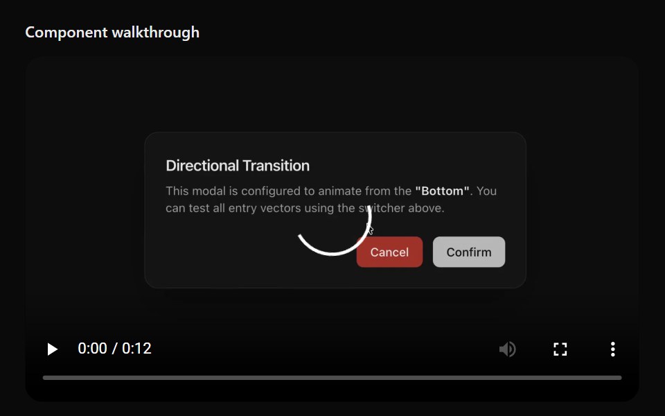 Floating ViewerSona UI · ReactAn in-page media surface that automatically or manually detaches, stays within viewport bounds, snaps to a corner, and…
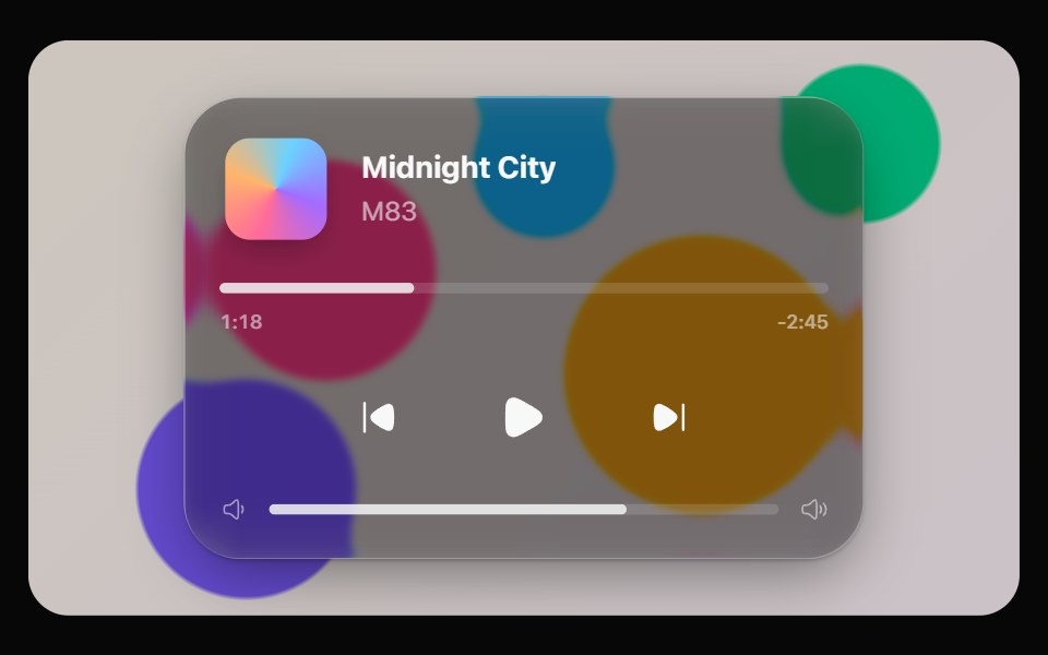 Glass PlayerOpaline · ReactNow-playing widget with scrubber, transport controls and volume.
Libraries with Animated mini player components
Related categories
- Mini Player Components
- React Mini Player Components
- Animated Overlay Components
- Animated Modal Components
- Animated Popover Components
- Animated Toast Components
- Animated Drawer Components
- Animated Tooltip Components
- Animated Dynamic Island Components
- Animated Hover Card Components
- Animated Bottom Sheet Components
- Animated Alert Dialog Components