 Dev Design Library
Animated Popover Components
Dev Design Library indexes 56 Animated popover components from 19 open-source UI libraries, with the most coming from Watermelon UI, Arc Library, Cult UI, UI Lab and ReactFrame. Each one links to its page with the source code, a live preview where available, the library license and the install command. These are the popover components tagged as animated: motion on hover, on scroll or on load, usually built with CSS transitions or Framer Motion. Popover components belong to the Overlays group.
 PopoverHeroUI · ReactDisplays a floating content panel anchored to a trigger element with placement and alignment options.
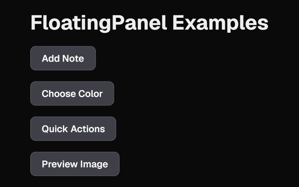 Floating PanelCult UI · ReactFloating panel component with backdrop blur and position-aware animations
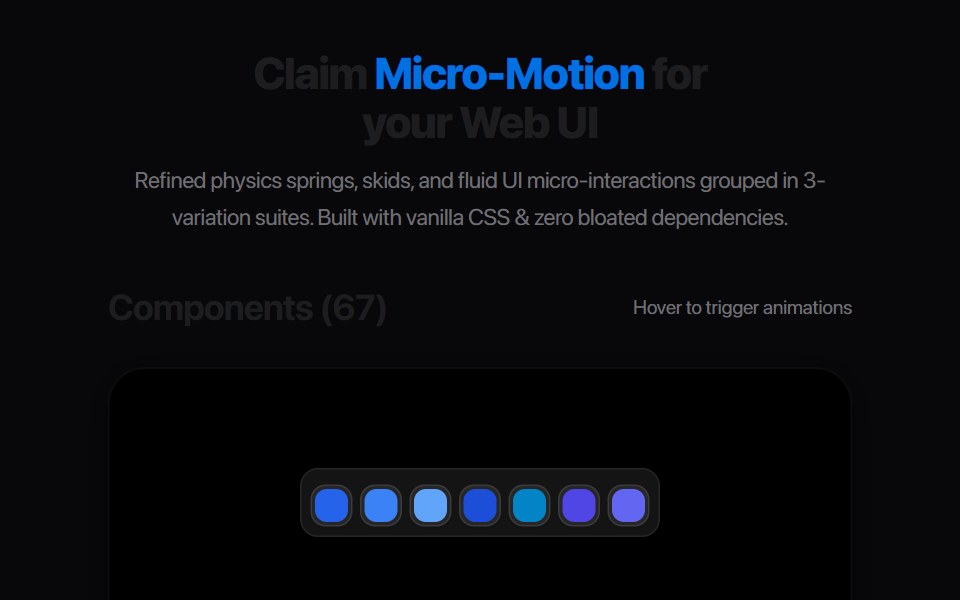 Card Glance PreviewAmicro Micro Transitions · ReactMicro floating glance card popup with status indicator dot.
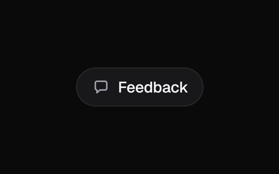 Morph PopoverKokonut UI · ReactA button that grows into the form it opens, with its label sliding up to become the title, then shrinks into a…
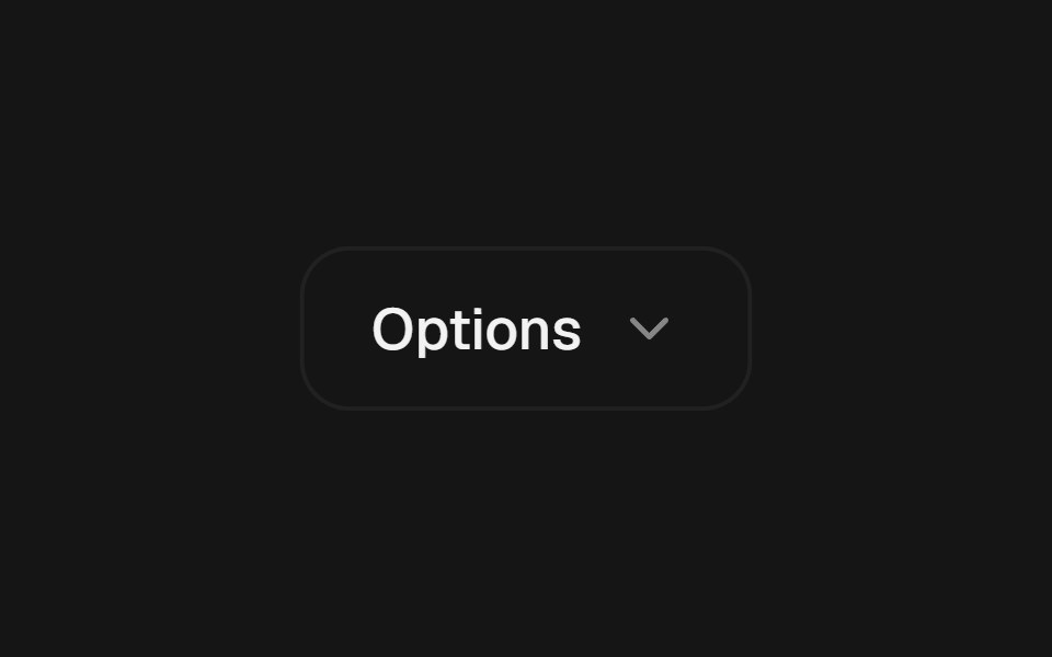 Popover MorphbeUI · ReactPopover that grows out of its trigger button, sharing the same shape.
 Date PickerFluid Functionalism · ReactField or ghost trigger for a date, a range, or a date and a time: a calendar popover that opens on the selected day…
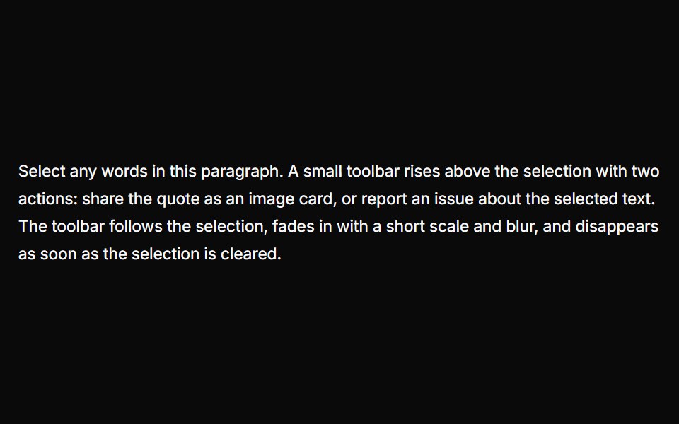 Text Selection PopoverUser Interface Wiki · React
 Card-01 - ArticlePreviewCardShadcn Space · ReactCard component
 Image Hover RevealGreatUI · React
 Gooey Color Picker23rd.dev · ReactA floating color picker with a circular hue wheel, alpha slider, hex field, and motion-powered open/close.
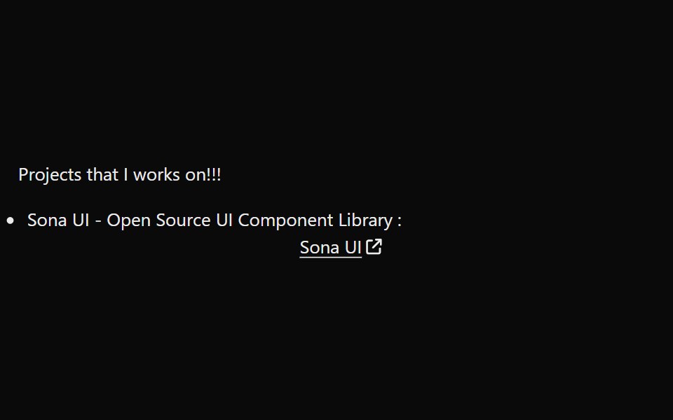 LinkPreviewSona UI · ReactThe `LinkPreview` component is an interactive UI element that displays a preview of a link when hovered over. It…
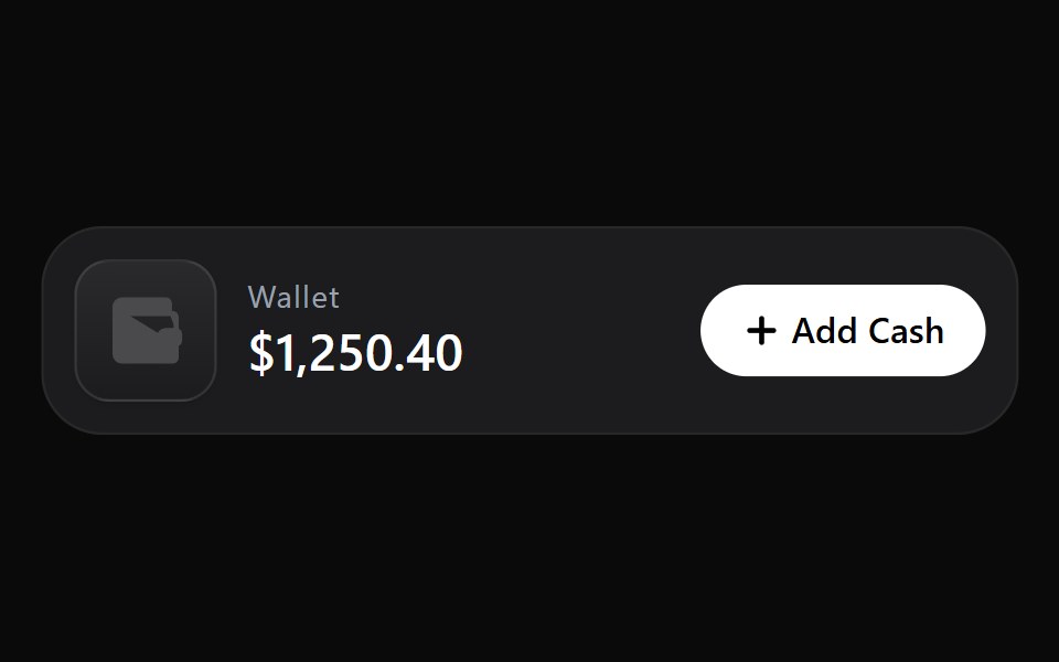 Add Cash DisclosureWatermelon UI · React
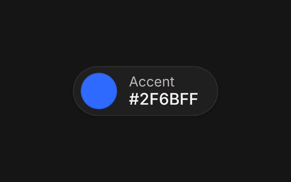 Color pickerArc Library · ReactA swatch that grows into a picker with format morphing, eyedropper, saved swatches, and contrast readout.
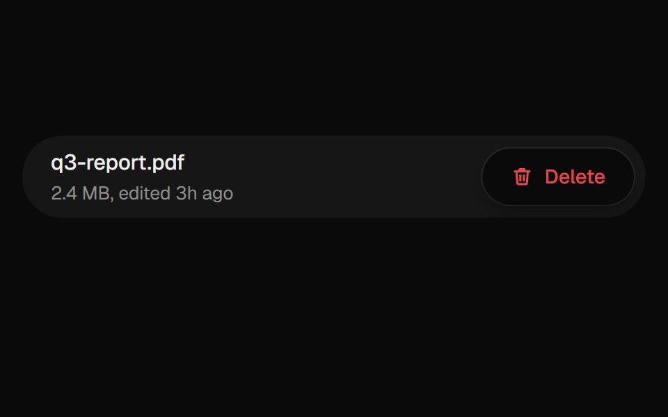 Confirm PopoverUI Lab · ReactAsks before deleting, from a popover that grows out of the button.
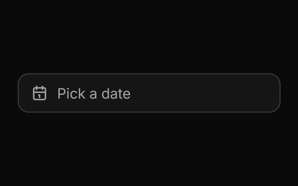 Date pickerHextaUI · ReactA button that opens a calendar in a popover, or a bottom sheet on phones, for single dates and ranges.
 Card InfoSpaceUI · ReactResponsive feature and philosophy cards with gradient icons, clean typography, and layered container aesthetics.
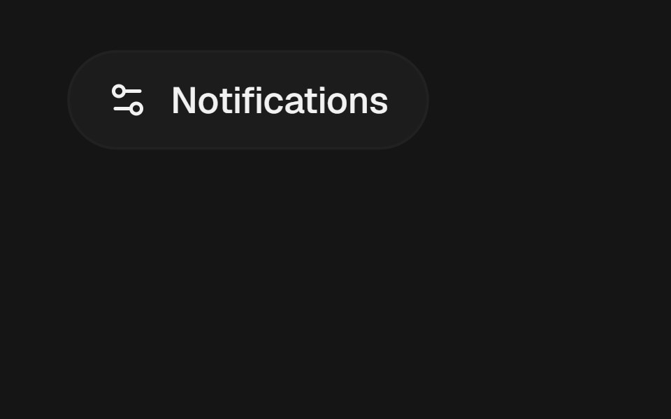 PopoverEaseUI · ReactA panel of arbitrary content anchored to a trigger, opening on click and flipping above it when there's no room below.
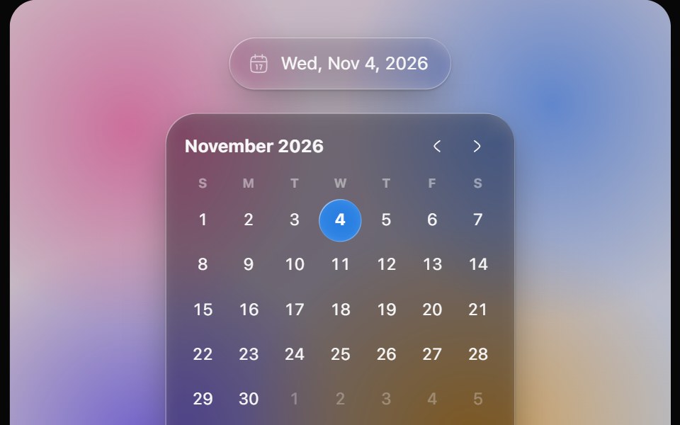 Glass Date PickerOpaline · ReactGlass calendar with a gliding day bubble, and a capsule date picker.
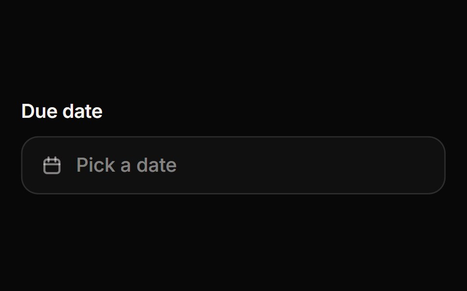 Date PickerReactFrame · ReactA date picker with a popover calendar: single date or range selection, month navigation, min/max and disabled dates…
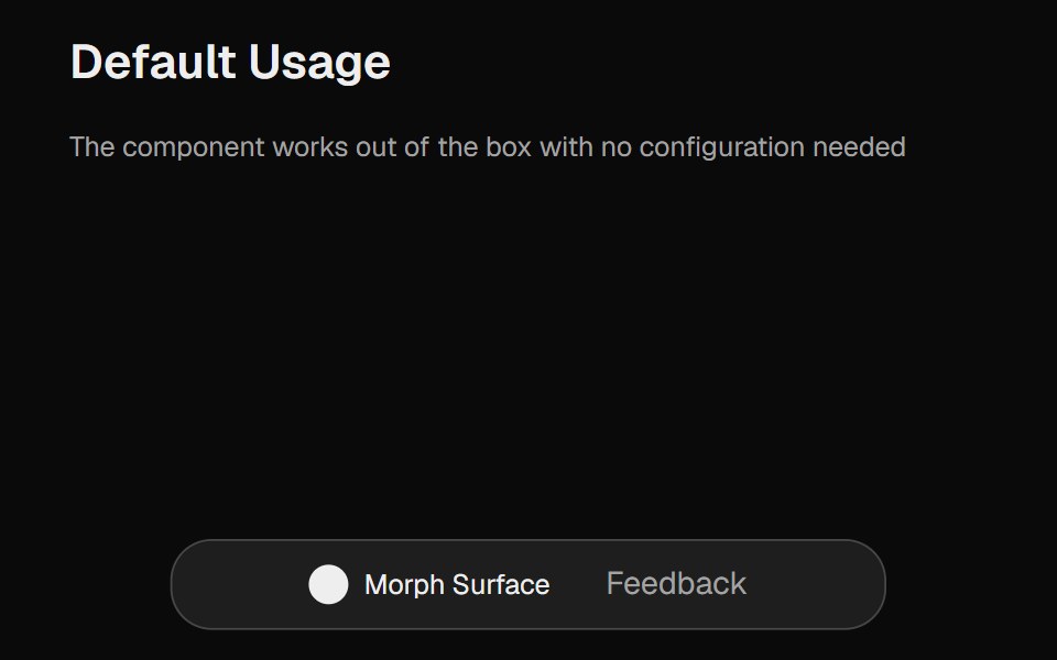 Morph SurfaceCult UI · ReactA morphing surface component with smooth animations, customizable dimensions, and configurable content
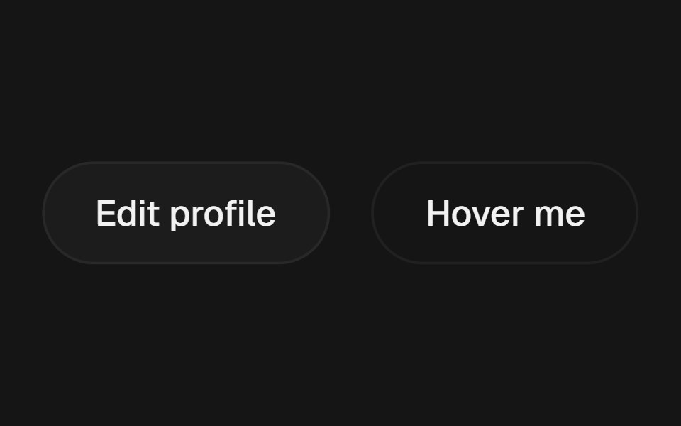 PopoverbeUI · React
 Date PickerFluid Functionalism · ReactField or ghost trigger for a date, a range, or a date and a time: a calendar popover that opens on the selected day…
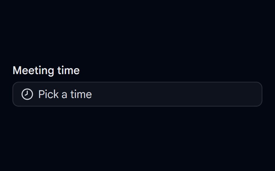 Time Picker 07 - Analog Clock PopoverShadcn Space · ReactForm field button that opens a draggable ring track time picker in a popover, with cancel and set actions
 Cursor Hover CardSona UI · React
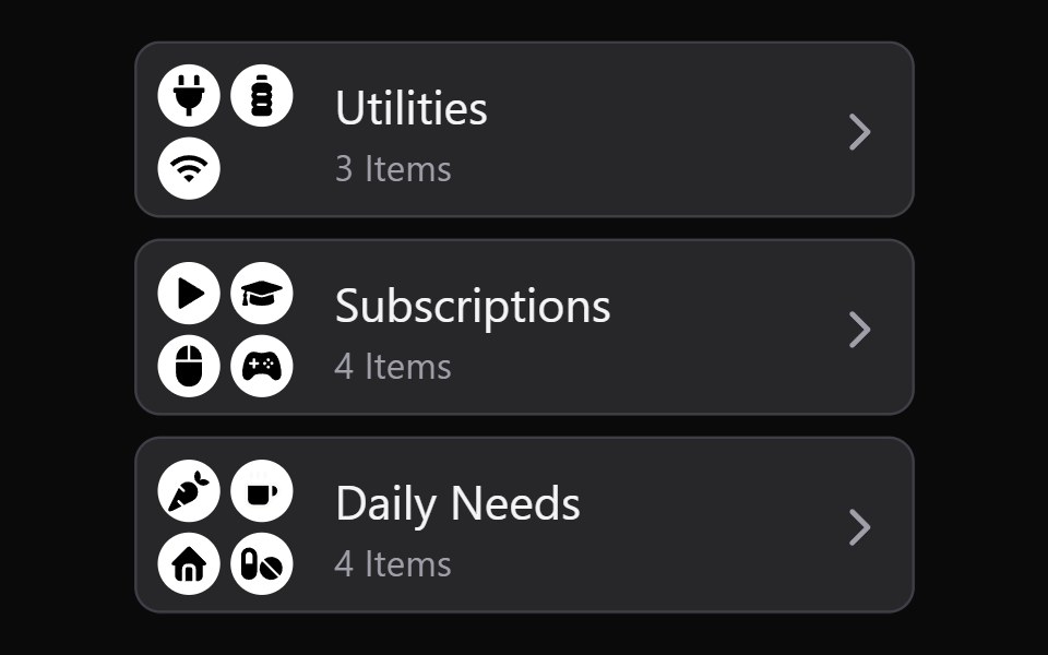 Collection Grid DisclosureWatermelon UI · React
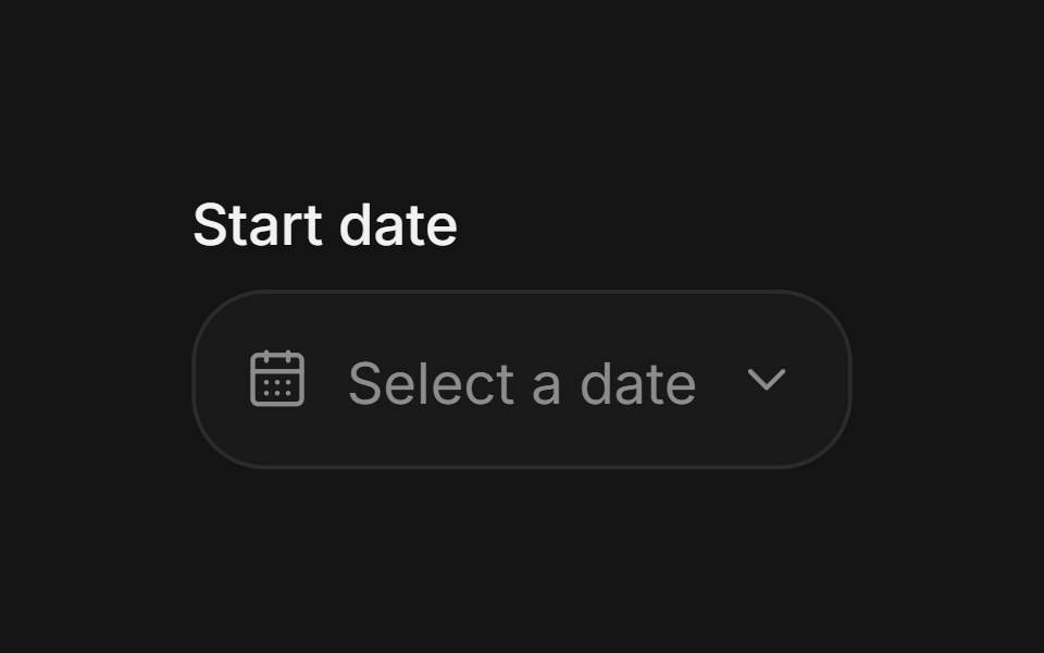 Date pickerArc Library · ReactChoose a date without losing context.
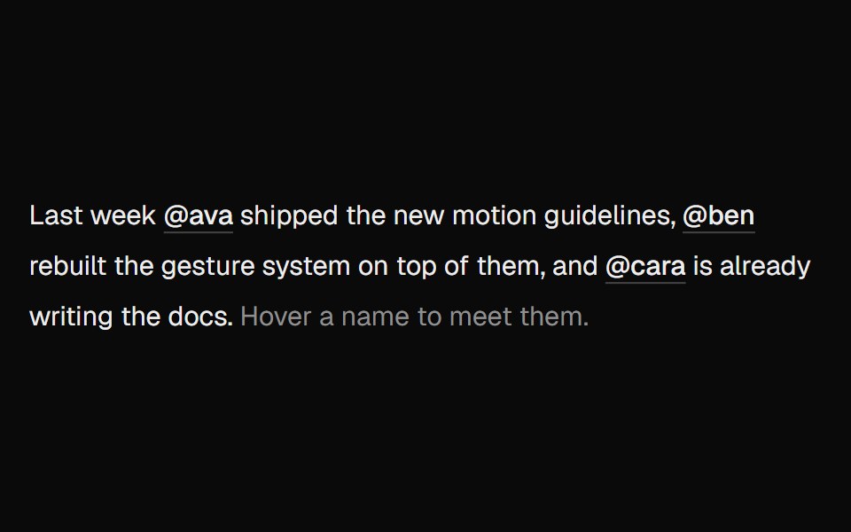 Hover CardUI Lab · ReactOne card travels between names as you hover them.
 Hover cardHextaUI · ReactA preview card that opens when a link is hovered or focused, for content sighted users can glance at.
 Preview CardSpaceUI · ReactDisplays an informative preview card when users hover over a link, giving them a summary of the linked page before…
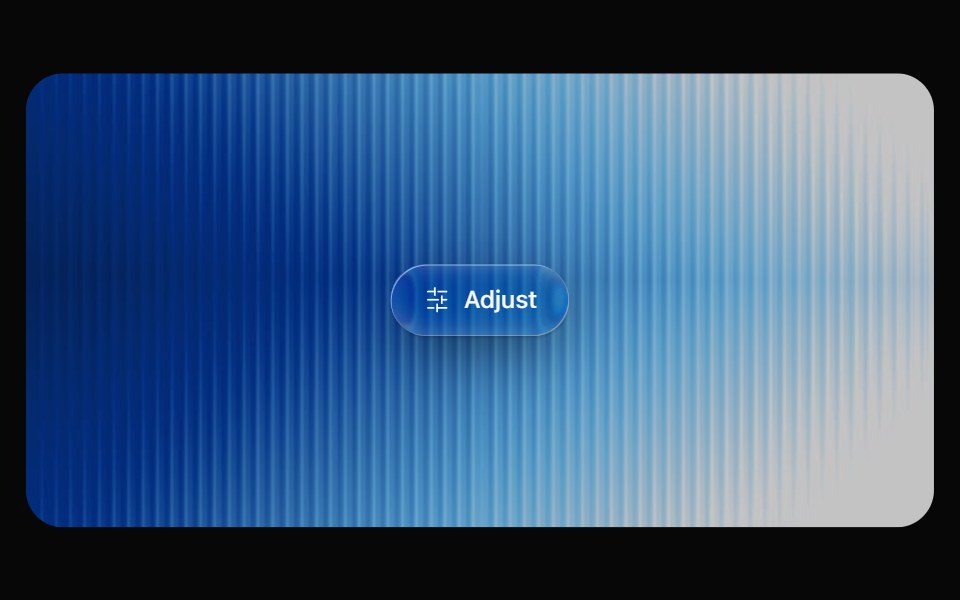 Glass PopoverOpaline · ReactRich popover content on a frosted glass surface.
 Hover CardReactFrame · ReactA hover-triggered rich preview card with open/close delays, a hover bridge so moving into the card keeps it open…
 PopoverCult UI · ReactAnimated popover component with form support and smooth transitions
 Create New DisclosureWatermelon UI · React
 Date range pickerArc Library · ReactA range picker that grows from its trigger into two months with presets and a stretching range highlight.
 Hover Preview LinkUI Lab · ReactHover a link to get a preview card that trails your cursor and leans as it moves.
 PopoverHextaUI · ReactA floating panel anchored to a trigger that resizes smoothly with its content and follows the trigger’s direction.
 Preview Link CardSpaceUI · ReactDisplays an interactive card preview of a website with its thumbnail, title, and domain name when shared or hovered.
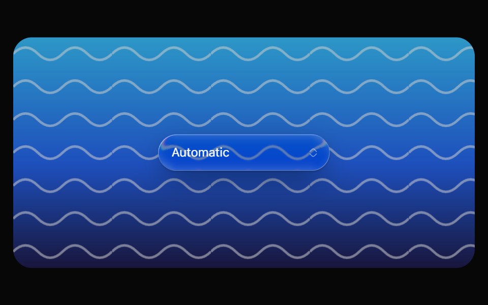 Glass SelectOpaline · ReactCapsule select with a frosted glass option list.
 PopoverReactFrame · ReactAn accessible popover for interactive content with click or hover triggers, 4 placements and 3 alignments, auto-flip…
 Popover FormCult UI · ReactForm popover component with success states and animated transitions
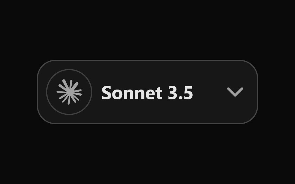 Dropdown DisclosureWatermelon UI · React
 Hover cardArc Library · ReactPreview a person or link on hover or focus without leaving the page.
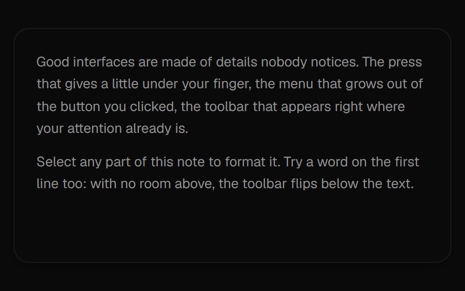 Selection ToolbarUI Lab · ReactA formatting toolbar that grows out of whatever text you select.
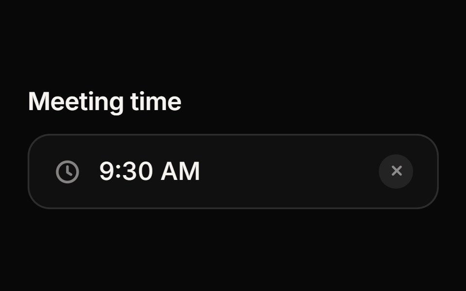 Time PickerReactFrame · ReactA time picker with a popover of scrollable hour, minute and AM/PM columns: 12 or 24-hour clock, minute steps, min/max…
 Filter DisclosureWatermelon UI · React
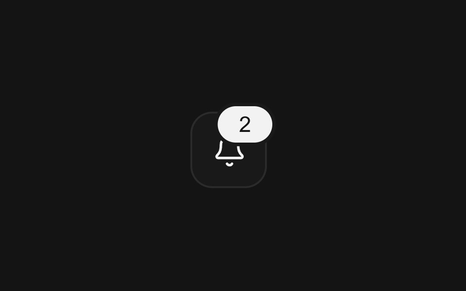 Notification centerArc Library · ReactA home for updates with read state, grouped information, and animated disclosure.
 Filter Disclosure BaseWatermelon UI · React
 PopoverArc Library · ReactA small anchored surface for contextual information.
 Floating DisclosureWatermelon UI · React
 Floating Disclosure BaseWatermelon UI · React
 Invite DisclosureWatermelon UI · React
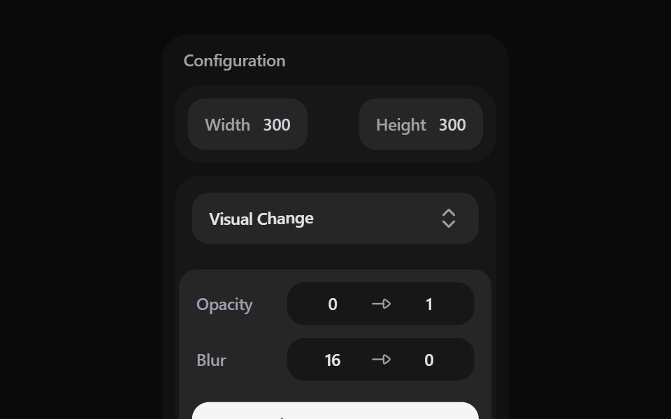 Layered Progressive DisclosureWatermelon UI · React
 Preview Link CardWatermelon UI · React
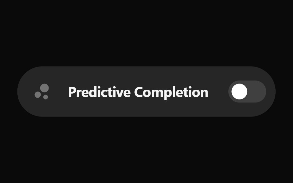 Switch DisclosureWatermelon UI · React
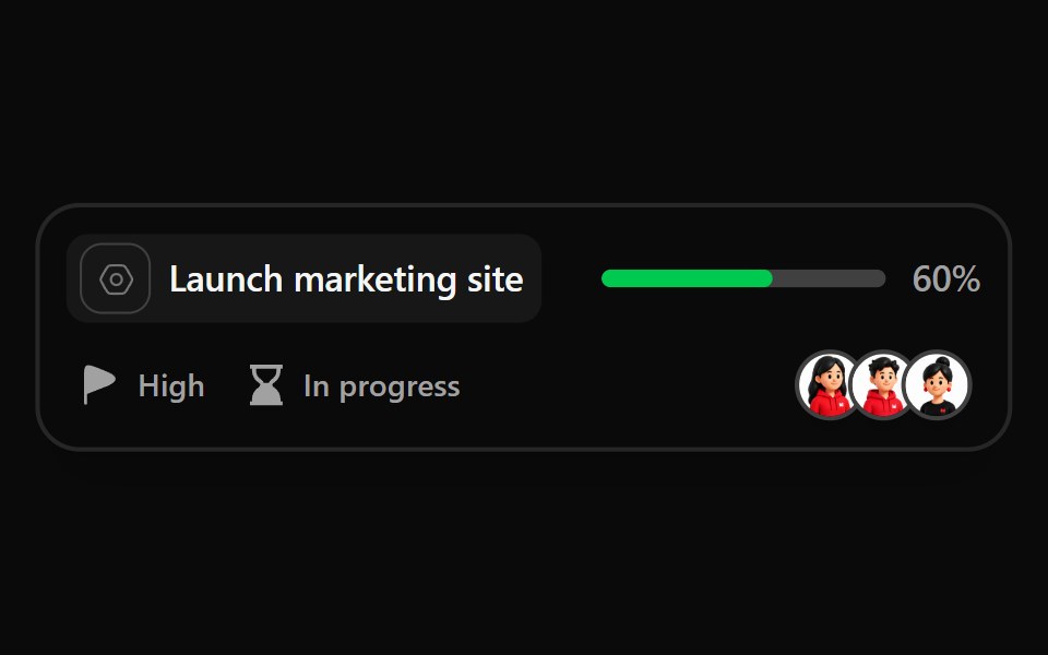 Task Widget DisclosureWatermelon UI · React
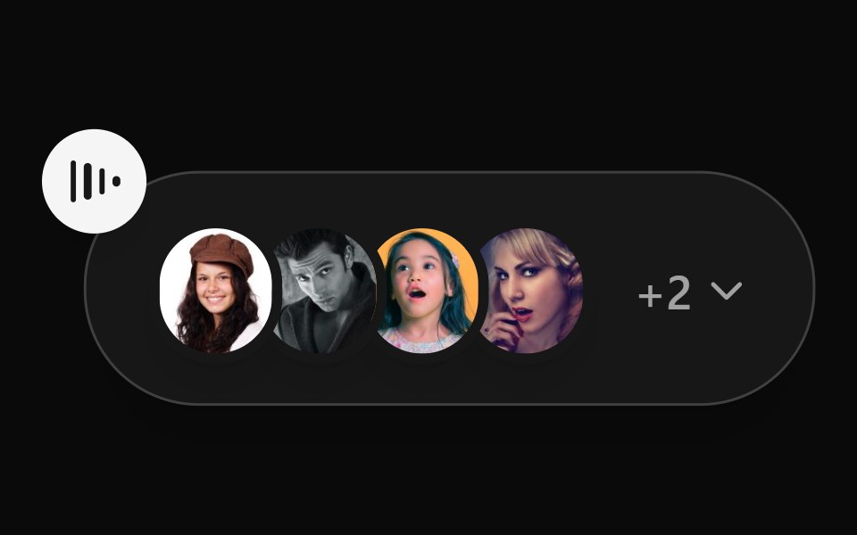 Voice Chat DisclosureWatermelon UI · React
Libraries with Animated popover components
Related categories
- Popover Components
- React Popover Components
- Tailwind CSS Popover Components
- shadcn/ui Popover Components
- Animated Overlay Components
- Animated Modal Components
- Animated Toast Components
- Animated Drawer Components
- Animated Tooltip Components
- Animated Dynamic Island Components
- Animated Hover Card Components
- Animated Bottom Sheet Components
- Animated Alert Dialog Components
- Animated Mini Player Components