 Dev Design Library
Animated Tooltip Components
Dev Design Library indexes 32 Animated tooltip components from 22 open-source UI libraries, with the most coming from beUI, UI Lab, Shadcn Space, Kinetics and SpaceUI. Each one links to its page with the source code, a live preview where available, the library license and the install command. These are the tooltip components tagged as animated: motion on hover, on scroll or on load, usually built with CSS transitions or Framer Motion. Tooltip components belong to the Overlays group.
 Warm TooltipReact Bits · ReactTooltip group with one shared delay: the first label waits and pops from its trigger, then siblings open instantly…
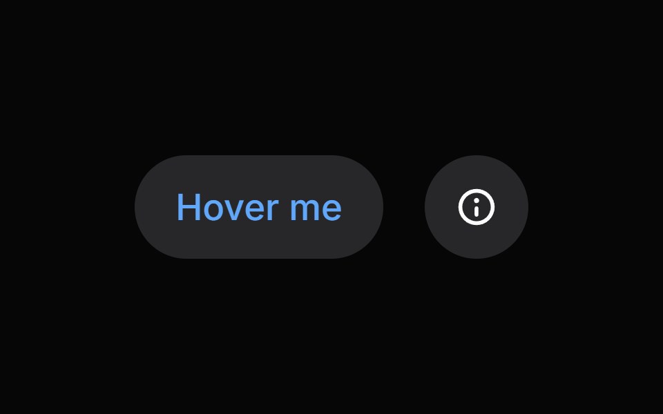 TooltipHeroUI · ReactDisplays informative text when users hover over or focus on an element
 Tooltip Open Closetransitions.dev · HTML/CSS
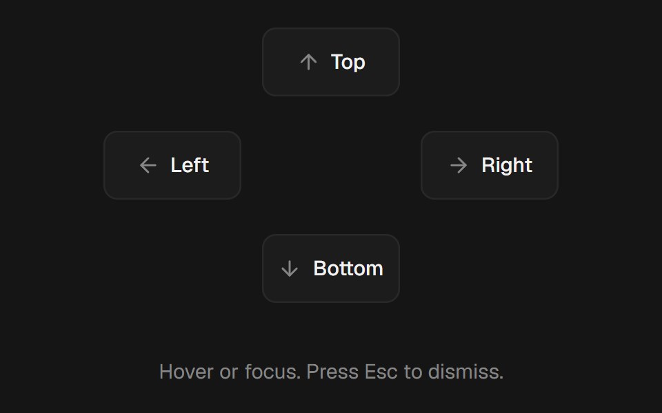 TooltipbeUI · ReactHover or focus tooltip with a subtle scale and fade, collision-aware placement, and optional cursor tracking.
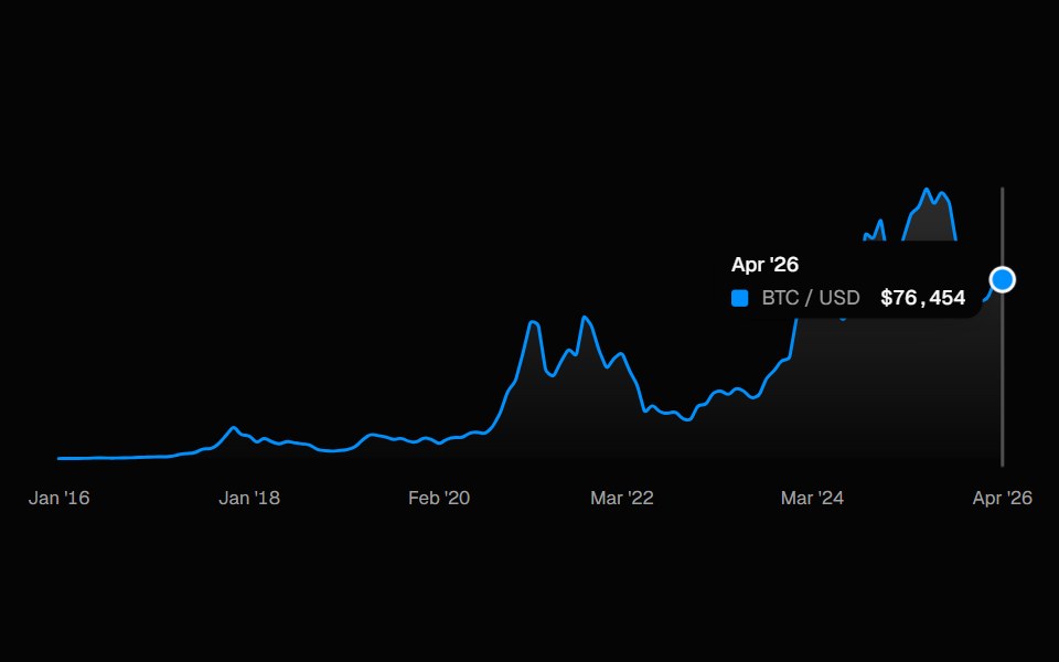 ChartSpell UI · ReactInteractive line chart with a cursor-tracked tooltip card, snap-to-point hover, and built-in X-axis labels.
 Shared Tooltip AvatarsVengeance UI · ReactAvatar stack with a sliding shared tooltip
 TooltipFluid Functionalism · ReactFloating tooltip with spring-based animations, configurable placement, and rich content support.
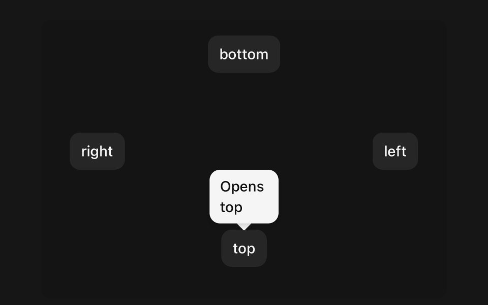 TooltipPanel UI · React NativeA small label that names the control under your finger.
 Tooltip-03 - Animated TooltipShadcn Space · ReactAnimated Tooltip component
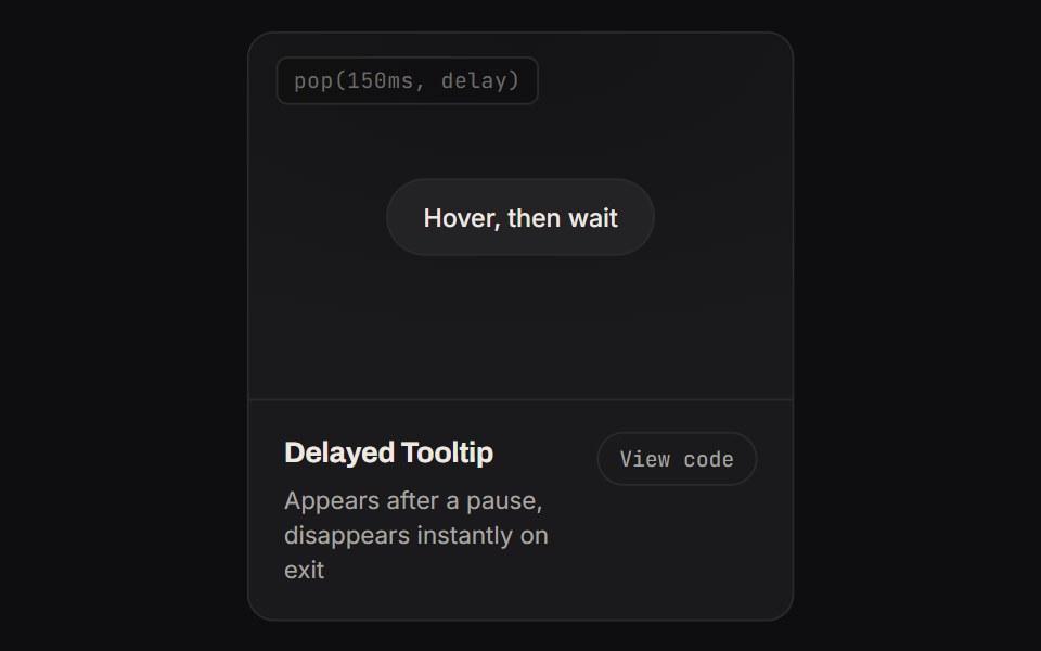 Delayed TooltipKinetics · HTML/CSSAppears after a pause, disappears instantly on exit
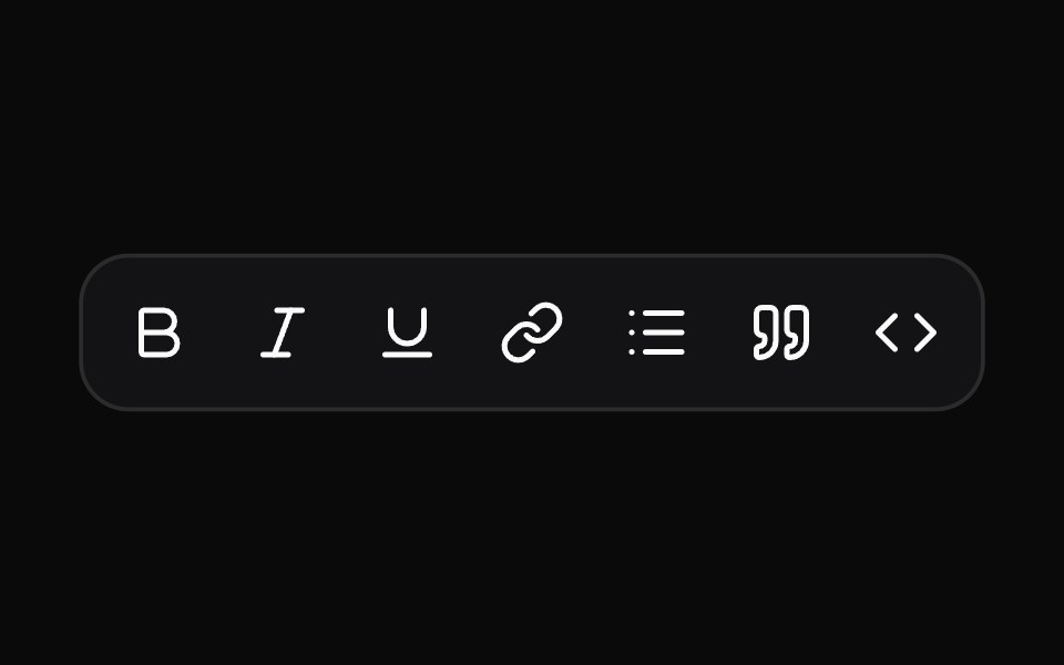 TooltipNotra · ReactA Base UI tooltip with the Depth surface of the buttons that glides between neighbouring triggers.
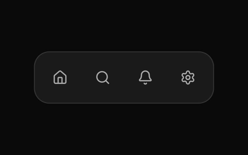 Fluid TooltipSona UI · ReactA grouped Base UI tooltip system with a deliberate first appearance and fast directional handoffs between related…
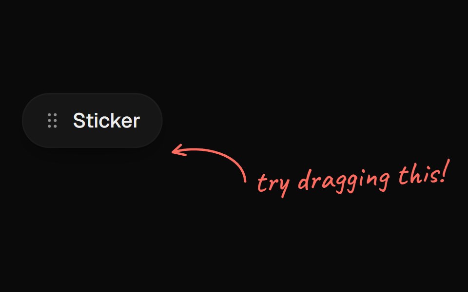 Arrow CalloutUI Lab · ReactA handwritten note whose arrow draws itself to whatever it points at.
 TooltipHextaUI · ReactA short hint on hover or keyboard focus that opens after a brief rest, switches instantly between neighbours and shows…
 BubbleSpaceUI · ReactRenders floating animated bubbles across the background that smoothly move and drift away when users move their mouse.
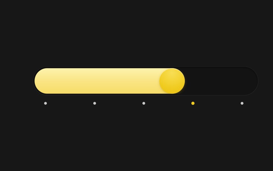 Spring SliderSkecher UI · ReactA pill-track slider with a spring-driven fill and thumb, tick markers, and a tooltip that blurs in and out.
 Base TooltipSora UI · ReactAn accessible tooltip built on Base UI with spring-based keyframe scale and translation animations powered by Motion.
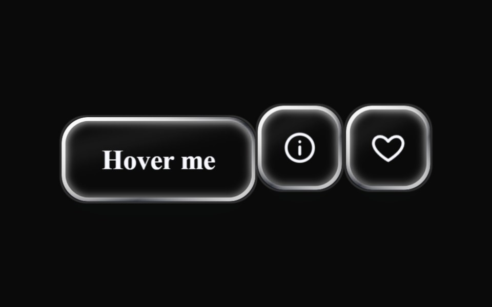 Liquid TooltipLiquefy UI · ReactTooltip in liquid glass style. Dica flutuante em estilo vidro líquido.
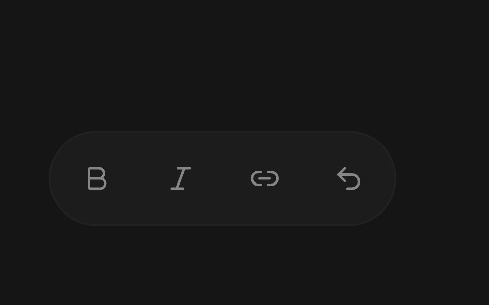 TooltipEaseUI · ReactTooltip that shows a label with its keyboard shortcut, using Command on Mac and Ctrl elsewhere. Moving along a toolbar…
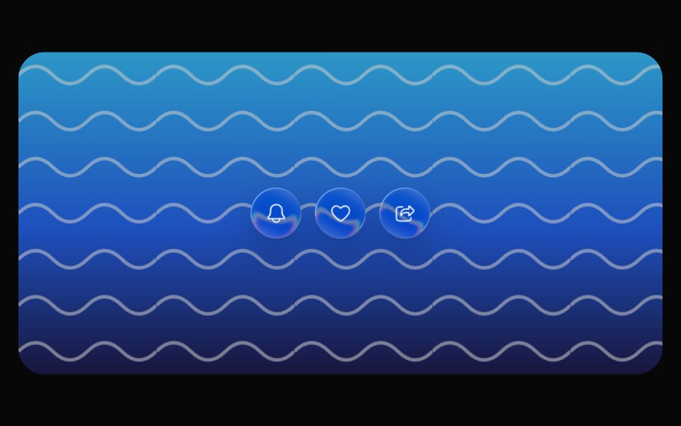 Glass TooltipOpaline · ReactCapsule tooltip that springs out of its trigger.
 TooltipReactFrame · ReactAn accessible tooltip with 4 placements, auto-flip near the screen edge, a hover delay, keyboard-focus support, an…
 Tooltip CardAceternity UI · React
 Tooltip SurfacebeUI · ReactPresentation only: the unanimated parent owns measurement and positioning.
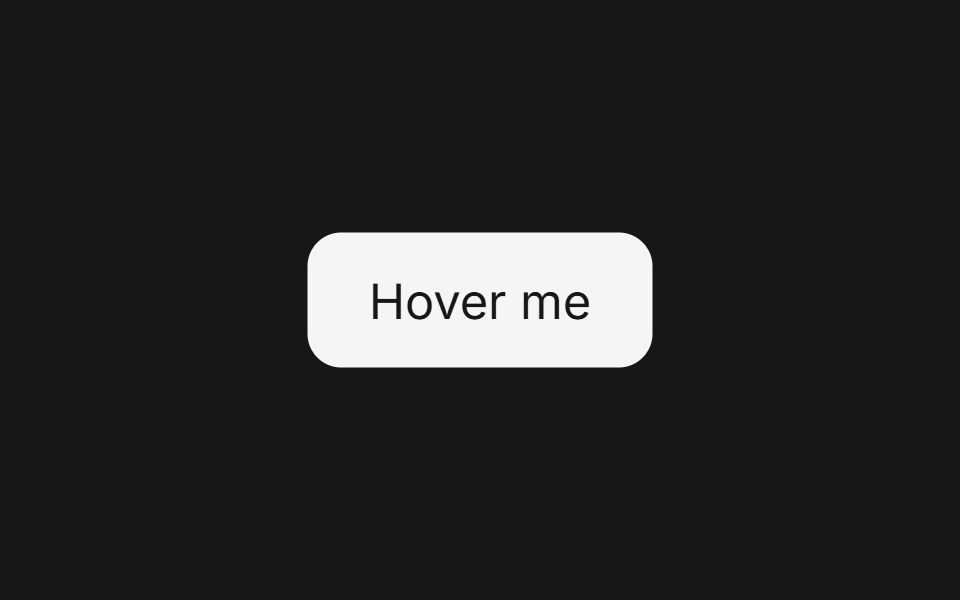 Tooltip (Base UI)Fluid Functionalism · ReactFloating tooltip with spring-based animations, configurable placement, and rich content support. Base UI flavor.
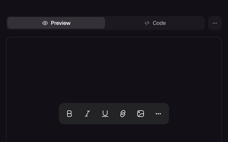
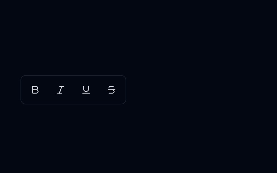 Tooltip 08 - Editor Toolbar TooltipShadcn Space · ReactTooltip component
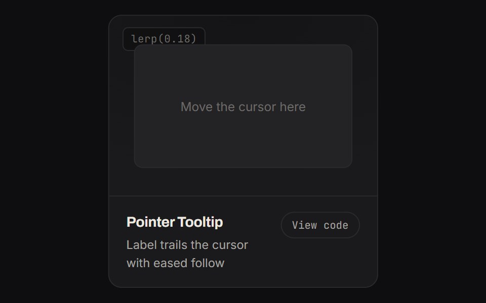 Pointer TooltipKinetics · HTML/CSSLabel trails the cursor with eased follow
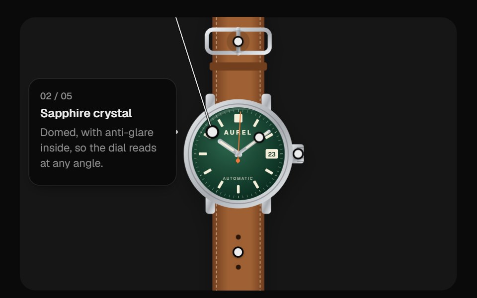 Image HotspotsUI Lab · ReactDraws a leader line to one label card that travels between a watch's features, never covering the product.
 Gooey TooltipSpaceUI · ReactA tooltip bubble that mouse-follows and gooey-connects to its trigger button on hover.
 Radix TooltipSora UI · ReactAn accessible tooltip built on Radix UI with spring-based keyframe scale and translation animations powered by Motion.
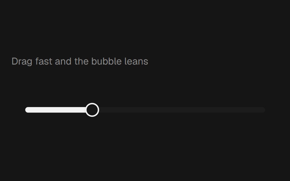 Range Slider BubblebeUI · React
 Tooltip 09 - Gooey Status TooltipShadcn Space · ReactTooltip component
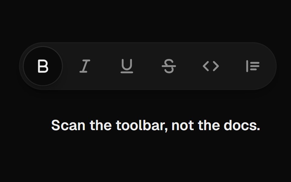 Tooltip GroupUI Lab · ReactOne tooltip slides from button to button and reshapes around each label.
Libraries with Animated tooltip components
Related categories
- Tooltip Components
- React Tooltip Components
- Tailwind CSS Tooltip Components
- shadcn/ui Tooltip Components
- Animated Overlay Components
- Animated Modal Components
- Animated Popover Components
- Animated Toast Components
- Animated Drawer Components
- Animated Dynamic Island Components
- Animated Hover Card Components
- Animated Bottom Sheet Components
- Animated Alert Dialog Components
- Animated Mini Player Components