 Dev Design Library
Animated Hover Card Components
Dev Design Library indexes 14 Animated hover card components from 10 open-source UI libraries, with the most coming from SpaceUI, Sona UI, UI Lab, GreatUI and Amicro Micro Transitions. Each one links to its page with the source code, a live preview where available, the library license and the install command. These are the hover card components tagged as animated: motion on hover, on scroll or on load, usually built with CSS transitions or Framer Motion. Hover card components belong to the Overlays group.
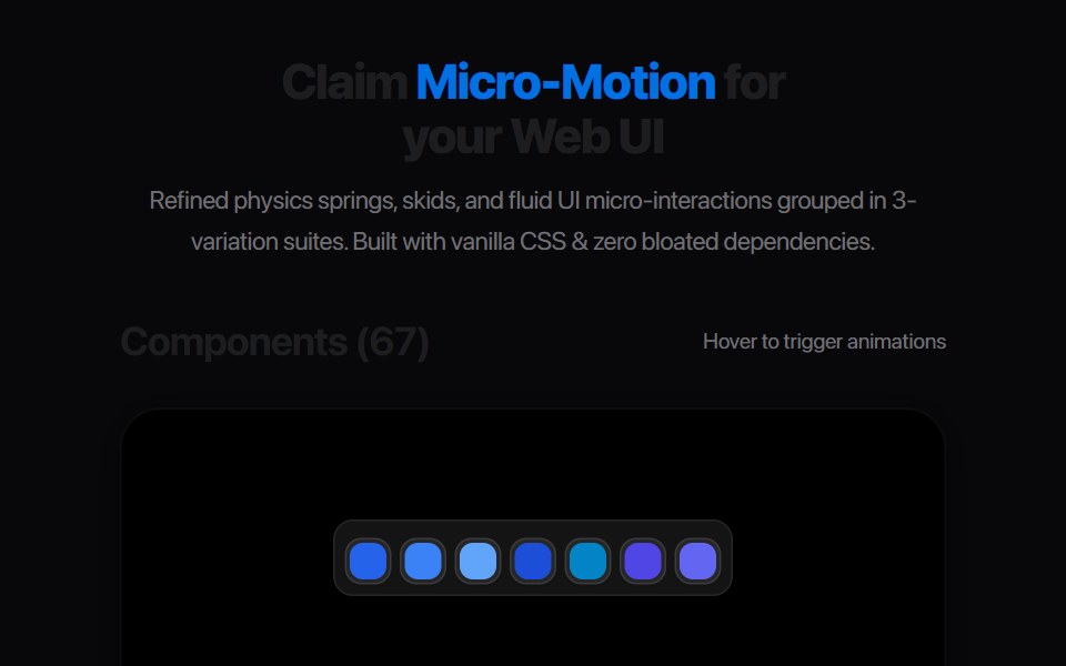 Card Glance PreviewAmicro Micro Transitions · ReactMicro floating glance card popup with status indicator dot.
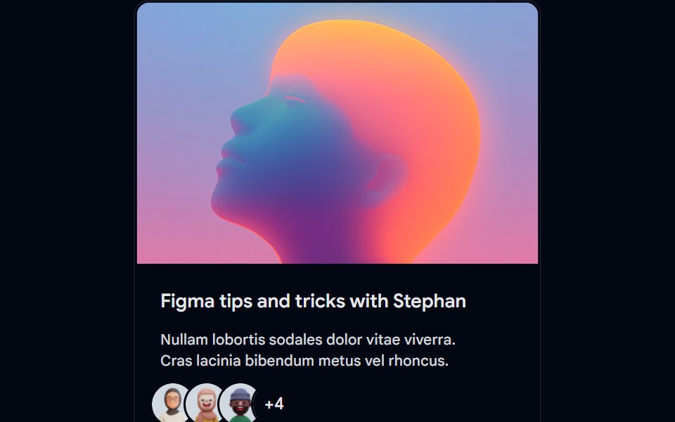 Card-01 - ArticlePreviewCardShadcn Space · ReactCard component
 Image Hover RevealGreatUI · React
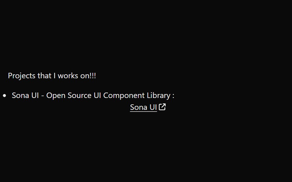 LinkPreviewSona UI · ReactThe `LinkPreview` component is an interactive UI element that displays a preview of a link when hovered over. It…
 Preview Link CardWatermelon UI · React
 Hover cardArc Library · ReactPreview a person or link on hover or focus without leaving the page.
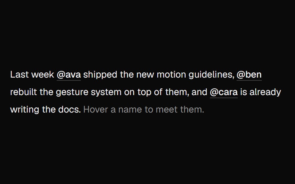 Hover CardUI Lab · ReactOne card travels between names as you hover them.
 Hover cardHextaUI · ReactA preview card that opens when a link is hovered or focused, for content sighted users can glance at.
 Card InfoSpaceUI · ReactResponsive feature and philosophy cards with gradient icons, clean typography, and layered container aesthetics.
 Hover CardReactFrame · ReactA hover-triggered rich preview card with open/close delays, a hover bridge so moving into the card keeps it open…
 Cursor Hover CardSona UI · React
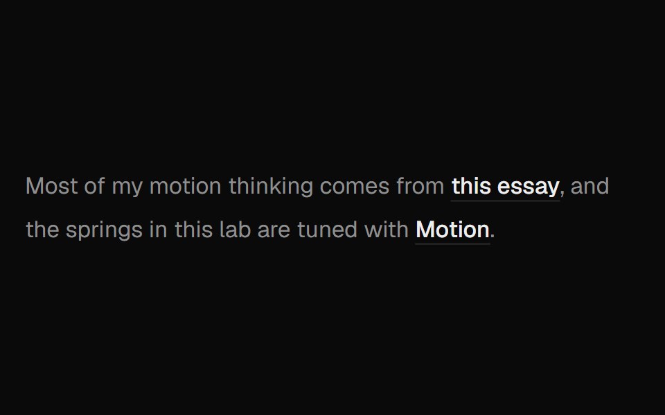 Hover Preview LinkUI Lab · ReactHover a link to get a preview card that trails your cursor and leans as it moves.
 Preview CardSpaceUI · ReactDisplays an informative preview card when users hover over a link, giving them a summary of the linked page before…
 Preview Link CardSpaceUI · ReactDisplays an interactive card preview of a website with its thumbnail, title, and domain name when shared or hovered.
Libraries with Animated hover card components
Related categories
- Hover Card Components
- React Hover Card Components
- Tailwind CSS Hover Card Components
- shadcn/ui Hover Card Components
- Animated Overlay Components
- Animated Modal Components
- Animated Popover Components
- Animated Toast Components
- Animated Drawer Components
- Animated Tooltip Components
- Animated Dynamic Island Components
- Animated Bottom Sheet Components
- Animated Alert Dialog Components
- Animated Mini Player Components