 Dev Design Library
shadcn/ui Hover Card Components
Dev Design Library indexes 10 shadcn/ui hover card components from 5 open-source UI libraries, with the most coming from Notra, AI Elements (Svelte), Shadcn Space, glasscn and FLX UI. Each one links to its page with the source code, a live preview where available, the library license and the install command. They follow the shadcn/ui conventions, so most install with the shadcn CLI and drop into a Tailwind project. Hover card components belong to the Overlays group.
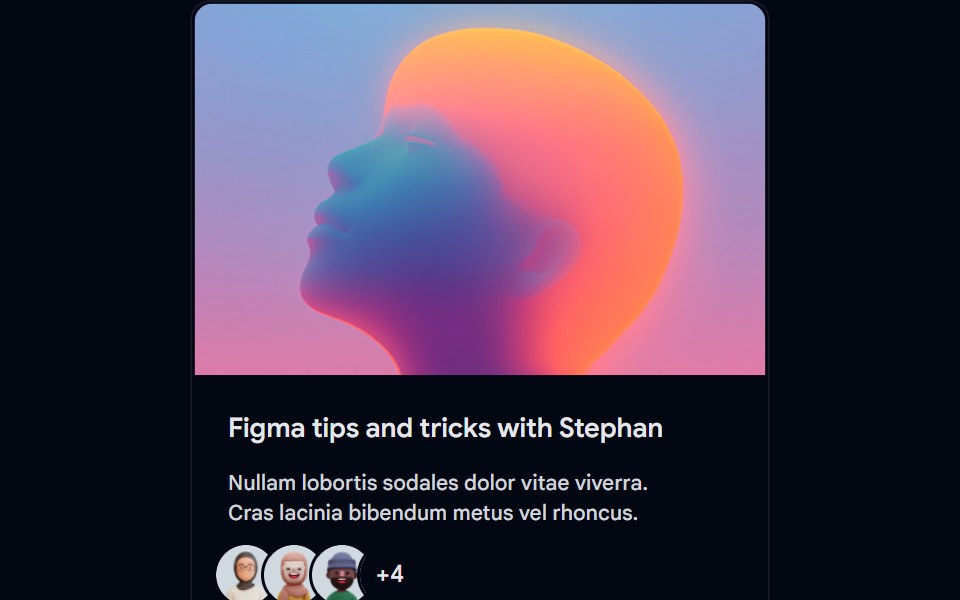 Card-01 - ArticlePreviewCardShadcn Space · ReactCard component
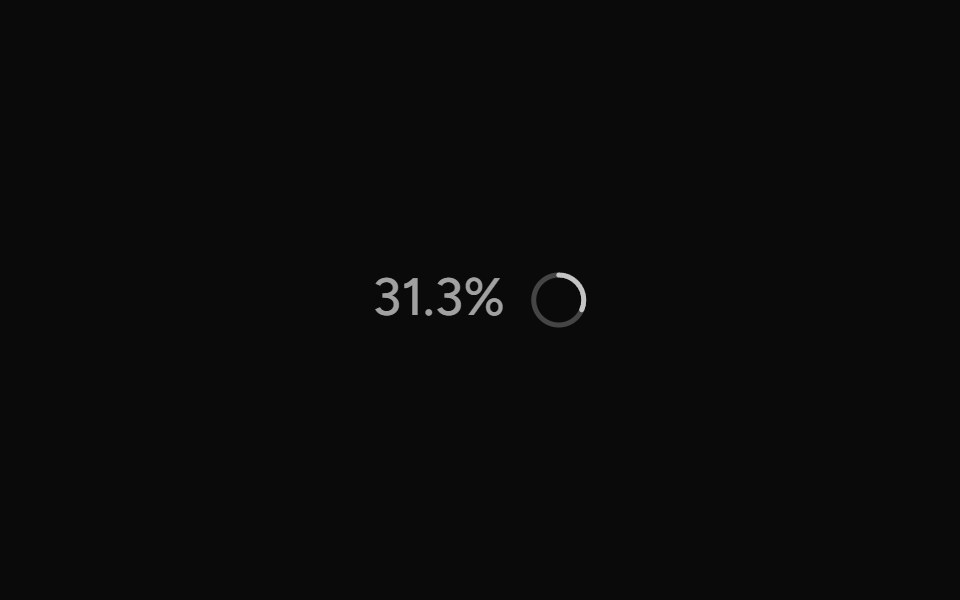 ContextAI Elements (Svelte) · SvelteA hover-card-based context window usage component with token, cost, and model usage breakdowns.
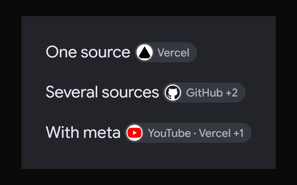 AI Overview CitationNotra · ReactA source chip built on shadcn Badge and HoverCard.
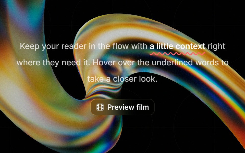 Highlight Phraseglasscn · ReactA smooth glass hover popover for text, video, and rich content, with click and keyboard access.
 Profile cardFLX UI · ReactBanner image, avatar, bio, and follow / message actions.
 Card-02 - Preview CardShadcn Space · ReactCard component
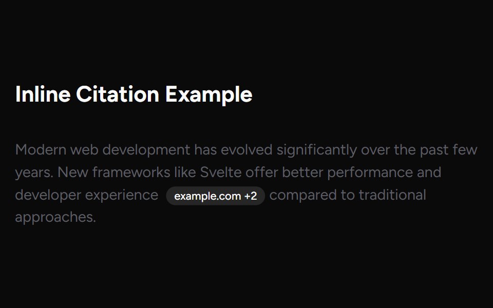 Inline CitationAI Elements (Svelte) · SvelteAn inline citation system with hover cards and carousel views for source-backed AI content.
 ChatGPT Source ChipNotra · ReactAn inline citation pill with a hover card.
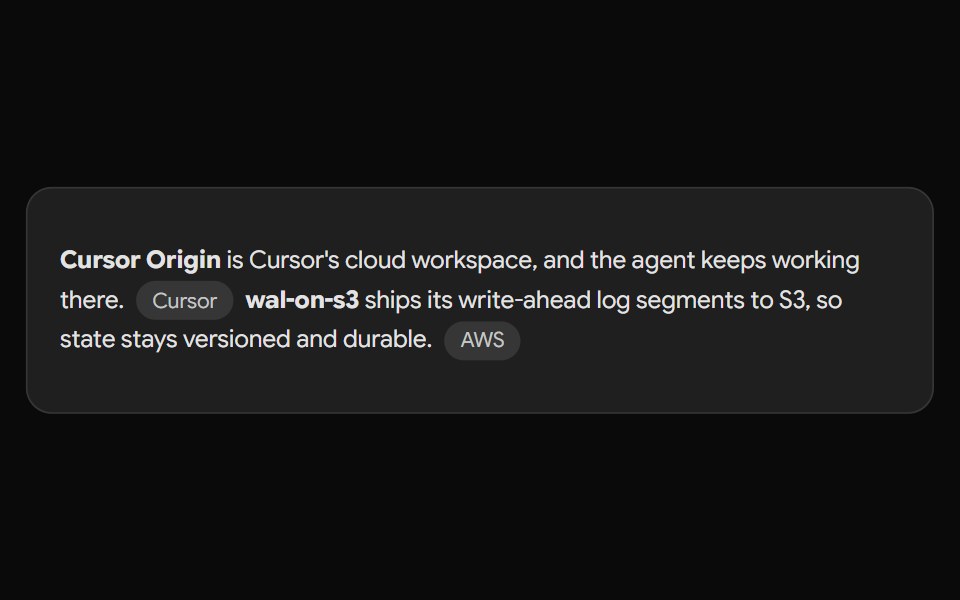 Gemini Source ChipNotra · ReactAn inline source pill with a hover card.
 Perplexity CitationNotra · ReactAn inline source pill with favicon, label and +N count, built on shadcn Badge.
Libraries with shadcn/ui hover card components
Related categories
- Hover Card Components
- React Hover Card Components
- Tailwind CSS Hover Card Components
- Animated Hover Card Components
- shadcn/ui Overlay Components
- shadcn/ui Modal Components
- shadcn/ui Popover Components
- shadcn/ui Tooltip Components
- shadcn/ui Drawer Components
- shadcn/ui Toast Components
- shadcn/ui Alert Dialog Components