 Dev Design Library
shadcn/ui Tooltip Components
Dev Design Library indexes 39 shadcn/ui tooltip components from 5 open-source UI libraries, with the most coming from Watermelon UI, FLX UI, Shadcn Space, sv-particles and Cojeev UI. Each one links to its page with the source code, a live preview where available, the library license and the install command. They follow the shadcn/ui conventions, so most install with the shadcn CLI and drop into a Tailwind project. Tooltip components belong to the Overlays group.
 Avatar 11 - Group with TooltipsShadcn Space · ReactAvatar group with name tooltips on hover and a +N counter that opens a popover listing the remaining members and their…
 Tooltip 1Watermelon UI · React
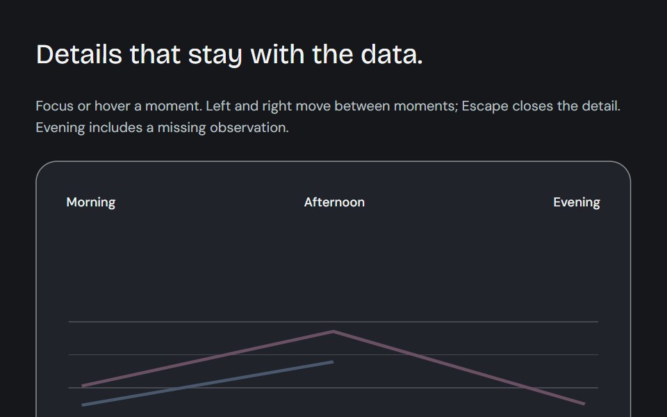 Dynamic chart tooltipCojeev UI · ReactCompare a point, read its known subtotal or rank its series. Values update in place and keep their series colours.
 BasicFLX UI · ReactDefault dark tooltip on a button.
 End Tooltipsv-particles · Svelte
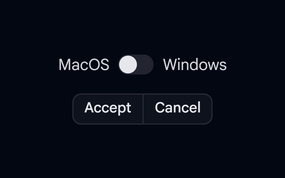 KBD 03 - KBD in TooltipShadcn Space · ReactButtonGroup with KBD shortcut hints shown inside tooltips on hover, with Mac/Windows platform switch
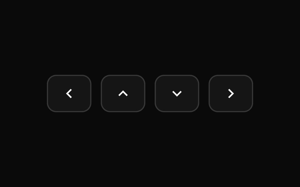 Tooltip 10Watermelon UI · React
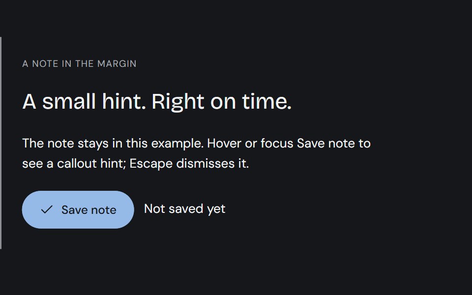 TooltipCojeev UI · ReactPrecise ink callouts, useful keyboard hints and small paper annotations. Short explanations that appear where…
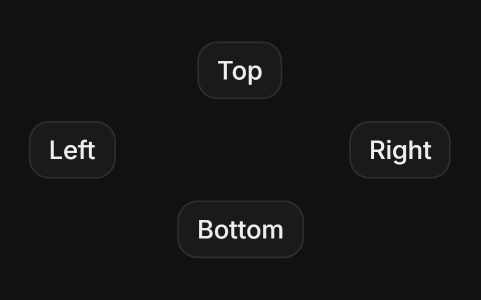 SidesFLX UI · ReactPlace the tooltip on top, right, bottom, or left.
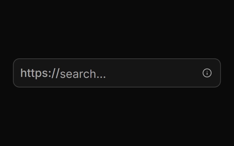 With Start Text End Tooltipsv-particles · Svelte
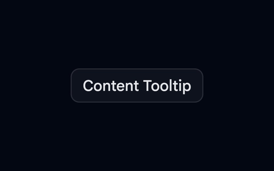 Tooltip-02 - Content TooltipShadcn Space · ReactTooltip component
 Tooltip 11Watermelon UI · React
 With shortcutFLX UI · ReactLabel paired with a keyboard shortcut badge inside the tooltip.
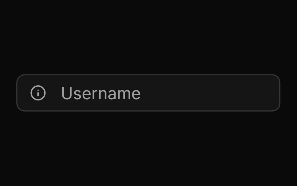 With Start Tooltipsv-particles · Svelte
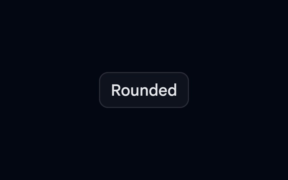 Tooltip-04 - Rounded TooltipShadcn Space · ReactTooltip component
 Tooltip 12Watermelon UI · React
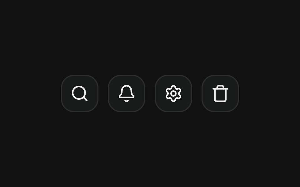 On icon buttonFLX UI · ReactLabels icon-only buttons in a toolbar.
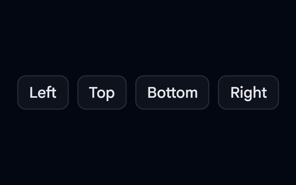 Tooltip-05 - Tooltip PositionShadcn Space · ReactTooltip component
 Tooltip 13Watermelon UI · React
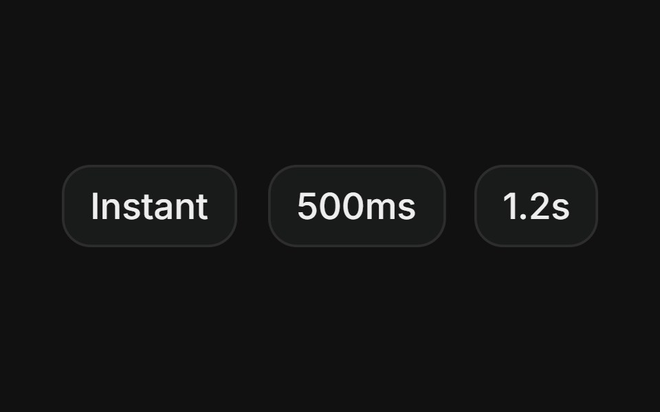 Custom delayFLX UI · ReactTooltips that open instantly, after 500ms, or after 1.2s, showing different hover delay behaviors.
 Tooltip-06 - Avatar TooltipShadcn Space · ReactTooltip component
 Tooltip 14Watermelon UI · React
 Rich contentFLX UI · ReactTitle plus supporting description in the content.
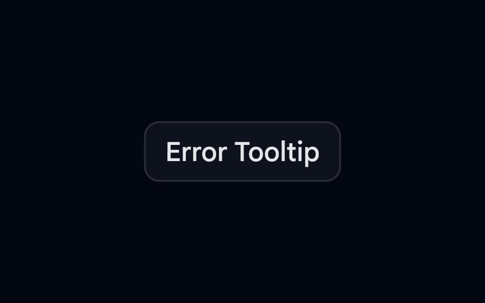 Tooltip-07 - Error TooltipShadcn Space · ReactTooltip component
 Tooltip 15Watermelon UI · React
 Light via dark classFLX UI · ReactA light-colored tooltip that appears in light mode, inverted from the default dark style.
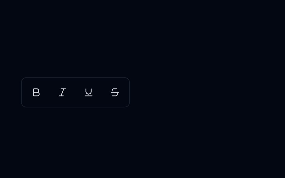 Tooltip 08 - Editor Toolbar TooltipShadcn Space · ReactTooltip component
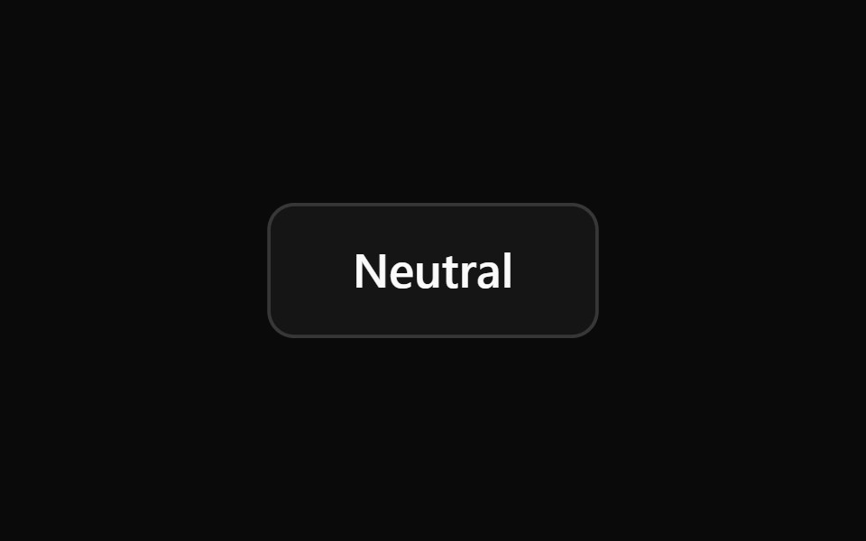 Tooltip 2Watermelon UI · React
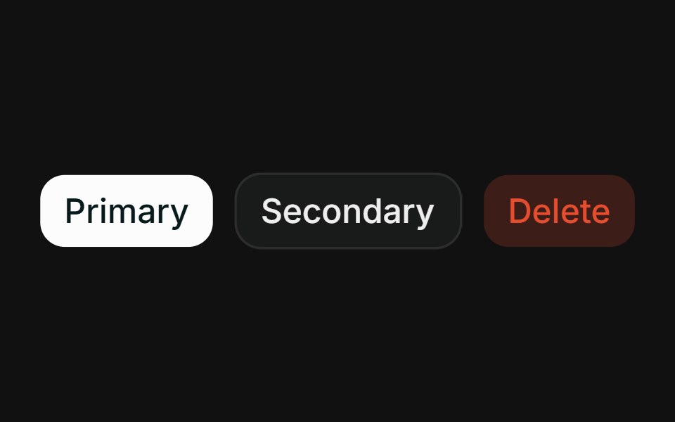 ColoredFLX UI · ReactPrimary, secondary, and destructive tooltips with arrow color matching the content.
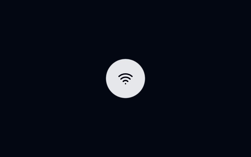 Tooltip 09 - Gooey Status TooltipShadcn Space · ReactTooltip component
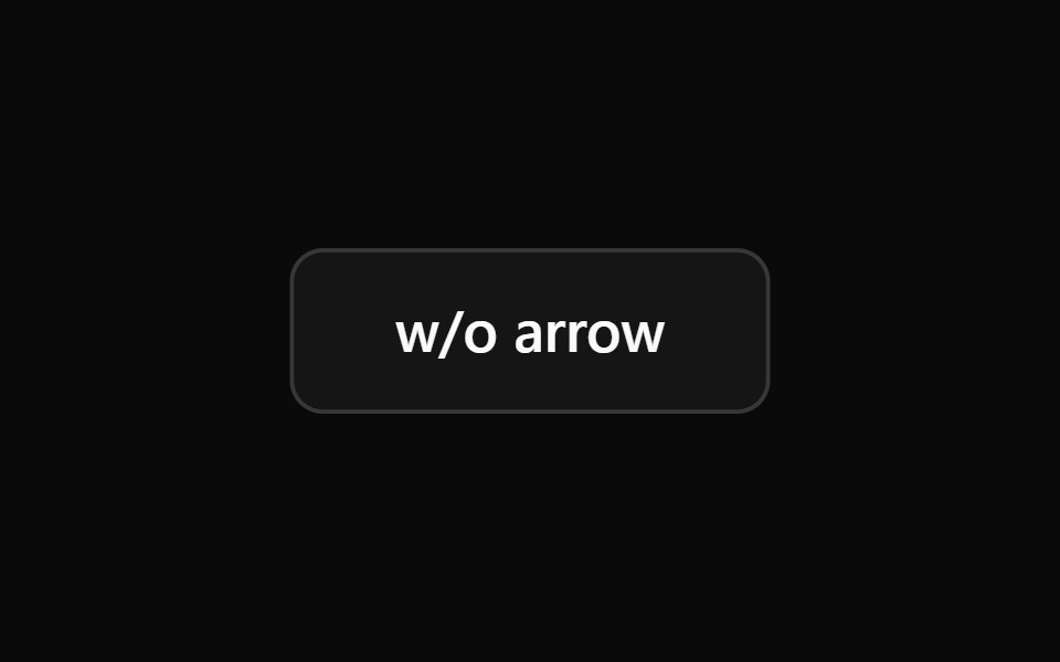 Tooltip 3Watermelon UI · React
 No arrowFLX UI · ReactHide the pointer arrow for a flatter look.
 Tooltip 4Watermelon UI · React
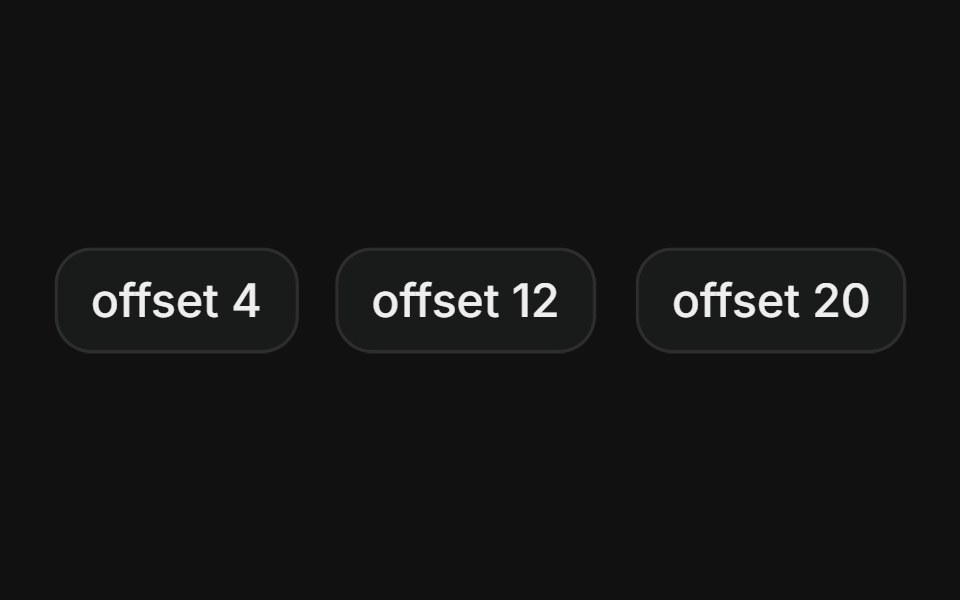 Side offsetFLX UI · ReactAdjust the gap between trigger and content.
 Tooltip 5Watermelon UI · React
 Tooltip 6Watermelon UI · React
 Tooltip 7Watermelon UI · React
 Tooltip 8Watermelon UI · React
 Tooltip 9Watermelon UI · React