 Dev Design Library
shadcn/ui Overlay Components
Dev Design Library indexes 230 shadcn/ui overlay components from 20 open-source UI libraries, with the most coming from Watermelon UI, FLX UI, Shadcn Space, Notra and HextaUI. Each one links to its page with the source code, a live preview where available, the library license and the install command. They follow the shadcn/ui conventions, so most install with the shadcn CLI and drop into a Tailwind project.
Showing 120 of 230, a mix from every library. Open a library to see all of its components.
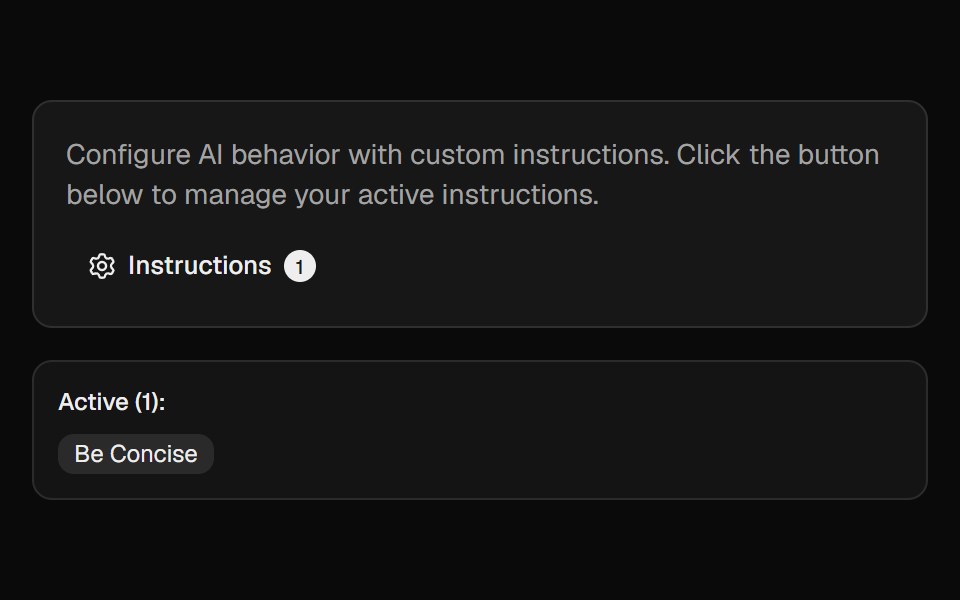 Ai InstructionsCult UI · ReactManage and toggle AI instructions with a popover, search, and create-dialog
 Smooth DrawerKokonut UI · ReactCheckout bottom sheet on Vaul snap points, peeking at the total and dragging up for details.
 Animated DrawerSpectrum UI · Reactcomponent for the Animated Drawer
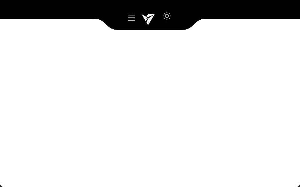 Notch NavbarVengeance UI · ReactResponsive navbar with a sleek cutout notch design
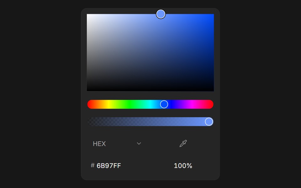 Color PickerFluid Functionalism · ReactColor picker with HEX, RGB, HSL, and OKLCH formats, alpha channel, optional swatches, and a popover trigger. Built on…
 Aspect Ratio 03 - Caption OverlayShadcn Space · ReactA portrait aspect ratio card with a gradient overlay and caption text.
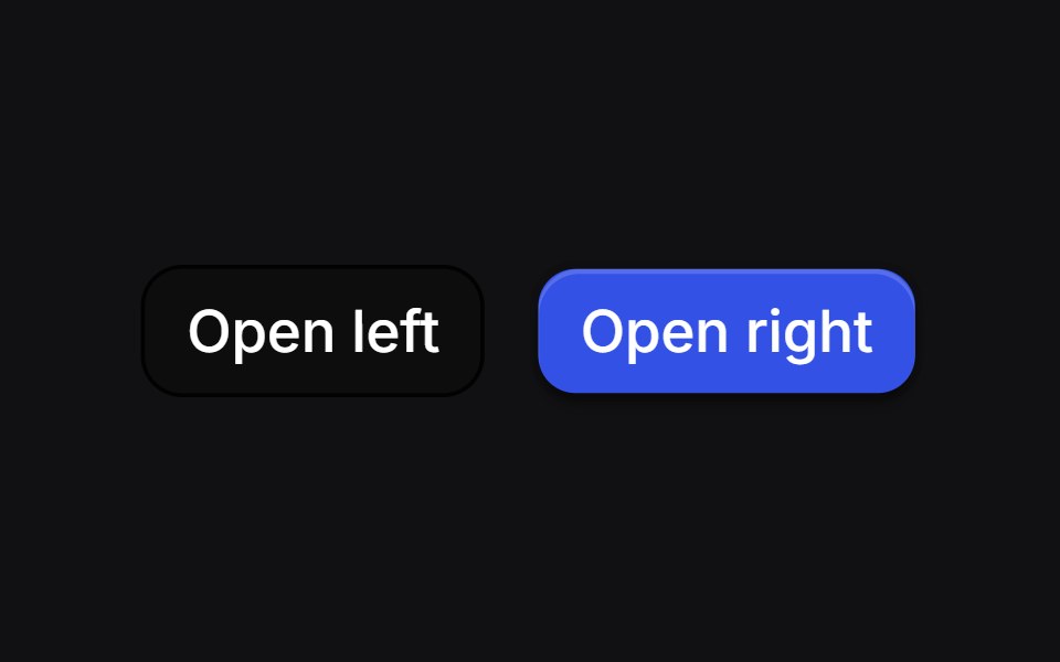 Curve Draweruselayouts · ReactSide drawers whose inner edge starts as a bulge and morphs into a straight line as the panel settles.
 Alert DialogShadcn Dashboard · React
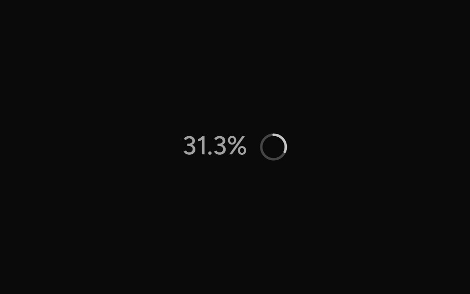 ContextAI Elements (Svelte) · SvelteA hover-card-based context window usage component with token, cost, and model usage breakdowns.
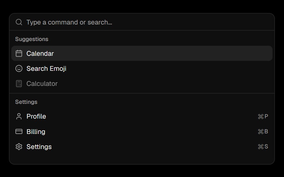 CommandObsidianUI · React
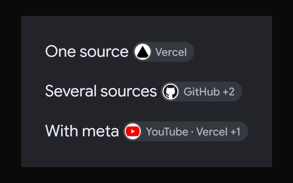 AI Overview CitationNotra · ReactA source chip built on shadcn Badge and HoverCard.
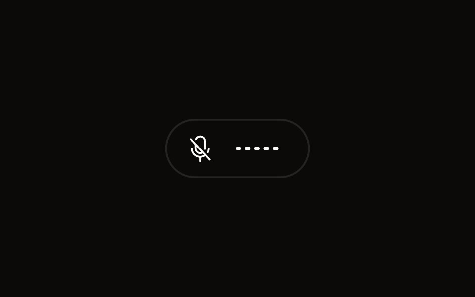 Quick Audio Popoveraudiocn · ReactCompact microphone and system audio controls behind one toolbar button that shows a live level.
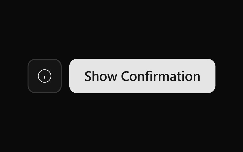 Alert Dialog 01Watermelon UI · React
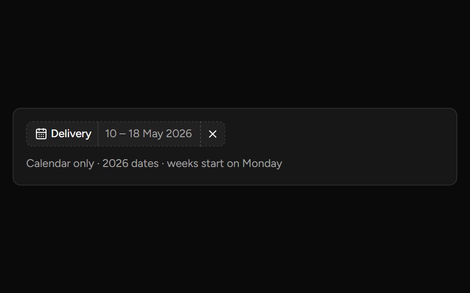 Date Range Filtersv-table · SvelteA responsive date-range picker with presets and explicit apply behavior.
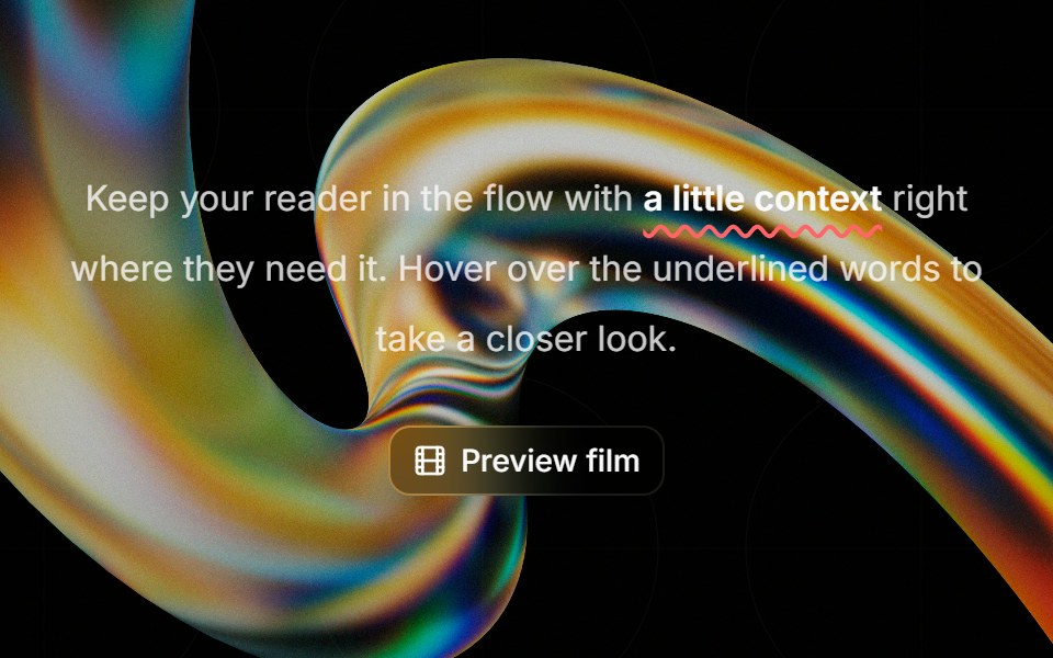 Highlight Phraseglasscn · ReactA smooth glass hover popover for text, video, and rich content, with click and keyboard access.
 Alert dialogHextaUI · ReactA confirmation dialog for destructive or important actions that waits for async work, and becomes a bottom sheet on…
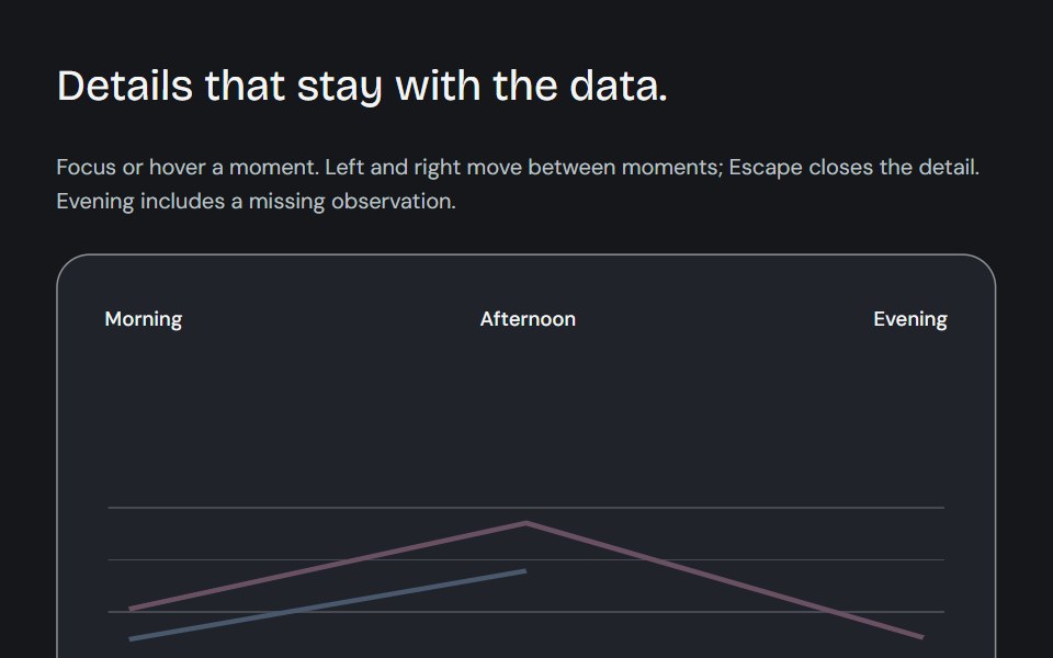 Dynamic chart tooltipCojeev UI · ReactCompare a point, read its known subtotal or rank its series. Values update in place and keep their series colours.
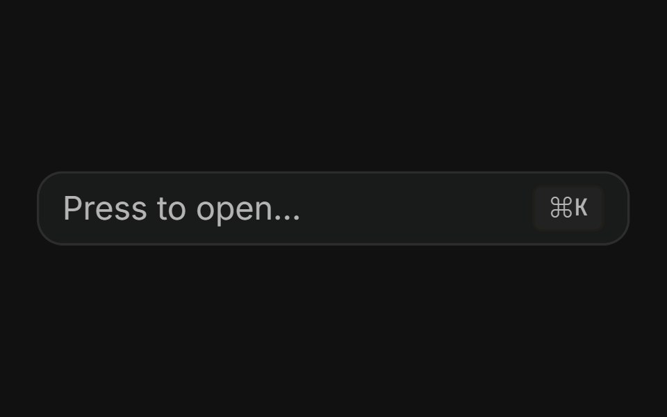 Command dialogFLX UI · ReactSpotlight-style ⌘K palette toggled by a button or keyboard shortcut.
 Alert Dialog With Bare Footersv-particles · Svelte
 Alert Dialogark-cn · ReactA shadcn-style alert dialog component built with Ark UI primitives.
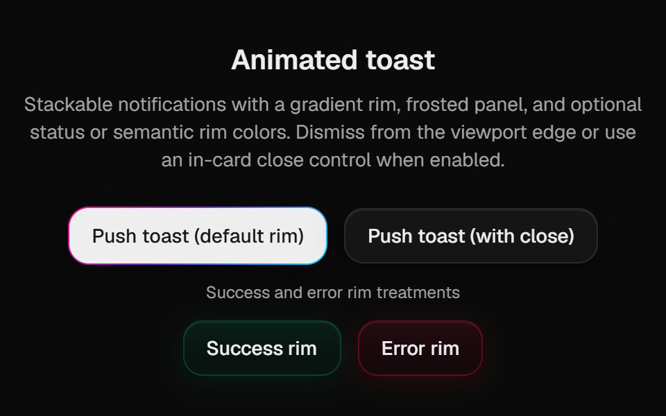 Halo ToastCult UI · ReactSonner-backed polished toasts with rim variants; mount PolishedToaster once in the root layout
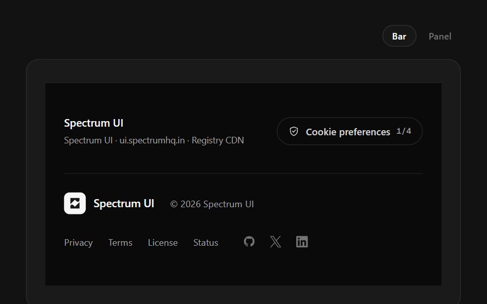 Policy FooterSpectrum UI · ReactCookie-category switches with a save state, over a layered legal row.
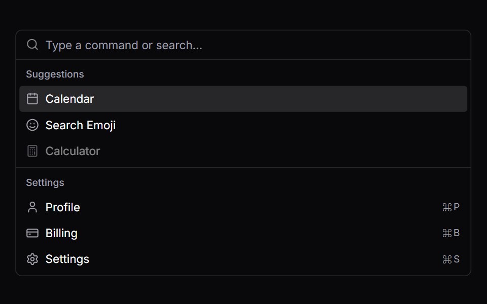 CommandVengeance UI · React
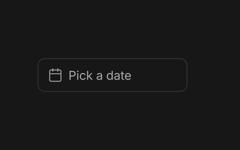 Date PickerFluid Functionalism · ReactField or ghost trigger for a date, a range, or a date and a time: a calendar popover that opens on the selected day…
 Avatar 11 - Group with TooltipsShadcn Space · ReactAvatar group with name tooltips on hover and a +N counter that opens a popover listing the remaining members and their…
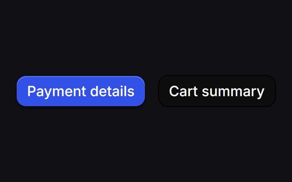 Drawer Buttonsuselayouts · ReactTwo buttons that open side drawers with a 3D fold. Payment comes from the right, cart from the left, and the fields…
 DialogShadcn Dashboard · React
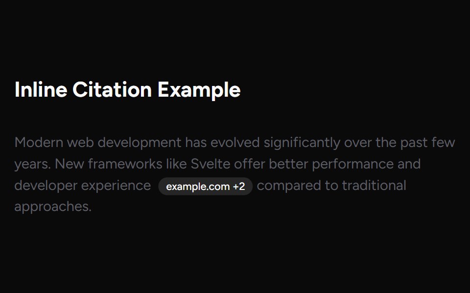 Inline CitationAI Elements (Svelte) · SvelteAn inline citation system with hover cards and carousel views for source-backed AI content.
 ChatGPT ActivityNotra · ReactThe search activity and sources side sheet, built on shadcn Sheet, Badge and Avatar.
 Alert Dialog 02Watermelon UI · React
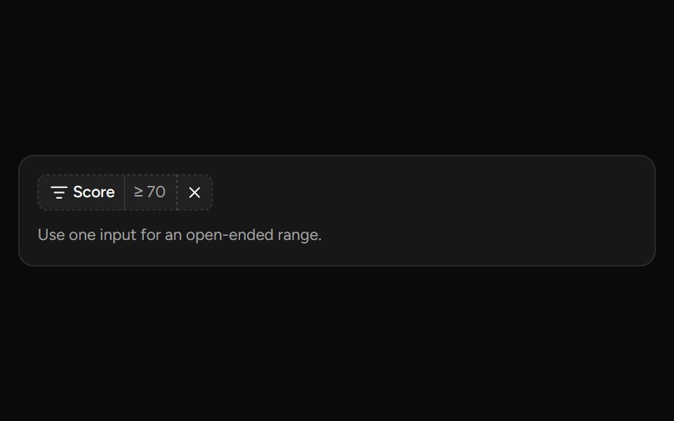 Number Range Filtersv-table · SvelteA number range picker with exact inputs, an optional slider, and explicit apply behavior.
 Alert Dialogglasscn · React
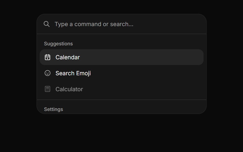 CommandHextaUI · ReactA searchable list of actions, inline or as a ⌘K palette, with pages, shortcuts and highlighted matches.
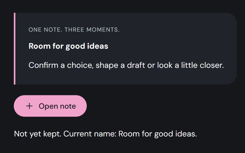 DialogCojeev UI · ReactA decision slip, focused editor or illustrated exhibit. Give one task your attention without losing your place.
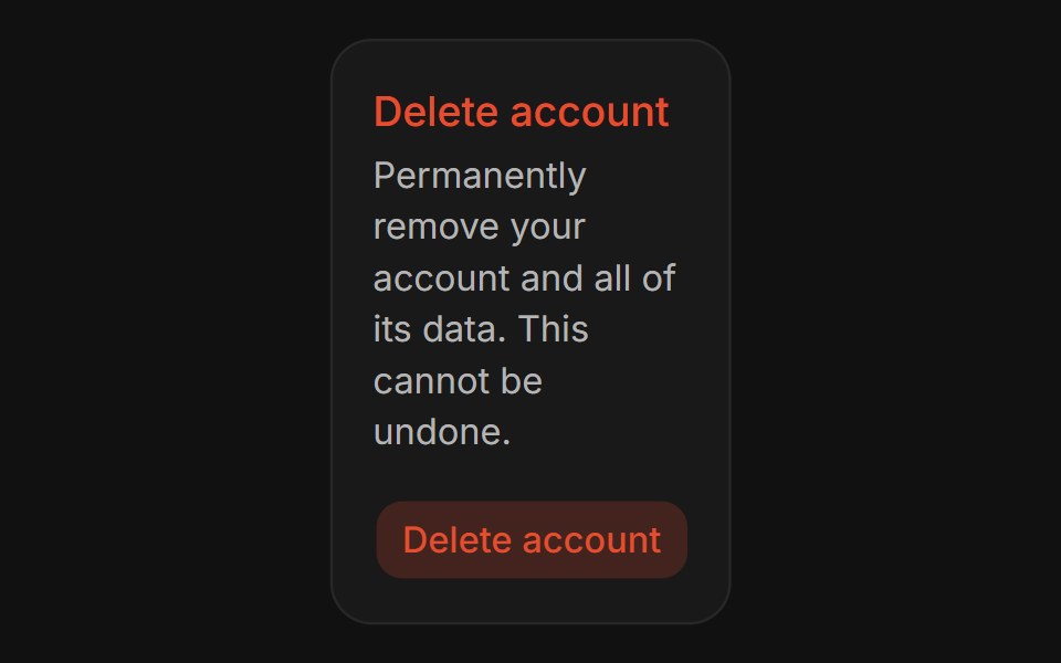 Confirm DialogFLX UI · ReactConfirm Dialog for Delete Account.
 Basic Alert Dialogsv-particles · Svelte
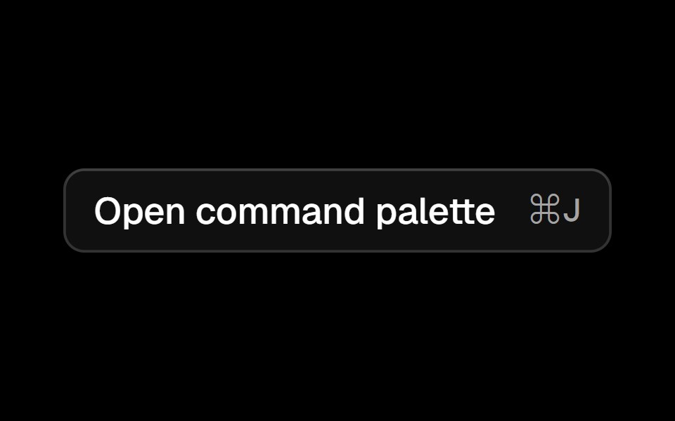 Commandark-cn · ReactA shadcn-style command component built with Ark UI primitives.
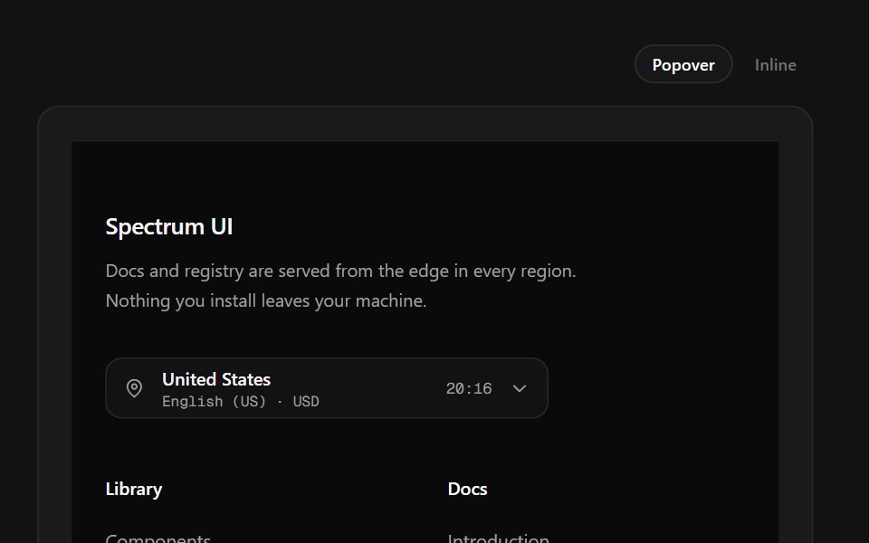 Region Picker FooterSpectrum UI · ReactA region popover with locale, currency, data residency and live local time.
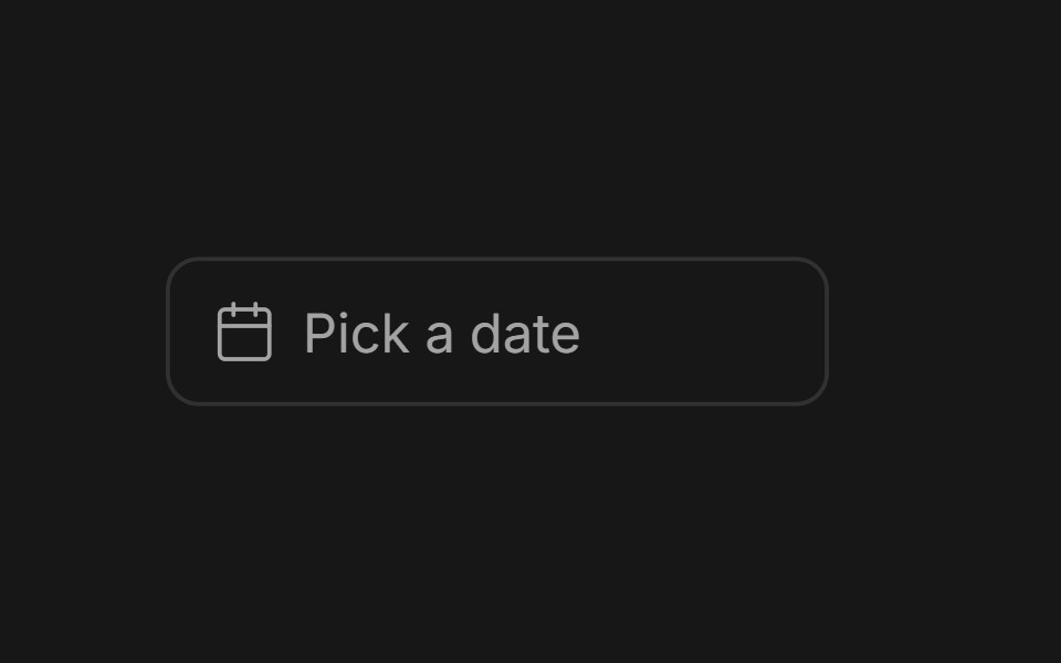 Date PickerFluid Functionalism · ReactField or ghost trigger for a date, a range, or a date and a time: a calendar popover that opens on the selected day…
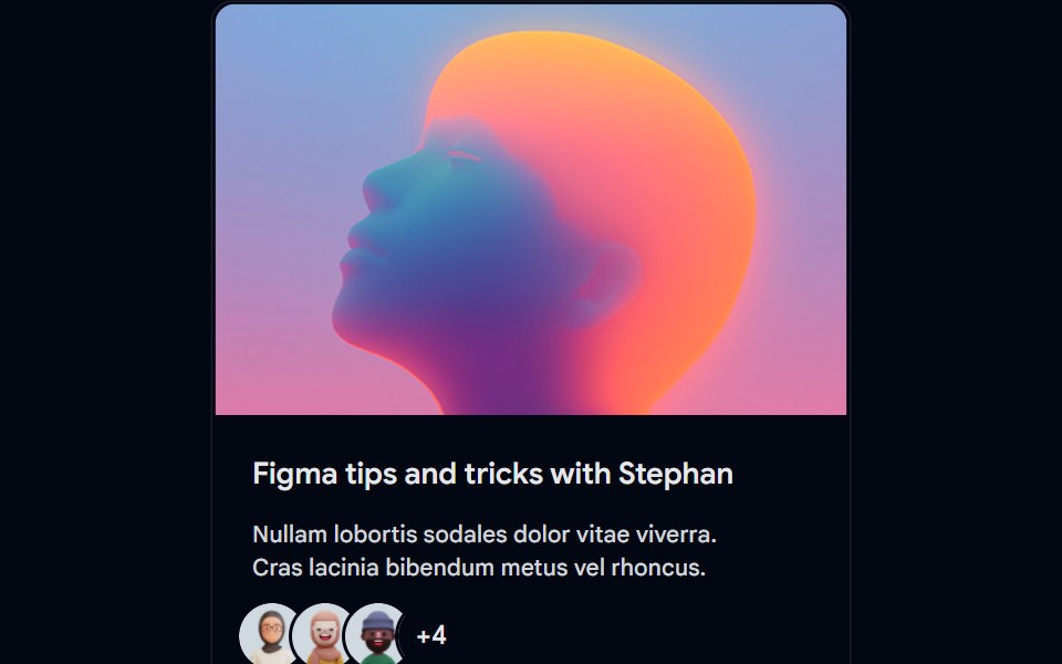 Card-01 - ArticlePreviewCardShadcn Space · ReactCard component
 SheetShadcn Dashboard · React
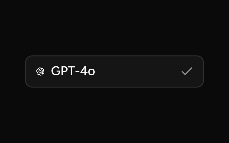 Model SelectorAI Elements (Svelte) · SvelteA searchable model selector dialog built on command and dialog primitives.
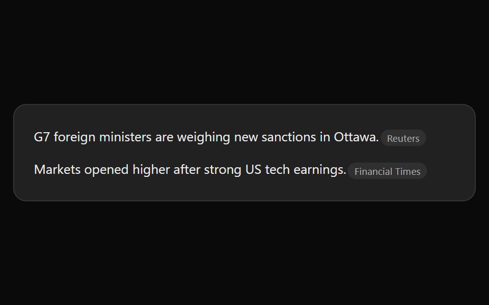 ChatGPT Source ChipNotra · ReactAn inline citation pill with a hover card.
 Alert Dialog 03Watermelon UI · React
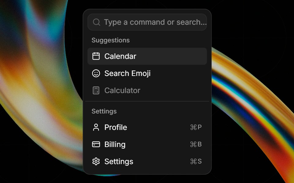 Commandglasscn · React
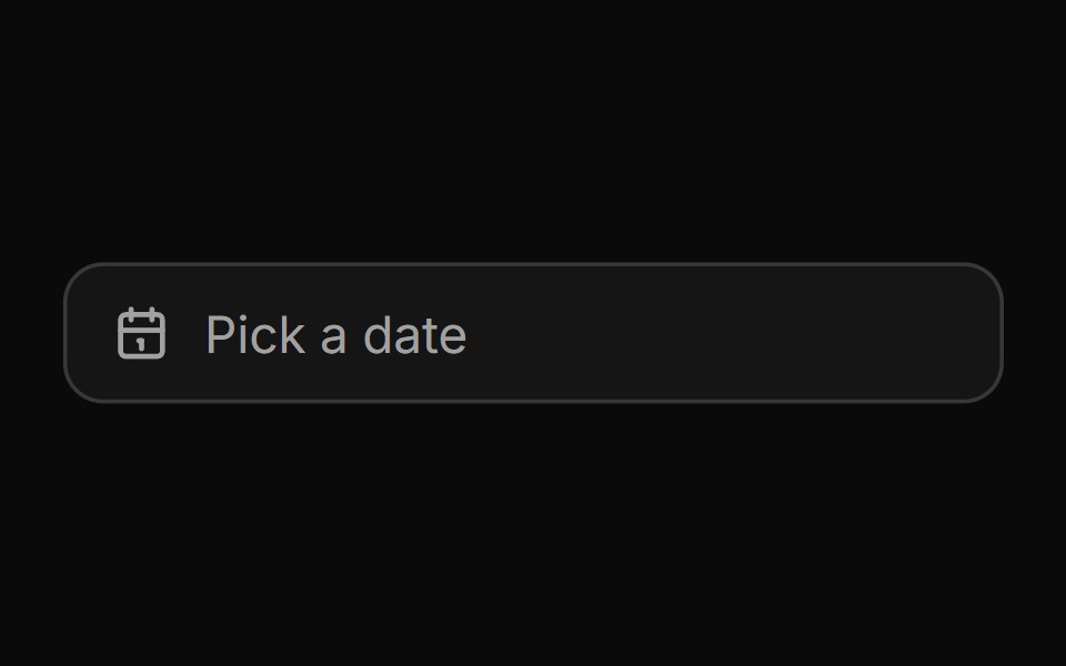 Date pickerHextaUI · ReactA button that opens a calendar in a popover, or a bottom sheet on phones, for single dates and ranges.
 PopoverCojeev UI · ReactPlaces a dismissible panel next to a trigger for a small contextual task or set of controls.
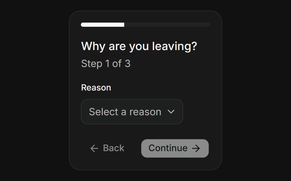 Multi-StepFLX UI · ReactMulti-Step for Delete Account.
 End Tooltipsv-particles · Svelte
 Date Pickerark-cn · ReactA shadcn-style date picker component built with Ark UI primitives.
 Responsive ModalSpectrum UI · Reactcomponent for the Responsive Modal
 DialogFluid Functionalism · ReactAnimated modal dialog with spring-based scale and opacity transitions in three widths (sm, lg, and an xl canvas for…
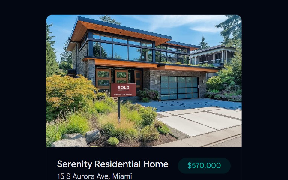 Card-02 - Preview CardShadcn Space · ReactCard component
 Claude Plus MenuNotra · ReactThe composer's + menu with files, skills, connectors, design system, plugins and research.
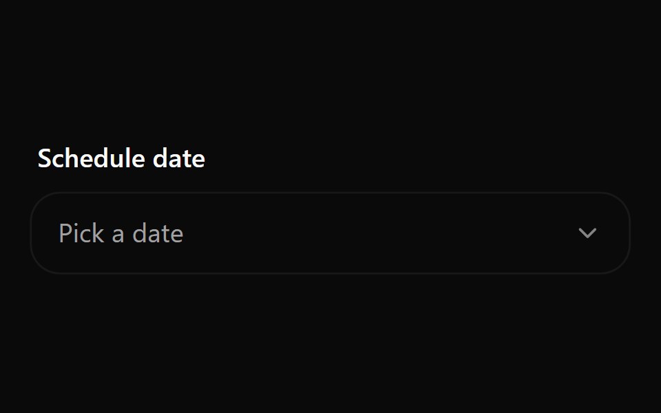 Date Picker 1Watermelon UI · React
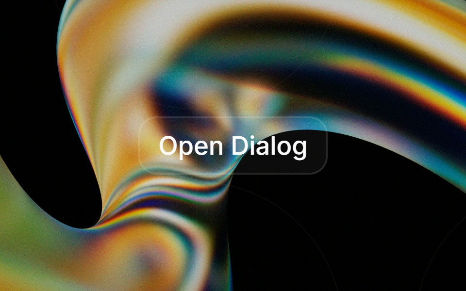 Dialogglasscn · React
 DialogHextaUI · ReactA window over the page for forms and focused tasks, with a pinned header and footer, nesting, and a swipeable bottom…
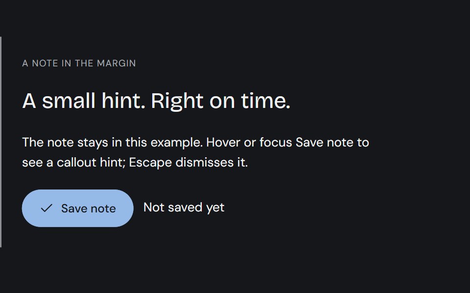 TooltipCojeev UI · ReactPrecise ink callouts, useful keyboard hints and small paper annotations. Short explanations that appear where…
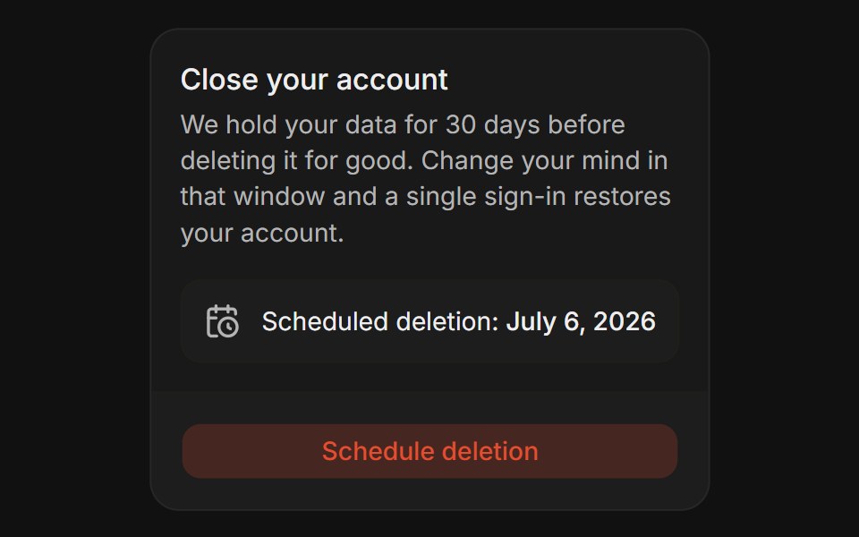 Grace PeriodFLX UI · ReactGrace Period for Delete Account.
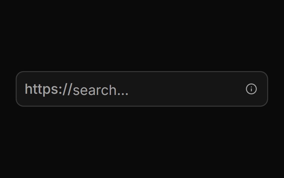 With Start Text End Tooltipsv-particles · Svelte
 Sheetark-cn · ReactA shadcn-style sheet component built with Ark UI primitives.
 Dialog (Base UI)Fluid Functionalism · ReactAnimated modal dialog with spring-based scale and opacity transitions in three widths (sm, lg, and an xl canvas for…
 Dialog 01 - Slide from TopShadcn Space · ReactDialog that slides in from the top — ideal for notifications and alerts.
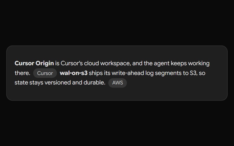 Gemini Source ChipNotra · ReactAn inline source pill with a hover card.
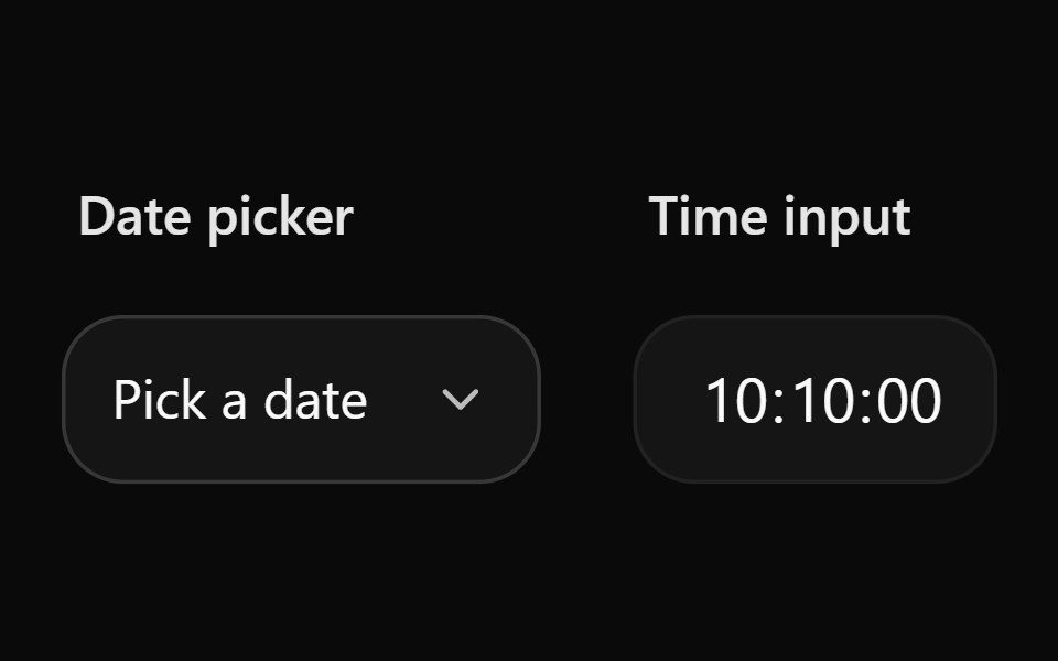 Date Picker 10Watermelon UI · React
 Sheetglasscn · React
 DrawerHextaUI · ReactA panel that slides in from any edge and follows your finger, with snap points, a working handle and nested drawers…
 Confirm actionFLX UI · ReactPolished yes/no with icon and clear hierarchy.
 With Start Tooltipsv-particles · Svelte
 Tourark-cn · ReactA shadcn-style tour component built with Ark UI primitives.
 Settings Dialog (Sidebar in a Dialog)Fluid Functionalism · ReactA settings dialog: the xl Dialog as a canvas, a non-collapsing Sidebar of sections down its left edge, and a scrolling…
 Dialog 02 - Slide from BottomShadcn Space · ReactDialog that slides in from the bottom — ideal for confirmations and destructive actions.
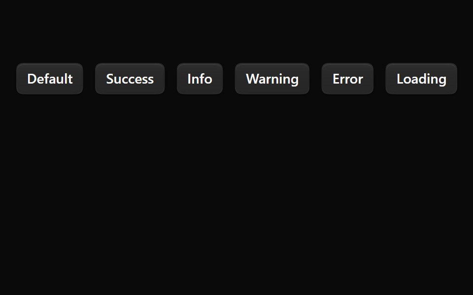 SonnerNotra · ReactA Sonner toaster with the Depth surface of the buttons and tinted status icons.
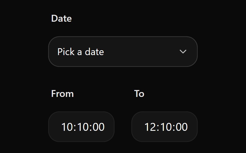 Date Picker 11Watermelon UI · React
 SheetHextaUI · ReactA panel that slides in from any edge, with swipe-to-dismiss, scroll lock and stacked nesting.
 Edit profileFLX UI · ReactFieldGroup form with Save and Cancel footer.
 Dialog 03 - Slide from LeftShadcn Space · ReactDialog that slides in from the left — ideal for subscription forms and quick inputs.
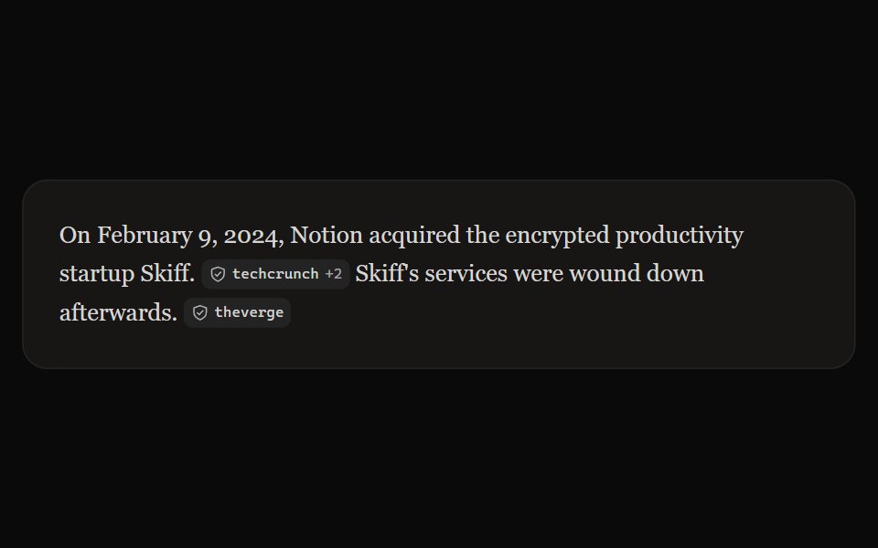 Perplexity CitationNotra · ReactAn inline source pill with favicon, label and +N count, built on shadcn Badge.
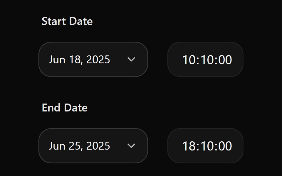 Date Picker 12Watermelon UI · React
 ToastHextaUI · ReactBrief messages that stack neatly, expand on hover, swipe away, and turn a loading state into success or error in place.
 Delete accountFLX UI · ReactDestructive warning with icon and emphasized copy.
 Dialog 04 - Slide from RightShadcn Space · ReactDialog that slides in from the right — ideal for user profiles and detail panels.
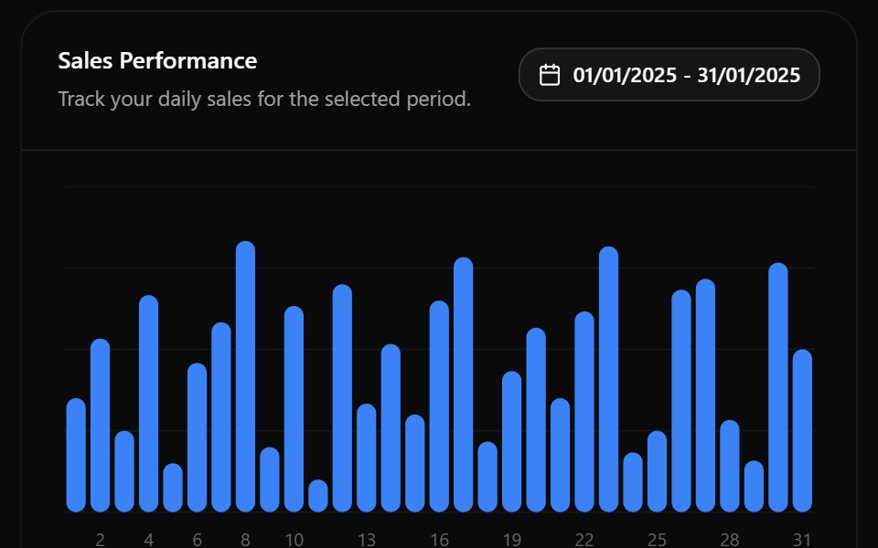 Date Picker 13Watermelon UI · React
 Terms, sticky footerFLX UI · ReactLong scroll body; Accept and Decline pinned footer.
 Dialog 05 - Zoom InShadcn Space · ReactDialog that scales up from the center — ideal for success states and celebrations.
 Date Picker 2Watermelon UI · React
 Share linkFLX UI · ReactReadonly URL with copy control; minimal footer.
 Dialog 06 - Zoom OutShadcn Space · ReactDialog that shrinks into place from a larger scale — ideal for announcements and feature highlights.
 Date Picker 3Watermelon UI · React
 Sticky headerFLX UI · ReactHeader fixed; scrollable changelog-style body.
 Dialog 12 - OTP VerificationShadcn Space · ReactEmail verification dialog with a 6-digit OTP input, auto-submit, attempt limit, resend countdown, and a verified state.
 Date Picker 4Watermelon UI · React
 Verify code (OTP)FLX UI · React6-digit InputOTP with separator; Verify footer.
 Dialog 14 - Responsive DialogShadcn Space · ReactResponsive pattern that shows a dialog on desktop and a swipeable bottom drawer on mobile, sharing one form.
 Date Picker 5Watermelon UI · React
 Onboarding welcomeFLX UI · ReactCompact hero image, title, and description; dual CTAs.
 Dialog 01 - Newsletter Subscription DialogShadcn Space · ReactA modern modal popup for capturing newsletter signups with a friendly hero image, email field, opt-out checkbox, and…
 Date Picker 6Watermelon UI · React
 Footer-only dismissFLX UI · ReactNo corner close button; dismiss only through the footer.
 Drawer 03 - Filters PanelShadcn Space · ReactLeft side filter drawer with category checkboxes, a price range slider, an in stock switch, a live result count, and…
 Date Picker 7Watermelon UI · React
 Pick teammatesFLX UI · ReactScrollable avatar rows with selection; Invite footer.
 Drawer 05 - Snap Points Order TrackingShadcn Space · ReactBottom drawer with peek, half, and full snap points showing delivery ETA, rider contact, a status timeline, and the…
 Date Picker 8Watermelon UI · React
 SuccessFLX UI · ReactCompletion check icon and Continue action.
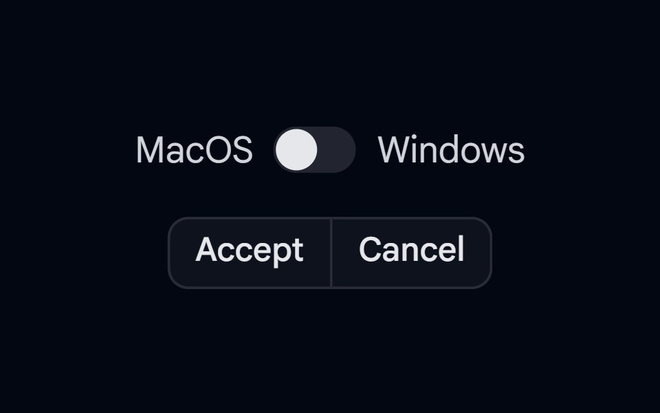 KBD 03 - KBD in TooltipShadcn Space · ReactButtonGroup with KBD shortcut hints shown inside tooltips on hover, with Mac/Windows platform switch
 Date Picker 9Watermelon UI · React
 Type to confirmFLX UI · ReactType delete to enable destructive button.
 Popover 01 - About Shadcn SpaceShadcn Space · ReactPopover that slides in from the top - ideal for notifications and alerts.
 Dialog 1Watermelon UI · React
 Settings sectionsFLX UI · ReactNotifications and Security blocks via Separator.
 Popover 04 - Volume ControlShadcn Space · ReactPopover that slides in from the top - ideal for notifications and alerts.
 Dialog 10Watermelon UI · React
 Choose imageFLX UI · ReactThumbnail grid with selection ring.
 Popover 06 - LocationShadcn Space · ReactPopover that slides in from the top - ideal for location details.
 Dialog 11Watermelon UI · React
 Invite teamFLX UI · ReactIcon header plus email field.
 Popover 08 - Product TourShadcn Space · ReactIcon-led product tour popover with progress dots and skip/next controls.
 Dialog 12Watermelon UI · React
 Long form, sticky footerFLX UI · ReactMany fields in scroll; footer-only sticky.
Libraries with shadcn/ui overlay components
Related categories
- Overlay Components
- React Overlay Components
- Tailwind CSS Overlay Components
- Svelte Overlay Components
- React Native Overlay Components
- Animated Overlay Components
- shadcn/ui Modal Components
- shadcn/ui Popover Components
- shadcn/ui Tooltip Components
- shadcn/ui Drawer Components
- shadcn/ui Toast Components
- shadcn/ui Alert Dialog Components
- shadcn/ui Hover Card Components