Dialog 14 - Responsive Dialog
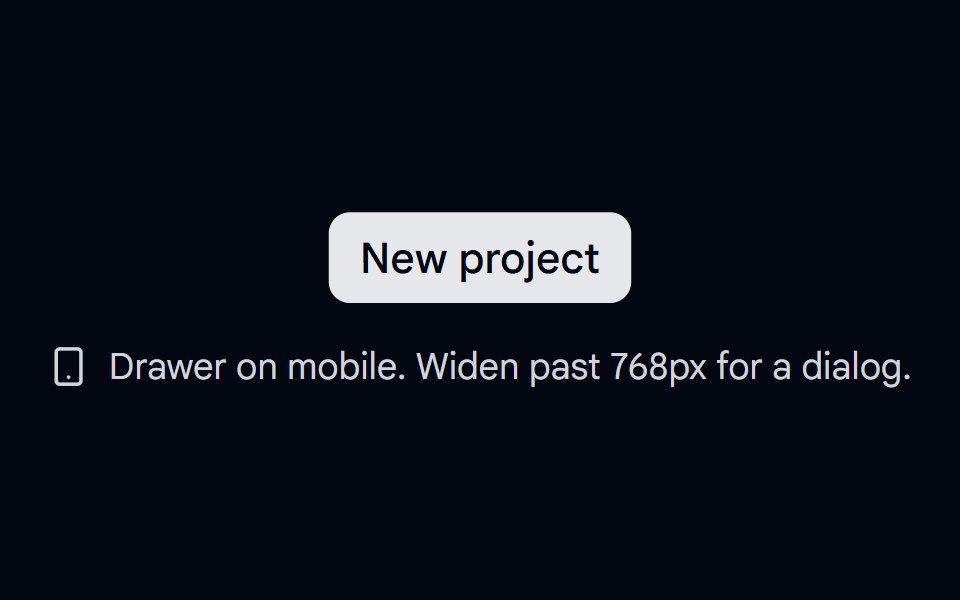
Responsive pattern that shows a dialog on desktop and a swipeable bottom drawer on mobile, sharing one form.
- Library
- Shadcn Space
- Framework
- React
- Type
- component
- License
- MIT
- Dependencies
- lucide-react
- Files
src/components/shadcn-space/dialog/dialog-14.tsxsrc/lib/utils.tssrc/components/ui/dialog.tsxsrc/components/ui/drawer.tsxsrc/components/ui/button.tsxsrc/components/ui/input.tsxsrc/components/ui/label.tsxsrc/config.ts
- Source
- https://github.com/shadcnspace/shadcnspace
Categories
- Modal Components
- React Modal Components
- Tailwind CSS Modal Components
- shadcn/ui Modal Components
- Overlay Components
- React Overlay Components
- Tailwind CSS Overlay Components
- shadcn/ui Overlay Components
More from Shadcn Space
- Dialog 01 - Slide from Top
- Dialog 02 - Slide from Bottom
- Dialog 03 - Slide from Left
- Dialog 04 - Slide from Right
- Dialog 05 - Zoom In
- Dialog 06 - Zoom Out
- Dialog 12 - OTP Verification
- Dialog 01 - Newsletter Subscription Dialog
- Time Picker 08 - Analog Clock Dialog
- About Us 01 - Impact Metrics
- Accordion-01 - Default
- Accordion-02 - Multi-level