 Dev Design Library
shadcn/ui Modal Components
Dev Design Library indexes 85 shadcn/ui modal components from 14 open-source UI libraries, with the most coming from FLX UI, Watermelon UI, Shadcn Space, glasscn and Fluid Functionalism. Each one links to its page with the source code, a live preview where available, the library license and the install command. They follow the shadcn/ui conventions, so most install with the shadcn CLI and drop into a Tailwind project. Modal components belong to the Overlays group.
 Responsive ModalSpectrum UI · Reactcomponent for the Responsive Modal
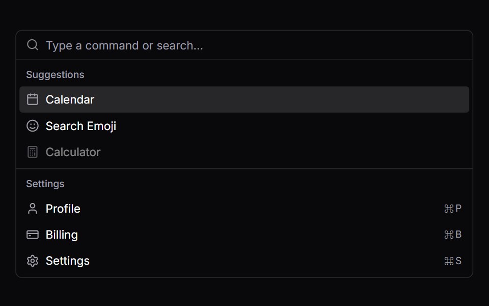 CommandVengeance UI · React
 DialogFluid Functionalism · ReactAnimated modal dialog with spring-based scale and opacity transitions in three widths (sm, lg, and an xl canvas for…
 Dialog 01 - Slide from TopShadcn Space · ReactDialog that slides in from the top — ideal for notifications and alerts.
 Alert DialogShadcn Dashboard · React
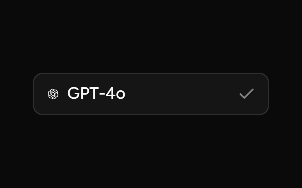 Model SelectorAI Elements (Svelte) · SvelteA searchable model selector dialog built on command and dialog primitives.
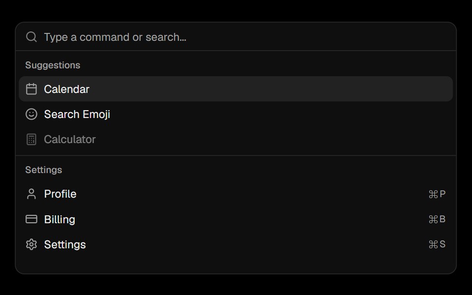 CommandObsidianUI · React
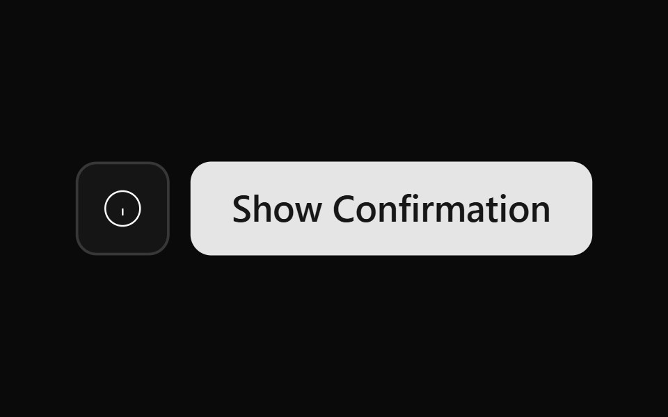 Alert Dialog 01Watermelon UI · React
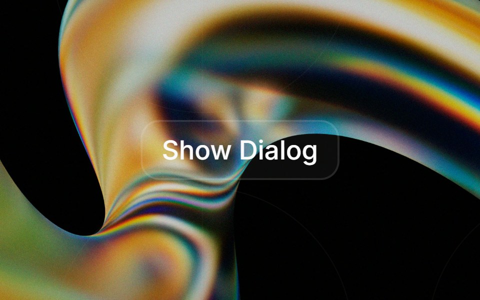 Alert Dialogglasscn · React
 Alert dialogHextaUI · ReactA confirmation dialog for destructive or important actions that waits for async work, and becomes a bottom sheet on…
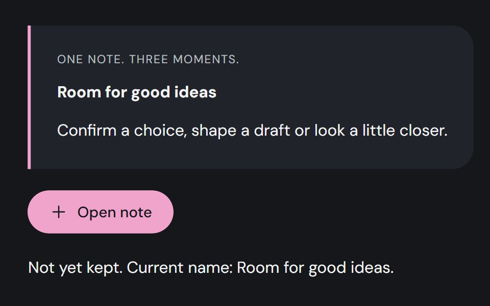 DialogCojeev UI · ReactA decision slip, focused editor or illustrated exhibit. Give one task your attention without losing your place.
 Command dialogFLX UI · ReactSpotlight-style ⌘K palette toggled by a button or keyboard shortcut.
 Alert Dialog With Bare Footersv-particles · Svelte
 Alert Dialogark-cn · ReactA shadcn-style alert dialog component built with Ark UI primitives.
 Dialog (Base UI)Fluid Functionalism · ReactAnimated modal dialog with spring-based scale and opacity transitions in three widths (sm, lg, and an xl canvas for…
 Dialog 02 - Slide from BottomShadcn Space · ReactDialog that slides in from the bottom — ideal for confirmations and destructive actions.
 DialogShadcn Dashboard · React
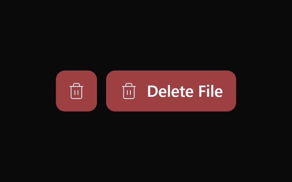 Alert Dialog 02Watermelon UI · React
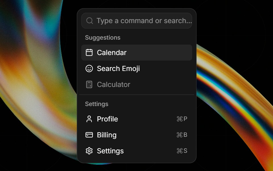 Commandglasscn · React
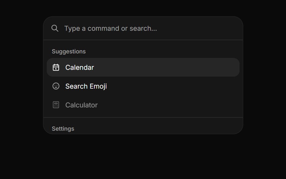 CommandHextaUI · ReactA searchable list of actions, inline or as a ⌘K palette, with pages, shortcuts and highlighted matches.
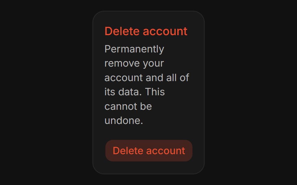 Confirm DialogFLX UI · ReactConfirm Dialog for Delete Account.
 Basic Alert Dialogsv-particles · Svelte
 Commandark-cn · ReactA shadcn-style command component built with Ark UI primitives.
 Settings Dialog (Sidebar in a Dialog)Fluid Functionalism · ReactA settings dialog: the xl Dialog as a canvas, a non-collapsing Sidebar of sections down its left edge, and a scrolling…
 Dialog 03 - Slide from LeftShadcn Space · ReactDialog that slides in from the left — ideal for subscription forms and quick inputs.
 Alert Dialog 03Watermelon UI · React
 Dialogglasscn · React
 DialogHextaUI · ReactA window over the page for forms and focused tasks, with a pinned header and footer, nesting, and a swipeable bottom…
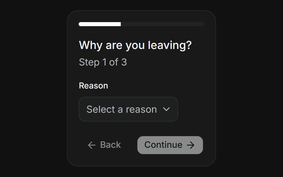 Multi-StepFLX UI · ReactMulti-Step for Delete Account.
 Dialog 04 - Slide from RightShadcn Space · ReactDialog that slides in from the right — ideal for user profiles and detail panels.
 Dialog 1Watermelon UI · React
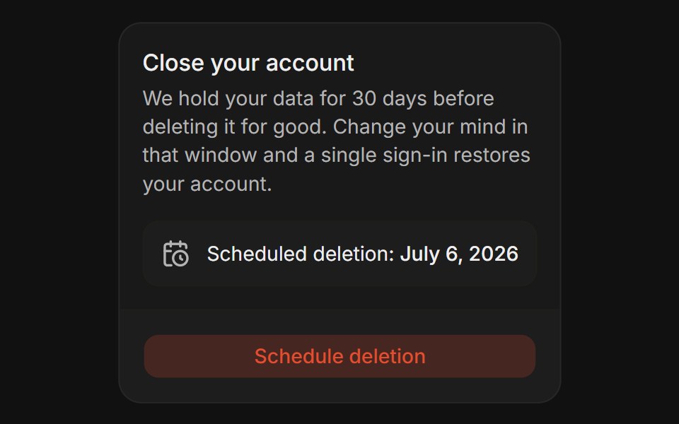 Grace PeriodFLX UI · ReactGrace Period for Delete Account.
 Dialog 05 - Zoom InShadcn Space · ReactDialog that scales up from the center — ideal for success states and celebrations.
 Dialog 10Watermelon UI · React
 Confirm actionFLX UI · ReactPolished yes/no with icon and clear hierarchy.
 Dialog 06 - Zoom OutShadcn Space · ReactDialog that shrinks into place from a larger scale — ideal for announcements and feature highlights.
 Dialog 11Watermelon UI · React
 Edit profileFLX UI · ReactFieldGroup form with Save and Cancel footer.
 Dialog 12 - OTP VerificationShadcn Space · ReactEmail verification dialog with a 6-digit OTP input, auto-submit, attempt limit, resend countdown, and a verified state.
 Dialog 12Watermelon UI · React
 Delete accountFLX UI · ReactDestructive warning with icon and emphasized copy.
 Dialog 14 - Responsive DialogShadcn Space · ReactResponsive pattern that shows a dialog on desktop and a swipeable bottom drawer on mobile, sharing one form.
 Dialog 13Watermelon UI · React
 Terms, sticky footerFLX UI · ReactLong scroll body; Accept and Decline pinned footer.
 Dialog 01 - Newsletter Subscription DialogShadcn Space · ReactA modern modal popup for capturing newsletter signups with a friendly hero image, email field, opt-out checkbox, and…
 Dialog 14Watermelon UI · React
 Share linkFLX UI · ReactReadonly URL with copy control; minimal footer.
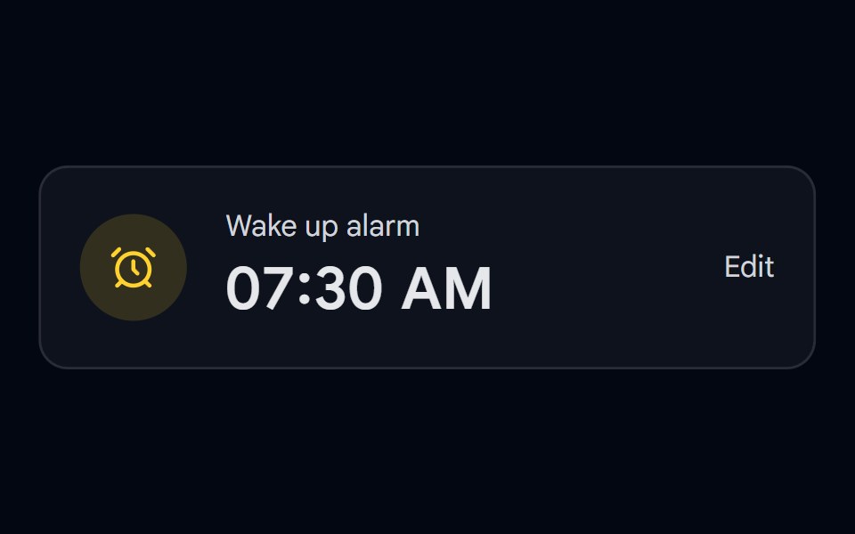 Time Picker 08 - Analog Clock DialogShadcn Space · ReactAlarm card that opens a draggable ring track time picker in a modal dialog, ideal for mobile time selection
 Dialog 15Watermelon UI · React
 Sticky headerFLX UI · ReactHeader fixed; scrollable changelog-style body.
 Dialog 16Watermelon UI · React
 Verify code (OTP)FLX UI · React6-digit InputOTP with separator; Verify footer.
 Dialog 17Watermelon UI · React
 Onboarding welcomeFLX UI · ReactCompact hero image, title, and description; dual CTAs.
 Dialog 18Watermelon UI · React
 Footer-only dismissFLX UI · ReactNo corner close button; dismiss only through the footer.
 Dialog 19Watermelon UI · React
 Pick teammatesFLX UI · ReactScrollable avatar rows with selection; Invite footer.
 Dialog 2Watermelon UI · React
 SuccessFLX UI · ReactCompletion check icon and Continue action.
 Dialog 20Watermelon UI · React
 Type to confirmFLX UI · ReactType delete to enable destructive button.
 Dialog 21Watermelon UI · React
 Settings sectionsFLX UI · ReactNotifications and Security blocks via Separator.
 Dialog 22Watermelon UI · React
 Choose imageFLX UI · ReactThumbnail grid with selection ring.
 Dialog 23Watermelon UI · React
 Invite teamFLX UI · ReactIcon header plus email field.
 Dialog 3Watermelon UI · React
 Long form, sticky footerFLX UI · ReactMany fields in scroll; footer-only sticky.
 Dialog 4Watermelon UI · React
 Stacked actionsFLX UI · ReactFull-width footer buttons for mobile-friendly CTAs.
 Dialog 5Watermelon UI · React
 React Hook FormFLX UI · ReactDialog form with RHF, Zod resolver, and FieldError on invalid fields.
 Dialog 6Watermelon UI · React
 TanStack FormFLX UI · ReactDialog form with TanStack Form and Zod onSubmit validation.
 Dialog 7Watermelon UI · React
 Nested dialogFLX UI · ReactDialog stacked inside another dialog, e.g. avatar picker from profile.
 Dialog 8Watermelon UI · React
 From dropdownFLX UI · ReactDialog triggered by a DropdownMenuItem with onSelect preventDefault.
 Dialog 9Watermelon UI · React
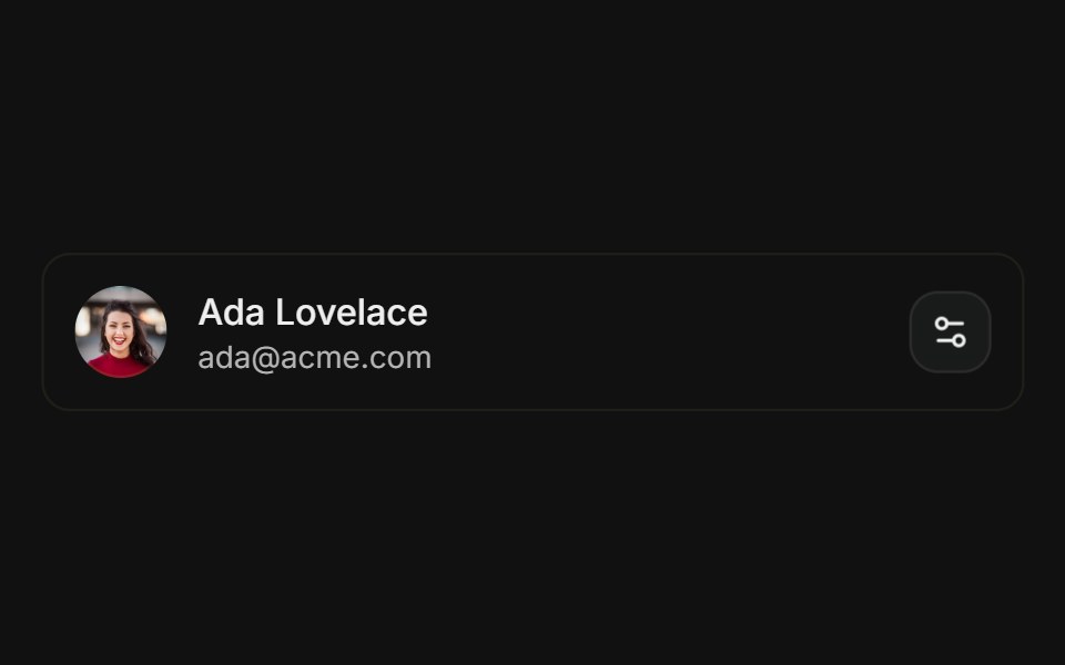 Preferences DialogFLX UI · ReactPreferences Dialog for Settings.
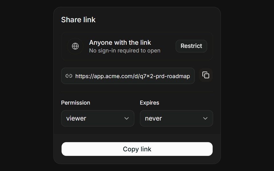 Link with ScopeFLX UI · ReactLink with Scope for Share Access.
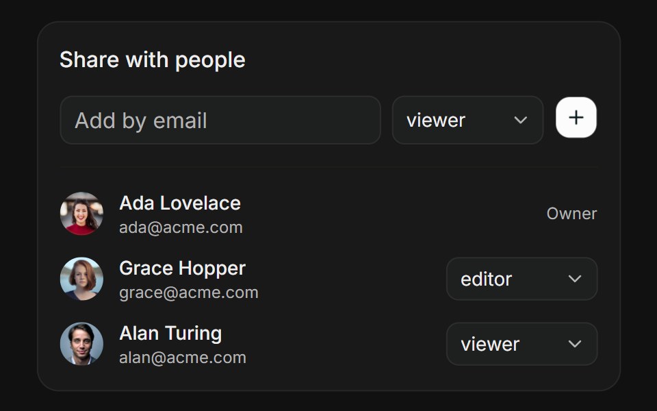 People PickerFLX UI · ReactPeople Picker for Share Access.
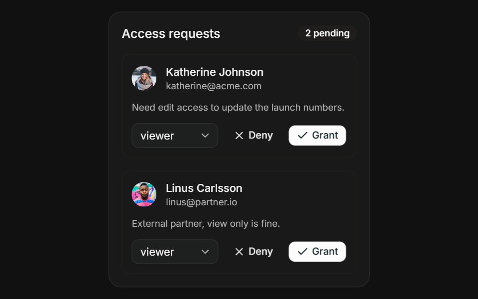 Request AccessFLX UI · ReactRequest Access for Share Access.