 Dev Design Library
Animated Modal Components
Dev Design Library indexes 62 Animated modal components from 29 open-source UI libraries, with the most coming from ReactFrame, Shadcn Space, Sora UI, beUI and Arc Library. Each one links to its page with the source code, a live preview where available, the library license and the install command. These are the modal components tagged as animated: motion on hover, on scroll or on load, usually built with CSS transitions or Framer Motion. Modal components belong to the Overlays group.
 DialogChakra UI · ReactUsed to display a dialog prompt
 Alert DialogHeroUI · ReactModal dialog for critical confirmations requiring user attention and explicit action
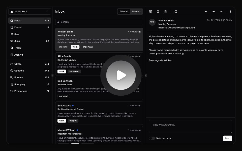 Hero Video DialogMagic UI · ReactA hero video dialog component.
 Expandable ScreenCult UI · ReactA full-screen expandable component with morphing animations using shared layout IDs for smooth transitions
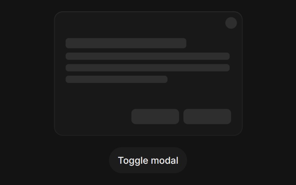 Modal Open Closetransitions.dev · HTML/CSS
 dialogIntent UI · Reactdialog
 Center Morph ModalbeUI · ReactA composable modal whose full-size surface unfolds from its exact center toward every edge, then folds back the same…
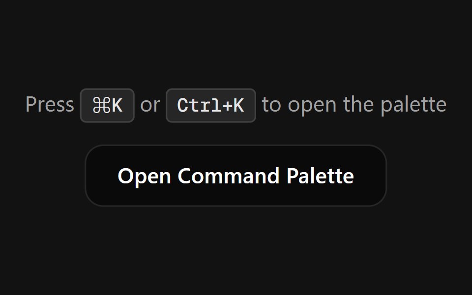 Command PaletteSpectrum UI · ReactA fully customizable, smooth-animated Command Palette (Cmd+K) component
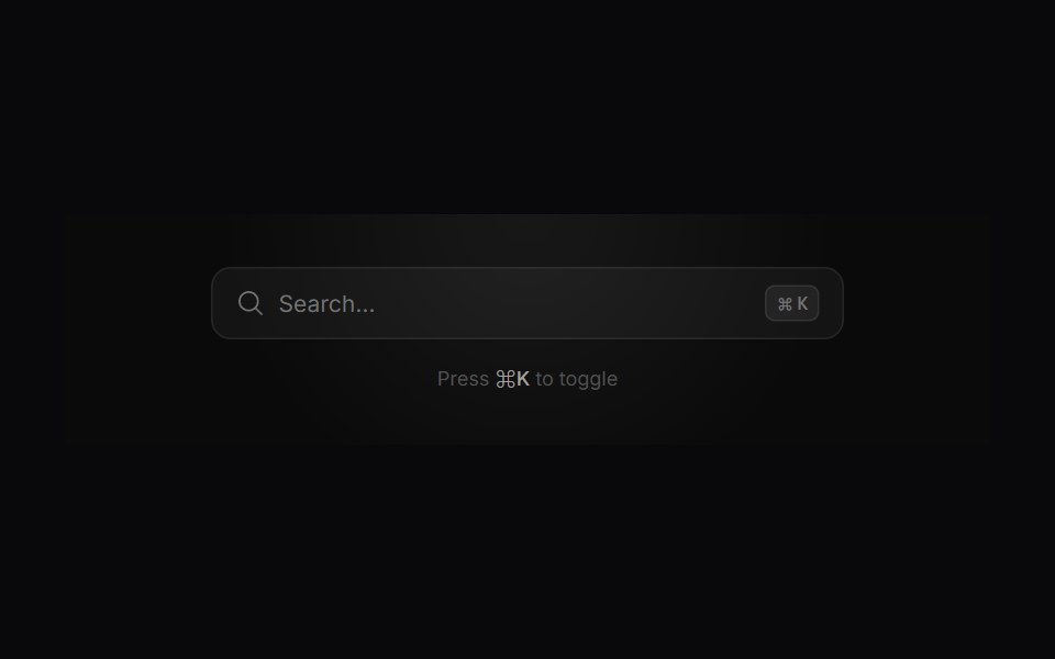 Search ModalVengeance UI · ReactMinimalist command-palette search with live filtering, tags, and actions
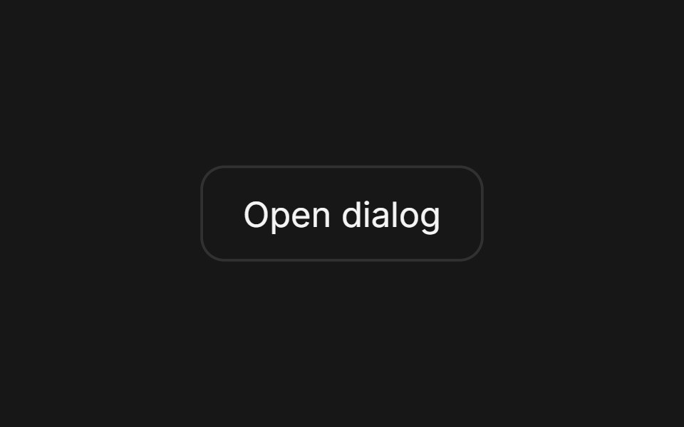 DialogFluid Functionalism · ReactAnimated modal dialog with spring-based scale and opacity transitions in three widths (sm, lg, and an xl canvas for…
 Dialog 01 - Slide from TopShadcn Space · ReactDialog that slides in from the top — ideal for notifications and alerts.
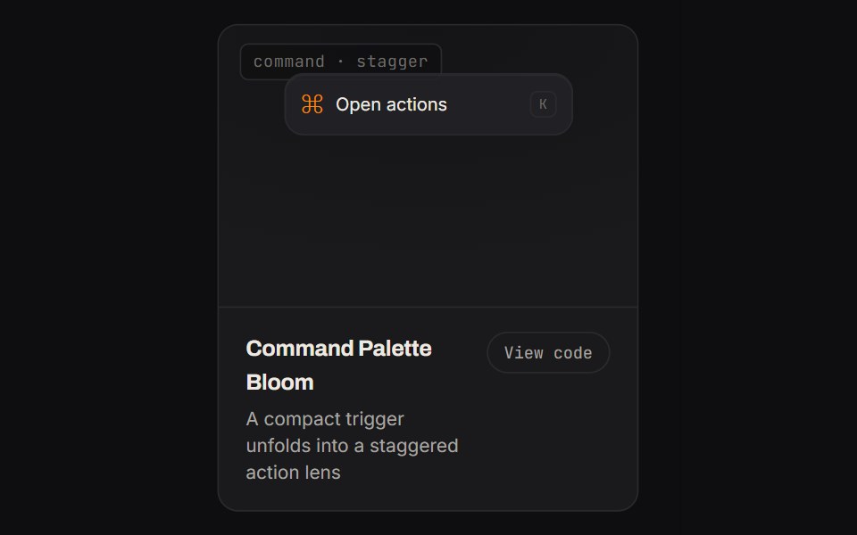 Command Palette BloomKinetics · HTML/CSSA compact trigger unfolds into a staggered action lens
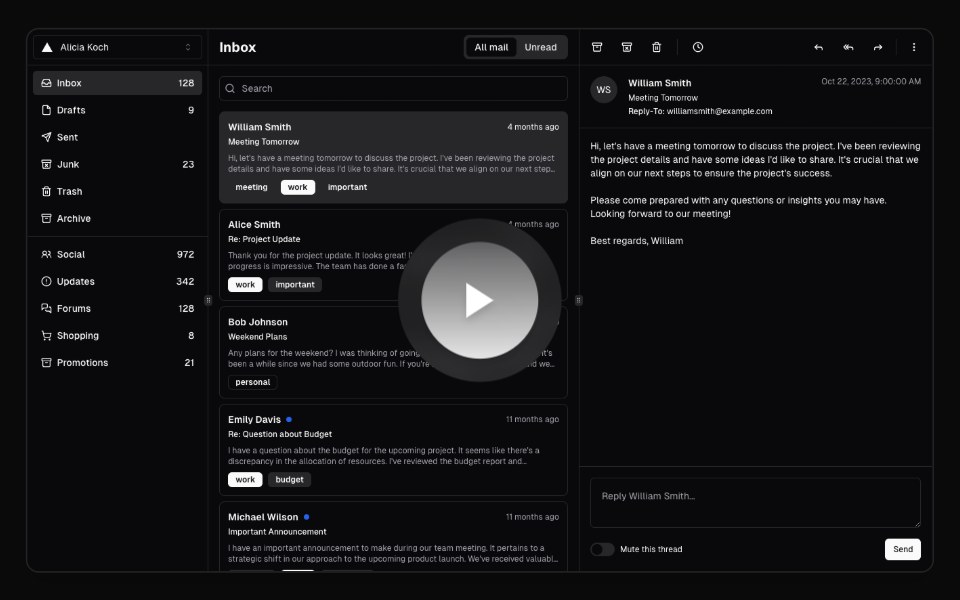 Hero Video DialogAnimations (Svelte) · SvelteA video dialog component with animated entrance effects, thumbnail support, and customizable animation styles.
 Expandable CardBadtz UI · ReactA versatile and engaging UI component that allows users to explore content in a more immersive way.
 DoubtButtonEvil Buttons · ReactAn escalating-confirmation button that makes you click through increasingly absurd, guilt-tripping prompts before the…
 Animated DialogSona UI · ReactA composable, accessible dialog modal built on Base UI with controlled state, direction-aware enter and exit motion…
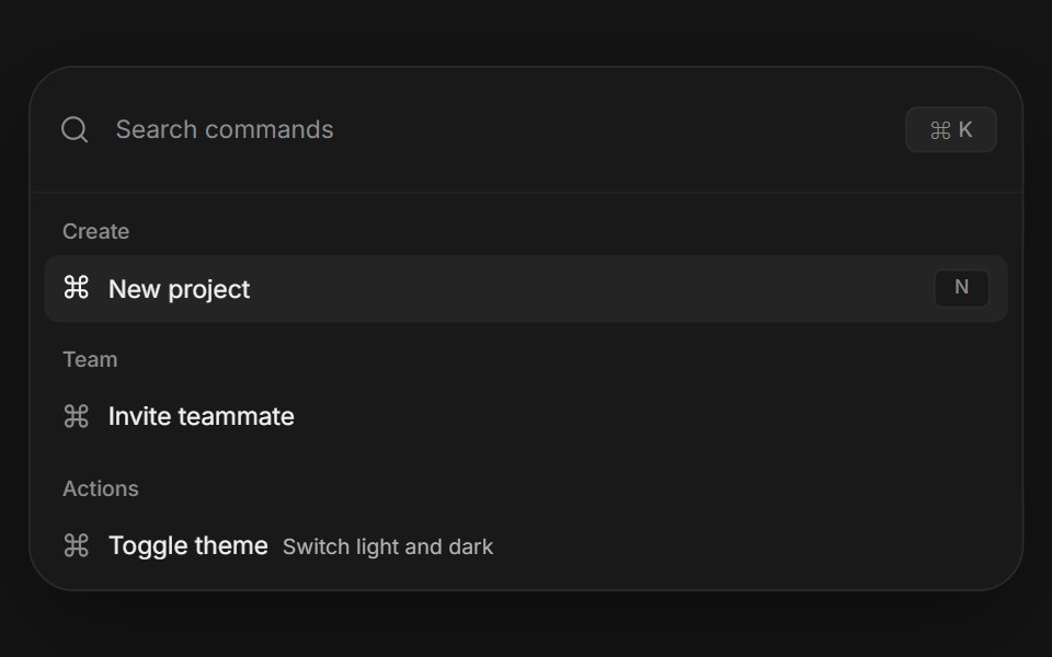 Command paletteArc Library · ReactA complete keyboard driven action surface with search, grouped results, and shortcuts.
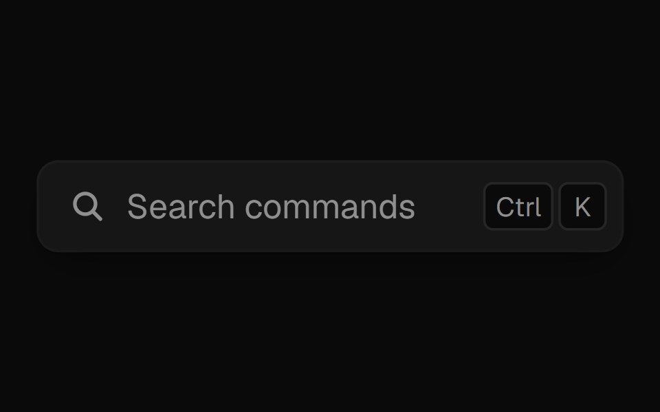 Command PaletteUI Lab · ReactOpens on ⌘K and filters commands as you type.
 Alert dialogHextaUI · ReactA confirmation dialog for destructive or important actions that waits for async work, and becomes a bottom sheet on…
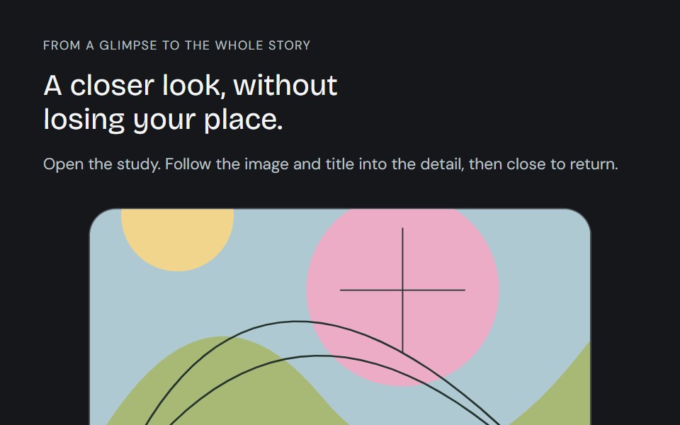 Linear ModalCojeev UI · ReactFollow a card, image and title into a full detail, then back. Card, Centered and browsable Gallery preserve the…
 Apple Cards CarouselVelora UI · ReactSnap-scrolling row of tall image cards that morph into a full modal story.
 Base Alert DialogSora UI · ReactAn accessible alert dialog built on Base UI with smooth Motion 3D perspective entrance and exit animations…
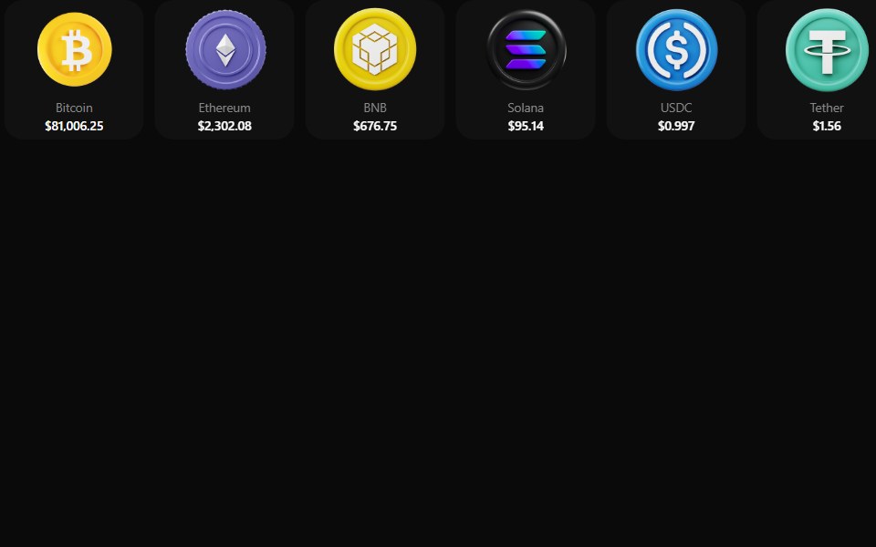 Coin MorphZAYX · React NativeReact Native crypto coin list (CoinMorphList) with an animated counter and a coin detail modal.
 Add Product Wizard ModalCue Foundations · React
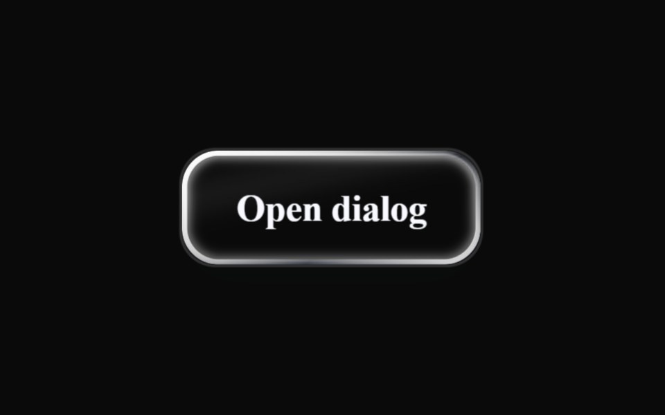 Liquid DialogLiquefy UI · ReactModal dialog in liquid glass style. Janela modal em estilo vidro líquido.
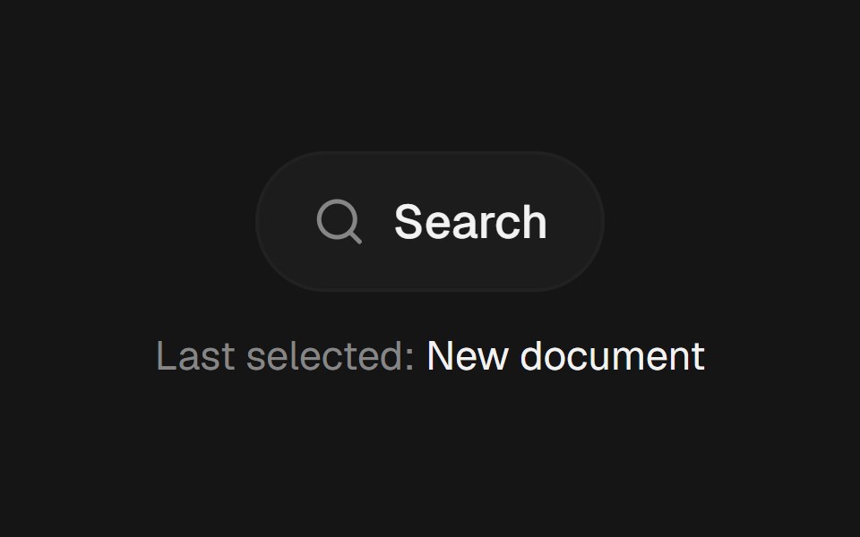 Command PaletteEaseUI · ReactCommand-K style search overlay that filters as you type, with arrow keys to move the highlight and Enter to select.
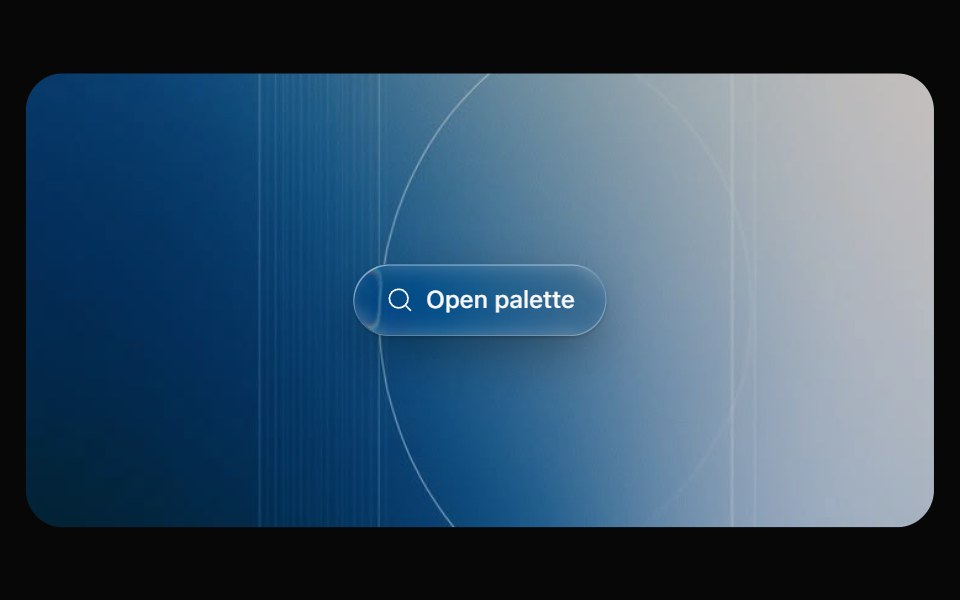 Glass CommandOpaline · React⌘K command palette on a frosted glass sheet, powered by cmdk.
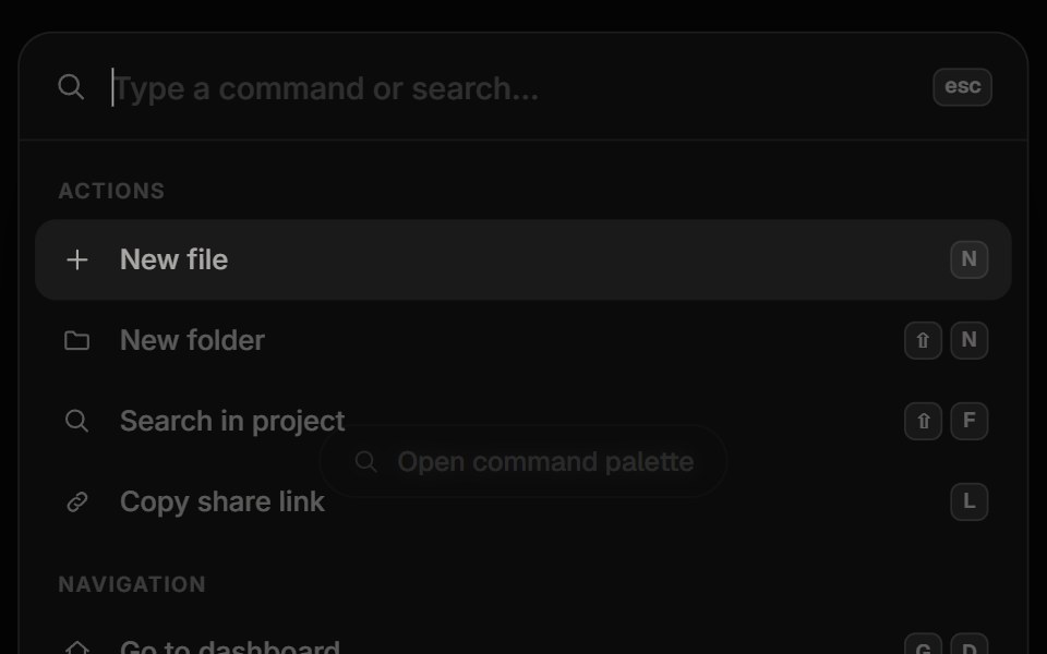 Command PaletteReactFrame · ReactA Cmd/Ctrl+K command palette with fuzzy search and match highlighting, grouped results, keyboard navigation, shortcuts…
 Apple Cards CarouselAceternity UI · React
 ModalHeroUI · ReactDialog overlay for focused user interactions and important content
 Family DrawerCult UI · ReactA multi-view drawer component with smooth animations, view navigation, and customizable content views
- modalIntent UI · Reactmodal
 Command PalettebeUI · React⌘K palette with fuzzy filter, spring-animated active row and glass surface.
 Dialog (Base UI)Fluid Functionalism · ReactAnimated modal dialog with spring-based scale and opacity transitions in three widths (sm, lg, and an xl canvas for…
 Dialog 02 - Slide from BottomShadcn Space · ReactDialog that slides in from the bottom — ideal for confirmations and destructive actions.
 Command Palette PreviewSona UI · React
 Confirm morphArc Library · ReactA destructive button that morphs into an inline confirmation, a spinner, and a result with undo.
 DialogUI Lab · ReactOpens a modal over the page, with a confirmation that stacks on top of it.
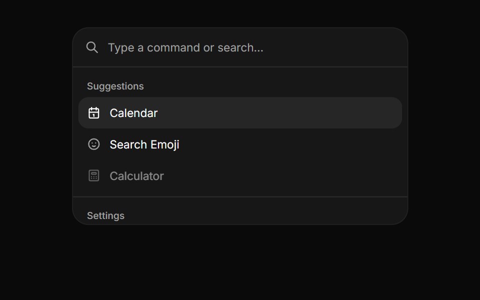 CommandHextaUI · ReactA searchable list of actions, inline or as a ⌘K palette, with pages, shortcuts and highlighted matches.
 Base DialogSora UI · ReactAn accessible modal dialog built on Base UI with smooth Motion spring entrance and exit animations.
 ModalEaseUI · ReactCentered dialog on the native dialog element that fades and scales in, leaves faster than it arrives, and keeps focus…
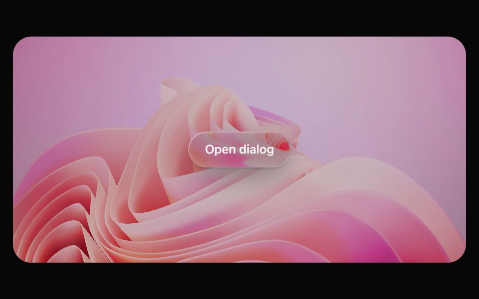 Glass DialogOpaline · ReactModal on a frosted glass sheet with springy transform-only motion.
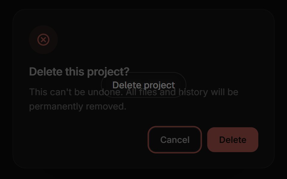 Confirm DialogReactFrame · ReactA focused alert dialog for confirming an action, with default/warning/danger variants, an async-aware confirm button…
 Morphing ModalbeUI · ReactFamily-app-style modal. A single panel that morphs its height as you navigate between inner views, with blur…
 Settings Dialog (Sidebar in a Dialog)Fluid Functionalism · ReactA settings dialog: the xl Dialog as a canvas, a non-collapsing Sidebar of sections down its left edge, and a scrolling…
 Dialog 03 - Slide from LeftShadcn Space · ReactDialog that slides in from the left — ideal for subscription forms and quick inputs.
 DialogArc Library · ReactA focused surface for decisions that need attention.
 Shortcut SheetUI Lab · ReactPress ? anywhere to see every shortcut, then press one to watch it light up.
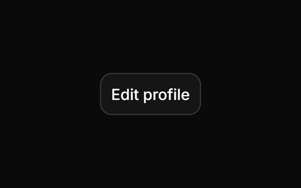 DialogHextaUI · ReactA window over the page for forms and focused tasks, with a pinned header and footer, nesting, and a swipeable bottom…
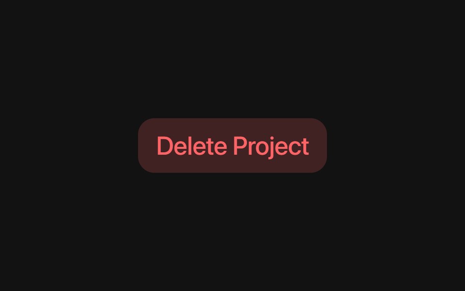 Radix Alert DialogSora UI · ReactAn accessible alert dialog built on Radix UI with smooth Motion 3D perspective entrance and exit animations…
 Dice Discount PopupReactFrame · ReactA gamified discount popup, roll two animated 3D dice for a reward tier (with a doubles bonus), copy the code, and…
 Dialog 04 - Slide from RightShadcn Space · ReactDialog that slides in from the right — ideal for user profiles and detail panels.
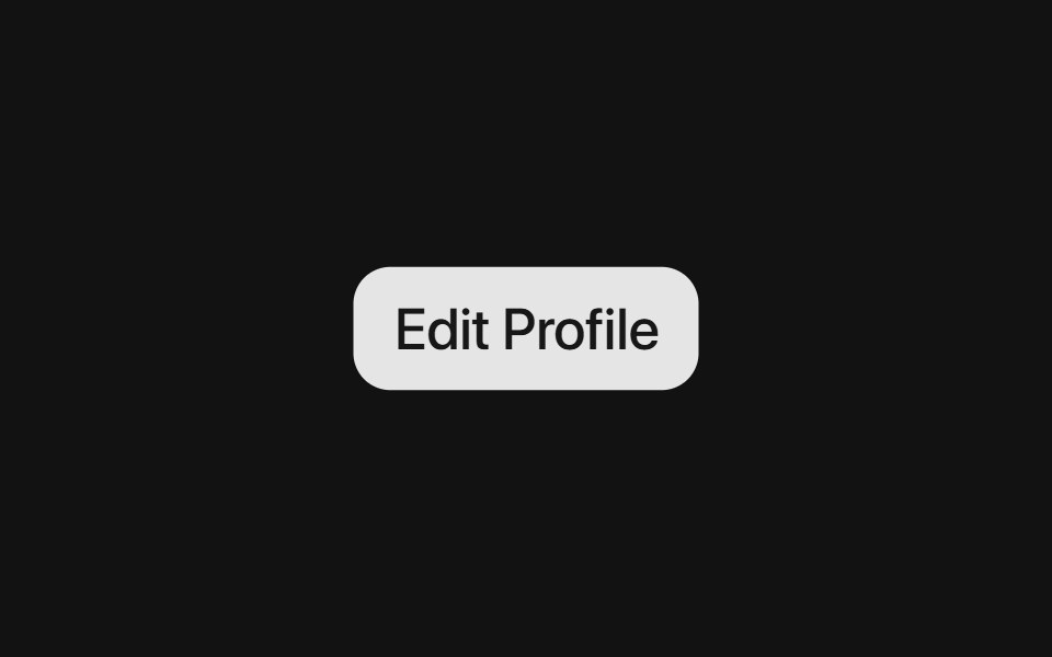 Radix DialogSora UI · ReactAn accessible modal dialog built on Radix UI with smooth Motion spring entrance and exit animations.
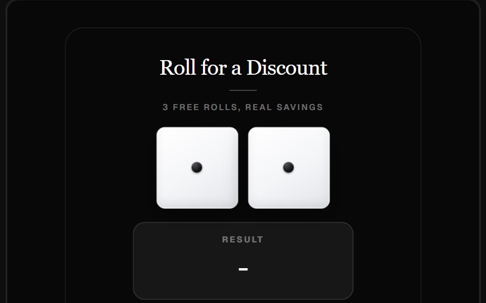 Dice Roll Discount PopupReactFrame · ReactA gamified discount-capture widget where visitors roll two 3D dice for a reward tier, with a themed reveal modal and…
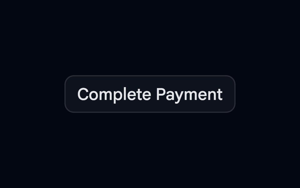 Dialog 05 - Zoom InShadcn Space · ReactDialog that scales up from the center — ideal for success states and celebrations.
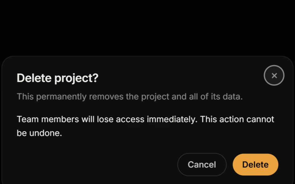 ModalReactFrame · ReactAn accessible modal dialog with a blurred backdrop, focus trap, Escape and backdrop close, scroll lock, focus restore…
 Dialog 06 - Zoom OutShadcn Space · ReactDialog that shrinks into place from a larger scale — ideal for announcements and feature highlights.
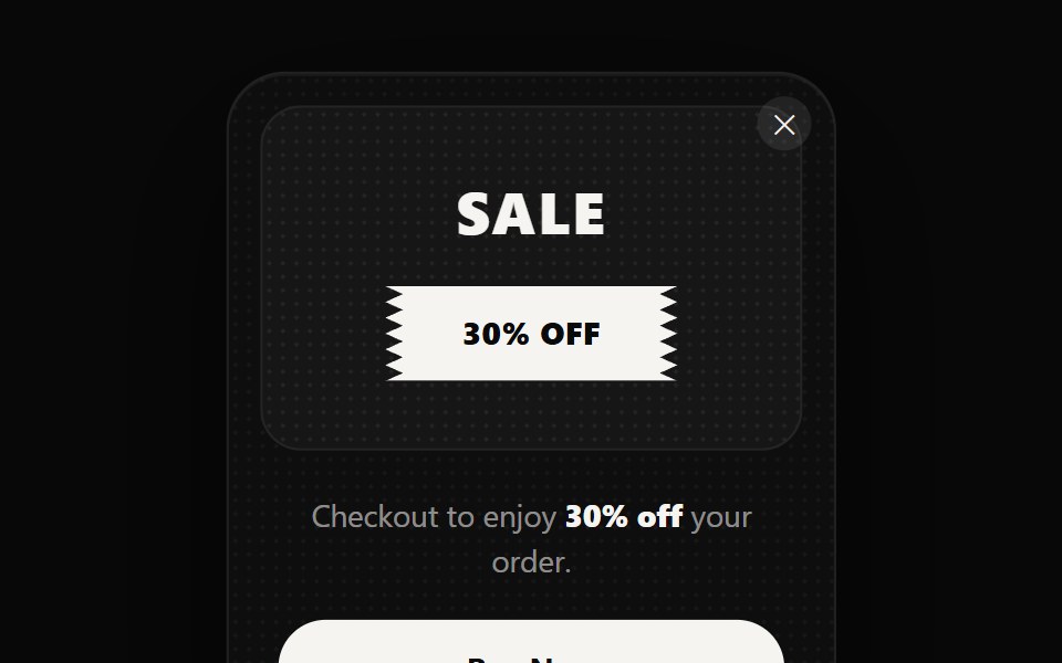 Sales Ticket PopupReactFrame · ReactA corner-anchored promo popup shaped like a torn event ticket, with 5 themes, a zigzag badge stub…
 Dialog 12 - OTP VerificationShadcn Space · ReactEmail verification dialog with a 6-digit OTP input, auto-submit, attempt limit, resend countdown, and a verified state.
 Scratch Card PopupReactFrame · ReactA gamified scratch-to-win popup, drag to scratch a gold-foil canvas off a 3x3 icon grid, match three to win a reward…
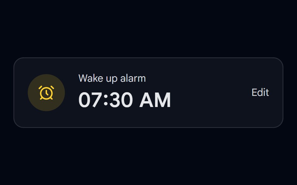 Time Picker 08 - Analog Clock DialogShadcn Space · ReactAlarm card that opens a draggable ring track time picker in a modal dialog, ideal for mobile time selection
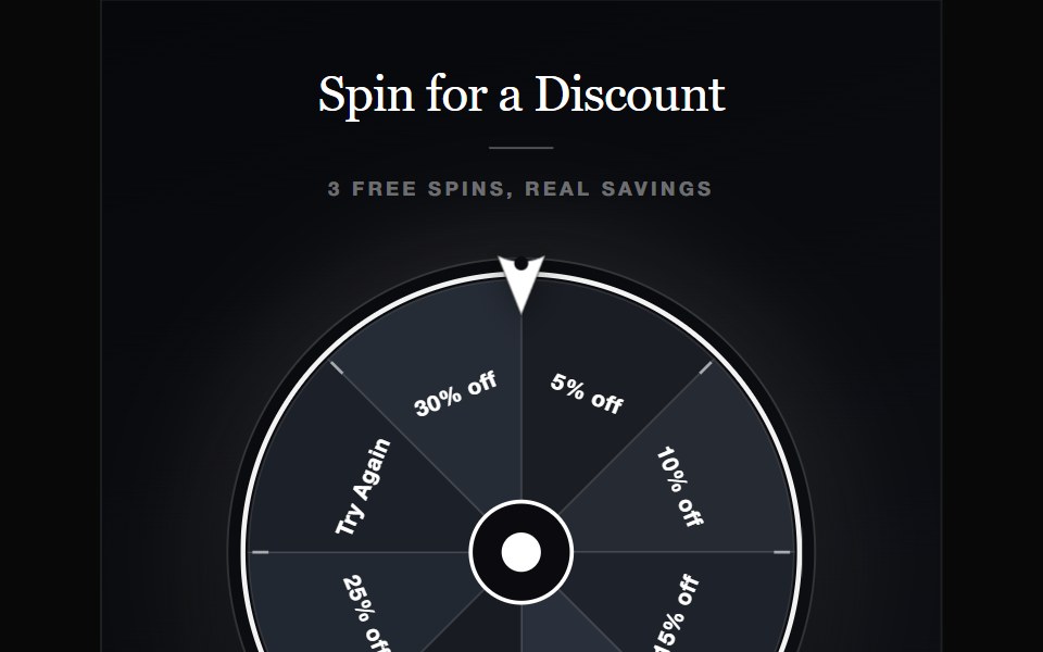 Spin to Win WheelReactFrame · ReactA gamified discount-capture widget where visitors spin a weighted SVG prize wheel for a reward, with five glass…
Libraries with Animated modal components
Related categories
- Modal Components
- React Modal Components
- Tailwind CSS Modal Components
- shadcn/ui Modal Components
- Animated Overlay Components
- Animated Popover Components
- Animated Toast Components
- Animated Drawer Components
- Animated Tooltip Components
- Animated Dynamic Island Components
- Animated Hover Card Components
- Animated Bottom Sheet Components
- Animated Alert Dialog Components
- Animated Mini Player Components