 Dev Design Library
shadcn/ui Popover Components
Dev Design Library indexes 65 shadcn/ui popover components from 14 open-source UI libraries, with the most coming from Watermelon UI, FLX UI, Shadcn Space, Notra and Fluid Functionalism. Each one links to its page with the source code, a live preview where available, the library license and the install command. They follow the shadcn/ui conventions, so most install with the shadcn CLI and drop into a Tailwind project. Popover components belong to the Overlays group.
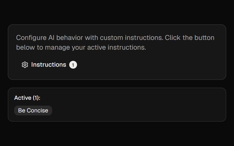 Ai InstructionsCult UI · ReactManage and toggle AI instructions with a popover, search, and create-dialog
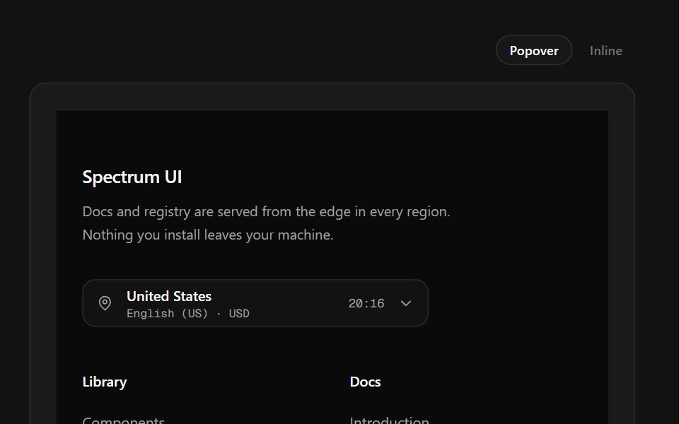 Region Picker FooterSpectrum UI · ReactA region popover with locale, currency, data residency and live local time.
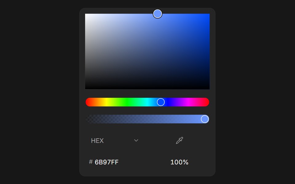 Color PickerFluid Functionalism · ReactColor picker with HEX, RGB, HSL, and OKLCH formats, alpha channel, optional swatches, and a popover trigger. Built on…
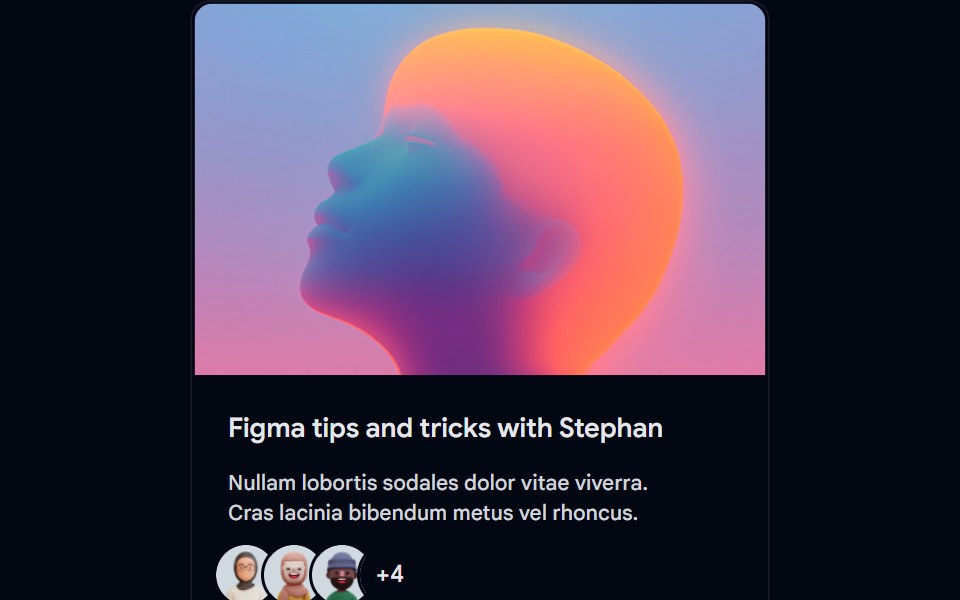 Card-01 - ArticlePreviewCardShadcn Space · ReactCard component
 ContextAI Elements (Svelte) · SvelteA hover-card-based context window usage component with token, cost, and model usage breakdowns.
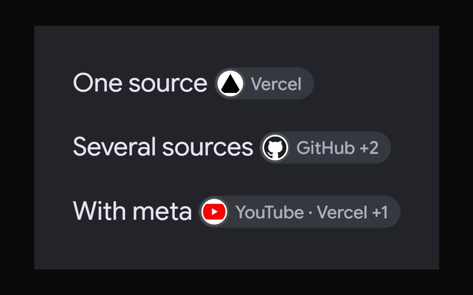 AI Overview CitationNotra · ReactA source chip built on shadcn Badge and HoverCard.
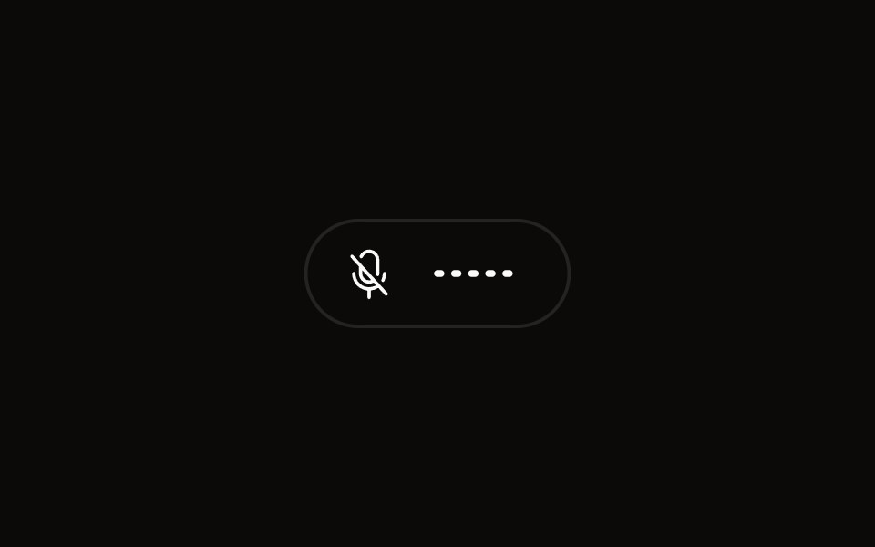 Quick Audio Popoveraudiocn · ReactCompact microphone and system audio controls behind one toolbar button that shows a live level.
 Date Picker 1Watermelon UI · React
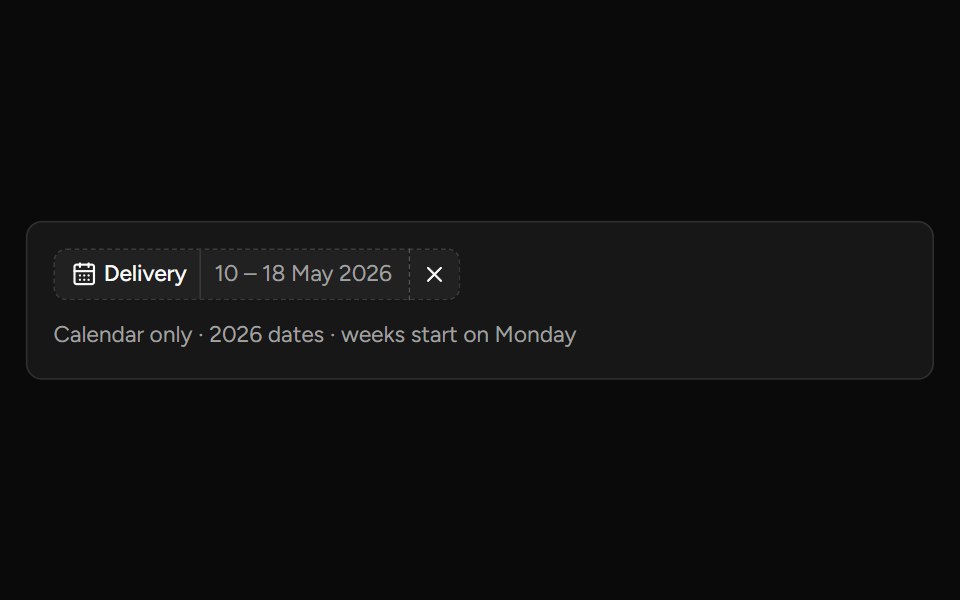 Date Range Filtersv-table · SvelteA responsive date-range picker with presets and explicit apply behavior.
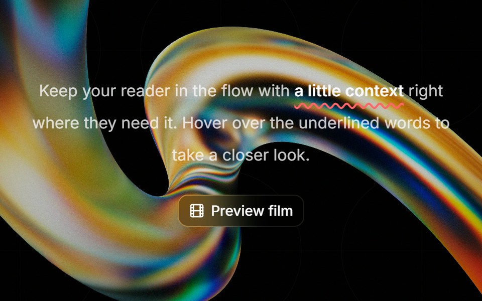 Highlight Phraseglasscn · ReactA smooth glass hover popover for text, video, and rich content, with click and keyboard access.
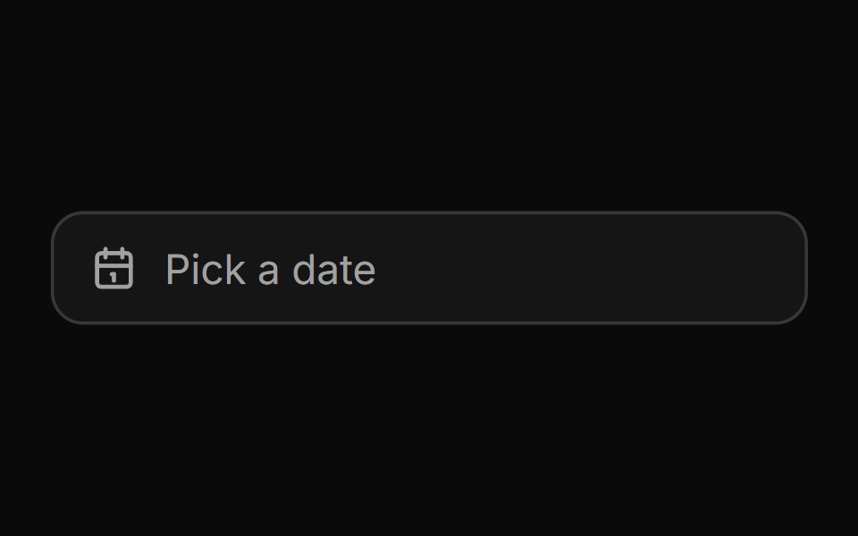 Date pickerHextaUI · ReactA button that opens a calendar in a popover, or a bottom sheet on phones, for single dates and ranges.
 PopoverCojeev UI · ReactPlaces a dismissible panel next to a trigger for a small contextual task or set of controls.
 BasicFLX UI · ReactDefault popover with a button trigger and simple text.
 Date Pickerark-cn · ReactA shadcn-style date picker component built with Ark UI primitives.
 Date PickerFluid Functionalism · ReactField or ghost trigger for a date, a range, or a date and a time: a calendar popover that opens on the selected day…
 Card-02 - Preview CardShadcn Space · ReactCard component
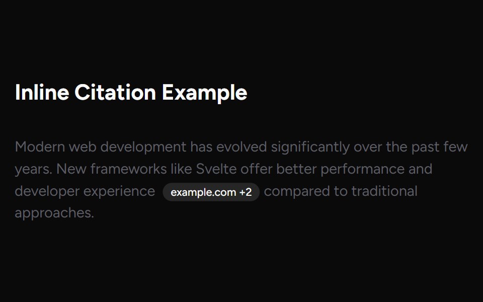 Inline CitationAI Elements (Svelte) · SvelteAn inline citation system with hover cards and carousel views for source-backed AI content.
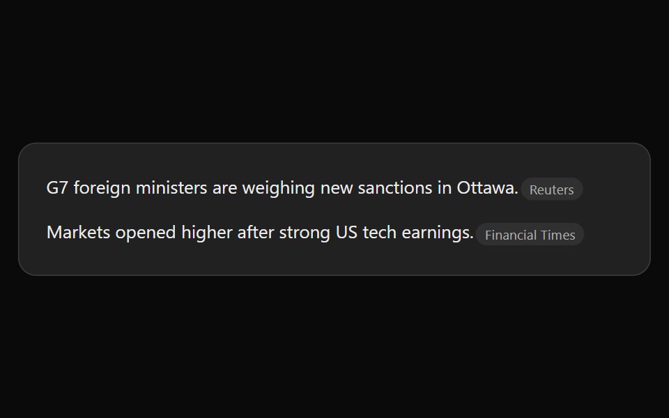 ChatGPT Source ChipNotra · ReactAn inline citation pill with a hover card.
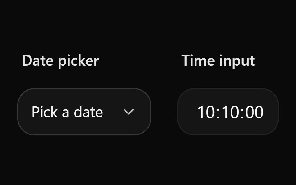 Date Picker 10Watermelon UI · React
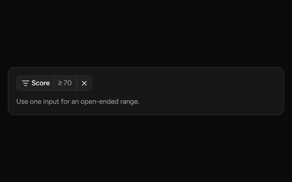 Number Range Filtersv-table · SvelteA number range picker with exact inputs, an optional slider, and explicit apply behavior.
 With headerFLX UI · ReactPopover with a bold title and a short description below it.
 Tourark-cn · ReactA shadcn-style tour component built with Ark UI primitives.
 Date PickerFluid Functionalism · ReactField or ghost trigger for a date, a range, or a date and a time: a calendar popover that opens on the selected day…
 Popover 01 - About Shadcn SpaceShadcn Space · ReactPopover that slides in from the top - ideal for notifications and alerts.
 Claude Plus MenuNotra · ReactThe composer's + menu with files, skills, connectors, design system, plugins and research.
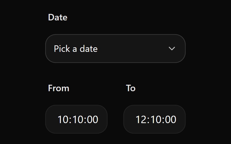 Date Picker 11Watermelon UI · React
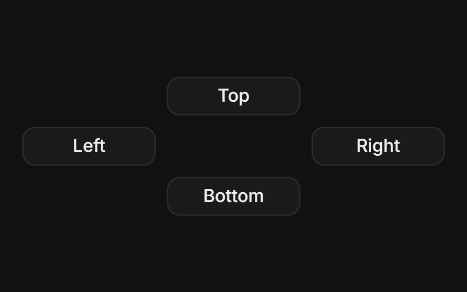 SidesFLX UI · ReactPlace the popover on top, right, bottom, or left of the trigger.
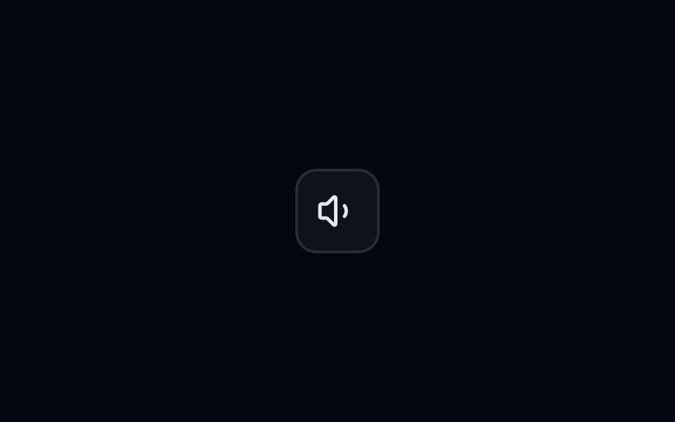 Popover 04 - Volume ControlShadcn Space · ReactPopover that slides in from the top - ideal for notifications and alerts.
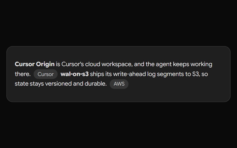 Gemini Source ChipNotra · ReactAn inline source pill with a hover card.
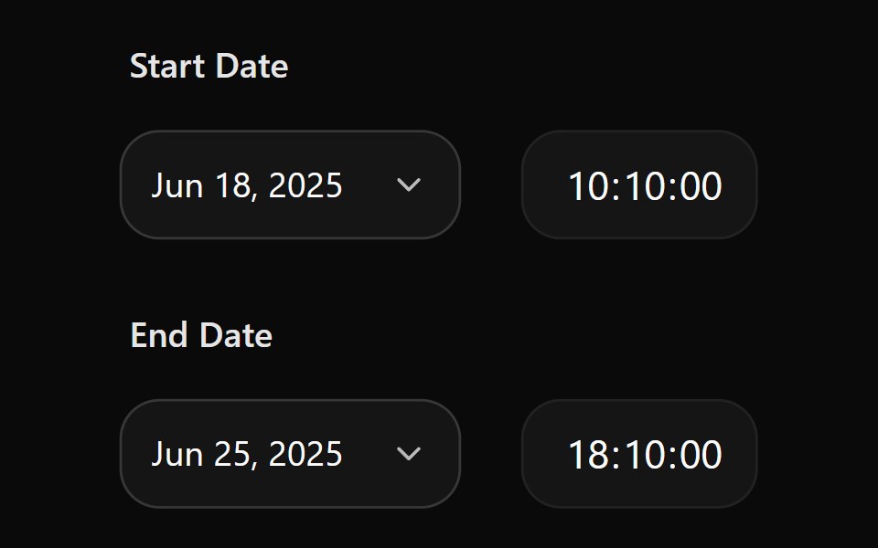 Date Picker 12Watermelon UI · React
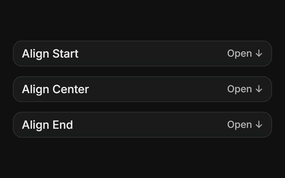 AlignmentFLX UI · ReactAlign the content to the start, center, or end of the trigger.
 Popover 06 - LocationShadcn Space · ReactPopover that slides in from the top - ideal for location details.
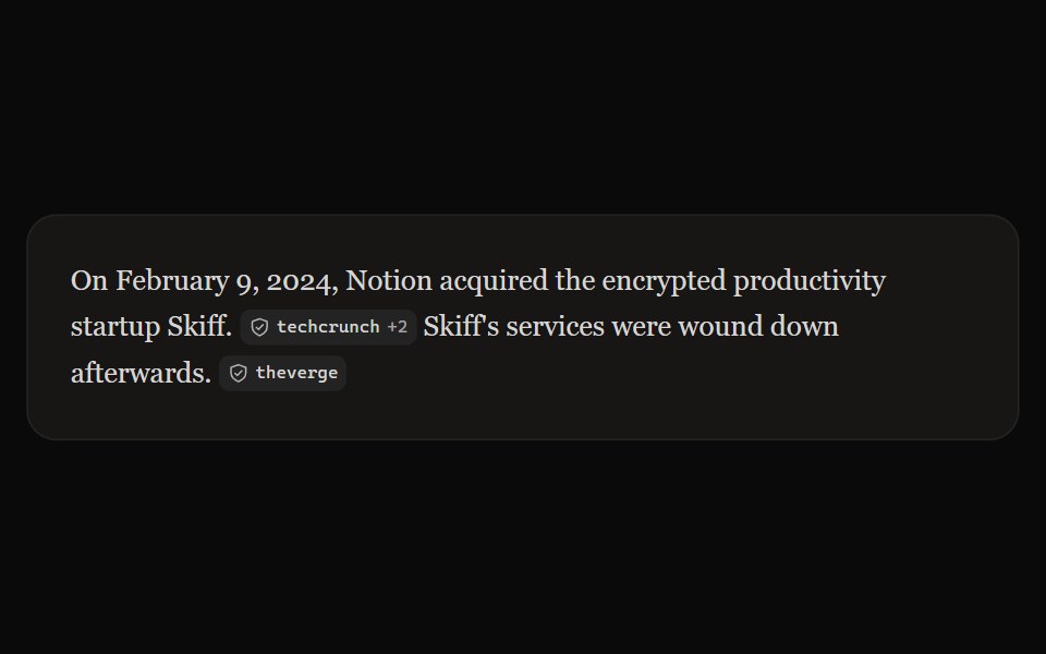 Perplexity CitationNotra · ReactAn inline source pill with favicon, label and +N count, built on shadcn Badge.
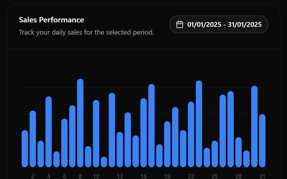 Date Picker 13Watermelon UI · React
 Custom widthFLX UI · ReactOverride the default width via className on PopoverContent.
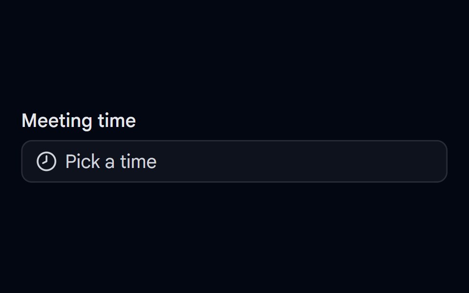 Time Picker 07 - Analog Clock PopoverShadcn Space · ReactForm field button that opens a draggable ring track time picker in a popover, with cancel and set actions
 Date Picker 2Watermelon UI · React
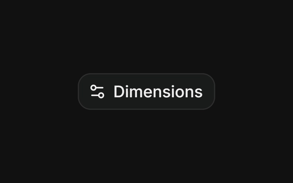 Dimensions formFLX UI · ReactForm with inline labeled inputs for width, max-width, height, and max-height.
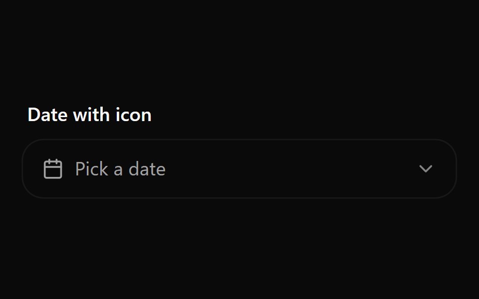 Date Picker 3Watermelon UI · React
 Notification settingsFLX UI · ReactSwitches with labels and descriptions inside the popover.
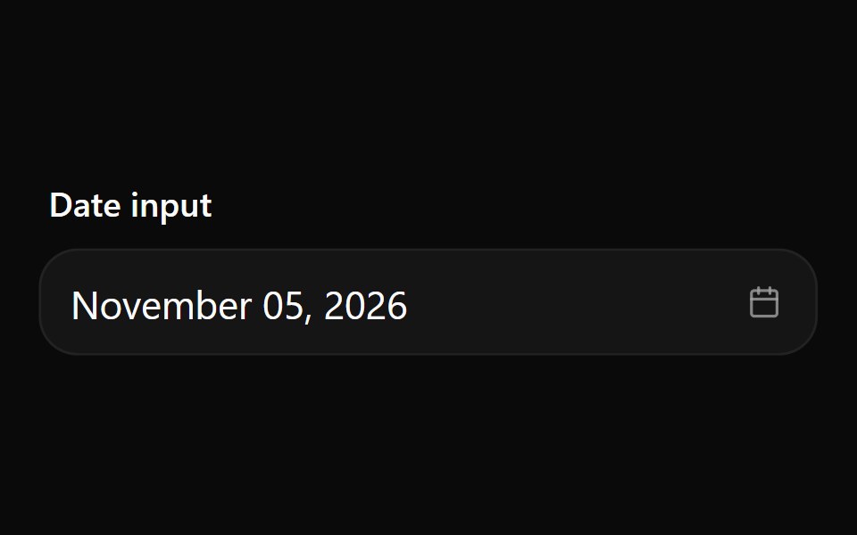 Date Picker 4Watermelon UI · React
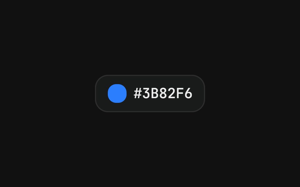 Color pickerFLX UI · ReactSwatch grid with a check icon on the active color.
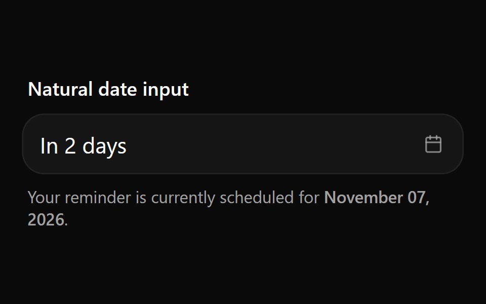 Date Picker 5Watermelon UI · React
 Share linkFLX UI · ReactReadonly URL input with a trailing copy button.
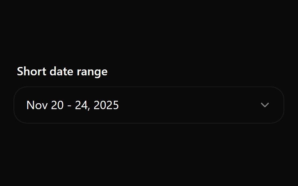 Date Picker 6Watermelon UI · React
 Notifications listFLX UI · ReactNotification rows with an icon, message text, timestamp, and unread indicator dot.
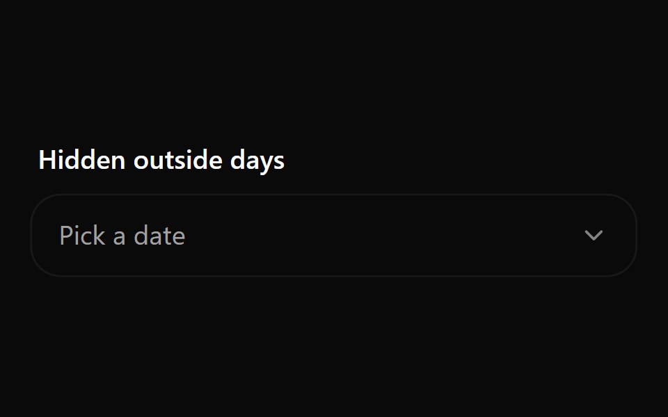 Date Picker 7Watermelon UI · React
 Profile cardFLX UI · ReactBanner image, avatar, bio, and follow / message actions.
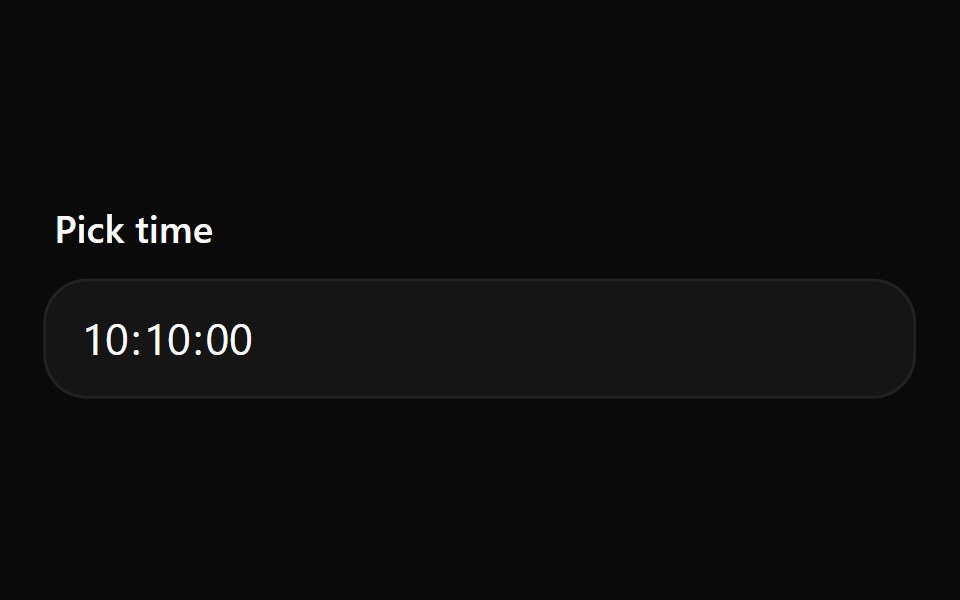 Date Picker 8Watermelon UI · React
 Cover pickerFLX UI · ReactThumbnail grid with a selection ring for choosing a cover image.
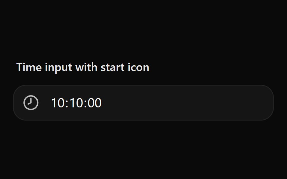 Date Picker 9Watermelon UI · React
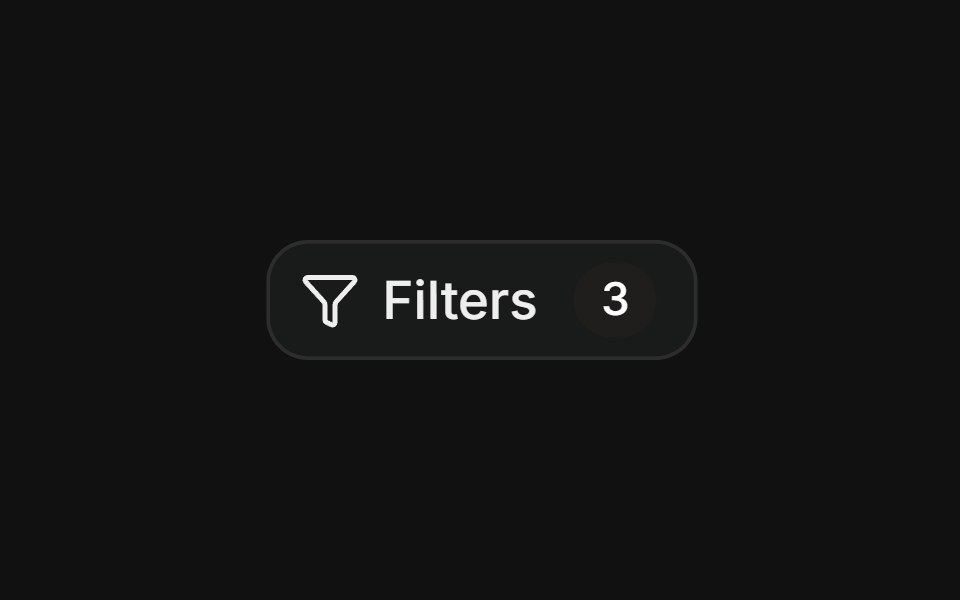 FiltersFLX UI · ReactGrouped toggle button filters for status and priority, with reset and apply actions.
 Popover 1Watermelon UI · React
 Scrollable listFLX UI · ReactScrollable list of team members with avatars and roles inside a fixed-height popover.
 Popover 10Watermelon UI · React
 Popover 11Watermelon UI · React
 Popover 12Watermelon UI · React
 Popover 2Watermelon UI · React
 Popover 3Watermelon UI · React
 Popover 4Watermelon UI · React
 Popover 5Watermelon UI · React
 Popover 6Watermelon UI · React
 Popover 7Watermelon UI · React
 Popover 8Watermelon UI · React
 Popover 9Watermelon UI · React