 Dev Design Library
Tailwind CSS Popover Components
Dev Design Library indexes 220 Tailwind CSS popover components from 51 open-source UI libraries, with the most coming from Watermelon UI, ReUI, FLX UI, Origin UI and React Spectrum. Each one links to its page with the source code, a live preview where available, the library license and the install command. Every library in this list styles its components with Tailwind CSS utility classes. Popover components belong to the Overlays group.
Showing 120 of 220, a mix from every library. Open a library to see all of its components.
 Hover Cardshadcn/ui · ReactA popover that appears on hover, focus, or long press to preview content available behind a link.
 Color PickerHeroUI · ReactA composable color picker that synchronizes color value between multiple color components
 Contextual HelpReact Spectrum · ReactContextual help shows a user extra information about the state of an adjacent component, or a total view.
 Popovercoss ui · ReactAn accessible popup anchored to a button.
 PopoverOrigin UI · ReactAn accessible popup anchored to a button.
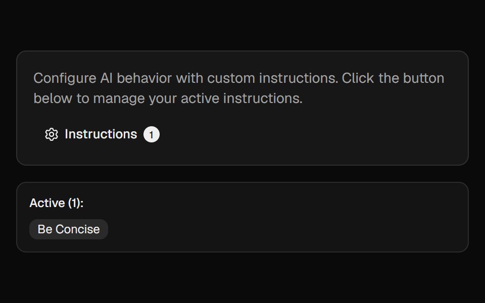 Ai InstructionsCult UI · ReactManage and toggle AI instructions with a popover, search, and create-dialog
 PopoverTremor · React
 Basic hover card.ReUI · ReactBasic hover card.
 Card Preview TileAmicro Micro Transitions · ReactCatalog preview for a card spread / carousel. Hover state lives here so hovering one tile re-renders only that tile…
 ContextAI Elements · ReactA compound component system for displaying AI model context window usage, token consumption, and cost estimation.
 Morph PopoverKokonut UI · ReactA button that grows into the form it opens, with its label sliding up to become the title, then shrinks into a…
 popoverIntent UI · Reactpopover
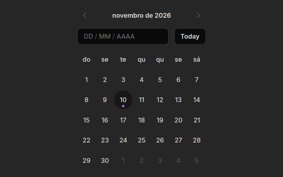 Date PickerUntitled UI React · React
 Popover MorphbeUI · ReactPopover that grows out of its trigger button, sharing the same shape.
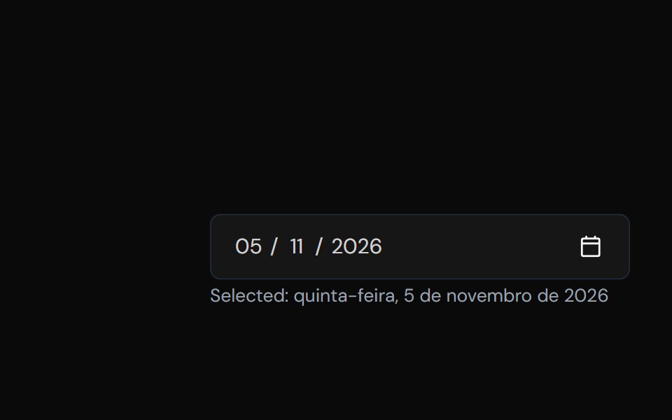 Date PickerTailGrids · ReactA component to select a date.
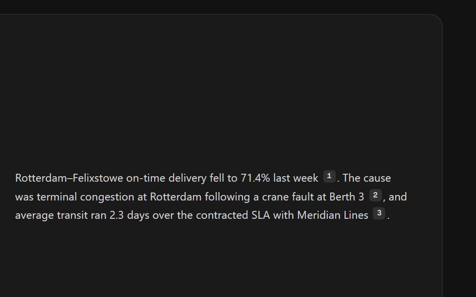 Citation SourcesSpectrum UI · ReactInline citation markers with hover previews or a footnote list.
 Hover CardVengeance UI · React
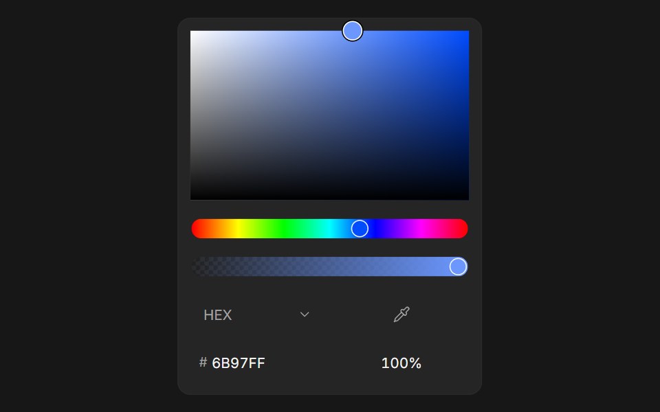 Color PickerFluid Functionalism · ReactColor picker with HEX, RGB, HSL, and OKLCH formats, alpha channel, optional swatches, and a popover trigger. Built on…
 Hover CardToolcraft · React
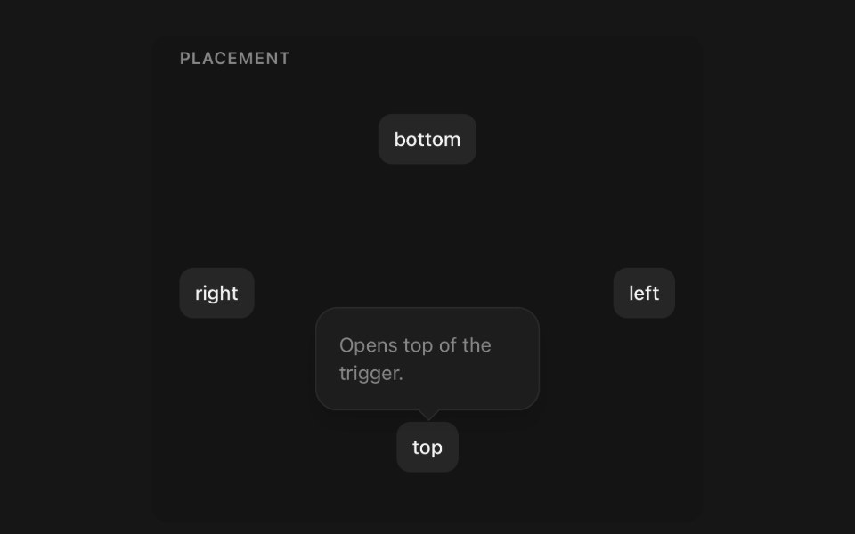 PopoverPanel UI · React NativePanel anchored to the element that opened it.
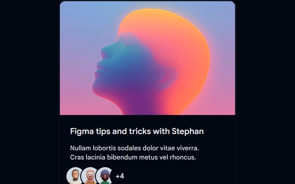 Card-01 - ArticlePreviewCardShadcn Space · ReactCard component
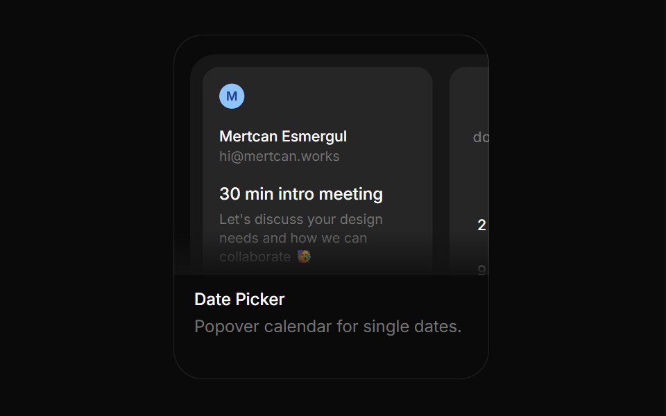 Date PickerBoardUI · ReactPopover calendar for single dates.
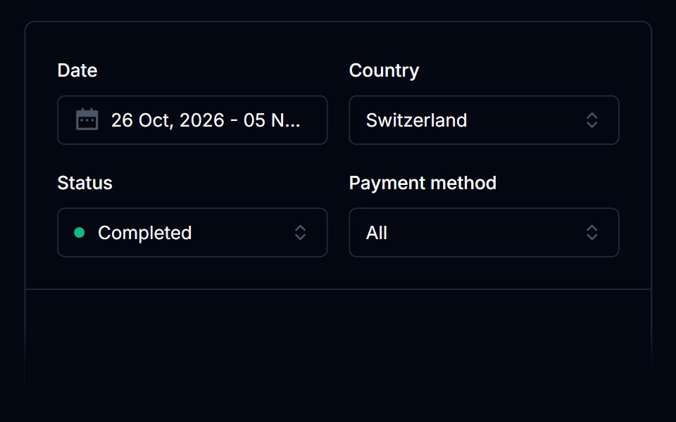 Date PickerTremor Blocks · React
 Hover CardShadcn Dashboard · React
 ContextAI Elements (Svelte) · SvelteA hover-card-based context window usage component with token, cost, and model usage breakdowns.
 Hover CardObsidianUI · React
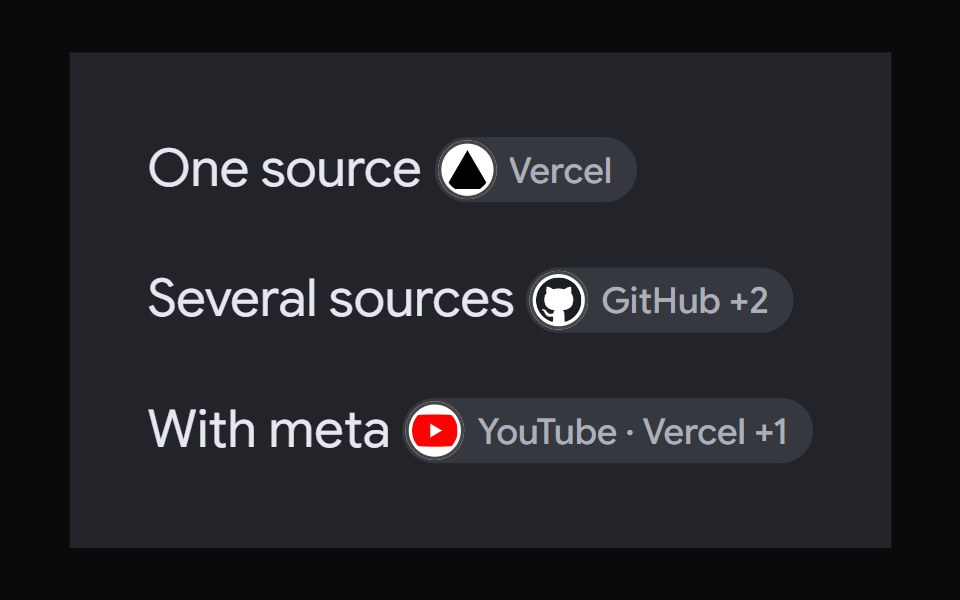 AI Overview CitationNotra · ReactA source chip built on shadcn Badge and HoverCard.
 Image Hover RevealGreatUI · React
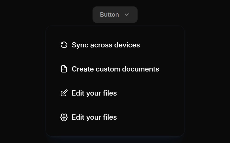 Flyouts 01Oxbow UI · Astro
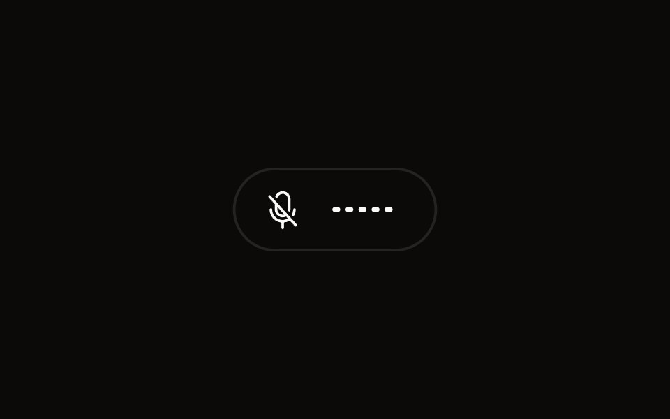 Quick Audio Popoveraudiocn · ReactCompact microphone and system audio controls behind one toolbar button that shows a live level.
 popoverBaseLayer · ReactA popover is an overlay element positioned relative to a trigger.
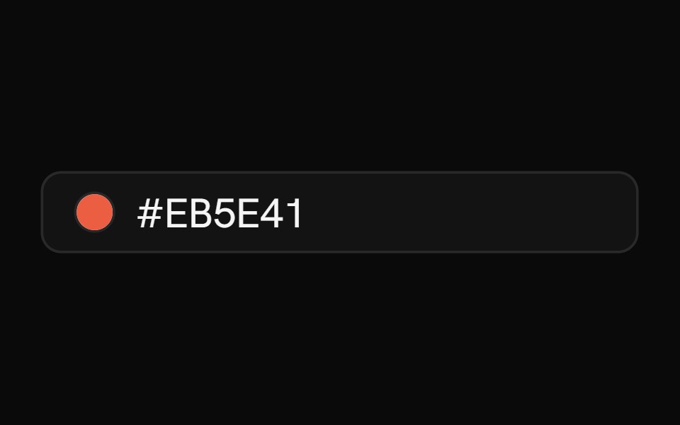 Color PickerShark UI · ReactPick colors with hue and alpha controls.
 Gooey Color Picker23rd.dev · ReactA floating color picker with a circular hue wheel, alpha slider, hex field, and motion-powered open/close.
 LinkPreviewSona UI · ReactThe `LinkPreview` component is an interactive UI element that displays a preview of a link when hovered over. It…
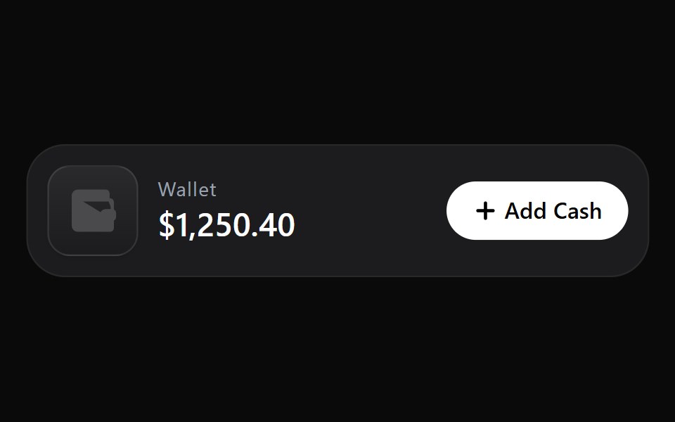 Add Cash DisclosureWatermelon UI · React
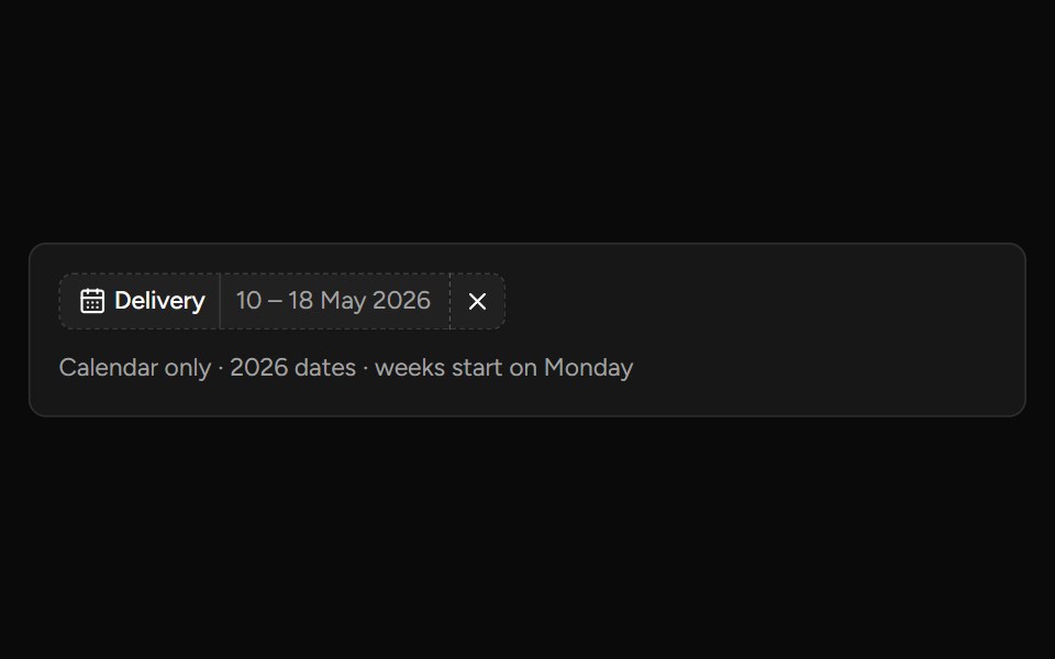 Date Range Filtersv-table · SvelteA responsive date-range picker with presets and explicit apply behavior.
 Glass Popoverglasscn · ReactGlass Popover with five variants: clear, frosted, subtle, liquid, and liquid-refract
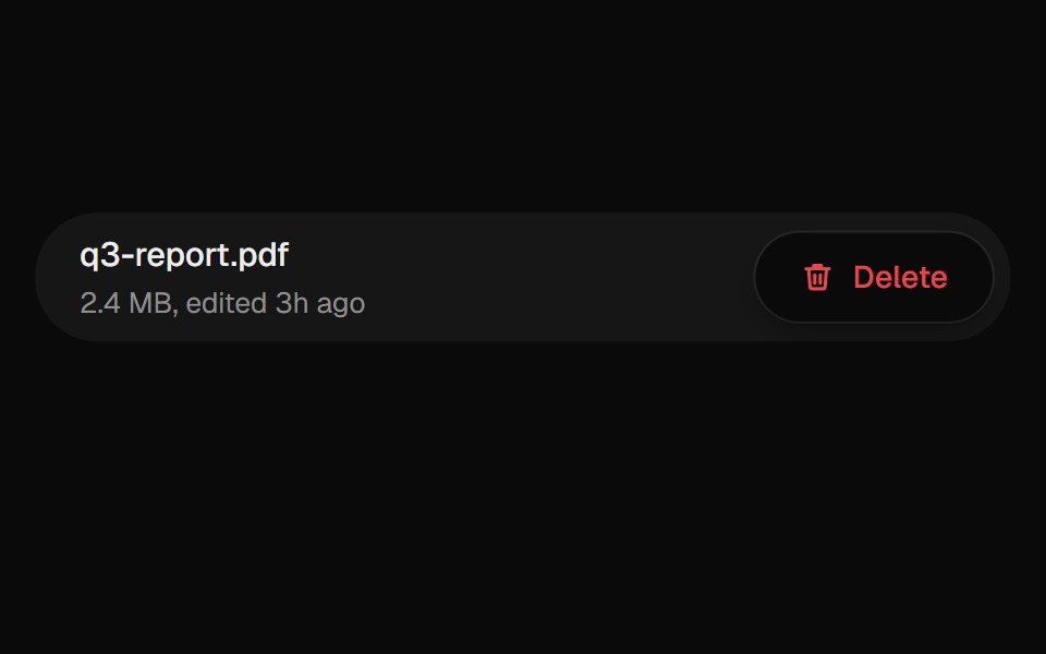 Confirm PopoverUI Lab · ReactAsks before deleting, from a popover that grows out of the button.
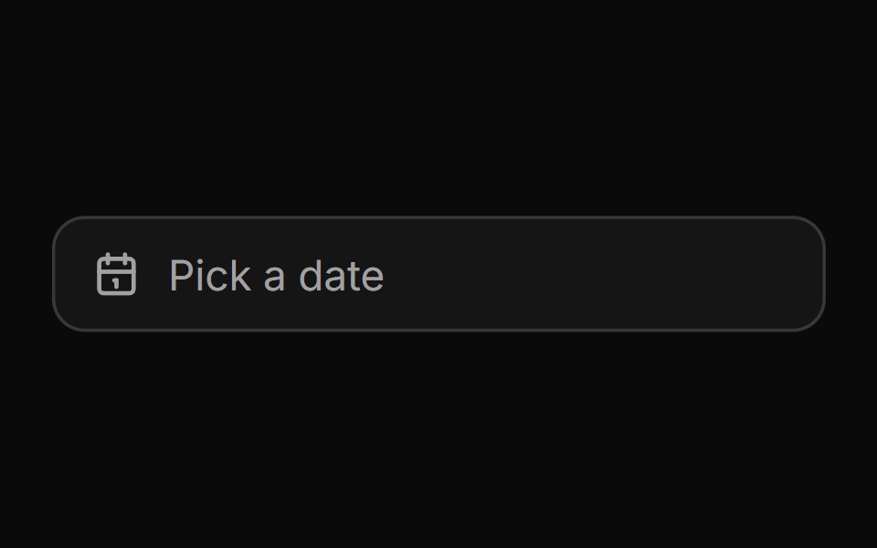 Date pickerHextaUI · ReactA button that opens a calendar in a popover, or a bottom sheet on phones, for single dates and ranges.
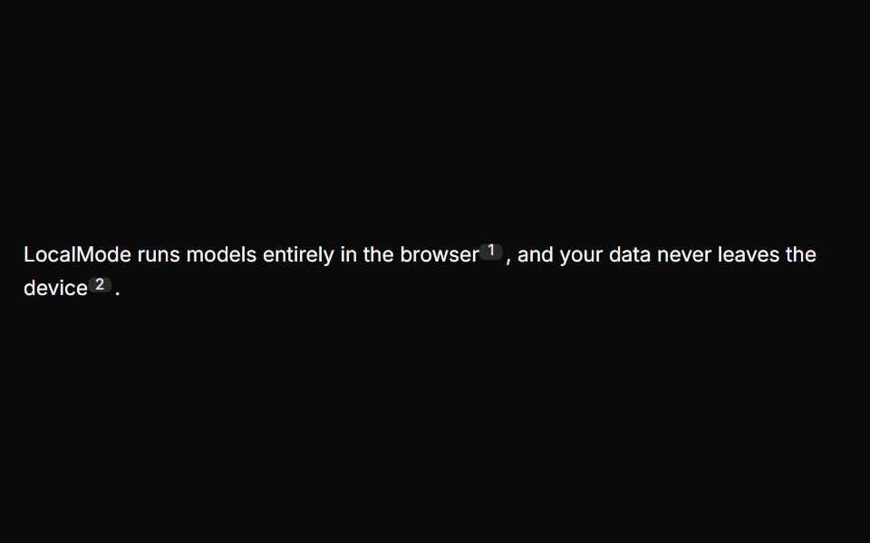 Inline CitationLocalMode · ReactInline superscript citation markers in prose that open a hovercard with the cited local chunk (title, excerpt, quoted…
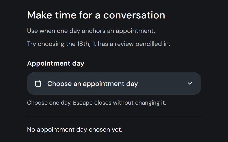 Date PickerCojeev UI · ReactChoose one day, a range, or multiple dates from a labelled field and calendar popover.
 BasicFLX UI · ReactDefault popover with a button trigger and simple text.
 Menu and correction popoverMetal UI · React + SwiftUIA frosted plate of 30 rows (frost-strong at .92, radius 18, padding 6, at least 200 wide) from a trigger or at the…
 Card InfoSpaceUI · ReactResponsive feature and philosophy cards with gradient icons, clean typography, and layered container aesthetics.
 Date PickerOUI · ReactReact aria components DatePicker with shadcn characteristics.
 Hover CardD2Studio UI · ReactFor sighted users to preview content available behind a link.
 PopoverEaseUI · ReactA panel of arbitrary content anchored to a trigger, opening on click and flipping above it when there's no room below.
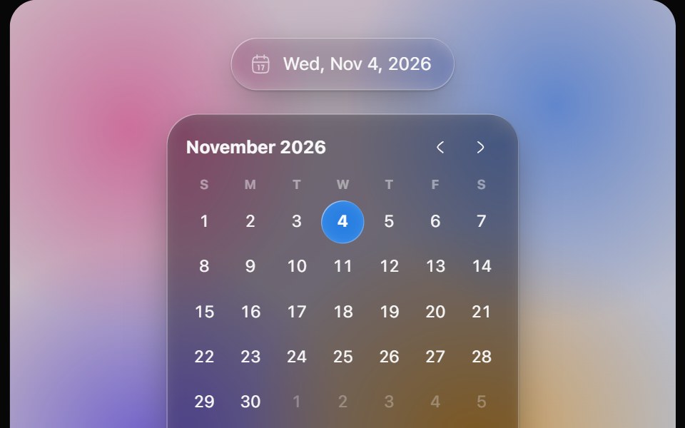 Glass Date PickerOpaline · ReactGlass calendar with a gliding day bubble, and a capsule date picker.
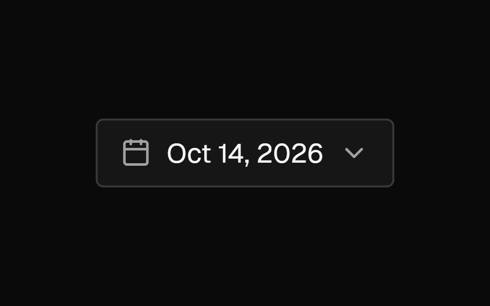 Date PickerFibo · ReactA field that opens a calendar to pick a day, or a range with presets and Apply; a popover on desktop, a drawer on…
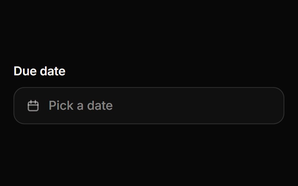 Date PickerReactFrame · ReactA date picker with a popover calendar: single date or range selection, month navigation, min/max and disabled dates…
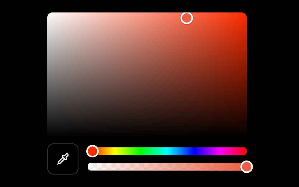 Color Pickerark-cn · ReactA shadcn-style color picker component built with Ark UI primitives.
 Popovershadcn/ui · ReactDisplays rich content in a portal, triggered by a button.
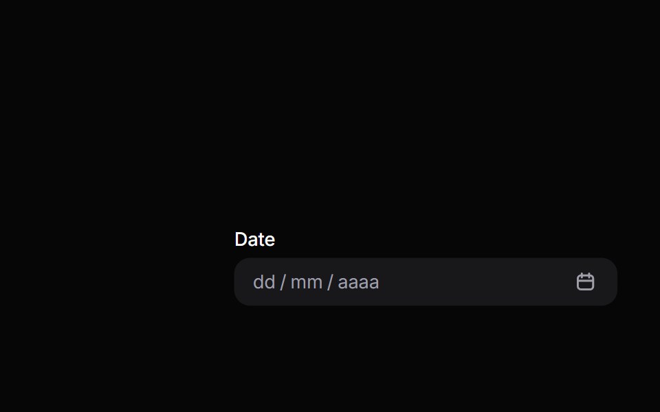 Date PickerHeroUI · ReactComposable date picker built on React Aria DatePicker with DateField and Calendar composition
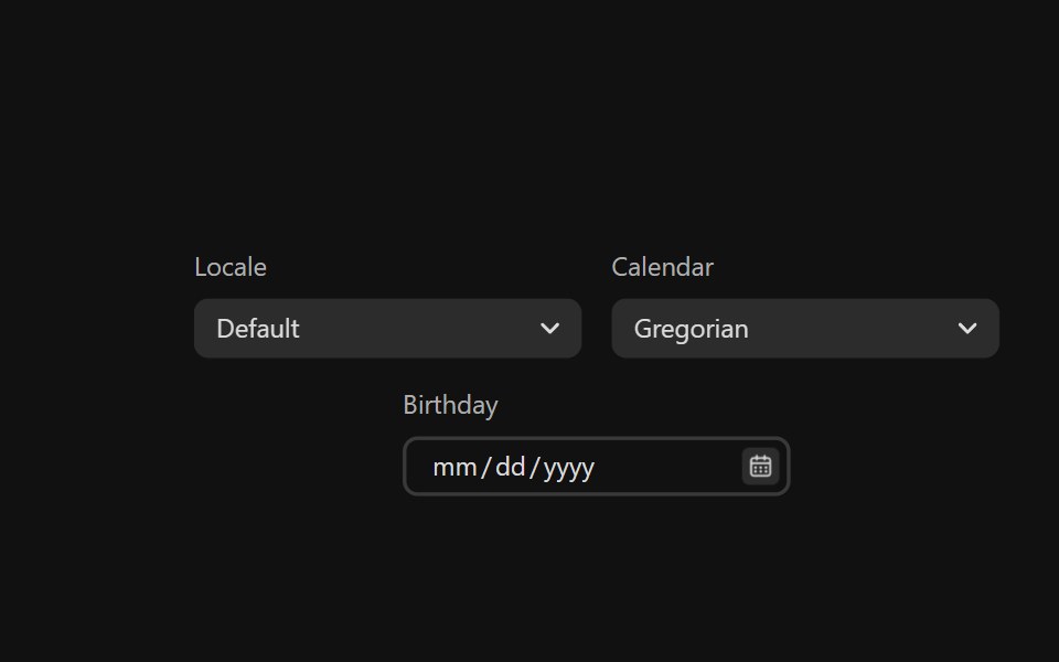 Date PickerReact Spectrum · ReactDatePickers combine a DateField and a Calendar popover to allow users to enter or select a date and time value.
 Preview Cardcoss ui · ReactA popup that appears when a link is hovered, showing a preview for sighted users.
 Comp 381Origin UI · React
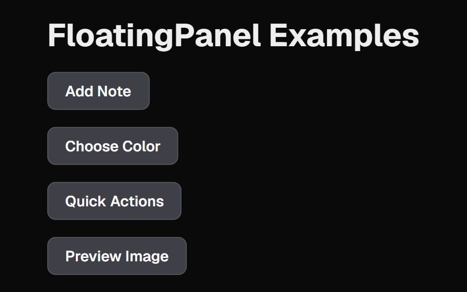 Floating PanelCult UI · ReactFloating panel component with backdrop blur and position-aware animations
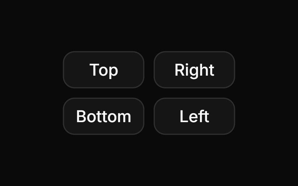 Hover card with positions.ReUI · ReactHover card with positions.
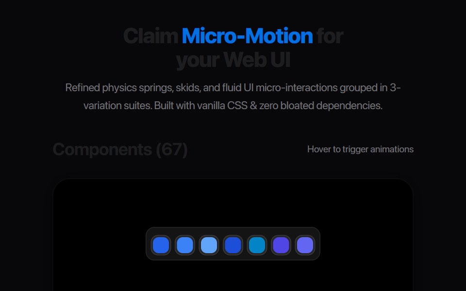 Card Glance PreviewAmicro Micro Transitions · ReactMicro floating glance card popup with status indicator dot.
 Inline CitationAI Elements · ReactA hoverable citation component that displays source information and quotes inline with text, perfect for AI-generated…
 PopoverbeUI · React
 Hover CardTailGrids · ReactA hover card component that displays information when the user hovers over an element.
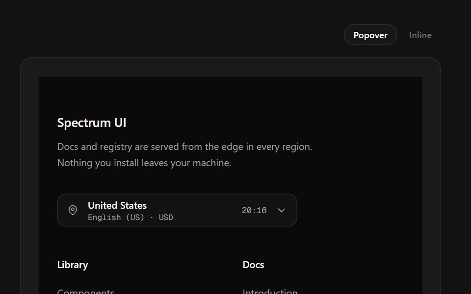 Region Picker FooterSpectrum UI · ReactA region popover with locale, currency, data residency and live local time.
 PopoverVengeance UI · React
 Date PickerFluid Functionalism · ReactField or ghost trigger for a date, a range, or a date and a time: a calendar popover that opens on the selected day…
 PopoverToolcraft · React
 Card-02 - Preview CardShadcn Space · ReactCard component
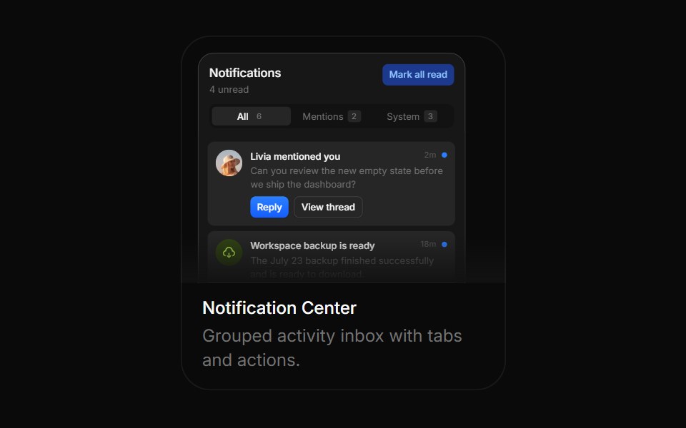 Notification CenterBoardUI · ReactGrouped activity inbox with tabs and actions.
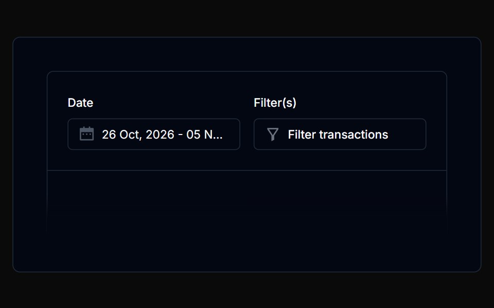 PopoverTremor Blocks · React
 PopoverShadcn Dashboard · React
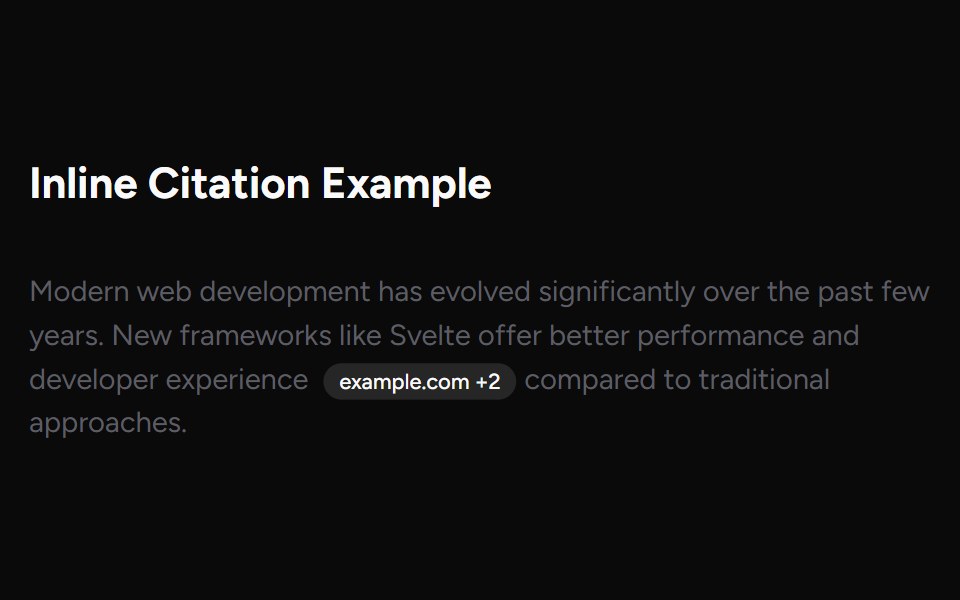 Inline CitationAI Elements (Svelte) · SvelteAn inline citation system with hover cards and carousel views for source-backed AI content.
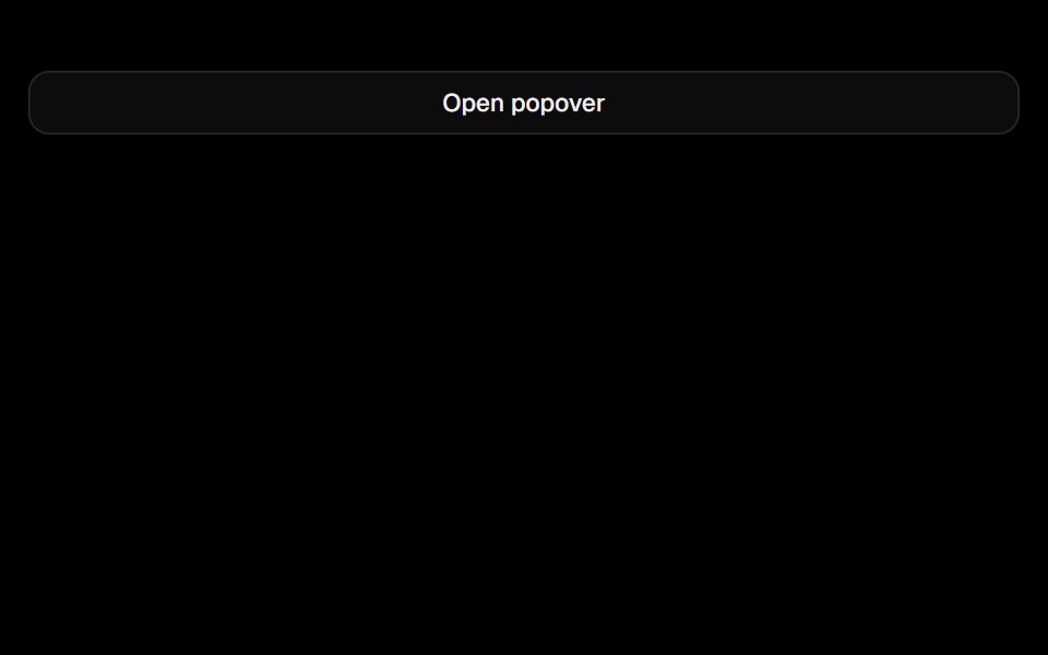 PopoverObsidianUI · React
 ChatGPT Source ChipNotra · ReactAn inline citation pill with a hover card.
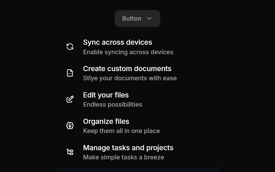 Flyouts 02Oxbow UI · Astro
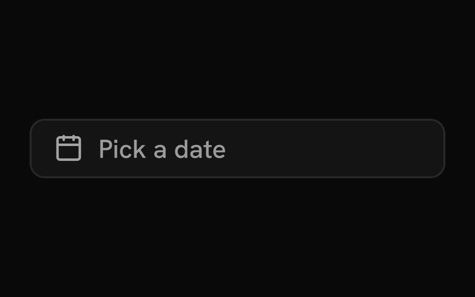 Date PickerShark UI · ReactInput with a built-in calendar.
 Cursor Hover CardSona UI · React
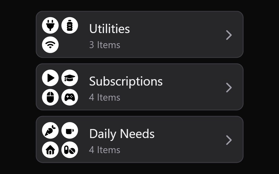 Collection Grid DisclosureWatermelon UI · React
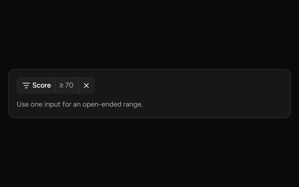 Number Range Filtersv-table · SvelteA number range picker with exact inputs, an optional slider, and explicit apply behavior.
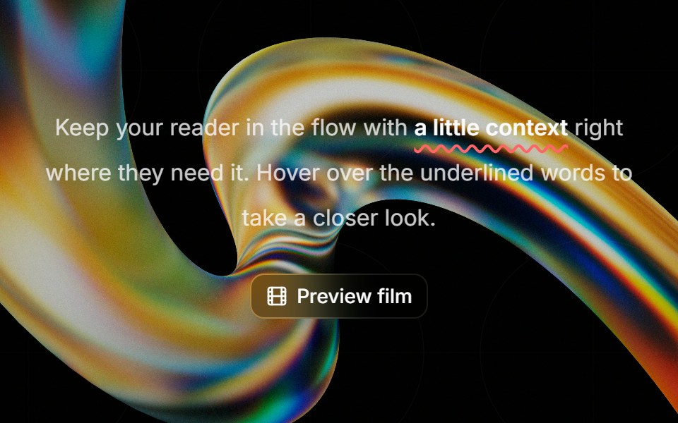 Highlight Phraseglasscn · ReactA smooth glass hover popover for text, video, and rich content, with click and keyboard access.
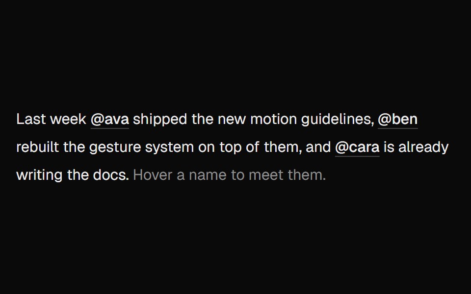 Hover CardUI Lab · ReactOne card travels between names as you hover them.
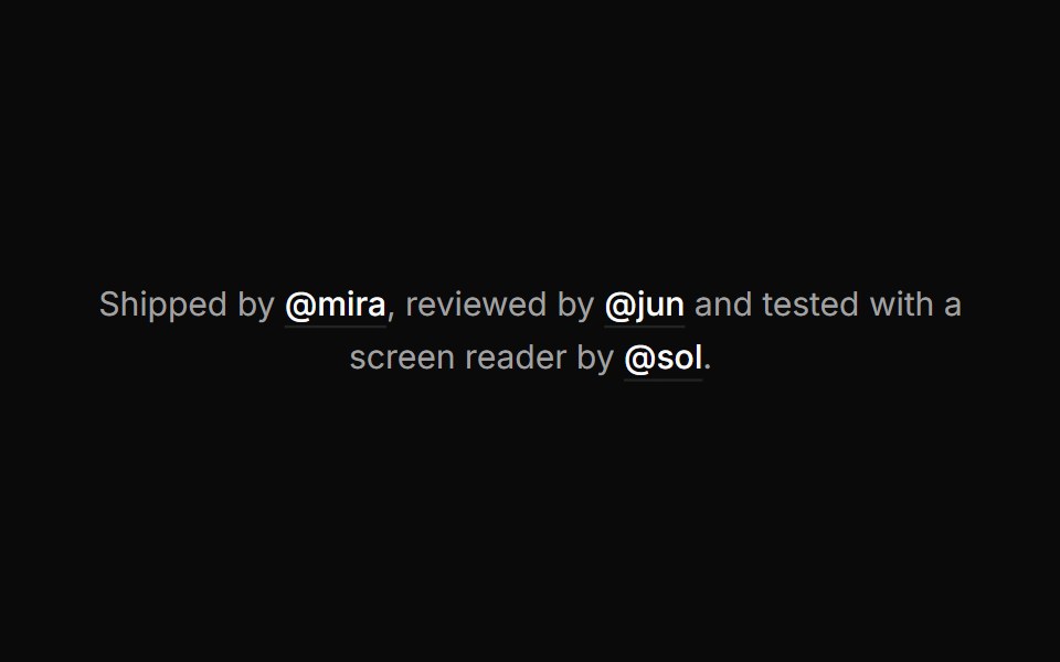 Hover cardHextaUI · ReactA preview card that opens when a link is hovered or focused, for content sighted users can glance at.
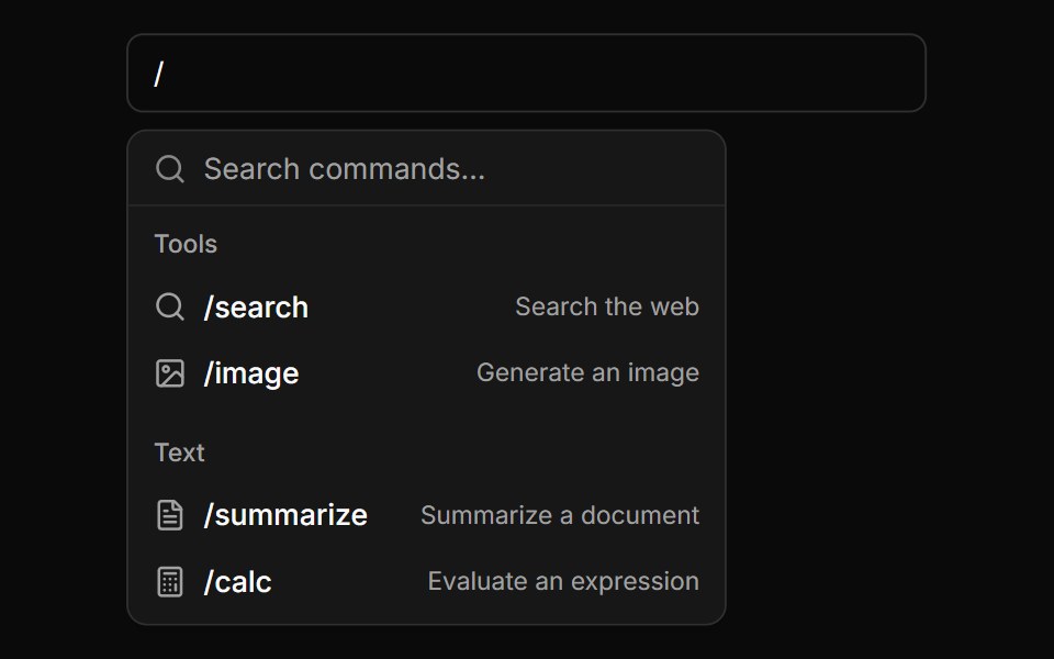 Slash Command PaletteLocalMode · ReactA '/'-triggered command palette over a local tool/command list — name, category, description, and icon — to layer onto…
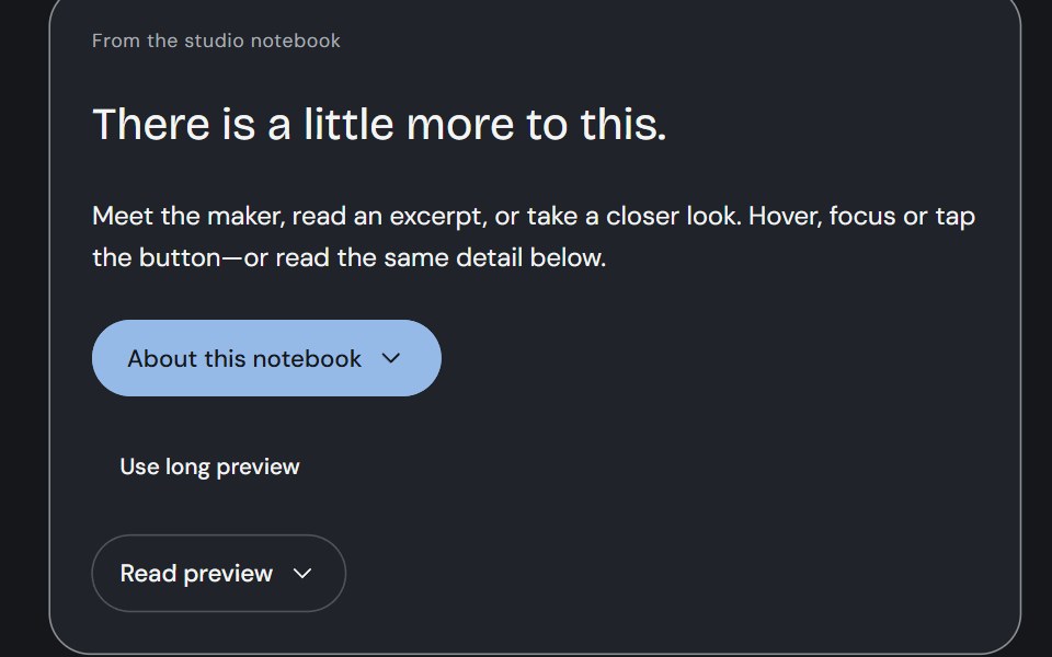 Hover CardCojeev UI · ReactA person, an excerpt or a small visual study—three considered previews, close to the thing you are exploring.
 With headerFLX UI · ReactPopover with a bold title and a short description below it.
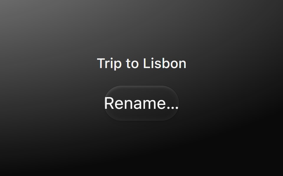 PopoverMetal UI · React + SwiftUIA small panel that comes out of its trigger: the menu's frosted plate rising one nest from the trigger's side on the…
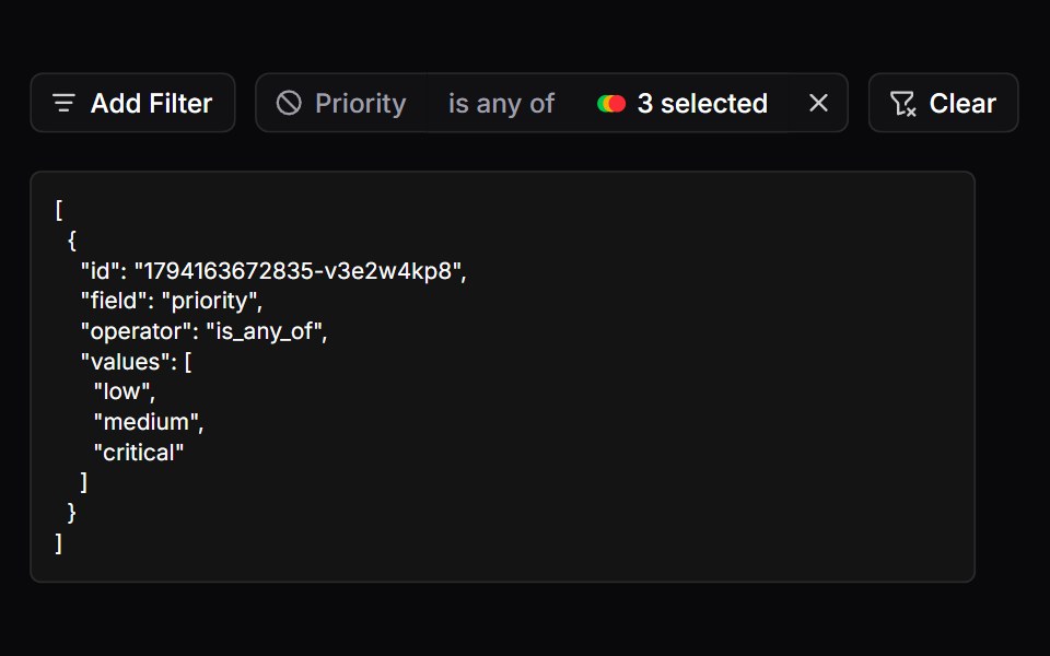 FiltersSpaceUI · ReactProvides a filter bar with badges and active tags, allowing users to narrow down search results by multiple criteria…
 PopoverOUI · ReactReact aria components Popover with shadcn characteristics.
 PopoverD2Studio UI · ReactDisplays rich content in a portal, triggered by a button.
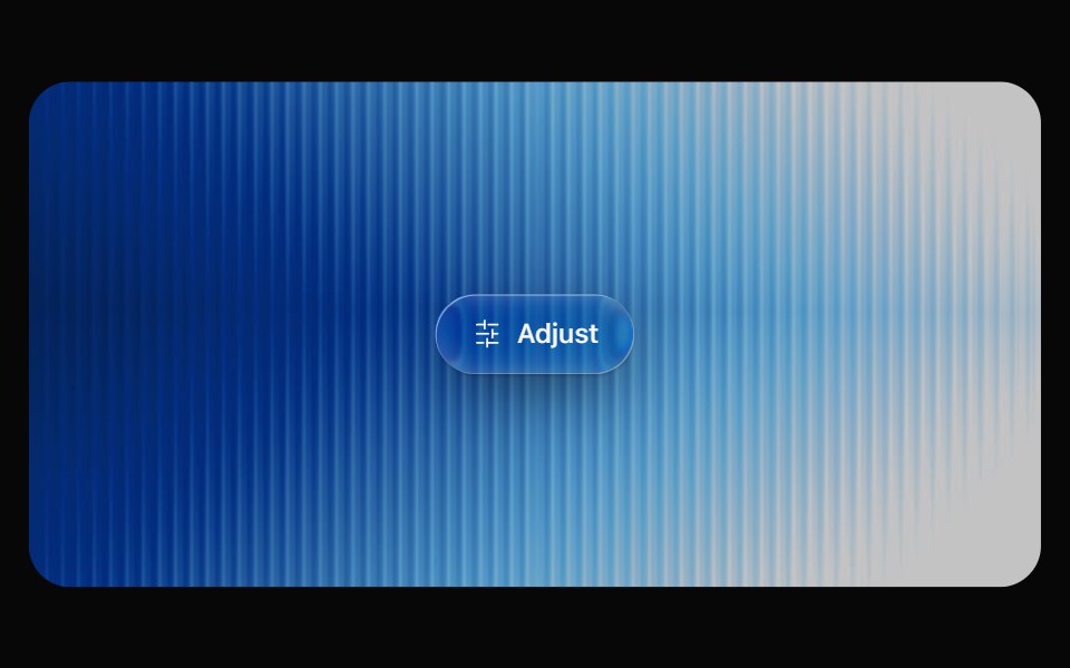 Glass PopoverOpaline · ReactRich popover content on a frosted glass surface.
 Hover CardReactFrame · ReactA hover-triggered rich preview card with open/close delays, a hover bridge so moving into the card keeps it open…
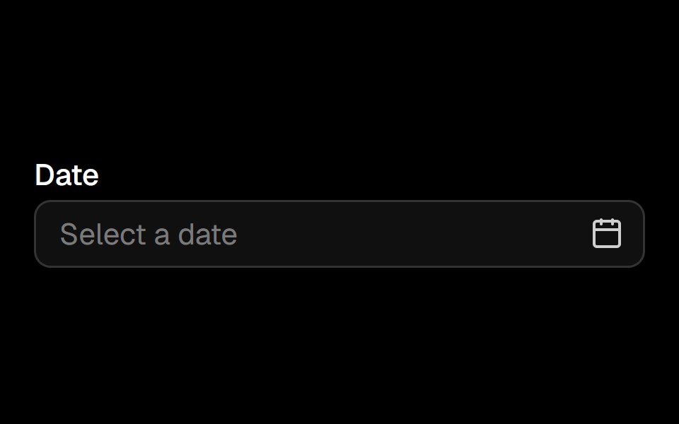 Date Pickerark-cn · ReactA shadcn-style date picker component built with Ark UI primitives.
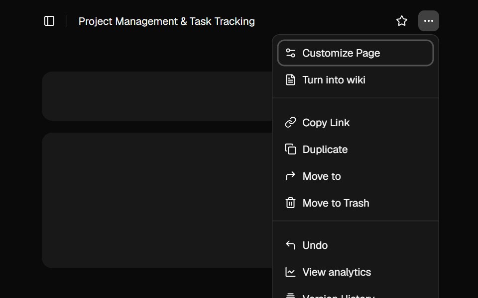 Sidebar 10shadcn/ui · ReactA sidebar in a popover.
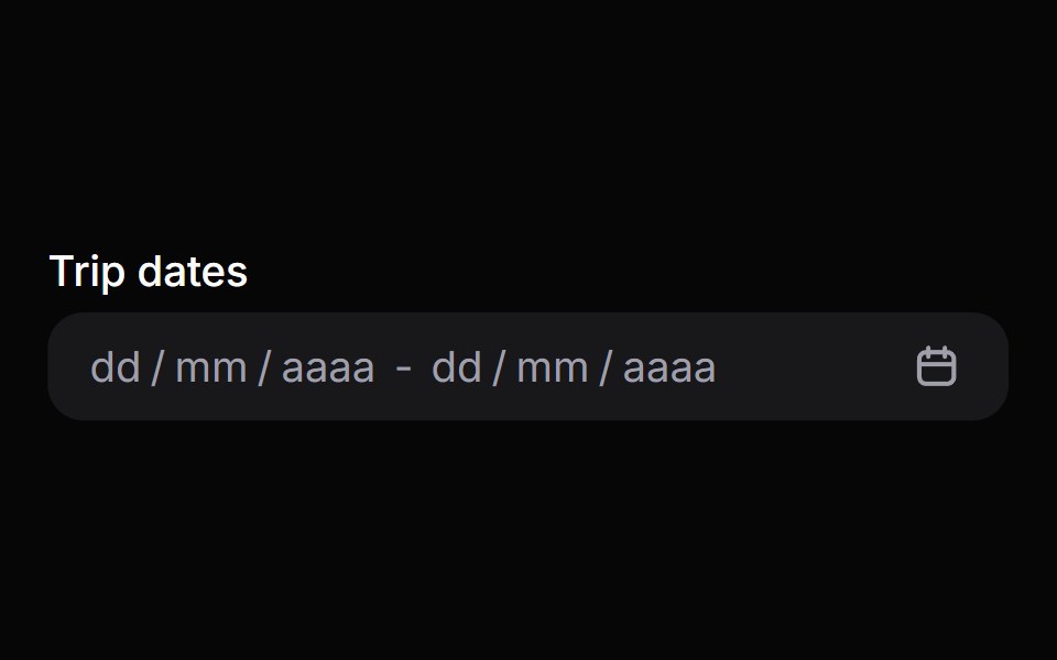 Date Range PickerHeroUI · ReactComposable date range picker built on React Aria DateRangePicker with DateField and RangeCalendar composition
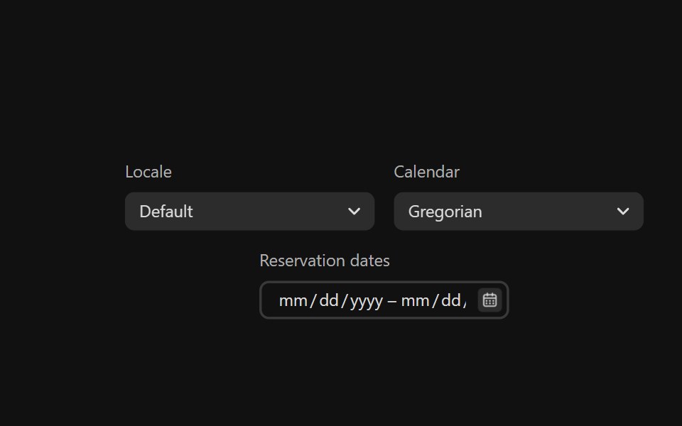 Date Range PickerReact Spectrum · ReactDateRangePickers combine two DateFields and a RangeCalendar popover to allow users to enter or select a date and time…
 Comp 382Origin UI · React
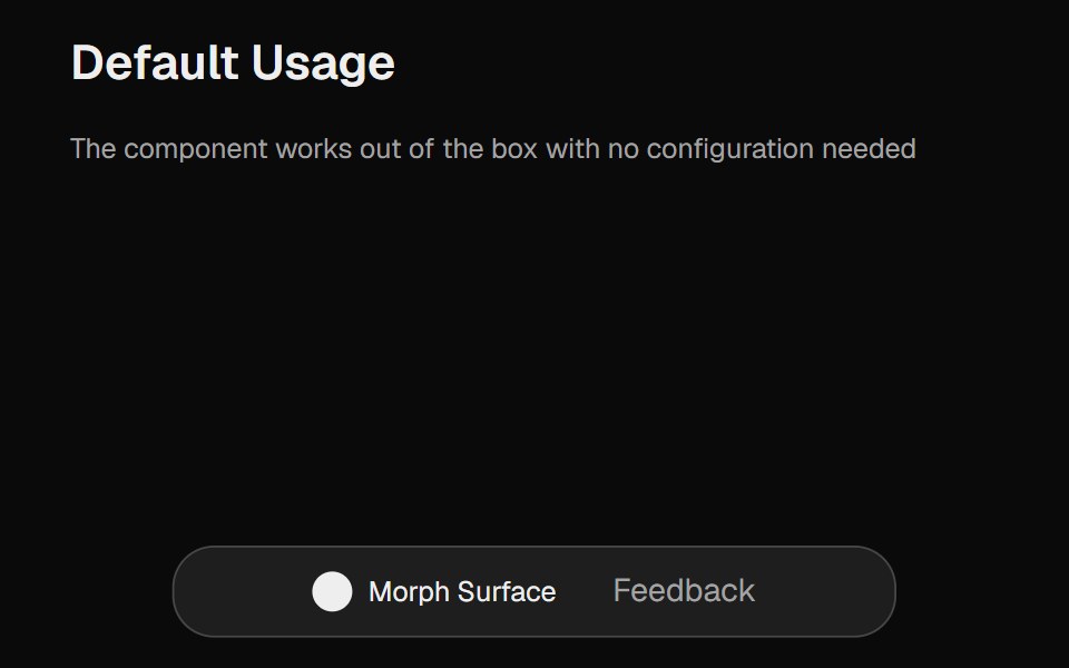 Morph SurfaceCult UI · ReactA morphing surface component with smooth animations, customizable dimensions, and configurable content
 Hover card with profile information.ReUI · ReactHover card with profile information.
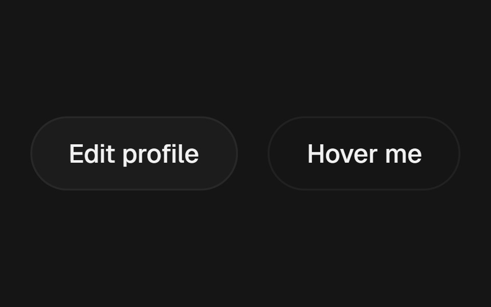 Popover PositionbeUI · React
 PopoverTailGrids · ReactA popover component that displays content in a floating container.
 Date PickerFluid Functionalism · ReactField or ghost trigger for a date, a range, or a date and a time: a calendar popover that opens on the selected day…
 Popover 01 - About Shadcn SpaceShadcn Space · ReactPopover that slides in from the top - ideal for notifications and alerts.
 Claude Plus MenuNotra · ReactThe composer's + menu with files, skills, connectors, design system, plugins and research.
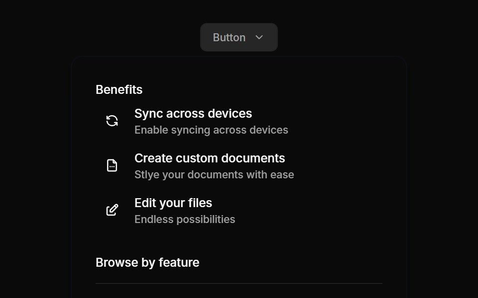 Flyouts 03Oxbow UI · Astro
 Hover CardShark UI · ReactPopover that appears on hover.
 Create New DisclosureWatermelon UI · React
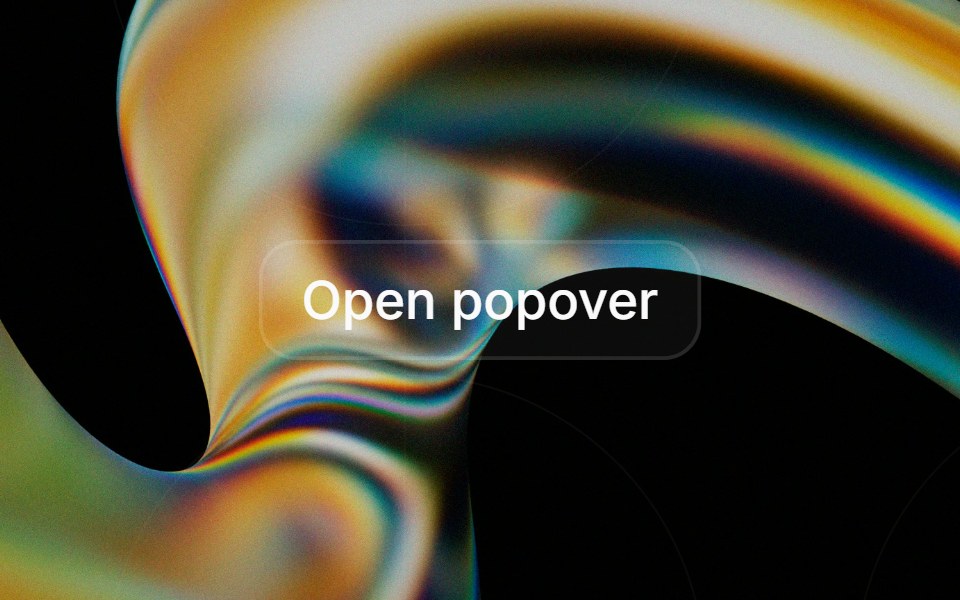 Popoverglasscn · React
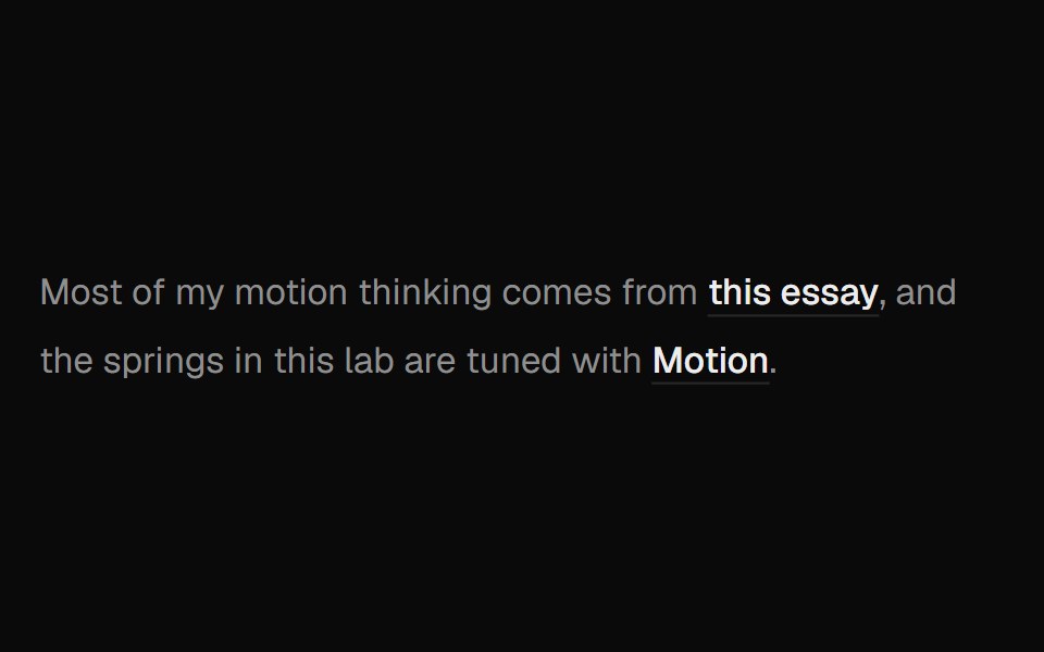 Hover Preview LinkUI Lab · ReactHover a link to get a preview card that trails your cursor and leans as it moves.
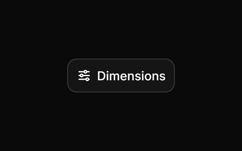 PopoverHextaUI · ReactA floating panel anchored to a trigger that resizes smoothly with its content and follows the trigger’s direction.
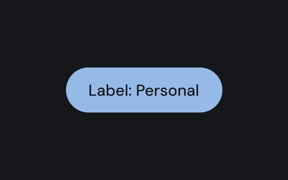 PopoverCojeev UI · ReactPlaces a dismissible panel next to a trigger for a small contextual task or set of controls.
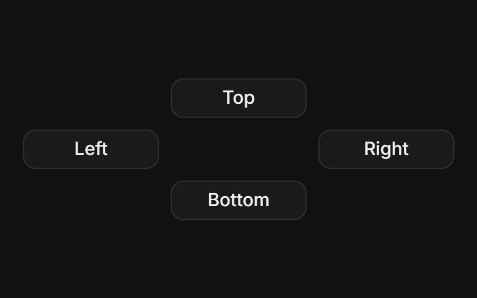 SidesFLX UI · ReactPlace the popover on top, right, bottom, or left of the trigger.
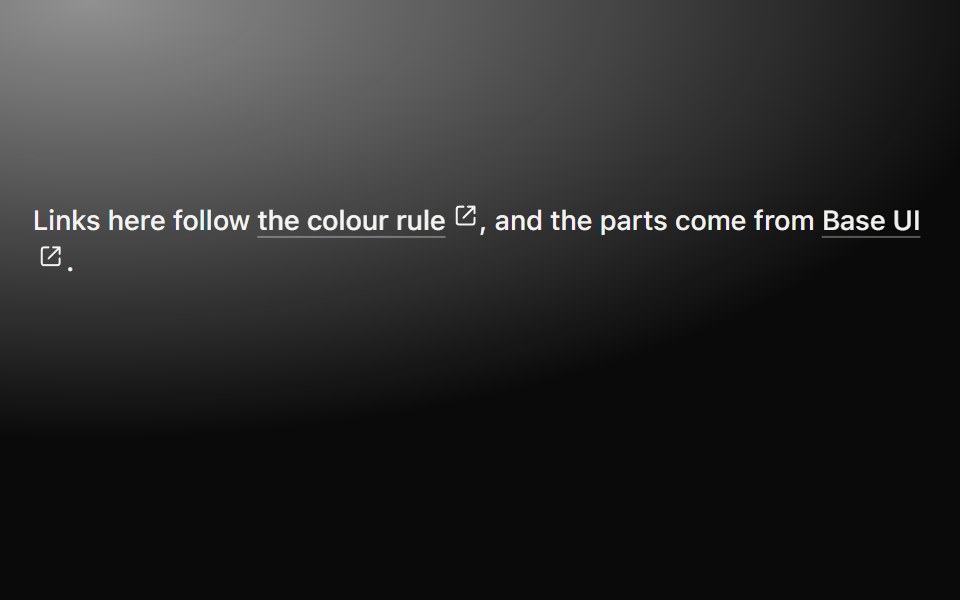 Preview cardMetal UI · React + SwiftUIWhat is behind a link, seen by resting on it: after a steady hover the popover's plate rises out of the link with an…
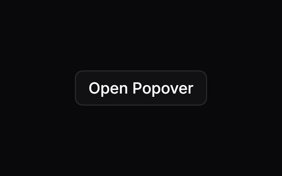 PopoverSpaceUI · ReactOpens a floating content box anchored to a button or icon, showing interactive settings, tools, or details right next…
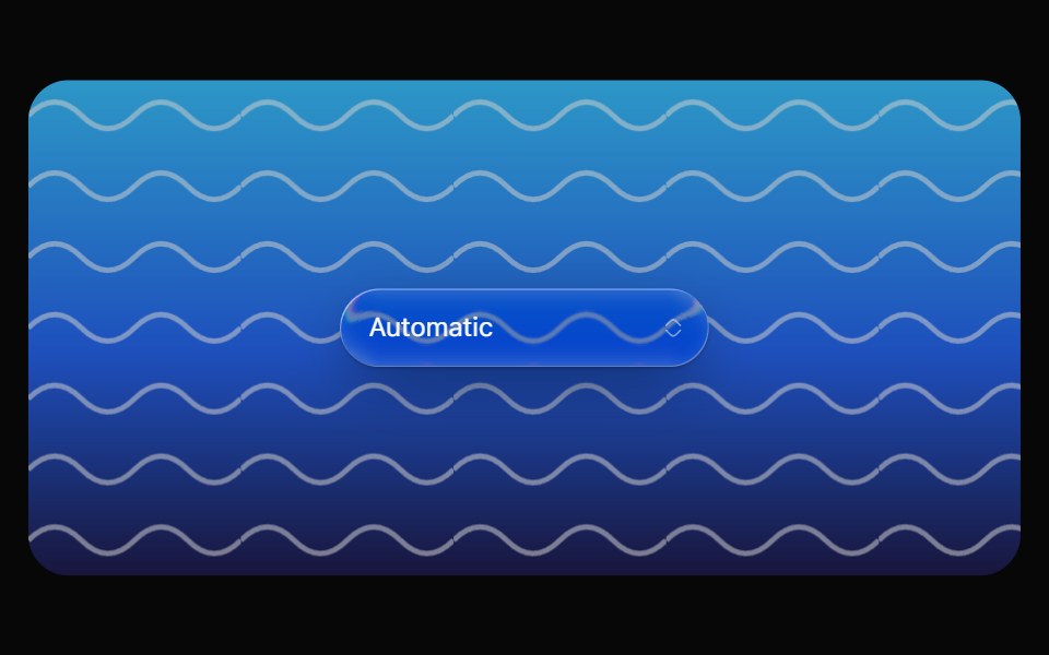 Glass SelectOpaline · ReactCapsule select with a frosted glass option list.
 PopoverReactFrame · ReactAn accessible popover for interactive content with click or hover triggers, 4 placements and 3 alignments, auto-flip…
 Hover Cardark-cn · ReactA shadcn-style hover card component built with Ark UI primitives.
 PopoverHeroUI · ReactDisplays a floating content panel anchored to a trigger element with placement and alignment options.
 PopoverReact Spectrum · ReactA popover is an overlay element positioned relative to a trigger.
 Comp 383Origin UI · React
 PopoverCult UI · ReactAnimated popover component with form support and smooth transitions
 Hover card with iconReUI · ReactHover card with icon
Libraries with Tailwind CSS popover components
Related categories
- Popover Components
- React Popover Components
- Animated Popover Components
- shadcn/ui Popover Components
- Tailwind CSS Overlay Components
- Tailwind CSS Modal Components
- Tailwind CSS Tooltip Components
- Tailwind CSS Toast Components
- Tailwind CSS Drawer Components
- Tailwind CSS Alert Dialog Components
- Tailwind CSS Hover Card Components
- Tailwind CSS Bottom Sheet Components
- Tailwind CSS Tour Components
- Tailwind CSS Dynamic Island Components
- Tailwind CSS Cookie Banner Components
- Tailwind CSS Lightbox Components