 Dev Design Library
Tailwind CSS Toast Components
Dev Design Library indexes 107 Tailwind CSS toast components from 39 open-source UI libraries, with the most coming from Origin UI, ReUI, Watermelon UI, Shadcn Space and Oxbow UI. Each one links to its page with the source code, a live preview where available, the library license and the install command. Every library in this list styles its components with Tailwind CSS utility classes. Toast components belong to the Overlays group.
 Sonnershadcn/ui · ReactAn opinionated toast component for React.
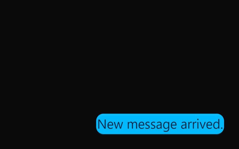 ToastdaisyUI · CSS (Tailwind)
 ToastHeroUI · ReactDisplays temporary notification messages that appear at the top or bottom of the screen.
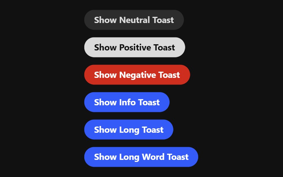 ToastReact Spectrum · React
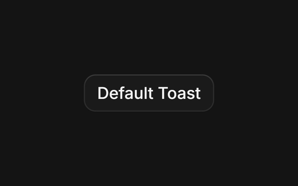 Toastcoss ui · ReactA temporary notification that appears on screen to inform users.
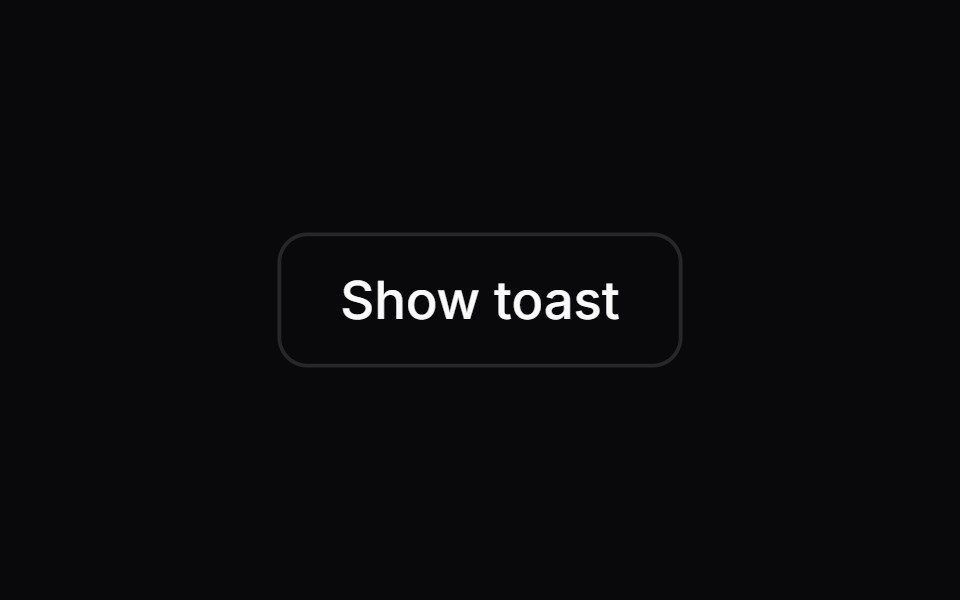 ToastOrigin UI · ReactA temporary notification that appears on screen to inform users.
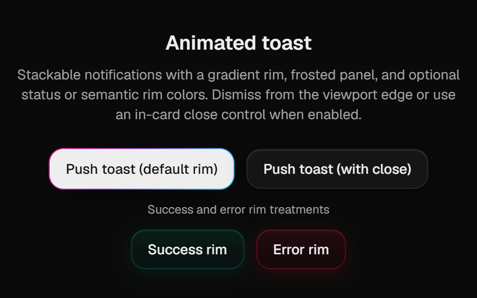 Halo ToastCult UI · ReactSonner-backed polished toasts with rim variants; mount PolishedToaster once in the root layout
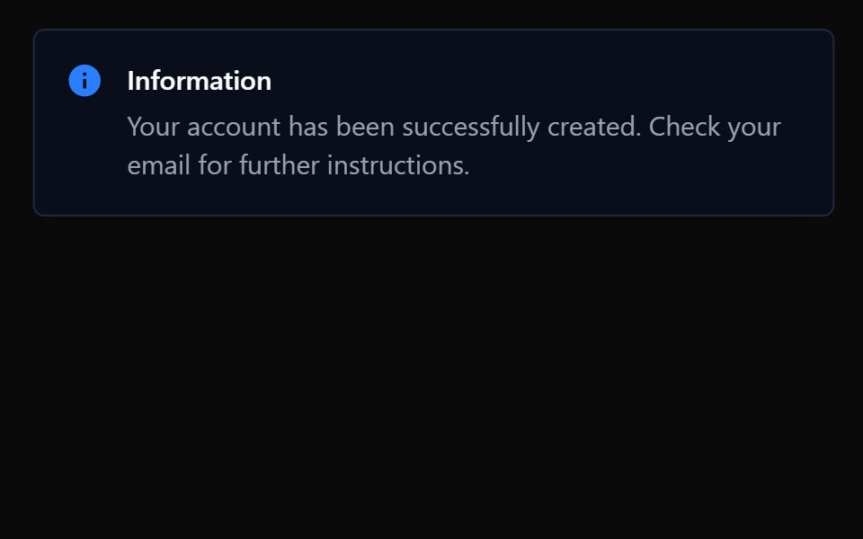 ToastTremor · React
 Basic toast notification.ReUI · ReactBasic toast notification.
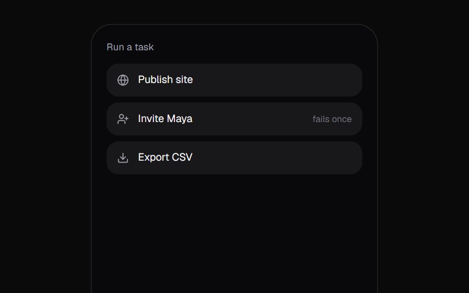 Promise ToastKokonut UI · React"A toast that follows a task: the ring spins while it works, closes into a check or a warning when it lands, and…
 toastIntent UI · Reacttoast
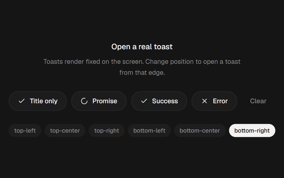 Animated Toast StackbeUI · ReactStacked toasts with status morphs, swipe dismissal, actions and layout-aware motion.
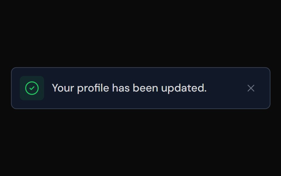 ToastTailGrids · ReactA toast component for displaying notifications.
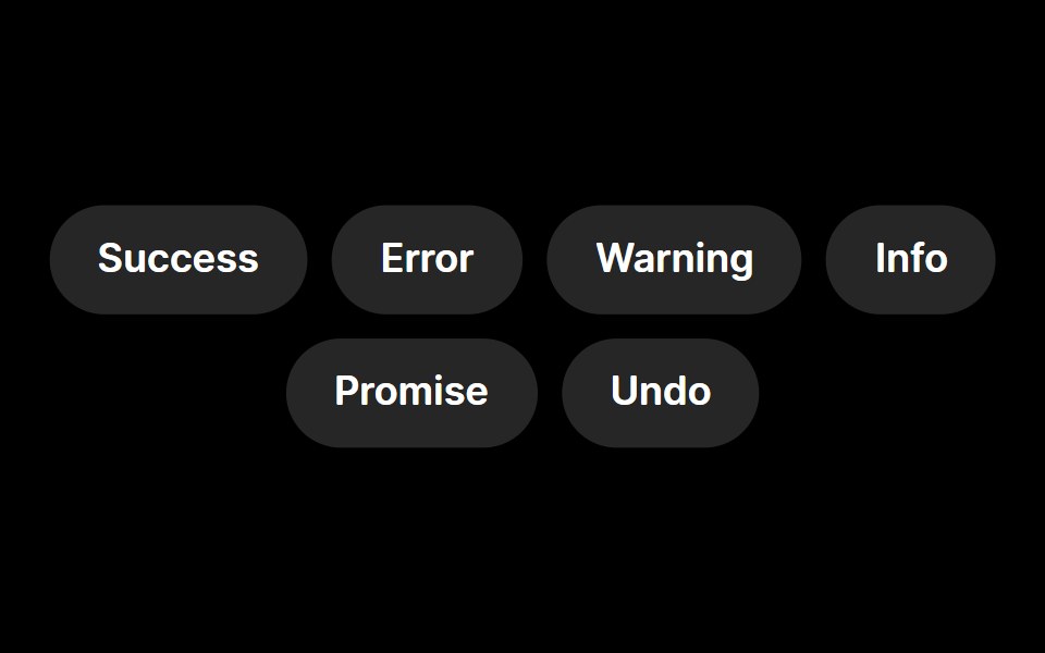 ToastRare UI · ReactA toast notification with animated status icons, built on Sonner.
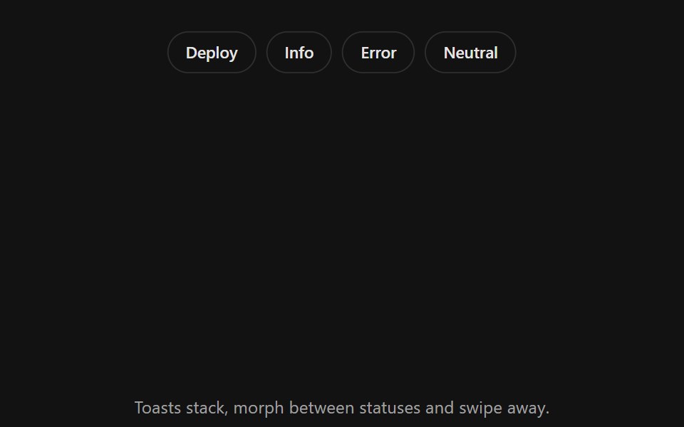 Toast StackSpectrum UI · ReactStacked toasts with status morphs, swipe to dismiss, actions and layout-aware motion.
 SonnerVengeance UI · React
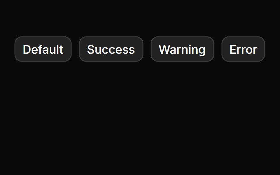 SonnerToolcraft · React
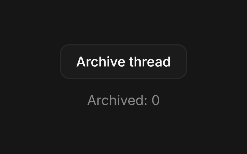 Web ToastPanel UI · React NativeToasts for actions such as archive, publish and deploy, with progress and undo.
 Sonner 01 - Upload FileShadcn Space · ReactA clean, minimal toast notification for file upload progress and status updates.
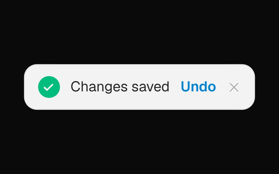 Toast Notification BannerOpenSourceUI · React
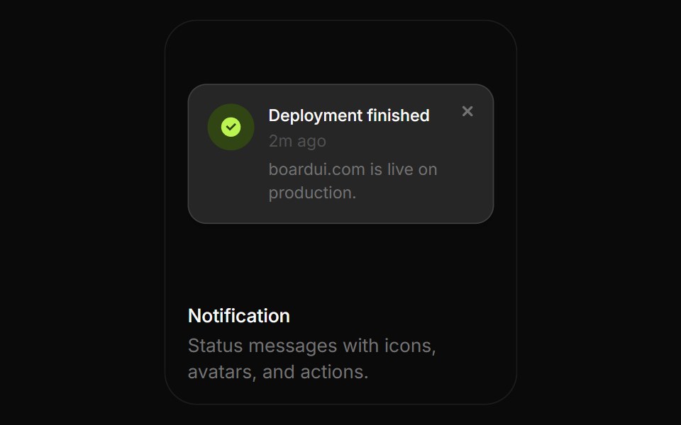 NotificationBoardUI · ReactStatus messages with icons, avatars, and actions.
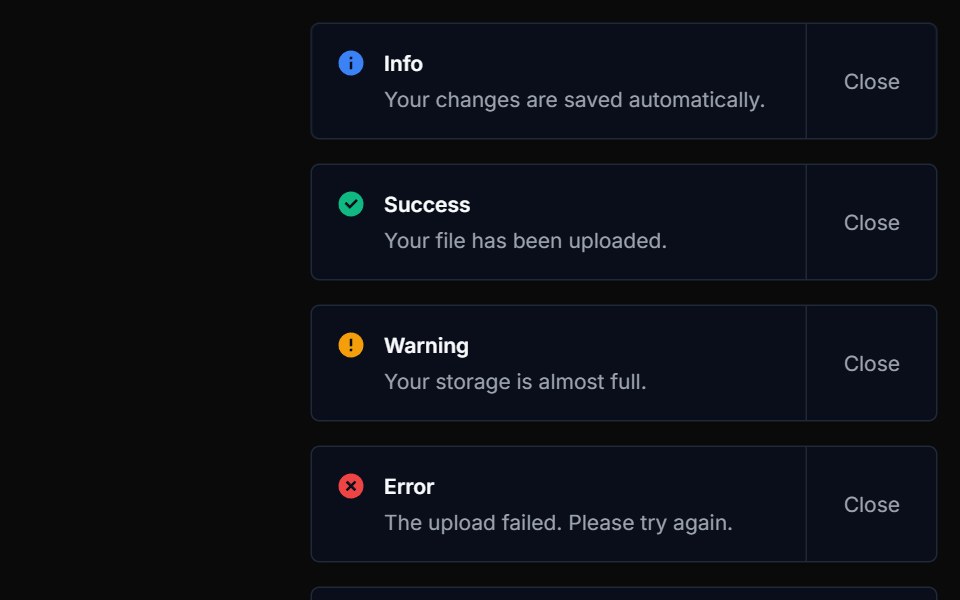 ToastTremor Blocks · React
- SonnerShadcn Dashboard · React
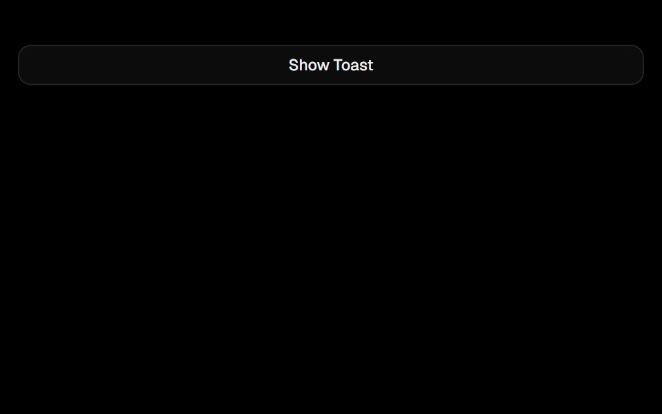 SonnerObsidianUI · React
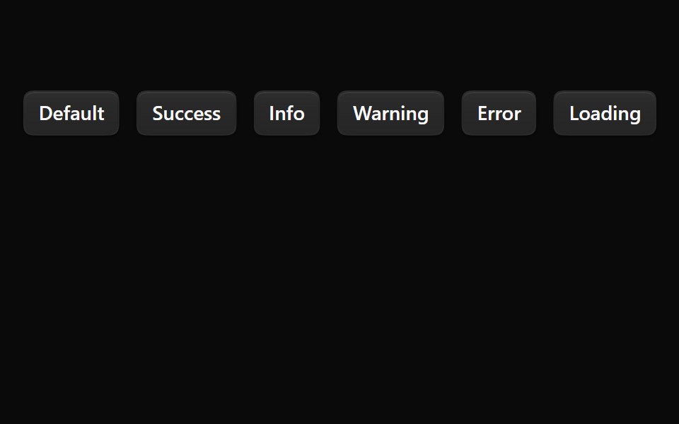 SonnerNotra · ReactA Sonner toaster with the Depth surface of the buttons and tinted status icons.
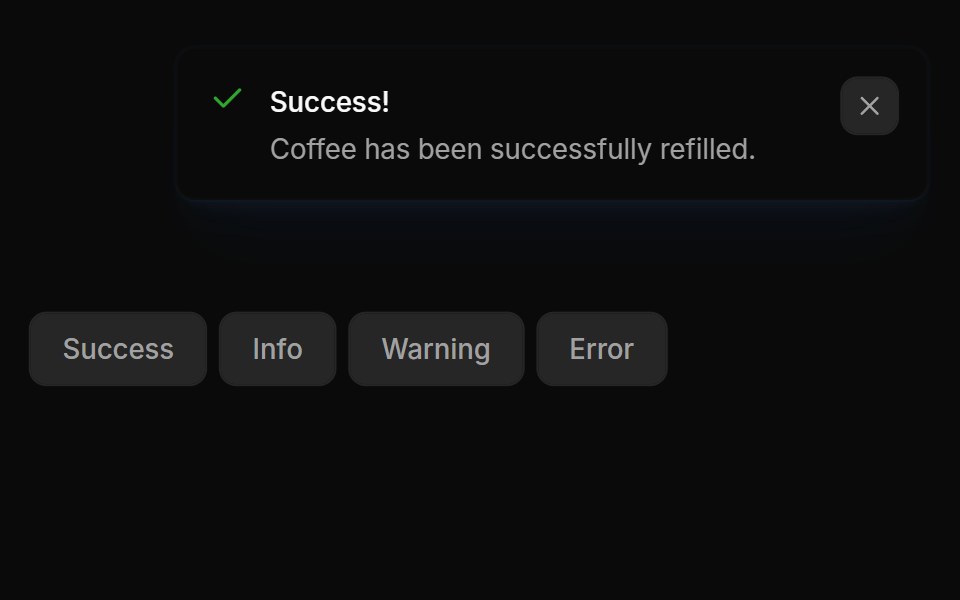 Notifications 01Oxbow UI · Astro
 ToastShark UI · ReactProvides feedback on an action.
 Inline ToastWatermelon UI · React
 Promise ToastUI Lab · ReactOne toast that morphs from saving to saved, or to an error with retry.
 ToastHextaUI · ReactBrief messages that stack neatly, expand on hover, swipe away, and turn a loading state into success or error in place.
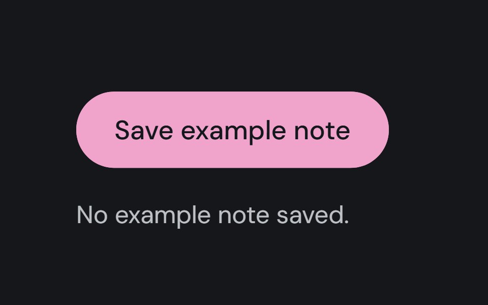 ToastCojeev UI · ReactReports a brief outcome in a notification area without moving the user away from the current task.
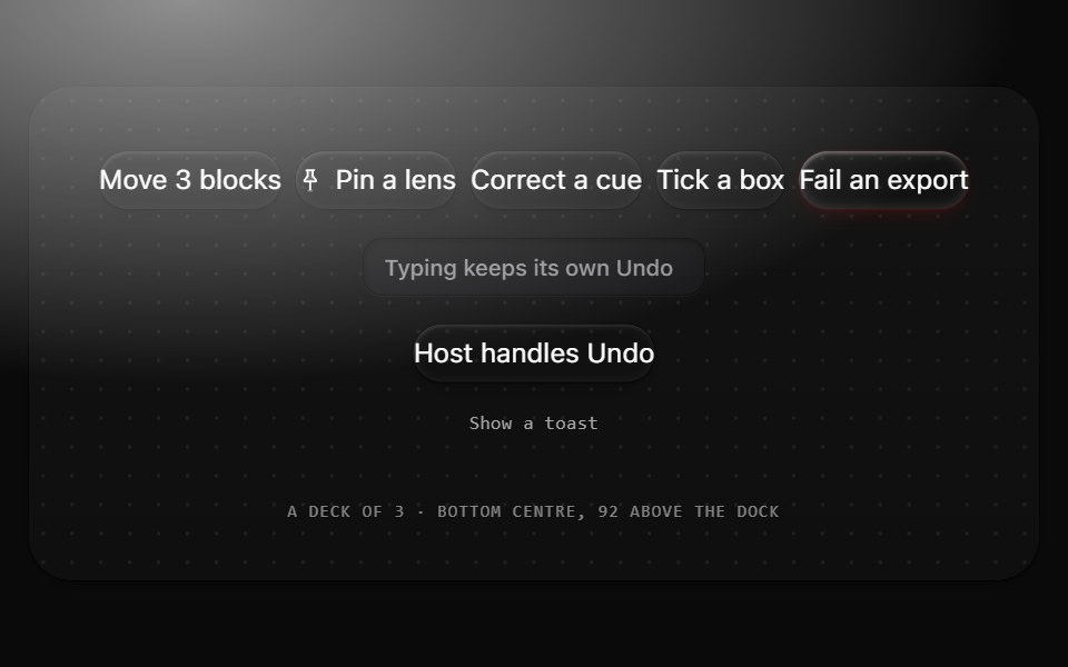 ToastMetal UI · React + SwiftUIThe result of a person's own action, with Undo: a 44 tall pill in the colorway at the bottom centre. Results stack as…
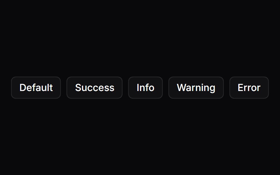 ToastSpaceUI · ReactDisplays temporary popup notifications at the corner of the screen to confirm user actions, show progress, or report…
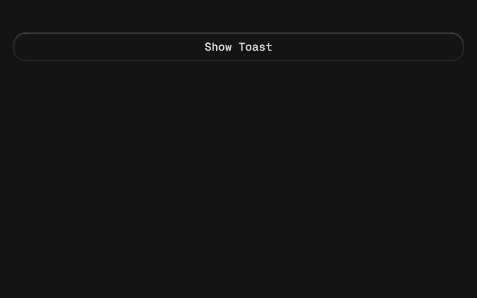 SonnerD2Studio UI · ReactAn opinionated toast component for React.
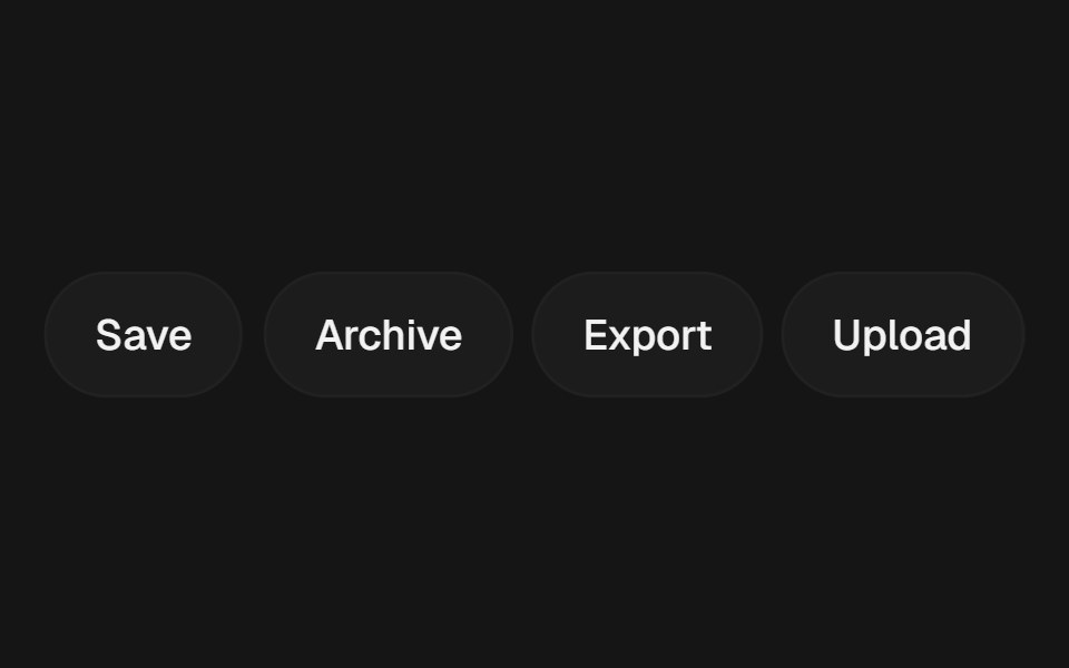 ToastEaseUI · ReactToasts that stay long enough to read based on their word count, and pause while hovered or while the tab is in the…
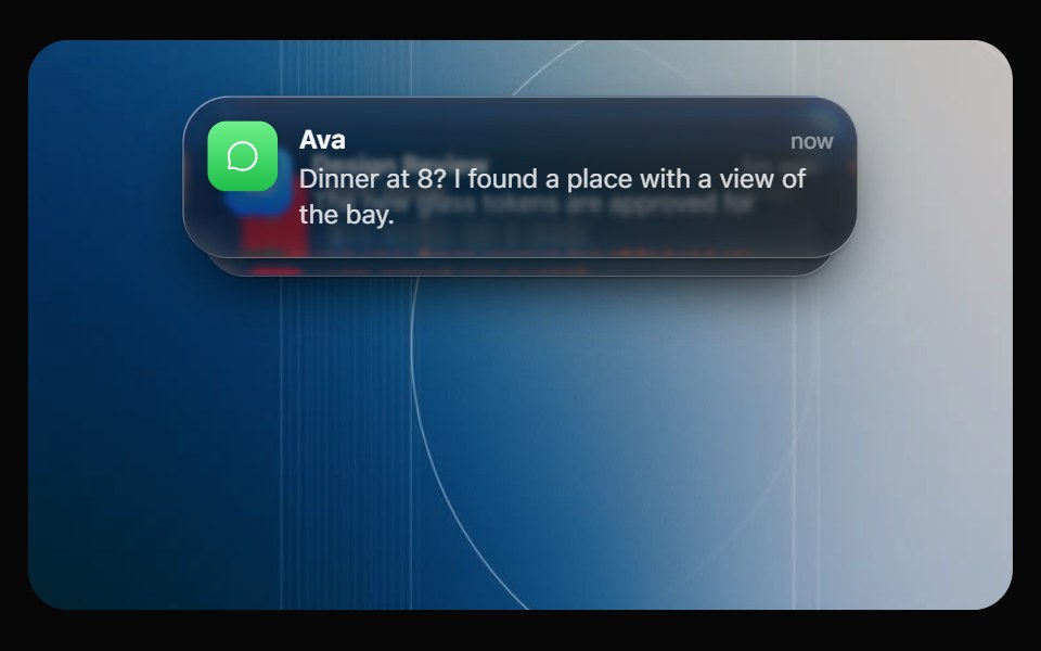 Glass NotificationOpaline · ReactiOS notification banner plus a stack that fans out on hover.
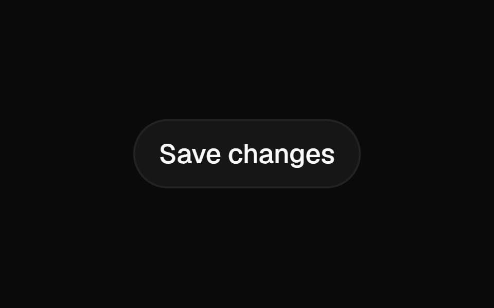 ToastFibo · ReactA brief message in the corner about something that just happened.
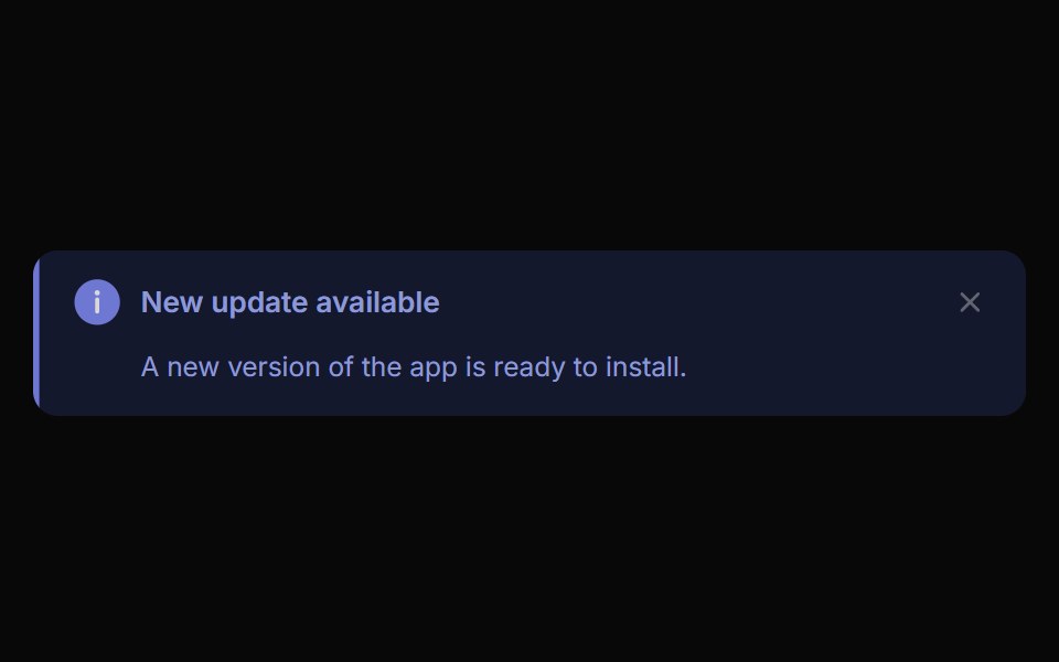 Alert ToastReactFrame · ReactA polished toast/alert notification, 5 tones, stacked or inline layout, icons, primary/secondary actions, dismiss and…
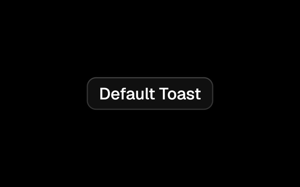 Toastark-cn · ReactA shadcn-style toast component built with Ark UI primitives.
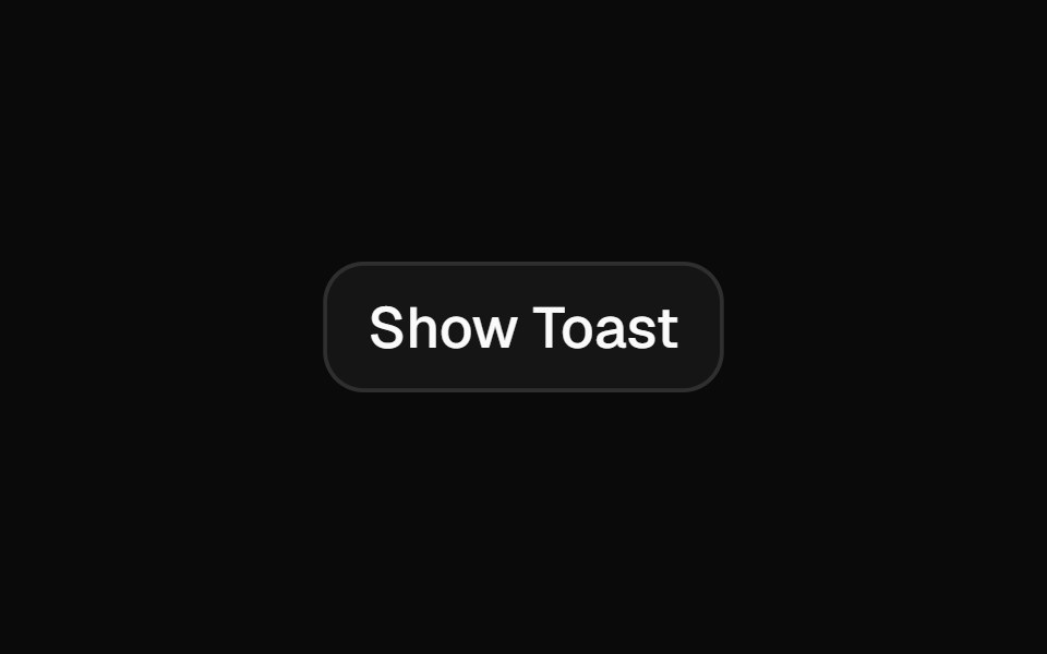 Toastshadcn/ui · ReactA succinct message that is displayed temporarily.
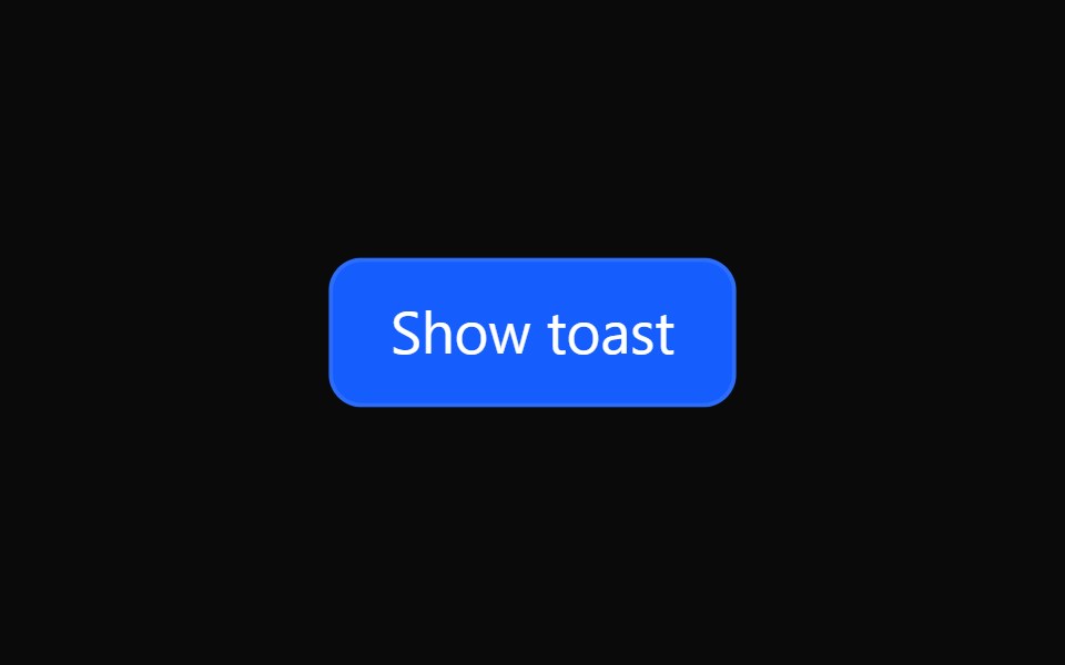 Tailwind ToastReact Spectrum · React
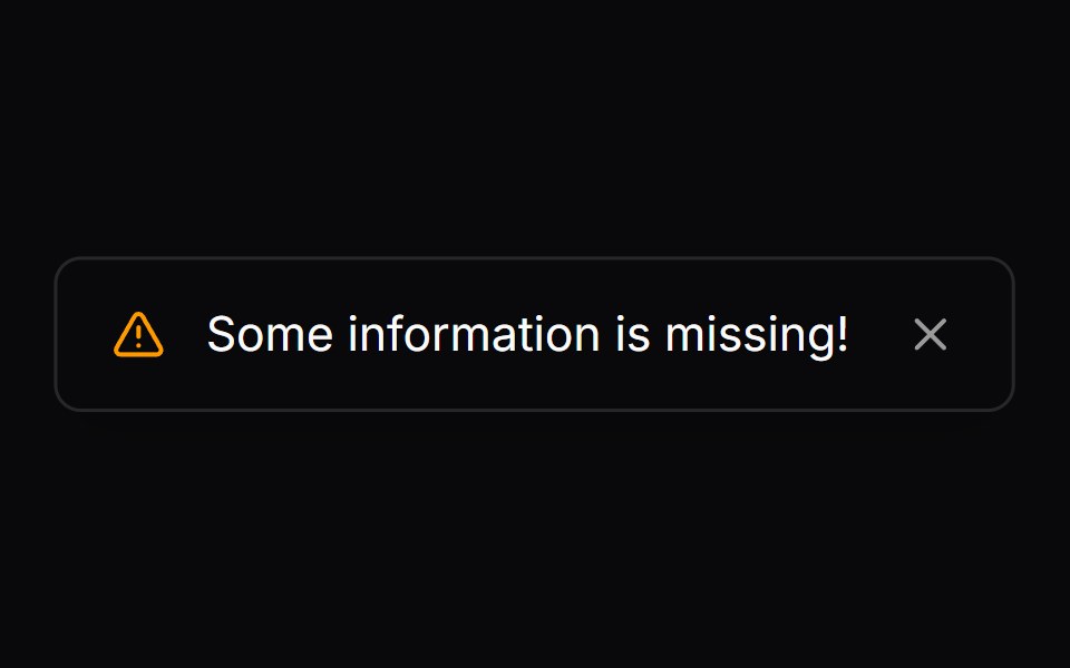 Comp 279Origin UI · React
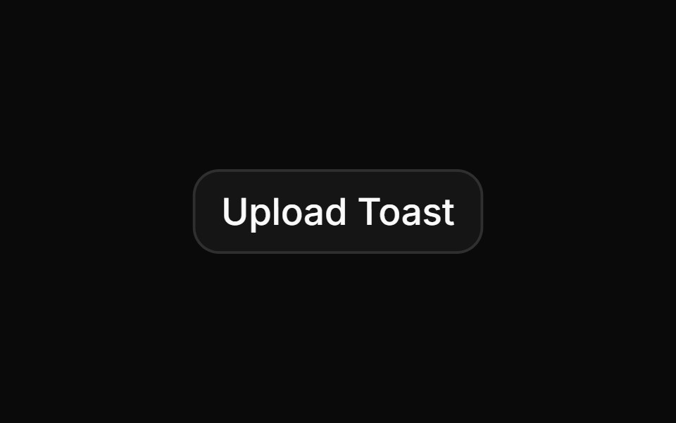 Toast with upload progress simulationReUI · ReactToast with upload progress simulation
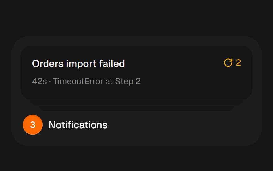 Notification StackbeUI · ReactCompact notification cards that spring from a stacked summary into a readable list on hover, focus or tap.
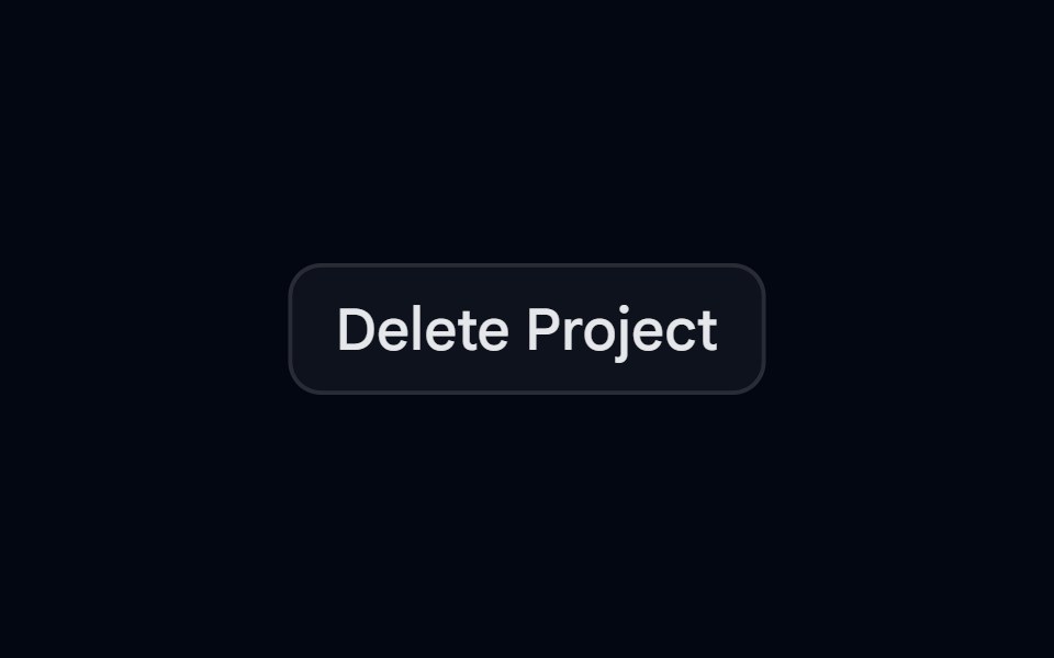 Sonner 02 - Delete ProjectShadcn Space · ReactA clean, minimal toast notification for confirming permanent project deletion.
 ToasterTremor Blocks · React
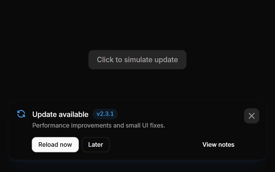 Notifications 02Oxbow UI · Astro
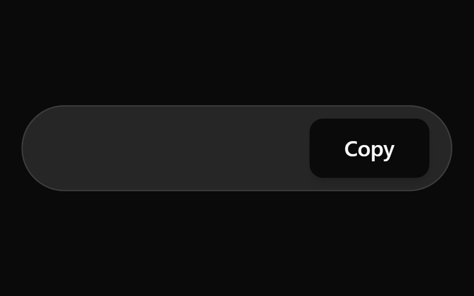 Inline Toast BaseWatermelon UI · React
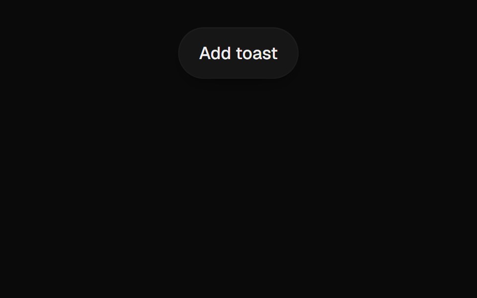 Toast StackUI Lab · ReactStacks with depth, fans out on hover, and each toast's edge drains as its timer.
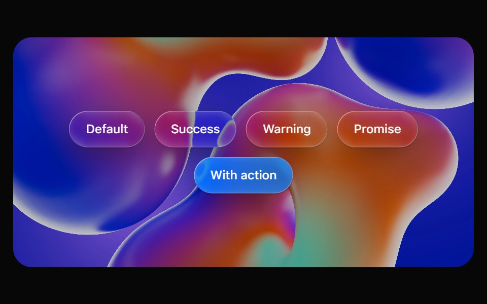 Glass ToastOpaline · ReactImperative toasts on glass that stack into a deck, fan out on hover and swipe away.
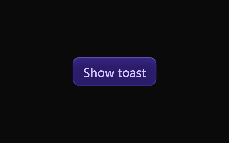 Vanilla ToastReact Spectrum · React
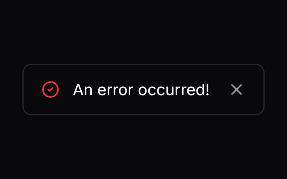 Comp 280Origin UI · React
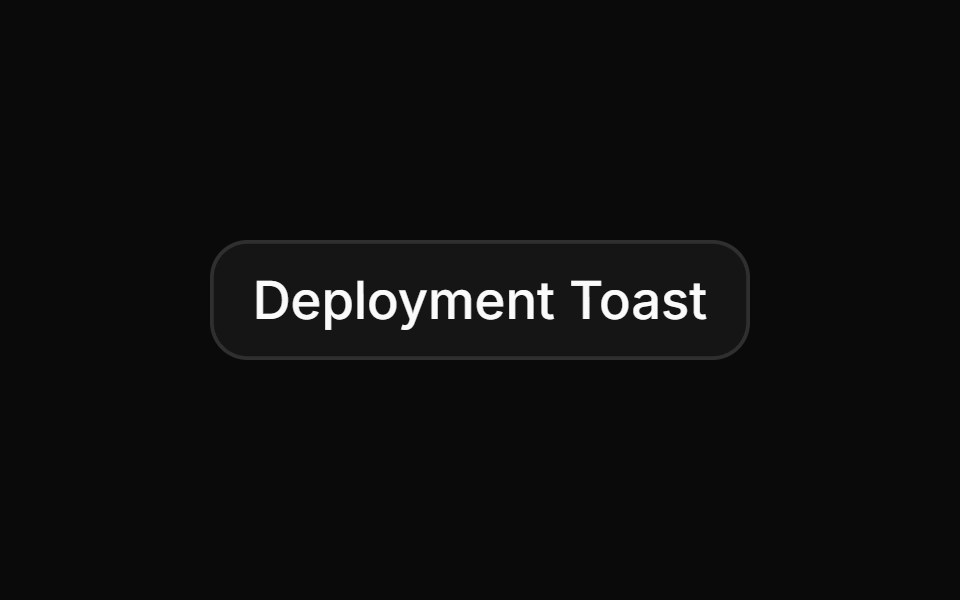 Toast with status alert markupReUI · ReactToast with status alert markup
 Sonner 03 - Invite MemberShadcn Space · ReactA clean, minimal toast notification for inviting a new member to a project.
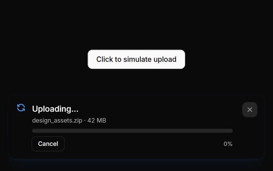 Notifications 03Oxbow UI · Astro
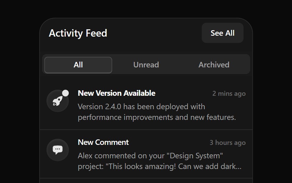 Notification 1Watermelon UI · React
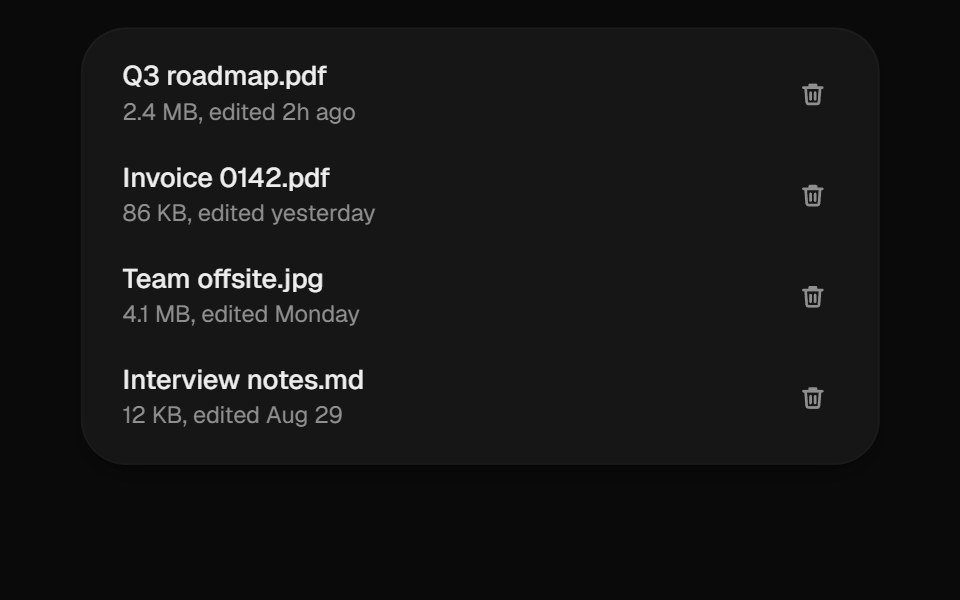 Undo ToastUI Lab · ReactDeletes instantly and gives you five seconds to change your mind.
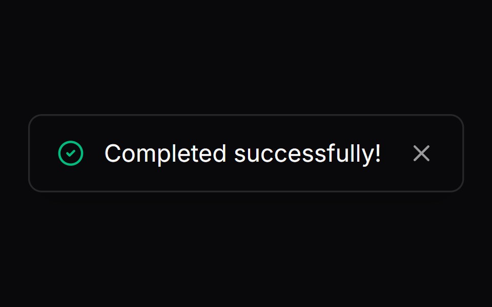 Comp 281Origin UI · React
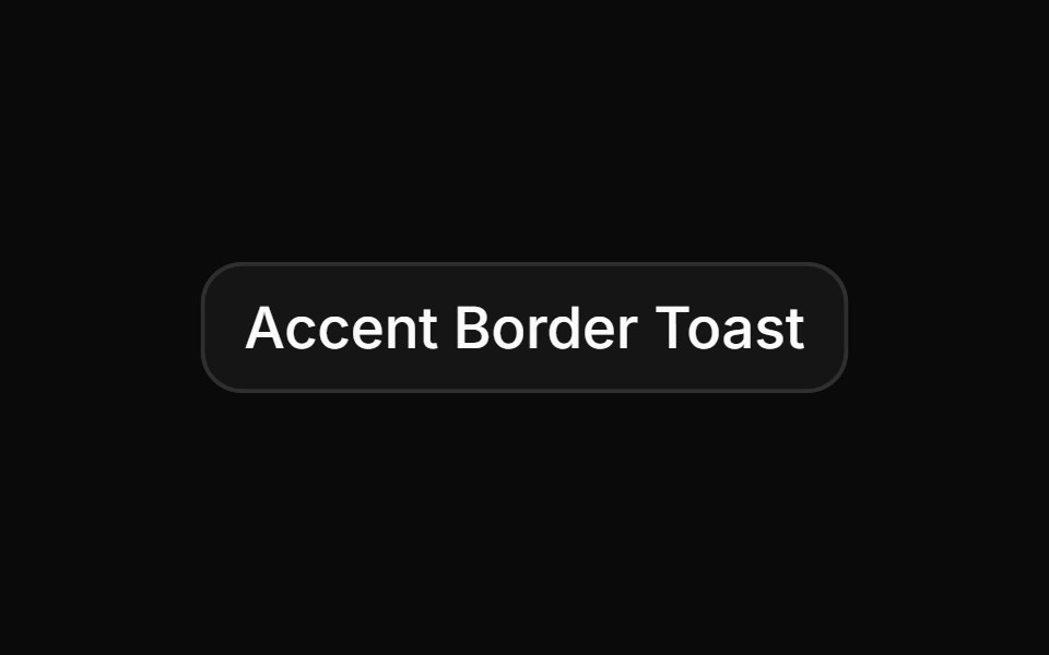 Custom accent border toastReUI · ReactCustom accent border toast
 Sonner 04 - Custom PR MergeShadcn Space · ReactA premium custom toast notification for Pull Request merge flows with approval avatars.
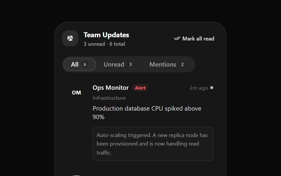 Notification 2Watermelon UI · React
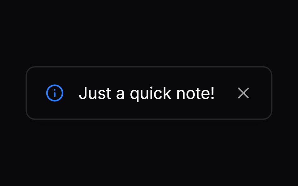 Comp 282Origin UI · React
 Custom invert success toastReUI · ReactCustom invert success toast
 Sonner 06 - Success PayoutShadcn Space · ReactAnimated payout toast that transitions from an amber pending state to a teal success state with a smooth ocean-wave…
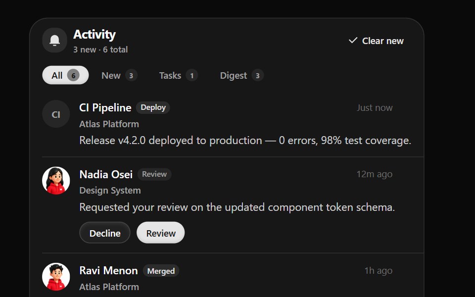 Notification 3Watermelon UI · React
 Comp 283Origin UI · React
 Custom invert error toast with detailsReUI · ReactCustom invert error toast with details
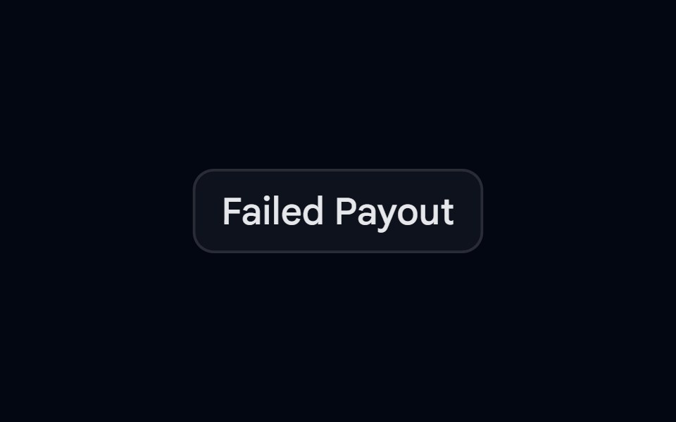 Sonner 07 - Failed PayoutShadcn Space · ReactAnimated payout toast that transitions from an amber pending state to a red-500 failed state with a smooth ripple wave…
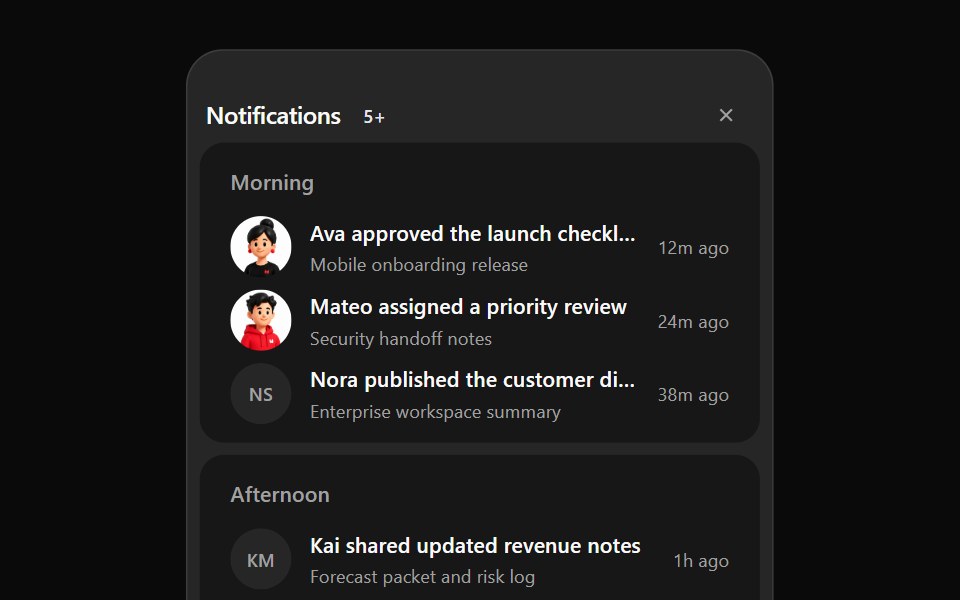 Notification 4Watermelon UI · React
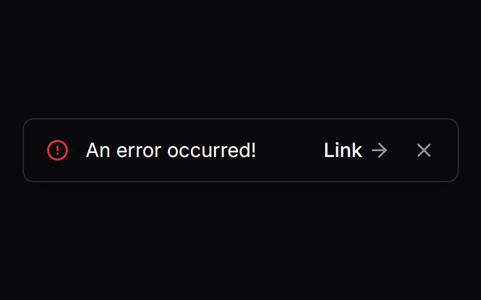 Comp 284Origin UI · React
 Custom invert info toast with avatarReUI · ReactCustom invert info toast with avatar
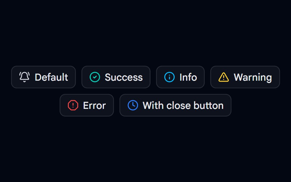 Sonner 08 - Toast TypesShadcn Space · ReactDefault, success, info, warning, and error toasts with descriptions, plus a toast with a close button and longer…
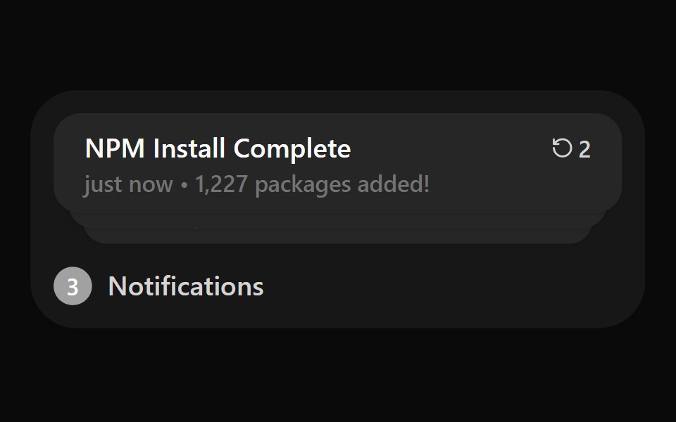 Notification ListWatermelon UI · React
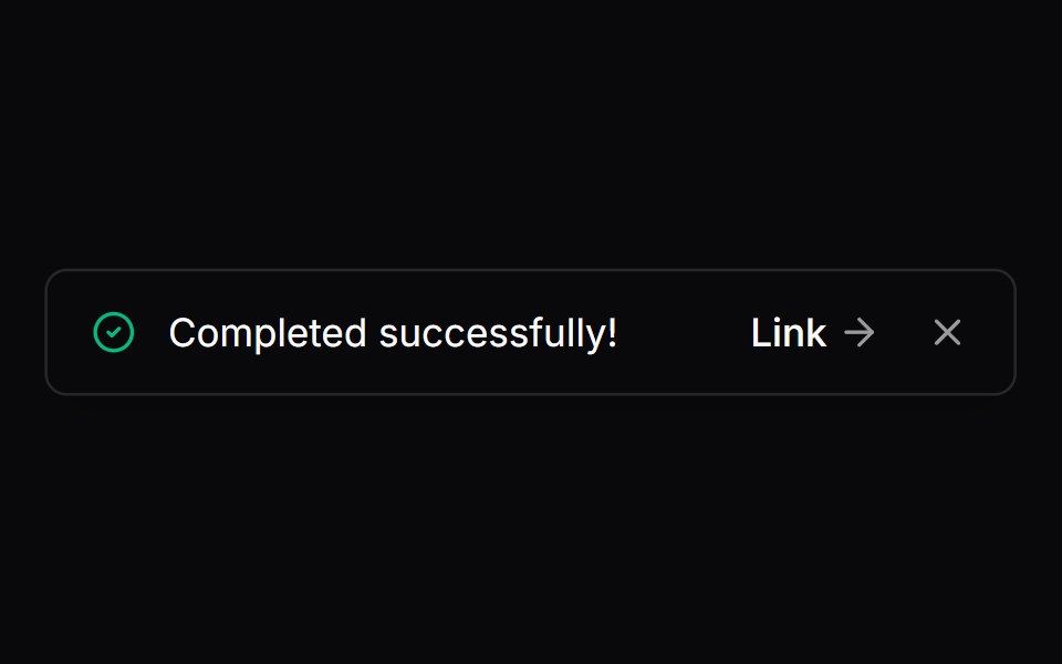 Comp 285Origin UI · React
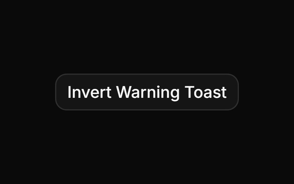 Custom invert warning toast with countdownReUI · ReactCustom invert warning toast with countdown
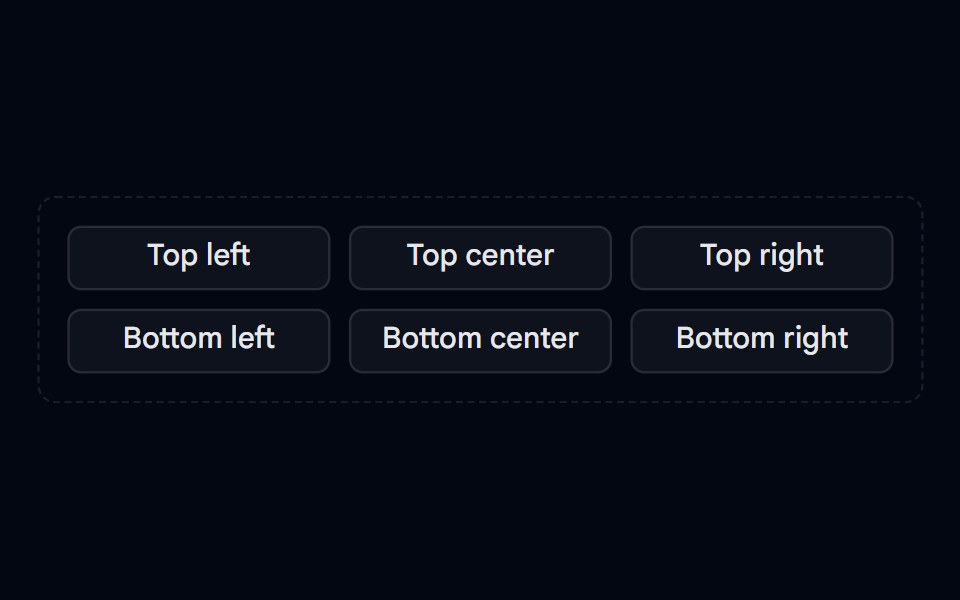 Sonner 10 - PositionsShadcn Space · ReactPosition picker that fires toasts at top left, top center, top right, bottom left, bottom center, and bottom right…
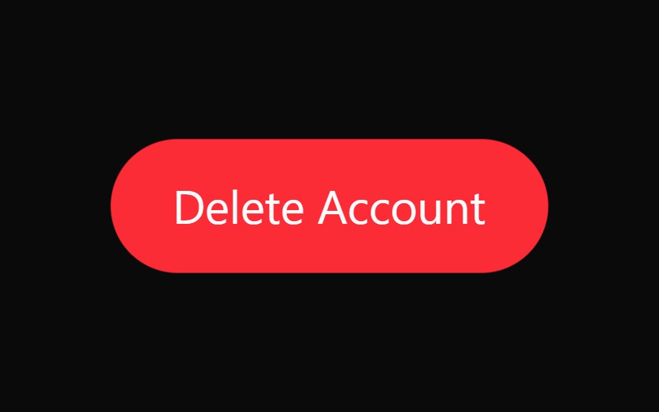 Timed Undo ActionWatermelon UI · React
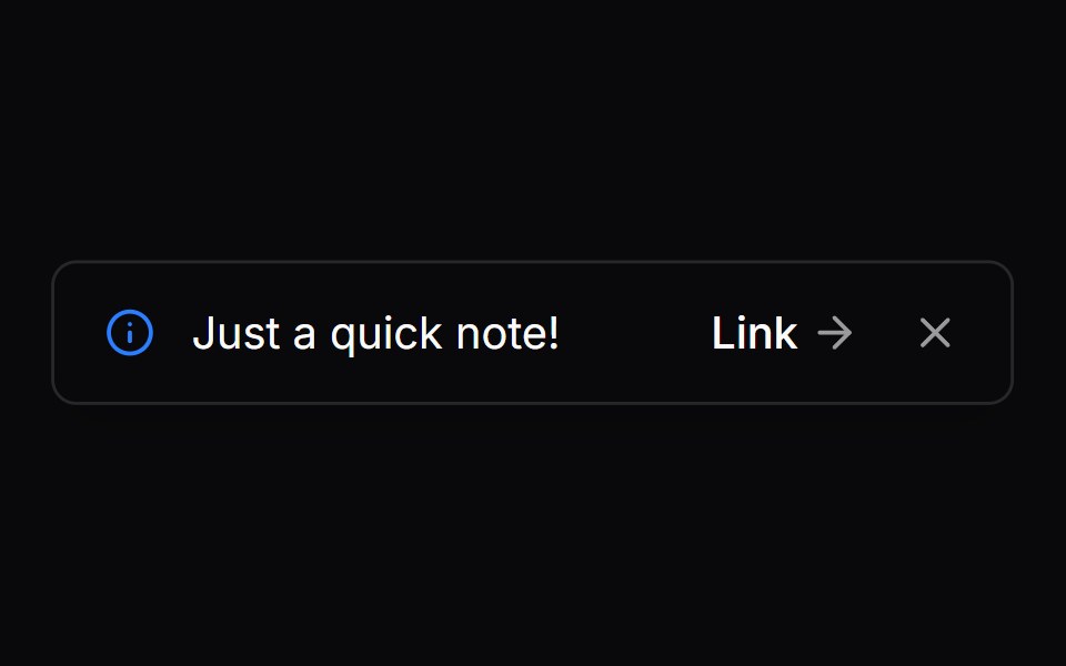 Comp 286Origin UI · React
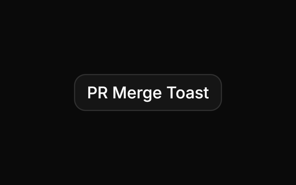 Multi-action invert toast with avatar groupReUI · ReactMulti-action invert toast with avatar group
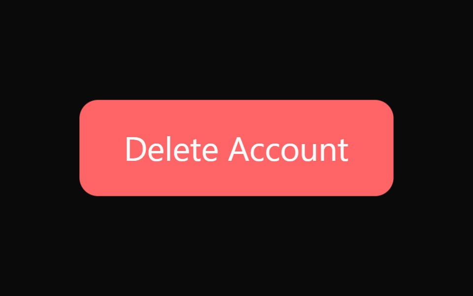 Timed Undo Action BaseWatermelon UI · React
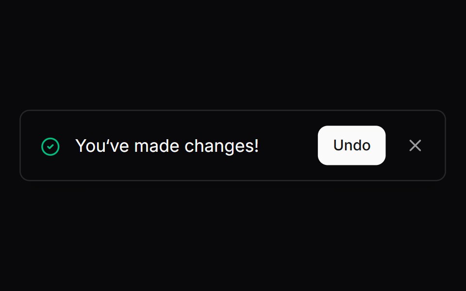 Comp 287Origin UI · React
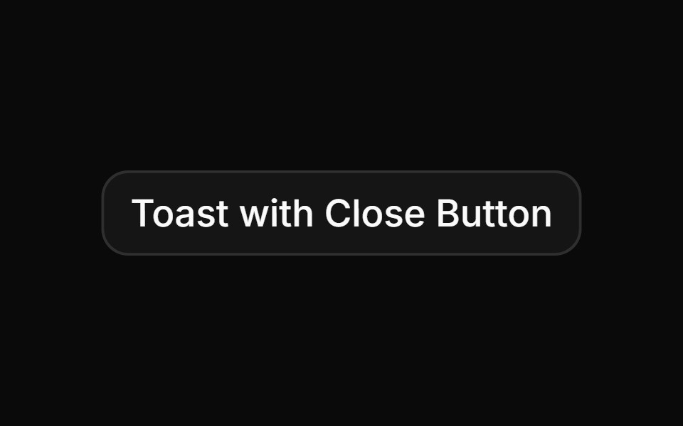 Toast with close button on top-rightReUI · ReactToast with close button on top-right
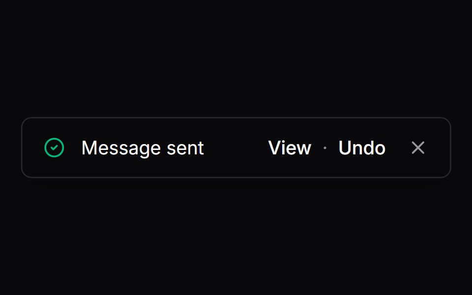 Comp 288Origin UI · React
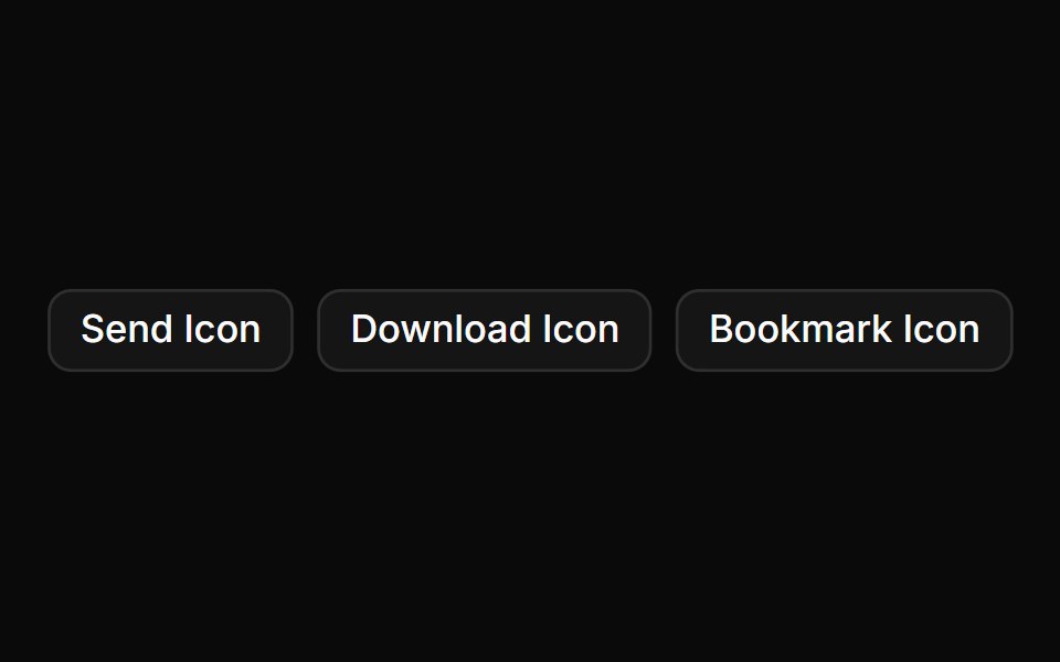 Toast with custom iconReUI · ReactToast with custom icon
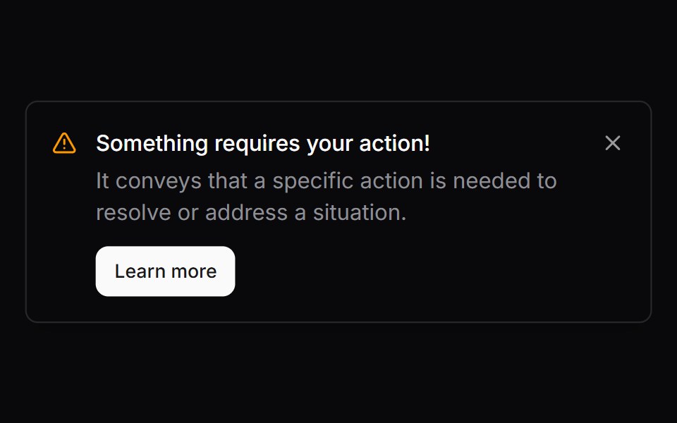 Comp 289Origin UI · React
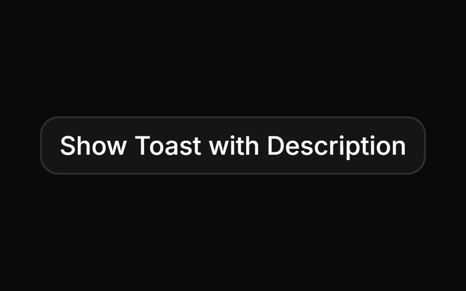 Toast notification with description.ReUI · ReactToast notification with description.
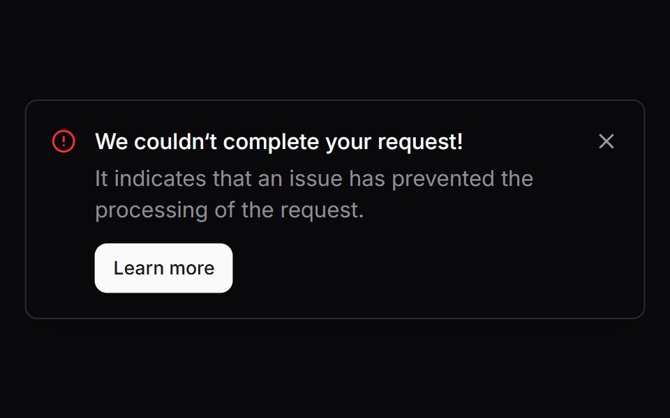 Comp 290Origin UI · React
 Custom integration toastReUI · ReactCustom integration toast
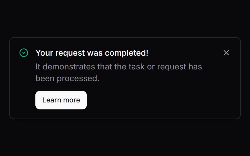 Comp 291Origin UI · React
 Updatable toast with IDReUI · ReactUpdatable toast with ID
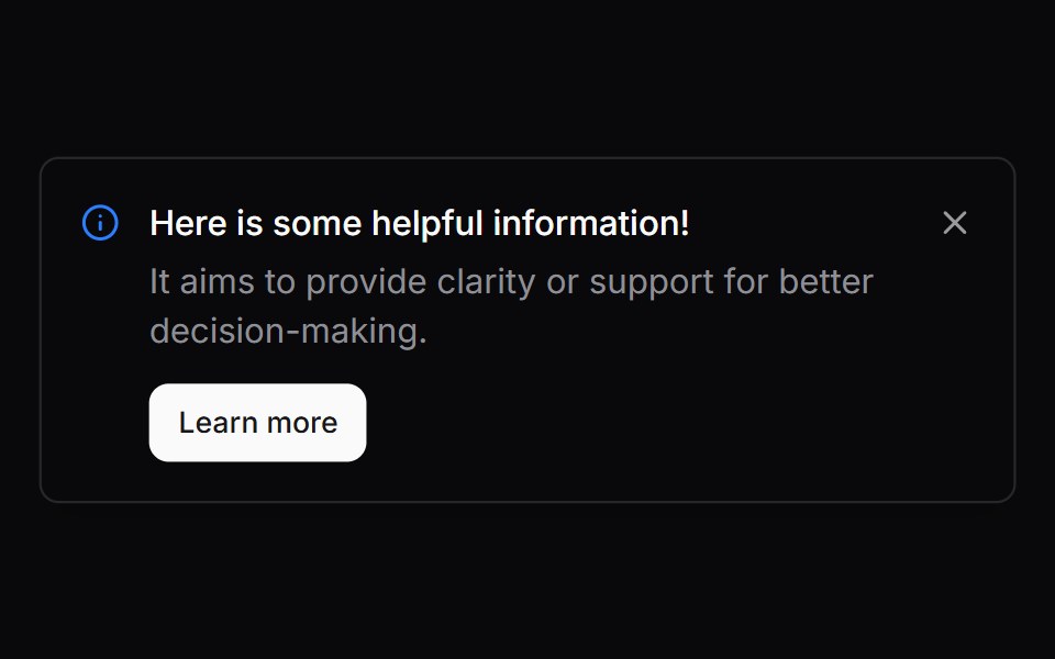 Comp 292Origin UI · React
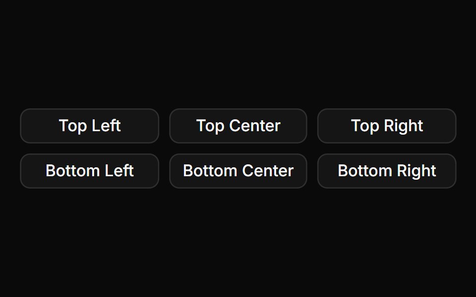 Toast positionsReUI · ReactToast positions
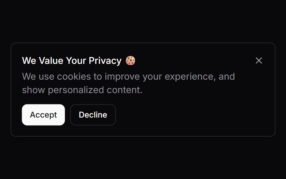 Comp 293Origin UI · React
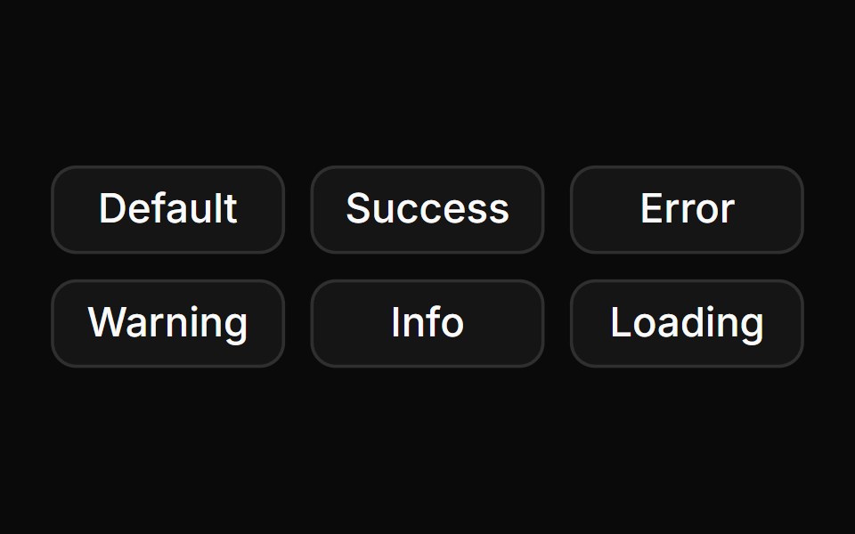 Toast variants with colored iconsReUI · ReactToast variants with colored icons
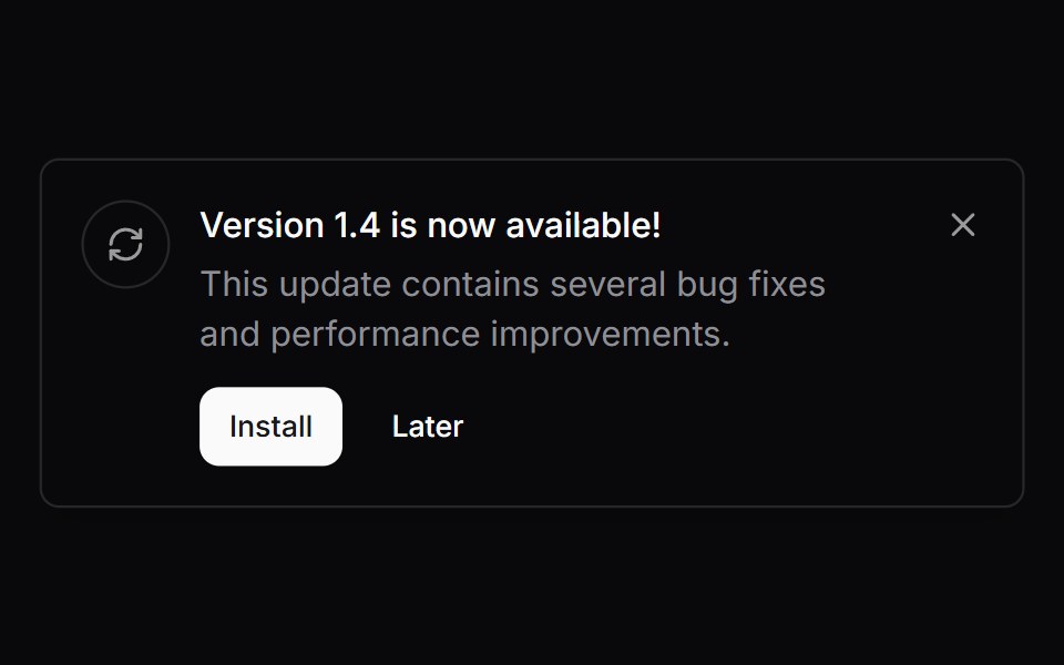 Comp 294Origin UI · React
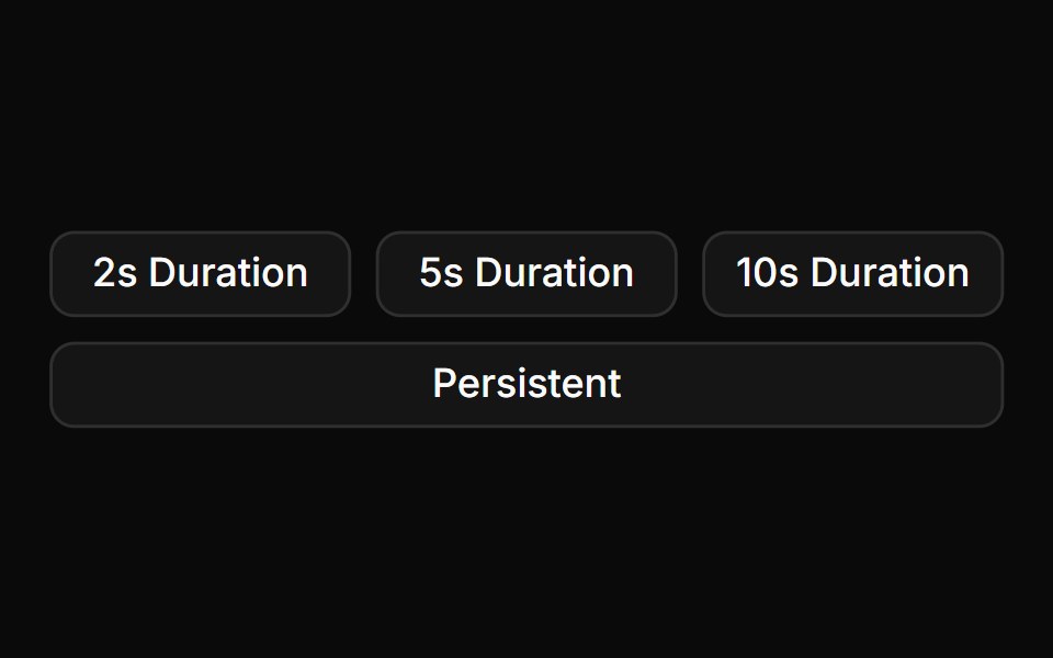 Toast duration optionsReUI · ReactToast duration options
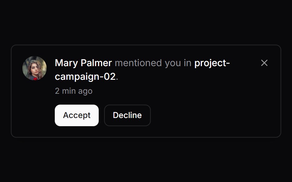 Comp 295Origin UI · React
 Toast with action buttonReUI · ReactToast with action button
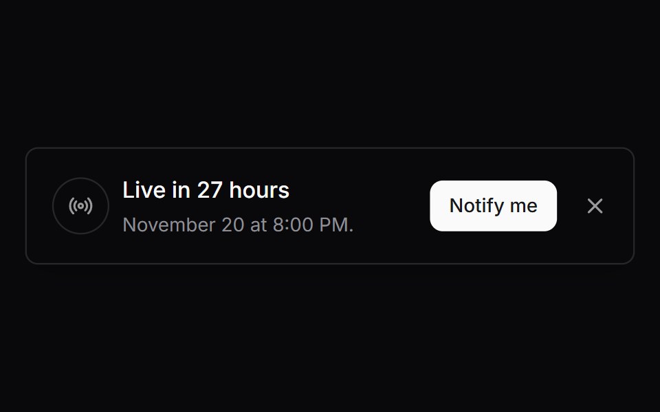 Comp 296Origin UI · React
 Promise toast with loading stateReUI · ReactPromise toast with loading state
 Comp 297Origin UI · React
 Toast with custom close and cancel buttonsReUI · ReactToast with custom close and cancel buttons
 Comp 298Origin UI · React
 Toast with custom rich contentReUI · ReactToast with custom rich content
 Comp 299Origin UI · React
 Comp 300Origin UI · React
 SonnerOrigin UI · React
Libraries with Tailwind CSS toast components
Related categories
- Toast Components
- React Toast Components
- Animated Toast Components
- shadcn/ui Toast Components
- Tailwind CSS Overlay Components
- Tailwind CSS Modal Components
- Tailwind CSS Popover Components
- Tailwind CSS Tooltip Components
- Tailwind CSS Drawer Components
- Tailwind CSS Alert Dialog Components
- Tailwind CSS Hover Card Components
- Tailwind CSS Bottom Sheet Components
- Tailwind CSS Tour Components
- Tailwind CSS Dynamic Island Components
- Tailwind CSS Cookie Banner Components
- Tailwind CSS Lightbox Components