 Dev Design Library
React Toast Components
Dev Design Library indexes 119 React toast components from 49 open-source UI libraries, with the most coming from Origin UI, ReUI, Watermelon UI, Shadcn Space and UI Lab. Each one links to its page with the source code, a live preview where available, the library license and the install command. Every library in this list targets React. Toast components belong to the Overlays group.
 Sonnershadcn/ui · ReactAn opinionated toast component for React.
 SnackbarMUI / Material UI · React
 Swipe ToastReact Bits · ReactSingle toast that rises through its bottom edge, swipes down to dismiss on a flick or a distance, and burns a thin…
 ToastChakra UI · ReactUsed to display a temporary message to the user
 ToastHeroUI · ReactDisplays temporary notification messages that appear at the top or bottom of the screen.
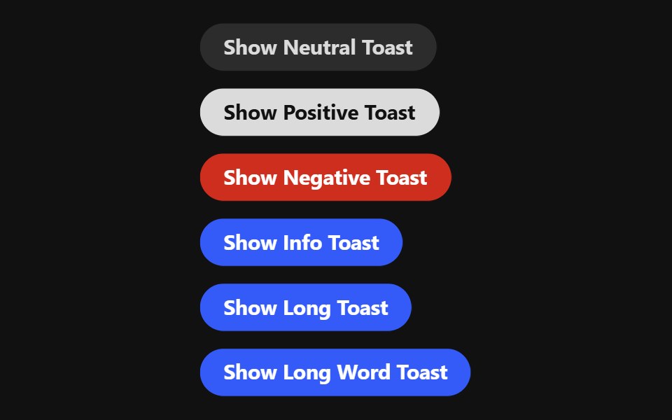 ToastReact Spectrum · React
 Toastcoss ui · ReactA temporary notification that appears on screen to inform users.
 ToastOrigin UI · ReactA temporary notification that appears on screen to inform users.
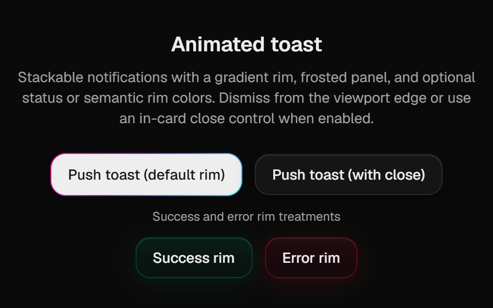 Halo ToastCult UI · ReactSonner-backed polished toasts with rim variants; mount PolishedToaster once in the root layout
 ToastArk UI · ReactA message that appears on the screen to provide feedback on an action.
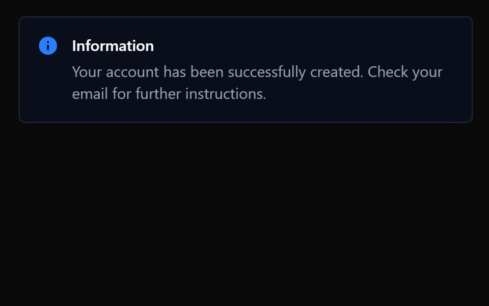 ToastTremor · React
 Basic toast notification.ReUI · ReactBasic toast notification.
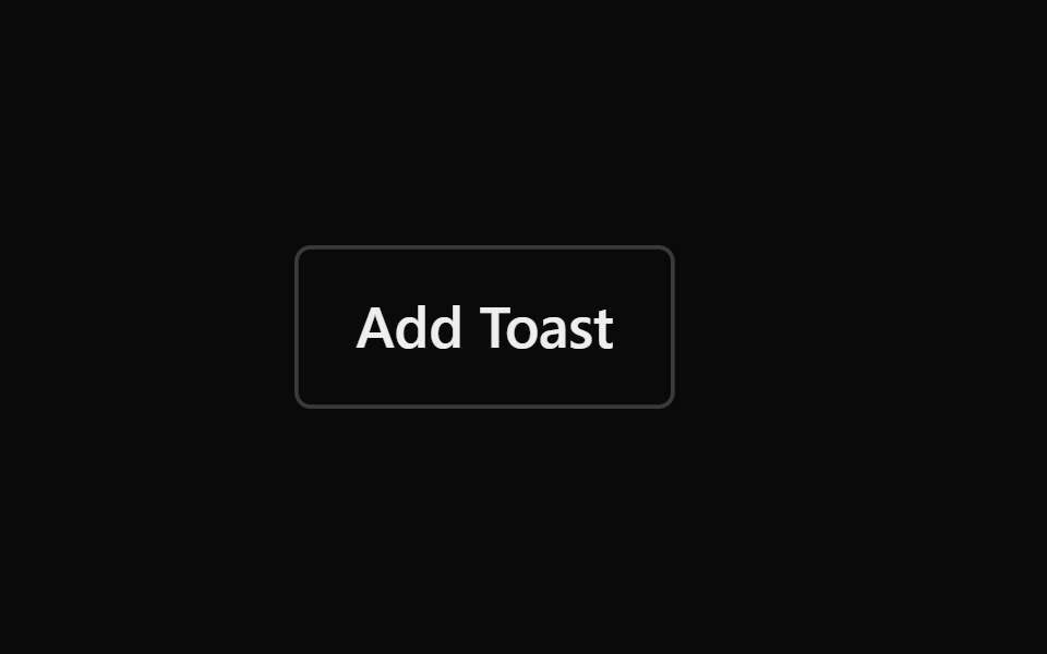 ToastPark UI · ReactA feedback component for displaying temporary notification messages.
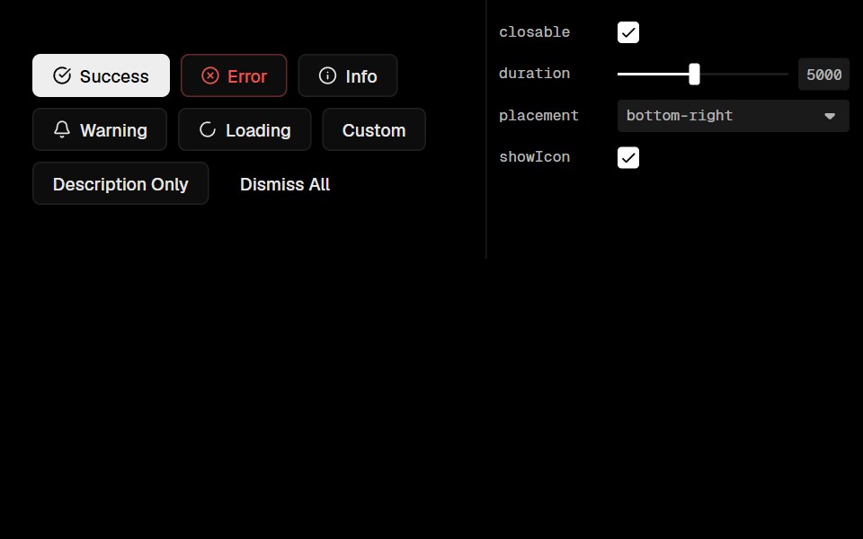 Base Ui ToastLobe UI · React
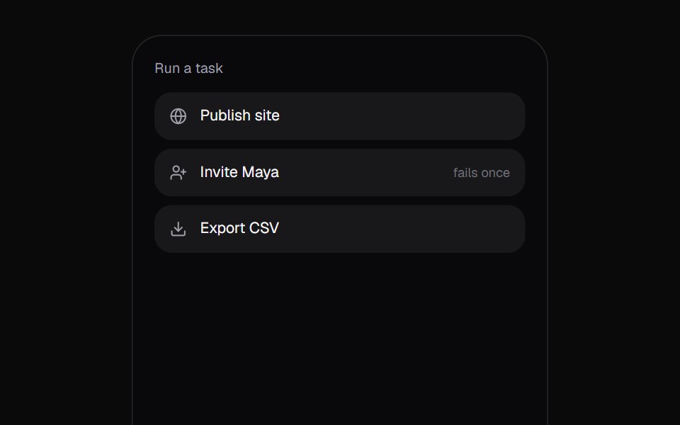 Promise ToastKokonut UI · React"A toast that follows a task: the ring spins while it works, closes into a check or a warning when it lands, and…
 toastIntent UI · Reacttoast
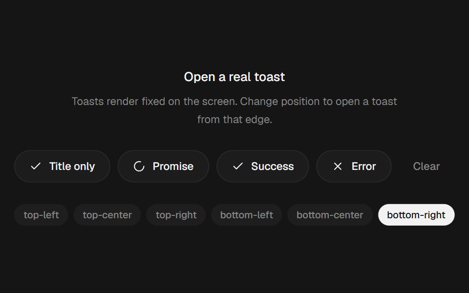 Animated Toast StackbeUI · ReactStacked toasts with status morphs, swipe dismissal, actions and layout-aware motion.
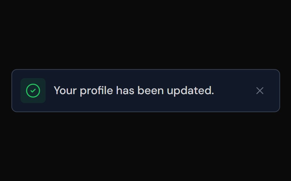 ToastTailGrids · ReactA toast component for displaying notifications.
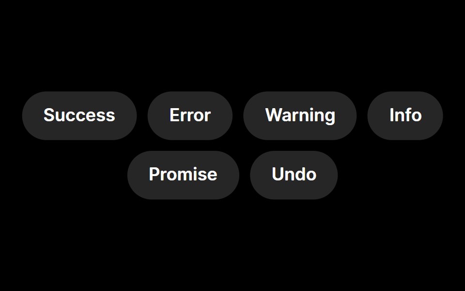 ToastRare UI · ReactA toast notification with animated status icons, built on Sonner.
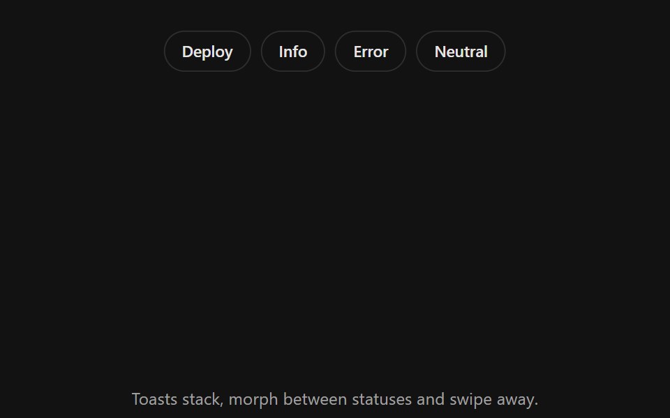 Toast StackSpectrum UI · ReactStacked toasts with status morphs, swipe to dismiss, actions and layout-aware motion.
 SonnerVengeance UI · React
 SonnerToolcraft · React
 Web ToastPanel UI · React NativeToasts for actions such as archive, publish and deploy, with progress and undo.
 Sonner 01 - Upload FileShadcn Space · ReactA clean, minimal toast notification for file upload progress and status updates.
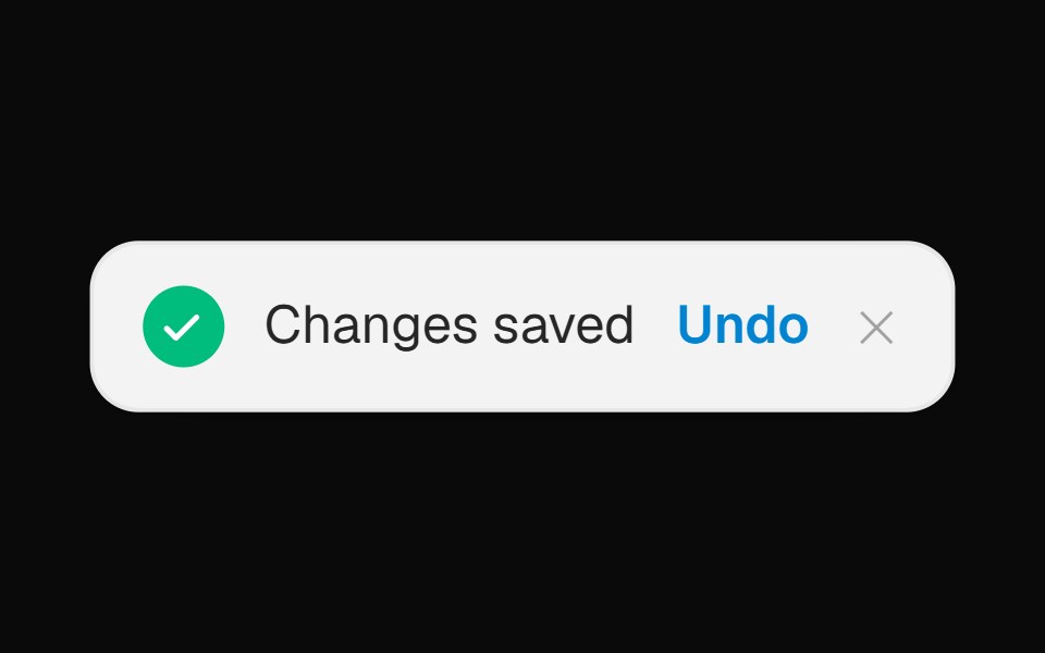 Toast Notification BannerOpenSourceUI · React
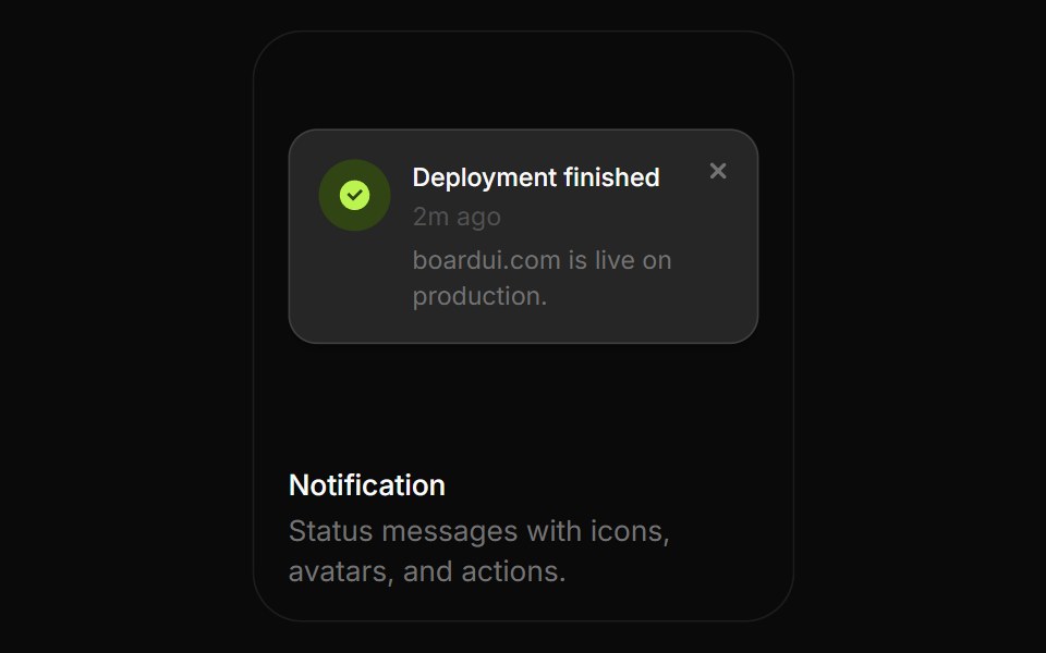 NotificationBoardUI · ReactStatus messages with icons, avatars, and actions.
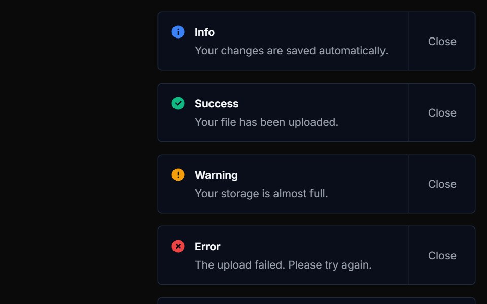 ToastTremor Blocks · React
- SonnerShadcn Dashboard · React
 SonnerObsidianUI · React
 SonnerNotra · ReactA Sonner toaster with the Depth surface of the buttons and tinted status icons.
 ToastShark UI · ReactProvides feedback on an action.
 Inline ToastWatermelon UI · React
 ToastArc Library · ReactBrief confirmation for a completed background action.
 Promise ToastUI Lab · ReactOne toast that morphs from saving to saved, or to an error with retry.
 ToastHextaUI · ReactBrief messages that stack neatly, expand on hover, swipe away, and turn a loading state into success or error in place.
 ToastCojeev UI · ReactReports a brief outcome in a notification area without moving the user away from the current task.
 ToastROI UI · ReactA succinct message notification.
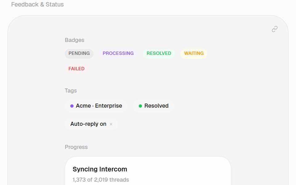 ToastHalaska UI · React
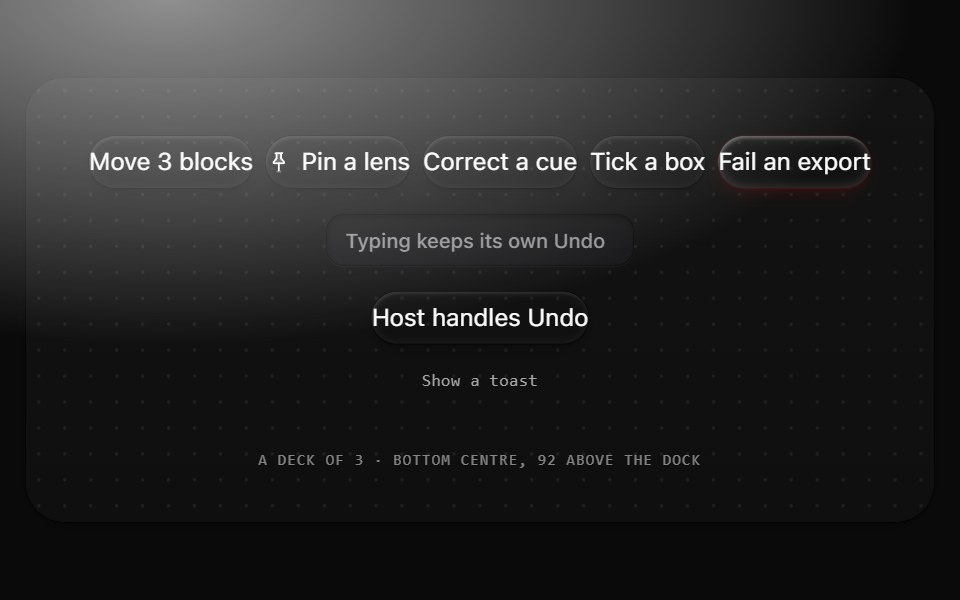 ToastMetal UI · React + SwiftUIThe result of a person's own action, with Undo: a 44 tall pill in the colorway at the bottom centre. Results stack as…
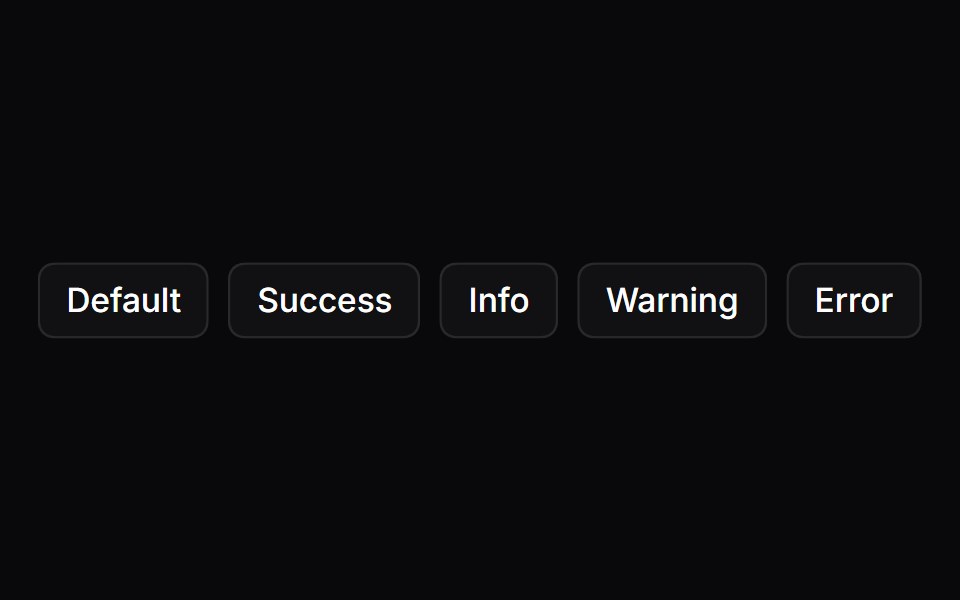 ToastSpaceUI · ReactDisplays temporary popup notifications at the corner of the screen to confirm user actions, show progress, or report…
 Aria SonnerReScript shadcn · ReScript
 Notif MorphZAYX · React NativeA notification stack that morphs between rows like follows and likes, with springy row height changes.
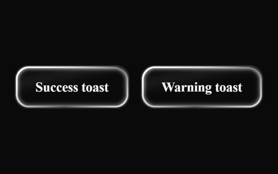 Liquid ToastLiquefy UI · ReactToast notification in liquid glass style.
 SonnerD2Studio UI · ReactAn opinionated toast component for React.
 ToastEaseUI · ReactToasts that stay long enough to read based on their word count, and pause while hovered or while the tab is in the…
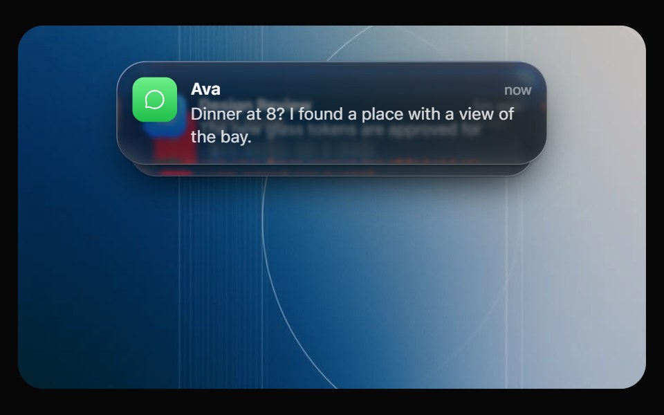 Glass NotificationOpaline · ReactiOS notification banner plus a stack that fans out on hover.
 ToastFibo · ReactA brief message in the corner about something that just happened.
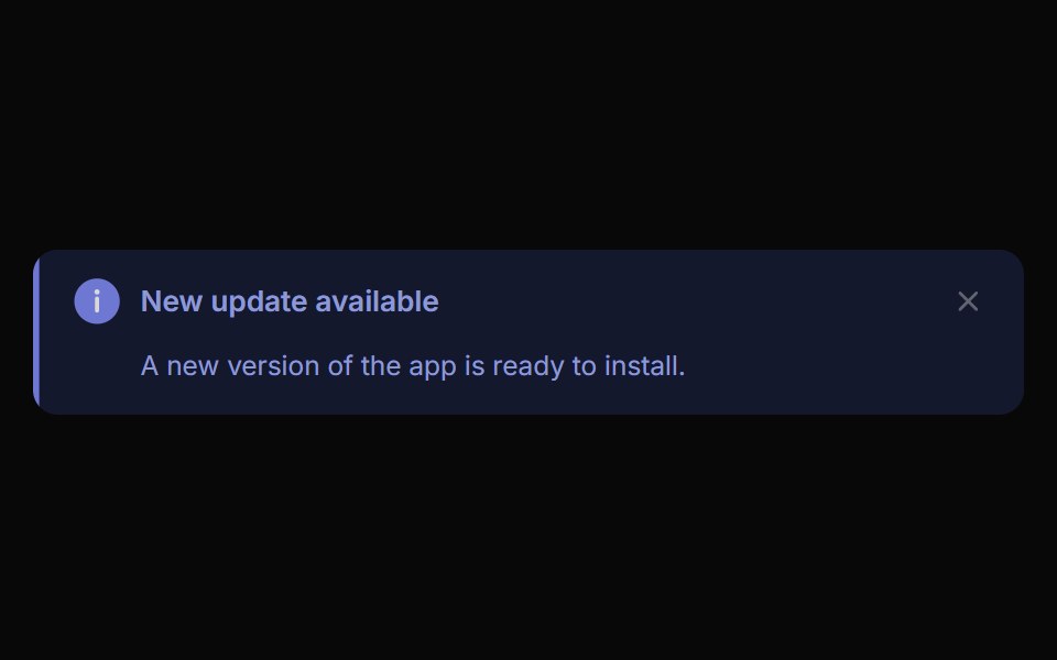 Alert ToastReactFrame · ReactA polished toast/alert notification, 5 tones, stacked or inline layout, icons, primary/secondary actions, dismiss and…
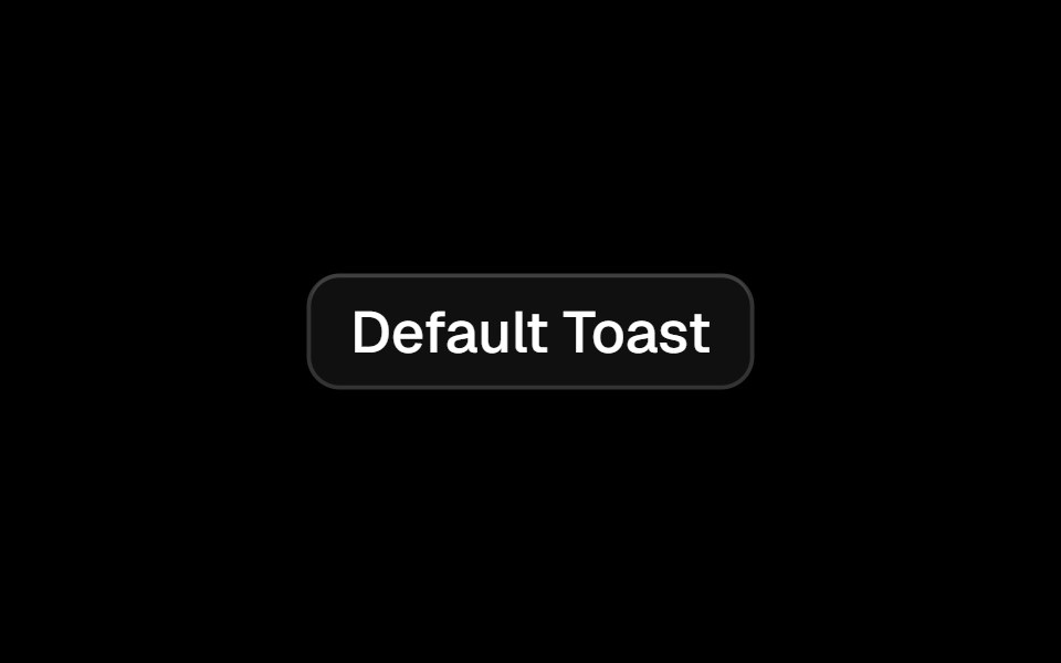 Toastark-cn · ReactA shadcn-style toast component built with Ark UI primitives.
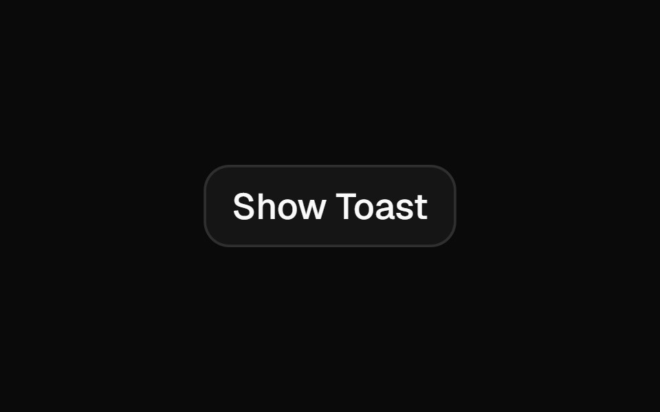 Toastshadcn/ui · ReactA succinct message that is displayed temporarily.
 Snackbar ContentMUI / Material UI · React
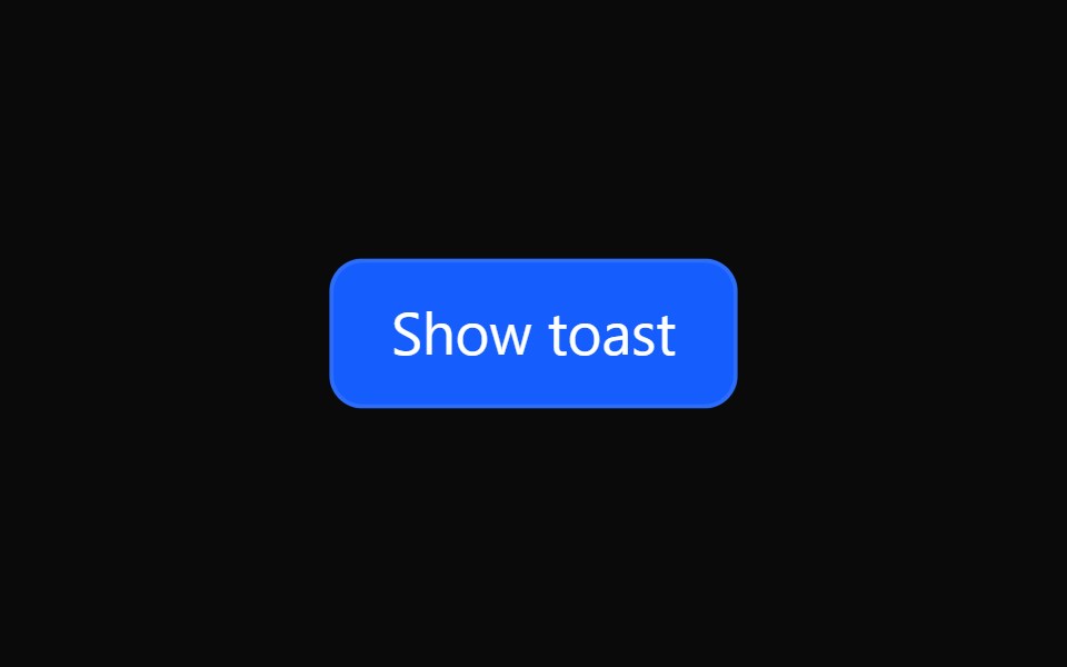 Tailwind ToastReact Spectrum · React
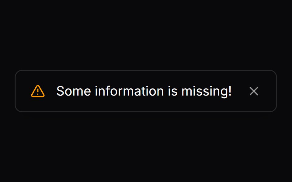 Comp 279Origin UI · React
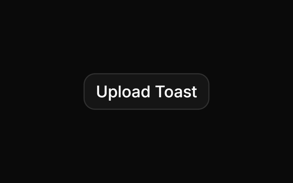 Toast with upload progress simulationReUI · ReactToast with upload progress simulation
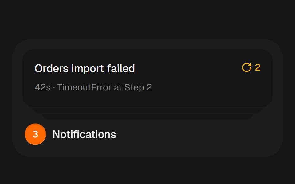 Notification StackbeUI · ReactCompact notification cards that spring from a stacked summary into a readable list on hover, focus or tap.
 Sonner 02 - Delete ProjectShadcn Space · ReactA clean, minimal toast notification for confirming permanent project deletion.
 ToasterTremor Blocks · React
 Inline Toast BaseWatermelon UI · React
 Toast stackArc Library · ReactStack short results at the edge until you reach for them.
 Toast StackUI Lab · ReactStacks with depth, fans out on hover, and each toast's edge drains as its timer.
 Base SonnerReScript shadcn · ReScript
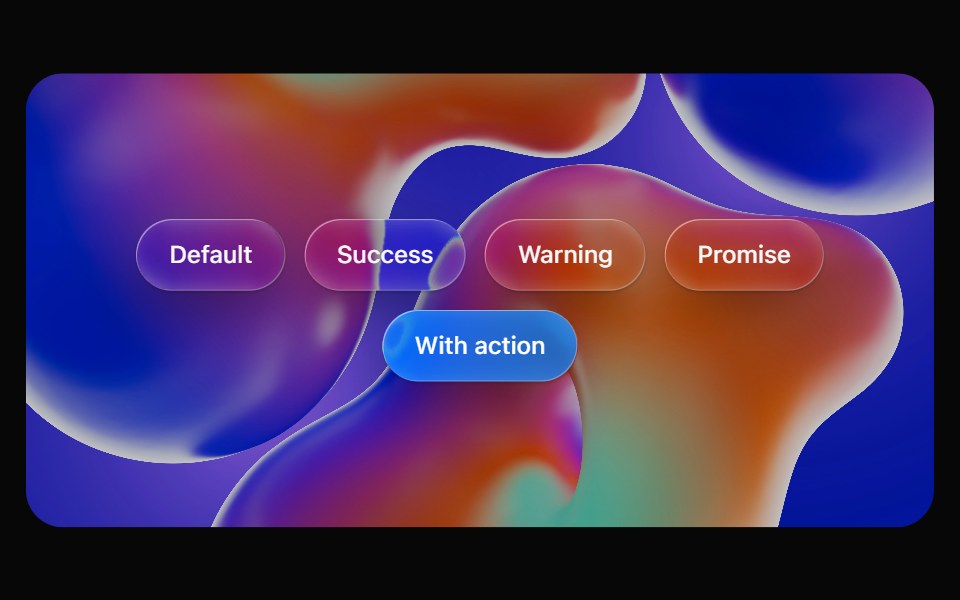 Glass ToastOpaline · ReactImperative toasts on glass that stack into a deck, fan out on hover and swipe away.
 Vanilla ToastReact Spectrum · React
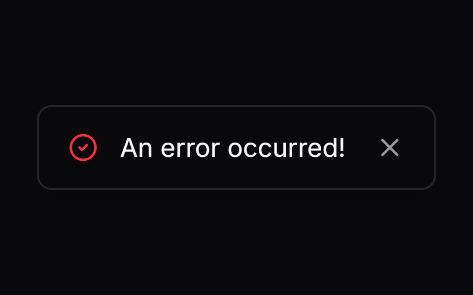 Comp 280Origin UI · React
 Toast with status alert markupReUI · ReactToast with status alert markup
 Sonner 03 - Invite MemberShadcn Space · ReactA clean, minimal toast notification for inviting a new member to a project.
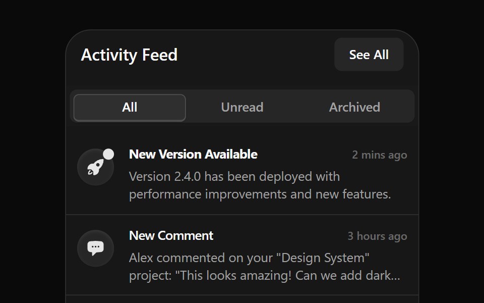 Notification 1Watermelon UI · React
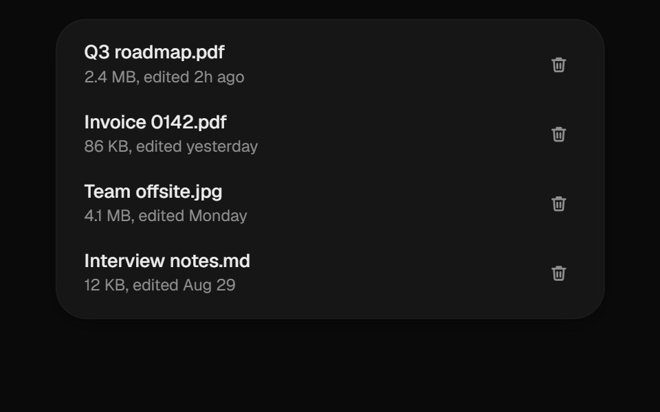 Undo ToastUI Lab · ReactDeletes instantly and gives you five seconds to change your mind.
 Base ToastReScript shadcn · ReScript
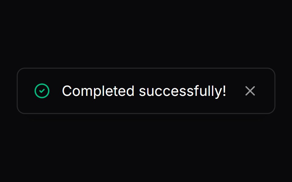 Comp 281Origin UI · React
 Custom accent border toastReUI · ReactCustom accent border toast
 Sonner 04 - Custom PR MergeShadcn Space · ReactA premium custom toast notification for Pull Request merge flows with approval avatars.
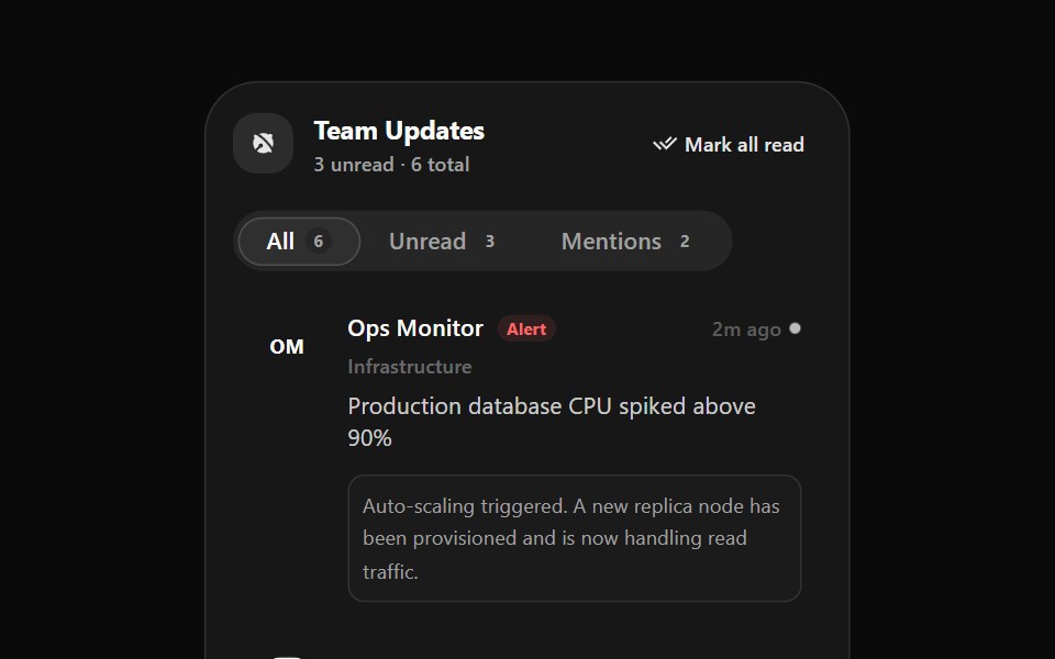 Notification 2Watermelon UI · React
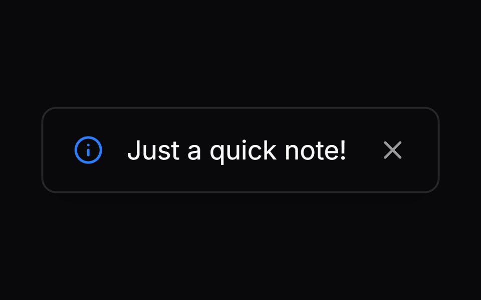 Comp 282Origin UI · React
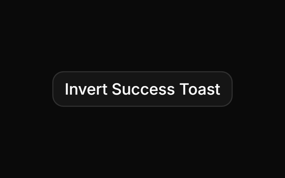 Custom invert success toastReUI · ReactCustom invert success toast
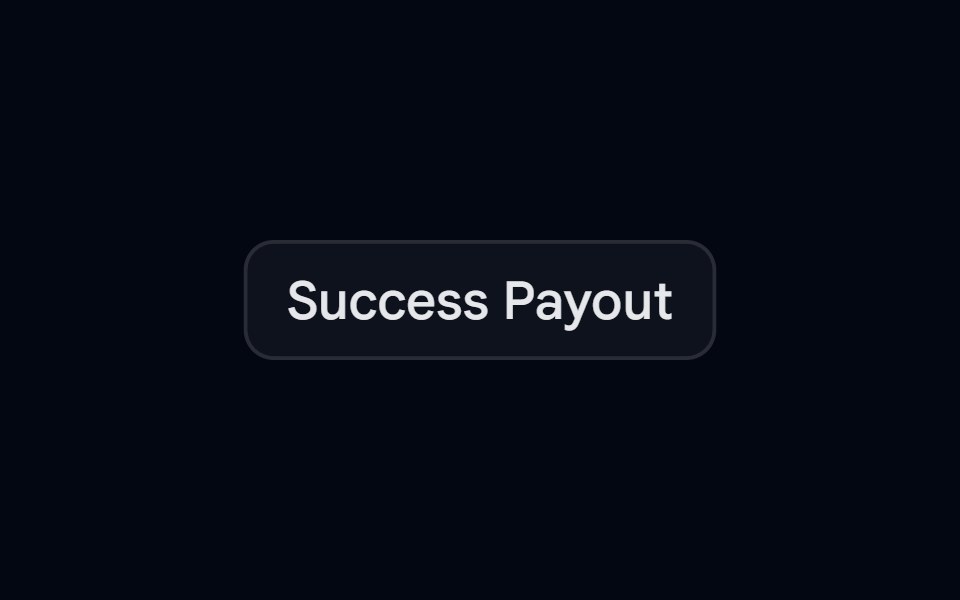 Sonner 06 - Success PayoutShadcn Space · ReactAnimated payout toast that transitions from an amber pending state to a teal success state with a smooth ocean-wave…
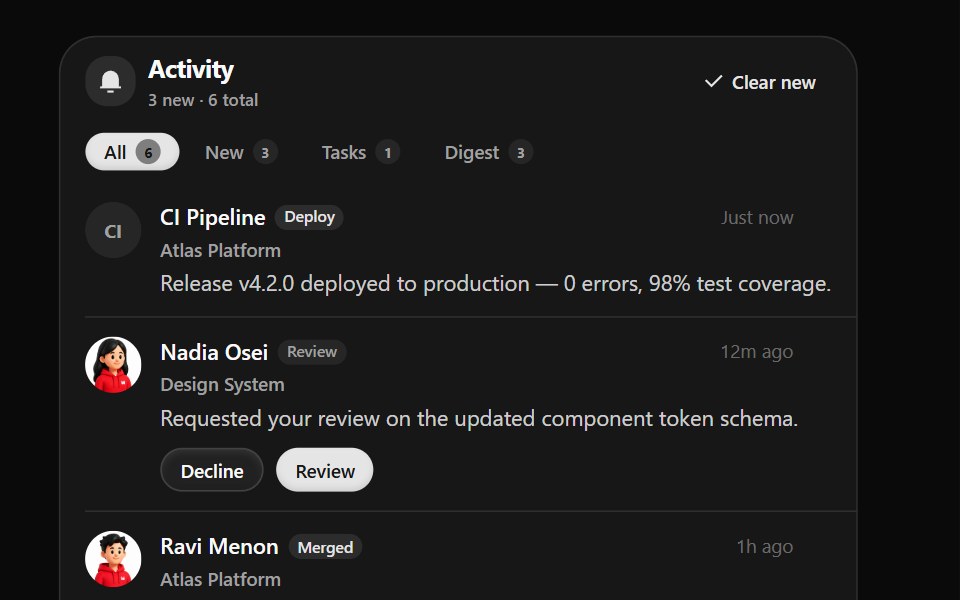 Notification 3Watermelon UI · React
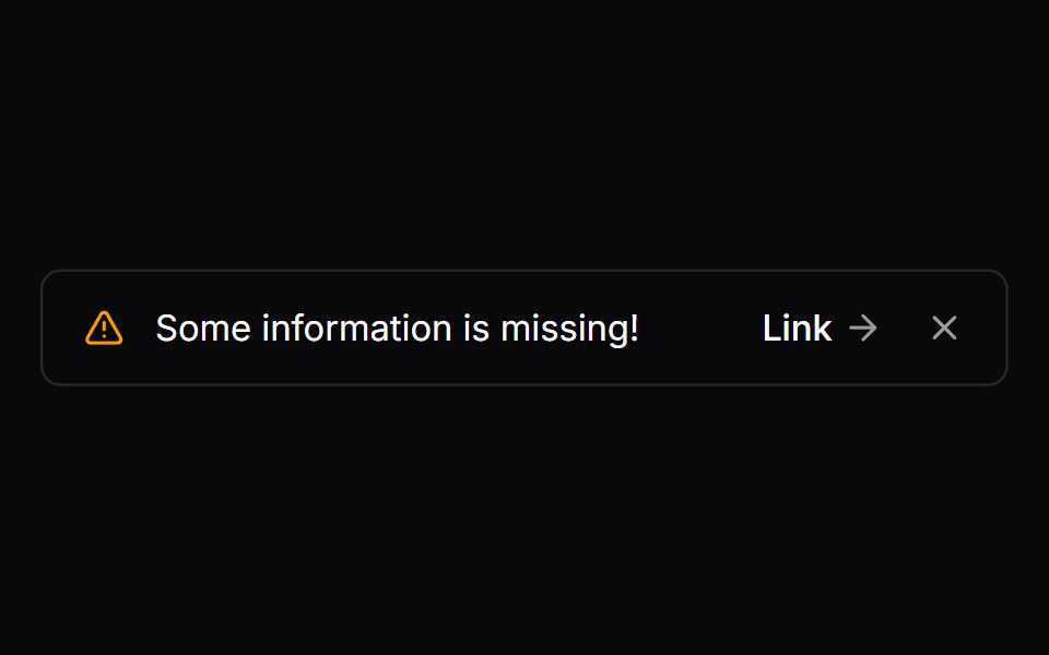 Comp 283Origin UI · React
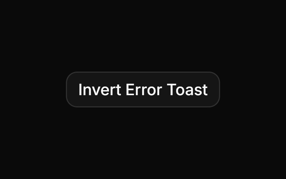 Custom invert error toast with detailsReUI · ReactCustom invert error toast with details
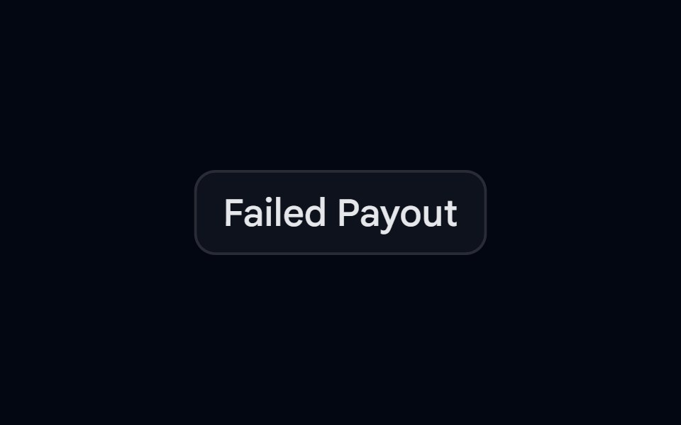 Sonner 07 - Failed PayoutShadcn Space · ReactAnimated payout toast that transitions from an amber pending state to a red-500 failed state with a smooth ripple wave…
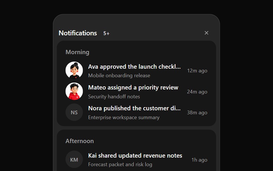 Notification 4Watermelon UI · React
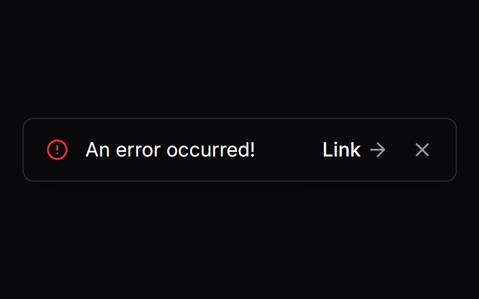 Comp 284Origin UI · React
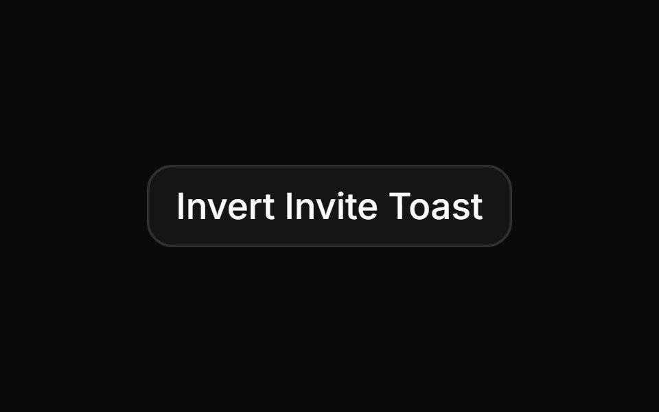 Custom invert info toast with avatarReUI · ReactCustom invert info toast with avatar
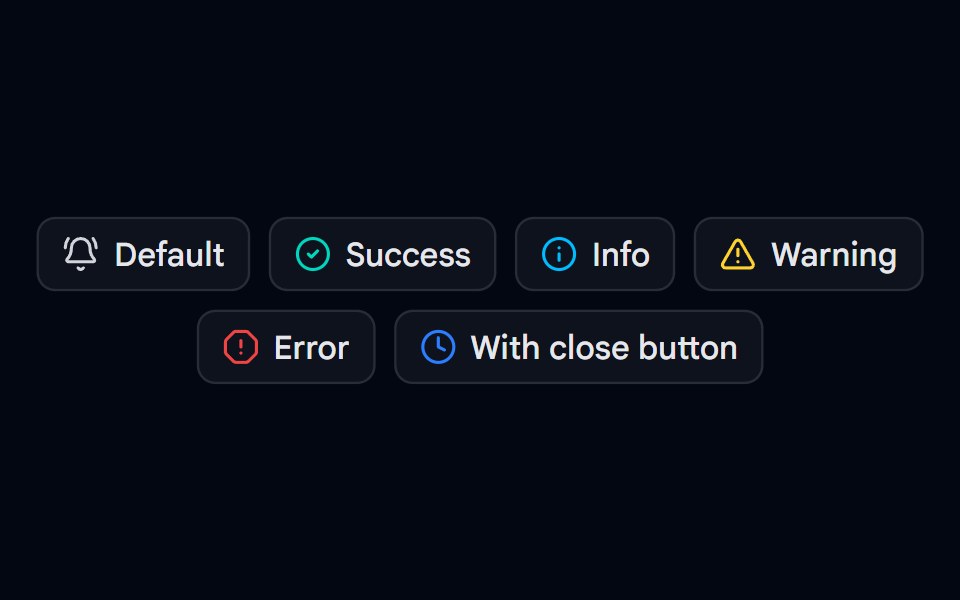 Sonner 08 - Toast TypesShadcn Space · ReactDefault, success, info, warning, and error toasts with descriptions, plus a toast with a close button and longer…
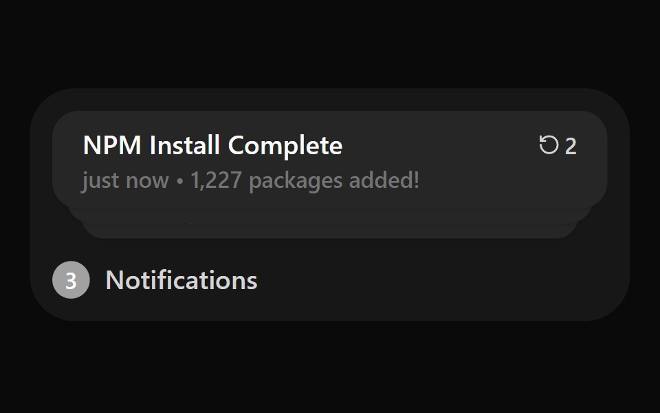 Notification ListWatermelon UI · React
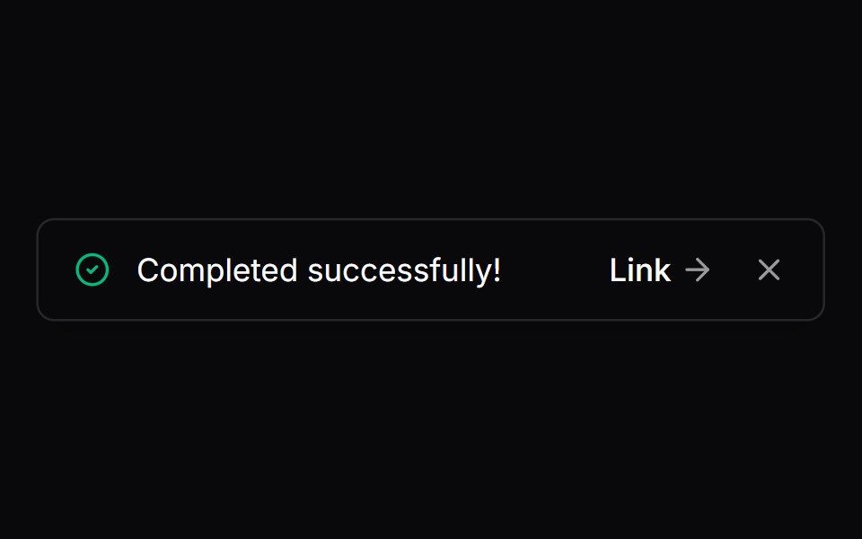 Comp 285Origin UI · React
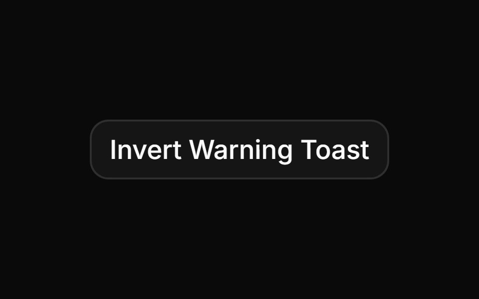 Custom invert warning toast with countdownReUI · ReactCustom invert warning toast with countdown
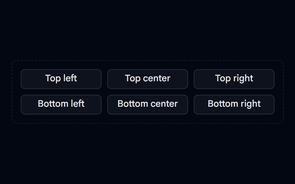 Sonner 10 - PositionsShadcn Space · ReactPosition picker that fires toasts at top left, top center, top right, bottom left, bottom center, and bottom right…
 Timed Undo ActionWatermelon UI · React
 Comp 286Origin UI · React
 Multi-action invert toast with avatar groupReUI · ReactMulti-action invert toast with avatar group
 Timed Undo Action BaseWatermelon UI · React
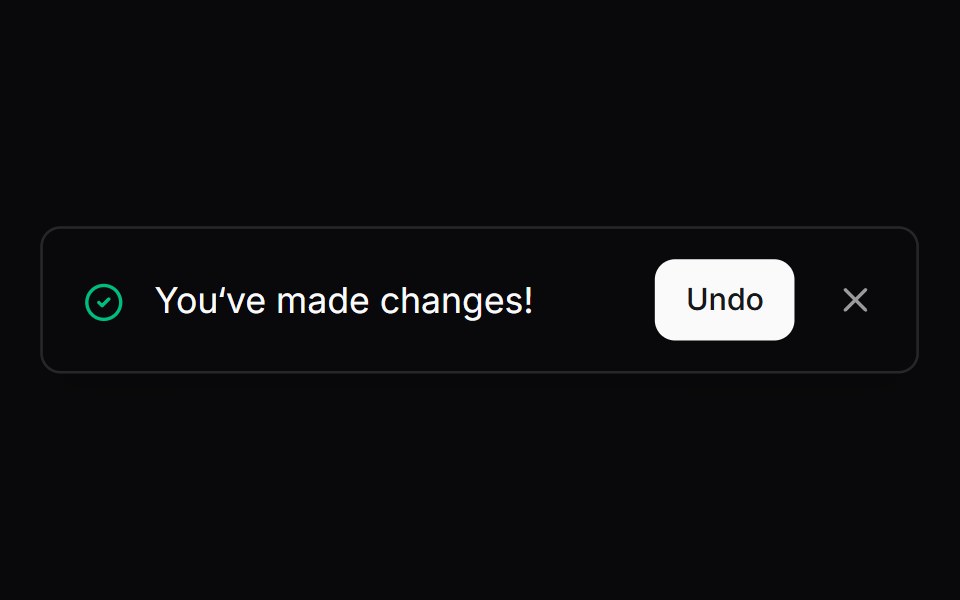 Comp 287Origin UI · React
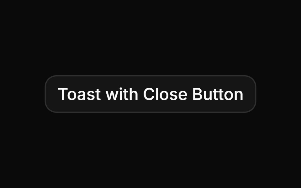 Toast with close button on top-rightReUI · ReactToast with close button on top-right
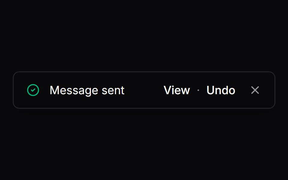 Comp 288Origin UI · React
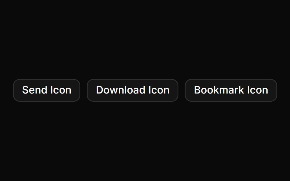 Toast with custom iconReUI · ReactToast with custom icon
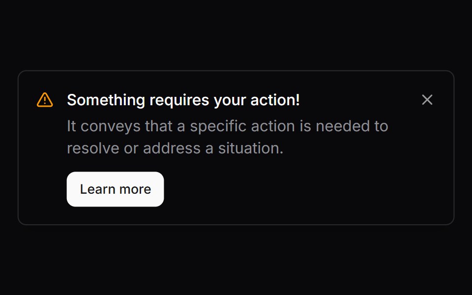 Comp 289Origin UI · React
 Toast notification with description.ReUI · ReactToast notification with description.
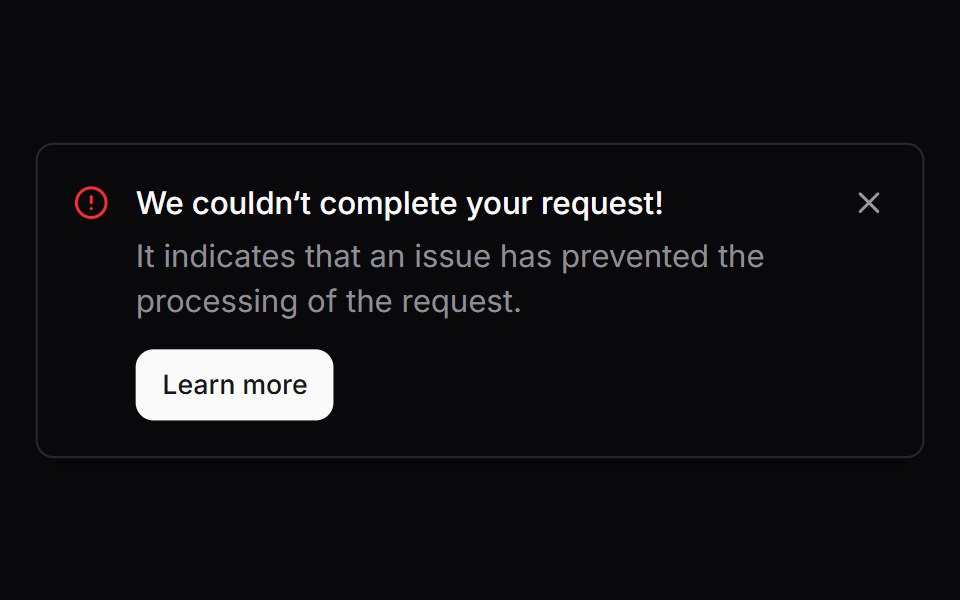 Comp 290Origin UI · React
 Custom integration toastReUI · ReactCustom integration toast
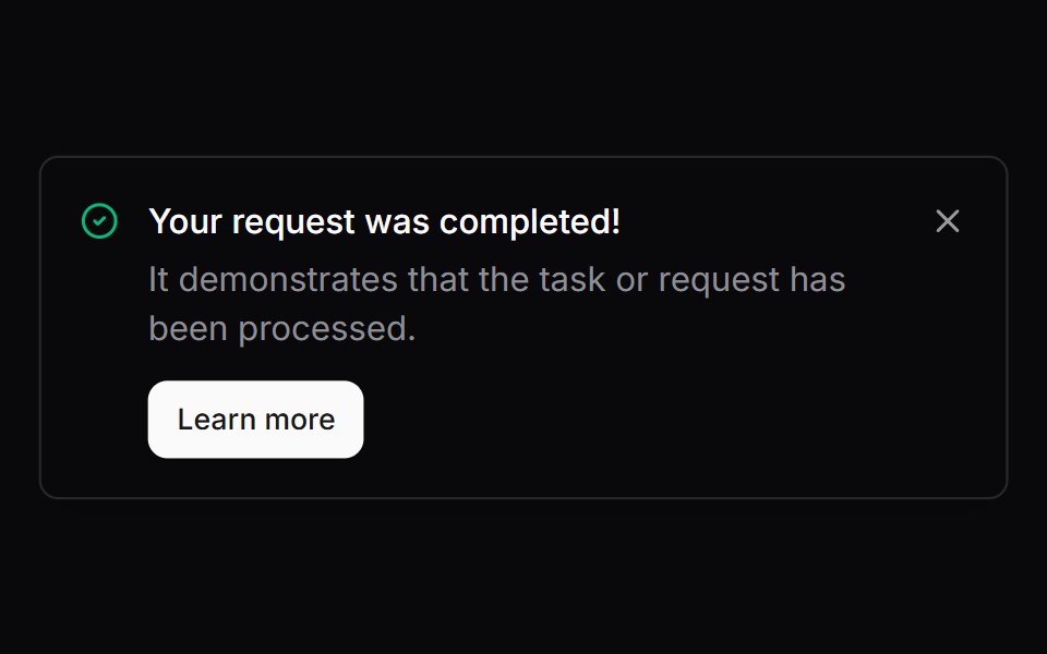 Comp 291Origin UI · React
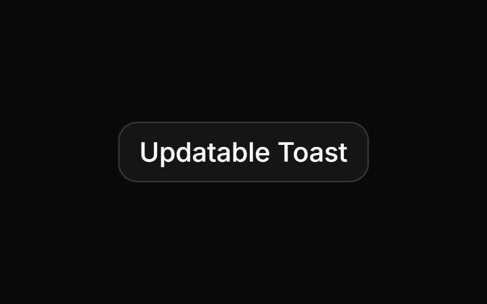 Updatable toast with IDReUI · ReactUpdatable toast with ID
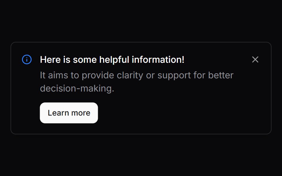 Comp 292Origin UI · React
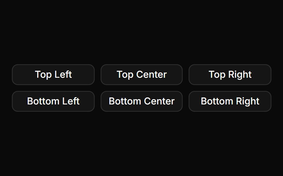 Toast positionsReUI · ReactToast positions
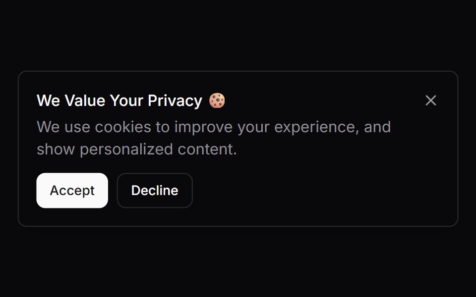 Comp 293Origin UI · React
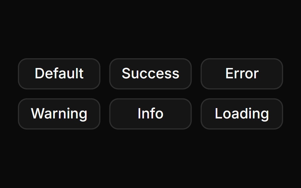 Toast variants with colored iconsReUI · ReactToast variants with colored icons
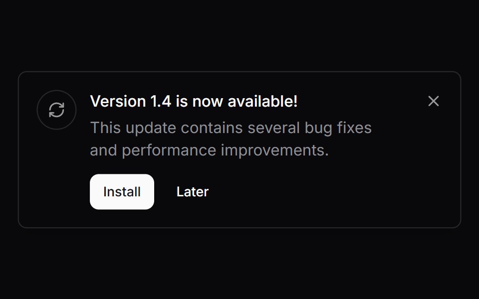 Comp 294Origin UI · React
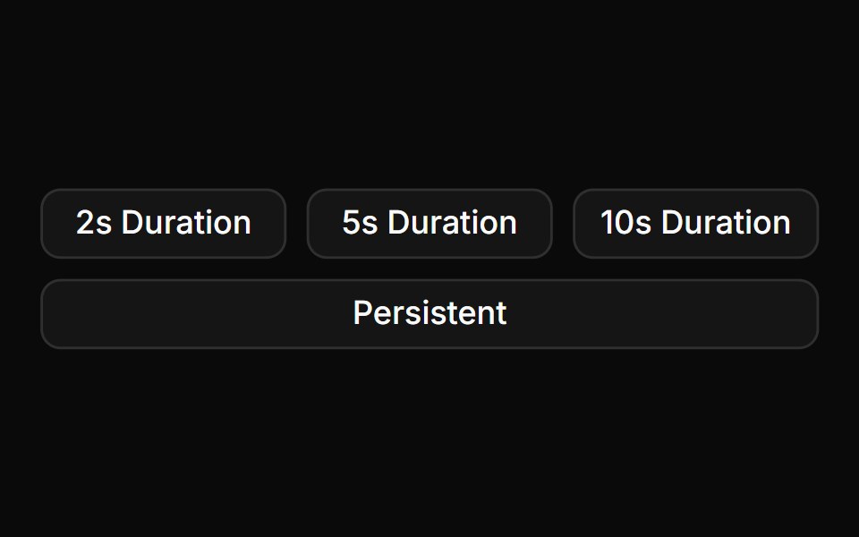 Toast duration optionsReUI · ReactToast duration options
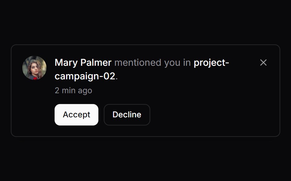 Comp 295Origin UI · React
 Toast with action buttonReUI · ReactToast with action button
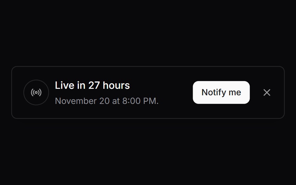 Comp 296Origin UI · React
 Promise toast with loading stateReUI · ReactPromise toast with loading state
 Comp 297Origin UI · React
 Toast with custom close and cancel buttonsReUI · ReactToast with custom close and cancel buttons
 Comp 298Origin UI · React
 Toast with custom rich contentReUI · ReactToast with custom rich content
 Comp 299Origin UI · React
 Comp 300Origin UI · React
 SonnerOrigin UI · React
Libraries with React toast components
Related categories
- Toast Components
- Tailwind CSS Toast Components
- Animated Toast Components
- shadcn/ui Toast Components
- React Overlay Components
- React Modal Components
- React Popover Components
- React Tooltip Components
- React Drawer Components
- React Hover Card Components
- React Alert Dialog Components
- React Bottom Sheet Components
- React Dynamic Island Components
- React Tour Components
- React Lightbox Components
- React Mini Player Components