 Dev Design Library
React Tooltip Components
Dev Design Library indexes 181 React tooltip components from 59 open-source UI libraries, with the most coming from Tremor Blocks, Watermelon UI, ReUI, Origin UI and Shark UI. Each one links to its page with the source code, a live preview where available, the library license and the install command. Every library in this list targets React. Tooltip components belong to the Overlays group.
Showing 120 of 181, a mix from every library. Open a library to see all of its components.
 Tooltipshadcn/ui · ReactA popup that displays information related to an element when the element receives keyboard focus or the mouse hovers…
- TooltipMUI / Material UI · React
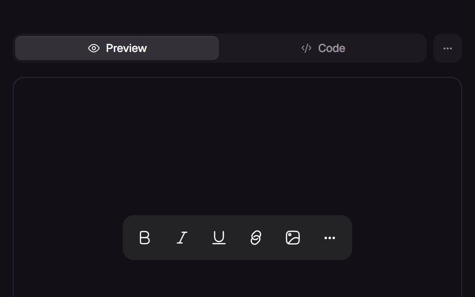 Warm TooltipReact Bits · ReactTooltip group with one shared delay: the first label waits and pops from its trigger, then siblings open instantly…
 Toggle TipChakra UI · ReactLooks like a tooltip, but works like a popover.
 TooltipHeroUI · ReactDisplays informative text when users hover over or focus on an element
- TooltipHeadless UI · React
 TooltipReact Spectrum · ReactDisplay container for Tooltip content. Has a directional arrow dependent on its placement.
 Tooltipcoss ui · ReactA popup that appears when an element is hovered or focused, showing a hint for sighted users.
 TooltipOrigin UI · ReactA popup that appears when an element is hovered or focused, showing a hint for sighted users.
 TooltipRadix Themes · React
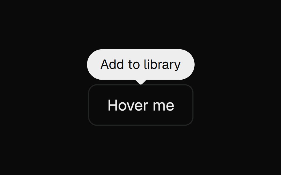 Base TooltipCult UI · ReactBase UI tooltip primitives used by Apple Pro Display XDR
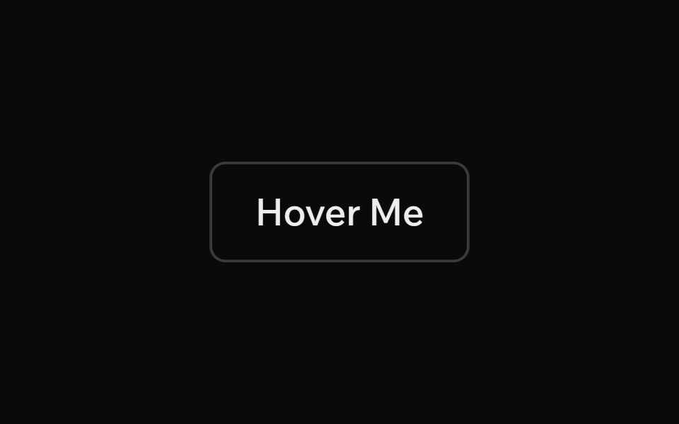 TooltipArk UI · ReactA label that provides information on hover or focus.
 TooltipTremor · React
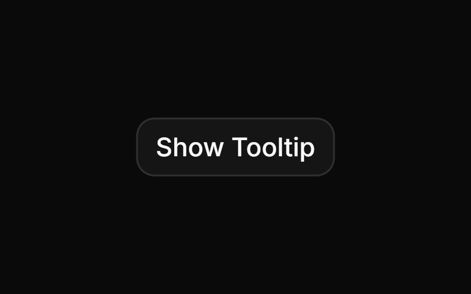 Basic tooltip.ReUI · ReactBasic tooltip.
 TooltipPark UI · ReactA component for displaying contextual information on hover or focus.
 Base Ui TooltipLobe UI · React
 tooltipIntent UI · Reacttooltip
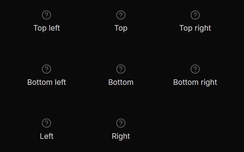 TooltipUntitled UI React · React
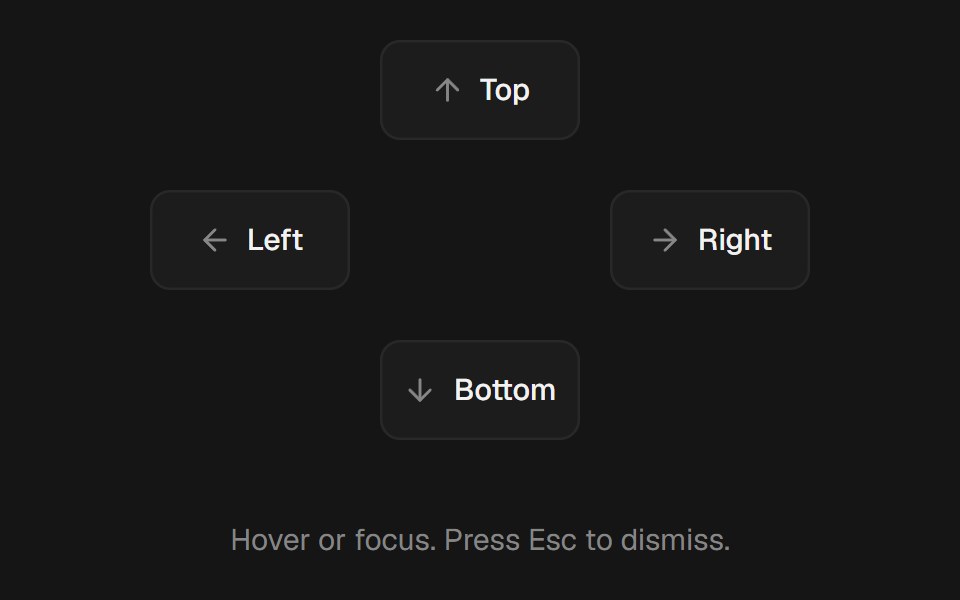 TooltipbeUI · ReactHover or focus tooltip with a subtle scale and fade, collision-aware placement, and optional cursor tracking.
 TooltipTailGrids · ReactA tooltip component.
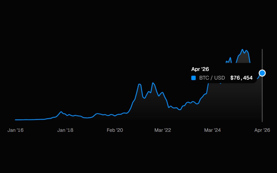 ChartSpell UI · ReactInteractive line chart with a cursor-tracked tooltip card, snap-to-point hover, and built-in X-axis labels.
 Animated TooltipVengeance UI · ReactBouncy SVG-shaped tooltips with spring animations
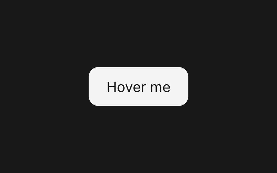 TooltipFluid Functionalism · ReactFloating tooltip with spring-based animations, configurable placement, and rich content support.
 TooltipToolcraft · React
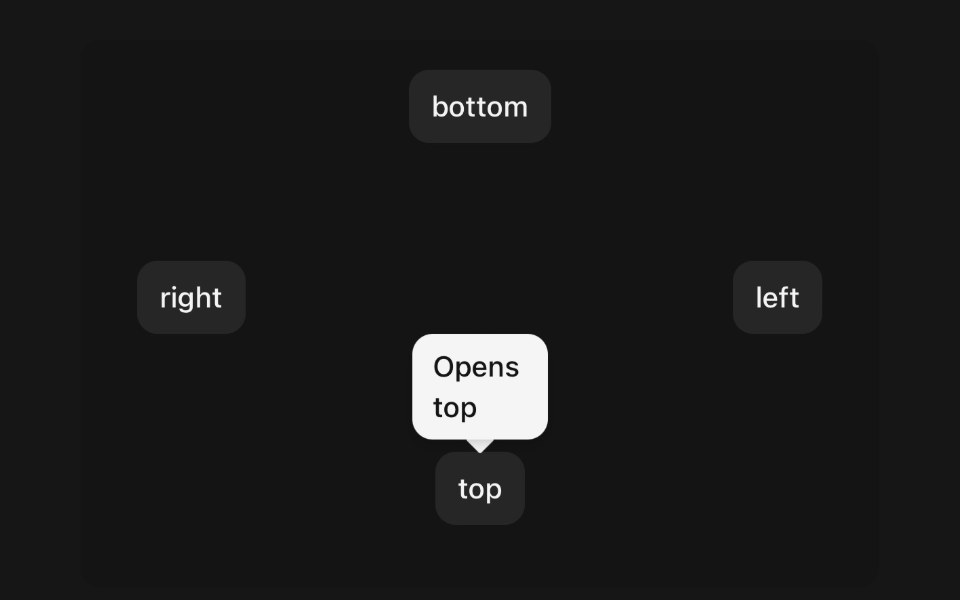 TooltipPanel UI · React NativeA small label that names the control under your finger.
 Avatar 11 - Group with TooltipsShadcn Space · ReactAvatar group with name tooltips on hover and a +N counter that opens a popover listing the remaining members and their…
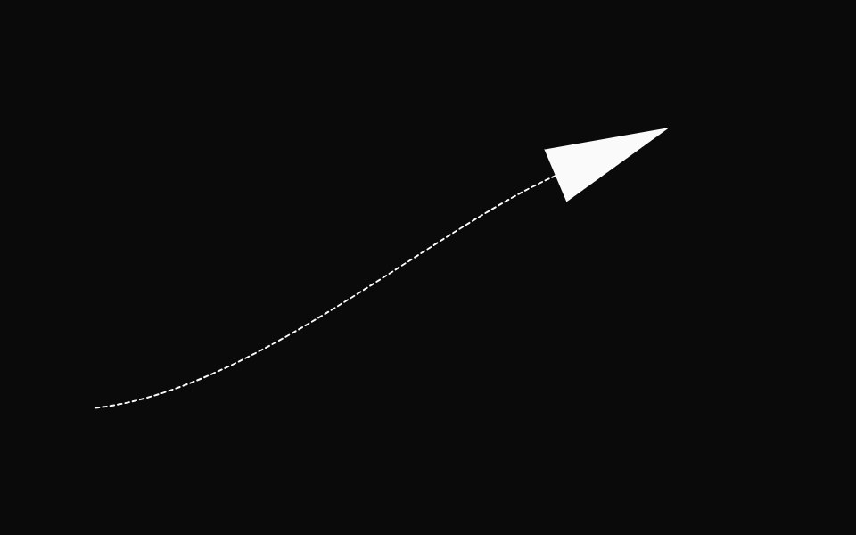 AnnotationsOpenSourceUI · React
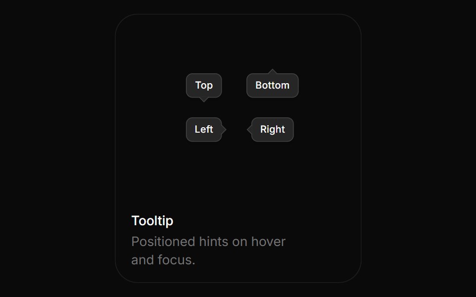 TooltipBoardUI · ReactPositioned hints on hover and focus.
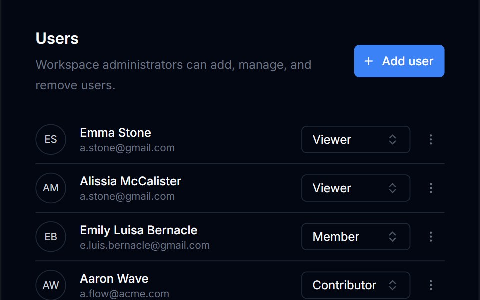 TooltipTremor Blocks · React
 TooltipShadcn Dashboard · React
 TooltipObsidianUI · React
 TooltipNotra · ReactA Base UI tooltip with the Depth surface of the buttons that glides between neighbouring triggers.
 tooltipBaseLayer · ReactA tooltip displays a description of an element on hover or focus.
 HintShark UI · ReactMinimal tooltip for showing information.
 Fluid TooltipSona UI · ReactA grouped Base UI tooltip system with a deliberate first appearance and fast directional handoffs between related…
 TooltipWatermelon UI · React
 TooltipArc Library · ReactShort supporting text for unfamiliar controls.
 Tooltipglasscn · React
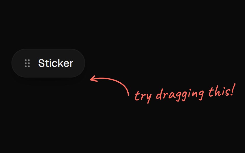 Arrow CalloutUI Lab · ReactA handwritten note whose arrow draws itself to whatever it points at.
 TooltipHextaUI · ReactA short hint on hover or keyboard focus that opens after a brief rest, switches instantly between neighbours and shows…
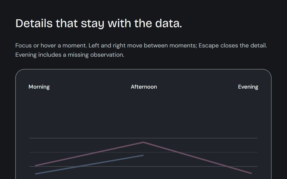 Dynamic chart tooltipCojeev UI · ReactCompare a point, read its known subtotal or rank its series. Values update in place and keep their series colours.
 TooltipROI UI · ReactA popup that displays information on hover.
 BasicFLX UI · ReactDefault dark tooltip on a button.
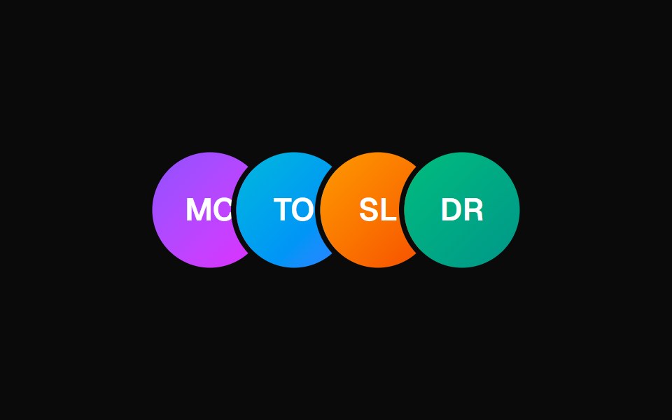 Animated TooltipVelora UI · ReactAvatar row with springy name tooltips on hover.
 TooltipHalaska UI · React
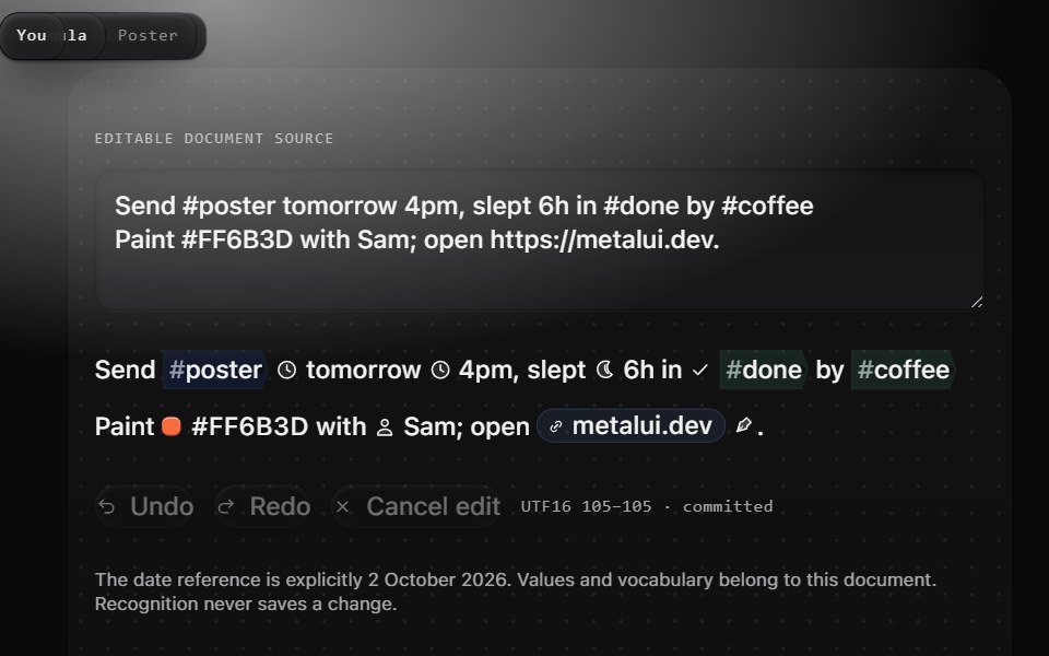 Provenance tooltipMetal UI · React + SwiftUIOne hover away from every cue: a wrapped Tooltip that says where the cue came from (Rule · date parser, Recognizer ·…
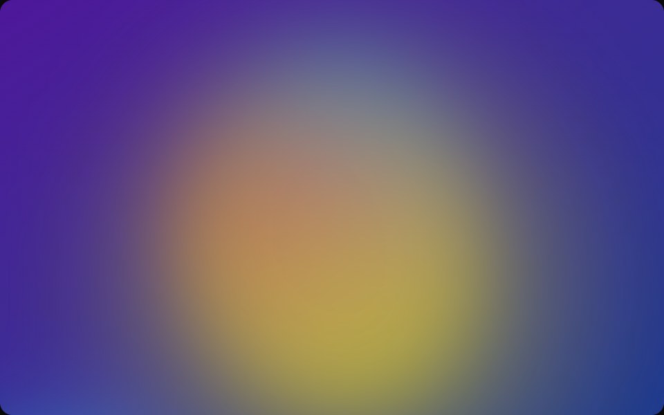 BubbleSpaceUI · ReactRenders floating animated bubbles across the background that smoothly move and drift away when users move their mouse.
 Aria TooltipReScript shadcn · ReScript
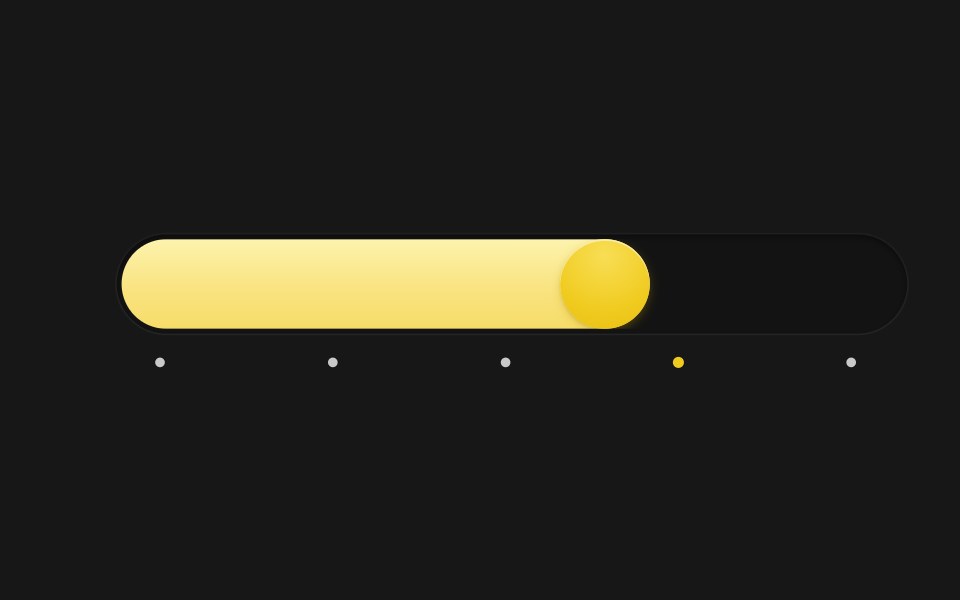 Spring SliderSkecher UI · ReactA pill-track slider with a spring-driven fill and thumb, tick markers, and a tooltip that blurs in and out.
 Base TooltipSora UI · ReactAn accessible tooltip built on Base UI with spring-based keyframe scale and translation animations powered by Motion.
 TooltipOUI · ReactReact aria components Tooltip with shadcn characteristics.
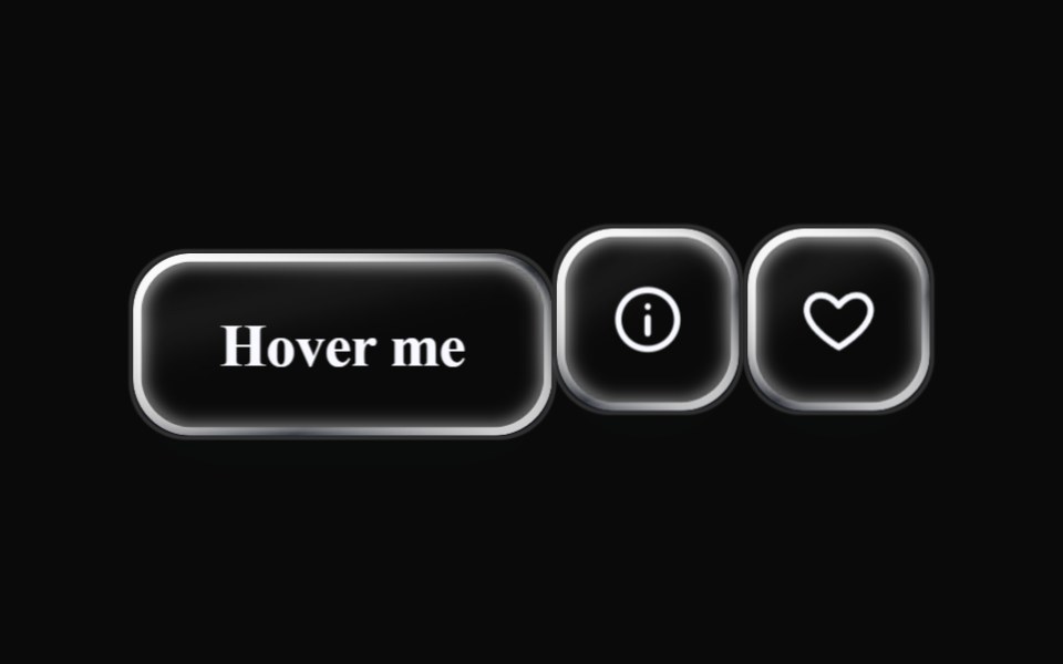 Liquid TooltipLiquefy UI · ReactTooltip in liquid glass style. Dica flutuante em estilo vidro líquido.
 TooltipD2Studio UI · ReactA popup that displays information related to an element when the element receives keyboard focus or the mouse hovers…
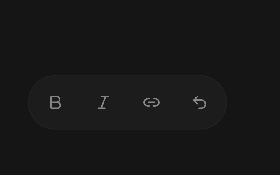 TooltipEaseUI · ReactTooltip that shows a label with its keyboard shortcut, using Command on Mac and Ctrl elsewhere. Moving along a toolbar…
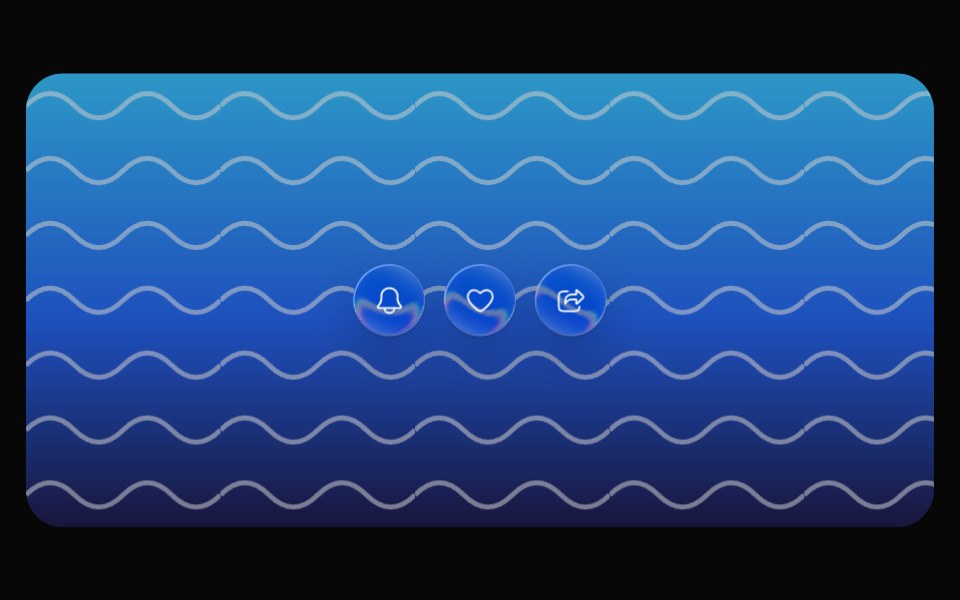 Glass TooltipOpaline · ReactCapsule tooltip that springs out of its trigger.
 TooltipFibo · ReactA short label that appears when a control is hovered or focused.
 TooltipReactFrame · ReactAn accessible tooltip with 4 placements, auto-flip near the screen edge, a hover delay, keyboard-focus support, an…
 Animated TooltipAceternity UI · React
 Tooltipark-cn · ReactA shadcn-style tooltip component built with Ark UI primitives.
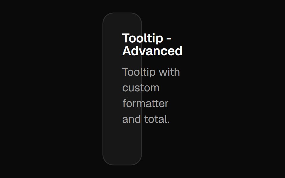 Chart Tooltip Advancedshadcn/ui · React
 TooltipChakra UI · ReactHow to customize the tooltip of the charts component
 Tailwind TooltipReact Spectrum · React
 Comp 354Origin UI · React
 Tooltip with feature badge and upgrade linkReUI · ReactTooltip with feature badge and upgrade link
 Dashboard Title With TipsLobe UI · React
 Tooltip SurfacebeUI · ReactPresentation only: the unanimated parent owns measurement and positioning.
 Shared Tooltip AvatarsVengeance UI · ReactAvatar stack with a sliding shared tooltip
 Tooltip (Base UI)Fluid Functionalism · ReactFloating tooltip with spring-based animations, configurable placement, and rich content support. Base UI flavor.
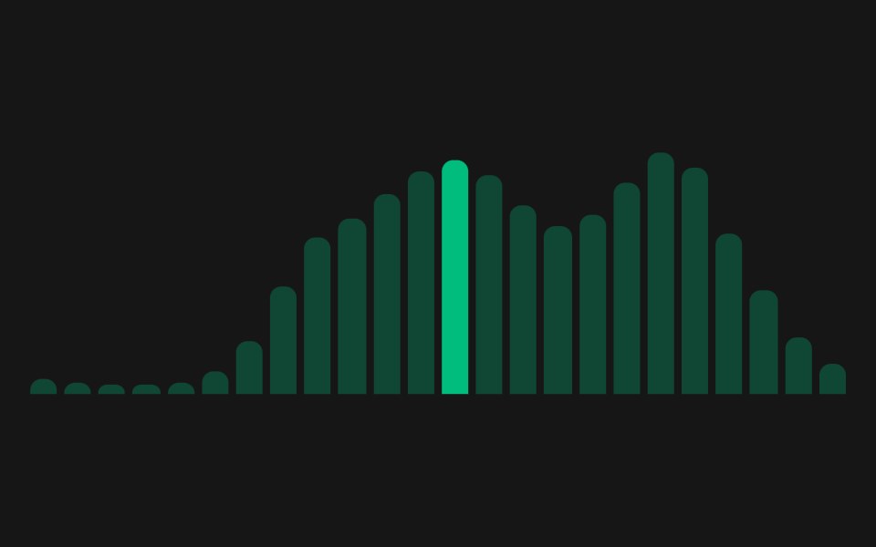 Web TooltipPanel UI · React NativeTooltips with icons, longer descriptions and keyboard access.
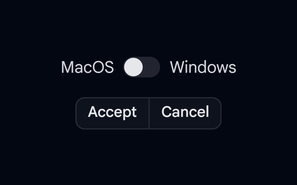 KBD 03 - KBD in TooltipShadcn Space · ReactButtonGroup with KBD shortcut hints shown inside tooltips on hover, with Mac/Windows platform switch
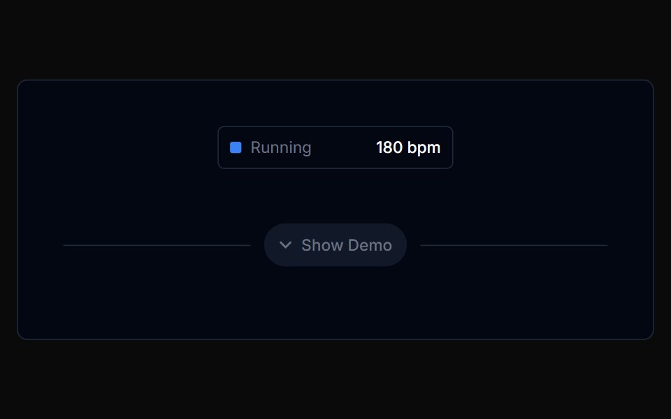 Chart Tooltip 01Tremor Blocks · React
 Toggle TooltipShark UI · ReactDisplay information on click.
 Tooltip 1Watermelon UI · React
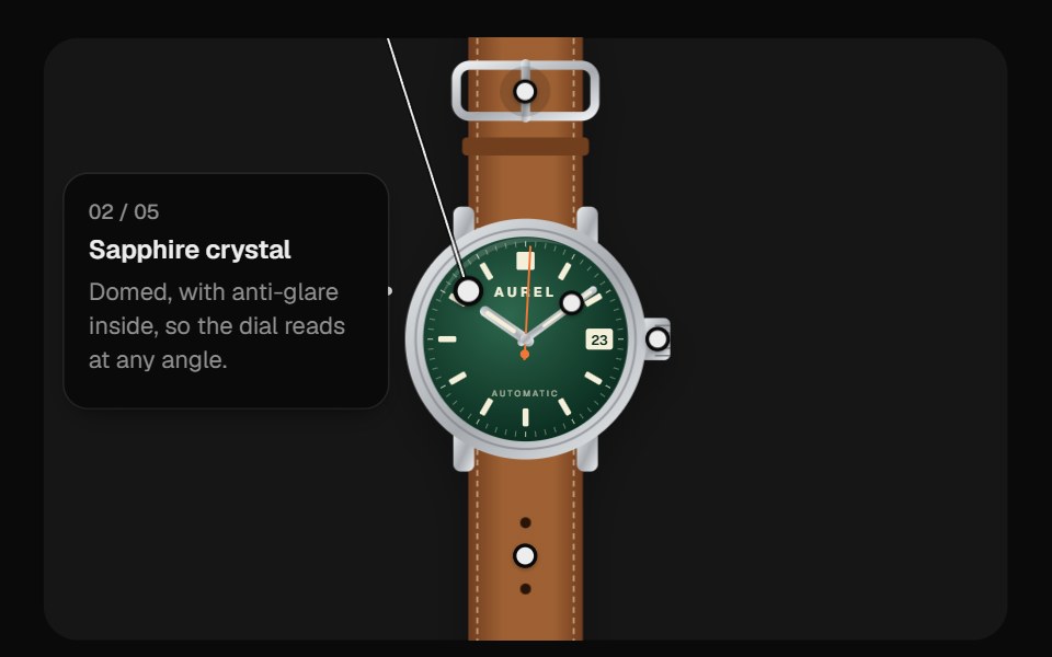 Image HotspotsUI Lab · ReactDraws a leader line to one label card that travels between a watch's features, never covering the product.
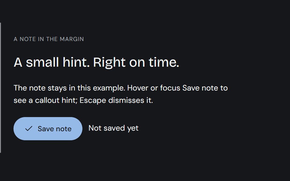 TooltipCojeev UI · ReactPrecise ink callouts, useful keyboard hints and small paper annotations. Short explanations that appear where…
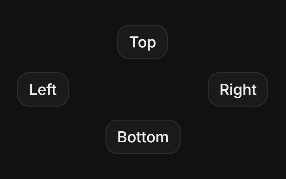 SidesFLX UI · ReactPlace the tooltip on top, right, bottom, or left.
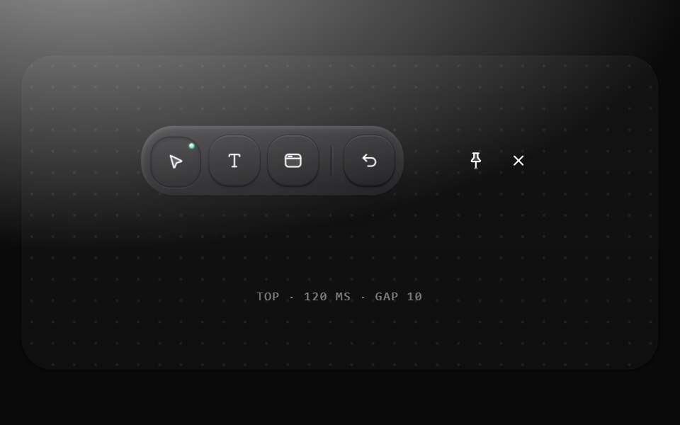 TooltipMetal UI · React + SwiftUINames an icon-only control and its key: a graphite pill chip in the label role, SELECT · V with the key dimmed, 10…
 Gooey TooltipSpaceUI · ReactA tooltip bubble that mouse-follows and gooey-connects to its trigger button on hover.
 Base TooltipReScript shadcn · ReScript
 Radix TooltipSora UI · ReactAn accessible tooltip built on Radix UI with spring-based keyframe scale and translation animations powered by Motion.
 Tooltip CardAceternity UI · React
 Chart Tooltip Defaultshadcn/ui · React
 Vanilla TooltipReact Spectrum · React
 Comp 355Origin UI · React
 Tooltip with avatar and role badgeReUI · ReactTooltip with avatar and role badge
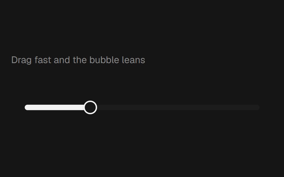 Range Slider BubblebeUI · React
 TooltipVengeance UI · React
 Tooltip-02 - Content TooltipShadcn Space · ReactTooltip component
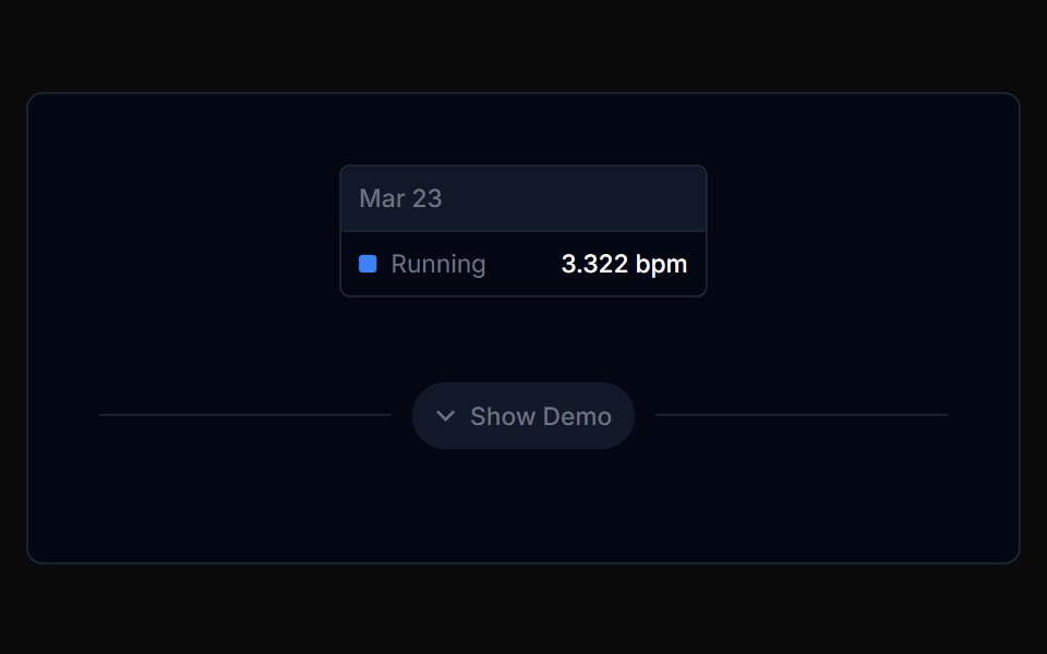 Chart Tooltip 02Tremor Blocks · React
 TooltipShark UI · ReactDisplay information on hover or focus.
 Tooltip 10Watermelon UI · React
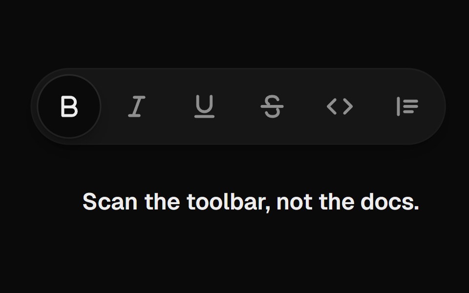 Tooltip GroupUI Lab · ReactOne tooltip slides from button to button and reshapes around each label.
 With shortcutFLX UI · ReactLabel paired with a keyboard shortcut badge inside the tooltip.
 TooltipSpaceUI · ReactDisplays a small floating text bubble when users hover over or focus on an element, explaining what that button or…
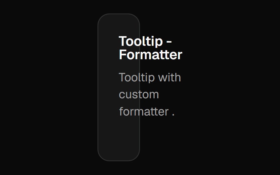 Chart Tooltip Formattershadcn/ui · React
 Comp 356Origin UI · React
 Tooltip on disabled button with wrapperReUI · ReactTooltip on disabled button with wrapper
 Tooltip-03 - Animated TooltipShadcn Space · ReactAnimated Tooltip component
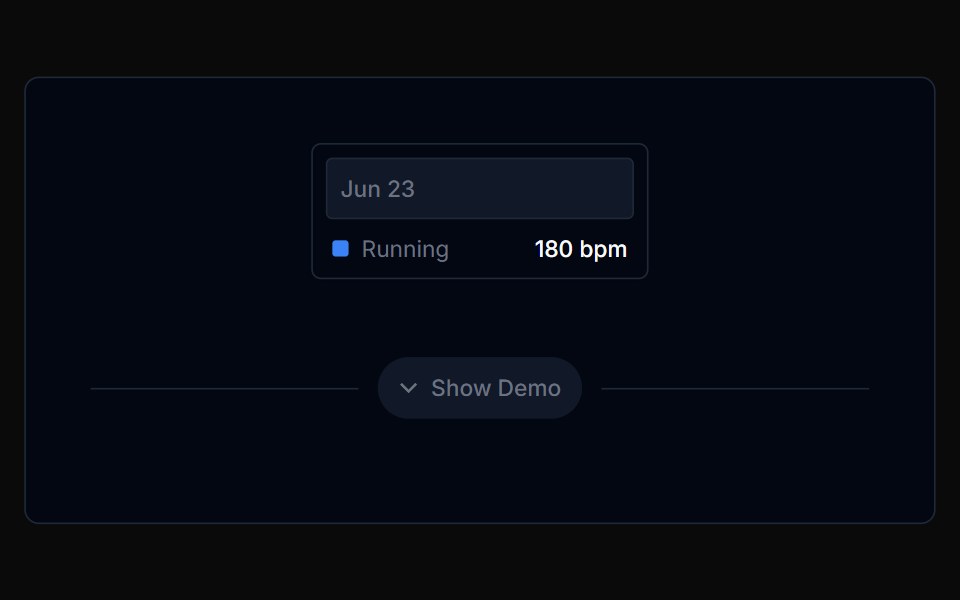 Chart Tooltip 03Tremor Blocks · React
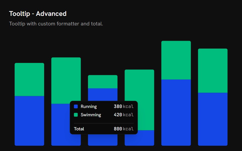 Chart Tooltip AdvancedShark UI · React
 Tooltip 11Watermelon UI · React
 On icon buttonFLX UI · ReactLabels icon-only buttons in a toolbar.
 Chart Tooltip Iconsshadcn/ui · React
 Comp 357Origin UI · React
 Tooltip with online status indicatorReUI · ReactTooltip with online status indicator
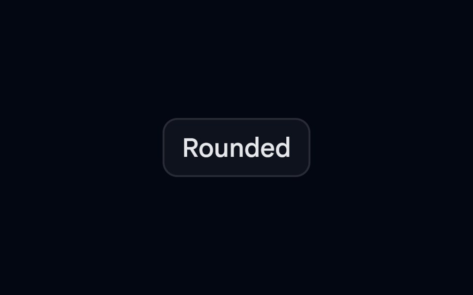 Tooltip-04 - Rounded TooltipShadcn Space · ReactTooltip component
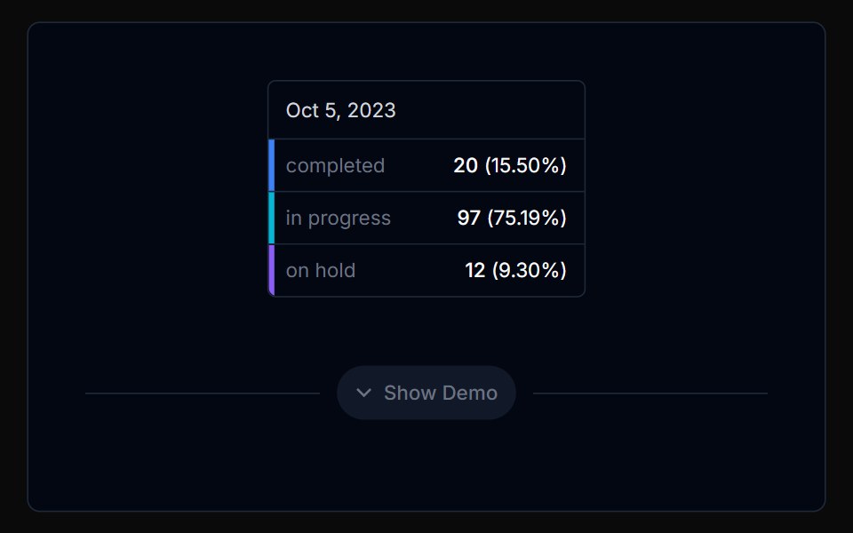 Chart Tooltip 04Tremor Blocks · React
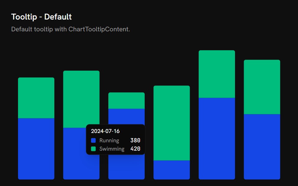 Chart Tooltip DefaultShark UI · React
 Tooltip 12Watermelon UI · React
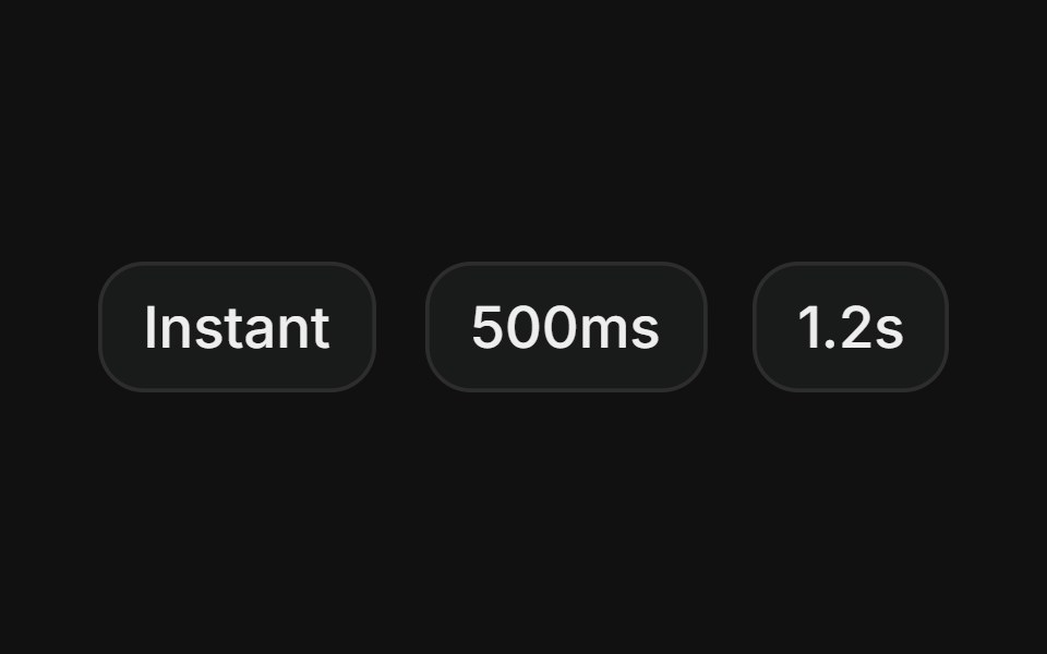 Custom delayFLX UI · ReactTooltips that open instantly, after 500ms, or after 1.2s, showing different hover delay behaviors.
 Chart Tooltip Indicator Lineshadcn/ui · React
 Comp 358Origin UI · React
 Tooltip with file info and badgesReUI · ReactTooltip with file info and badges
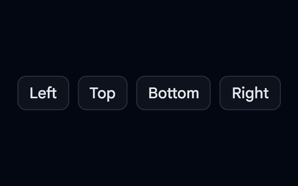 Tooltip-05 - Tooltip PositionShadcn Space · ReactTooltip component
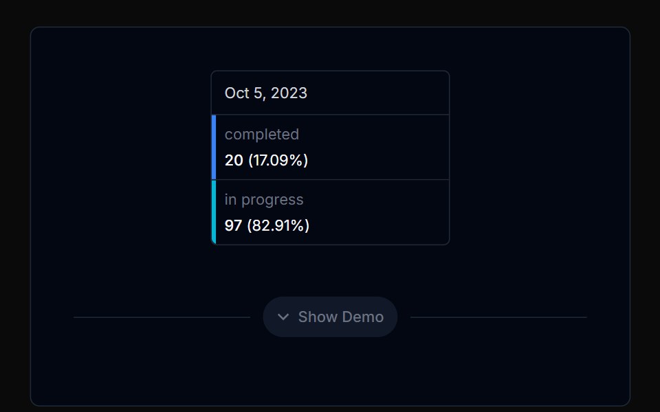 Chart Tooltip 05Tremor Blocks · React
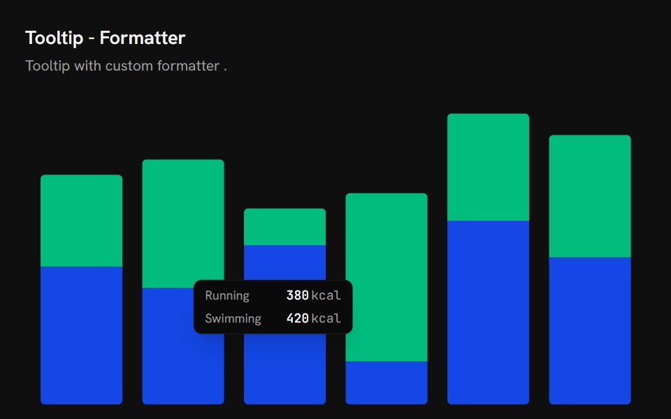 Chart Tooltip FormatterShark UI · React
 Tooltip 13Watermelon UI · React
 Rich contentFLX UI · ReactTitle plus supporting description in the content.
 Chart Tooltip Indicator Noneshadcn/ui · React
 Comp 359Origin UI · React
Libraries with React tooltip components
Related categories
- Tooltip Components
- Tailwind CSS Tooltip Components
- Animated Tooltip Components
- shadcn/ui Tooltip Components
- React Overlay Components
- React Modal Components
- React Popover Components
- React Toast Components
- React Drawer Components
- React Hover Card Components
- React Alert Dialog Components
- React Bottom Sheet Components
- React Dynamic Island Components
- React Tour Components
- React Lightbox Components
- React Mini Player Components