 Dev Design Library
React Popover Components
Dev Design Library indexes 247 React popover components from 60 open-source UI libraries, with the most coming from Watermelon UI, ReUI, FLX UI, Origin UI and React Spectrum. Each one links to its page with the source code, a live preview where available, the library license and the install command. Every library in this list targets React. Popover components belong to the Overlays group.
Showing 120 of 247, a mix from every library. Open a library to see all of its components.
 Hover Cardshadcn/ui · ReactA popover that appears on hover, focus, or long press to preview content available behind a link.
 PopoverMUI / Material UI · React
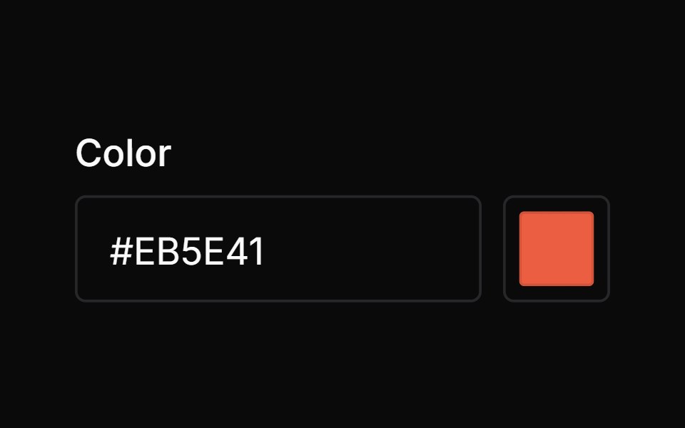 Color PickerChakra UI · ReactUsed to select colors from a color area or a set of defined swatches
 Color PickerHeroUI · ReactA composable color picker that synchronizes color value between multiple color components
 PopoverHeadless UI · React
 Contextual HelpReact Spectrum · ReactContextual help shows a user extra information about the state of an adjacent component, or a total view.
 Popovercoss ui · ReactAn accessible popup anchored to a button.
 PopoverOrigin UI · ReactAn accessible popup anchored to a button.
 Hover CardRadix Themes · React
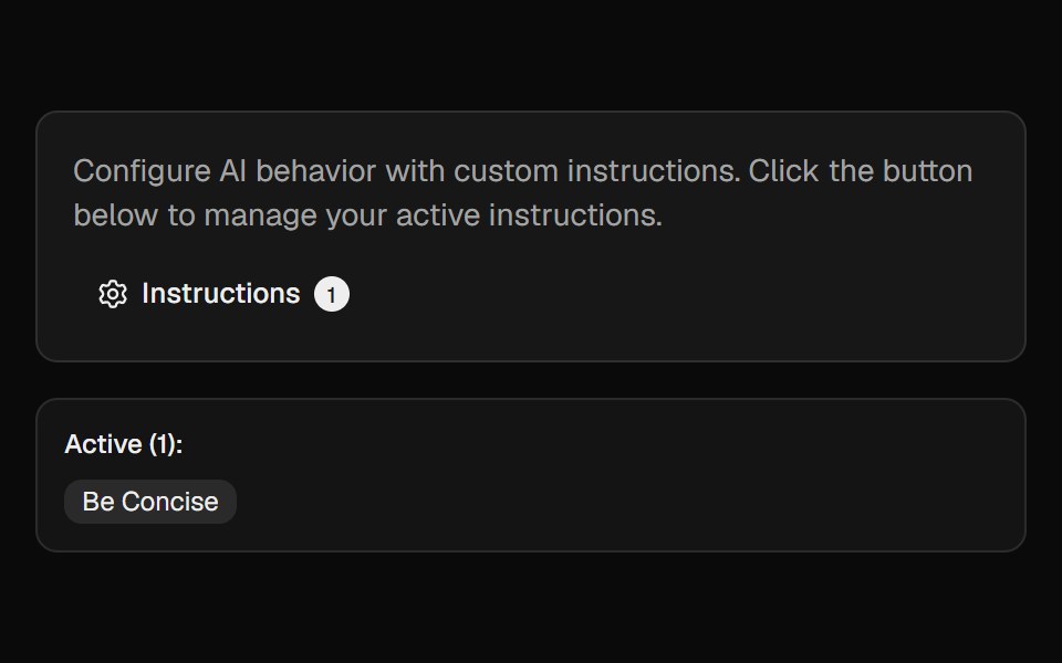 Ai InstructionsCult UI · ReactManage and toggle AI instructions with a popover, search, and create-dialog
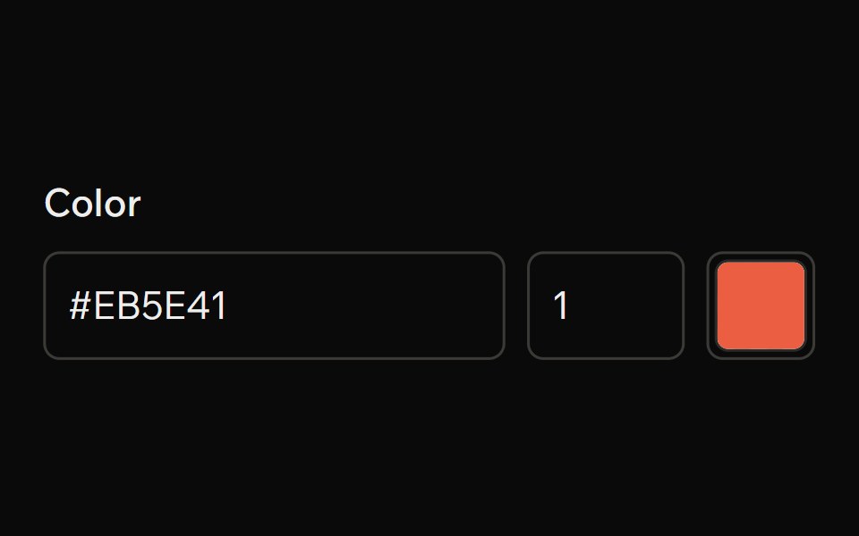 Color PickerArk UI · ReactA component that allows users to select a color from a color picker.
 PopoverTremor · React
 Basic hover card.ReUI · ReactBasic hover card.
 Card Preview TileAmicro Micro Transitions · ReactCatalog preview for a card spread / carousel. Hover state lives here so hovering one tile re-renders only that tile…
 ContextAI Elements · ReactA compound component system for displaying AI model context window usage, token consumption, and cost estimation.
 Color PickerPark UI · ReactAn input component for selecting and manipulating color values.
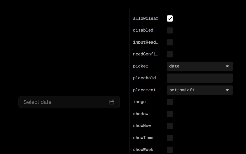 Date PickerLobe UI · ReactA DatePicker component that extends Ant Design's DatePicker with additional styling options. It provides different…
 Morph PopoverKokonut UI · ReactA button that grows into the form it opens, with its label sliding up to become the title, then shrinks into a…
 popoverIntent UI · Reactpopover
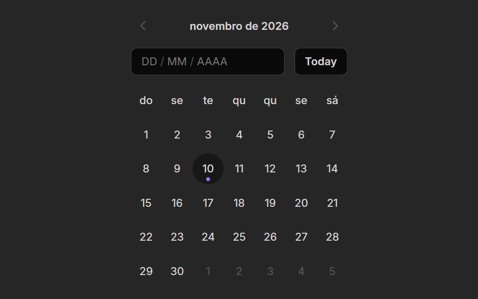 Date PickerUntitled UI React · React
 Popover MorphbeUI · ReactPopover that grows out of its trigger button, sharing the same shape.
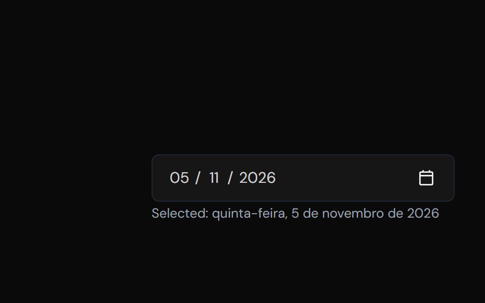 Date PickerTailGrids · ReactA component to select a date.
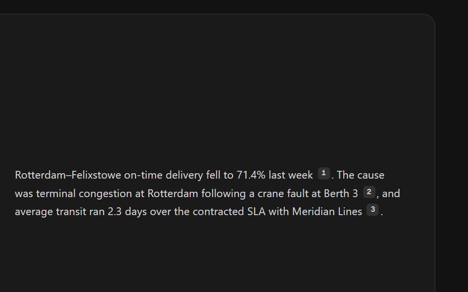 Citation SourcesSpectrum UI · ReactInline citation markers with hover previews or a footnote list.
 Hover CardVengeance UI · React
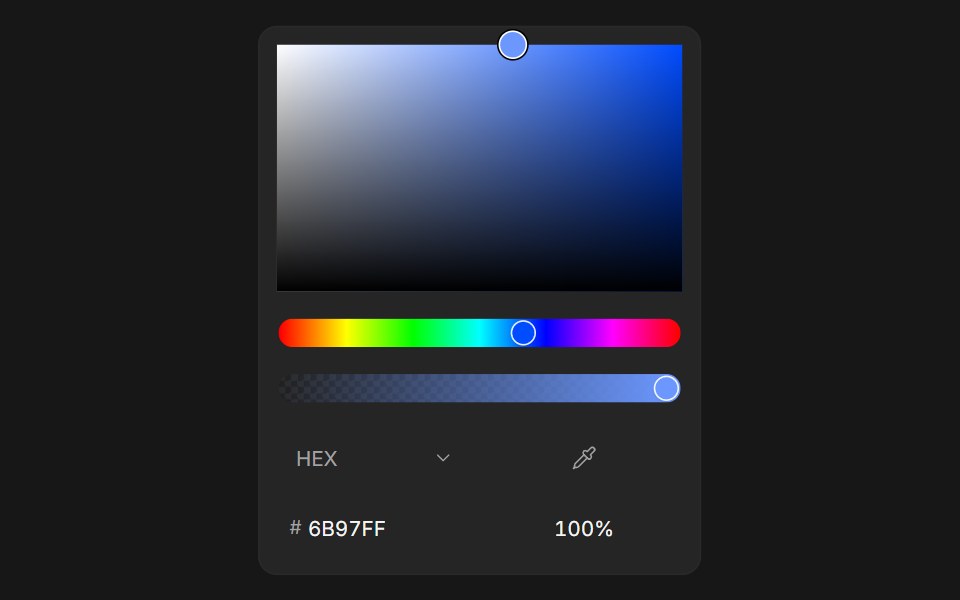 Color PickerFluid Functionalism · ReactColor picker with HEX, RGB, HSL, and OKLCH formats, alpha channel, optional swatches, and a popover trigger. Built on…
 PopoverUser Interface Wiki · React
 Hover CardToolcraft · React
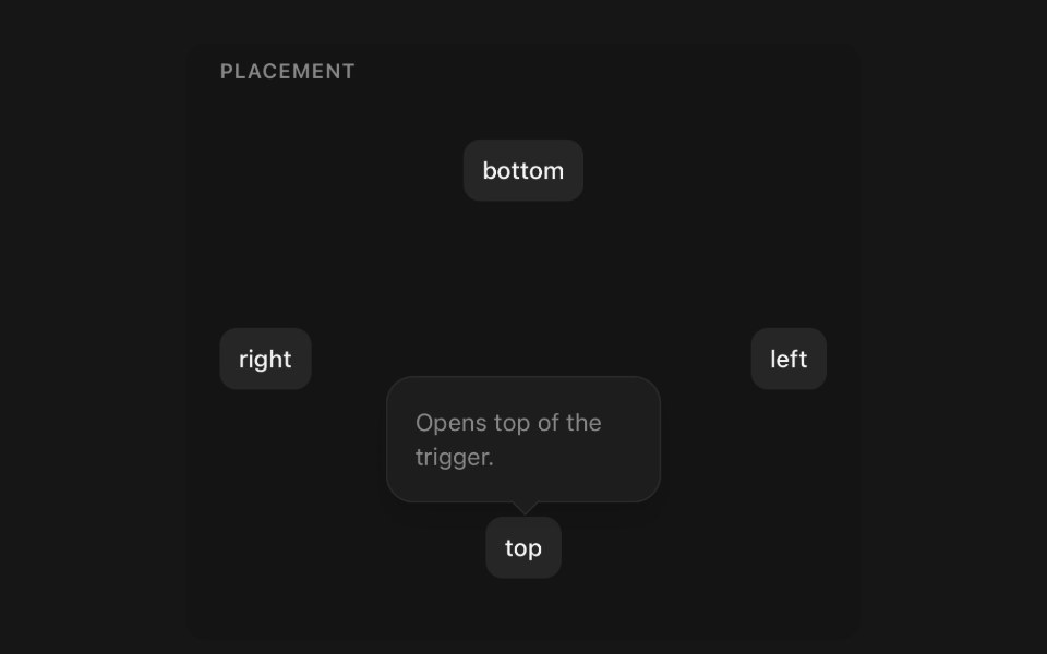 PopoverPanel UI · React NativePanel anchored to the element that opened it.
 Card-01 - ArticlePreviewCardShadcn Space · ReactCard component
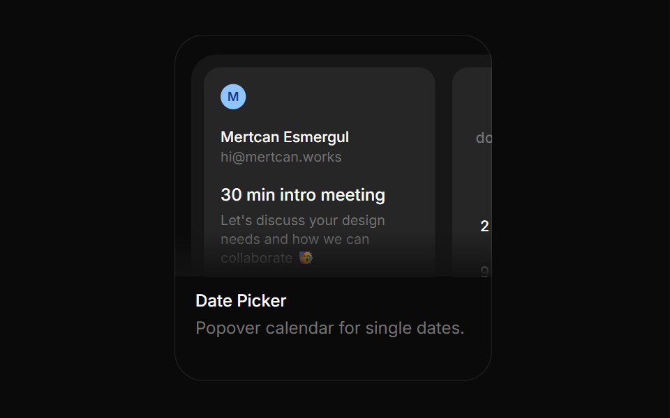 Date PickerBoardUI · ReactPopover calendar for single dates.
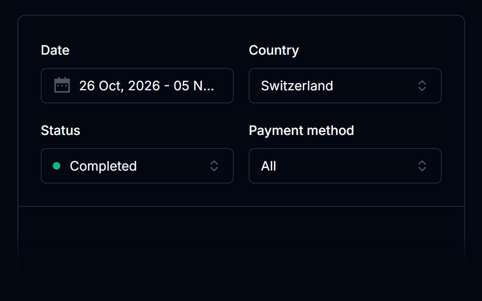 Date PickerTremor Blocks · React
 Hover CardShadcn Dashboard · React
 Hover CardObsidianUI · React
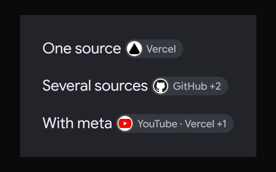 AI Overview CitationNotra · ReactA source chip built on shadcn Badge and HoverCard.
 Image Hover RevealGreatUI · React
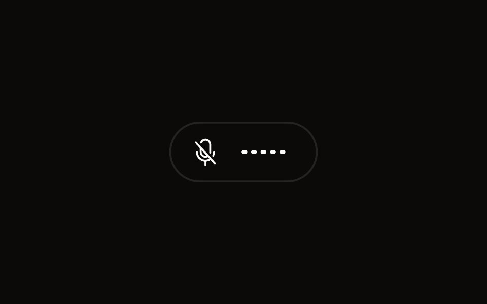 Quick Audio Popoveraudiocn · ReactCompact microphone and system audio controls behind one toolbar button that shows a live level.
 popoverBaseLayer · ReactA popover is an overlay element positioned relative to a trigger.
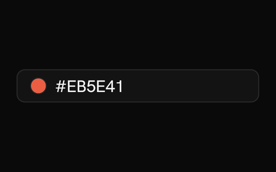 Color PickerShark UI · ReactPick colors with hue and alpha controls.
 Gooey Color Picker23rd.dev · ReactA floating color picker with a circular hue wheel, alpha slider, hex field, and motion-powered open/close.
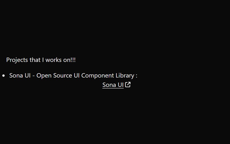 LinkPreviewSona UI · ReactThe `LinkPreview` component is an interactive UI element that displays a preview of a link when hovered over. It…
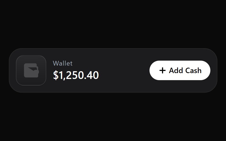 Add Cash DisclosureWatermelon UI · React
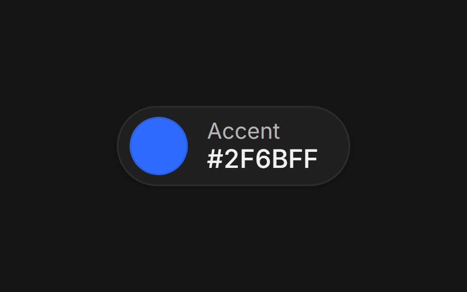 Color pickerArc Library · ReactA swatch that grows into a picker with format morphing, eyedropper, saved swatches, and contrast readout.
 Glass Popoverglasscn · ReactGlass Popover with five variants: clear, frosted, subtle, liquid, and liquid-refract
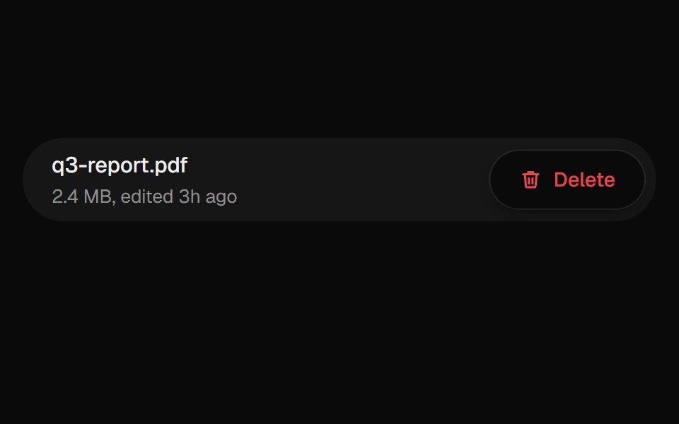 Confirm PopoverUI Lab · ReactAsks before deleting, from a popover that grows out of the button.
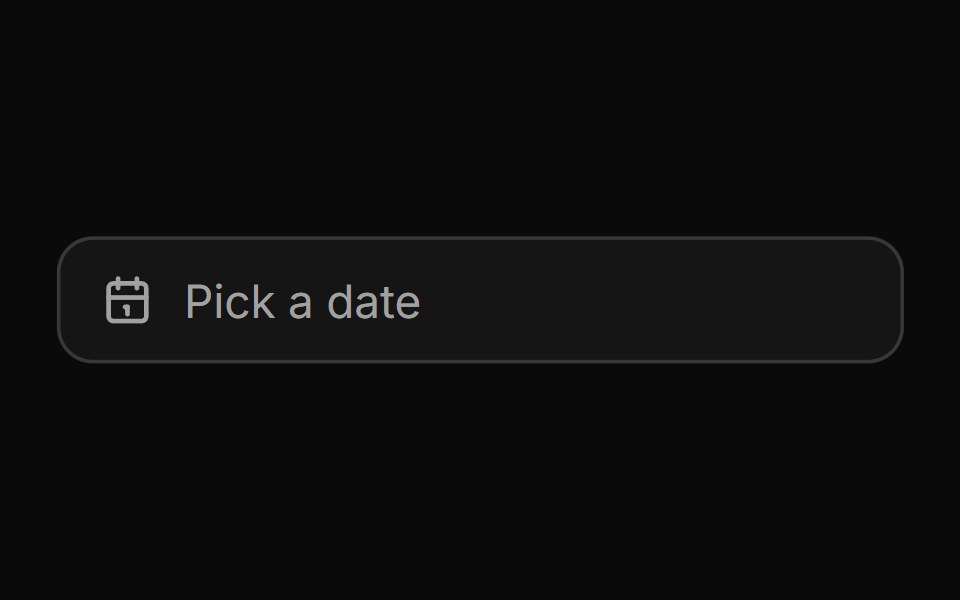 Date pickerHextaUI · ReactA button that opens a calendar in a popover, or a bottom sheet on phones, for single dates and ranges.
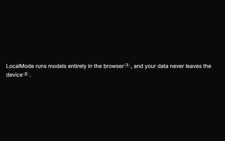 Inline CitationLocalMode · ReactInline superscript citation markers in prose that open a hovercard with the cited local chunk (title, excerpt, quoted…
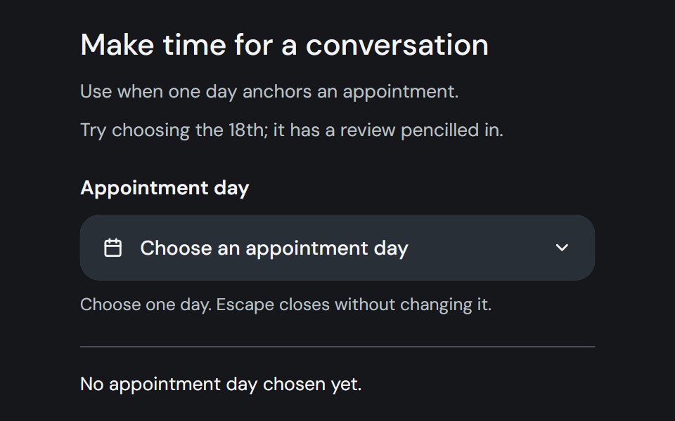 Date PickerCojeev UI · ReactChoose one day, a range, or multiple dates from a labelled field and calendar popover.
 PopoverROI UI · ReactA floating content container.
 BasicFLX UI · ReactDefault popover with a button trigger and simple text.
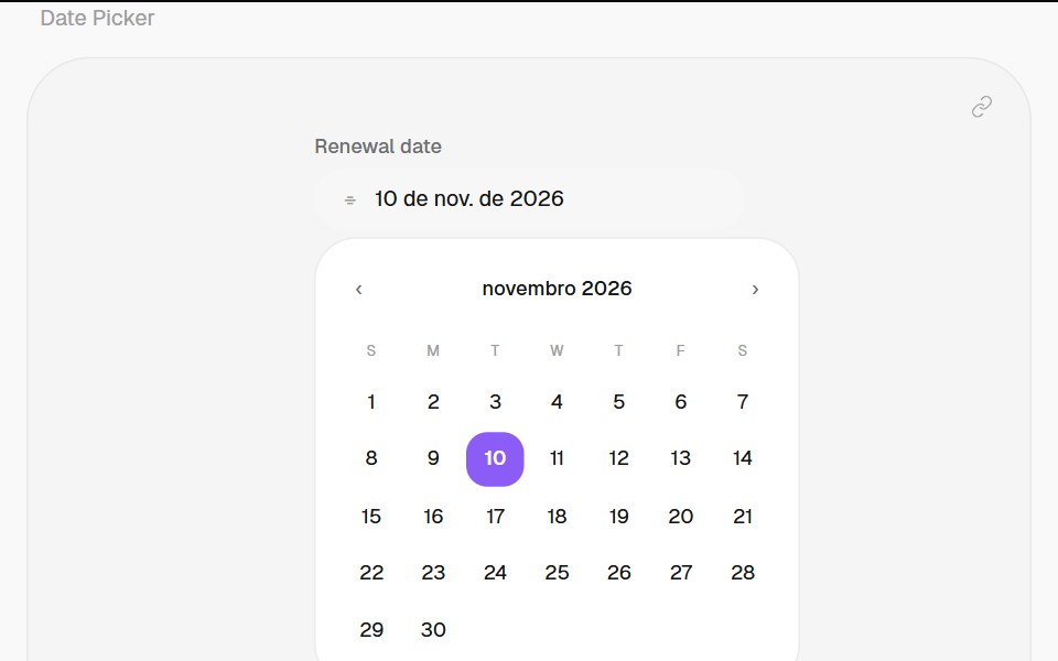 Date PickerHalaska UI · React
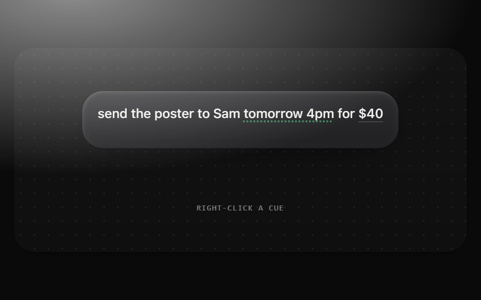 Menu and correction popoverMetal UI · React + SwiftUIA frosted plate of 30 rows (frost-strong at .92, radius 18, padding 6, at least 200 wide) from a trigger or at the…
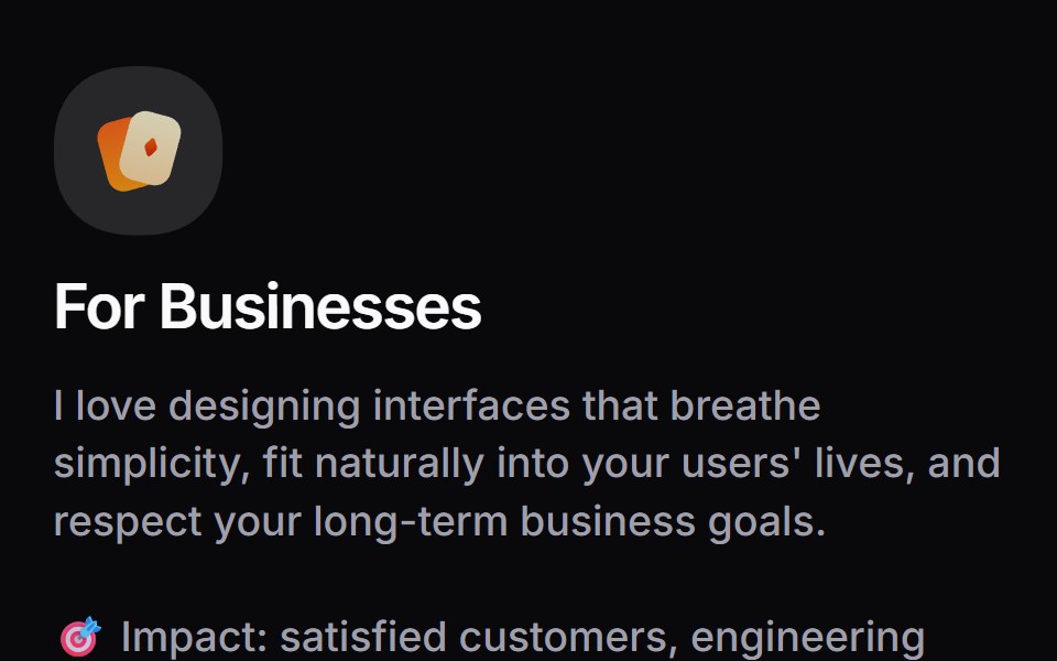 Card InfoSpaceUI · ReactResponsive feature and philosophy cards with gradient icons, clean typography, and layered container aesthetics.
 Aria Hover CardReScript shadcn · ReScript
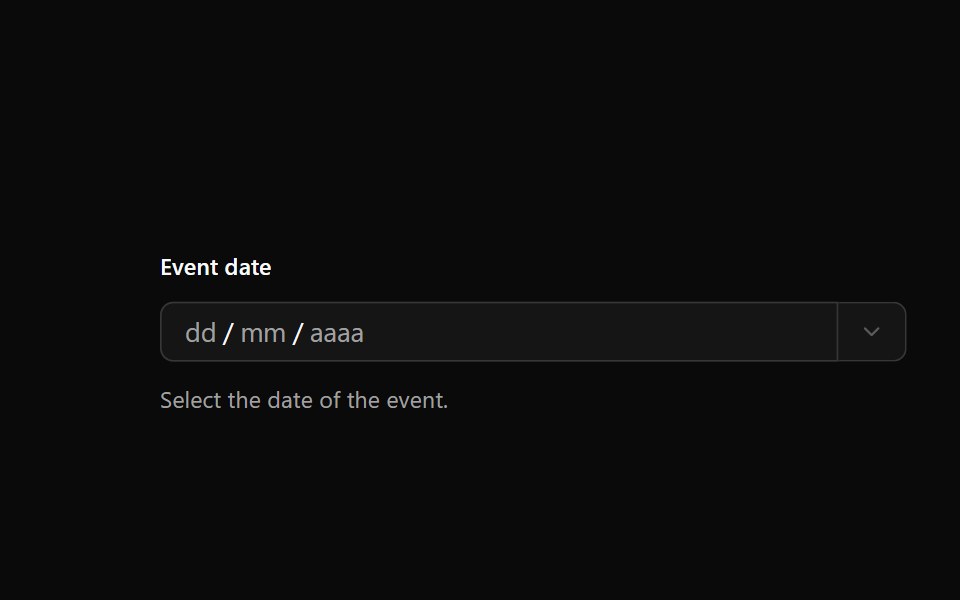 Date PickerOUI · ReactReact aria components DatePicker with shadcn characteristics.
 Hover CardD2Studio UI · ReactFor sighted users to preview content available behind a link.
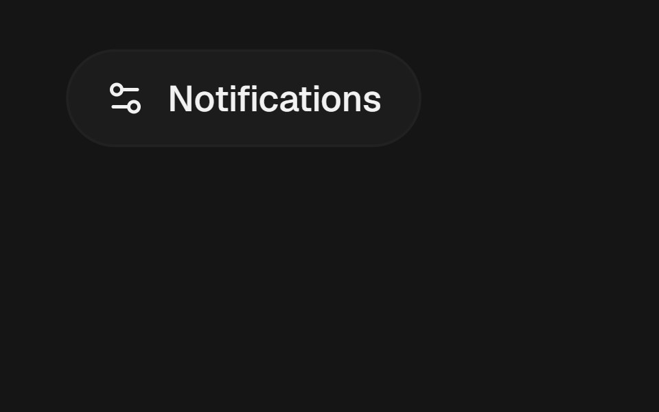 PopoverEaseUI · ReactA panel of arbitrary content anchored to a trigger, opening on click and flipping above it when there's no room below.
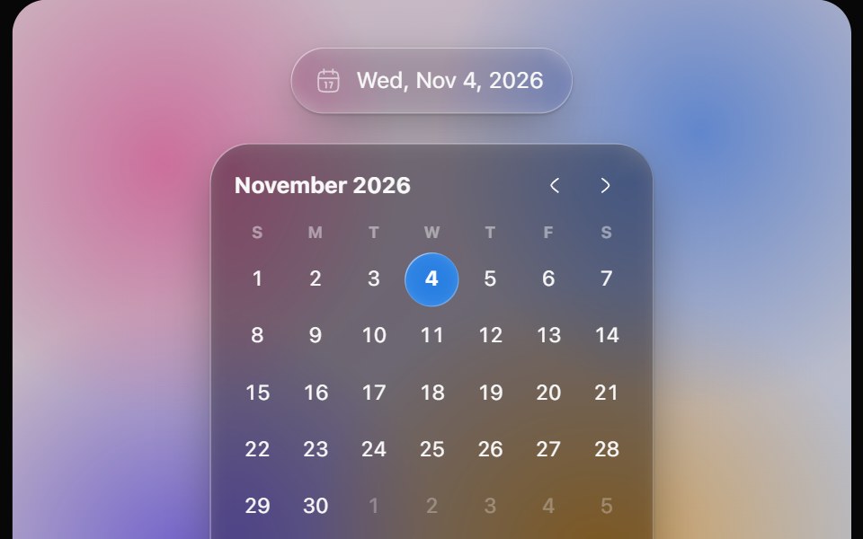 Glass Date PickerOpaline · ReactGlass calendar with a gliding day bubble, and a capsule date picker.
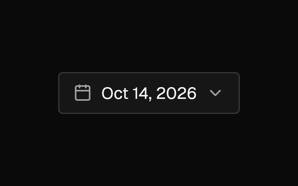 Date PickerFibo · ReactA field that opens a calendar to pick a day, or a range with presets and Apply; a popover on desktop, a drawer on…
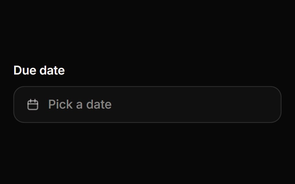 Date PickerReactFrame · ReactA date picker with a popover calendar: single date or range selection, month navigation, min/max and disabled dates…
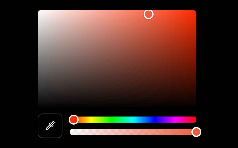 Color Pickerark-cn · ReactA shadcn-style color picker component built with Ark UI primitives.
 Popovershadcn/ui · ReactDisplays rich content in a portal, triggered by a button.
 PopperMUI / Material UI · React
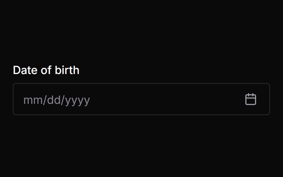 Date PickerChakra UI · ReactUsed to select dates or date ranges from a calendar.
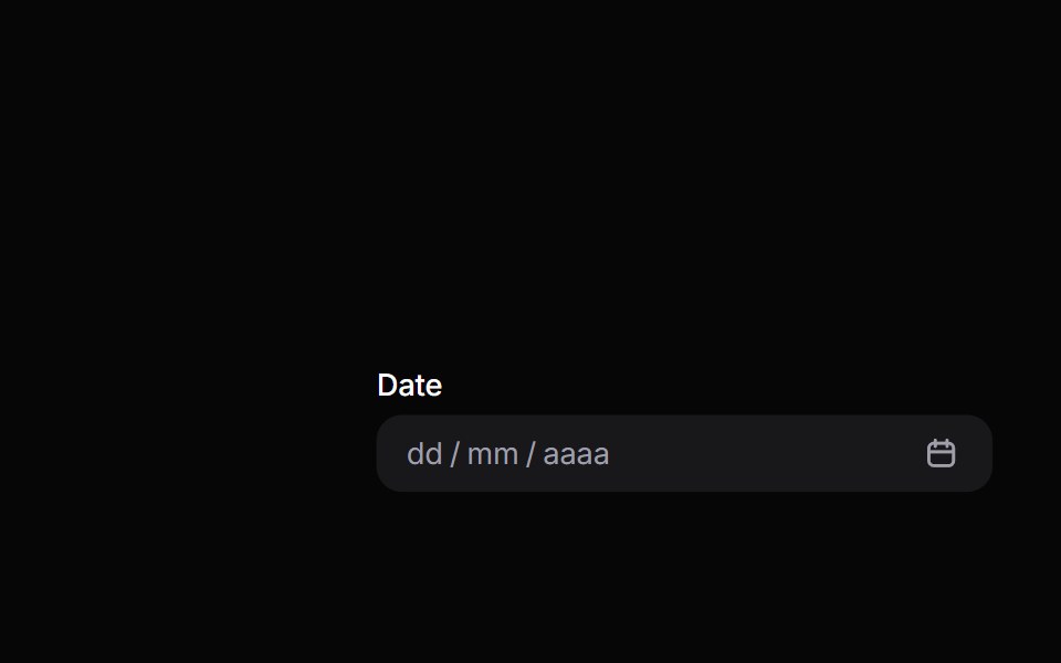 Date PickerHeroUI · ReactComposable date picker built on React Aria DatePicker with DateField and Calendar composition
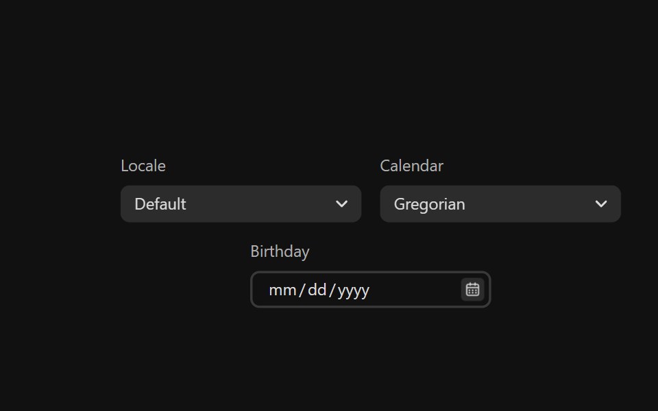 Date PickerReact Spectrum · ReactDatePickers combine a DateField and a Calendar popover to allow users to enter or select a date and time value.
 Preview Cardcoss ui · ReactA popup that appears when a link is hovered, showing a preview for sighted users.
 Comp 381Origin UI · React
 PopoverRadix Themes · React
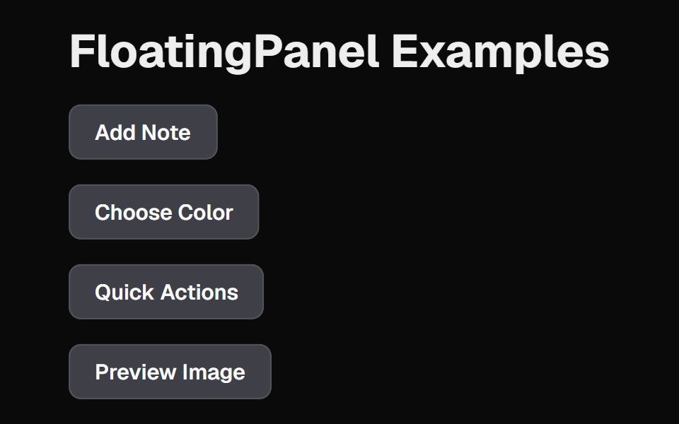 Floating PanelCult UI · ReactFloating panel component with backdrop blur and position-aware animations
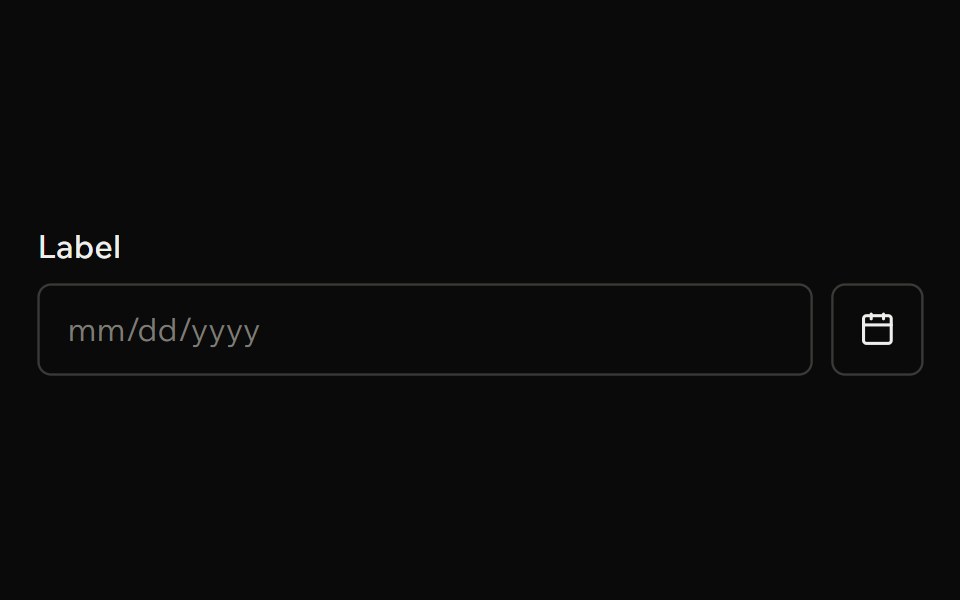 Date PickerArk UI · ReactA component that allows users to select a date from a calendar.
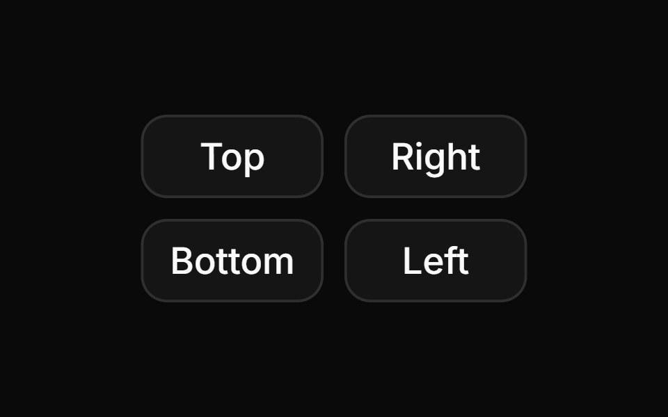 Hover card with positions.ReUI · ReactHover card with positions.
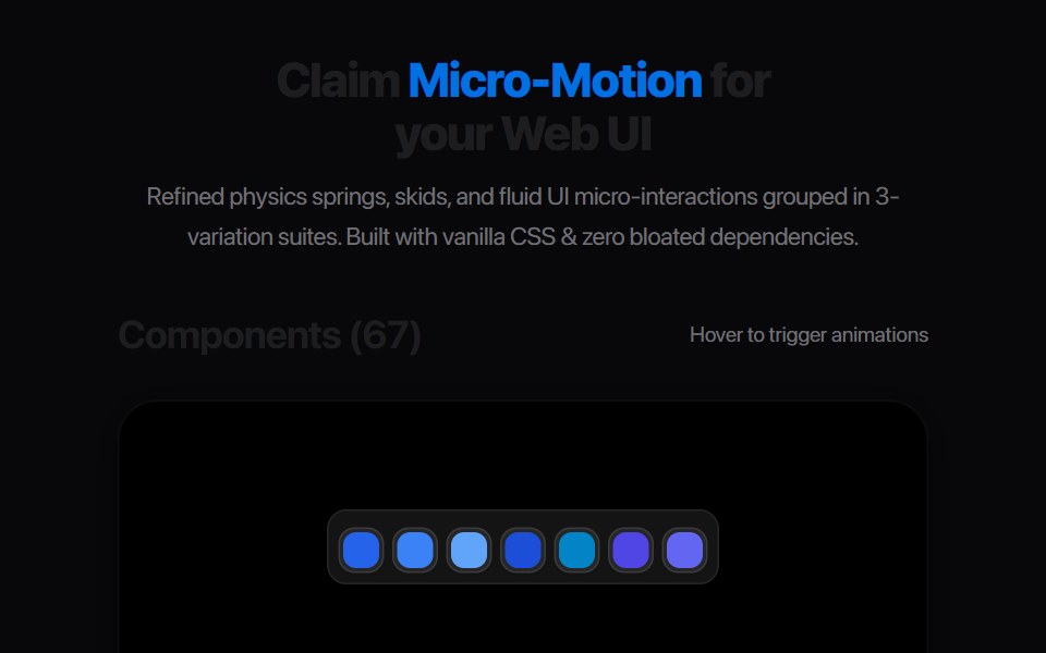 Card Glance PreviewAmicro Micro Transitions · ReactMicro floating glance card popup with status indicator dot.
 Inline CitationAI Elements · ReactA hoverable citation component that displays source information and quotes inline with text, perfect for AI-generated…
 Date PickerPark UI · ReactAn input component for selecting dates with a calendar interface.
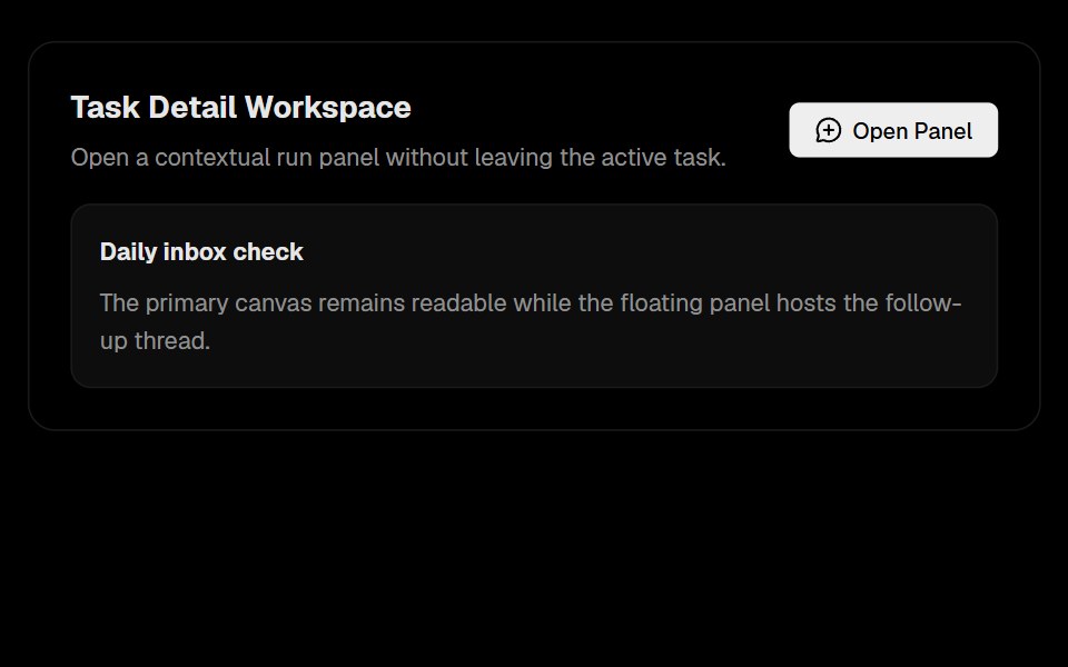 Floating PanelLobe UI · React
 PopoverbeUI · React
 Hover CardTailGrids · ReactA hover card component that displays information when the user hovers over an element.
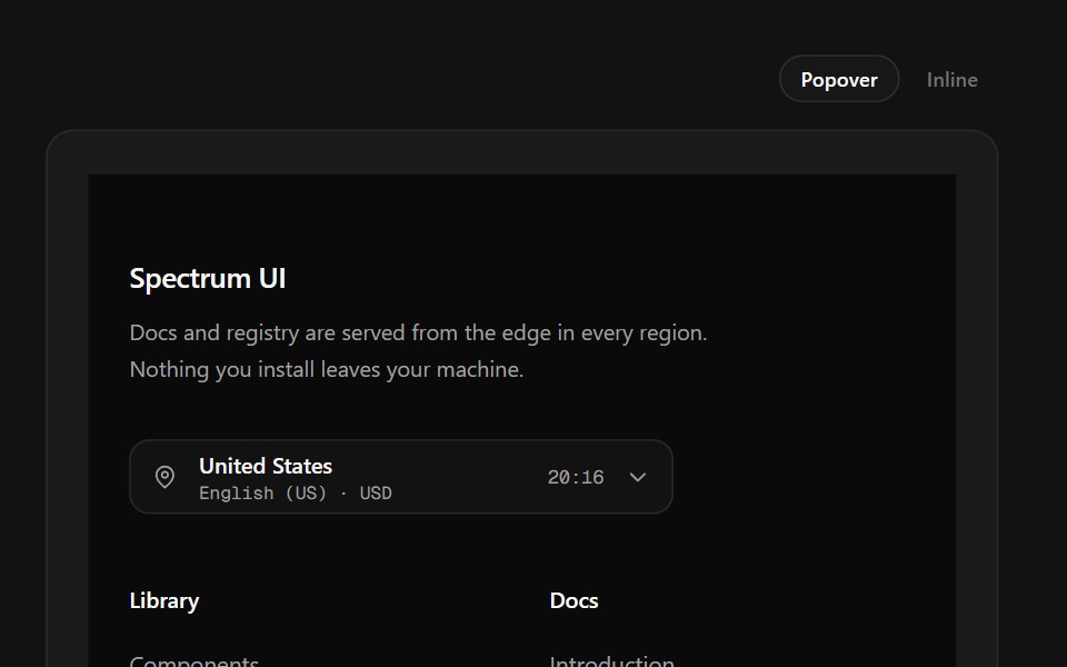 Region Picker FooterSpectrum UI · ReactA region popover with locale, currency, data residency and live local time.
 PopoverVengeance UI · React
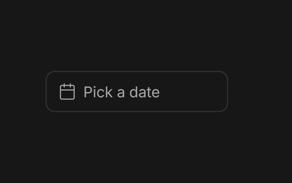 Date PickerFluid Functionalism · ReactField or ghost trigger for a date, a range, or a date and a time: a calendar popover that opens on the selected day…
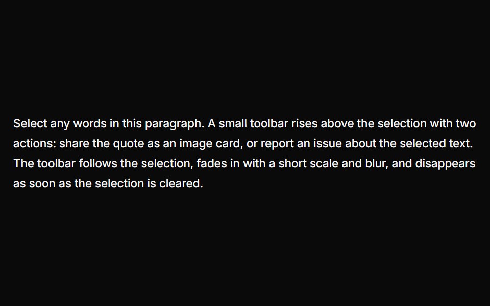 Text Selection PopoverUser Interface Wiki · React
 PopoverToolcraft · React
 Card-02 - Preview CardShadcn Space · ReactCard component
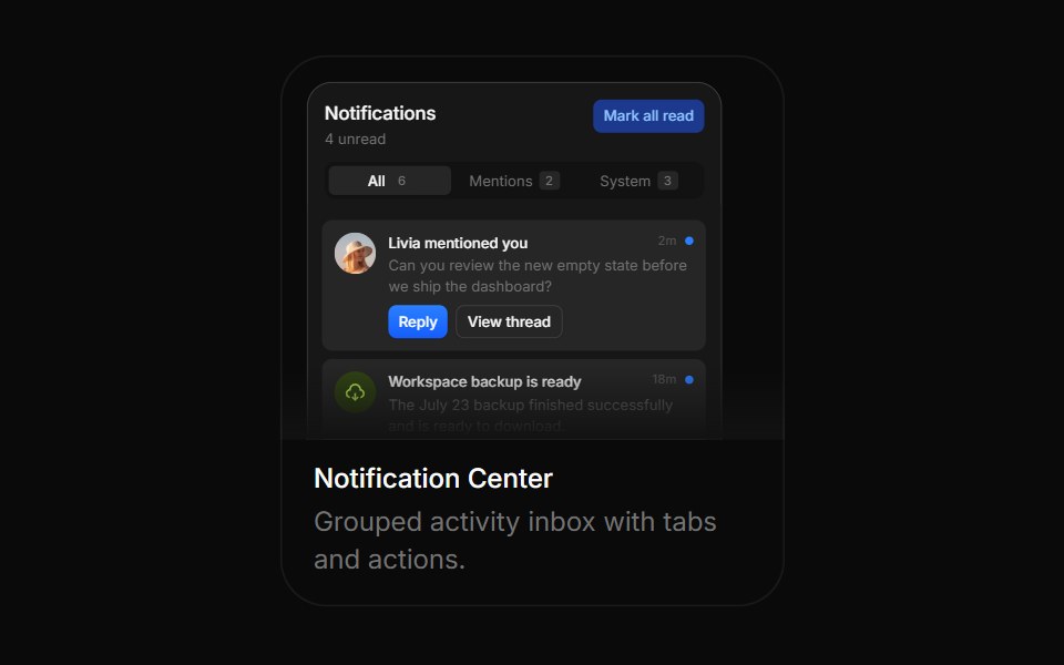 Notification CenterBoardUI · ReactGrouped activity inbox with tabs and actions.
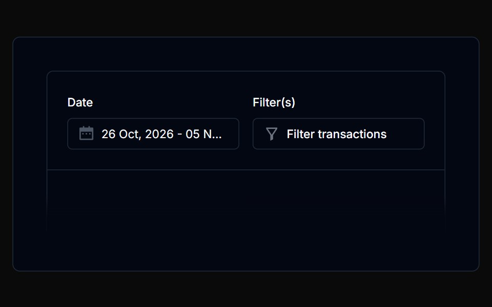 PopoverTremor Blocks · React
 PopoverShadcn Dashboard · React
 PopoverObsidianUI · React
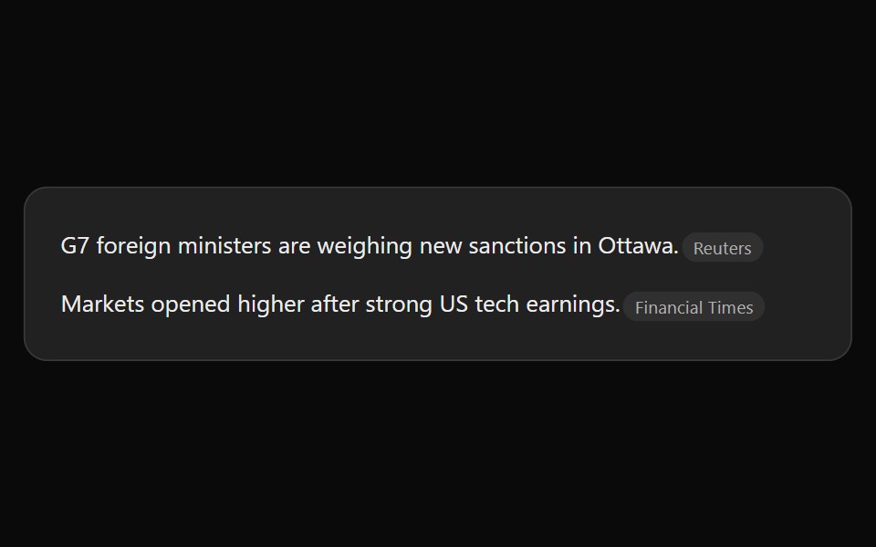 ChatGPT Source ChipNotra · ReactAn inline citation pill with a hover card.
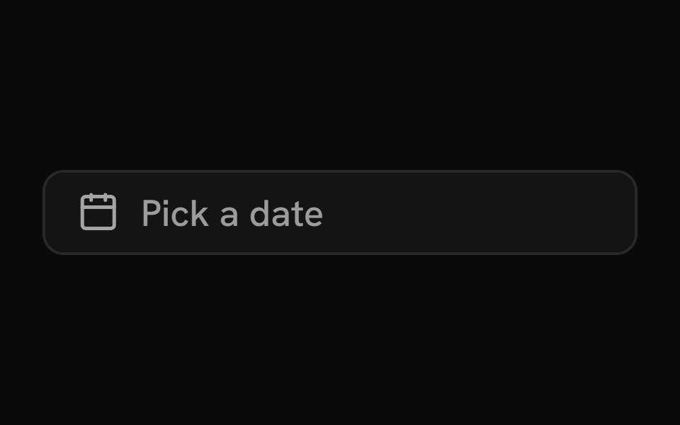 Date PickerShark UI · ReactInput with a built-in calendar.
 Cursor Hover CardSona UI · React
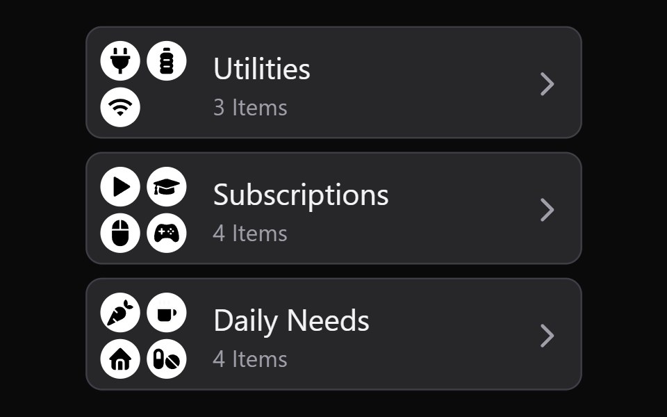 Collection Grid DisclosureWatermelon UI · React
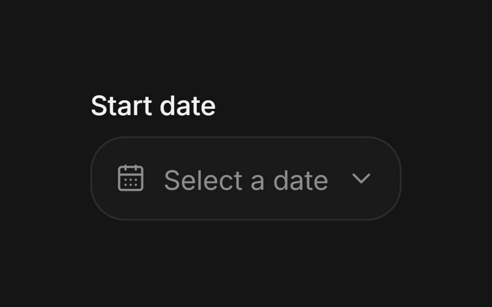 Date pickerArc Library · ReactChoose a date without losing context.
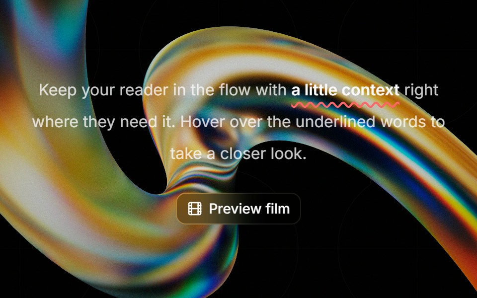 Highlight Phraseglasscn · ReactA smooth glass hover popover for text, video, and rich content, with click and keyboard access.
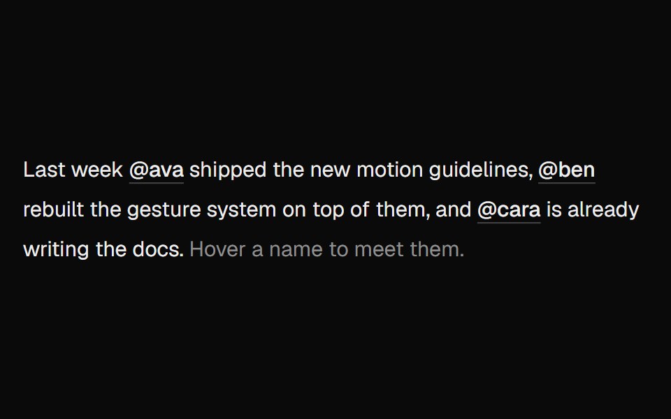 Hover CardUI Lab · ReactOne card travels between names as you hover them.
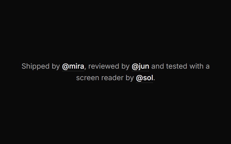 Hover cardHextaUI · ReactA preview card that opens when a link is hovered or focused, for content sighted users can glance at.
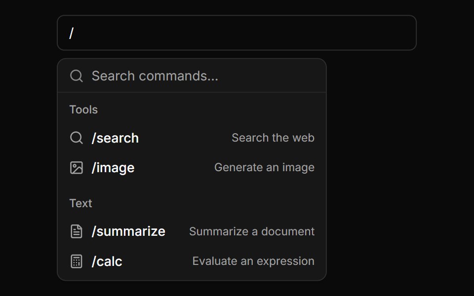 Slash Command PaletteLocalMode · ReactA '/'-triggered command palette over a local tool/command list — name, category, description, and icon — to layer onto…
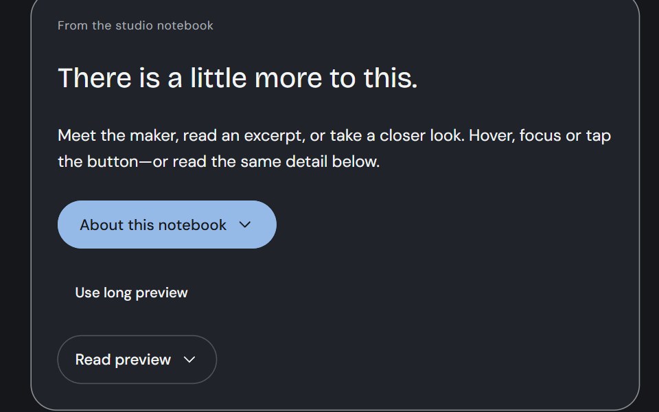 Hover CardCojeev UI · ReactA person, an excerpt or a small visual study—three considered previews, close to the thing you are exploring.
 With headerFLX UI · ReactPopover with a bold title and a short description below it.
 Hover CardHalaska UI · React
 PopoverMetal UI · React + SwiftUIA small panel that comes out of its trigger: the menu's frosted plate rising one nest from the trigger's side on the…
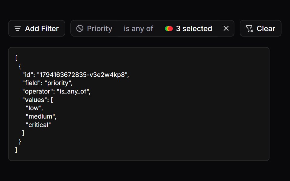 FiltersSpaceUI · ReactProvides a filter bar with badges and active tags, allowing users to narrow down search results by multiple criteria…
 Aria PopoverReScript shadcn · ReScript
 PopoverOUI · ReactReact aria components Popover with shadcn characteristics.
 PopoverD2Studio UI · ReactDisplays rich content in a portal, triggered by a button.
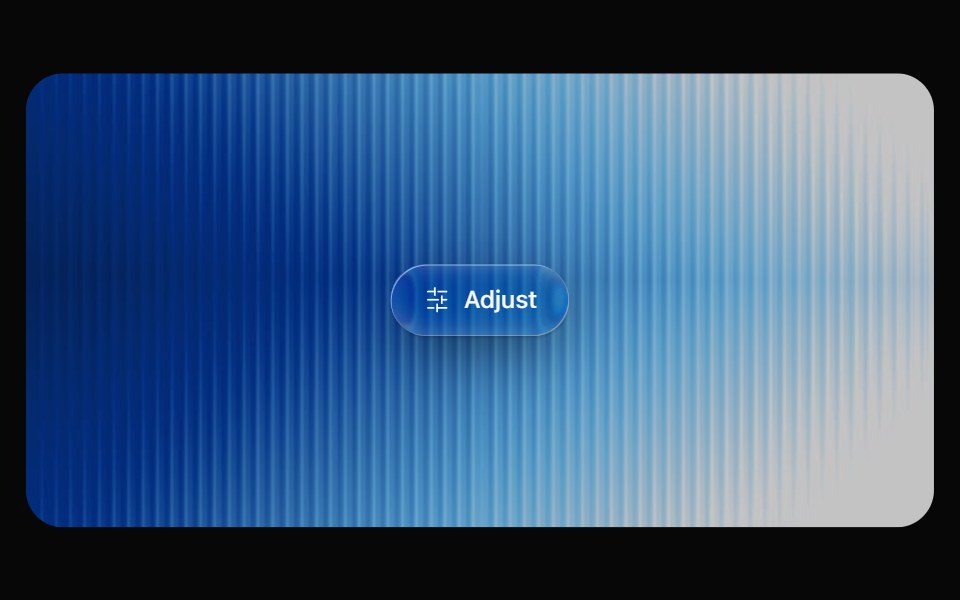 Glass PopoverOpaline · ReactRich popover content on a frosted glass surface.
 Hover CardReactFrame · ReactA hover-triggered rich preview card with open/close delays, a hover bridge so moving into the card keeps it open…
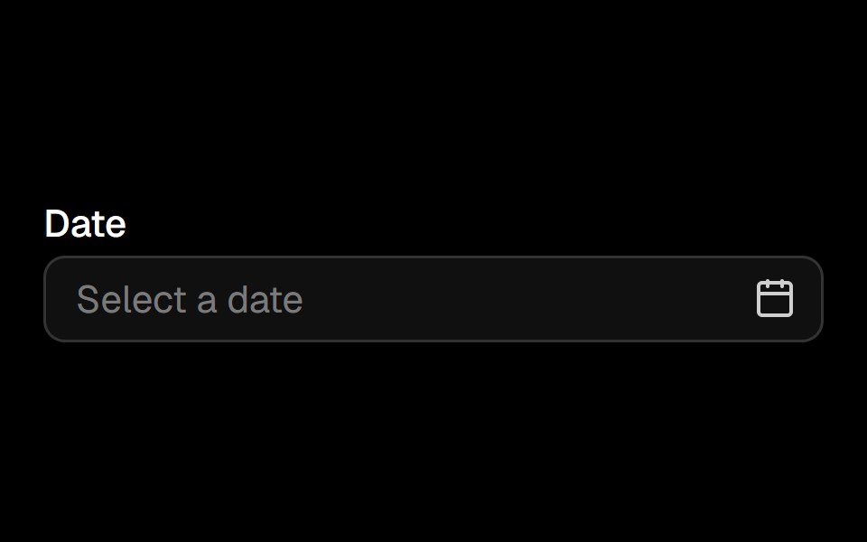 Date Pickerark-cn · ReactA shadcn-style date picker component built with Ark UI primitives.
 Sidebar 10shadcn/ui · ReactA sidebar in a popover.
 Hover CardChakra UI · ReactUsed to display content when hovering over an element
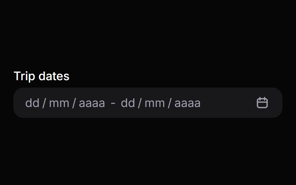 Date Range PickerHeroUI · ReactComposable date range picker built on React Aria DateRangePicker with DateField and RangeCalendar composition
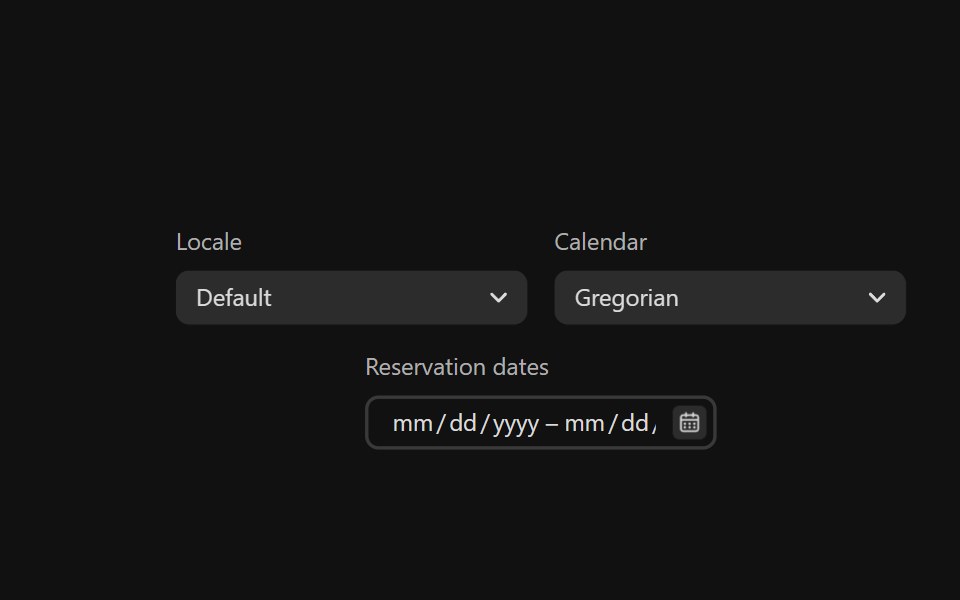 Date Range PickerReact Spectrum · ReactDateRangePickers combine two DateFields and a RangeCalendar popover to allow users to enter or select a date and time…
 Comp 382Origin UI · React
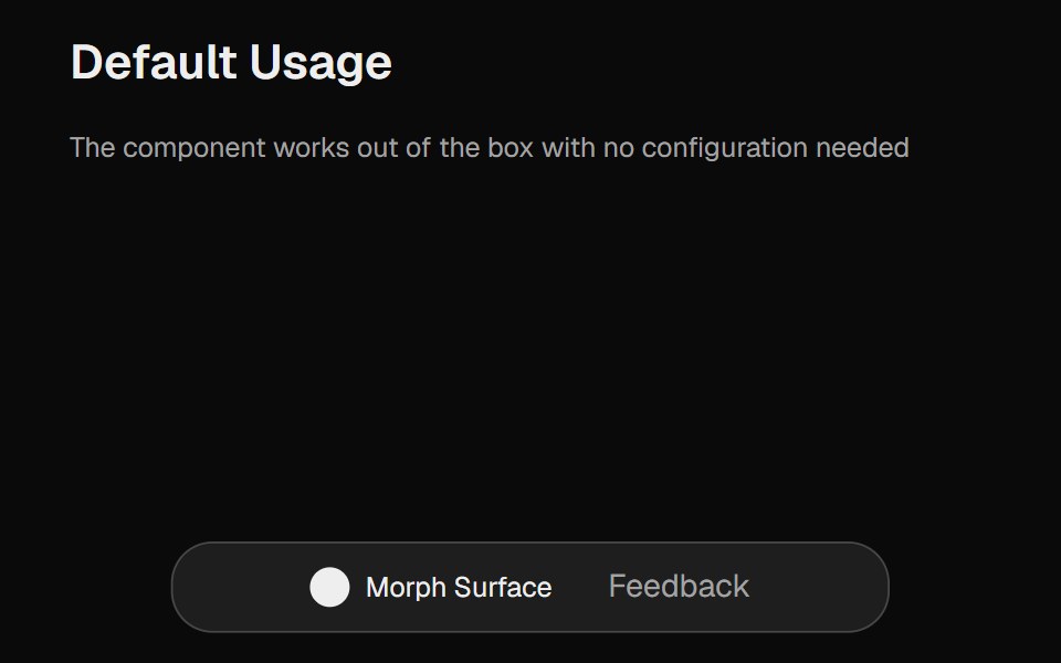 Morph SurfaceCult UI · ReactA morphing surface component with smooth animations, customizable dimensions, and configurable content
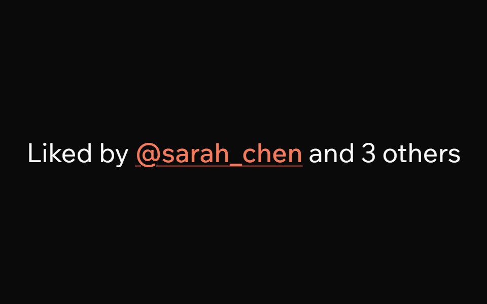 Hover CardArk UI · ReactA card that appears when a user hovers over an element.
 Hover card with profile information.ReUI · ReactHover card with profile information.
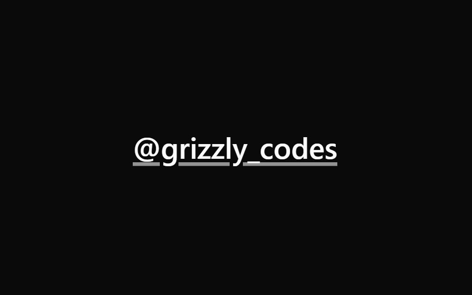 Hover CardPark UI · ReactA popover component that displays content when hovering over an element.
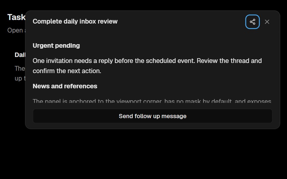 Base Ui Floating PanelLobe UI · React
 Popover PositionbeUI · React
 PopoverTailGrids · ReactA popover component that displays content in a floating container.
 Date PickerFluid Functionalism · ReactField or ghost trigger for a date, a range, or a date and a time: a calendar popover that opens on the selected day…
Libraries with React popover components
Related categories
- Popover Components
- Tailwind CSS Popover Components
- Animated Popover Components
- shadcn/ui Popover Components
- React Overlay Components
- React Modal Components
- React Tooltip Components
- React Toast Components
- React Drawer Components
- React Hover Card Components
- React Alert Dialog Components
- React Bottom Sheet Components
- React Dynamic Island Components
- React Tour Components
- React Lightbox Components
- React Mini Player Components