Tooltip
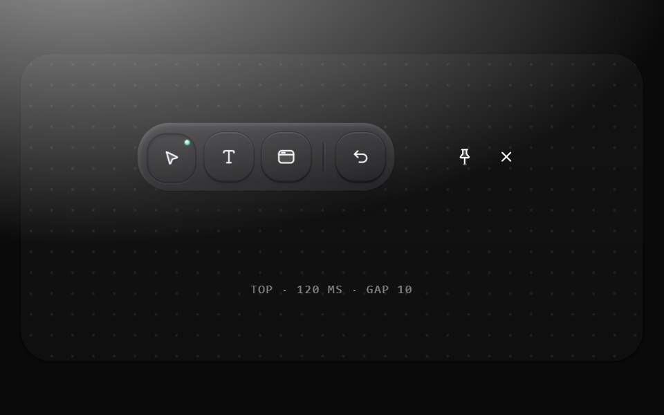
Names an icon-only control and its key: a graphite pill chip in the label role, SELECT · V with the key dimmed, 10 from the trigger after 120 ms, grouped so the next trigger shows at once; flips near the edge; fades on settle. Built on Base.
- Library
- Metal UI
- Framework
- React + SwiftUI
- Type
- ui
- License
- MIT
- Dependencies
- @base-ui/react@^1.8.0
- Files
packages/metalui/src/components/tooltip/tooltip.tsxpackages/metalui/src/motion/awake.tspackages/metalui/src/motion/duration.tspackages/metalui/src/motion/haptic.tspackages/metalui/src/motion/hop.tspackages/metalui/src/motion/indicator.tsxpackages/metalui/src/motion/layout-effect.tspackages/metalui/src/motion/leave.ts
- Source
- https://github.com/vijayksingh/metalui
Categories
- Overlay Components
- React Overlay Components
- Tailwind CSS Overlay Components
- Tooltip Components
- React Tooltip Components
- Tailwind CSS Tooltip Components