 Dev Design Library
Tailwind CSS Alert Dialog Components
Dev Design Library indexes 50 Tailwind CSS alert dialog components from 27 open-source UI libraries, with the most coming from ReUI, Watermelon UI, FLX UI, sv-particles and glasscn. Each one links to its page with the source code, a live preview where available, the library license and the install command. Every library in this list styles its components with Tailwind CSS utility classes. Alert dialog components belong to the Overlays group.
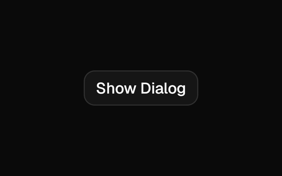 Alert Dialogshadcn/ui · ReactA modal dialog that interrupts the user with important content and expects a response.
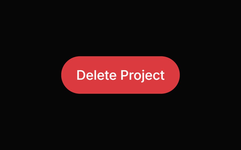 Alert DialogHeroUI · ReactModal dialog for critical confirmations requiring user attention and explicit action
 Alert DialogReact Spectrum · ReactAlertDialogs are a specific type of Dialog. They display important information that users need to acknowledge.
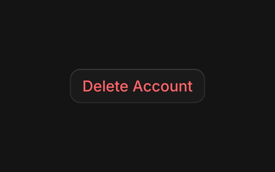 Alert Dialogcoss ui · ReactA dialog that requires user response to proceed.
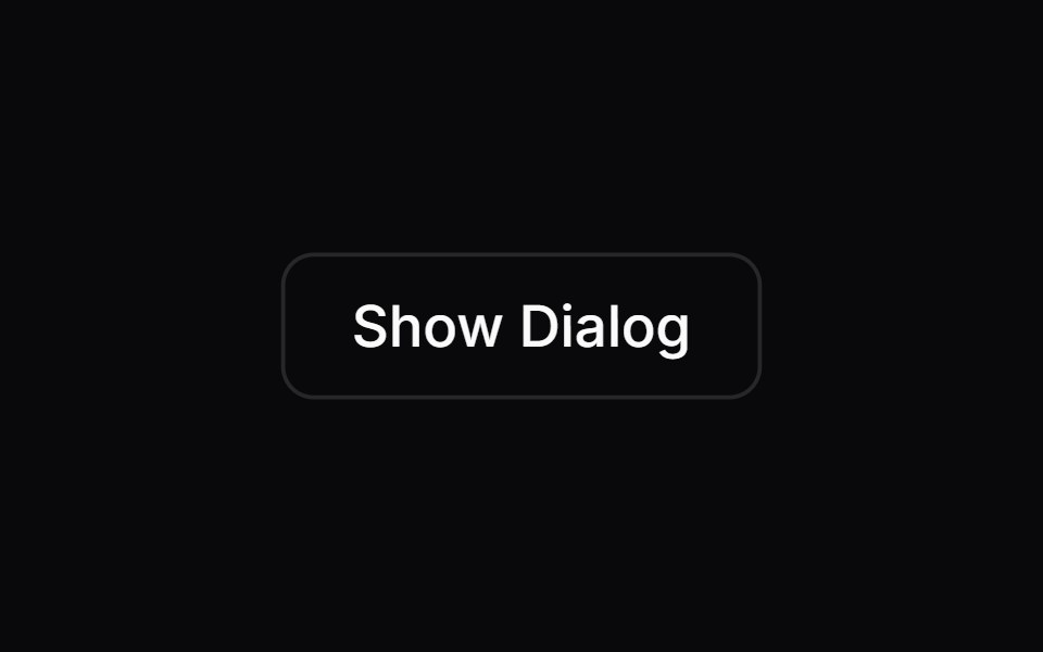 Alert DialogOrigin UI · ReactA dialog that requires user response to proceed.
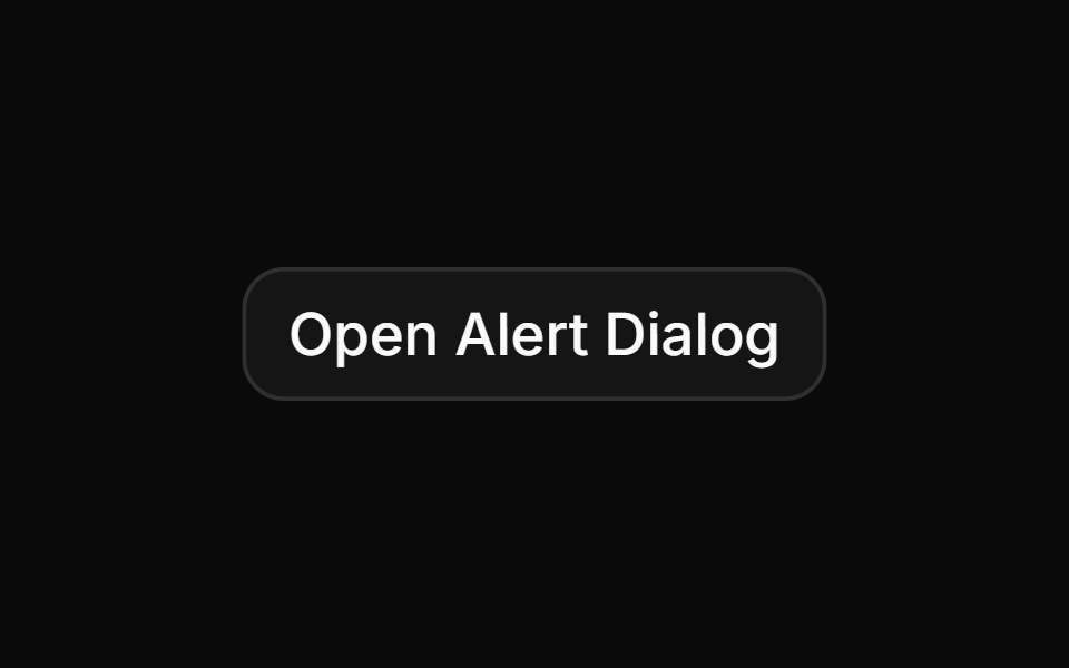 Basic alert dialog with title, description, and action buttonsReUI · ReactBasic alert dialog with title, description, and action buttons
 dialogIntent UI · Reactdialog
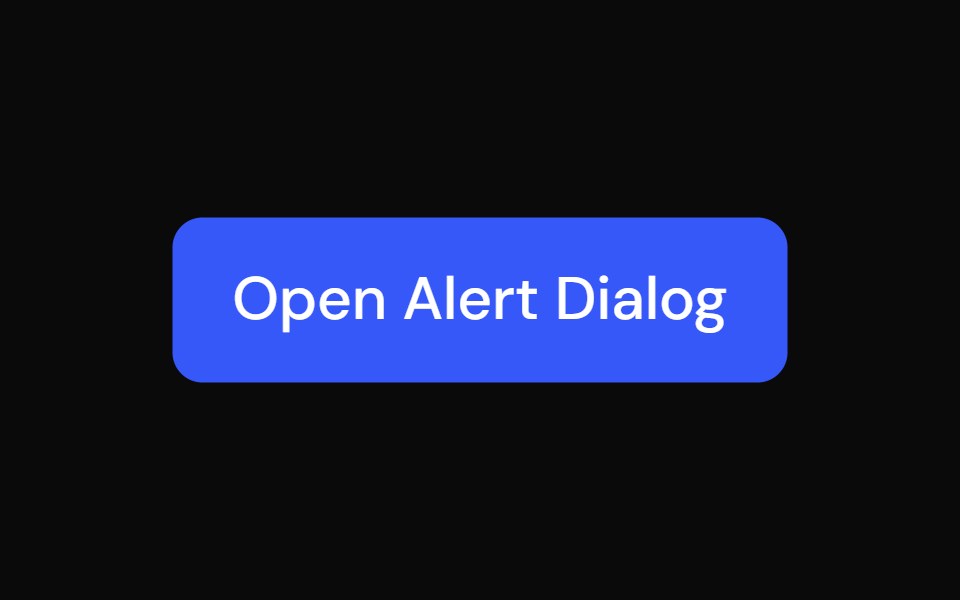 Alert DialogTailGrids · ReactA modal dialog that interrupts the user with important content and expects a response.
 Alert DialogToolcraft · React
 Web Alert DialogPanel UI · React Native
 Alert DialogShadcn Dashboard · React
 Alert DialogShark UI · ReactDialog for displaying important content.
 DoubtButtonEvil Buttons · ReactAn escalating-confirmation button that makes you click through increasingly absurd, guilt-tripping prompts before the…
 Alert DialogWatermelon UI · React
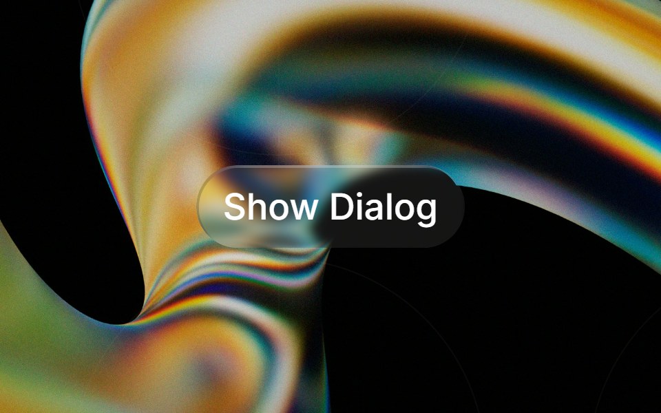 Glass Alert Dialogglasscn · ReactGlass Alert Dialog with five variants: clear, frosted, subtle, liquid, and liquid-refract
 Alert dialogHextaUI · ReactA confirmation dialog for destructive or important actions that waits for async work, and becomes a bottom sheet on…
 Alert DialogCojeev UI · ReactPauses a workflow for a focused confirmation before a consequential action proceeds.
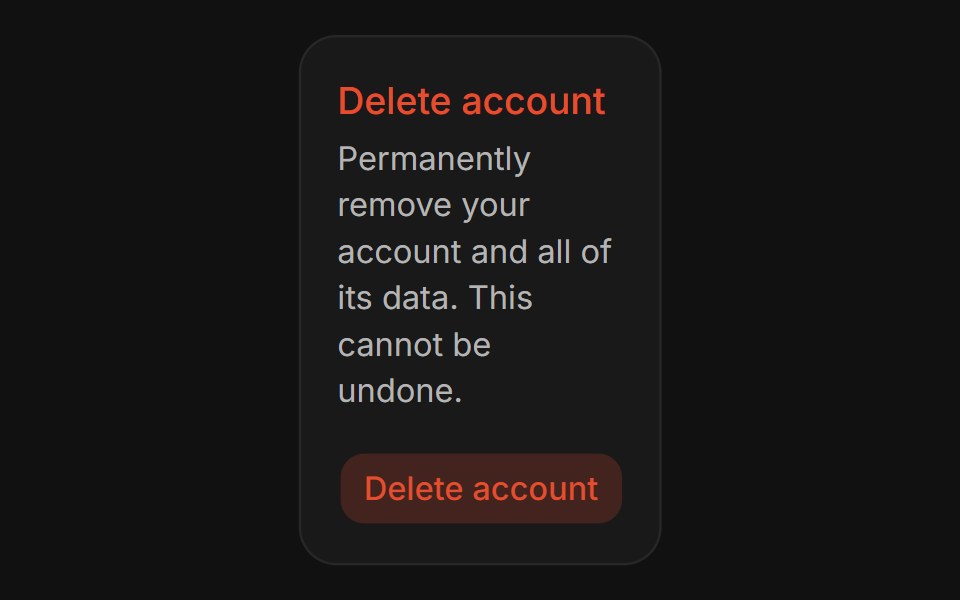 Confirm DialogFLX UI · ReactConfirm Dialog for Delete Account.
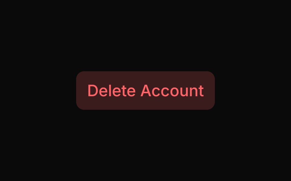 Alert Dialog With Bare Footersv-particles · Svelte
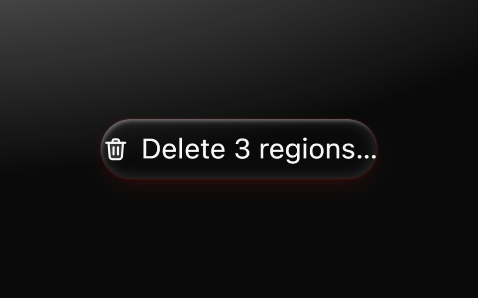 Alert dialogMetal UI · React + SwiftUIA question that must be answered: the dialog's plate and motion; a click outside shakes it once on the refusal spring…
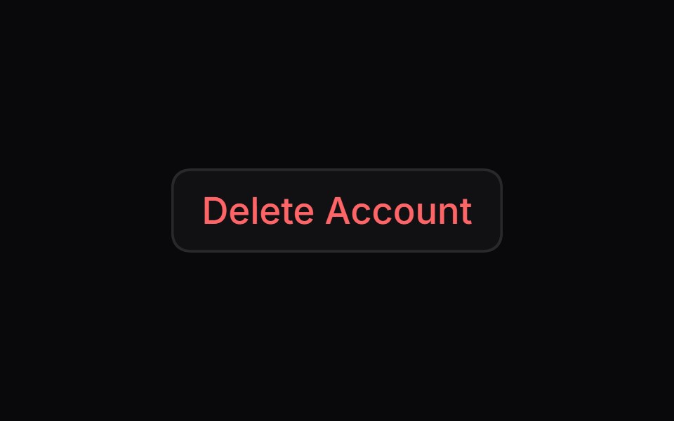 Alert DialogSpaceUI · ReactDisplays a modal window that asks users to confirm important actions before proceeding, helping prevent accidental…
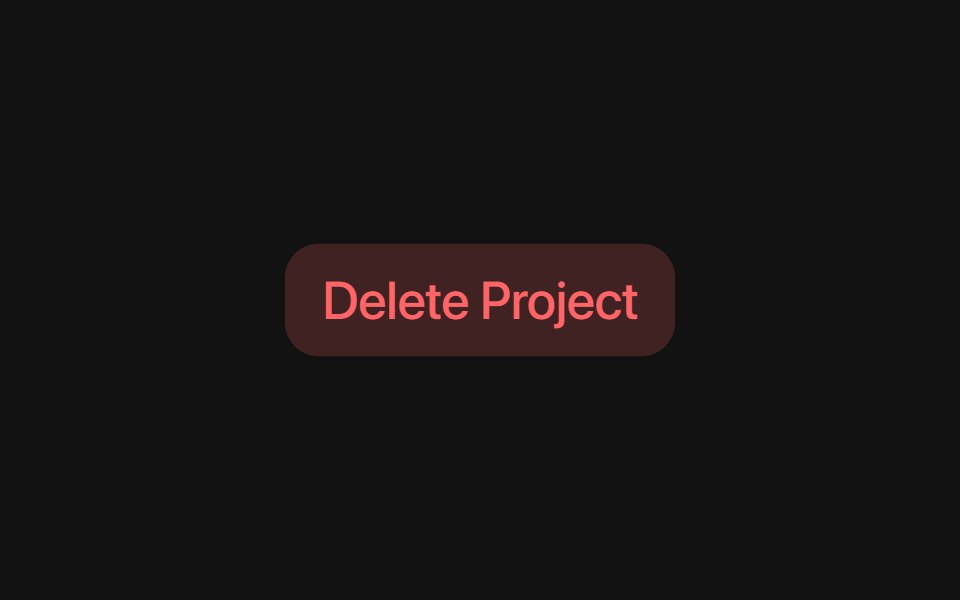 Base Alert DialogSora UI · ReactAn accessible alert dialog built on Base UI with smooth Motion 3D perspective entrance and exit animations…
 Alert DialogD2Studio UI · ReactA modal dialog that interrupts the user with important content and expects a response.
 Glass DialogOpaline · ReactModal on a frosted glass sheet with springy transform-only motion.
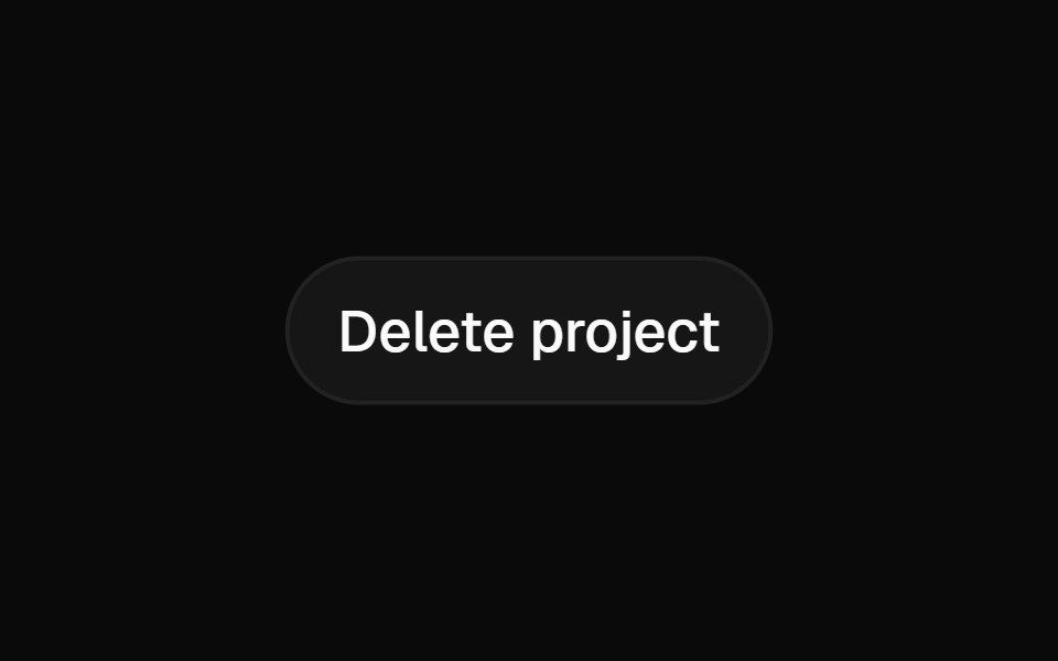 Alert DialogFibo · ReactAsks for a decision before something that can't be undone, with Cancel focused and no click-outside dismiss.
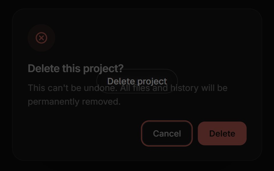 Confirm DialogReactFrame · ReactA focused alert dialog for confirming an action, with default/warning/danger variants, an async-aware confirm button…
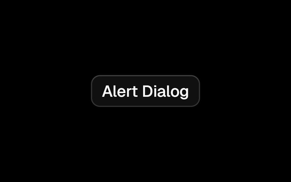 Alert Dialogark-cn · ReactA shadcn-style alert dialog component built with Ark UI primitives.
 Tailwind Alert DialogReact Spectrum · React
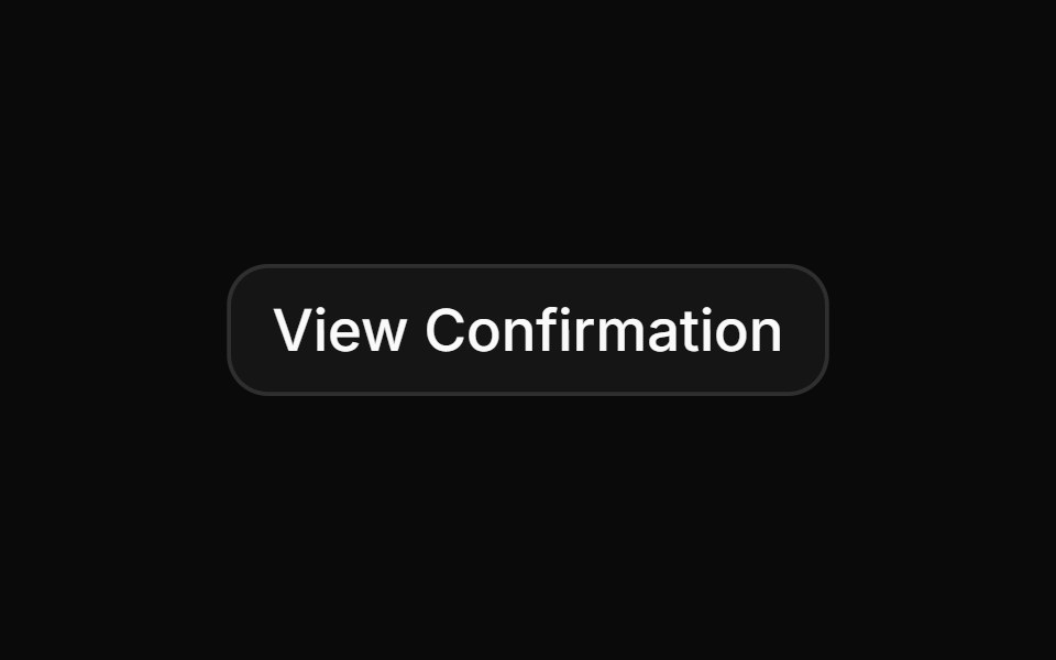 Confirmation for successful e-ticket registrationReUI · ReactConfirmation for successful e-ticket registration
- modalIntent UI · Reactmodal
 Alert Dialog 01Watermelon UI · React
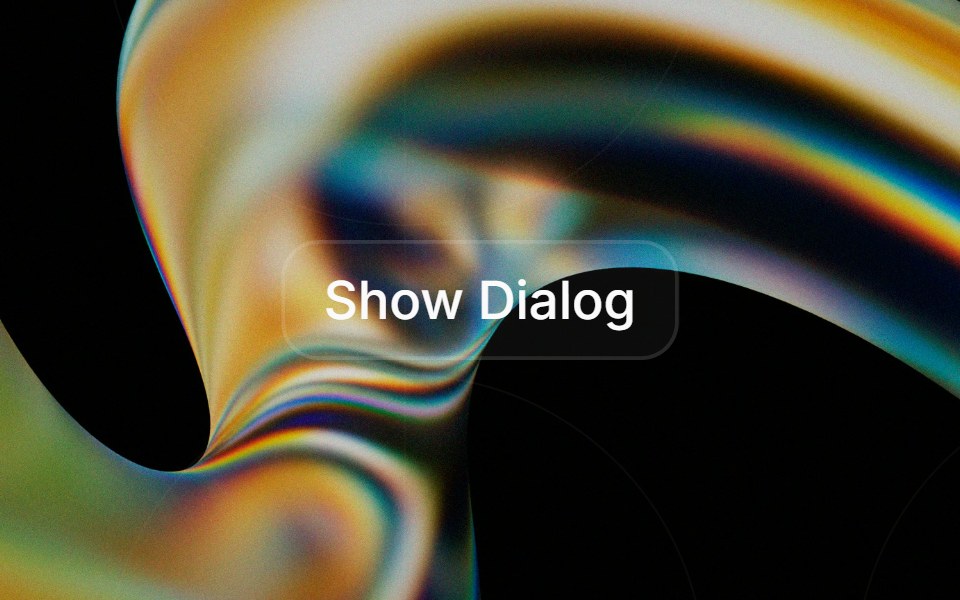 Alert Dialogglasscn · React
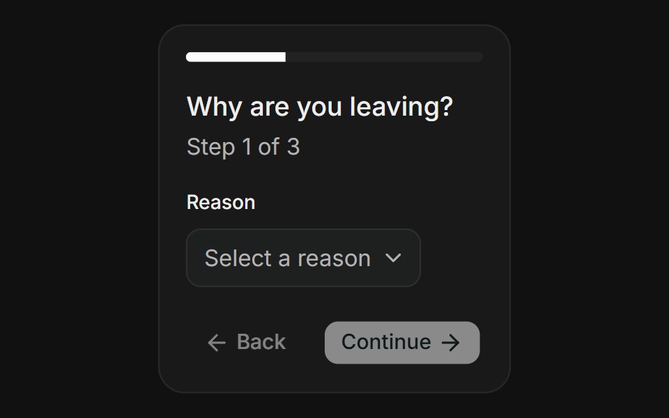 Multi-StepFLX UI · ReactMulti-Step for Delete Account.
 Basic Alert Dialogsv-particles · Svelte
 Radix Alert DialogSora UI · ReactAn accessible alert dialog built on Radix UI with smooth Motion 3D perspective entrance and exit animations…
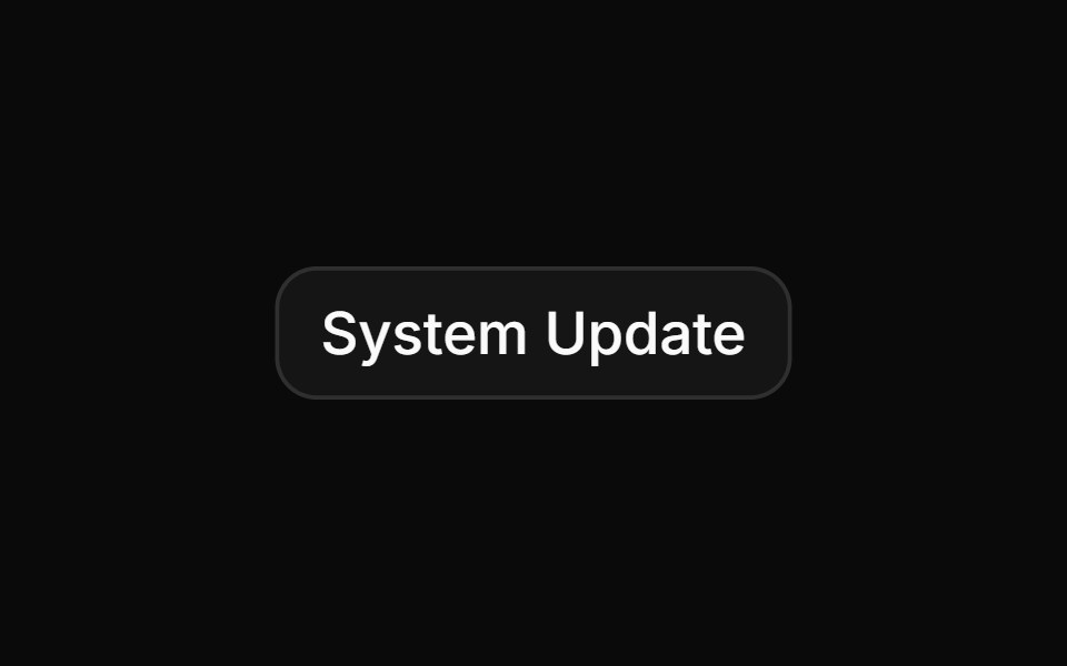 System update notification requiring application restartReUI · ReactSystem update notification requiring application restart
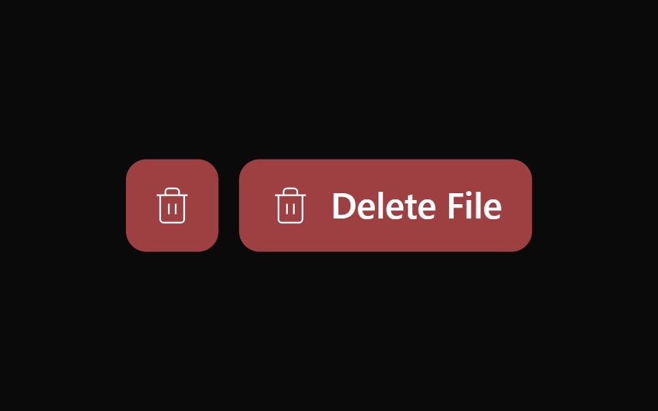 Alert Dialog 02Watermelon UI · React
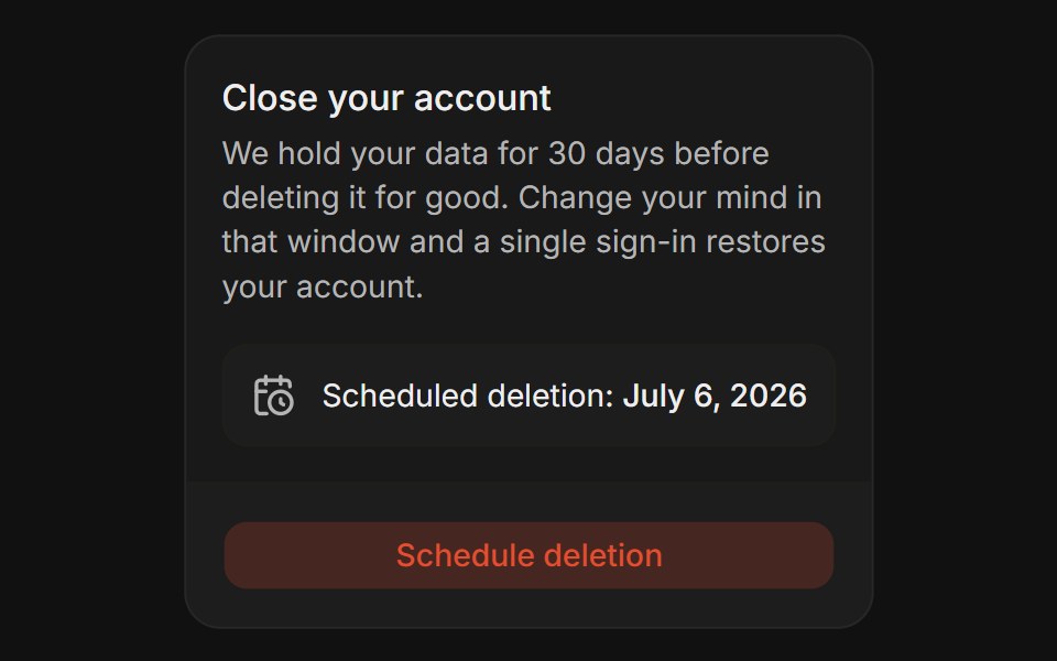 Grace PeriodFLX UI · ReactGrace Period for Delete Account.
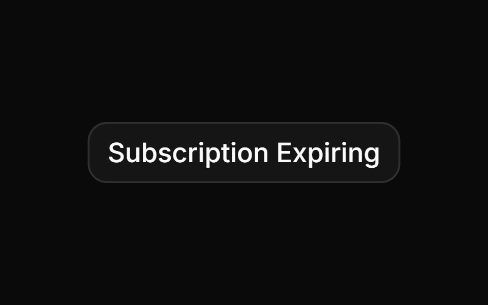 Billing warning for expired subscriptions or failed paymentsReUI · ReactBilling warning for expired subscriptions or failed payments
 Alert Dialog 03Watermelon UI · React
 Logout confirmation dialogReUI · ReactLogout confirmation dialog
 Advanced security audit confirmationReUI · ReactAdvanced security audit confirmation
 Small size alert dialog for quick confirmationsReUI · ReactSmall size alert dialog for quick confirmations
 Alert dialog with iconReUI · ReactAlert dialog with icon
 Small size alert dialog with media (icon)ReUI · ReactSmall size alert dialog with media (icon)
 Destructive alert dialog for irreversible actions like deletionReUI · ReactDestructive alert dialog for irreversible actions like deletion
 Alert dialog nested within a standard Dialog componentReUI · ReactAlert dialog nested within a standard Dialog component
 Task success confirmationReUI · ReactTask success confirmation
 Account deactivation confirmationReUI · ReactAccount deactivation confirmation
 Warning for unsaved changes when navigating awayReUI · ReactWarning for unsaved changes when navigating away
Libraries with Tailwind CSS alert dialog components
Related categories
- Alert Dialog Components
- React Alert Dialog Components
- Animated Alert Dialog Components
- shadcn/ui Alert Dialog Components
- Tailwind CSS Overlay Components
- Tailwind CSS Modal Components
- Tailwind CSS Popover Components
- Tailwind CSS Tooltip Components
- Tailwind CSS Toast Components
- Tailwind CSS Drawer Components
- Tailwind CSS Hover Card Components
- Tailwind CSS Bottom Sheet Components
- Tailwind CSS Tour Components
- Tailwind CSS Dynamic Island Components
- Tailwind CSS Cookie Banner Components
- Tailwind CSS Lightbox Components