 Dev Design Library
Tailwind CSS Drawer Components
Dev Design Library indexes 89 Tailwind CSS drawer components from 42 open-source UI libraries, with the most coming from ReUI, Watermelon UI, Shadcn Space, Cojeev UI and Vengeance UI. Each one links to its page with the source code, a live preview where available, the library license and the install command. Every library in this list styles its components with Tailwind CSS utility classes. Drawer components belong to the Overlays group.
 Drawershadcn/ui · ReactA drawer component for React.
 DrawerdaisyUI · CSS (Tailwind)
 DrawerHeroUI · ReactSlide-out panel for supplementary content and actions
 Tailwind SheetReact Spectrum · React
 Drawercoss ui · ReactA panel that slides in from the edge of the screen with swipe gestures, snap points, and nested drawer support.
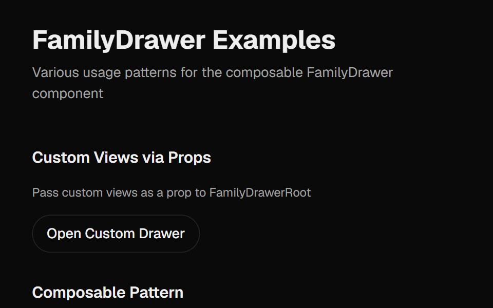 Family DrawerCult UI · ReactA multi-view drawer component with smooth animations, view navigation, and customizable content views
 DrawerTremor · React
 A basic drawer with scrollable contentReUI · ReactA basic drawer with scrollable content
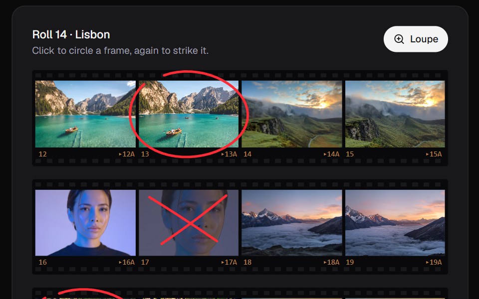 Contact SheetKokonut UI · ReactPick from a shoot the way photographers do. Circle a frame in china marker, click again to strike it, and look through…
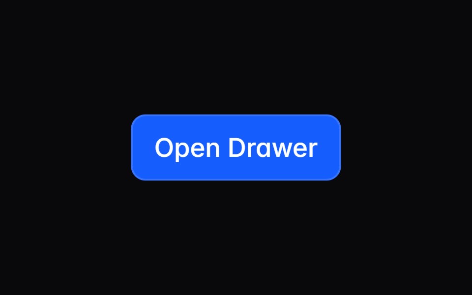 drawerIntent UI · Reactdrawer
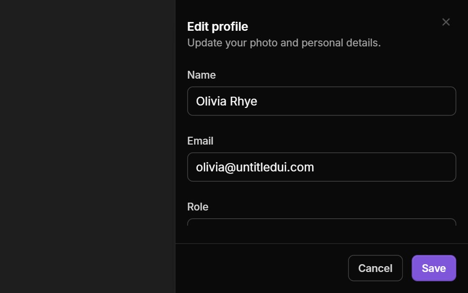 Slideout MenusUntitled UI React · React
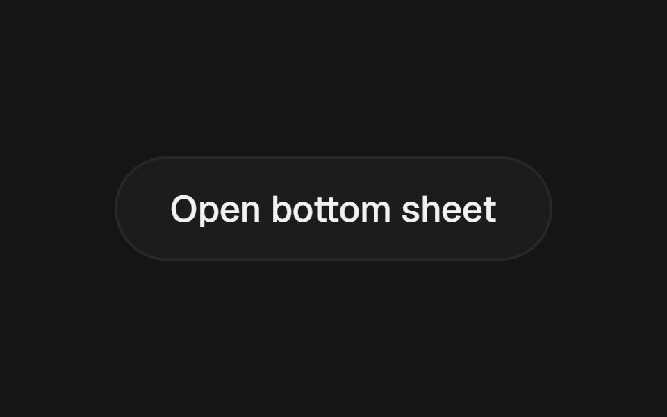 Bottom SheetbeUI · ReactVaul-inspired draggable bottom sheet with snap points, inertia and glass surface.
 DrawerTailGrids · ReactA drawer component that slides in from the edge of the screen, typically used for navigation or displaying additional…
 Family DrawerRare UI · ReactA bottom drawer with smooth, morphing transitions between stacked views, inspired by the Family app. Built on Vaul.
 Animated DrawerSpectrum UI · Reactcomponent for the Animated Drawer
 Share SheetVengeance UI · ReactAnimated share dialog with direct sharing, copy-link feedback, and a downloadable QR code
 Mobile DrawerFluid Functionalism · ReactSlide-in navigation drawer with scrim, focus trap, and scroll lock. Radix flavor.
 SheetToolcraft · React
 Navbar SectionLaunch UI · React
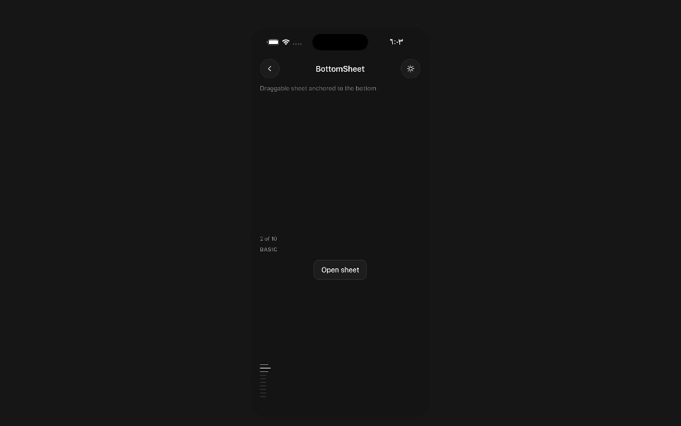 Bottom SheetPanel UI · React NativeDraggable sheet anchored to the bottom of the screen.
 Drawer 03 - Filters PanelShadcn Space · ReactLeft side filter drawer with category checkboxes, a price range slider, an in stock switch, a live result count, and…
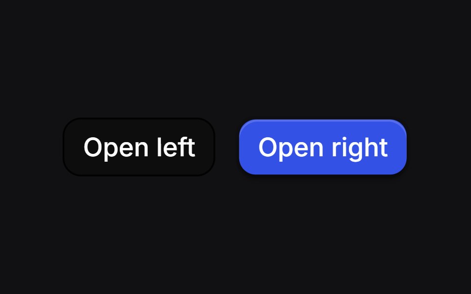 Curve Draweruselayouts · ReactSide drawers whose inner edge starts as a bulge and morphs into a straight line as the panel settles.
 DrawerTremor Blocks · React
 DrawerShadcn Dashboard · React
 DrawerObsidianUI · React
 ChatGPT ActivityNotra · ReactThe search activity and sources side sheet, built on shadcn Sheet, Badge and Avatar.
 DrawerShark UI · ReactA sliding panel with swipe support.
 DrawerWatermelon UI · React
 Sheetglasscn · React
 SheetUI Lab · ReactDrag it down or flick it away; pull it up and it pushes back.
 DrawerHextaUI · ReactA panel that slides in from any edge and follows your finger, with snap points, a working handle and nested drawers…
 DevTools Drawer BlockLocalMode · ReactA global on-device observability drawer: six tabbed surfaces (inference queues, event log, pipeline runs, model cache…
 DrawerCojeev UI · ReactPresents dialog content in a drawer surface while keeping the current page underneath.
 SheetMetal UI · React + SwiftUIA panel that slides in from an edge (right or bottom) on the surface spring, follows a drag one to one, and leaves on…
 DrawerSpaceUI · ReactSlides an interactive panel in from the edge of the screen, giving users quick access to secondary tools, forms, or…
 SheetOUI · ReactA className function to style a react aria components Modal as a shadcn Sheet.
 DrawerD2Studio UI · ReactA drawer component that slides in from the bottom or sides of the screen.
 DrawerEaseUI · ReactSheet that slides up from the bottom edge on the native dialog element. Drag the handle down, or flick it, to dismiss.
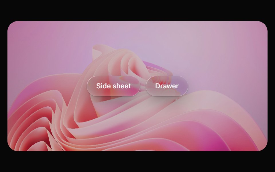 Glass SheetOpaline · ReactFloating side sheet, or a drag-to-dismiss bottom drawer with side="bottom".
 SheetFibo · ReactA panel that slides in from an edge for a focused task.
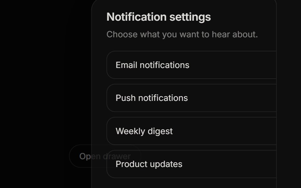 DrawerReactFrame · ReactAn accessible slide-in drawer from any of 4 sides with a backdrop, focus trap, Escape and backdrop close, scroll lock…
 Sheetark-cn · ReactA shadcn-style sheet component built with Ark UI primitives.
 Sheetshadcn/ui · ReactExtends the Dialog component to display content that complements the main content of the screen.
 SheetHeroUI · ReactSwipeable overlay with native scroll snapping, partial positions, and nested sheets
 Vanilla SheetReact Spectrum · React
 Sheetcoss ui · ReactA flyout that opens from the side of the screen, based on the dialog component.
 Side PanelCult UI · ReactSliding side panel component with customizable positioning and animations
 A drawer that opens from the right sideReUI · ReactA drawer that opens from the right side
 Smooth DrawerKokonut UI · ReactCheckout bottom sheet on Vaul snap points, peeking at the total and dragging up for details.
 sheetIntent UI · Reactsheet
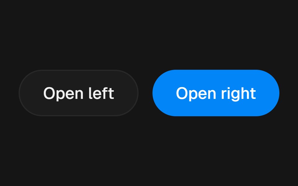 DrawerbeUI · ReactSide panel that slides in from the left or right with a spring, backdrop blur, body scroll lock and esc-to-close.
 SheetTailGrids · ReactA sheet component that slides in from the edge of the screen, typically used for navigation or displaying additional…
 Responsive ModalSpectrum UI · Reactcomponent for the Responsive Modal
 DrawerVengeance UI · React
 Mobile DrawerFluid Functionalism · ReactSlide-in navigation drawer with scrim, focus trap, and scroll lock. Base UI flavor.
 SheetLaunch UI · React
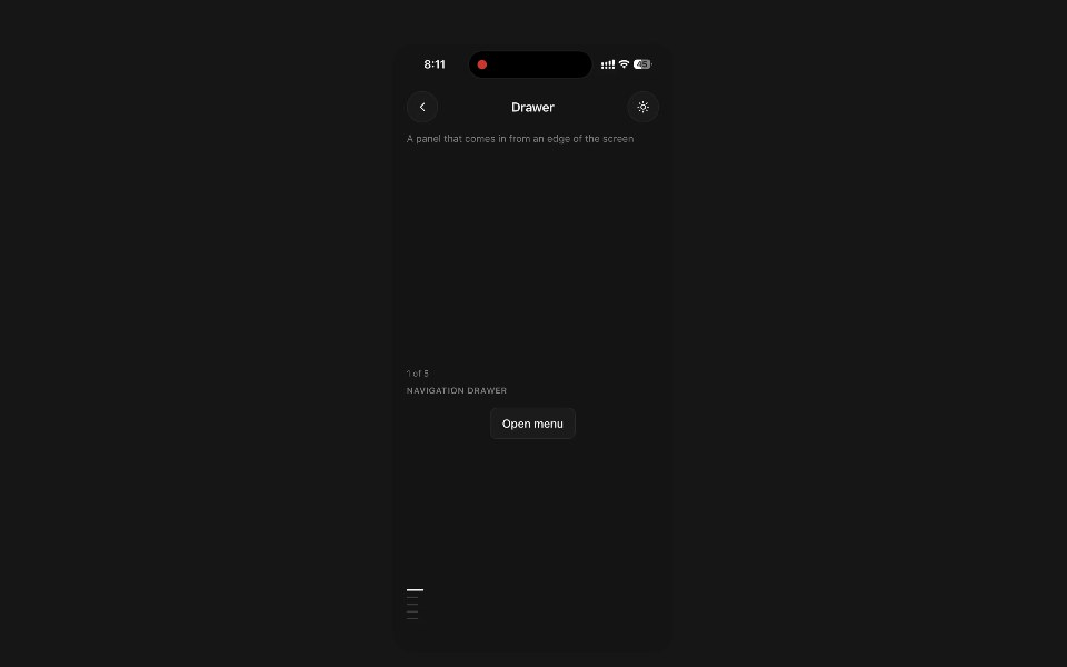 DrawerPanel UI · React NativeA panel that comes in from an edge of the screen and covers the app until dismissed.
 Drawer 05 - Snap Points Order TrackingShadcn Space · ReactBottom drawer with peek, half, and full snap points showing delivery ETA, rider contact, a status timeline, and the…
 Drawer Buttonsuselayouts · ReactTwo buttons that open side drawers with a 3D fold. Payment comes from the right, cart from the left, and the fields…
 SheetShadcn Dashboard · React
 SheetObsidianUI · React
 SheetShark UI · ReactContent that slides in from the screen edge.
 SheetWatermelon UI · React
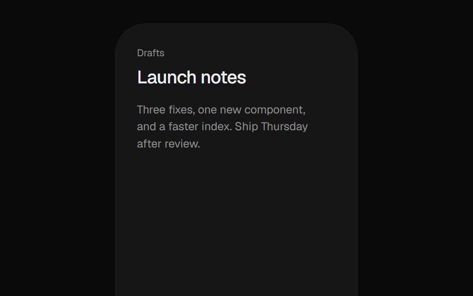 Stacked DrawerUI Lab · ReactStacks iOS sheets that push the page back and drag down to dismiss.
 SheetHextaUI · ReactA panel that slides in from any edge, with swipe-to-dismiss, scroll lock and stacked nesting.
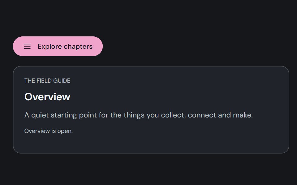 Motion DrawerCojeev UI · ReactA reference-faithful edge drawer, floating quick panel, layered workspace and bottom action tray.
 SheetSpaceUI · ReactOpens a slide-out panel from the edge of the screen, giving users space to edit settings or fill out forms without…
 SheetD2Studio UI · ReactExtends the Dialog component to display content that complements the main content of the screen.
 A drawer that opens from the left sideReUI · ReactA drawer that opens from the left side
 SheetVengeance UI · React
 Web SheetPanel UI · React Native
 Sheet 01 - Different DirectionsShadcn Space · ReactDrawer with different directions - top, right, bottom, left
 Sheet 1Watermelon UI · React
 SheetCojeev UI · ReactOpens a side surface for focused secondary content while the current page remains in place.
 A drawer that opens from the top sideReUI · ReactA drawer that opens from the top side
 Sheet 02 - Scrollable ContentShadcn Space · ReactDrawer with scrollable content
 Sheet 2Watermelon UI · React
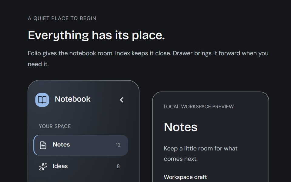 SidebarCojeev UI · ReactA paper folio, a readable compact index and a motion drawer. Three calm ways to keep the same workspace within reach.
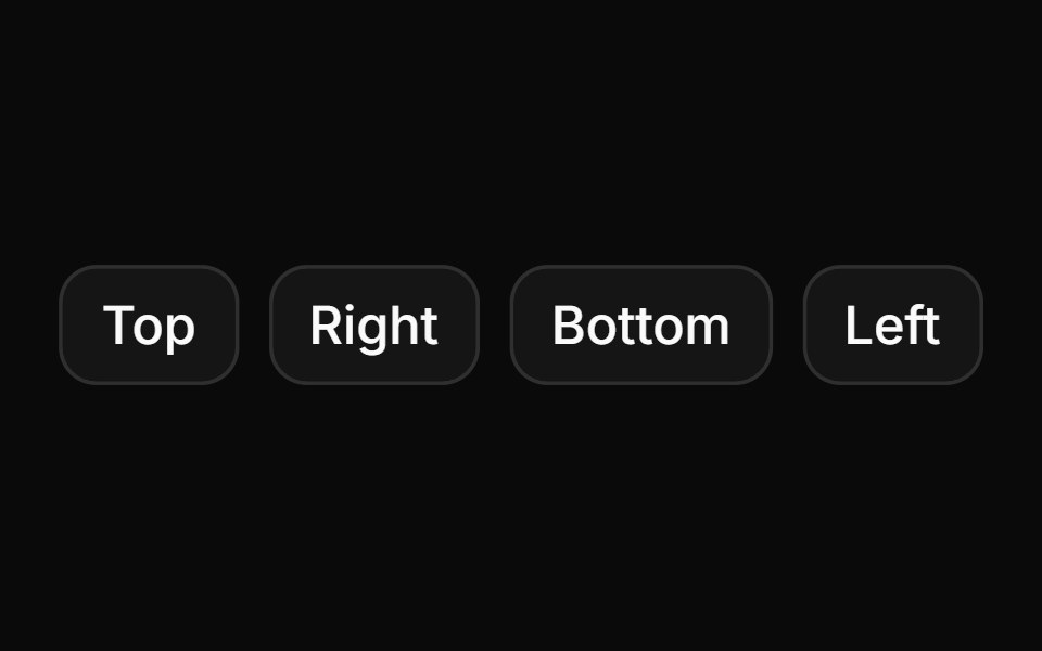 Drawers opening from different sidesReUI · ReactDrawers opening from different sides
 Sheet 04 - Filter PanelShadcn Space · ReactDrawer with products list, quantity controls, and sticky footer with total and checkout button
 Sheet 3Watermelon UI · React
 Sheet containing a form for editing profile informationReUI · ReactSheet containing a form for editing profile information.
 Sheet 4Watermelon UI · React
 Sheet without a corner close buttonReUI · ReactSheet containing a profile form with the corner close button hidden, so the footer Cancel button closes it.
 Sheet 5Watermelon UI · React
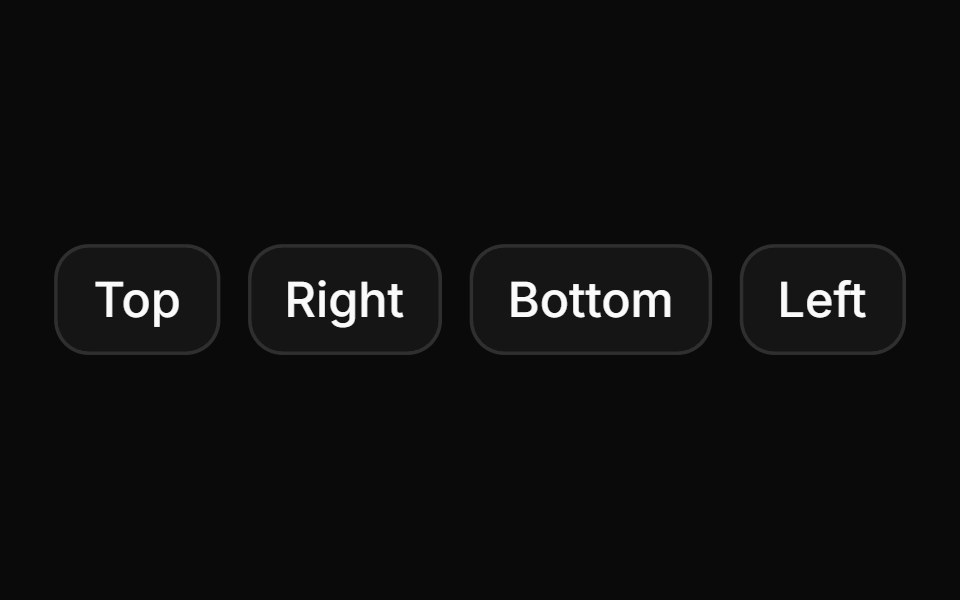 Sheets that open from any sideReUI · ReactSheets that open from any side.
 Sheet 6Watermelon UI · React
 Sheet with scrollable contentReUI · ReactSheet with scrollable content
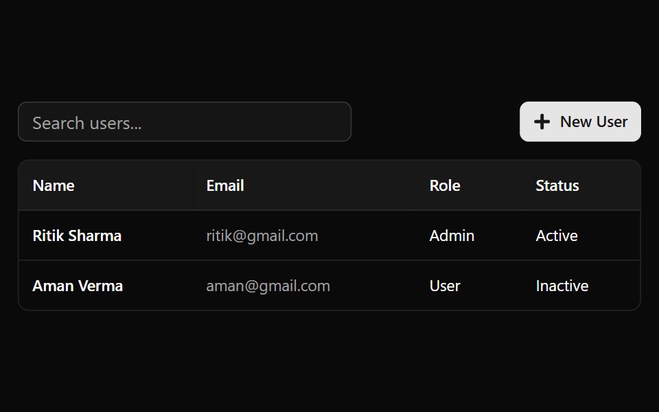 Sheet 7Watermelon UI · React
Libraries with Tailwind CSS drawer components
Related categories
- Drawer Components
- React Drawer Components
- Animated Drawer Components
- shadcn/ui Drawer Components
- Tailwind CSS Overlay Components
- Tailwind CSS Modal Components
- Tailwind CSS Popover Components
- Tailwind CSS Tooltip Components
- Tailwind CSS Toast Components
- Tailwind CSS Alert Dialog Components
- Tailwind CSS Hover Card Components
- Tailwind CSS Bottom Sheet Components
- Tailwind CSS Tour Components
- Tailwind CSS Dynamic Island Components
- Tailwind CSS Cookie Banner Components
- Tailwind CSS Lightbox Components