 Dev Design Library
shadcn/ui Alert Dialog Components
Dev Design Library indexes 12 shadcn/ui alert dialog components from 7 open-source UI libraries, with the most coming from Watermelon UI, FLX UI, sv-particles, ark-cn and glasscn. Each one links to its page with the source code, a live preview where available, the library license and the install command. They follow the shadcn/ui conventions, so most install with the shadcn CLI and drop into a Tailwind project. Alert dialog components belong to the Overlays group.
 Alert DialogShadcn Dashboard · React
 Alert Dialog 01Watermelon UI · React
 Alert Dialogglasscn · React
 Alert dialogHextaUI · ReactA confirmation dialog for destructive or important actions that waits for async work, and becomes a bottom sheet on…
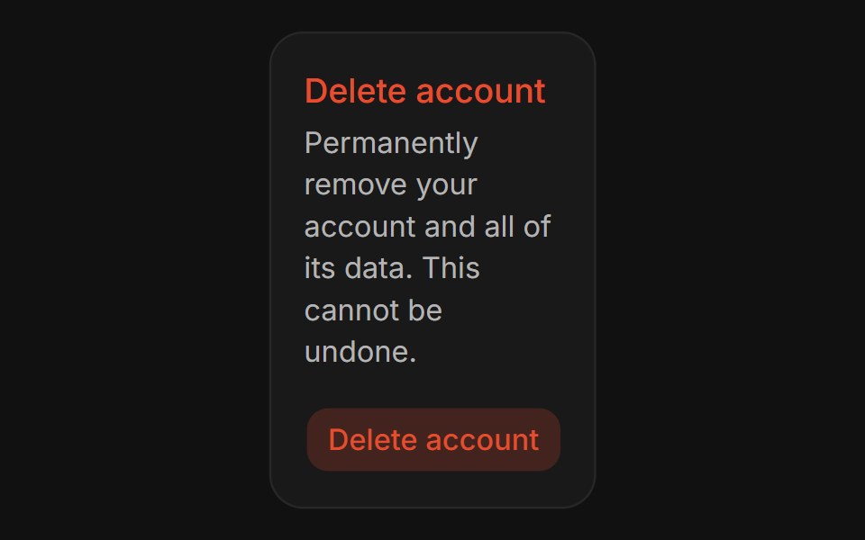 Confirm DialogFLX UI · ReactConfirm Dialog for Delete Account.
 Alert Dialog With Bare Footersv-particles · Svelte
 Alert Dialogark-cn · ReactA shadcn-style alert dialog component built with Ark UI primitives.
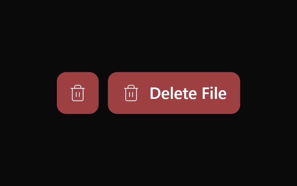 Alert Dialog 02Watermelon UI · React
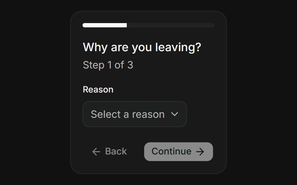 Multi-StepFLX UI · ReactMulti-Step for Delete Account.
 Basic Alert Dialogsv-particles · Svelte
 Alert Dialog 03Watermelon UI · React
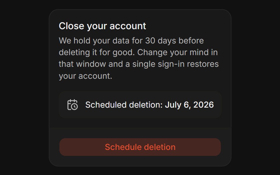 Grace PeriodFLX UI · ReactGrace Period for Delete Account.
Libraries with shadcn/ui alert dialog components
Related categories
- Alert Dialog Components
- React Alert Dialog Components
- Tailwind CSS Alert Dialog Components
- Animated Alert Dialog Components
- shadcn/ui Overlay Components
- shadcn/ui Modal Components
- shadcn/ui Popover Components
- shadcn/ui Tooltip Components
- shadcn/ui Drawer Components
- shadcn/ui Toast Components
- shadcn/ui Hover Card Components