 Dev Design Library
Hover Card Components
Dev Design Library indexes 58 hover card components from 38 open-source UI libraries, with the most coming from ReUI, Notra, SpaceUI, Sona UI and AI Elements. Each one links to its page with the source code, a live preview where available, the library license and the install command. Hover card components belong to the Overlays group.
 Hover Cardshadcn/ui · ReactA popover that appears on hover, focus, or long press to preview content available behind a link.
 Hover CardChakra UI · ReactUsed to display content when hovering over an element
 Preview Cardcoss ui · ReactA popup that appears when a link is hovered, showing a preview for sighted users.
 Hover CardOrigin UI · React
 Hover CardRadix Themes · React
 Hover CardArk UI · ReactA card that appears when a user hovers over an element.
 Basic hover card.ReUI · ReactBasic hover card.
 Card Preview TileAmicro Micro Transitions · ReactCatalog preview for a card spread / carousel. Hover state lives here so hovering one tile re-renders only that tile…
 ContextAI Elements · ReactA compound component system for displaying AI model context window usage, token consumption, and cost estimation.
 Hover CardPark UI · ReactA popover component that displays content when hovering over an element.
 Hover CardTailGrids · ReactA hover card component that displays information when the user hovers over an element.
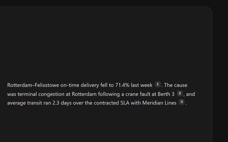 Citation SourcesSpectrum UI · ReactInline citation markers with hover previews or a footnote list.
 Hover CardVengeance UI · React
 Hover CardToolcraft · React
 Card-01 - ArticlePreviewCardShadcn Space · ReactCard component
 Hover CardShadcn Dashboard · React
 ContextAI Elements (Svelte) · SvelteA hover-card-based context window usage component with token, cost, and model usage breakdowns.
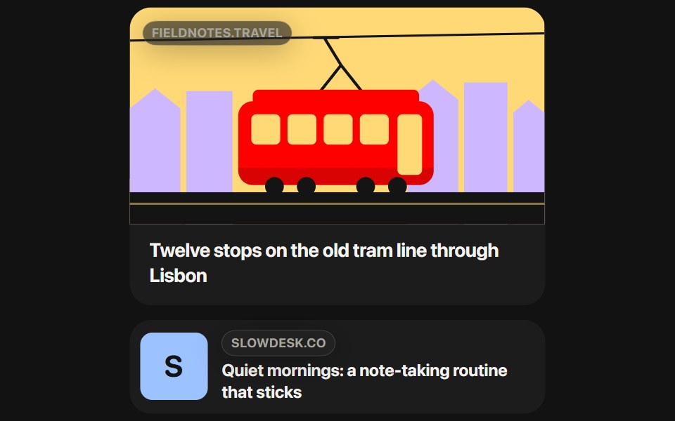 Link PreviewSwiftPieces · SwiftUIA rich card for any URL that holds its size while it loads, then settles the page's image and title under a glass host…
 Hover CardObsidianUI · React
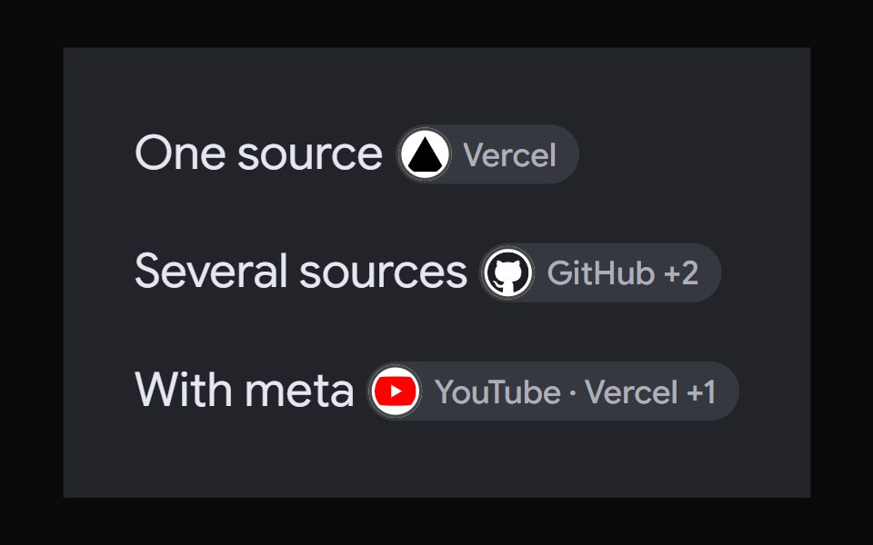 AI Overview CitationNotra · ReactA source chip built on shadcn Badge and HoverCard.
 Image Hover RevealGreatUI · React
 Hover CardShark UI · ReactPopover that appears on hover.
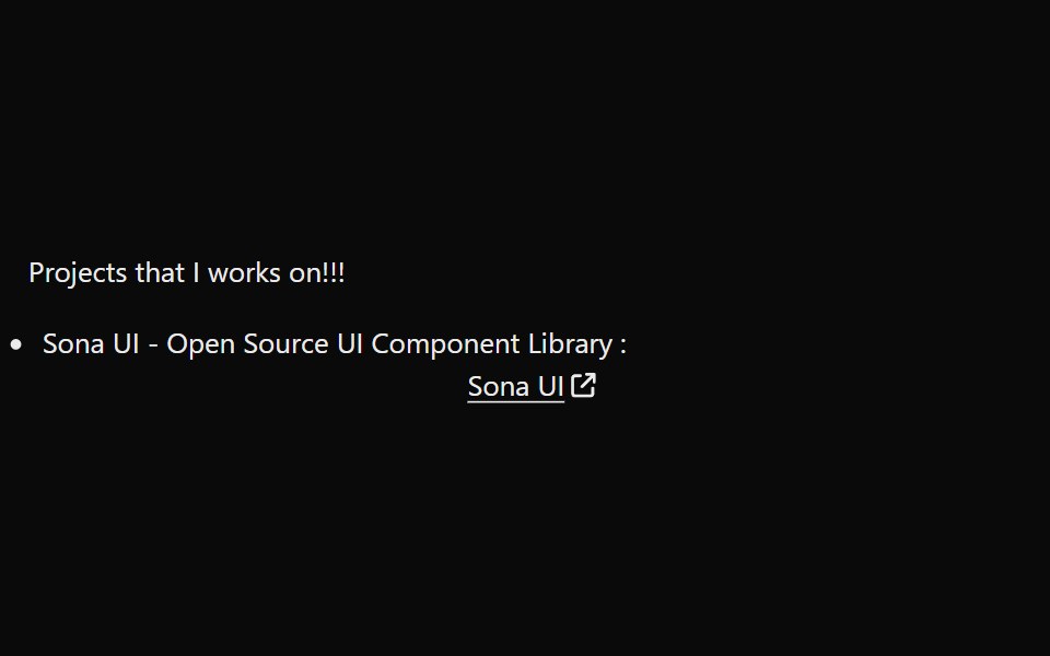 LinkPreviewSona UI · ReactThe `LinkPreview` component is an interactive UI element that displays a preview of a link when hovered over. It…
 Hover CardWatermelon UI · React
 Hover cardArc Library · ReactPreview a person or link on hover or focus without leaving the page.
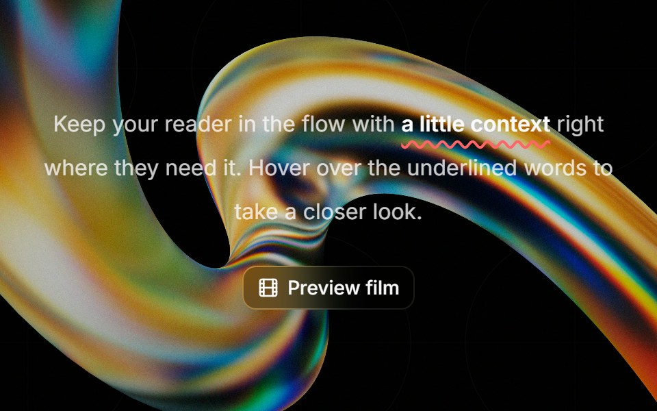 Highlight Phraseglasscn · ReactA smooth glass hover popover for text, video, and rich content, with click and keyboard access.
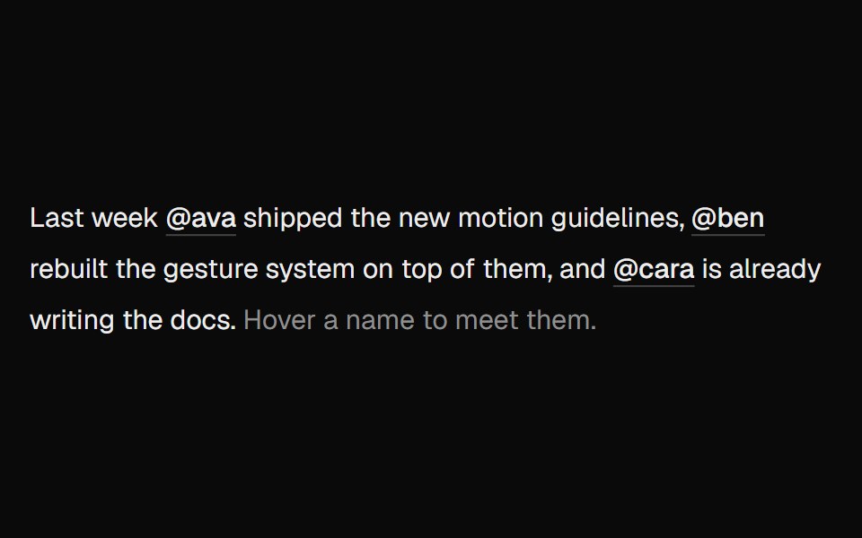 Hover CardUI Lab · ReactOne card travels between names as you hover them.
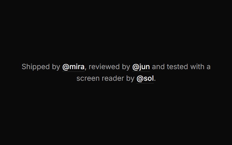 Hover cardHextaUI · ReactA preview card that opens when a link is hovered or focused, for content sighted users can glance at.
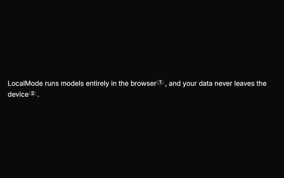 Inline CitationLocalMode · ReactInline superscript citation markers in prose that open a hovercard with the cited local chunk (title, excerpt, quoted…
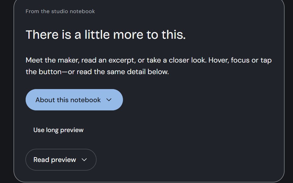 Hover CardCojeev UI · ReactA person, an excerpt or a small visual study—three considered previews, close to the thing you are exploring.
 Profile cardFLX UI · ReactBanner image, avatar, bio, and follow / message actions.
 Hover CardHalaska UI · React
 Preview cardMetal UI · React + SwiftUIWhat is behind a link, seen by resting on it: after a steady hover the popover's plate rises out of the link with an…
 Card InfoSpaceUI · ReactResponsive feature and philosophy cards with gradient icons, clean typography, and layered container aesthetics.
 Aria Hover CardReScript shadcn · ReScript
 Hover CardD2Studio UI · ReactFor sighted users to preview content available behind a link.
 Hover CardReactFrame · ReactA hover-triggered rich preview card with open/close delays, a hover bridge so moving into the card keeps it open…
 Hover Cardark-cn · ReactA shadcn-style hover card component built with Ark UI primitives.
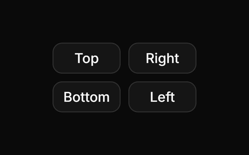 Hover card with positions.ReUI · ReactHover card with positions.
 Card Glance PreviewAmicro Micro Transitions · ReactMicro floating glance card popup with status indicator dot.
 Inline CitationAI Elements · ReactA hoverable citation component that displays source information and quotes inline with text, perfect for AI-generated…
 Card-02 - Preview CardShadcn Space · ReactCard component
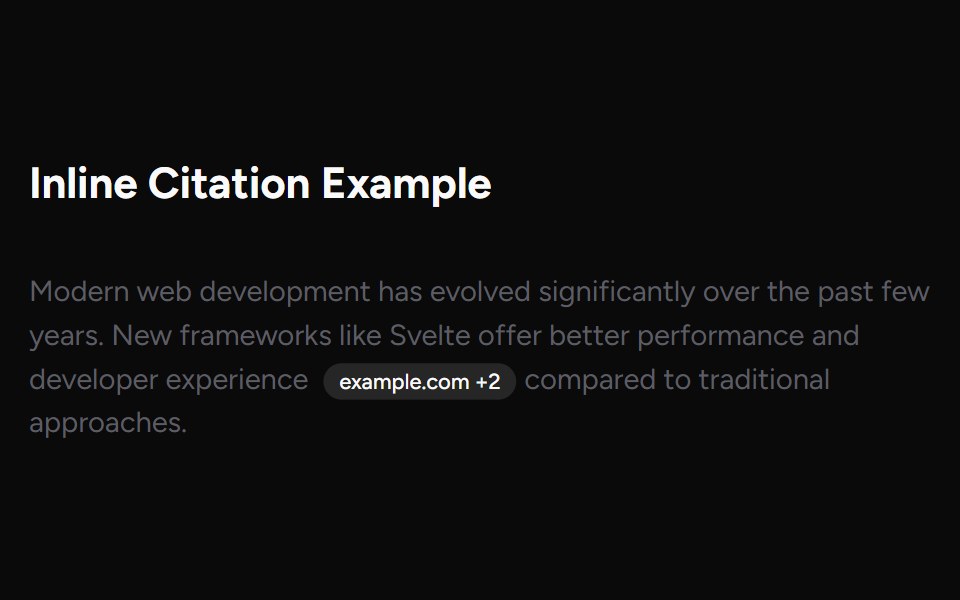 Inline CitationAI Elements (Svelte) · SvelteAn inline citation system with hover cards and carousel views for source-backed AI content.
 ChatGPT Source ChipNotra · ReactAn inline citation pill with a hover card.
 Cursor Hover CardSona UI · React
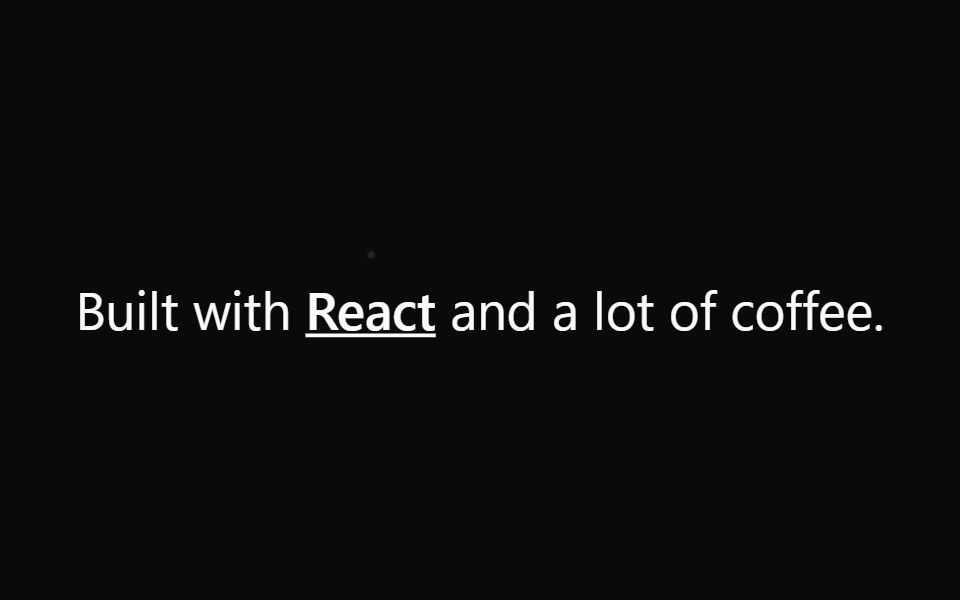 Preview Link CardWatermelon UI · React
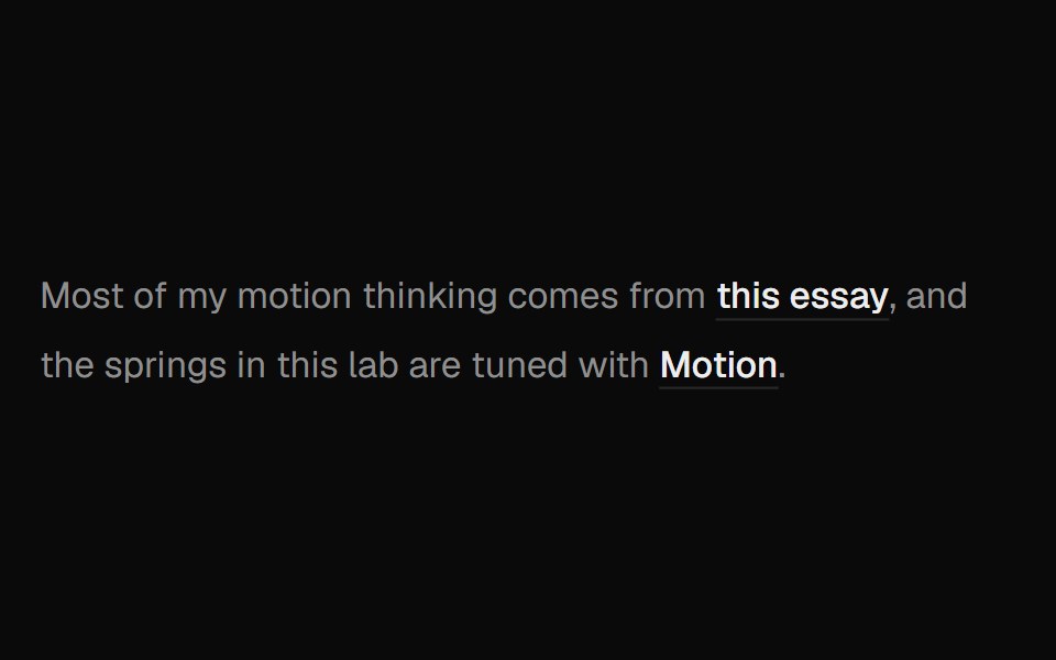 Hover Preview LinkUI Lab · ReactHover a link to get a preview card that trails your cursor and leans as it moves.
 Preview CardSpaceUI · ReactDisplays an informative preview card when users hover over a link, giving them a summary of the linked page before…
 Base Hover CardReScript shadcn · ReScript
 Hover card with profile information.ReUI · ReactHover card with profile information.
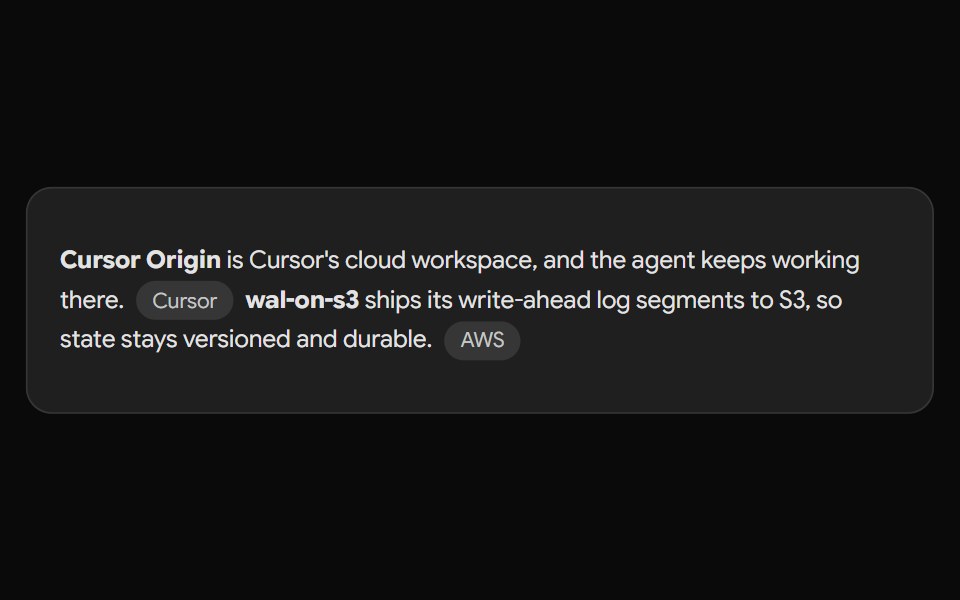 Gemini Source ChipNotra · ReactAn inline source pill with a hover card.
 Preview Link CardSpaceUI · ReactDisplays an interactive card preview of a website with its thumbnail, title, and domain name when shared or hovered.
 Hover card with iconReUI · ReactHover card with icon
 Perplexity CitationNotra · ReactAn inline source pill with favicon, label and +N count, built on shadcn Badge.
 Hover card with an image and text content.ReUI · ReactHover card with an image and text content.
 Hover card inside a dialog.ReUI · ReactHover card inside a dialog.
 Timestamp hover card with active relative timeReUI · ReactTimestamp hover card with active relative time
 Hover card with paginated release notesReUI · ReactHover card with paginated release notes
Libraries with hover card components
Related categories
- React Hover Card Components
- Tailwind CSS Hover Card Components
- Animated Hover Card Components
- shadcn/ui Hover Card Components
- Overlay Components
- Modal Components
- Popover Components
- Tooltip Components
- Toast Components
- Drawer Components
- Alert Dialog Components
- Bottom Sheet Components
- Dynamic Island Components
- Tour Components
- Lightbox Components
- Cookie Banner Components
- Mini Player Components