 Dev Design Library
Tour Components
Dev Design Library indexes 17 tour components from 11 open-source UI libraries, with the most coming from Watermelon UI, Ark UI, Origin UI, UI Lab and ark-cn. Each one links to its page with the source code, a live preview where available, the library license and the install command. Tour components belong to the Overlays group.
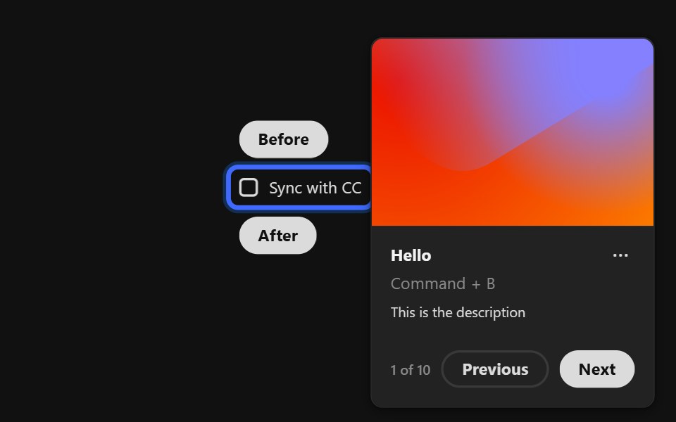 Coach MarkReact Spectrum · React
 Comp 389Origin UI · React
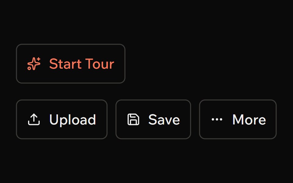 TourArk UI · ReactA guided tour that helps users understand the interface.
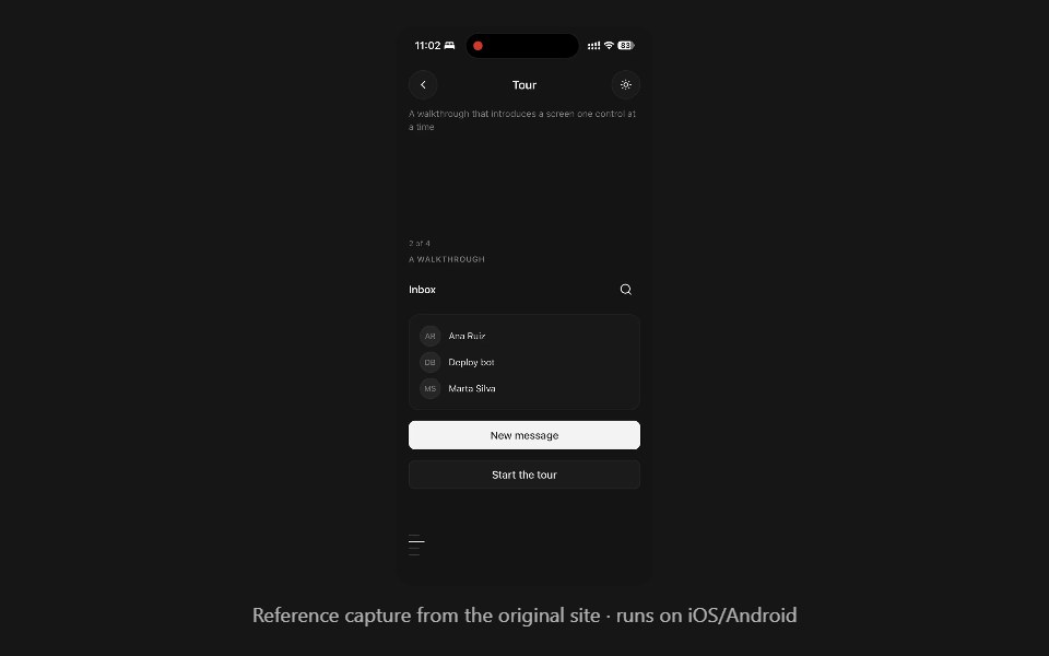 TourPanel UI · React NativeA walkthrough that introduces a screen one control at a time.
 Popover 08 - Product TourShadcn Space · ReactIcon-led product tour popover with progress dots and skip/next controls.
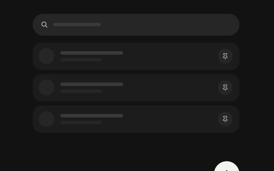 Spotlight TourSwiftPieces · SwiftUIA first-run feature tour that dims the screen around each control, with a glass callout that steps from stop to stop.
 TourShark UI · ReactDisplays a guided tour of the application.
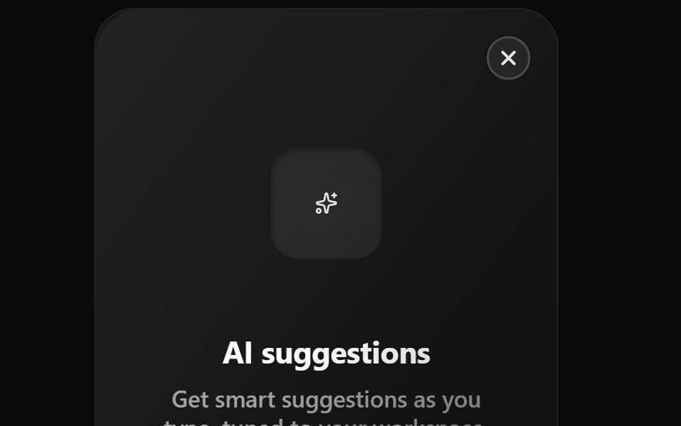 Feature TourWatermelon UI · React
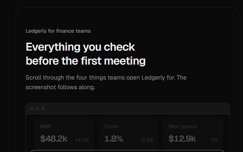 Feature SpotlightUI Lab · ReactA camera zooms into the part of the product screenshot each feature describes as you scroll past it.
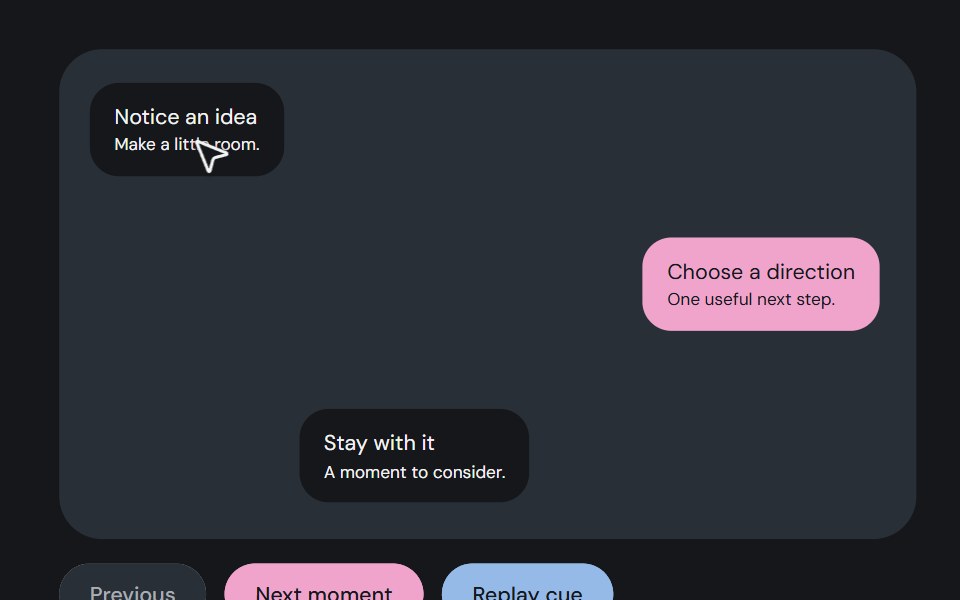 Guided pointerCojeev UI · ReactAn illustrated pointer moves between story waypoints, with a small arrival or hold cue.
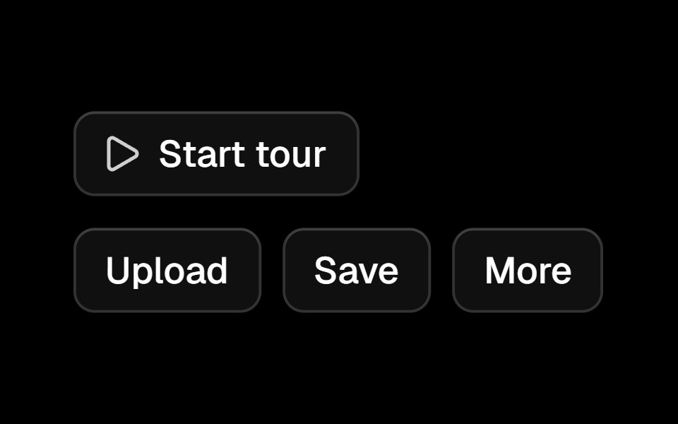 Tourark-cn · ReactA shadcn-style tour component built with Ark UI primitives.
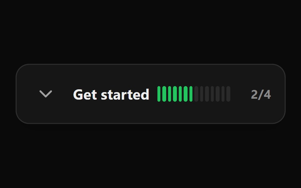 Onboarding ChecklistWatermelon UI · React
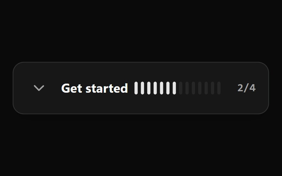 Onboarding Checklist BaseWatermelon UI · React
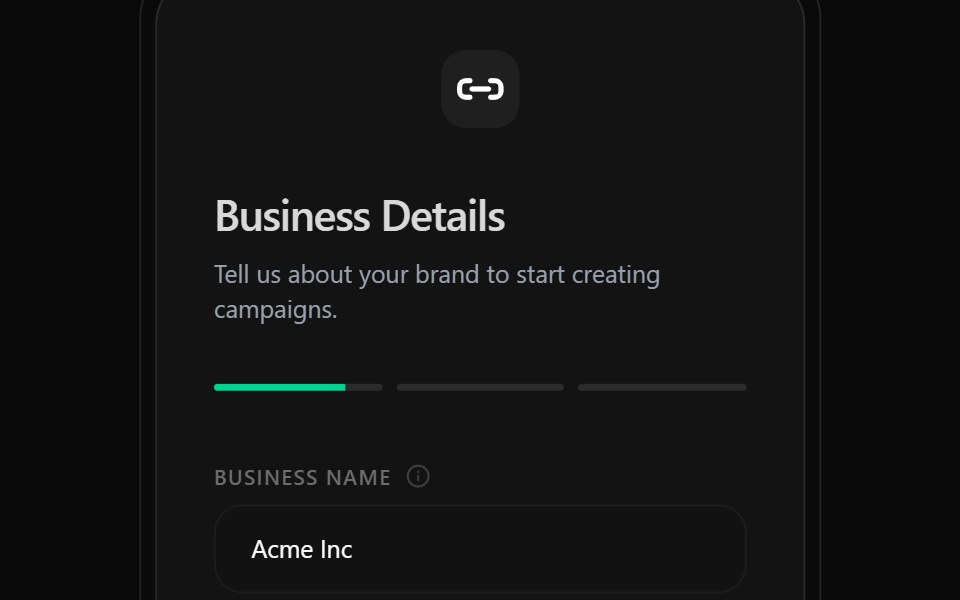 Onboarding ScreenWatermelon UI · React
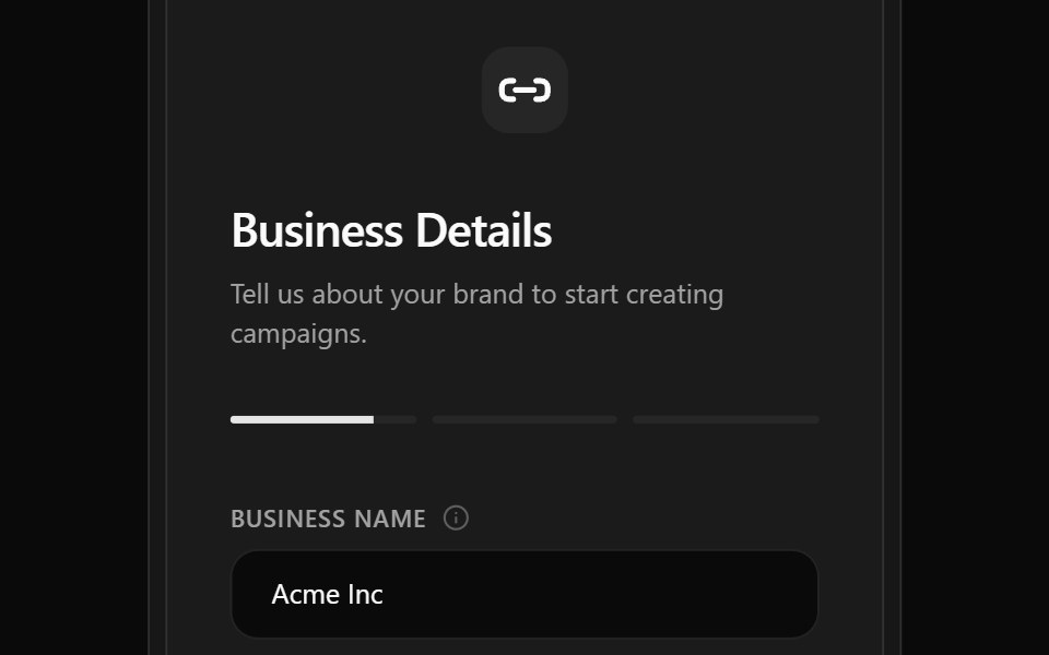 Onboarding Screen BaseWatermelon UI · React
 Onboarding SetupWatermelon UI · React
 Onboarding Setup BaseWatermelon UI · React
Libraries with tour components
Related categories
- React Tour Components
- Tailwind CSS Tour Components
- Overlay Components
- Modal Components
- Popover Components
- Tooltip Components
- Toast Components
- Drawer Components
- Hover Card Components
- Alert Dialog Components
- Bottom Sheet Components
- Dynamic Island Components
- Lightbox Components
- Cookie Banner Components
- Mini Player Components