 Dev Design Library
Coverflow Components
Dev Design Library indexes 7 coverflow components from 6 open-source UI libraries, with the most coming from React Bits, uselayouts, Amicro Micro Transitions, UI Lab and ReactFrame. Each one links to its page with the source code, a live preview where available, the library license and the install command. Coverflow components belong to the Data display group.
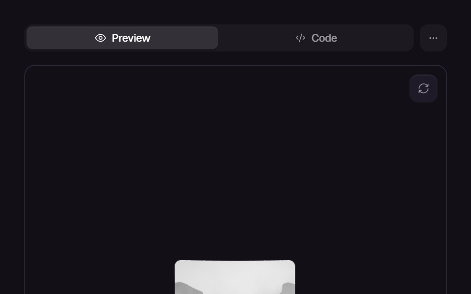 Circular CarouselReact Bits · ReactA 3D ring of images with four layouts, bendable cards, depth fade, momentum drag, snapping and click to focus.
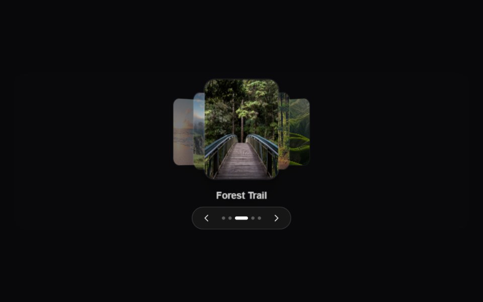 CoverFlow CarouselAmicro Micro Transitions · ReactA premium 3D CoverFlow carousel displaying cards along a perspective path.
 Photo Coverflow CyclePixel Perfect · ReactA cover-flow of photos that steps forward one at a time, the back of the deck blurred and dimmed.
 Coverflow Draguselayouts · ReactA drag coverflow of portraits that scale, dim, and snap as you swipe.
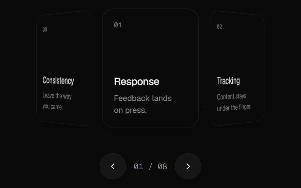 Carousel 3DUI Lab · ReactSpin a ring of cards and flick it to land on the one you were aiming for.
 Tilted CarouselReactFrame · ReactA 3D book-flow carousel where cards tilt around the active slide, with paper/glass themes and 3 title alignment styles.
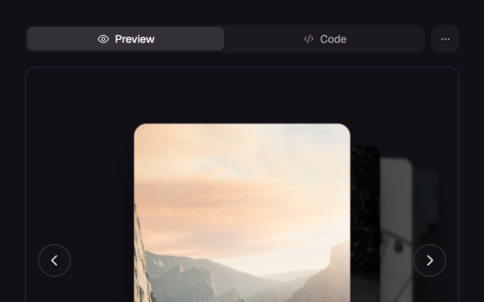 Depth CarouselReact Bits · ReactCards recede into depth on a 3D rail, with drag, keyboard and auto-advance.
Libraries with coverflow components
Related categories
- Data Display Components
- Card Components
- Chart Components
- Table Components
- Avatar Components
- List Components
- Stat Components
- Calendar Components
- Accordion Components
- Data Table Components
- Carousel Components
- Collapsible Components
- Avatar Group Components
- Stat Card Components
- Bar Chart Components
- Tree View Components